Monday, April 27, 2015
Millions of people tuned in this past March to #MobileMadness, a global campaign to help prepare webmasters for the mobile search ranking change that went live last week. The monthlong highlights included presentations, a Q&A session, office hours, polls, tips and a 30 day challenge to go mobile-friendly. Enjoy the full recap below!

Maximize your online strategy and search performance
In this presentation, learn to create an online strategy for your business, measure your search performance, and choose the right partner to design and manage your mobile website. The 3 topics are:
- Choosing the right online channel
- Webmaster Tools
- SEO as a long term strategy
Basics of a mobile website for small and medium businesses
If you own a small business, this series of short videos will show you how easy it can be to make your web pages mobile-friendly. The 4-part series include:
- Learn the tools: PageSpeed Insights, Mobile-Friendly Test and Mobile-Usability
- Bring it in: Viewports, zoom and plugins
- Focus on the user: Tap targets, margins and font sizes
- Set it right: Redirects and canonicals
Q&A session
Here are answers to questions you asked about the mobile-friendly ranking change. Check the comments section for answers to questions we weren't able to get to during the live event.
Results from audience polls
Thousands of people participated in the 3 polls below. What are your thoughts on the results: surprising or predictable?
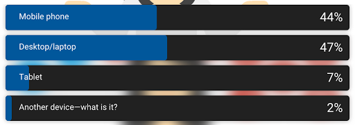
What device are you using to read this post?
Of 871 responses, desktop/laptop and mobile phone usage only differed by 28 votes. View on
Google+and
Twitter.
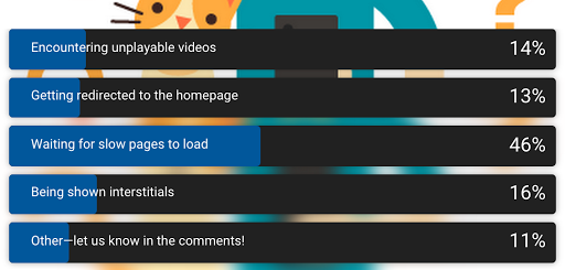
What do you dislike the most when browsing the web on your mobile device?
Almost half of 570 respondents said their top frustration was waiting for slow pages to load.
View onGoogle+ and
Twitter.
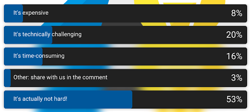
What's the hardest part about having a mobile-friendly site?
More than half of 490 respondents said it's not hard to have a mobile-friendly site. However,
1 in 5 said it's technically challenging. View on
Google+ and
Twitter.
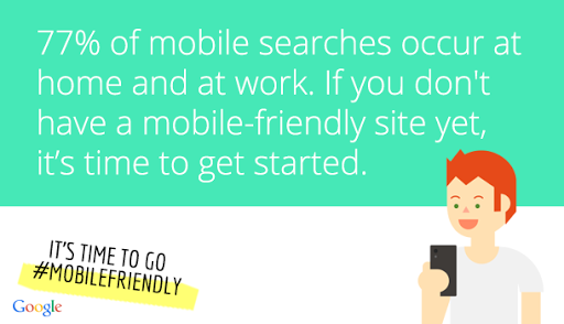
Mobile-friendly tips
These tips highlight specific resources to help you go mobile-friendly. View a few of them below and the entire #mobilefriendly collection.
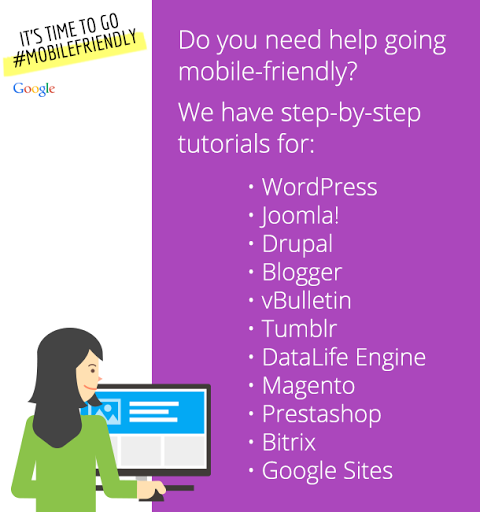

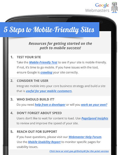
Mobile-friendly one-sheeter
Download the one-sheeter so you can access and share these 5 steps to mobile-friendliness on-the-go.
Results from our 30 Day Challenge to go mobile-friendly
Many people took our 30 Day Challenge to make their sites mobile-friendly in March. Take a look at some of the responses we got at the end of the challenge.
- Nicolas Chevallier: "Almost every sites we managed have been redesigned in RWD since the beginning of #mobilemadness"
- Daniel Harrison: "Still working on the responsive design site. Hope to be 100% finished in 2 weeks."
- Gina Gaudio-Graves: "Our site is now totally #mobilefriendly [...] And, many of our students sites are now #mobilefriendly as well! Thanks for the help!"
- Andreas Becker: "just a few more days ... so many sites :) i think 90%"
Thanks to all who participated in #MobileMadness! As a reminder, take the Mobile-Friendly Test, check the Mobile Usability Report for mobile usability issues, and read the step-by-step mobile guide which contains all our mobile resources. And as always, head on over to our webmasters help forum if you need any help.