The Hansen et al. (2013)
Global
Forest Change dataset in Earth Engine represents forest change, at 30 meters
resolution, globally, between 2000 and 2014. Let's start by adding the Hansen et
al. data to the map. Either import the global forest change data
(learn more about searching and importing datasets)
by searching for "Hansen forest" and naming the import gfc2014, or copy the
following code into the Code Editor:
Code Editor (JavaScript)
var gfc2014 = ee.Image('UMD/hansen/global_forest_change_2015');
Map.addLayer(gfc2014);
Click on the Run button at the top of the Code Editor and you should see something like Figure 1.
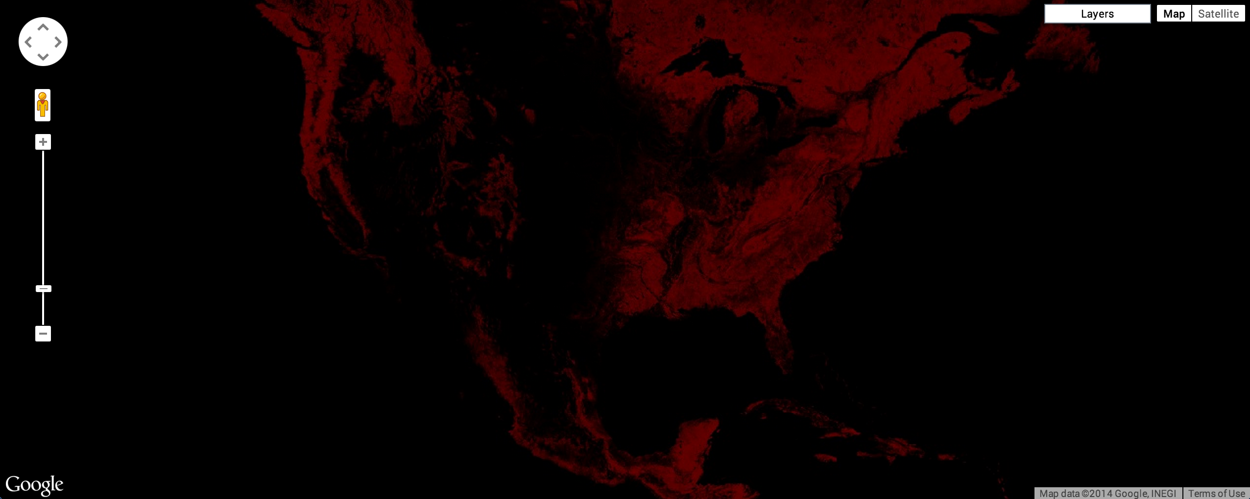
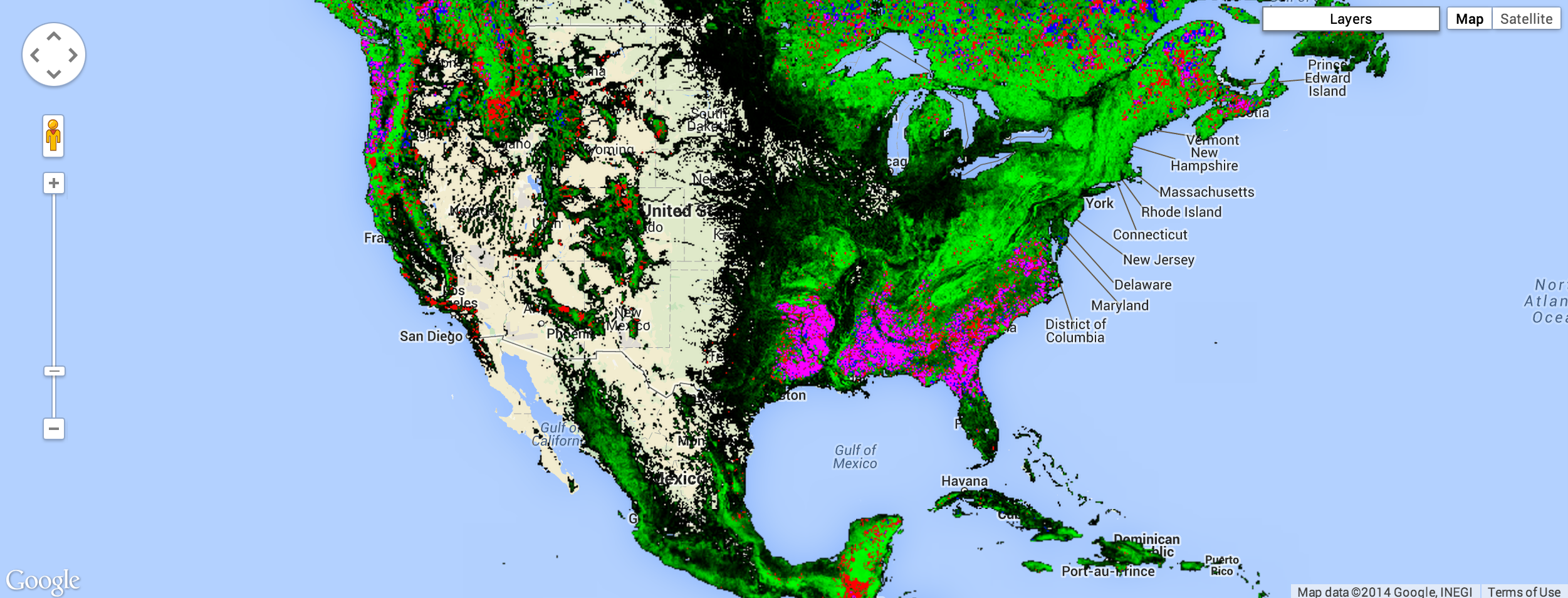
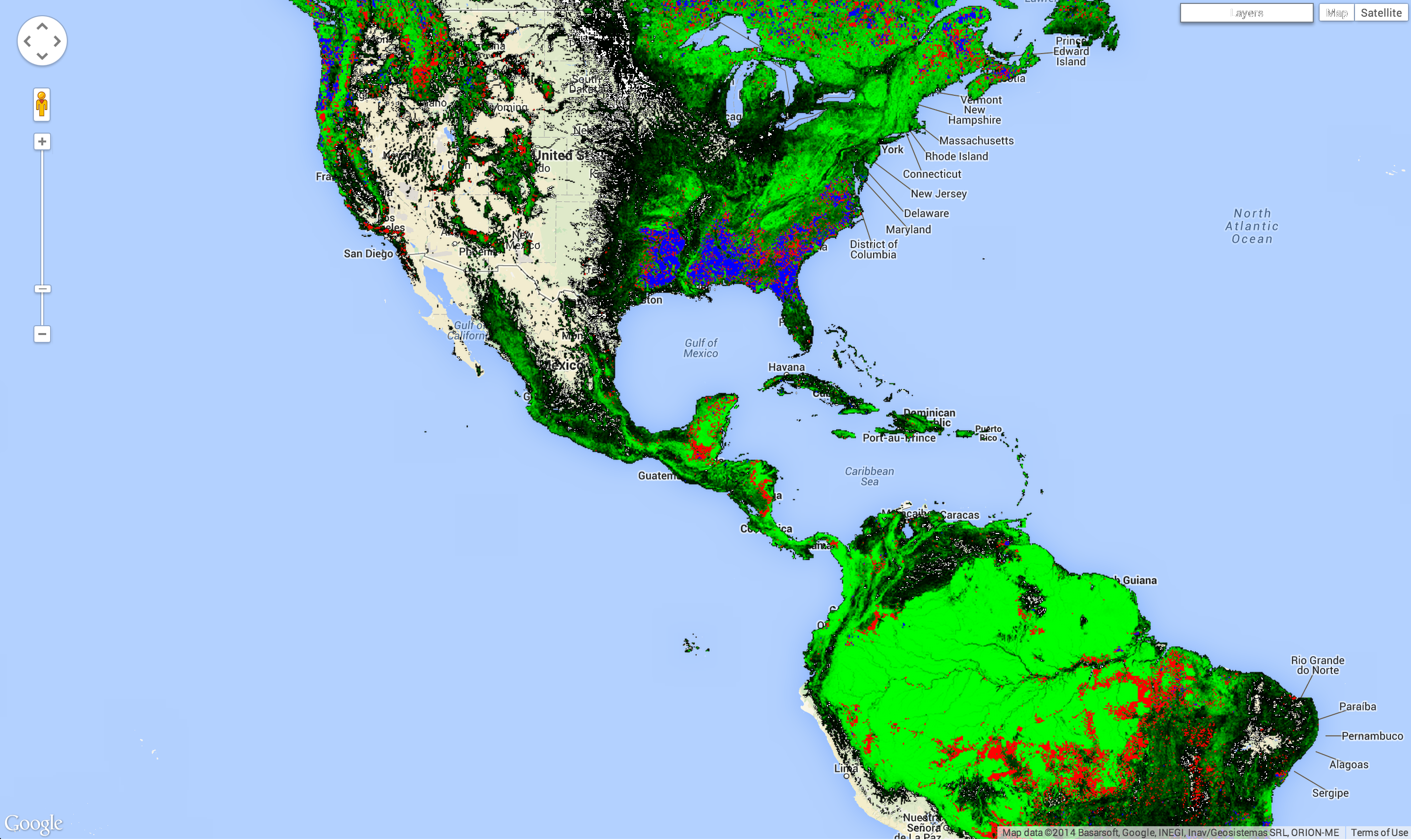
Don't worry, you'll make it look better soon. (Learn more about default image visualizations in Earth Engine). By the end of this section, you'll have an image that looks something like Figure 2, where green represents where the study detected forest in the year 2000, red is estimated forest loss over the study period, blue is forest gain during that period, magenta is areas where forest has been both lost and gained, and non-forest areas are masked.
Recall that when a multi-band image is added to a map, the first three bands of the image
are chosen as red, green, and blue, respectively, and stretched according to the data
type of each band. The reason the image looks red is that the first three bands are
treecover2000, loss, and gain. The
treecover2000 band is expressed as a percent and has values much higher than
loss (green) and gain (blue) which are binary ({0, 1}). The image
therefore displays as overwhelmingly red.
The bands in the Global Forest Change data are:
| Band Name | Description | Range |
|---|---|---|
| treecover2000 | Percentage of tree cover in the pixel. | 0 - 100 |
| loss | 1 if loss ever happen during the study period. | 0 or 1 |
| gain | 1 if gain ever happen during the study period. | 0 or 1 |
| lossyear | The year loss occurred, one-indexed from year 2001, or zero if no loss occurred. | 0 - 12 |
| first_b30 | The Landsat 7 red band built from the first valid pixels in 2000 (or older if there were no valid pixels in 2000). | 0 - 255 |
| first_b40 | The Landsat 7 near infrared band built from the first valid pixels in 2000. | 0 - 255 |
| first_b50 | The first Landsat 7 short wave infrared band built from the first valid pixels in 2000. | 0 - 255 |
| first_b70 | The second Landsat 7 short wave infrared band built from the first valid pixels in 2000. | 0 - 255 |
| last_b30 | The Landsat 7 red band built from the latest valid pixels in 2012. | 0 - 255 |
| last_b40 | The Landsat 7 near infrared band built from the latest valid pixels in 2012. | 0 - 255 |
| last_b50 | The first Landsat 7 short wave infrared band built from the latest valid pixels 2012. | 0 - 255 |
| last_b70 | The second Landsat 7 short wave infrared band built from the latest valid pixels 2012. | 0 - 255 |
| datamask | No data (0), mapped land surface (1), and permanent water bodies (2). | 0, 1, 2 |
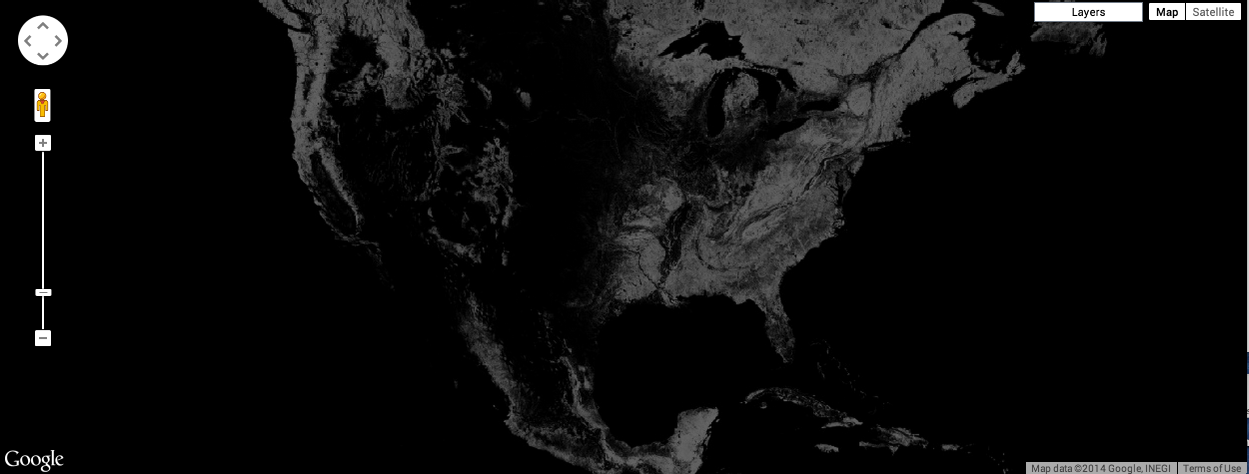
To display forest cover in the year 2000 as a grayscale image, you can use the
treecover2000 band, specified in the second argument to
Map.addLayer():
Code Editor (JavaScript)
Map.addLayer(gfc2014, {bands: ['treecover2000']}, 'treecover2000');
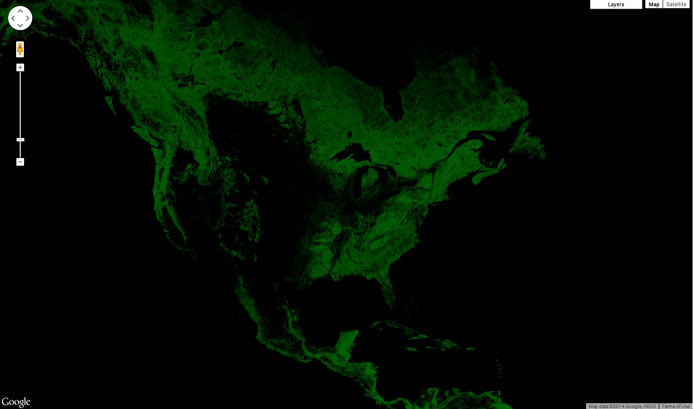
This results in an image that should look something like Figure 3.
Here's an image that uses 3 bands, Landsat bands 5, 4, and 3 for 2015. This band combination shows healthy vegetation as green and soil as mauve::
Code Editor (JavaScript)
Map.addLayer(
    gfc2014, {bands: ['last_b50', 'last_b40', 'last_b30']}, 'false color');
The result should look something like Figure 4.

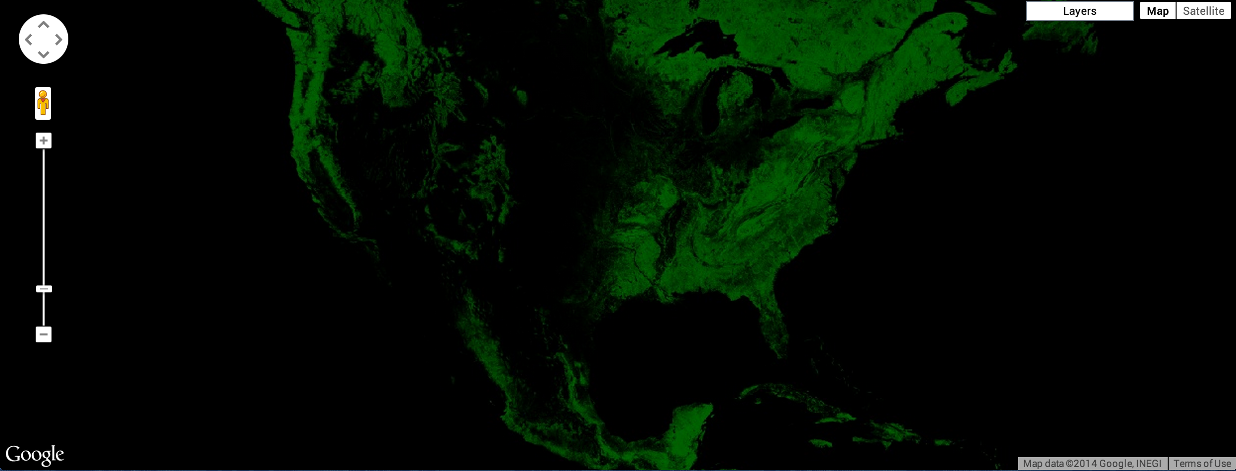
One nice visualization of the Global Forest Change dataset shows forest extent in
2000 as green, forest loss as red, and forest gain as blue. Specifically, make
loss the first band (red), treecover2000 the second band (green),
and gain the third band (blue):
Code Editor (JavaScript)
Map.addLayer(gfc2014, {bands: ['loss', 'treecover2000', 'gain']}, 'green');
The loss and gain band values are binary, so they will be barely visible on the image, which should look something like Figure 5.
We'd like forest loss to show up as bright red and forest gain to show up as bright
blue. To fix this, we can use the visualization parameter max to set the
range to which the image data are stretched. Note that the max visualization
parameter takes a list of values, corresponding to maxima for each band:
Code Editor (JavaScript)
Map.addLayer(gfc2014, {
  bands: ['loss', 'treecover2000', 'gain'],
  max: [1, 255, 1]
}, 'forest cover, loss, gain');
The result should look something like Figure 6.
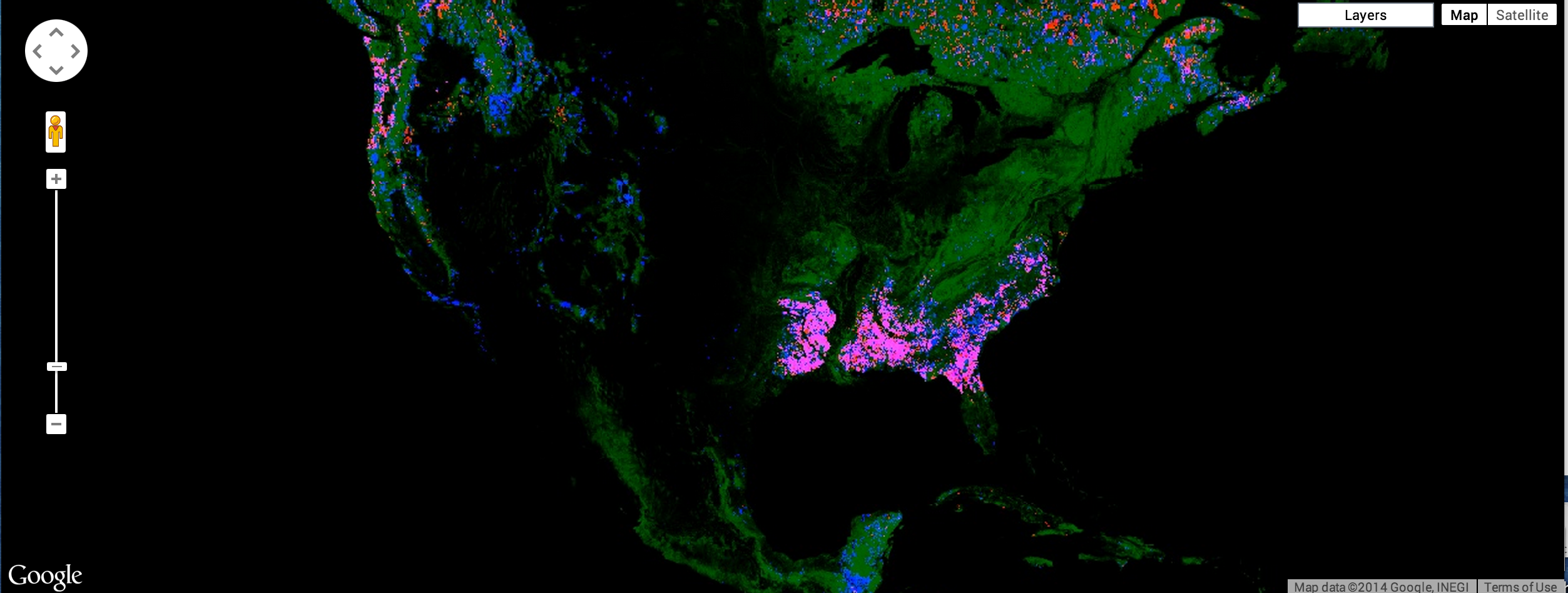
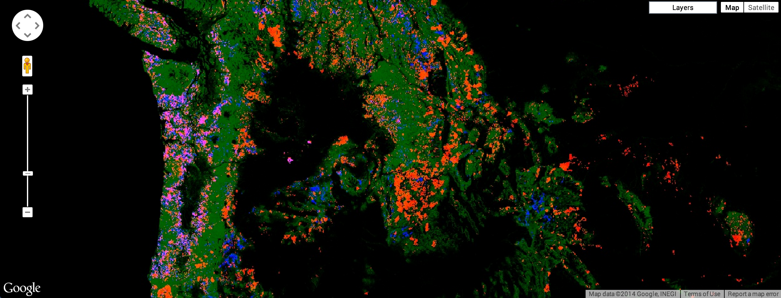
This results in an image that is green where there's forest, red where there's forest loss, blue where there's forest gain, and magenta where there's both gain and loss. A closer inspection, however, reveals that it's not quite right. Instead of loss being marked as red, it's orange. This is because the bright red pixels mix with the underlying green pixels, producing orange pixels. Similarly the pixels where there's forest, loss, and gain are pink - a combination of green, bright red and bright blue. See Figure 7 for an illustration.
To get the image promised at the beginning of the tutorial, you can create separate images for forest, loss, gain, and for both loss and gain. Add each of these images to the map in the order that's best for display.
Palettes
To display each image as a different color, you can use the palette
parameter of Map.addLayer() for single band images. Palettes let you set
the color scheme with which the image is displayed
(learn more about palettes). Recall from
the Earth Engine API tutorial that the colors
in a palette are linearly stretched to the min and max.
For example, to use a green palette to display the forest extent image, you could use:
Code Editor (JavaScript)
Map.addLayer(gfc2014, {
  bands: ['treecover2000'],
  palette: ['000000', '00FF00']
}, 'forest cover palette');
The result should look something like Figure 8.
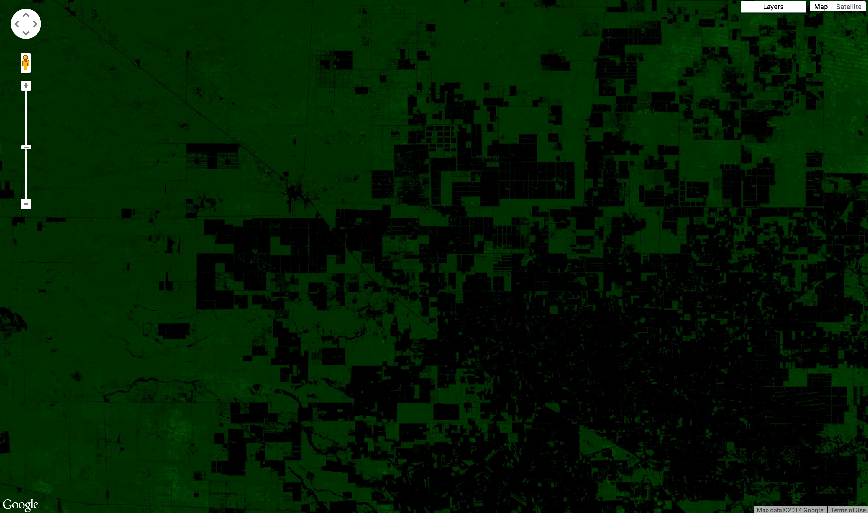
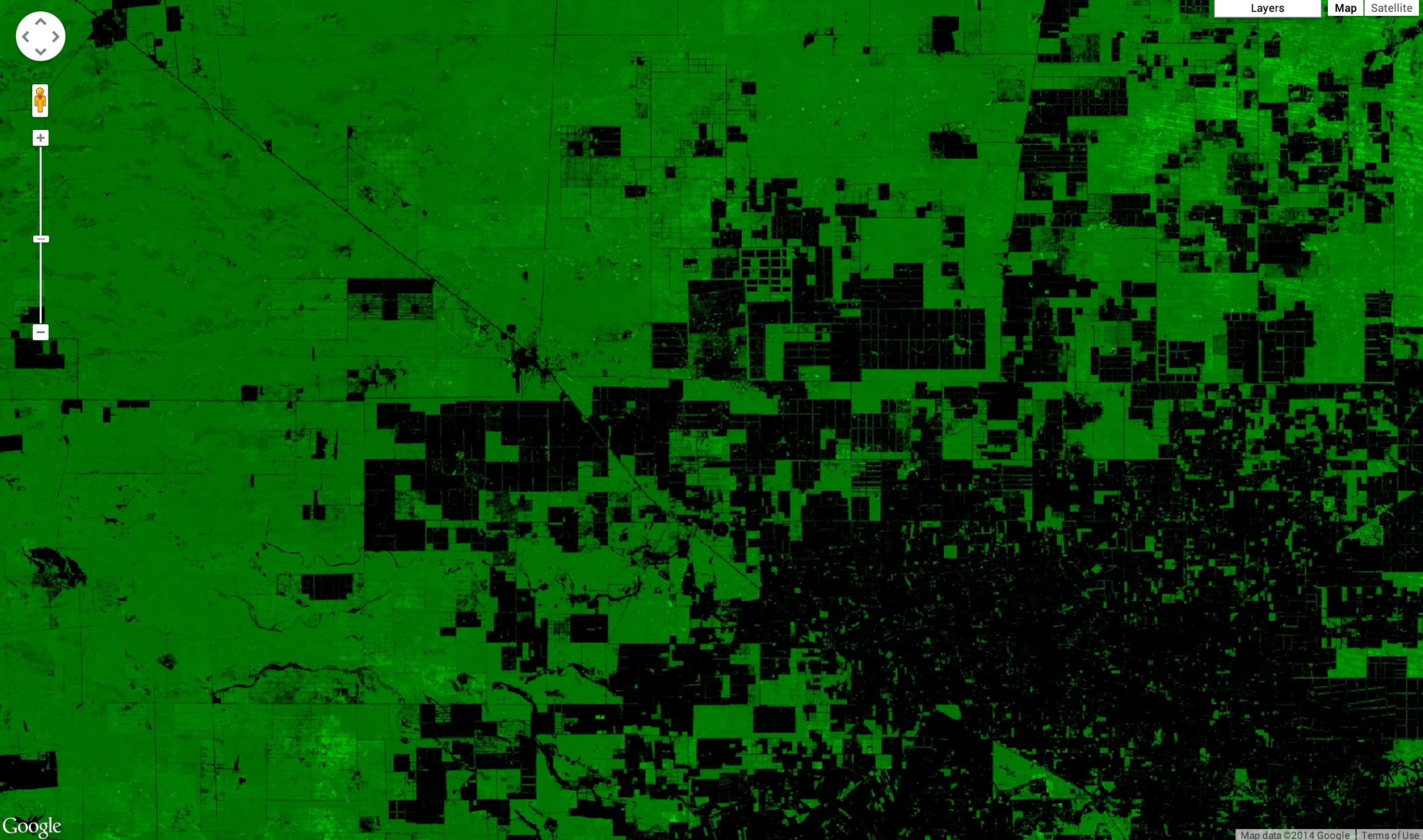
Zooming in gives a better sense for the resolution of the imagery. Figure 9 shows an area around Mariscal Estigarribia in Paraguay.
The image shown in Figure 3 is a bit dark. The problem is that the
treecover2000 band has a byte data type ([0, 255]), when in fact the
values are precentages ([0, 100]). To brighten the image, you can set the min
and/or max parameters accordingly. The palette is then stretched between
those extrema.
Code Editor (JavaScript)
Map.addLayer(gfc2014, {
  bands: ['treecover2000'],
  palette: ['000000', '00FF00'],
  max: 100
}, 'forest cover percent');
The result should look something like Figure 9. Note that in this example, only the
max is set. The min is zero by default.
Masking
All of the images shown so far have had big black areas were there the data is zero. For example, there are no trees in the ocean. To make these areas transparent, you can mask their values. Every pixel in Earth Engine has both a value and a mask. The image is rendered with transparency set by the mask, with zero being completely transparent and one being completely opaque.
You can mask an image with itself. For example, if you mask the treecover2000
band with itself, all the areas in which forest cover is zero will be transparent:
Code Editor (JavaScript)
Map.addLayer(gfc2014.mask(gfc2014), {
  bands: ['treecover2000'],
  palette: ['000000', '00FF00'],
  max: 100
}, 'forest cover masked');
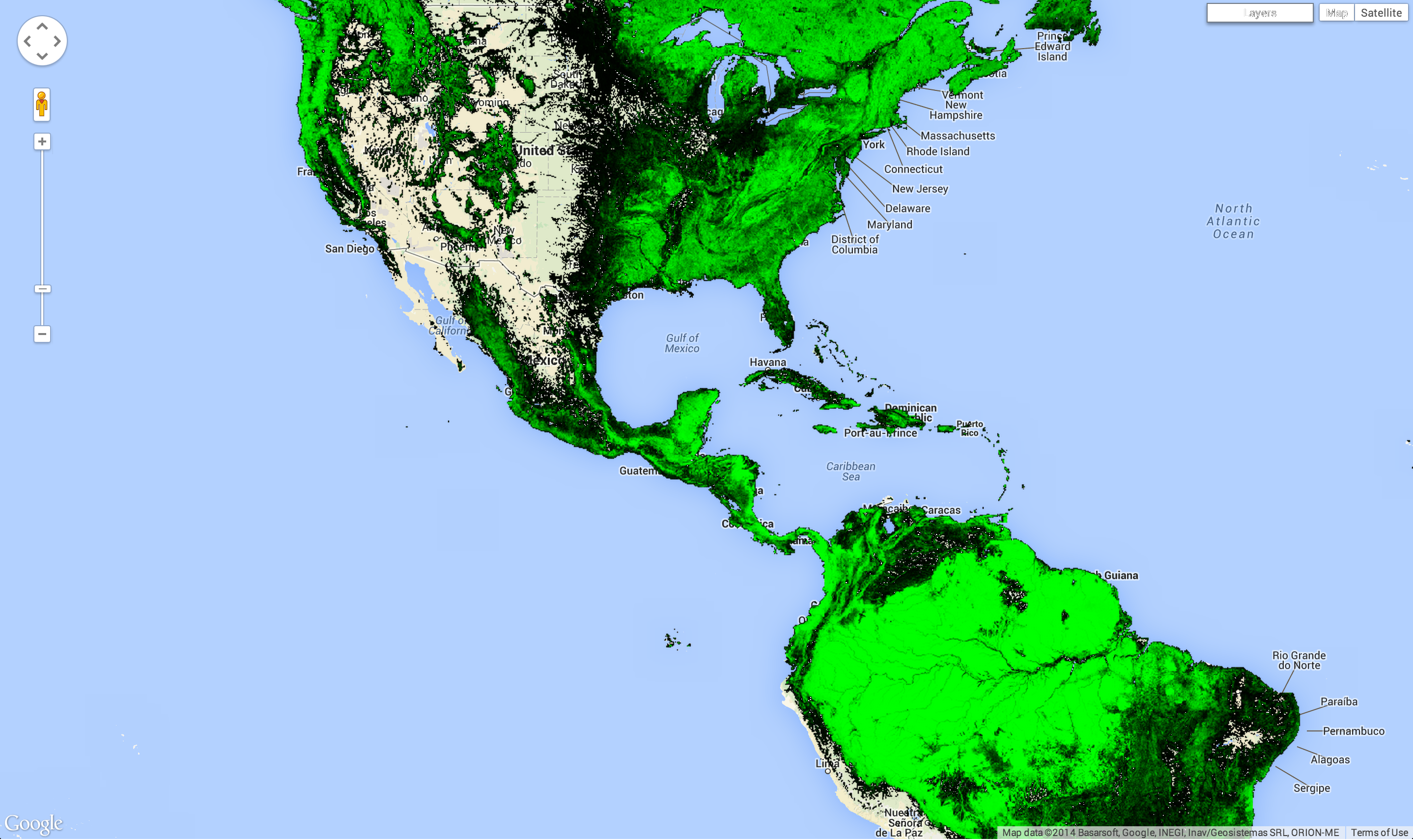
The result should look something like Figure 10.
Example
It's almost possible to make a visualization of the Hansen data like the one at the
beginning of the tutorial. In this example, we're putting everything together with
one small difference. Instead of specifying the bands parameter in the
Map.addLayer call, we're creating new images using select():
Code Editor (JavaScript)
var treeCover = gfc2014.select(['treecover2000']);
var lossImage = gfc2014.select(['loss']);
var gainImage = gfc2014.select(['gain']);

// Add the tree cover layer in green.
Map.addLayer(treeCover.updateMask(treeCover),
    {palette: ['000000', '00FF00'], max: 100}, 'Forest Cover');

// Add the loss layer in red.
Map.addLayer(lossImage.updateMask(lossImage),
            {palette: ['FF0000']}, 'Loss');

// Add the gain layer in blue.
Map.addLayer(gainImage.updateMask(gainImage),
            {palette: ['0000FF']}, 'Gain');
The result should look something like Figure 11.
Observe that there are three addLayer() calls. Each
addLayer() call adds a layer to the map. Mousing over the
Layers button in the upper right of the map reveals these
layers. Each layer can be turned off or on using the checkbox next to it, and the
opacity of the layer can be affected by the slider next to the layer name.
We're almost able to make the image shown at the start of the tutorial. However, the layer showing the pixels with both loss and gain is missing. It is missing because we need to know how to perform some calculations on image bands before we can calculate which pixels show both loss and gain. This is the topic of the next section.