
การจัดรูปแบบที่กำหนดเอง
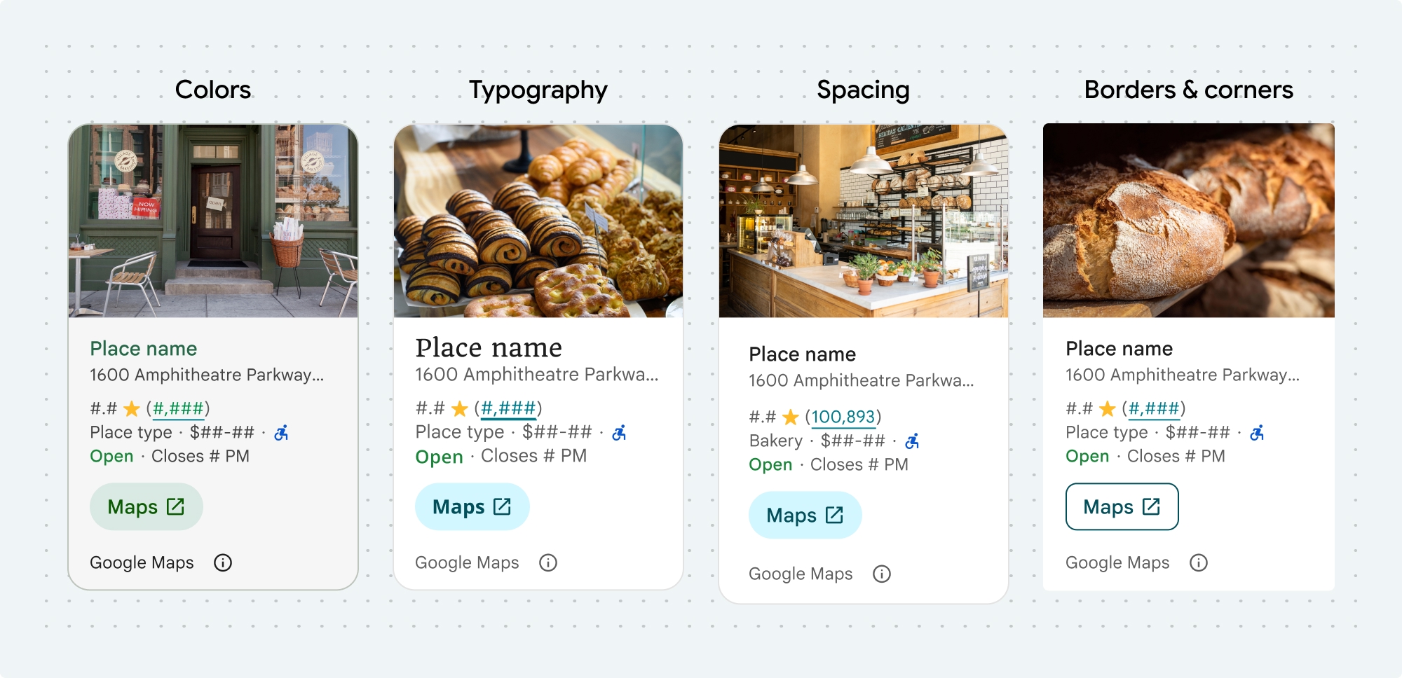
คุณปรับแต่งสี การพิมพ์ ระยะห่าง เส้นขอบ และมุมของคอมโพเนนต์ UI Kit ของ Places และฟีเจอร์ที่ไม่ใช่ UI Kit ได้ดังนี้
- คอมโพเนนต์รายละเอียดสถานที่
- คอมโพเนนต์การค้นหาสถานที่
- คอมโพเนนต์ Place Autocomplete พื้นฐาน
- วิดเจ็ต Place Autocomplete ของชุดเครื่องมือที่ไม่ใช่ UI
ชุดเครื่องมือ UI ของ Places มีแนวทางระบบการออกแบบสำหรับการปรับแต่งภาพโดยอิงตาม Material Design โดยประมาณ (มีการแก้ไขบางอย่างที่เฉพาะเจาะจงสำหรับ Google Maps) ดูข้อมูลอ้างอิงของ Material Design สำหรับสีและการพิมพ์ โดยค่าเริ่มต้น สไตล์จะเป็นไปตามภาษาการออกแบบภาพของ Google Maps
รูปลักษณ์ของคอมโพเนนต์ได้รับการปรับแต่งด้วยโครงสร้าง placesMaterialColor, placesMaterialFont, placesMaterialShape และ placesMaterialTheme
คุณปรับแต่งสไตล์ต่อไปนี้ได้
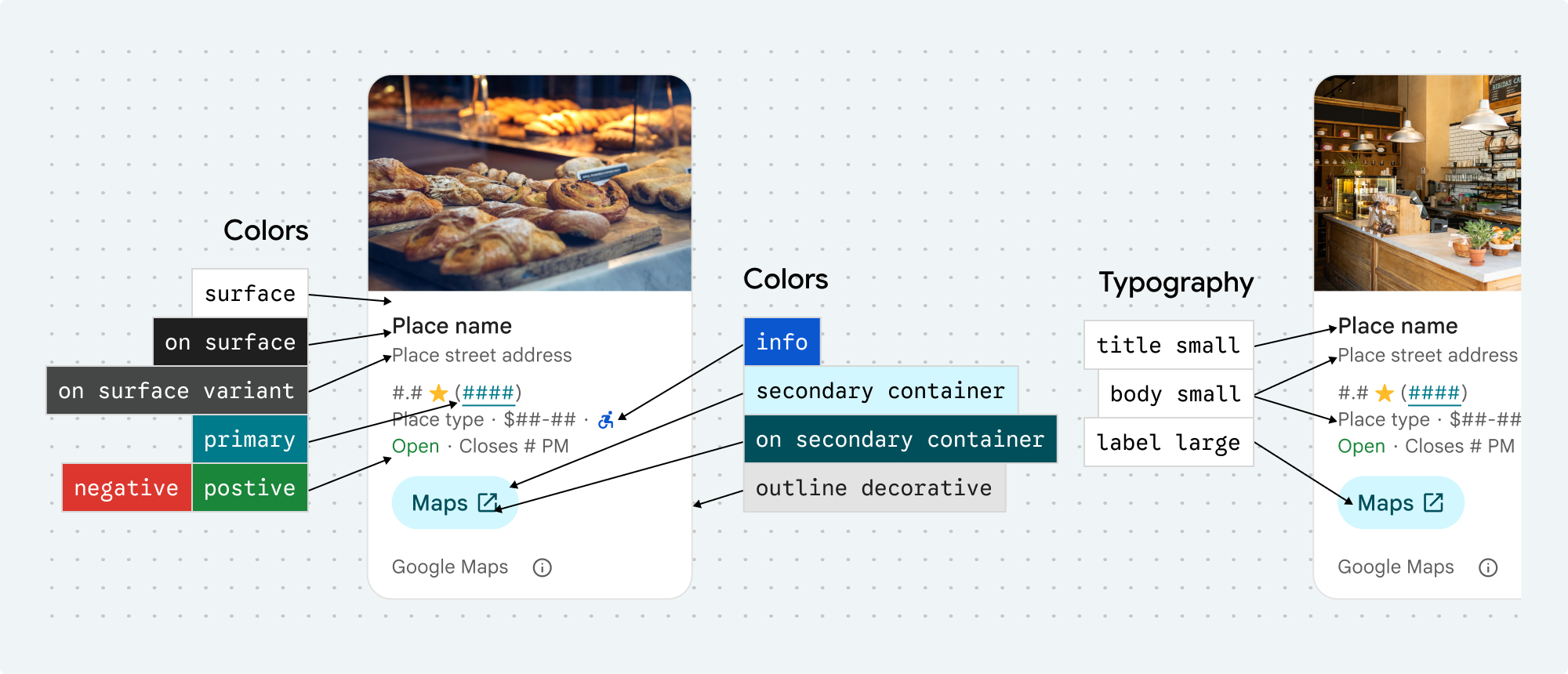
| แอตทริบิวต์ธีม | การใช้งาน |
|---|---|
| สี | |
theme.color.surface |
พื้นหลังของคอนเทนเนอร์และกล่องโต้ตอบ |
theme.color.outlineDecorative |
เส้นขอบคอนเทนเนอร์ |
theme.color.primary |
ลิงก์ สัญญาณบอกสถานะการโหลด ไอคอนภาพรวม |
theme.color.onSurface |
ส่วนหัว เนื้อหาของกล่องโต้ตอบ |
theme.color.onSurfaceVariant |
ข้อมูลสถานที่ |
theme.color.secondaryContainer |
พื้นหลังของปุ่ม |
theme.color.onSecondaryContainer |
ข้อความและไอคอนของปุ่ม |
theme.color.neutralContainer |
ป้ายวันที่รีวิว รูปร่างตัวยึดตำแหน่งการโหลด |
theme.color.onNeutralContainer |
วันที่ตรวจสอบ ข้อผิดพลาดในการโหลด |
theme.color.positiveContainer |
ป้ายที่ชาร์จ EV ที่พร้อมให้บริการ |
theme.color.onPositiveContainer |
เนื้อหาป้ายที่ชาร์จ EV ที่พร้อมใช้งาน |
theme.color.positive |
ป้ายกำกับ "เปิด" ของสถานที่ |
theme.color.negative |
ป้ายกำกับ "ปิด" ของสถานที่ |
theme.color.info |
ไอคอนทางเข้าที่รองรับเก้าอี้รถเข็น |
theme.measurement.borderWidthButton |
ปุ่มเปิดใน Maps และปุ่มตกลง |
| การออกแบบตัวอักษร | |
theme.font.bodySmall |
ข้อมูลสถานที่ |
theme.font.bodyMedium |
ข้อมูลสถานที่ เนื้อหาของกล่องโต้ตอบ |
theme.font.labelMedium |
เนื้อหาของป้าย |
theme.font.labelLarge |
เนื้อหาปุ่ม |
theme.font.headlineMedium |
ส่วนหัวของกล่องโต้ตอบ |
theme.font.displaySmall |
ชื่อสถานที่ |
theme.font.titleSmall |
ชื่อสถานที่ |
| การเว้นวรรค | |
theme.measurement.spacingExtraSmall |
|
theme.measurement.spacingSmall |
|
theme.measurement.spacingMedium |
|
theme.measurement.spacinglarge |
|
theme.measurement.spacingExtraLarge |
|
theme.measurement.spacingTwoExtraLarge |
|
| การวัดผล | |
borderWidth |
คอนเทนเนอร์ |
theme.measurement.borderWidthButton |
|
| รูปร่าง | |
theme.shape.cornerRadius |
คอนเทนเนอร์ |
theme.shape.cornerRadiusButton |
ปุ่มเปิดใน Maps และปุ่มตกลง (ไม่รวมปุ่มไอคอนกลม) |
theme.shape.cornerRadiusThumbnail |
รูปภาพขนาดย่อของสถานที่ |
theme.shape.cornerRadiusCollageOuter |
ภาพคอลลาจ |
theme.shape.cornerRadiusCard |
การ์ดสถานที่ การ์ดรีวิวจากผู้ใช้ |
theme.shape.cornerRadiusDialog |
กล่องโต้ตอบการเปิดเผยข้อมูลของ Google Maps |
| การระบุแหล่งที่มาของแบรนด์ Google Maps | |
attribution.lightModeColor |
ปุ่มการระบุแหล่งที่มาและการเปิดเผยข้อมูลของ Google Maps ในธีมสว่าง (Enums สำหรับสีขาว สีเทา และสีดำ) |
attribution.darkModeColor |
ปุ่มการระบุแหล่งที่มาและการเปิดเผยข้อมูลของ Google Maps ในธีมมืด (การแจงนับสำหรับสีขาว สีเทา และสีดำ) |
สีการระบุแหล่งที่มา
ข้อกำหนดในการให้บริการของ Google Maps กำหนดให้คุณต้องใช้สีแบรนด์สีใดสีหนึ่งจาก 3 สีสำหรับการระบุแหล่งที่มาของ Google Maps การระบุแหล่งที่มานี้ต้องมองเห็นได้และเข้าถึงได้เมื่อมีการเปลี่ยนแปลงการปรับแต่ง
เรามีสีแบรนด์ 3 สีให้เลือก ซึ่งตั้งค่าแยกกันสำหรับธีมสว่างและธีมมืดได้
- ธีมสว่าง:
attributionColorLightพร้อมด้วยการแจงนับสำหรับสีขาว เทา และดำ - ธีมมืด:
attributionColorDarkพร้อมการแจงนับสำหรับสีขาว เทา และดำ
ตัวอย่าง
ฟังก์ชันนี้จะสร้างธีมที่ลบล้างแอตทริบิวต์รูปแบบเริ่มต้น แอตทริบิวต์ธีมที่ไม่ได้ลบล้างจะใช้รูปแบบเริ่มต้นSwift
  // Same for compact and full
func makeTemplateTheme(colorScheme: ColorScheme) -> PlacesMaterialTheme {
  var theme = PlacesMaterialTheme()
  var color = PlacesMaterialColor()
  color.surface = (colorScheme == .dark ? .blue : .gray)
  color.buttonBorder = (colorScheme == .dark ? .pink : .orange)
  color.outlineDecorative = (colorScheme == .dark ? .white : .black)
  color.onSurface = (colorScheme == .dark ? .yellow : .red)
  color.onSurfaceVariant = (colorScheme == .dark ? .white : .blue)
  color.onSecondaryContainer = (colorScheme == .dark ? .white : .red)
  color.secondaryContainer = (colorScheme == .dark ? .green : .purple)
  color.positive = (colorScheme == .dark ? .yellow : .red)
  color.primary = (colorScheme == .dark ? .yellow : .purple)
  color.info = (colorScheme == .dark ? .yellow : .purple)
  var shape = PlacesMaterialShape()
  shape.cornerRadius = 10
  var font = PlacesMaterialFont()
  font.labelLarge = .system(size: UIFontMetrics.default.scaledValue(for: 18))
  font.headlineMedium = .system(size: UIFontMetrics.default.scaledValue(for: 15))
  font.bodyLarge = .system(size: UIFontMetrics.default.scaledValue(for: 15))
  font.bodyMedium = .system(size: UIFontMetrics.default.scaledValue(for: 12))
  font.bodySmall = .system(size: UIFontMetrics.default.scaledValue(for: 11))
  var attribution = PlacesMaterialAttribution()
  attribution.lightModeColor = .black
  attribution.darkModeColor = .white
  theme.measurement.borderWidthButton = 1
  theme.color = color
  theme.shape = shape
  theme.font = font
  theme.attribution = attribution
  return theme
}
ตัวอย่างทั้งหมดของแต่ละคอมโพเนนต์
- ตัวอย่างการจัดรูปแบบคอมโพเนนต์รายละเอียดสถานที่
- ตัวอย่างการจัดรูปแบบคอมโพเนนต์การค้นหาสถานที่
- ตัวอย่างการจัดรูปแบบคอมโพเนนต์ Place Autocomplete พื้นฐาน