
Customizeable style properties
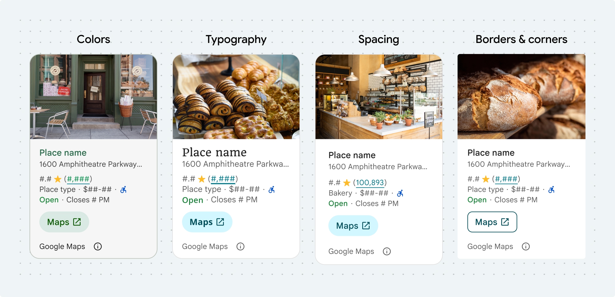
You can customize the colors, typography, spacing, borders, and corners of these Places UI kit components and non-UI kit features:
- Place Details component
- Place Search component
- Basic Place Autocomplete component
- Non-UI Kit Place Autocomplete widget
Places UI kit offers a design system approach to visual customization roughly based on Material Design (with some Google-Maps-specific modifications). See Material Design's reference for Color and Typography. By default, the style adheres to the Google Maps visual design language.
Use the Customization tool to visualize custom configurations in a Places UI Kit element. The Code tab provides configurations in HTML/CSS, Kotlin/XML, and Swift.

The look and feel of the component is customized with the placesMaterialColor, placesMaterialFont, placesMaterialShape, and placesMaterialTheme structs.
Customization tool
Use this tool to visualize custom configurations in a Places UI Kit element. The Code tab provides configurations in HTML/CSS, Kotlin/XML, and Swift.
Style properties
You can customize the following styles:
| Theme attribute | Usage |
|---|---|
| Color | |
theme.color.surface |
Container and dialog background |
theme.color.outlineDecorative |
Container border |
theme.color.primary |
Links, loading indicator, overview icons |
theme.color.onSurface |
Headings, dialog content |
theme.color.onSurfaceVariant |
Place information |
theme.color.secondaryContainer |
Button background |
theme.color.onSecondaryContainer |
Button text and icon |
theme.color.neutralContainer |
Review date badge, loading placeholder shapes |
theme.color.onNeutralContainer |
Review date, loading error |
theme.color.positiveContainer |
Available EV charger badge |
theme.color.onPositiveContainer |
Available EV charger badge content |
theme.color.positive |
Place "Open" now label |
theme.color.negative |
Place "Closed" now label |
theme.color.info |
Accessible entrance icon |
theme.measurement.borderWidthButton |
Open in maps and OK buttons |
| Typography | |
theme.font.bodySmall |
Place information |
theme.font.bodyMedium |
Place information, dialog content |
theme.font.labelMedium |
Badge content |
theme.font.labelLarge |
Button content |
theme.font.headlineMedium |
Dialog headings |
theme.font.displaySmall |
Place name |
theme.font.titleSmall |
Place name |
| Spacing | |
theme.measurement.spacingExtraSmall |
|
theme.measurement.spacingSmall |
|
theme.measurement.spacingMedium |
|
theme.measurement.spacinglarge |
|
theme.measurement.spacingExtraLarge |
|
theme.measurement.spacingTwoExtraLarge |
|
| Measurement | |
borderWidth |
Container |
theme.measurement.borderWidthButton |
|
| Shape | |
theme.shape.cornerRadius |
Container |
theme.shape.cornerRadiusButton |
Open in Maps and OK buttons (excludes round icon button) |
theme.shape.cornerRadiusThumbnail |
Place thumbnail image |
theme.shape.cornerRadiusCollageOuter |
Media collage |
theme.shape.cornerRadiusCard |
Place card, User review card |
theme.shape.cornerRadiusDialog |
Google Maps disclosure dialog |
| Google Maps Brand Attribution | |
attribution.lightModeColor |
Light theme Google Maps attribution and disclosure button (enums for white, gray, and black) |
attribution.darkModeColor |
Dark theme Google Maps attribution and disclosure button (enums for white, gray, and black) |
Attribution colors
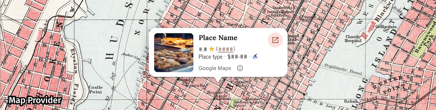
Google Maps' terms of service require you to use one of three brand colors for the Google Maps attribution. This attribution must be visible and accessible when customization changes have been made.
We offer 3 brand colors to choose from that can be independently set for light and dark themes:
- Light theme:
attributionColorLightwith enums for white, gray, and black. - Dark theme:
attributionColorDarkwith enums for white, gray, and black.
Examples
This function creates a theme that overrides the default style attributes. Any theme attributes that are not overridden use the default styles.Swift
  // Same for compact and full
func makeTemplateTheme(colorScheme: ColorScheme) -> PlacesMaterialTheme {
  var theme = PlacesMaterialTheme()
  var color = PlacesMaterialColor()
  color.surface = (colorScheme == .dark ? .blue : .gray)
  color.buttonBorder = (colorScheme == .dark ? .pink : .orange)
  color.outlineDecorative = (colorScheme == .dark ? .white : .black)
  color.onSurface = (colorScheme == .dark ? .yellow : .red)
  color.onSurfaceVariant = (colorScheme == .dark ? .white : .blue)
  color.onSecondaryContainer = (colorScheme == .dark ? .white : .red)
  color.secondaryContainer = (colorScheme == .dark ? .green : .purple)
  color.positive = (colorScheme == .dark ? .yellow : .red)
  color.primary = (colorScheme == .dark ? .yellow : .purple)
  color.info = (colorScheme == .dark ? .yellow : .purple)
  var shape = PlacesMaterialShape()
  shape.cornerRadius = 10
  var font = PlacesMaterialFont()
  font.labelLarge = .system(size: UIFontMetrics.default.scaledValue(for: 18))
  font.headlineMedium = .system(size: UIFontMetrics.default.scaledValue(for: 15))
  font.bodyLarge = .system(size: UIFontMetrics.default.scaledValue(for: 15))
  font.bodyMedium = .system(size: UIFontMetrics.default.scaledValue(for: 12))
  font.bodySmall = .system(size: UIFontMetrics.default.scaledValue(for: 11))
  var attribution = PlacesMaterialAttribution()
  attribution.lightModeColor = .black
  attribution.darkModeColor = .white
  theme.measurement.borderWidthButton = 1
  theme.color = color
  theme.shape = shape
  theme.font = font
  theme.attribution = attribution
  return theme
}
Full examples for each component or feature
- Place Details component styling example.
- Place Search component styling example.
- Basic Place Autocomplete component styling example.
- Place Autocomplete widget styling example.