使用 Search Console 泡泡圖改善 SEO
分析搜尋成效資料一直是個挑戰,尤其當您有大量長尾查詢時,會更難以理解以及視覺化。泡泡圖可協助您瞭解,對您的網站來說有哪些查詢成效較佳,哪些有待改善。
如果您想測試本文討論的技巧,可以將資料連結至 Looker Studio,然後嘗試調整圖表設定。
如果您尚未讀過將 Search Console 連結至 Looker Studio,以及使用 Looker Studio 監控搜尋流量,建議參閱這兩篇文章,進一步瞭解在 Looker Studio 中可以利用 Search Console 執行哪些作業。
瞭解圖表內容
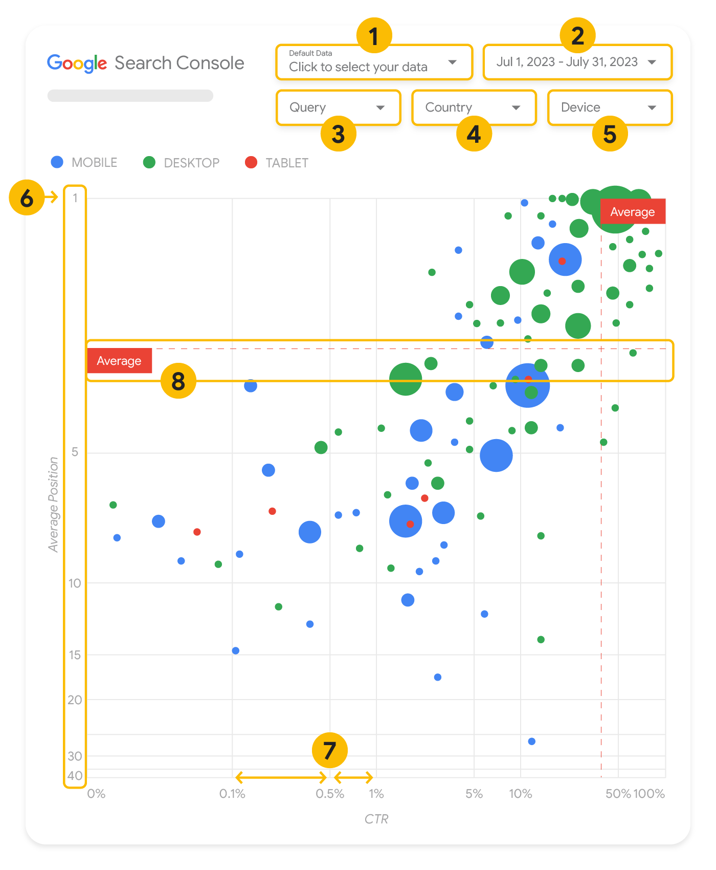
如果您擁有多項指標和維度,泡泡圖就是絕佳的視覺化圖表,可讓您更有效率地看出資料中的關係和模式。在這裡顯示的範例中,您可以在同一個檢視畫面中查看查詢和裝置維度的點閱率 (CTR)、平均排序和點擊次數。
本節將詳細說明部分圖表元素,釐清圖表含有哪些內容,不含哪些內容。
資料來源
本頁顯示的泡泡圖使用 Search Console 資料來源提供的「網站曝光」表格,其中包含依網站和查詢匯總的搜尋成效資料。
篩選條件和資料控制項
圖表提供五個自訂選項,協助您有效控管資料:
- 資料控制:選擇想要分析的 Search Console 資源。
- 日期範圍:選擇想要在報表中查看的日期範圍,系統預設顯示過去 28 天。
- 查詢:納入或排除要聚焦的查詢。您可以按照在 Search Console 中篩選資料的方式,輕鬆篩選資料。
- 國家/地區:納入或排除國家/地區。
- 裝置:納入或排除裝置類別。
軸
圖表中的軸代表平均排序 (Y 軸) 和網站點閱率 (X 軸)。軸有三個重大轉換:
- 倒轉 Y 軸方向:Y 軸顯示的是平均排序,倒轉代表 1 位於頂端。就大部分圖表來說,最佳位置在右上角,因此用圖表顯示平均排序時,倒轉 Y 軸較符合直覺。
- 對數刻度:兩個軸都採用對數刻度,可讓您深入瞭解圖表中極端值的查詢情形 (極低的點閱率、平均排序或兩者兼具)。
- 參考資料線:參考資料線的作用是醒目顯示高於或低於特定門檻的值。查看平均值、中位數或特定百分位數,可能會讓人注意到偏離模式的情況。
泡泡
圖表中每個泡泡都代表一項查詢,樣式屬性說明如下:
- 大小:以泡泡大小表示點擊次數,可協助您快速瞭解哪些查詢帶來大量流量 — 泡泡越大,表示該查詢產生的流量越多。
- 顏色:以泡泡顏色表示裝置類別,可協助您瞭解行動裝置和電腦兩者間的搜尋成效差異。您可以採用任何維度當做顏色,不過,值的數量越多,會越難識別出模式。
分析資料
這種視覺化呈現方式的目標是要突顯查詢最佳化商機。圖表會顯示查詢成效,其中 Y 軸代表平均排序,X 軸代表點閱率,泡泡大小代表總點擊次數,而泡泡顏色代表裝置類別。
紅色平均參考虛線代表各個軸的平均值,這兩條線將圖表分割成不同象限,代表四種類型的查詢成效。您的象限可能會與本文中分享的圖表看起來不太一樣,因為畫面是由您的網站查詢分布情形決定的。
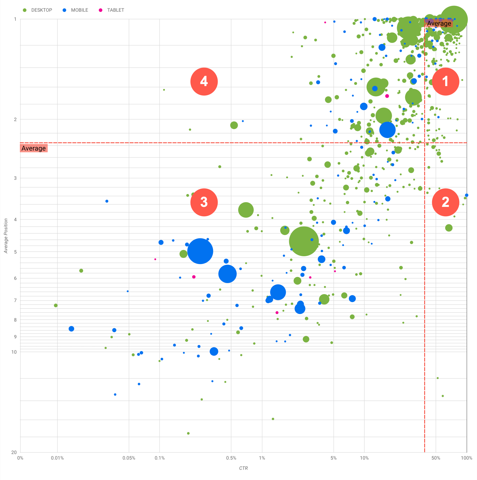
圖表顯示四個查詢群組,您可以分析這些內容,決定要在改善 Google 搜尋成效時投注心力在哪些方面。
- 高排名,高點閱率:這部分沒什麼需要進行處理,效果已經很好。
- 低排名,高點閱率:這些查詢似乎很貼近使用者需求,雖然排名低於網站上的平均查詢排名,點閱率卻很高。如果查詢的平均排序升高,就有可能大幅影響您的成效。針對這類查詢,建議您著重於改善 SEO。舉例來說,園藝網站第 2 象限的熱門查詢可能是「如何製作木屋」。請檢查您是否已經有關於這個主題的網頁,然後透過以下兩種方式繼續操作:
- 如果沒有相關網頁,建議建立一個網頁,集中收錄您網站上有關該主題的所有資訊。
- 如果已有相關網頁,建議增加內容,進一步滿足使用者的需求。
- 低排名,低點閱率:查看低點閱率 (包含低排名與高排名) 的查詢時,最有趣的部分是查看泡泡大小,瞭解哪些查詢雖然點閱率低,但仍帶來大量流量。雖然在此象限的查詢似乎不值得您投資改善,但這些查詢主要可分為兩組:
- 「相關查詢」:如果此處的查詢對您來說很重要,這是個好的開始,因為這表示這些查詢已經顯示在 Google 搜尋中了。將這些查詢排在完全不會顯示在搜尋結果中的查詢之前,因為這類查詢比較容易最佳化。
- 「不相關查詢」:如果您的網站內容與這些查詢無關,也許這正是個好機會,可以微調您的內容,鎖定能帶來相關流量的查詢。
- 高排名,低點閱率:這些查詢的點閱率偏低可能有各種不同理由。查看最大的泡泡,找出下列跡象:
- 您的競爭對手可能使用了結構化資料標記,而且搭配複合式搜尋結果顯示,這有可能吸引使用者點擊他們的結果,而非點擊您的結果。建議您針對 Google 搜尋中最常見的視覺元素進行最佳化。
- 您已最佳化的查詢,或「意外」獲得排名的查詢,可能是與您的網站相關但使用者不感興趣的查詢。這對您來說可能不是問題,在這種情況下,您可以忽略這些查詢。如果不想讓使用者透過這些查詢找到您 (例如含有令人反感的字詞),可以試著調整內容,針對這些流量的相關字詞,移除某些可能被視為同義詞或相關查詢的說法。
- 使用者可能已經找到所需資訊,例如公司的營業時間、地址或電話號碼。請檢查所使用的查詢和包含相關資訊的網址。如果您網站的目標之一是吸引使用者前往商店,這種情況就沒什麼問題;如果您認為使用者有必要造訪網站瞭解更多資訊,可以試試改善標題和說明,清楚傳達這項訊息。詳情請參閱下一節。
我們之所以未提及裝置類別,是因為裝置類別可當成查詢成效的額外線索。舉例來說,假設使用者在街上使用導航尋找某個地點,這時有某些查詢會比較貼近使用者需求;在此情況下,該查詢可能在行動裝置上展現高成效,而在電腦上展現低成效。
改善特定查詢的 SEO
找到值得投入時間和心力的查詢後,請務必建立相關網頁,或對相關網頁進行最佳化。
透過本頁面顯示的視覺化圖表找到查詢後,您可以透過 Search Console 使用者介面建立特定查詢的查詢篩選器,或是使用 Looker Studio 建立資料透視表。透過這兩種方法,都可以查看由特定查詢帶來流量的所有網頁。確認要最佳化的查詢及其相關網址後,請參考搜尋引擎最佳化 (SEO) 入門指南,瞭解如何最佳化內容。以下提供幾個訣竅:
- 確認標題元素、說明中繼標記和 alt 屬性皆具體、準確且具有描述性。
- 使用標題元素強調重要文字,並為內容建立階層式結構,方便使用者和搜尋引擎瀏覽您的文件。
- 思考使用者為了尋找您的某些內容而可能搜尋的其他字詞,例如同義詞和相關查詢。您可以運用 Google Ads 提供的關鍵字規劃工具,藉此找出新的關鍵字變化版本,並查看每個關鍵字的大致搜尋量。您也可以利用 Google 搜尋趨勢,從與您網站相關的新熱門話題與查詢中尋找靈感。