
Page Summary
-
Google Chat apps can enhance user interaction through features like slash commands, interactive cards, and dialogs.
-
Onboarding messages are crucial for introducing your Chat app's functionality and guiding users on how to get started.
-
Cards provide a visually engaging way to gather information, display details, and guide users within Chat.
-
Dialogs facilitate multi-step processes by enabling sequential card interactions within a dedicated window.
-
Chat apps can preview links shared by users, enhancing the context and information associated with them.
This page describes how Google Chat apps can design and respond to interactions with users.
Chat apps support interactivity in some of the following ways:
- Introduce users to your Chat app
- Respond to commands
- Display or send interactive card-based interfaces
- Open interactive dialogs
- Preview links
- @mention users in a message
Introduce users to your Chat app
Onboard people and spaces to your Chat app with a welcome message that details what your Chat app does, and how people can best work with it.
An effective onboarding message has the following structure:
- Say hello. Set the right voice and tone with your users.
- Describe briefly what your Chat app does. Introduce your Chat app by telling people what it can help them do in one or two sentences.
- Tell people how to get started. Tell people how to work with your Chat app. If your Chat app requires configuration or authorization, this is a good place to prompt people to complete the set-up process. For example, suggest one or two common commands.
- Explain how to get help and how to give feedback. End the message by telling people how they can get help or offer feedback.
The following Chat app's onboarding message prepares users for success:

Respond to commands
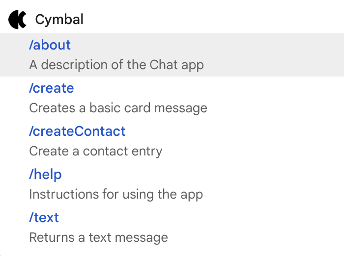
Commands
let users request or interact with your Chat app in
specific or repeatable ways. Users can use commands in messages (such as typing
/help), or select them from a menu in the reply area.
The following is a list of commands available for the Cymbal Chat app:
@mention users in messages
Your Chat app can @mention specific users or all users in a space to notify them of the message. Before you mention a single user, and especially before you mention all users in a space, you should consider whether or not it's really necessary, and err on the side of not @mentioning people.
Mentioning single users causes them to receive a notification and interrupts whatever else they're doing. Mentioning all users in a space sends a notification to everyone in the space. Mention people too often, and they might become annoyed with your Chat app and start to view it as spam.
It is OK to mention users for very important or time-sensitive reasons. For example, the following Chat app @mentions a space full of software developers to notify them that code freeze is approaching and to give them the chance to say they need a bit more time before the deadline:

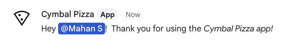
On the other hand, the following Chat app mentions a customer directly to thank them; which is polite, but not notification-worthy:
Send or display interactive cards
Cards are UI elements that can contain both interactive and static widgets such as text, images, and buttons that Chat apps can send to users and spaces. If your Chat app needs to gather information from users, present detailed information, or guide users to take a next step, send a card message.
As a Chat app, you can send card interfaces in messages or display cards as a homepage in direct message spaces.
Use the Card Builder to design and preview messaging and user interfaces for Chat apps:
Open the Card BuilderThe following is a card message from a Chat app:
Open interactive dialogs
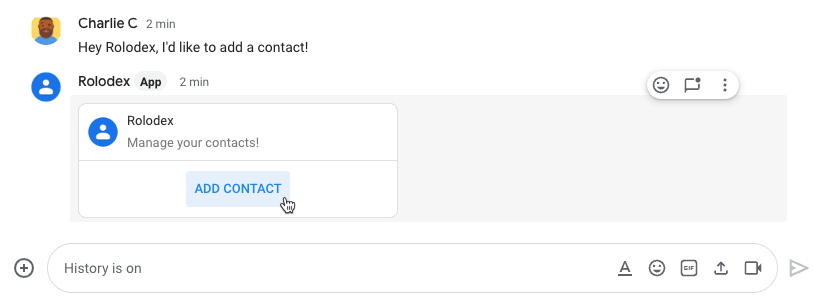
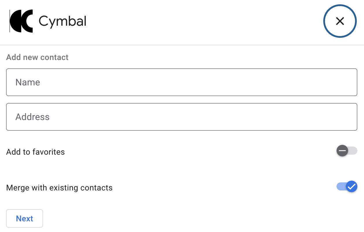
Dialogs are windowed, card-based interfaces that a user can open to interact with your Chat app. In dialogs, you can string together multiple card messages sequentially, which helps users complete multi-step processes, like filling in form data.
In the following example, a Chat app starts a dialog to
gather contact details from a user who issues the /createContact slash
command:
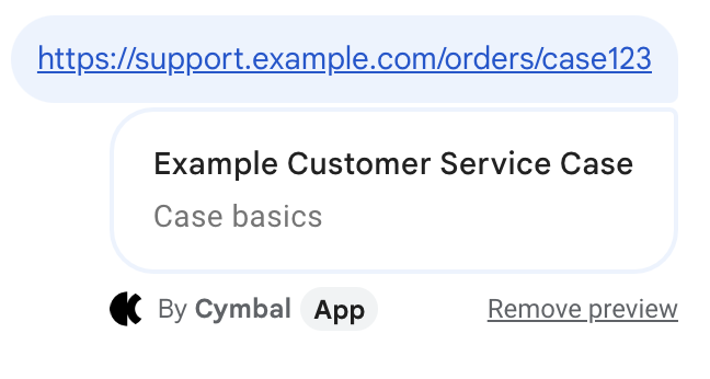
Preview links sent by Chat users
Chat apps can preview links for users in a space. Whenever someone shares a matching link, a Chat app can attach a card to their message that displays information about the link.
The following Chat app helps customer service agents preview links to cases shared in a Chat space:
Next steps
To build interactive features, you must configure your Chat app to receive interaction events. For steps, Receive and respond to interactions with your Chat app