Page Summary
-
Interactive Canvas design involves two main aspects: designing the conversation and designing the user interface (UI).
-
Actions benefiting from full-screen, visually rich experiences with intuitive conversational flows are good candidates for Interactive Canvas.
-
There are constraints to consider, such as no local storage of data and no pop-ups or modals.
-
When designing the conversation, prioritize a voice-forward experience and try to offer the same capabilities through touch and voice.
-
When designing the UI, focus on responsive designs, keeping information concise, and visually complementing the voice output.
There are two main aspects of designing for Interactive Canvas:
- Designing the conversation
- Designing the user interface (UI)
Your users can interact with your Action that uses Interactive Canvas by speaking to Google Assistant or touching the UI. You should make sure that your spoken conversation and UI complement each other and make it easy and exciting for users to progress through your Action. The following sections discuss how to design both the conversation and UI for the best user experience.
Is Interactive Canvas right for my Action?
Before you begin designing, think about whether your Action will work well with Interactive Canvas. You should consider using Interactive Canvas if your Action meets the following criteria:
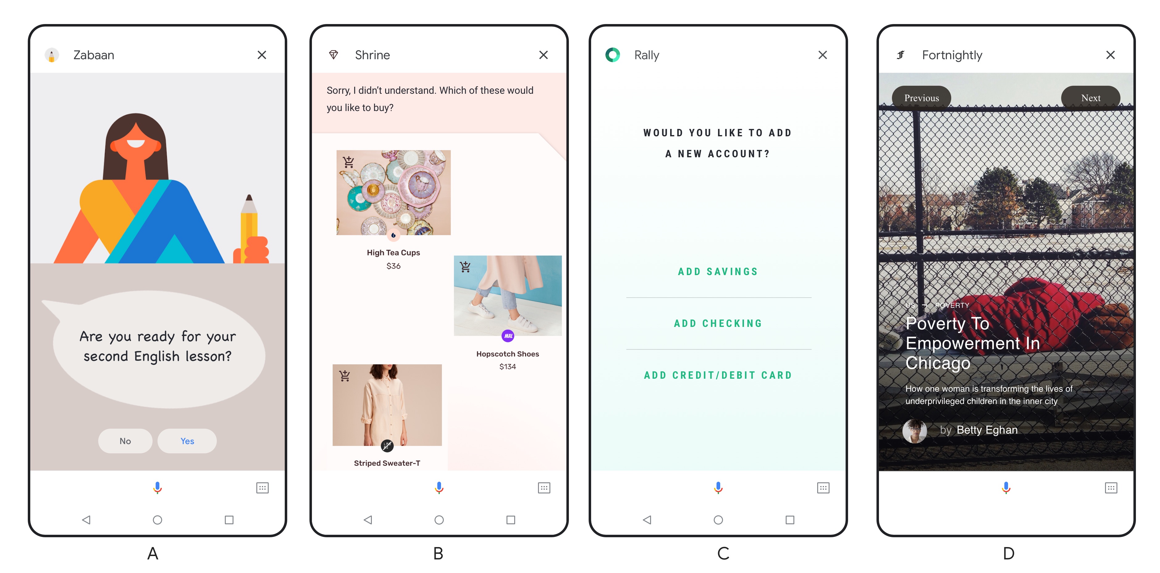
- Your Action benefits from full-screen, visually rich experiences. Interactive Canvas is ideal for full-screen experiences that benefit from rich visuals, like immersive voice-driven games.
- Your Action has an intuitive conversational flow. The critical path through your Action should be navigable through voice alone. An Action that requires spatial precision, like a drawing app, could provide a difficult experience around which to design an intuitive conversational flow.
- Existing components and customization are not enough. For example, you want to go beyond existing Assistant visual components and customization. Interactive Canvas is great for showcasing your unique visual brand attributes, dynamic elements, and animations. Additionally, Interactive Canvas may be used to provide updates to a single visual interface as the user progresses through conversation.
Requirements
Although Interactive Canvas uses familiar web development environments, there are some requirements to take into account before designing your Action.
Header or toast message
By default, every Interactive Canvas web app includes a header at the top of the screen with the name of your brand. The reserved area for the header has a height of 56 dp for mobile, 96 dp for Home Hub, and 120 dp for smart display. Make sure to follow this header requirement:
- Ensure that no important information or interactive elements are hidden
behind the header. The
getHeaderHeightPx()method determines the height of the header.
You can optionally replace the header with a toast message that appears on the loading screen and includes the Action's display name, the developer's name, and instructions for exiting the Action. To replace the header with the toast message and enable full-screen mode for your user, see Enable full-screen mode.
Constraints
Consider these constraints before designing your Action with Interactive Canvas:
- No local storage of data. We prevent the Action from storing cookies and from accessing the Web Storage API. Given these restrictions, we recommend that your Action manages state in the webhook and uses user storage to save user data.
- No pop-ups or modals. We prevent the Action from showing any pop-up windows or modals. We also strongly discourage using other standard navigational UI elements that you usually see in web apps, like keyboards and pagination.
Design your conversation
You first need to design your Action's conversation. Interactive Canvas experiences are still voice-forward, so it's important that your conversation effectively guides the user through your Action. You can think of an Action that uses Interactive Canvas as a conversation with helpful visuals. For more information on designing conversations, see Google's conversation design guidelines.
Guidelines
For the best user experience, you should:
Follow the conversation design process and best practices. The Google conversation design guidelines outline the best practices we recommend. This means that, among other things, you need to:
- Make sure that your Action experience works well for conversation
- Create a brand persona
- Handle errors within your conversation
- Try out a voice-only experience before figuring out what it would look with a screen
Try to provide the same capabilities through touch and voice. If possible, make sure that everything you can do by touching the screen you can also do with your voice.
Make sure the critical path through your Action is feasible using voice. Your users should be able to navigate through the main paths of your Action using only voice.
Ensure the user can use your Action without audio. On mobile devices, the user may not have the audio on. For this reason, consider adding transcripts to your Action to guide the user.
Take cognitive load into consideration. Avoid overly lengthy voice responses to reduce the cognitive toll on the user.
Design your UI
Once you've designed your conversation, you can design your UI to complement it. While designing, consider how the natural back and forth of dialogue can drive the visual interface you present to the user. If you're designing for smart displays, see specific considerations in Design for smart displays.
Guidelines
For the best user experience, you should:
- Create responsive designs. Make sure your designs work for either landscape and portrait mode and hold up from small phones to larger screens. Your users should be able to easily read the UI for each type of surface.
- Take cognitive load into consideration. To avoid overwhelming your users, keep the information and content you present on the screen organized, clean, and concise.
- Adapt voice output for the screen. Be creative with how you use visuals to complement the audio— don't just write what is being said out loud. When a screen is available, we may be more concise with our voice output than when one is not.
- Avoid placing any critical information or components towards the bottom of the screen. On mobile, the user transcript appears above the mic plate and can grow to a few lines. Although this transcript is transient, avoid writing important content towards the bottom of the screen. Buttons similar to suggestion chips are fine at the bottom of the screen, as user input is an alternative to using suggestion chips.
- Handle errors within your conversation visually. Errors could occur when the user doesn't respond, if you don't understand them, or don't provide fulfillment for what they said. Figure out where these error prompts go on your UI. This could be wherever you put your display prompts (such as in the title) or it could be something different (such as a special area of content that appears as needed). Refer to Errors in the conversation design guidelines for more tips on error handling.
Design for smart displays
While the above guidelines still apply, you should keep other design considerations in mind when designing for smart displays. It's tempting to treat smart displays like tablets when designing for them. However, smart displays are a completely different and new category of device for two reasons:
- Smart displays are voice-enabled and Google Assistant is the operating system
- Smart displays are stationary and, unlike mobile devices, are often placed in the kitchen or bedroom when used at home
Because of these characteristics, users are sometimes not physically near the device and interact with smart displays using only their voice. Users might also be multitasking while using smart displays. It's important to keep these usages in mind when designing for smart displays.
Guidelines
For the best user experience with smart displays, you should:
- Design with voice-first in mind. Designing your Interactive Canvas Action to be voice-forward is even more important for smart displays. Unlike with a mobile device, your user may be standing across the room and only communicating with their smart display through voice. For this reason, you can't always rely on the user touching the device to proceed through your Action, and need to ensure your users can proceed in your Action using voice.
- Design with a specific viewing distance in mind. Design content on the
smart display so it can be viewed from a distance. Depending on the size of
the room, the typical viewing distance for smart displays ranges from 3 to
10 feet.
- Use a minimum font size of 32 pt for primary text, like titles. Use a minimum 24 pt for secondary text, like descriptions or paragraphs of text.
- Focus on one touchpoint at a time. Display one type of primary information or task at a time to reduce cognitive workload and keep the content legible from a distance. For example, when users ask "What's my day like?", Google Assistant responds with weather, calendar, commute, and news content. Each type of content takes up the full screen and is presented sequentially rather than all showing up at once on the screen.
Resources
For more information about designing an Action that uses Interactive Canvas, see the following resources:
- Conversation design guidelines
- Multimodal design guidelines
- Download our Sketch template to help you design your UI.