Оптимизируйте свои подборки
Сохраняйте и классифицируйте контент в соответствии со своими настройками.
Поисковая оптимизация сайта при помощи пузырьковой диаграммы в Search Console
Анализировать данные об эффективности Поиска всегда непросто. Делать это ещё сложнее, если на ваш сайт часто попадают по низкочастотным запросам, визуализировать и интерпретировать которые гораздо труднее. На пузырьковой диаграмме показано, какие поисковые запросы приводят много посетителей на ваш сайт, а какие работают не так, как вам бы хотелось.
Пузырьковая диаграмма – отличное средство визуализации, если вы используете много показателей и параметров. Такая диаграмма лучше выявляет связи и закономерности в данных. На диаграмме в примере одновременно отображаются такие показатели, как CTR, средняя позиция, количество кликов по запросу и параметры устройства.
В этом разделе мы подробно расскажем о некоторых элементах диаграммы и объясним, что она показывает, а что – нет.
Устройство. Включите или исключите отдельные категории устройств.
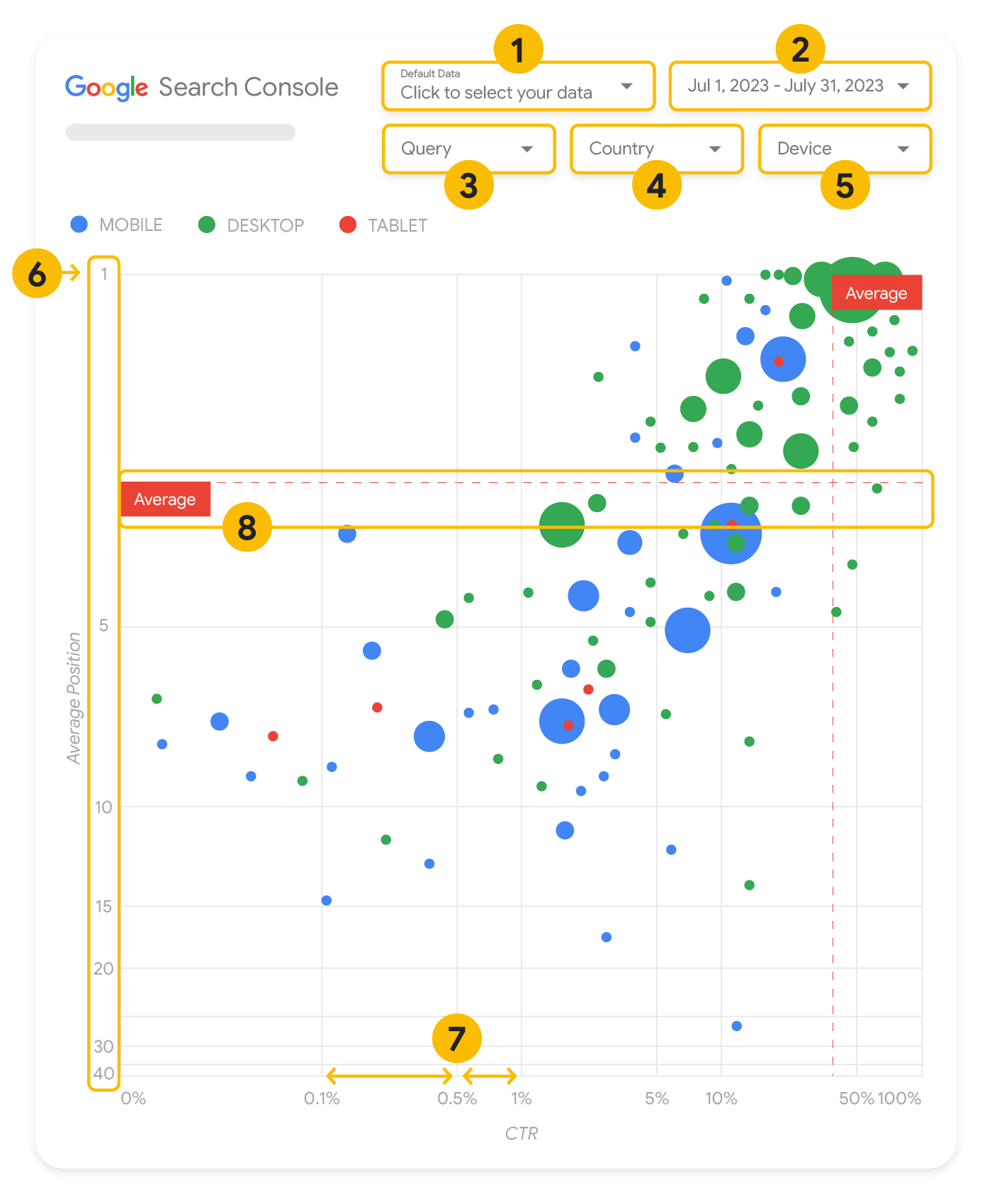
Оси
На диаграмме оси Y соответствует средняя позиция, а оси X – показатель CTR сайта. Мы внесли три существенных изменения в отношении осей:
Инвертированная ось Y. Так как ось Y показывает значение средней позиции, при ее инвертированном расположении значение 1 окажется в верхней части диаграммы.
Обычно если элемент диаграммы находится в правом верхнем углу, то его показатели считаются наилучшими, поэтому с инвертированной осью Y значение средней позиции воспринимается нагляднее.
Логарифмическая шкала. Благодаря тому, что на диаграмме обе оси представлены в виде логарифмической шкалы, вы сразу можете понять, какие запросы находятся на краю диаграммы, то есть имеют очень низкий CTR и/или среднюю позицию.
Базисные линии. Базисная линия помогает выделить значения выше или ниже порогового.
Если на диаграмме есть линии, отмечающие среднее, медианное значение или процентиль, то вы легко сможете заметить, когда запросы выбиваются из обычной картины распределения.
Круги
Каждый круг на диаграмме представляет собой отдельный запрос и обладает следующими свойствами:
Размер. Количество кликов влияет на размер круга, поэтому вы с первого взгляда сможете понять, на какие запросы приходится больше всего трафика: чем больше круг, тем больше трафика генерирует этот запрос.
Цвет. Для разных категорий устройств используется разный цвет кругов, поэтому заметить разницу в эффективности Поиска на мобильных устройствах и компьютерах очень просто. Вы можете назначать цвета любым параметрам, но чем больше значений на вашей диаграмме, тем сложнее выявлять закономерности.
Как анализировать данные
Эта пузырьковая диаграмма помогает анализировать эффективность поисковых запросов. Ось Y показывает среднюю позицию, ось X – CTR, размер круга отражает общее количество кликов, а цвет означает категорию устройств.
Красные пунктирные базисные линии показывают средние значения для каждой оси и разделяют диаграмму на квадранты, которые соответствуют четырем типам эффективности запросов. Квадранты вашей диаграммы будут отличаться от представленных в этой статье. Их вид зависит от того, как распределяются запросы вашего сайта.
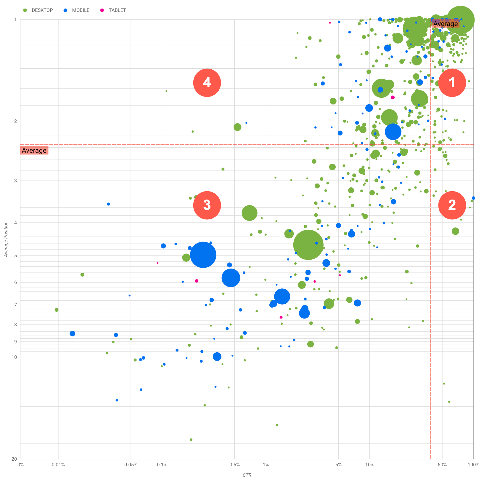
На диаграмме отображаются четыре группы запросов, проанализировав которые, вы сможете решить, в каком направлении прилагать усилия в области поисковой оптимизации сайта.
Верхняя позиция, высокий CTR. Запрос отлично работает, нет необходимости что-либо менять.
Низкая позиция, высокий CTR. Пользователи считают важными запросы из этой категории, так как CTR высокий, хотя рейтинг этих запросов ниже среднего для вашего сайта. Повышение рейтинга запроса может заметно повлиять на вашу эффективность, поэтому постарайтесь оптимизировать сайт под эти запросы. Например, для сайта о садоводстве самым популярным запросом в квадранте 2 может быть запрос "как построить деревянный сарай".
Проверьте, есть ли на вашем сайте страница, посвященная этой теме, и выберите одну из следующих стратегий:
Если такой страницы ещё нет, вы можете создать ее и собрать на ней всю информацию по этой теме, которая содержится на сайте.
Если такая страница уже существует, дополните ее, чтобы она в большей степени соответствовала потребностям пользователей.
Низкая позиция, низкий CTR. При анализе запросов с низким CTR (как с низким, так и с высоким рейтингом) обратите внимание на размер кругов. Большие круги означают, что при низком CTR эти запросы дают много трафика. Даже если вам кажется, что усилия по оптимизации запросов из этой категории не оправдаются, эти запросы можно разделить на две группы:
Связанные запросы. Если этот запрос важен для вас, сначала добейтесь того, чтобы ваш сайт появлялся в результатах поиска по нему. Такие запросы легче оптимизировать, поэтому займитесь ими раньше, чем запросами, которые не приводят к показу вашего сайта в результатах поиска.
Несвязанные запросы. Если на вашем сайте нет контента по этому запросу, то вам следует либо доработать контент, либо сосредоточиться на запросах, которые могут обеспечить трафик на основе уже имеющегося контента.
Верхняя позиция, низкий CTR. Показатель CTR может быть низким по ряду причин. Изучите самые большие круги, чтобы проверить следующие гипотезы:
Возможно, ваш сайт случайно или в результате оптимизации стал показываться по запросам, которые не интересуют пользователей в связи с вашим сайтом. Если для вас это не проблема, вы можете просто игнорировать такие запросы. Если вы не хотите, чтобы посетители попадали на ваш сайт по этим запросам (например, если они содержат неприемлемые высказывания), исключите все выражения, которые могут рассматриваться как их синонимы или похожие запросы.
Пользователи могли уже найти интересующую их информацию, например часы работы вашей организации или контактный телефон. Проверьте, какие при этом использовались запросы и на каких страницах содержится эта информация. Если одна из целей вашего сайта – привлечь покупателей в магазины, значит все в порядке. Если же вы хотите, чтобы пользователи посещали ваш сайт для получения дополнительной информации, вы можете оптимизировать заголовки и описания, чтобы они были более информативными. Более подробную информацию вы найдете в следующем разделе.
Мы не рассматривали категории устройств, поскольку их можно использовать в качестве дополнительных признаков эффективности запросов. Например, некоторые запросы являются более подходящими, когда люди в пути пытаются найти какое-то место. В этом случае запрос может иметь высокую эффективность на мобильных устройствах, но низкую на компьютерах.
Поисковая оптимизация сайта под определенные запросы
Когда вы определите, работа над какими запросами оправдает затраченные усилия и время, оптимизируйте или создайте страницы под эти запросы.
После того как вы выберете запросы при помощи визуальных элементов, представленных на этой странице, вы можете создать фильтр для конкретных запросов в пользовательском интерфейсе Search Console или сводную таблицу в Looker Studio. Так или иначе вы можете проверить все страницы, которые обеспечивают трафик по определенному запросу. Выбрав запросы, оптимизируйте связанные с ними URL согласно рекомендациям из Введения в поисковую оптимизацию. Вот несколько советов:
Убедитесь, что элементы title, метатеги description и атрибуты alt содержат полную, точную и верную информацию.
Используйте элементы заголовков, чтобы выделить важный текст и создать иерархическую структуру контента, которая сделает навигацию по документу проще как для пользователей, так и для поисковых систем.
Подумайте, по каким ещё ключевым словам потенциальные посетители могли бы находить ваш контент. Это могут быть синонимы или похожие запросы. Инструмент Планировщик ключевых слов, который предлагает Google Реклама, поможет вам подобрать новые комбинации ключевых слов и оценить приблизительное количество запросов по каждому из них. Сервис Google Trends подскажет, какие темы и запросы, связанные с вашим сайтом, набирают популярность.
[[["Прост для понимания","easyToUnderstand","thumb-up"],["Помог мне решить мою проблему","solvedMyProblem","thumb-up"],["Другое","otherUp","thumb-up"]],[["Отсутствует нужная мне информация","missingTheInformationINeed","thumb-down"],["Слишком сложен/слишком много шагов","tooComplicatedTooManySteps","thumb-down"],["Устарел","outOfDate","thumb-down"],["Проблема с переводом текста","translationIssue","thumb-down"],["Проблемы образцов/кода","samplesCodeIssue","thumb-down"],["Другое","otherDown","thumb-down"]],["Последнее обновление: 2025-08-04 UTC."],[[["\u003cp\u003eVisualize Search Console data with a bubble chart to reveal query optimization opportunities by analyzing click-through rate, average position, and clicks.\u003c/p\u003e\n"],["\u003cp\u003eIdentify high-potential queries by focusing on those with low positions but high click-through rates, indicating relevance and potential for increased traffic with improved ranking.\u003c/p\u003e\n"],["\u003cp\u003eInvestigate queries with low click-through rates and high positions to determine if they are unrelated to your site or require optimization for better user engagement.\u003c/p\u003e\n"],["\u003cp\u003eOptimize content for identified queries by refining titles, meta descriptions, headings, and incorporating relevant keywords to enhance search visibility and user experience.\u003c/p\u003e\n"]]],["A bubble chart visualizes query performance using Search Console data. It displays click-through rate (CTR) on the x-axis, average position on the y-axis, click volume as bubble size, and device category as bubble color. Customization options include data control, date range, query, country, and device filters. Analyzing the quadrants formed by average CTR and position helps identify optimization opportunities. Focus on queries with low position but high CTR, and address top-position, low-CTR queries by improving content or structured data.\n"],null,["# How to Create a Search Console Bubble Chart | Google Search Central\n\nImproving SEO with a Search Console bubble chart\n================================================\n\n\nAnalyzing Search performance data is always a challenge, but even more so when you have plenty of\nlong-tail queries, which are harder to visualize and understand. A\n[bubble chart](https://support.google.com/datastudio/answer/7207785)\ncan help you understand which queries are performing well for your site, and which could be improved.\n\n\nIf you'd like to test the techniques discussed here, you can\n[connect your data to Looker Studio](https://datastudio.google.com/reporting/1e5b5f6a-38d7-4547-a54b-69594681a09b/page/xFbeC/preview) and play with the chart settings. \n\n\nIf you haven't read [connecting Search Console to Looker Studio](/search/blog/2022/03/connecting-data-studio) and\n[monitoring Search traffic with Looker Studio](/search/blog/2022/03/monitoring-dashboard),\nconsider checking them out to understand more about what you can do with Search Console in Looker\nStudio.\n\nUnderstanding the chart\n-----------------------\n\n\nA bubble chart is a great visualization when you have multiple metrics and dimensions because it\nlets you to see relationships and patterns in your\ndata more effectively. In the example shown here, you can see\n[click-through rate](https://support.google.com/webmasters/answer/7576553#choosingmetrics)\n(CTR), average position, and clicks for the query and device dimensions in one view.\n\n\nThis section goes into detail on some of the chart elements to clarify what the chart shows, and what it doesn't.\n\n### Data source\n\n\nThe bubble chart shown in this page uses the Site Impression table available through the\n[Search Console data source](https://support.google.com/datastudio/answer/7314895),\nwhich includes [Search performance data](https://support.google.com/webmasters/answer/7576553)\naggregated by site and queries.\n\n### Filters and data controls\n\n\nThere are five customization options in the chart to help you control your data effectively:\n\n1. **[Data control](https://support.google.com/datastudio/answer/7415591)**: Choose the Search Console property you'd like to analyze.\n2. **Date range**: Choose the date range you'd like to see in the report; by default you'll see the last 28 days.\n3. **Query** : Include or exclude queries to focus on. You can [filter your data](/search/blog/2021/06/regex-negative-match) similar to how you do it in Search Console.\n4. **Country**: Include or exclude countries.\n5. **Device**: Include or exclude device categories.\n\n### Axes\n\n\nThe axes in the chart are average position (y-axis) and site CTR (x-axis). There are three\nsignificant transformations in the axes:\n\n6. **Reverse y-axis direction**: Since the y-axis shows average position, inverting it means that 1 is at the top. For most charts, the best position is in the top right corner, so it is more intuitive to invert the y-axis when using it to display average position.\n7. **Log scale** : Using a [logarithmic scale](https://en.wikipedia.org/wiki/Logarithmic_scale) for both axes lets you to have a better understanding of queries that are in the extremities of the chart (very low CTR, average position, or both).\n8. **[Reference lines](https://support.google.com/datastudio/answer/9921462)**: The reference line is very helpful to highlight values that are above or below a certain threshold. Looking at the average, median, or a certain percentile can call attention to deviations from the pattern.\n\n### Bubbles\n\n\nEach bubble in the chart represents a single query, with the following\n[style properties](https://support.google.com/datastudio/answer/7207785#style-properties):\n\n- **Size**: Using the number of clicks as the bubble size helps you see in a glance which queries are driving the bulk of the traffic---the larger the bubble the more traffic the query generates.\n- **Color**: Using the device category as the bubble color helps you understand the differences between mobile and desktop Search performance. You can use any dimension as the color, but as the number of values increases, the harder it is to recognize patterns.\n\nAnalyzing the data\n------------------\n\n\nThe goal of this visualization is to help surface query optimization opportunities. The chart\nshows query performance, where the y-axis represents average position, the x-axis represents CTR\nthe bubble size represents total number of clicks, and the bubble color represents\ndevice category.\n\n\nThe red Average dashed reference lines show the average for each of the axes, which split the chart\ninto quadrants, showing four types of query performance. Your quadrants are likely to look\ndifferent than the one shared in this post; they'll depend on how your site queries\nare distributed.\n\n\nThe chart shows four groups of queries, which you can analyze to help you decide where to invest\nyour time when optimizing your Google Search performance.\n\n1. **Top position, high CTR**: There's not much you need to do for those; you're doing a great job already.\n2. **Low position, high CTR** : Those queries seem relevant to users; the queries get a high CTR even when ranking lower than the average query on your website. If the query average position moves up, it could have a significant impact on your performance---focus on improving SEO for these queries. For example, a top query in quadrant 2 for a gardening website could be \"how to build a wooden shed.\" Check if you have a page about this already, and proceed in two ways:\n - If you don't have a page, consider creating one to centralize all the info you have in the website about the subject.\n - If you do have a page, consider adding content to better address that user need.\n3. **Low position, low CTR** : When looking at queries with low CTR (both with low and top position), it's especially interesting to look at the bubble sizes to understand which queries have a low CTR but are still driving significant traffic. While the queries in this quadrant might seem unworthy of your effort, they can be divided into two main groups:\n - **Related queries**: If the query in question is important to you, it's a good start to have it appearing in Search already. Prioritize these queries over queries that are not appearing in Search results at all, as they'll be easier to optimize.\n - **Unrelated queries**: If your site doesn't cover content related to this query, maybe it's a good opportunity to fine tune your content or focus on queries that will bring relevant traffic.\n4. **Top position, low CTR** : Those queries might have a low CTR for various reasons. Check the largest bubbles to find signs of the following:\n - Your competitors may have [structured data markup](/search/docs/appearance/search-result-features) and are showing up with rich results, which might attract users to click their results instead of yours. Consider optimizing for the most common [visual elements in Google Search](/search/docs/appearance/visual-elements-gallery).\n - You may have optimized, or be \"accidentally\" ranking, for a query that users are not interested in relation to your site. This might not be an issue for you, in which case you can ignore those queries. If you prefer people not to find you through those queries (for example, they contain offensive words), try to fine-tune your content to remove mentions that could be seen as synonyms or related queries to the one bringing traffic.\n - People may have already found the information they needed, for example your company's opening hours, address, or phone number. Check the queries that were used and the URLs that contained the information. If one of your website goals is to drive people to your stores, this is working as intended; if you believe that people should visit your website for extra information, you could try to optimize your titles and description to make that clear. See next section for more details.\n\n\nWe haven't mentioned the device categories because they can be used as additional signs of query\nperformance. For example, suppose some queries are more relevant when people are navigating in the\nstreet, trying to find a location; in that case, the query might have a high performance\non mobile devices, but a low performance on desktop.\n\nImproving SEO for specific queries\n----------------------------------\n\n\nOnce you find queries that are worth the time and effort, make sure to optimize or create pages\nrelated to those queries.\n\n\nAfter you find the queries using the visualization shown in this page, you can\n[create a query filter](https://support.google.com/webmasters/answer/7576553#filteringdata)\nfor specific queries using the Search Console user interface, or create a\n[pivot table](https://support.google.com/looker-studio/answer/7516660)\nusing Looker Studio; in both ways, you can check all the pages that are receiving\ntraffic for a specific query. After you know the queries you want to optimize and their related\nURLs, use the [SEO starter guide](/search/docs/fundamentals/seo-starter-guide)\nto optimize your content. Here are some tips:\n\n- Ensure that your [title](/search/docs/appearance/title-link#page-titles) elements, [description meta tags](/search/docs/appearance/snippet#meta-descriptions), and alt attributes are descriptive, specific, and accurate.\n- Use heading elements to emphasize important text and help create a hierarchical structure for your content, making it easier for users and search engines to navigate through your document.\n- Think about other words that a user might search for to find a piece of your content, for example, synonyms and related queries. You can use the [Keyword Planner](https://ads.google.com/home/tools/keyword-planner/) provided by Google Ads to help you discover new keyword variations and see the approximate search volume for each keyword. You can also [use Google Trends](/search/docs/monitor-debug/google-trends) to find ideas from rising topics and queries related to your website."]]