Sử dụng bộ sưu tập để sắp xếp ngăn nắp các trang
Lưu và phân loại nội dung dựa trên lựa chọn ưu tiên của bạn.
Cải thiện SEO bằng biểu đồ bong bóng trên Search Console
Phân tích dữ liệu hiệu suất trên Tìm kiếm luôn là công việc khó khăn. Khi bạn có nhiều cụm từ tìm kiếm đuôi dài, vốn khó hình dung và khó hiểu hơn, thì việc phân tích dữ liệu hiệu suất càng thêm phần thử thách. Biểu đồ bong bóng có thể giúp bạn nắm bắt được những cụm từ tìm kiếm đang hoạt động hiệu quả đối với trang web của mình, cũng như những gì cần cải thiện.
Biểu đồ bong bóng là một công cụ trực quan rất hữu ích khi bạn xử lý dữ liệu có nhiều chỉ số và phương diện. Biểu đồ này cho phép bạn quan sát được các mối quan hệ và tính quy luật trong dữ liệu một cách hiệu quả hơn. Trong ví dụ dưới đây, bạn có thể thấy tỷ lệ nhấp (CTR), vị trí trung bình và số lượt nhấp cho các phương diện truy vấn và thiết bị trong một chế độ xem.
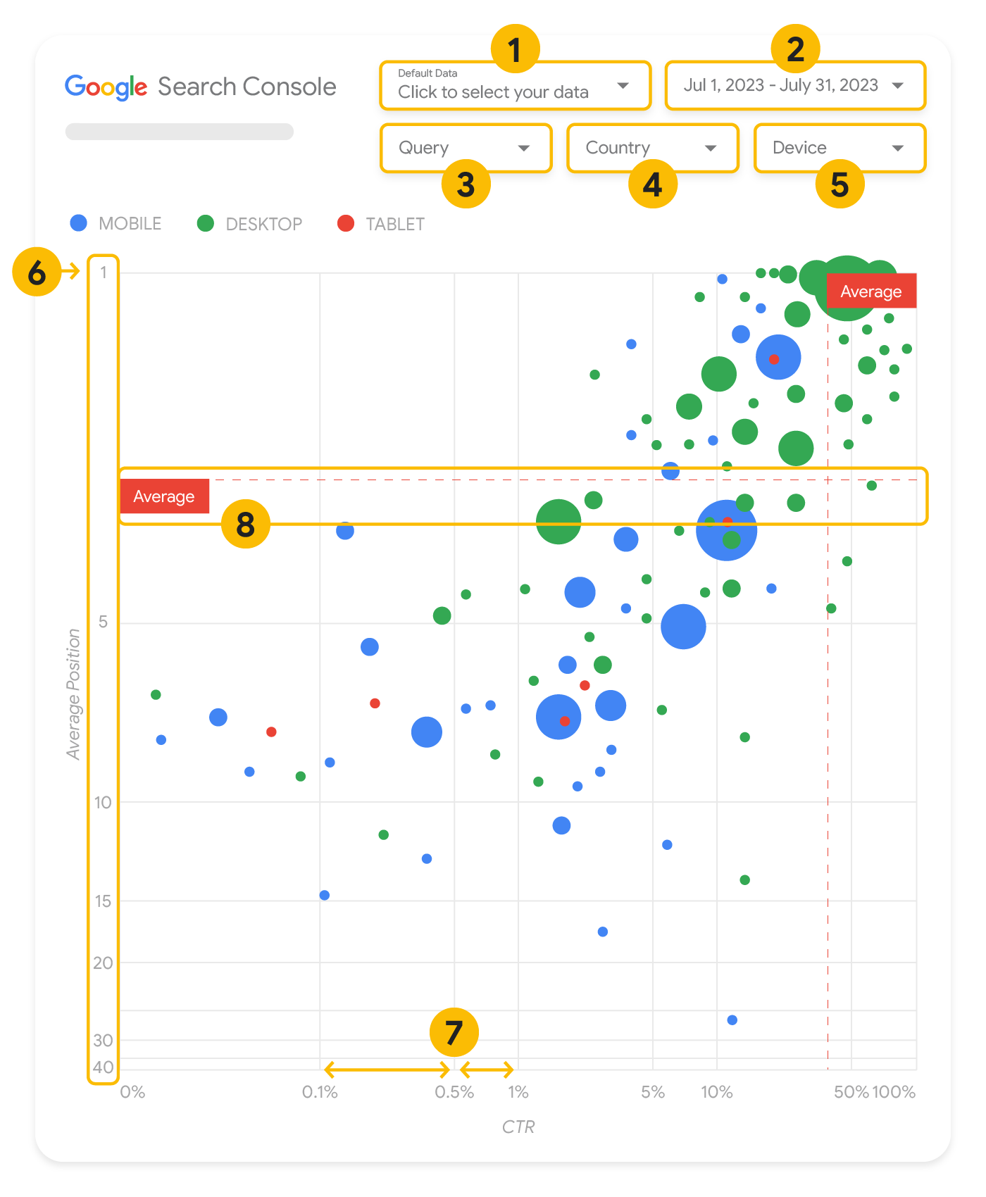
Phần này trình bày chi tiết về một số thành phần trong biểu đồ để làm rõ những yếu tố mà biểu đồ có và không thể hiện.
Có 5 cách tuỳ chỉnh trong biểu đồ để giúp bạn kiểm soát dữ liệu sao cho hiệu quả:
Kiểm soát dữ liệu: Chọn tài sản Search Console mà bạn muốn phân tích.
Phạm vi ngày: Chọn phạm vi ngày bạn muốn xem trong báo cáo; phạm vi ngày mặc định là 28 ngày gần nhất.
Cụm từ tìm kiếm: Thêm hoặc bớt các cụm từ tìm kiếm bạn cần chú trọng. Bạn có thể lọc dữ liệu tương tự như cách bạn thực hiện trong Search Console.
Quốc gia: Thêm hoặc bớt quốc gia.
Thiết bị: Thêm hoặc bớt danh mục thiết bị.
Trục
Các trục trong biểu đồ là vị trí trung bình (trục y) và CTR của trang web (trục x). Có 3 phép biến đổi quan trọng trên các trục:
Đảo ngược hướng trục y: Vì trục y cho thấy vị trí trung bình, nên đảo ngược trục này có nghĩa là vị trí số 1 nằm trên cùng.
Đối với hầu hết biểu đồ, vị trí tốt nhất được đặt ở góc trên cùng bên phải. Do đó, khi sử dụng trục y để thể hiện vị trí trung bình, việc đảo hướng trục này sẽ thuận mắt hơn.
Thang đo lôgarit: Việc sử dụng thang đo lôgarit cho cả hai trục cho phép bạn hiểu rõ hơn về các cụm từ tìm kiếm nằm ở các điểm xa nhất trên biểu đồ (CTR rất thấp, vị trí trung bình rất thấp hoặc cả hai đều rất thấp).
Đường tham chiếu: Đường tham chiếu rất hữu ích trong việc nêu bật các giá trị cao hơn hoặc thấp hơn một ngưỡng nhất định.
Khi xem xét giá trị trung bình, số trung vị hoặc một bách phân vị nào đó, bạn có thể nhìn ra những điểm dữ liệu lệch khỏi quy luật.
Bong bóng
Mỗi bong bóng trong biểu đồ đại diện cho một cụm từ tìm kiếm, với các thuộc tính định kiểu như sau:
Kích thước: Kích thước bong bóng tương ứng với số lượng lượt nhấp giúp bạn nhận ra ngay những cụm từ tìm kiếm đang thúc đẩy phần lớn lưu lượng truy cập – bong bóng càng lớn thì lưu lượng truy cập tạo ra càng nhiều.
Màu sắc: Việc biểu diễn danh mục thiết bị theo màu giúp bạn nắm được sự khác biệt giữa hiệu suất tìm kiếm trên thiết bị di động và máy tính. Bạn có thể biểu diễn mọi phương diện theo màu sắc, nhưng khi có càng nhiều giá trị thì càng khó để nhận ra quy luật.
Phân tích dữ liệu
Mục tiêu của biểu đồ trực quan này là giúp bạn tìm thấy cơ hội tối ưu hoá cụm từ tìm kiếm. Biểu đồ bong bóng cho thấy hiệu suất của các cụm từ tìm kiếm, trong đó trục y biểu thị vị trí trung bình, trục x biểu thị tỷ lệ nhấp (CTR), kích thước bong bóng biểu thị tổng số lượt nhấp và màu của bong bóng biểu thị danh mục thiết bị.
Các nét đứt tham chiếu Trung bình màu đỏ thể hiện giá trị trung bình của từng trục. Các đường này chia biểu đồ thành 4 góc phần tư, cho thấy 4 nhóm hiệu suất của cụm từ tìm kiếm. Có thể các góc phần tư của bạn trông khác với nội dung chia sẻ trong bài đăng này, tuỳ thuộc vào cách phân phối cụm từ tìm kiếm cho trang web của bạn.
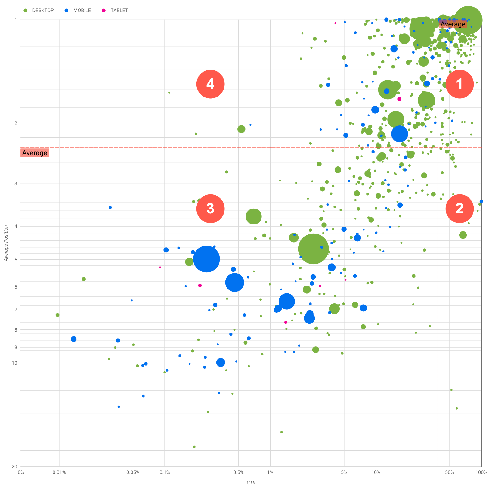
Biểu đồ này cho thấy 4 nhóm cụm từ tìm kiếm mà bạn có thể phân tích để quyết định nơi nên đầu tư thời gian khi tối ưu hoá hiệu suất trên Google Tìm kiếm.
Vị trí cao, CTR cao: Bạn không cần làm gì nhiều với nhóm này; kết quả đang rất tốt rồi.
Vị trí thấp, CTR cao: Các cụm từ này có vẻ phù hợp với người dùng; có CTR cao mặc dù nằm ở vị trí thấp hơn mức trung bình của cụm từ tìm kiếm cho trang web của bạn. Nếu vị trí trung bình của cụm từ tìm kiếm tăng lên thì điều đó có thể tác động đáng kể đến hiệu suất của bạn. Hãy tập trung vào việc cải thiện SEO cho những cụm từ tìm kiếm này. Ví dụ: cụm từ tìm kiếm hàng đầu trong góc phần tư 2 cho một trang web về làm vườn có thể là "cách xây nhà kho bằng gỗ".
Hãy kiểm tra xem bạn đã có trang về nội dung này hay chưa rồi tiến hành theo 2 hướng:
Nếu bạn chưa có trang nào, hãy cân nhắc tạo một trang như vậy để tập trung tất cả thông tin bạn có trên trang web của mình về chủ đề đó.
Nếu bạn đã có một trang như vậy, hãy xem xét việc bổ sung nội dung để phù hợp hơn với trang mà người dùng đó cần.
Vị trí thấp, CTR thấp: Khi xem xét các cụm từ tìm kiếm có CTR thấp (cả với vị trí cao và thấp), bạn nên xem xét kích thước bong bóng để nắm được cụm từ tìm kiếm nào có CTR thấp nhưng vẫn thúc đẩy được lưu lượng truy cập đáng kể. Mặc dù các cụm từ tìm kiếm trong góc phần tư này có vẻ không đáng quan tâm, nhưng bạn có thể chia chúng thành hai nhóm chính:
Cụm từ tìm kiếm có liên quan: Nếu cụm từ ở đây có ý nghĩa quan trọng với bạn, thì việc cụm từ đó xuất hiện trên Tìm kiếm cũng đã là một khởi đầu tốt rồi. Hãy ưu tiên những cụm từ tìm kiếm này hơn các cụm từ hoàn toàn không xuất hiện trong kết quả trên Tìm kiếm, vì các cụm từ này sẽ dễ tối ưu hoá hơn.
Cụm từ tìm kiếm không liên quan: Nếu trang web của bạn không chứa nội dung liên quan đến cụm từ tìm kiếm này, thì có lẽ bạn nên tinh chỉnh nội dung hoặc tập trung vào những cụm từ tìm kiếm mang lại lưu lượng truy cập phù hợp.
Vị trí cao, CTR thấp: Các cụm từ tìm kiếm này có thể có CTR thấp vì nhiều lý do. Hãy kiểm tra các bong bóng lớn nhất để tìm các dấu hiệu sau:
Có thể bạn đã tối ưu hoá hoặc "vô tình" được xếp hạng một cụm từ tìm kiếm mà người dùng không quan tâm đến khi nghĩ về trang web của bạn. Có thể đây không phải là vấn đề đối với bạn. Nếu vậy, bạn có thể bỏ qua các cụm từ tìm kiếm đó. Nếu bạn không muốn mọi người tìm thấy trang web của bạn thông qua những cụm từ tìm kiếm đó (ví dụ: nội dung chứa các từ phản cảm), hãy cố gắng tinh chỉnh nội dung của bạn để loại bỏ những cụm từ có khả năng là từ đồng nghĩa hoặc cụm từ tìm kiếm liên quan đến cụm từ mang lại lưu lượng truy cập đó.
Có thể mọi người đã tìm được thông tin họ cần nhưng không nhấp vào, chẳng hạn như giờ mở cửa, địa chỉ hoặc số điện thoại của công ty bạn. Hãy kiểm tra những cụm từ tìm kiếm được dùng và URL có chứa thông tin đó. Nếu một trong các mục tiêu của trang web là thúc đẩy mọi người đến cửa hàng thực tế của bạn, thì mục tiêu này đang hoạt động đúng ý; nếu cho rằng mọi người nên truy cập trang web của bạn để biết thêm thông tin, thì bạn có thể cố gắng tối ưu hoá tiêu đề và phần mô tả để làm rõ điều đó. Hãy xem phần tiếp theo để biết thêm chi tiết.
Chúng tôi chưa đề cập đến danh mục thiết bị vì chúng có thể được dùng làm dấu hiệu bổ sung cho hiệu suất của cụm từ tìm kiếm. Ví dụ: giả sử một số cụm từ tìm kiếm có liên quan hơn khi mọi người đang đi theo chỉ dẫn trên đường và cố gắng tìm một địa điểm nào đó; trong trường hợp đó, cụm từ tìm kiếm có thể có hiệu suất cao trên thiết bị di động nhưng lại có hiệu suất thấp trên máy tính.
Cải thiện SEO cho một số cụm từ tìm kiếm cụ thể
Khi bạn tìm được những cụm từ tìm kiếm đáng đầu tư thời gian và công sức, hãy tối ưu hoá hoặc tạo các trang có liên quan đến các cụm từ tìm kiếm đó.
Sau khi tìm thấy các cụm từ tìm kiếm bằng hình ảnh minh hoạ trực quan trên trang này, bạn có thể tạo một bộ lọc cụm từ tìm kiếm cho một số cụm từ tìm kiếm cụ thể qua giao diện người dùng của Search Console hoặc dùng Looker Studio để tạo một bảng tổng hợp; theo cả hai cách, bạn đều có thể kiểm tra tất cả những trang đang nhận được lưu lượng truy cập cho một cụm từ tìm kiếm cụ thể. Sau khi bạn biết những cụm từ tìm kiếm mà mình muốn tối ưu hoá và các URL liên quan của cụm từ đó, hãy sử dụng Cẩm nang SEO để tối ưu hoá nội dung của bạn. Dưới đây là một số mẹo hay:
Đảm bảo rằng các phần tử title, thẻ meta mô tả và thuộc tính alt đều được trình bày chi tiết, cụ thể và chính xác.
Dùng các phần tử tiêu đề để nêu bật phần văn bản quan trọng và tạo cấu trúc phân cấp cho nội dung. Nhờ đó, người dùng và các công cụ tìm kiếm có thể đọc tài liệu của bạn dễ dàng hơn.
Suy nghĩ xem người dùng có khả năng sẽ sử dụng những từ nào để tìm kiếm một nội dung cụ thể của bạn, chẳng hạn như từ đồng nghĩa và cụm từ liên quan. Bạn có thể sử dụng Công cụ lập kế hoạch từ khoá của Google Ads để khám phá các biến thể từ khoá mới và xem lượng tìm kiếm ước chừng của mỗi từ khoá. Bạn cũng có thể sử dụng Google Xu hướng để lấy ý tưởng qua các chủ đề và cụm từ tìm kiếm đang thịnh hành có liên quan đến trang web của mình.
[[["Dễ hiểu","easyToUnderstand","thumb-up"],["Giúp tôi giải quyết được vấn đề","solvedMyProblem","thumb-up"],["Khác","otherUp","thumb-up"]],[["Thiếu thông tin tôi cần","missingTheInformationINeed","thumb-down"],["Quá phức tạp/quá nhiều bước","tooComplicatedTooManySteps","thumb-down"],["Đã lỗi thời","outOfDate","thumb-down"],["Vấn đề về bản dịch","translationIssue","thumb-down"],["Vấn đề về mẫu/mã","samplesCodeIssue","thumb-down"],["Khác","otherDown","thumb-down"]],["Cập nhật lần gần đây nhất: 2025-08-04 UTC."],[[["\u003cp\u003eVisualize Search Console data with a bubble chart to reveal query optimization opportunities by analyzing click-through rate, average position, and clicks.\u003c/p\u003e\n"],["\u003cp\u003eIdentify high-potential queries by focusing on those with low positions but high click-through rates, indicating relevance and potential for increased traffic with improved ranking.\u003c/p\u003e\n"],["\u003cp\u003eInvestigate queries with low click-through rates and high positions to determine if they are unrelated to your site or require optimization for better user engagement.\u003c/p\u003e\n"],["\u003cp\u003eOptimize content for identified queries by refining titles, meta descriptions, headings, and incorporating relevant keywords to enhance search visibility and user experience.\u003c/p\u003e\n"]]],["A bubble chart visualizes query performance using Search Console data. It displays click-through rate (CTR) on the x-axis, average position on the y-axis, click volume as bubble size, and device category as bubble color. Customization options include data control, date range, query, country, and device filters. Analyzing the quadrants formed by average CTR and position helps identify optimization opportunities. Focus on queries with low position but high CTR, and address top-position, low-CTR queries by improving content or structured data.\n"],null,["# How to Create a Search Console Bubble Chart | Google Search Central\n\nImproving SEO with a Search Console bubble chart\n================================================\n\n\nAnalyzing Search performance data is always a challenge, but even more so when you have plenty of\nlong-tail queries, which are harder to visualize and understand. A\n[bubble chart](https://support.google.com/datastudio/answer/7207785)\ncan help you understand which queries are performing well for your site, and which could be improved.\n\n\nIf you'd like to test the techniques discussed here, you can\n[connect your data to Looker Studio](https://datastudio.google.com/reporting/1e5b5f6a-38d7-4547-a54b-69594681a09b/page/xFbeC/preview) and play with the chart settings. \n\n\nIf you haven't read [connecting Search Console to Looker Studio](/search/blog/2022/03/connecting-data-studio) and\n[monitoring Search traffic with Looker Studio](/search/blog/2022/03/monitoring-dashboard),\nconsider checking them out to understand more about what you can do with Search Console in Looker\nStudio.\n\nUnderstanding the chart\n-----------------------\n\n\nA bubble chart is a great visualization when you have multiple metrics and dimensions because it\nlets you to see relationships and patterns in your\ndata more effectively. In the example shown here, you can see\n[click-through rate](https://support.google.com/webmasters/answer/7576553#choosingmetrics)\n(CTR), average position, and clicks for the query and device dimensions in one view.\n\n\nThis section goes into detail on some of the chart elements to clarify what the chart shows, and what it doesn't.\n\n### Data source\n\n\nThe bubble chart shown in this page uses the Site Impression table available through the\n[Search Console data source](https://support.google.com/datastudio/answer/7314895),\nwhich includes [Search performance data](https://support.google.com/webmasters/answer/7576553)\naggregated by site and queries.\n\n### Filters and data controls\n\n\nThere are five customization options in the chart to help you control your data effectively:\n\n1. **[Data control](https://support.google.com/datastudio/answer/7415591)**: Choose the Search Console property you'd like to analyze.\n2. **Date range**: Choose the date range you'd like to see in the report; by default you'll see the last 28 days.\n3. **Query** : Include or exclude queries to focus on. You can [filter your data](/search/blog/2021/06/regex-negative-match) similar to how you do it in Search Console.\n4. **Country**: Include or exclude countries.\n5. **Device**: Include or exclude device categories.\n\n### Axes\n\n\nThe axes in the chart are average position (y-axis) and site CTR (x-axis). There are three\nsignificant transformations in the axes:\n\n6. **Reverse y-axis direction**: Since the y-axis shows average position, inverting it means that 1 is at the top. For most charts, the best position is in the top right corner, so it is more intuitive to invert the y-axis when using it to display average position.\n7. **Log scale** : Using a [logarithmic scale](https://en.wikipedia.org/wiki/Logarithmic_scale) for both axes lets you to have a better understanding of queries that are in the extremities of the chart (very low CTR, average position, or both).\n8. **[Reference lines](https://support.google.com/datastudio/answer/9921462)**: The reference line is very helpful to highlight values that are above or below a certain threshold. Looking at the average, median, or a certain percentile can call attention to deviations from the pattern.\n\n### Bubbles\n\n\nEach bubble in the chart represents a single query, with the following\n[style properties](https://support.google.com/datastudio/answer/7207785#style-properties):\n\n- **Size**: Using the number of clicks as the bubble size helps you see in a glance which queries are driving the bulk of the traffic---the larger the bubble the more traffic the query generates.\n- **Color**: Using the device category as the bubble color helps you understand the differences between mobile and desktop Search performance. You can use any dimension as the color, but as the number of values increases, the harder it is to recognize patterns.\n\nAnalyzing the data\n------------------\n\n\nThe goal of this visualization is to help surface query optimization opportunities. The chart\nshows query performance, where the y-axis represents average position, the x-axis represents CTR\nthe bubble size represents total number of clicks, and the bubble color represents\ndevice category.\n\n\nThe red Average dashed reference lines show the average for each of the axes, which split the chart\ninto quadrants, showing four types of query performance. Your quadrants are likely to look\ndifferent than the one shared in this post; they'll depend on how your site queries\nare distributed.\n\n\nThe chart shows four groups of queries, which you can analyze to help you decide where to invest\nyour time when optimizing your Google Search performance.\n\n1. **Top position, high CTR**: There's not much you need to do for those; you're doing a great job already.\n2. **Low position, high CTR** : Those queries seem relevant to users; the queries get a high CTR even when ranking lower than the average query on your website. If the query average position moves up, it could have a significant impact on your performance---focus on improving SEO for these queries. For example, a top query in quadrant 2 for a gardening website could be \"how to build a wooden shed.\" Check if you have a page about this already, and proceed in two ways:\n - If you don't have a page, consider creating one to centralize all the info you have in the website about the subject.\n - If you do have a page, consider adding content to better address that user need.\n3. **Low position, low CTR** : When looking at queries with low CTR (both with low and top position), it's especially interesting to look at the bubble sizes to understand which queries have a low CTR but are still driving significant traffic. While the queries in this quadrant might seem unworthy of your effort, they can be divided into two main groups:\n - **Related queries**: If the query in question is important to you, it's a good start to have it appearing in Search already. Prioritize these queries over queries that are not appearing in Search results at all, as they'll be easier to optimize.\n - **Unrelated queries**: If your site doesn't cover content related to this query, maybe it's a good opportunity to fine tune your content or focus on queries that will bring relevant traffic.\n4. **Top position, low CTR** : Those queries might have a low CTR for various reasons. Check the largest bubbles to find signs of the following:\n - Your competitors may have [structured data markup](/search/docs/appearance/search-result-features) and are showing up with rich results, which might attract users to click their results instead of yours. Consider optimizing for the most common [visual elements in Google Search](/search/docs/appearance/visual-elements-gallery).\n - You may have optimized, or be \"accidentally\" ranking, for a query that users are not interested in relation to your site. This might not be an issue for you, in which case you can ignore those queries. If you prefer people not to find you through those queries (for example, they contain offensive words), try to fine-tune your content to remove mentions that could be seen as synonyms or related queries to the one bringing traffic.\n - People may have already found the information they needed, for example your company's opening hours, address, or phone number. Check the queries that were used and the URLs that contained the information. If one of your website goals is to drive people to your stores, this is working as intended; if you believe that people should visit your website for extra information, you could try to optimize your titles and description to make that clear. See next section for more details.\n\n\nWe haven't mentioned the device categories because they can be used as additional signs of query\nperformance. For example, suppose some queries are more relevant when people are navigating in the\nstreet, trying to find a location; in that case, the query might have a high performance\non mobile devices, but a low performance on desktop.\n\nImproving SEO for specific queries\n----------------------------------\n\n\nOnce you find queries that are worth the time and effort, make sure to optimize or create pages\nrelated to those queries.\n\n\nAfter you find the queries using the visualization shown in this page, you can\n[create a query filter](https://support.google.com/webmasters/answer/7576553#filteringdata)\nfor specific queries using the Search Console user interface, or create a\n[pivot table](https://support.google.com/looker-studio/answer/7516660)\nusing Looker Studio; in both ways, you can check all the pages that are receiving\ntraffic for a specific query. After you know the queries you want to optimize and their related\nURLs, use the [SEO starter guide](/search/docs/fundamentals/seo-starter-guide)\nto optimize your content. Here are some tips:\n\n- Ensure that your [title](/search/docs/appearance/title-link#page-titles) elements, [description meta tags](/search/docs/appearance/snippet#meta-descriptions), and alt attributes are descriptive, specific, and accurate.\n- Use heading elements to emphasize important text and help create a hierarchical structure for your content, making it easier for users and search engines to navigate through your document.\n- Think about other words that a user might search for to find a piece of your content, for example, synonyms and related queries. You can use the [Keyword Planner](https://ads.google.com/home/tools/keyword-planner/) provided by Google Ads to help you discover new keyword variations and see the approximate search volume for each keyword. You can also [use Google Trends](/search/docs/monitor-debug/google-trends) to find ideas from rising topics and queries related to your website."]]