Arama performansı verilerini analiz etmek her zaman çaba gerektiren bir iş olmuştur. Üzerine bir de görselleştirmesi ve anlaması zahmetli olan çok sayıda genişlemeli sorgunuz varsa işiniz daha da zorlaşır. Kabarcık grafiği,
sitenizdeki hangi sorguların iyi performans gösterdiğini ve hangilerinin iyileştirilebileceğini anlamanıza yardımcı olabilir.
Kabarcık grafik, verilerinizdeki ilişkileri ve kalıpları daha etkili bir şekilde görmenizi sağladığı için birden fazla metriğiniz ve boyutunuz olduğunda mükemmel bir görselleştirme aracıdır. Burada gösterilen örnekte sorgu ve cihaz boyutları
için tıklama oranını (TO), ortalama konumu ve tıklama sayılarını tek bir görünümde inceleyebilirsiniz.
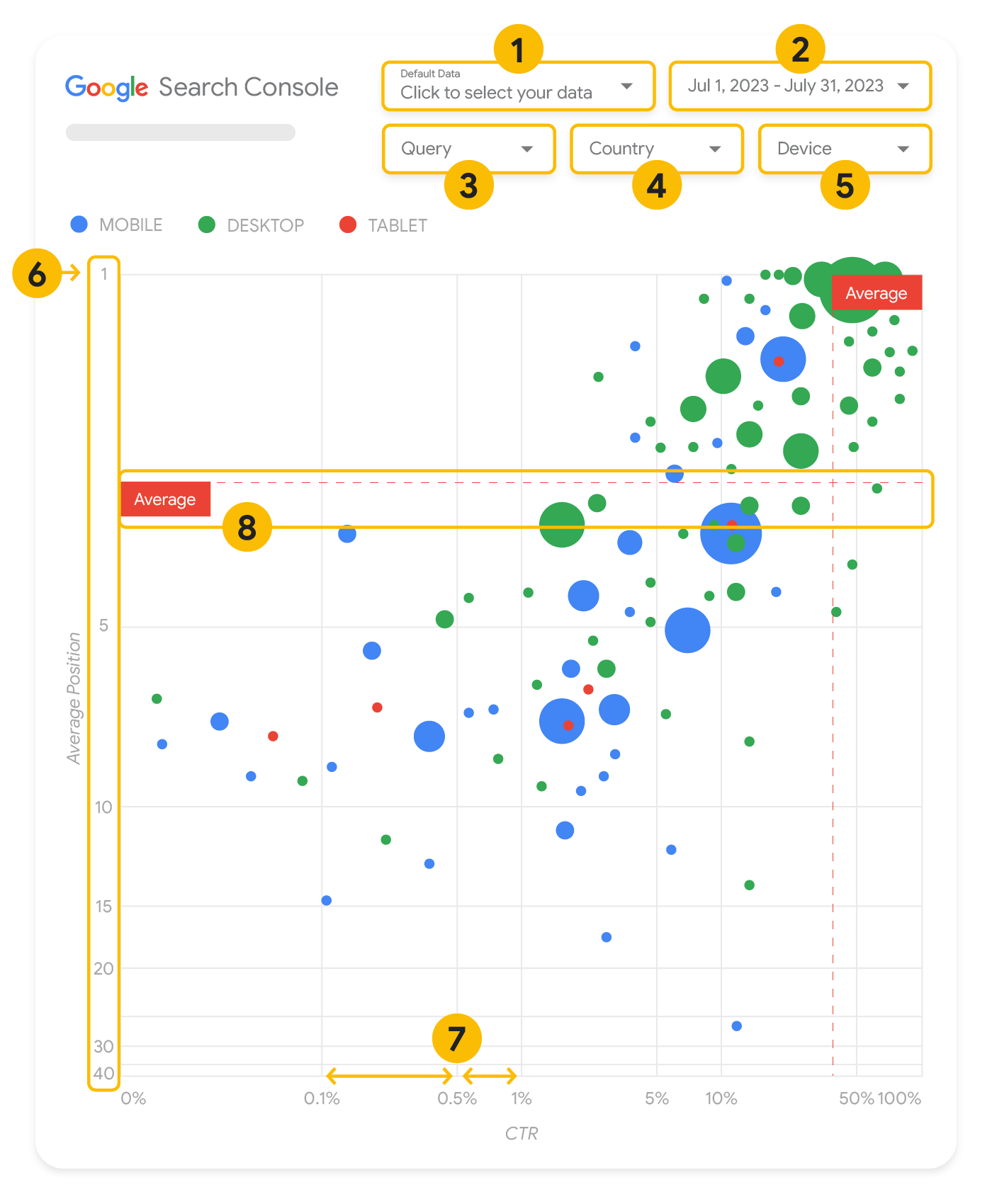
Bu bölümde, grafiğin neleri gösterip göstermediğini netleştirmek için bazı grafik öğeleri hakkında ayrıntılı bilgi verilmiştir.
Grafikte, verilerinizi etkili bir şekilde kontrol etmenize yardımcı olacak beş özelleştirme seçeneği vardır:
Veri kontrolü: Analiz etmek istediğiniz Search Console mülkünü seçin.
Tarih aralığı: Raporda görmek istediğiniz tarih aralığını seçin. Varsayılan olarak son 28 günü görürsünüz.
Sorgu: Odaklanmak istediğiniz sorguları dahil edin veya hariç tutun. Verilerinizi, Search Console'dakine
benzer şekilde filtreleyebilirsiniz.
Ülke: Ülkeleri dahil edin veya hariç tutun.
Cihaz: Cihaz kategorilerini dahil edin veya hariç tutun.
Eksenler
Grafikteki eksenler, ortalama konumu (y ekseni) ve site TO'sunu (x ekseni) ifade etmektedir. Eksenlerde üç önemli dönüşüm vardır:
Ters y ekseni yönü: Y ekseni, ortalama konumu gösterdiğinden bu eksen ters çevrildiğinde 1 değeri en üstte gelir.
Çoğu grafikte en iyi konum sağ üst köşededir. Bu nedenle, ortalama konumu göstermek için kullanılıyorsa y eksenini ters çevirmek kullanım açısından daha kolaydır.
Logaritmik ölçek: İki eksen için de logaritmik ölçek
kullanıldığında, grafiğin uç noktalarında bulunan sorguları (çok düşük TO, ortalama konum veya her ikisi) daha iyi anlayabilirsiniz.
Referans çizgileri: Referans çizgisi, belirli bir eşiğin üstündeki veya altındaki değerleri vurgulamak için oldukça faydalıdır.
Ortalamaya, ortanca değere veya belirli yüzdelik dilimlere bakıldığında düzendeki sapmalar dikkat çekebilir.
Baloncuklar
Grafikteki her bir kabarcık aşağıdaki stil özelliklerine sahip tek bir sorguyu temsil eder:
Boyut: Tıklama sayısını kabarcık boyutuyla göstermek, trafiğin büyük kısmını getiren sorguları bir bakışta görmenizi sağlar. Kabarcık ne kadar büyükse sorgu o kadar fazla trafik oluşturuyor demektir.
Renk: Cihaz kategorisini kabarcık rengiyle göstermek, mobil ve masaüstü Arama performansı arasındaki farkları anlamanızı sağlar. Herhangi bir boyutu renkle gösterebilirsiniz ancak değerlerin sayısı arttıkça düzenleri tanımak daha zor hale gelir.
Verileri analiz etme
Bu görselleştirmenin amacı, sorgu optimizasyon fırsatlarının ortaya çıkarılmasına yardımcı olmaktır. Sorgu performansının gösterildiği grafikte; y ekseni ortalama konumu, x ekseni TO'yu, kabarcık boyutu toplam tıklama sayısını ve kabarcık rengi cihaz kategorisini temsil eder.
Kırmızı referans çizgileri her bir eksenin ortalamasını belirtir. Bu eksenler grafiği dört bölüme ayırarak dört sorgu performansı türünü gösterir. Sizin grafiğinizdeki dört bölüm, site sorgularınızın nasıl dağıtıldığına bağlı olarak bu yayında paylaşılandan farklı olabilir.
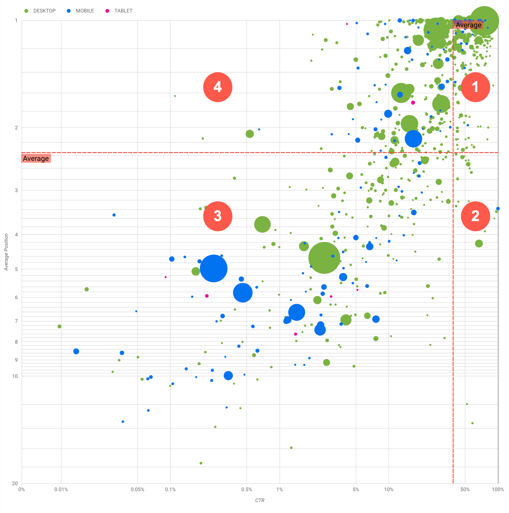
Grafikte dört sorgu grubu gösterilir. Bu grupları analiz edebilir ve Google Arama performansınızı optimize ederken zamanınızı nereye harcayacağınıza karar verebilirsiniz.
En üst konum, yüksek TO: Zaten mükemmel bir iş çıkardığınız için bu grupta yapmanız gereken pek fazla şey yoktur.
Düşük konum, yüksek TO: Bu sorgular kullanıcılar açısından alakalıdır. Sorgular, web sitenizdeki ortalama sorgudan daha düşük bir sıralamada olsalar bile yüksek TO alır. Sorgunun ortalama konumu yükselirse bu durum performansınızda önemli bir etki yaratabileceği için bu sorguların SEO'sunu iyileştirmeye odaklanın. Örneğin, bahçecilikle ilgili bir web sitesinin 2. bölümündeki en çok yapılan sorgu "ahşap kulübe nasıl yapılır?" olabilir.
Bu konuyla ilgili bir sayfanız olup olmadığını kontrol edin ve iki şekilde devam edin:
Sayfanız yoksa web sitesinde konuyla ilgili tüm bilgileri tek bir yerde toplamak için bir sayfa oluşturabilirsiniz.
Sayfanız varsa da kullanıcının bu ihtiyacına daha iyi cevap verecek içerikler ekleyebilirsiniz.
Düşük konum, düşük TO: Düşük TO'ya sahip sorgulara (hem düşük hem de en üst konuma sahip) bakarken TO'su düşük olmasına rağmen önemli miktarda trafik getiren sorguların hangileri olduğu anlamak için kabarcık boyutlarına bakmak ilginç olabilir. Bu bölümdeki sorgular için gösterdiğiniz çabaya değmez gibi görünse de bu sorgular da iki ana gruba ayrılabilir:
İlgili sorgular: Söz konusu sorgu sizin için önemliyse Arama'da zaten görünüyor olması iyi bir başlangıçtır. Arama sonuçlarında hiç görünmeyen sorgulara göre optimize edilmeleri daha kolay olacağından bu sorgulara öncelik verin.
İlgisiz sorgular: Siteniz bu sorguyla ilgili içeriği kapsamıyorsa içeriğinize küçük dokunuşlar yapmak veya alakalı trafik getirecek sorgulara odaklanmak iyi bir fırsat olabilir.
En üst konum, düşük TO: Bu sorgular çeşitli nedenlerle düşük TO'ya sahip olabilir. En büyük kabarcıkları kontrol ederek aşağıdaki durumları arayabilirsiniz:
Kullanıcıların sitenizde ilgilenmediği bir sorgu için optimizasyon yapmış veya "yanlışlıkla" sıralamada yer alıyor olabilirsiniz. Bu sizin için bir sorun değilse söz konusu sorguları yoksayabilirsiniz. Kullanıcıların sizi bu sorgular aracılığıyla bulmasını
tercih etmiyorsanız da (örneğin, rahatsız edici kelimeler içeriyorlarsa) trafik getiren sorguyla eş anlamlı olarak görülebilecek veya
ilgili sorguları kaldıracak şekilde içeriğinize küçük dokunuşlar yapmaya çalışın.
Kullanıcılar ihtiyaç duydukları bilgileri (örneğin, şirketinizin çalışma saatleri, adresi veya telefon numarası) zaten bulmuş olabilirler. Kullanılan sorguları ve bilgiyi içeren URL'leri kontrol edin. Web sitenizin hedeflerinden biri kullanıcıları mağazalarınıza çekmekse bu planlandığı gibi çalışıyor demektir. Kullanıcıların, web sitenizi daha fazla bilgi edinmek için ziyaret etmesi gerektiğini düşünüyorsanız bunu net bir şekilde belirtmek için başlıklarınızı ve açıklamanızı optimize etmeyi deneyebilirsiniz. Daha ayrıntılı bilgi için sonraki bölüme bakın.
Sorgu performansına dair ek göstergeler olarak kullanılabildiği için cihaz kategorilerinden bahsetmedik. Örneğin, bazı sorguların sokakta gezinen ve bir konumu bulmaya çalışan kullanıcılar için daha alakalı olduğunu varsayalım. Bu durumda, bu sorgu mobil cihazlarda yüksek, masaüstü cihazlarda ise düşük performans gösterebilir.
Belirli sorgular için SEO'yu iyileştirme
Zaman ve çaba harcamaya değer sorguları bulduktan sonra bu sorgularla ilgili sayfaları optimize edin veya sayfa oluşturun.
Bu sayfada gösterilen görselleştirmeyi kullanarak sorguları bulduktan sonra Search
Console kullanıcı arayüzünü kullanarak belirli sorgular için sorgu filtresi oluşturabilir veya Looker
Studio'yu kullanarak pivot tablo oluşturabilirsiniz. Her iki yöntemde de belirli bir sorgu için trafik alan tüm sayfalara göz atabilirsiniz. Optimize etmek istediğiniz sorguları ve ilgili URL'lerini öğrendikten sonra içeriğinizi optimize etmek için
SEO Başlangıç Kılavuzu'nu kullanın. Aşağıda bazı ipuçları verilmiştir:
Önemli metinleri vurgulamak ve içeriğinizde hiyerarşik bir yapı oluşturmak için başlık öğeleri kullanarak kullanıcıların ve arama motorlarının dokümanınızda gezinmesini kolaylaştırabilirsiniz.
Kullanıcıların içeriğinizde bir bölümü bulmak için arayabileceği diğer kelimeleri (örneğin, eş anlamlılar ve ilgili sorgular) düşünün. Google Ads'in sunduğu Anahtar Kelime Planlayıcı'yı kullanarak yeni anahtar kelime varyasyonlarını keşfedebilir ve her anahtar kelime için yaklaşık arama hacmine bakabilirsiniz. Web sitenizle alakalı popüler konulara ve sorgulara dair fikirler bulmak için Google Trendler'i de kullanabilirsiniz.
[[["Anlaması kolay","easyToUnderstand","thumb-up"],["Sorunumu çözdü","solvedMyProblem","thumb-up"],["Diğer","otherUp","thumb-up"]],[["İhtiyacım olan bilgiler yok","missingTheInformationINeed","thumb-down"],["Çok karmaşık / çok fazla adım var","tooComplicatedTooManySteps","thumb-down"],["Güncel değil","outOfDate","thumb-down"],["Çeviri sorunu","translationIssue","thumb-down"],["Örnek veya kod sorunu","samplesCodeIssue","thumb-down"],["Diğer","otherDown","thumb-down"]],["Son güncelleme tarihi: 2025-08-04 UTC."],[[["\u003cp\u003eVisualize Search Console data with a bubble chart to reveal query optimization opportunities by analyzing click-through rate, average position, and clicks.\u003c/p\u003e\n"],["\u003cp\u003eIdentify high-potential queries by focusing on those with low positions but high click-through rates, indicating relevance and potential for increased traffic with improved ranking.\u003c/p\u003e\n"],["\u003cp\u003eInvestigate queries with low click-through rates and high positions to determine if they are unrelated to your site or require optimization for better user engagement.\u003c/p\u003e\n"],["\u003cp\u003eOptimize content for identified queries by refining titles, meta descriptions, headings, and incorporating relevant keywords to enhance search visibility and user experience.\u003c/p\u003e\n"]]],["A bubble chart visualizes query performance using Search Console data. It displays click-through rate (CTR) on the x-axis, average position on the y-axis, click volume as bubble size, and device category as bubble color. Customization options include data control, date range, query, country, and device filters. Analyzing the quadrants formed by average CTR and position helps identify optimization opportunities. Focus on queries with low position but high CTR, and address top-position, low-CTR queries by improving content or structured data.\n"],null,["# How to Create a Search Console Bubble Chart | Google Search Central\n\nImproving SEO with a Search Console bubble chart\n================================================\n\n\nAnalyzing Search performance data is always a challenge, but even more so when you have plenty of\nlong-tail queries, which are harder to visualize and understand. A\n[bubble chart](https://support.google.com/datastudio/answer/7207785)\ncan help you understand which queries are performing well for your site, and which could be improved.\n\n\nIf you'd like to test the techniques discussed here, you can\n[connect your data to Looker Studio](https://datastudio.google.com/reporting/1e5b5f6a-38d7-4547-a54b-69594681a09b/page/xFbeC/preview) and play with the chart settings. \n\n\nIf you haven't read [connecting Search Console to Looker Studio](/search/blog/2022/03/connecting-data-studio) and\n[monitoring Search traffic with Looker Studio](/search/blog/2022/03/monitoring-dashboard),\nconsider checking them out to understand more about what you can do with Search Console in Looker\nStudio.\n\nUnderstanding the chart\n-----------------------\n\n\nA bubble chart is a great visualization when you have multiple metrics and dimensions because it\nlets you to see relationships and patterns in your\ndata more effectively. In the example shown here, you can see\n[click-through rate](https://support.google.com/webmasters/answer/7576553#choosingmetrics)\n(CTR), average position, and clicks for the query and device dimensions in one view.\n\n\nThis section goes into detail on some of the chart elements to clarify what the chart shows, and what it doesn't.\n\n### Data source\n\n\nThe bubble chart shown in this page uses the Site Impression table available through the\n[Search Console data source](https://support.google.com/datastudio/answer/7314895),\nwhich includes [Search performance data](https://support.google.com/webmasters/answer/7576553)\naggregated by site and queries.\n\n### Filters and data controls\n\n\nThere are five customization options in the chart to help you control your data effectively:\n\n1. **[Data control](https://support.google.com/datastudio/answer/7415591)**: Choose the Search Console property you'd like to analyze.\n2. **Date range**: Choose the date range you'd like to see in the report; by default you'll see the last 28 days.\n3. **Query** : Include or exclude queries to focus on. You can [filter your data](/search/blog/2021/06/regex-negative-match) similar to how you do it in Search Console.\n4. **Country**: Include or exclude countries.\n5. **Device**: Include or exclude device categories.\n\n### Axes\n\n\nThe axes in the chart are average position (y-axis) and site CTR (x-axis). There are three\nsignificant transformations in the axes:\n\n6. **Reverse y-axis direction**: Since the y-axis shows average position, inverting it means that 1 is at the top. For most charts, the best position is in the top right corner, so it is more intuitive to invert the y-axis when using it to display average position.\n7. **Log scale** : Using a [logarithmic scale](https://en.wikipedia.org/wiki/Logarithmic_scale) for both axes lets you to have a better understanding of queries that are in the extremities of the chart (very low CTR, average position, or both).\n8. **[Reference lines](https://support.google.com/datastudio/answer/9921462)**: The reference line is very helpful to highlight values that are above or below a certain threshold. Looking at the average, median, or a certain percentile can call attention to deviations from the pattern.\n\n### Bubbles\n\n\nEach bubble in the chart represents a single query, with the following\n[style properties](https://support.google.com/datastudio/answer/7207785#style-properties):\n\n- **Size**: Using the number of clicks as the bubble size helps you see in a glance which queries are driving the bulk of the traffic---the larger the bubble the more traffic the query generates.\n- **Color**: Using the device category as the bubble color helps you understand the differences between mobile and desktop Search performance. You can use any dimension as the color, but as the number of values increases, the harder it is to recognize patterns.\n\nAnalyzing the data\n------------------\n\n\nThe goal of this visualization is to help surface query optimization opportunities. The chart\nshows query performance, where the y-axis represents average position, the x-axis represents CTR\nthe bubble size represents total number of clicks, and the bubble color represents\ndevice category.\n\n\nThe red Average dashed reference lines show the average for each of the axes, which split the chart\ninto quadrants, showing four types of query performance. Your quadrants are likely to look\ndifferent than the one shared in this post; they'll depend on how your site queries\nare distributed.\n\n\nThe chart shows four groups of queries, which you can analyze to help you decide where to invest\nyour time when optimizing your Google Search performance.\n\n1. **Top position, high CTR**: There's not much you need to do for those; you're doing a great job already.\n2. **Low position, high CTR** : Those queries seem relevant to users; the queries get a high CTR even when ranking lower than the average query on your website. If the query average position moves up, it could have a significant impact on your performance---focus on improving SEO for these queries. For example, a top query in quadrant 2 for a gardening website could be \"how to build a wooden shed.\" Check if you have a page about this already, and proceed in two ways:\n - If you don't have a page, consider creating one to centralize all the info you have in the website about the subject.\n - If you do have a page, consider adding content to better address that user need.\n3. **Low position, low CTR** : When looking at queries with low CTR (both with low and top position), it's especially interesting to look at the bubble sizes to understand which queries have a low CTR but are still driving significant traffic. While the queries in this quadrant might seem unworthy of your effort, they can be divided into two main groups:\n - **Related queries**: If the query in question is important to you, it's a good start to have it appearing in Search already. Prioritize these queries over queries that are not appearing in Search results at all, as they'll be easier to optimize.\n - **Unrelated queries**: If your site doesn't cover content related to this query, maybe it's a good opportunity to fine tune your content or focus on queries that will bring relevant traffic.\n4. **Top position, low CTR** : Those queries might have a low CTR for various reasons. Check the largest bubbles to find signs of the following:\n - Your competitors may have [structured data markup](/search/docs/appearance/search-result-features) and are showing up with rich results, which might attract users to click their results instead of yours. Consider optimizing for the most common [visual elements in Google Search](/search/docs/appearance/visual-elements-gallery).\n - You may have optimized, or be \"accidentally\" ranking, for a query that users are not interested in relation to your site. This might not be an issue for you, in which case you can ignore those queries. If you prefer people not to find you through those queries (for example, they contain offensive words), try to fine-tune your content to remove mentions that could be seen as synonyms or related queries to the one bringing traffic.\n - People may have already found the information they needed, for example your company's opening hours, address, or phone number. Check the queries that were used and the URLs that contained the information. If one of your website goals is to drive people to your stores, this is working as intended; if you believe that people should visit your website for extra information, you could try to optimize your titles and description to make that clear. See next section for more details.\n\n\nWe haven't mentioned the device categories because they can be used as additional signs of query\nperformance. For example, suppose some queries are more relevant when people are navigating in the\nstreet, trying to find a location; in that case, the query might have a high performance\non mobile devices, but a low performance on desktop.\n\nImproving SEO for specific queries\n----------------------------------\n\n\nOnce you find queries that are worth the time and effort, make sure to optimize or create pages\nrelated to those queries.\n\n\nAfter you find the queries using the visualization shown in this page, you can\n[create a query filter](https://support.google.com/webmasters/answer/7576553#filteringdata)\nfor specific queries using the Search Console user interface, or create a\n[pivot table](https://support.google.com/looker-studio/answer/7516660)\nusing Looker Studio; in both ways, you can check all the pages that are receiving\ntraffic for a specific query. After you know the queries you want to optimize and their related\nURLs, use the [SEO starter guide](/search/docs/fundamentals/seo-starter-guide)\nto optimize your content. Here are some tips:\n\n- Ensure that your [title](/search/docs/appearance/title-link#page-titles) elements, [description meta tags](/search/docs/appearance/snippet#meta-descriptions), and alt attributes are descriptive, specific, and accurate.\n- Use heading elements to emphasize important text and help create a hierarchical structure for your content, making it easier for users and search engines to navigate through your document.\n- Think about other words that a user might search for to find a piece of your content, for example, synonyms and related queries. You can use the [Keyword Planner](https://ads.google.com/home/tools/keyword-planner/) provided by Google Ads to help you discover new keyword variations and see the approximate search volume for each keyword. You can also [use Google Trends](/search/docs/monitor-debug/google-trends) to find ideas from rising topics and queries related to your website."]]