Zadbaj o dobrą organizację dzięki kolekcji
Zapisuj i kategoryzuj treści zgodnie ze swoimi preferencjami.
Ulepszanie SEO za pomocą wykresu bąbelkowego w Search Console
Przeanalizowanie danych o skuteczności w wyszukiwarce jest zawsze trudne, tym bardziej, jeśli masz zapytania z długiego ogona, które są trudniejsze do zobrazowania i zrozumienia. Wykres bąbelkowy pomoże Ci określić, które zapytania sprawdzają się w przypadku Twojej witryny, a które warto poprawić.
Wykres bąbelkowy świetnie sprawdza się, gdy masz wiele rodzajów danych i wymiarów, ponieważ pozwala skuteczniej wyłapywać relacje i wzorce w danych. W powyższym przykładzie widoczne są jednocześnie współczynnik klikalności (CTR), średnia pozycja i kliknięcia dla wymiarów zapytań i urządzeń.
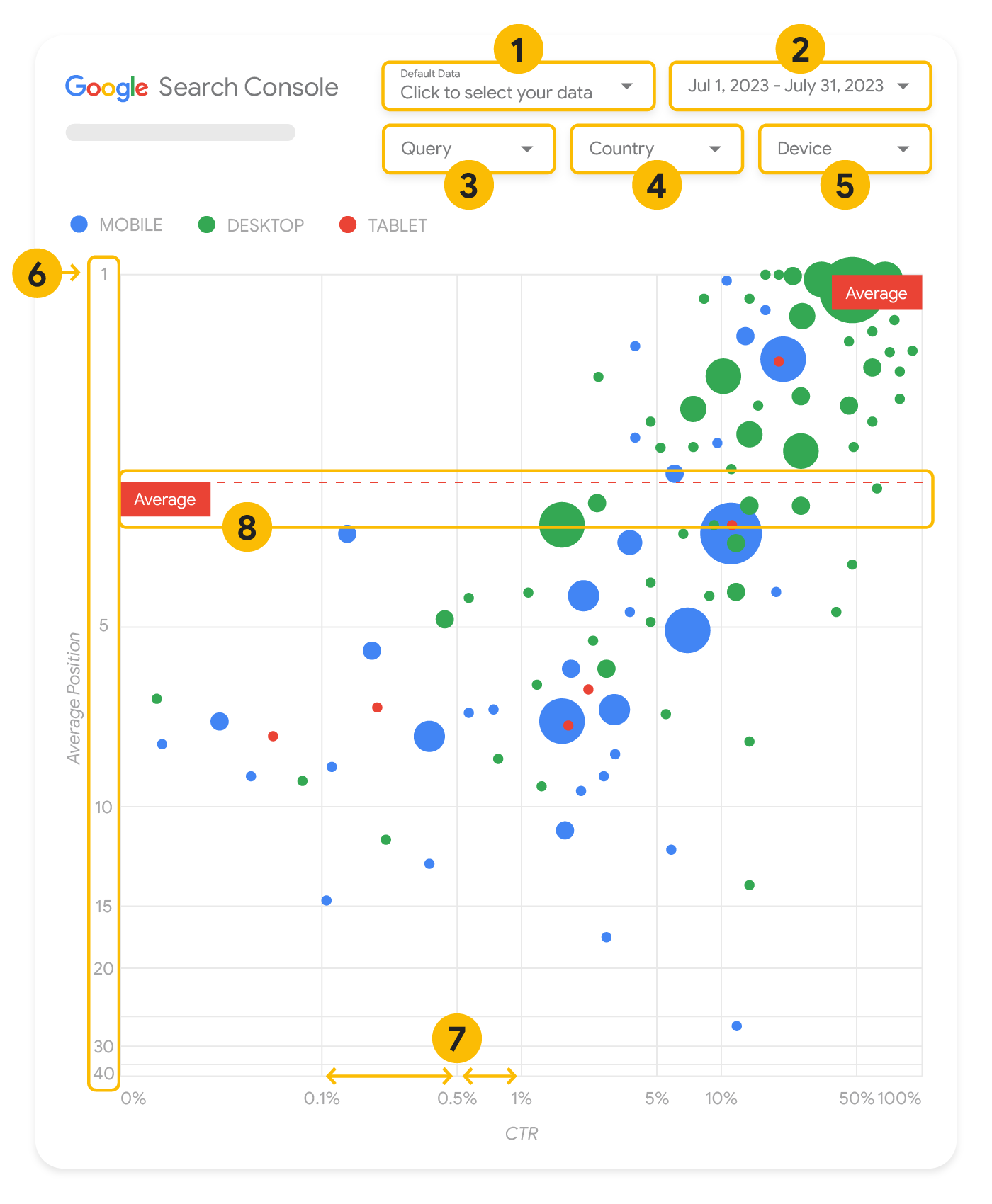
W tej sekcji szczegółowo opisujemy niektóre elementy wykresu, aby wyjaśnić, co przedstawia wykres, a czego nie przedstawia.
Wykres ma 5 opcji dostosowywania, które umożliwiają efektywną kontrolę nad danymi:
Kontrola danych: wybierz usługę w Search Console, którą chcesz przeanalizować.
Zakres dat: wybierz zakres dat, który chcesz zobaczyć w raporcie. Domyślnie: 28 dni.
Zapytanie: uwzględnij lub wyklucz zapytania, na których chcesz się skupić. Możesz filtrować dane podobnie jak w Search Console.
Kraj: uwzględnij lub wyklucz kraje.
Urządzenie: uwzględnij lub wyklucz kategorie urządzeń.
Osie
Osie na wykresie to średnia pozycja (oś Y) i CTR witryny (oś X). Na osiach występują 3 ważne przekształcenia:
Odwróć kierunek osi Y: oś Y pokazuje średnią pozycję, a odwrócenie oznacza, że wartość 1 jest na górze.
W przypadku większości wykresów najlepsza pozycja znajduje się w prawym górnym rogu, więc odwrócenie osi Y podczas wyświetlania średniej pozycji jest bardziej intuicyjne.
Skala logarytmiczna: skala logarytmiczna dla obu osi ułatwia zrozumienie zapytań znajdujących się w ekstremach wykresu (bardzo niski CTR, średnia pozycja lub obie te wartości).
Wiersze referencyjne: bardzo pomagają w wyróżnianiu wartości, które przekraczają określony próg lub są poniżej niego.
Przeanalizowanie średniej, mediany lub określonego percentyla może pomóc w zauważeniu odchyleń od wzorca.
Dymki
Każdy bąbelek na wykresie odpowiada jednemu zapytaniu z następującymi właściwościami stylu:
Rozmiar: korzystając z liczby kliknięć jako rozmiaru bąbelka, możesz szybko sprawdzić, które zapytania kierują większość ruchu – im większy bąbelek, tym więcej ruchu generuje zapytanie.
Kolor: użycie kategorii urządzenia jako koloru bąbelka pomaga przeanalizować różnice między skutecznością wyszukiwania na urządzeniach mobilnych i komputerach. Jako koloru możesz użyć dowolnego wymiaru, ale im większa liczba wartości, tym trudniej rozpoznać wzorce.
Analiza danych
Celem tej wizualizacji jest pomoc w odkrywaniu możliwości optymalizacji zapytań. Wykres przedstawia skuteczność zapytań, gdzie oś Y reprezentuje średnią pozycję, oś X reprezentuje CTR, rozmiar bąbelków oznacza łączną liczbę kliknięć, a kolor bąbelków oznacza kategorię urządzenia.
Czerwone przerywane linie referencyjne średniej pokazują średnią dla każdej osi, dzieląc wykres na ćwiartki – w ten sposób pokazane są 4 typy skuteczności zapytań. Twoje ćwiartki najprawdopodobniej będą wyglądać inaczej niż w tym poście. Będą one zależały od rozkładu zapytań w witrynie.
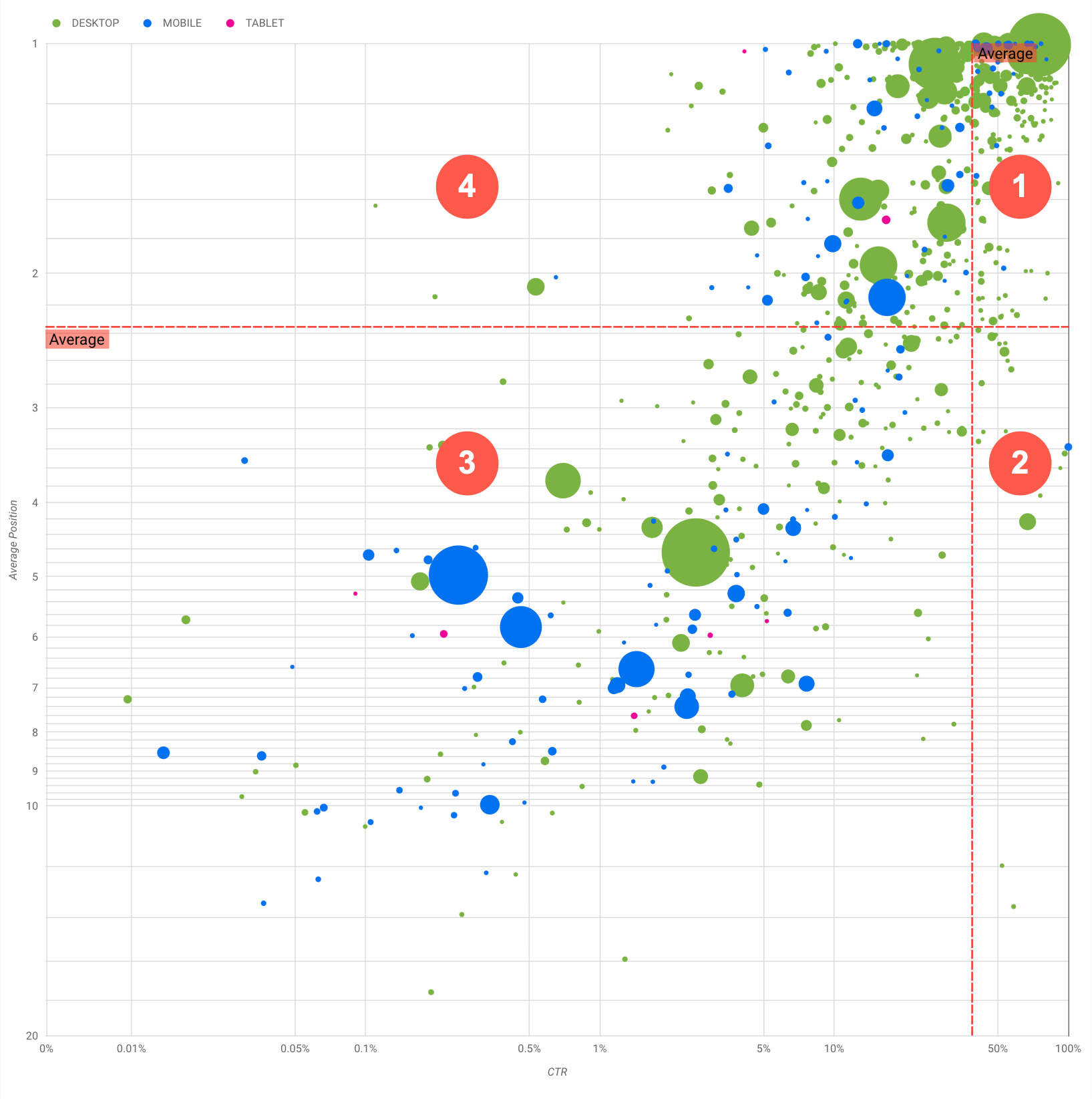
Wykres przedstawia 4 grupy zapytań, które możesz analizować, aby zdecydować, na co poświęcić czas podczas optymalizowania skuteczności w wyszukiwarce Google.
Najwyższa pozycja, wysoki CTR: nie musisz nic robić. Świetnie Ci idzie.
Niska pozycja, wysoki CTR: te zapytania wyglądają na trafne dla użytkowników. Uzyskują wysoki CTR, nawet jeśli mają niższą pozycję w rankingu niż średnia pozycja zapytania w Twojej witrynie. Jeśli średnia pozycja zapytania wzrośnie, może to mieć znaczny wpływ na skuteczność. Skup się na poprawie SEO w przypadku tych zapytań. Na przykład najczęściej wyszukiwanym hasłem w ćwiartce 2 dotyczącej witryny o ogrodnictwie może być „jak zbudować drewnianą szopę”.
Sprawdź, czy masz już stronę na ten temat, i wykonaj 2 czynności:
Jeśli nie masz strony, pomyśl o jej utworzeniu, aby zebrać w 1 miejscu wszystkie informacje ze swojej witryny na dany temat.
Jeśli masz stronę, możesz pomyśleć o dodaniu do niej treści, która lepiej zaspokoi potrzeby użytkowników.
Niska pozycja, niski CTR: w przypadku zapytań o niskim CTR (zarówno na niskiej jak i najwyższej pozycji) szczególnie warto przyjrzeć się rozmiarom bąbelków, aby dowiedzieć się, które zapytania mają niski CTR, ale nadal generują znaczny ruch. Zapytania w tej ćwiartce mogą wydawać się niewarte Twojej pracy, ale można je podzielić na 2 główne grupy:
Podobne zapytania: jeśli zapytanie jest dla Ciebie ważne, dobrze jest, aby pojawiło się ono już w wyszukiwarce. Takie zapytania ustaw jako bardziej priorytetowe niż te, które w ogóle nie pojawiają się w wynikach wyszukiwania, ponieważ będą łatwiejsze w optymalizacji.
Niepowiązane zapytania: jeśli Twoja witryna nie uwzględnia treści związanych z tym zapytaniem, być może warto doprecyzować zawartość witryny lub skupić się na zapytaniach, które przyciągną odpowiedni ruch.
Najwyższa pozycja, niski CTR: te zapytania mogą mieć niski CTR z różnych powodów. Sprawdź największe bąbelki, aby znaleźć oznaki tych przyczyn:
Możliwe, że masz zoptymalizowane zapytanie, którym użytkownicy nie są zainteresowani w powiązaniu z Twoją witryną, albo też pozycja tego zapytania w rankingu jest „przypadkowa”. Jeśli w przypadku Twojej witryny to nie jest problem, możesz zignorować te zapytania. Jeśli nie chcesz, aby użytkownicy mogli Cię znajdować za pomocą tych zapytań (bo na przykład zawierają one obraźliwe słowa), spróbuj usunąć z treści wzmianki, które mogą być uznane za synonimy lub podobne zapytania do tego, które generuje ruch.
Być może użytkownicy znaleźli już potrzebne informacje, np. godziny otwarcia Twojej firmy, jej adres lub numer telefonu. Sprawdź użyte zapytania i adresy URL zawierające te informacje. Jeśli jednym z celów Twojej witryny jest przyciąganie klientów do Twoich sklepów, jest to działanie zgodne z oczekiwaniami. Jeśli uważasz, że użytkownicy powinni odwiedzać Twoją witrynę w poszukiwaniu dodatkowych informacji, możesz spróbować zoptymalizować tytuły i opisy, tak aby było to zrozumiałe. Więcej informacji znajdziesz w następnej sekcji.
Nie wspomnieliśmy o kategoriach urządzeń, ponieważ mogą one posłużyć jako dodatkowe oznaki skuteczności zapytań. Załóżmy na przykład, że niektóre zapytania są bardziej trafne, gdy użytkownicy poruszają się po ulicy, próbując znaleźć lokalizację. W takim przypadku zapytanie może mieć wysoką skuteczność na urządzeniach mobilnych, ale niską skuteczność na komputerze.
Ulepszanie SEO w przypadku konkretnych zapytań
Gdy znajdziesz zapytania, na które warto poświęcić czas i wysiłek, zoptymalizuj lub utwórz strony powiązane z tymi zapytaniami.
Gdy znajdziesz zapytania za pomocą wizualizacji pokazanej na tej stronie, możesz w interfejsie Search Console utworzyć filtr zapytań dla określonych zapytań lub utworzyć tabelę przestawną. za pomocą Looker Studio. W obu przypadkach możesz sprawdzić wszystkie strony, na które ruch jest kierowany po wpisaniu konkretnego zapytania. Gdy znasz już zapytania, które chcesz zoptymalizować, i powiązane z nimi adresy URL, skorzystaj z SEO – przewodnika dla początkujących, aby zoptymalizować treści. Oto kilka porad:
Upewnij się, że elementy title, metatagi opisu i atrybuty alt są opisowe, konkretne i dokładne.
Elementy nagłówka pozwalają wyróżnić ważny tekst i utworzyć hierarchiczną strukturę zawartości. Ułatwi to użytkownikom i wyszukiwarkom poruszanie się po dokumencie.
Zastanów się nad innymi słowami, których może użyć użytkownik, aby coś znaleźć w Twoich materiałach, np. synonimami i podobnymi zapytaniami. Możesz skorzystać z Planera słów kluczowych dostępnego w Google Ads, który pomoże Ci poznać nowe warianty słów kluczowych i zobaczyć przybliżoną liczbę wyszukiwań każdego z nich. Możesz też skorzystać z Trendów Google, aby znaleźć pomysły na podstawie tematów zyskujących popularność i zapytań związanych z Twoją witryną.
[[["Łatwo zrozumieć","easyToUnderstand","thumb-up"],["Rozwiązało to mój problem","solvedMyProblem","thumb-up"],["Inne","otherUp","thumb-up"]],[["Brak potrzebnych mi informacji","missingTheInformationINeed","thumb-down"],["Zbyt skomplikowane / zbyt wiele czynności do wykonania","tooComplicatedTooManySteps","thumb-down"],["Nieaktualne treści","outOfDate","thumb-down"],["Problem z tłumaczeniem","translationIssue","thumb-down"],["Problem z przykładami/kodem","samplesCodeIssue","thumb-down"],["Inne","otherDown","thumb-down"]],["Ostatnia aktualizacja: 2025-08-04 UTC."],[[["\u003cp\u003eVisualize Search Console data with a bubble chart to reveal query optimization opportunities by analyzing click-through rate, average position, and clicks.\u003c/p\u003e\n"],["\u003cp\u003eIdentify high-potential queries by focusing on those with low positions but high click-through rates, indicating relevance and potential for increased traffic with improved ranking.\u003c/p\u003e\n"],["\u003cp\u003eInvestigate queries with low click-through rates and high positions to determine if they are unrelated to your site or require optimization for better user engagement.\u003c/p\u003e\n"],["\u003cp\u003eOptimize content for identified queries by refining titles, meta descriptions, headings, and incorporating relevant keywords to enhance search visibility and user experience.\u003c/p\u003e\n"]]],["A bubble chart visualizes query performance using Search Console data. It displays click-through rate (CTR) on the x-axis, average position on the y-axis, click volume as bubble size, and device category as bubble color. Customization options include data control, date range, query, country, and device filters. Analyzing the quadrants formed by average CTR and position helps identify optimization opportunities. Focus on queries with low position but high CTR, and address top-position, low-CTR queries by improving content or structured data.\n"],null,["# How to Create a Search Console Bubble Chart | Google Search Central\n\nImproving SEO with a Search Console bubble chart\n================================================\n\n\nAnalyzing Search performance data is always a challenge, but even more so when you have plenty of\nlong-tail queries, which are harder to visualize and understand. A\n[bubble chart](https://support.google.com/datastudio/answer/7207785)\ncan help you understand which queries are performing well for your site, and which could be improved.\n\n\nIf you'd like to test the techniques discussed here, you can\n[connect your data to Looker Studio](https://datastudio.google.com/reporting/1e5b5f6a-38d7-4547-a54b-69594681a09b/page/xFbeC/preview) and play with the chart settings. \n\n\nIf you haven't read [connecting Search Console to Looker Studio](/search/blog/2022/03/connecting-data-studio) and\n[monitoring Search traffic with Looker Studio](/search/blog/2022/03/monitoring-dashboard),\nconsider checking them out to understand more about what you can do with Search Console in Looker\nStudio.\n\nUnderstanding the chart\n-----------------------\n\n\nA bubble chart is a great visualization when you have multiple metrics and dimensions because it\nlets you to see relationships and patterns in your\ndata more effectively. In the example shown here, you can see\n[click-through rate](https://support.google.com/webmasters/answer/7576553#choosingmetrics)\n(CTR), average position, and clicks for the query and device dimensions in one view.\n\n\nThis section goes into detail on some of the chart elements to clarify what the chart shows, and what it doesn't.\n\n### Data source\n\n\nThe bubble chart shown in this page uses the Site Impression table available through the\n[Search Console data source](https://support.google.com/datastudio/answer/7314895),\nwhich includes [Search performance data](https://support.google.com/webmasters/answer/7576553)\naggregated by site and queries.\n\n### Filters and data controls\n\n\nThere are five customization options in the chart to help you control your data effectively:\n\n1. **[Data control](https://support.google.com/datastudio/answer/7415591)**: Choose the Search Console property you'd like to analyze.\n2. **Date range**: Choose the date range you'd like to see in the report; by default you'll see the last 28 days.\n3. **Query** : Include or exclude queries to focus on. You can [filter your data](/search/blog/2021/06/regex-negative-match) similar to how you do it in Search Console.\n4. **Country**: Include or exclude countries.\n5. **Device**: Include or exclude device categories.\n\n### Axes\n\n\nThe axes in the chart are average position (y-axis) and site CTR (x-axis). There are three\nsignificant transformations in the axes:\n\n6. **Reverse y-axis direction**: Since the y-axis shows average position, inverting it means that 1 is at the top. For most charts, the best position is in the top right corner, so it is more intuitive to invert the y-axis when using it to display average position.\n7. **Log scale** : Using a [logarithmic scale](https://en.wikipedia.org/wiki/Logarithmic_scale) for both axes lets you to have a better understanding of queries that are in the extremities of the chart (very low CTR, average position, or both).\n8. **[Reference lines](https://support.google.com/datastudio/answer/9921462)**: The reference line is very helpful to highlight values that are above or below a certain threshold. Looking at the average, median, or a certain percentile can call attention to deviations from the pattern.\n\n### Bubbles\n\n\nEach bubble in the chart represents a single query, with the following\n[style properties](https://support.google.com/datastudio/answer/7207785#style-properties):\n\n- **Size**: Using the number of clicks as the bubble size helps you see in a glance which queries are driving the bulk of the traffic---the larger the bubble the more traffic the query generates.\n- **Color**: Using the device category as the bubble color helps you understand the differences between mobile and desktop Search performance. You can use any dimension as the color, but as the number of values increases, the harder it is to recognize patterns.\n\nAnalyzing the data\n------------------\n\n\nThe goal of this visualization is to help surface query optimization opportunities. The chart\nshows query performance, where the y-axis represents average position, the x-axis represents CTR\nthe bubble size represents total number of clicks, and the bubble color represents\ndevice category.\n\n\nThe red Average dashed reference lines show the average for each of the axes, which split the chart\ninto quadrants, showing four types of query performance. Your quadrants are likely to look\ndifferent than the one shared in this post; they'll depend on how your site queries\nare distributed.\n\n\nThe chart shows four groups of queries, which you can analyze to help you decide where to invest\nyour time when optimizing your Google Search performance.\n\n1. **Top position, high CTR**: There's not much you need to do for those; you're doing a great job already.\n2. **Low position, high CTR** : Those queries seem relevant to users; the queries get a high CTR even when ranking lower than the average query on your website. If the query average position moves up, it could have a significant impact on your performance---focus on improving SEO for these queries. For example, a top query in quadrant 2 for a gardening website could be \"how to build a wooden shed.\" Check if you have a page about this already, and proceed in two ways:\n - If you don't have a page, consider creating one to centralize all the info you have in the website about the subject.\n - If you do have a page, consider adding content to better address that user need.\n3. **Low position, low CTR** : When looking at queries with low CTR (both with low and top position), it's especially interesting to look at the bubble sizes to understand which queries have a low CTR but are still driving significant traffic. While the queries in this quadrant might seem unworthy of your effort, they can be divided into two main groups:\n - **Related queries**: If the query in question is important to you, it's a good start to have it appearing in Search already. Prioritize these queries over queries that are not appearing in Search results at all, as they'll be easier to optimize.\n - **Unrelated queries**: If your site doesn't cover content related to this query, maybe it's a good opportunity to fine tune your content or focus on queries that will bring relevant traffic.\n4. **Top position, low CTR** : Those queries might have a low CTR for various reasons. Check the largest bubbles to find signs of the following:\n - Your competitors may have [structured data markup](/search/docs/appearance/search-result-features) and are showing up with rich results, which might attract users to click their results instead of yours. Consider optimizing for the most common [visual elements in Google Search](/search/docs/appearance/visual-elements-gallery).\n - You may have optimized, or be \"accidentally\" ranking, for a query that users are not interested in relation to your site. This might not be an issue for you, in which case you can ignore those queries. If you prefer people not to find you through those queries (for example, they contain offensive words), try to fine-tune your content to remove mentions that could be seen as synonyms or related queries to the one bringing traffic.\n - People may have already found the information they needed, for example your company's opening hours, address, or phone number. Check the queries that were used and the URLs that contained the information. If one of your website goals is to drive people to your stores, this is working as intended; if you believe that people should visit your website for extra information, you could try to optimize your titles and description to make that clear. See next section for more details.\n\n\nWe haven't mentioned the device categories because they can be used as additional signs of query\nperformance. For example, suppose some queries are more relevant when people are navigating in the\nstreet, trying to find a location; in that case, the query might have a high performance\non mobile devices, but a low performance on desktop.\n\nImproving SEO for specific queries\n----------------------------------\n\n\nOnce you find queries that are worth the time and effort, make sure to optimize or create pages\nrelated to those queries.\n\n\nAfter you find the queries using the visualization shown in this page, you can\n[create a query filter](https://support.google.com/webmasters/answer/7576553#filteringdata)\nfor specific queries using the Search Console user interface, or create a\n[pivot table](https://support.google.com/looker-studio/answer/7516660)\nusing Looker Studio; in both ways, you can check all the pages that are receiving\ntraffic for a specific query. After you know the queries you want to optimize and their related\nURLs, use the [SEO starter guide](/search/docs/fundamentals/seo-starter-guide)\nto optimize your content. Here are some tips:\n\n- Ensure that your [title](/search/docs/appearance/title-link#page-titles) elements, [description meta tags](/search/docs/appearance/snippet#meta-descriptions), and alt attributes are descriptive, specific, and accurate.\n- Use heading elements to emphasize important text and help create a hierarchical structure for your content, making it easier for users and search engines to navigate through your document.\n- Think about other words that a user might search for to find a piece of your content, for example, synonyms and related queries. You can use the [Keyword Planner](https://ads.google.com/home/tools/keyword-planner/) provided by Google Ads to help you discover new keyword variations and see the approximate search volume for each keyword. You can also [use Google Trends](/search/docs/monitor-debug/google-trends) to find ideas from rising topics and queries related to your website."]]