Mantieni tutto organizzato con le raccolte
Salva e classifica i contenuti in base alle tue preferenze.
Migliorare la SEO con un grafico a bolle di Search Console
Analizzare i dati sul rendimento nella Ricerca è sempre una sfida, ma lo è in particolar modo se hai molte query long-tail, che sono più difficili da visualizzare e comprendere. Un grafico a bolle
può aiutarti a capire quali query hanno un buon rendimento per il tuo sito e quali potrebbero essere migliorate.
Un grafico a bolle è un'ottima visualizzazione quando hai più metriche e dimensioni perché ti consente di individuare relazioni e pattern nei dati in modo più efficace. Nell'esempio riportato di seguito, puoi vedere in un'unica visualizzazione la
percentuale di clic (CTR), la posizione media e i clic per la query e le dimensioni del dispositivo.
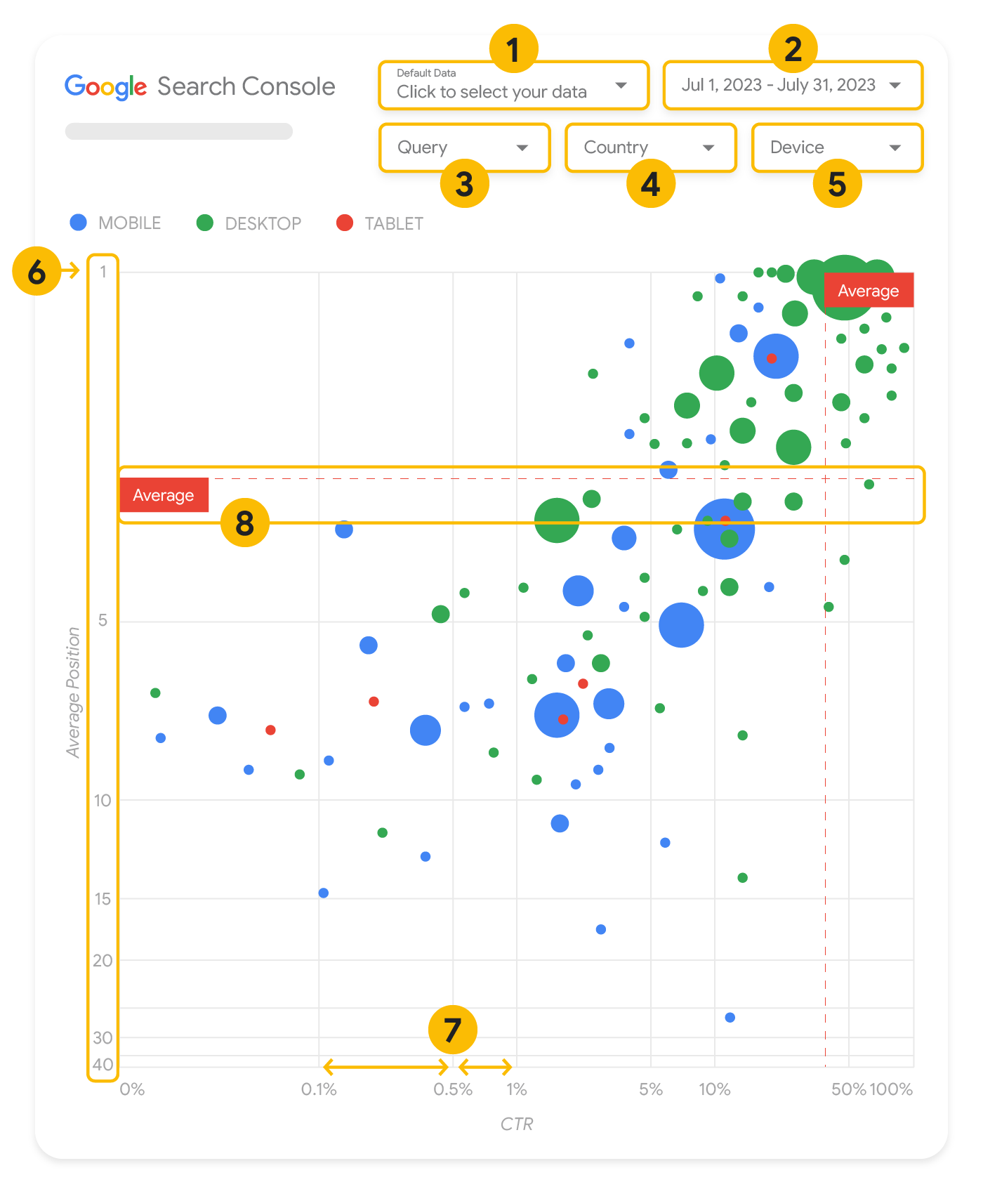
Questa sezione analizza nel dettaglio alcuni elementi del grafico per chiarire cosa viene e cosa non viene mostrato.
Il grafico offre cinque opzioni di personalizzazione per aiutarti a controllare i dati in modo efficace:
Controllo dei dati: scegli la proprietà di Search Console che vuoi analizzare.
Intervallo di date: scegli l'intervallo di date da visualizzare nel report; per impostazione predefinita, vengono mostrati gli ultimi 28 giorni.
Query: includi o escludi le query a seconda delle esigenze. Puoi filtrare i dati
in modo simile a come faresti in Search Console.
Paese: includi o escludi determinati paesi.
Dispositivo: includete o escludete categorie di dispositivi.
Assi
Gli assi nel grafico sono la posizione media (asse Y) e il CTR del sito (asse X). Esistono tre
trasformazioni significative negli assi:
Inverti direzione asse Y: poiché l'asse Y mostra la posizione media, l'inversione fa sì che l'1 sia in alto.
Per la maggior parte dei grafici, la posizione migliore è nell'angolo in alto a destra, in modo che sia più intuitivo invertire l'asse Y quando viene utilizzato per visualizzare la posizione media.
Scala logaritmica: l'uso di una scala logaritmica per entrambi gli assi ti consente di comprendere meglio le query che si trovano alle estremità del grafico (CTR molto basso, posizione media o entrambe).
Linee di riferimento: la linea di riferimento è molto utile per evidenziare valori superiori o inferiori a una determinata soglia.
Osservando la media, la mediana o un determinato percentile è possibile richiamare l'attenzione sulle deviazioni dal pattern.
Bolle
Ogni bolla del grafico rappresenta una singola query con le seguenti proprietà di stile:
Dimensioni: l'utilizzo del numero di clic come dimensione della bolla ti consente di vedere a colpo d'occhio quali query generano la maggior parte del traffico; più è grande la bolla, maggiore è il traffico generato dalla query.
Colore: l'uso della categoria del dispositivo come colore della bolla ti aiuta a comprendere le differenze di rendimento nella Ricerca da dispositivi mobili e computer. Puoi utilizzare qualsiasi dimensione come colore ma, man mano che aumenta il numero di valori, è più difficile riconoscere i pattern.
Analizzare i dati
L'obiettivo di questa visualizzazione è aiutare a mostrare le opportunità di ottimizzazione delle query. Il grafico mostra le prestazioni delle query, dove l'asse Y rappresenta la posizione media, l'asse X il CTR, mentre la dimensione delle bolle rappresenta il numero totale di clic e il colore delle bolle rappresenta la categoria del dispositivo.
Le linee di riferimento tratteggiate rosse mostrano la media di ciascuno degli assi, che divide il grafico in quadranti, mostrando quattro tipi di prestazioni delle query. È probabile che i tuoi quadranti abbiano un aspetto diverso da quello condiviso in questo post; dipende da come vengono distribuite le query del sito.
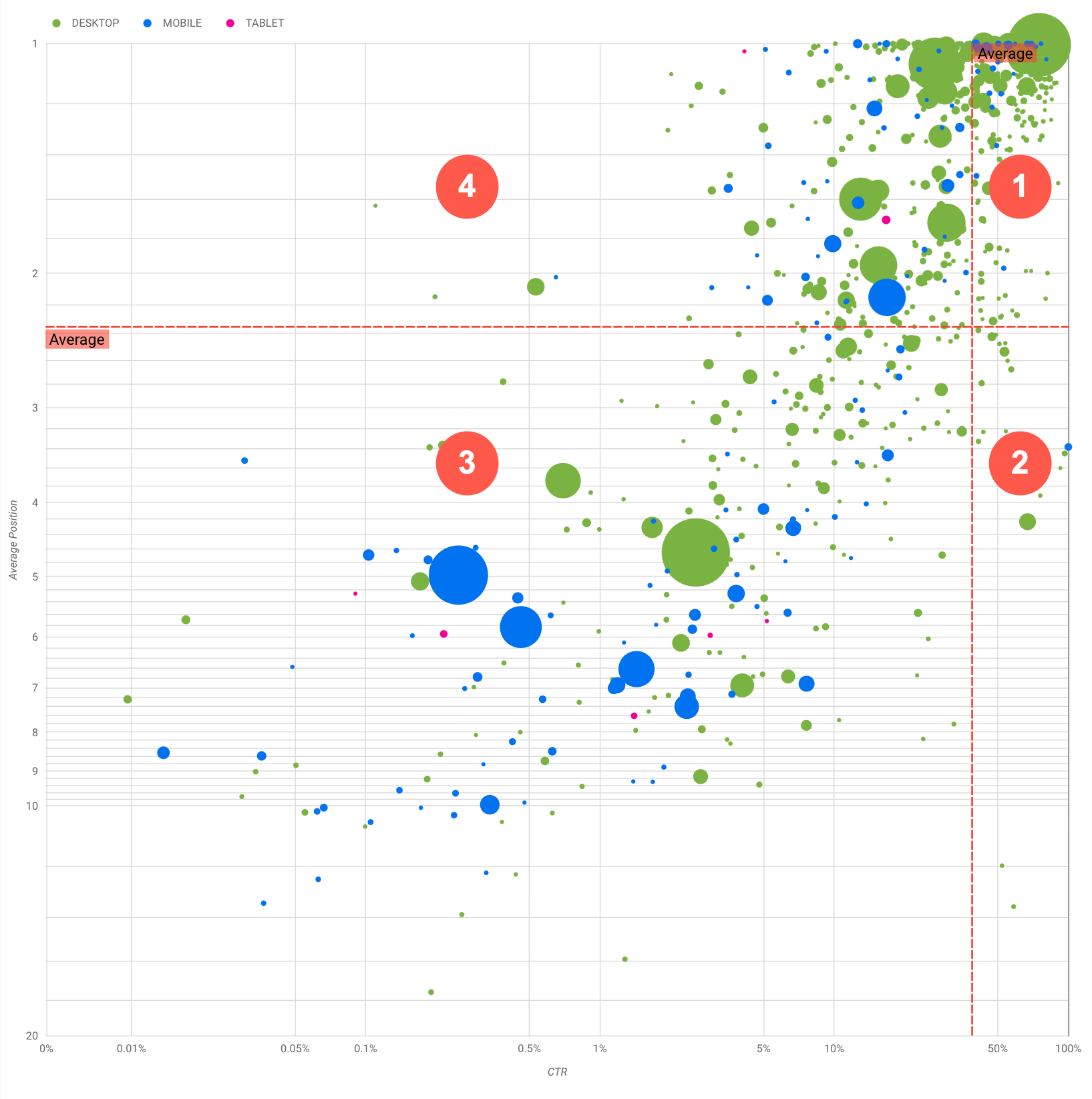
Il grafico mostra quattro gruppi di query che puoi analizzare per decidere su cosa concentrarti per ottimizzare il rendimento nella Ricerca Google.
Posizione alta, CTR elevato: non c'è molto da fare per queste query, stai già facendo un ottimo lavoro.
Posizione bassa, CTR elevato: le query sembrano pertinenti per gli utenti; ottengono un CTR elevato anche con un ranking inferiore alla query media sul tuo sito web. Se la posizione media delle query sale, potrebbe influire molto sul tuo rendimento; concentrati sul miglioramento della SEO per queste query. Ad esempio, una delle query principali nel quadrante 2 per un sito web di giardinaggio potrebbe essere "come costruire una casetta di legno".
Verifica se hai già una pagina in merito e procedi in due modi:
Se non hai già una relativa pagina, potresti crearne una per centralizzare tutte le informazioni presenti sul sito web sull'argomento.
Se ne hai già una, valuta la possibilità di aggiungere contenuti per soddisfare meglio le esigenze degli utenti.
Posizione bassa, CTR basso: quando esamini le query con un CTR basso (sia con posizione bassa che alta), è particolarmente interessante esaminare le dimensioni delle bolle per capire quali query hanno un CTR basso, ma generano comunque un traffico significativo. Anche se potrebbe sembrare inutile impegnarsi per le query in questo quadrante, possono essere divise in due gruppi principali:
Query correlate: se la query in questione è importante per te, per prima cosa dovrebbe già comparire nella Ricerca. Dai la priorità a queste query anziché a quelle che non vengono mostrate nei risultati della Ricerca, dato che saranno più facili da ottimizzare.
Query non correlate: se il tuo sito non tratta contenuti correlati a questa query, forse è una buona opportunità per ottimizzare i tuoi contenuti o concentrarti su query che genereranno traffico pertinente.
Posizione bassa, CTR basso: queste query potrebbero avere un CTR basso per vari motivi. Controlla le
bolle più grandi per rilevare i seguenti segnali:
I tuoi concorrenti potrebbero avere un markup dei dati strutturati e vengono mostrati con risultati avanzati, il che potrebbe portare gli utenti a fare clic sui loro risultati anziché sui tuoi. Valuta la possibilità di eseguire l'ottimizzazione per i più comuni
elementi visivi della Ricerca Google.
Potresti aver ottimizzato (oppure il ranking è stato accidentalmente ottimizzato) per una query che non interessa gli utenti in relazione al tuo sito. Questo potrebbe non essere un problema per te, nel qual caso puoi ignorare quelle query. Se preferisci che le persone non ti trovino tramite queste query (ad esempio, perché contengono parole offensive), prova a ottimizzare i tuoi contenuti rimuovendo le menzioni che potrebbero essere viste come sinonimi o query correlate a quella che genera il traffico.
Le persone potrebbero aver già trovato le informazioni di cui avevano bisogno, ad esempio l'orario di apertura, l'indirizzo o il numero di telefono della tua azienda. Controlla le query utilizzate e gli URL che contenevano le informazioni. Se uno degli obiettivi del tuo sito web è attirare le persone nei tuoi negozi, si tratta di un comportamento previsto; se ritieni che le persone debbano visitare il tuo sito web per ottenere ulteriori informazioni, puoi provare a ottimizzare i titoli e la descrizione per rendere chiaro questo obiettivo. Per ulteriori dettagli, consulta la sezione successiva.
Non abbiamo menzionato le categorie di dispositivo perché possono essere utilizzate come ulteriori indicatori delle prestazioni delle query. Ad esempio, supponiamo che alcune query siano più pertinenti quando le persone sono per strada, mentre cercano una località; in questo caso, la query potrebbe avere prestazioni elevate
sui dispositivi mobili, ma basse sui computer.
Migliorare la SEO per query specifiche
Una volta individuate query utili per cui valga la pena investire tempo e risorse, assicurati di ottimizzare o creare pagine correlate a esse.
Dopo aver trovato le query utilizzando la visualizzazione mostrata in questa pagina, puoi
creare un filtro query per query specifiche usando l'interfaccia utente di Search Console oppure creare una
tabella pivot con Looker Studio; in entrambi i modi, puoi controllare tutte le pagine che ricevono traffico per una query specifica. Dopo aver individuato le query da ottimizzare e i relativi URL correlati, utilizza la
Guida introduttiva alla SEO per ottimizzare i contenuti. Ecco alcuni suggerimenti:
Assicurati che gli elementi title, i
meta tag description e gli attributi ALT siano descrittivi, specifici e precisi.
Utilizza gli elementi di intestazione per mettere in evidenza il testo importante e contribuire a creare una struttura gerarchica per i contenuti, facilitando agli utenti e ai motori di ricerca la navigazione all'interno del documento.
Pensa ad altre parole che un utente potrebbe cercare per trovare uno dei tuoi contenuti, ad esempio sinonimi e query correlate. Puoi utilizzare lo Strumento di pianificazione delle parole chiave fornito da Google Ads per scoprire nuove varianti di parole chiave e conoscere il volume di ricerca approssimativo per ognuna di queste. Puoi anche usare Google Trends per trovare idee da query o argomenti in crescita correlati al tuo sito web.
[[["Facile da capire","easyToUnderstand","thumb-up"],["Il problema è stato risolto","solvedMyProblem","thumb-up"],["Altra","otherUp","thumb-up"]],[["Mancano le informazioni di cui ho bisogno","missingTheInformationINeed","thumb-down"],["Troppo complicato/troppi passaggi","tooComplicatedTooManySteps","thumb-down"],["Obsoleti","outOfDate","thumb-down"],["Problema di traduzione","translationIssue","thumb-down"],["Problema relativo a esempi/codice","samplesCodeIssue","thumb-down"],["Altra","otherDown","thumb-down"]],["Ultimo aggiornamento 2025-08-04 UTC."],[[["\u003cp\u003eVisualize Search Console data with a bubble chart to reveal query optimization opportunities by analyzing click-through rate, average position, and clicks.\u003c/p\u003e\n"],["\u003cp\u003eIdentify high-potential queries by focusing on those with low positions but high click-through rates, indicating relevance and potential for increased traffic with improved ranking.\u003c/p\u003e\n"],["\u003cp\u003eInvestigate queries with low click-through rates and high positions to determine if they are unrelated to your site or require optimization for better user engagement.\u003c/p\u003e\n"],["\u003cp\u003eOptimize content for identified queries by refining titles, meta descriptions, headings, and incorporating relevant keywords to enhance search visibility and user experience.\u003c/p\u003e\n"]]],["A bubble chart visualizes query performance using Search Console data. It displays click-through rate (CTR) on the x-axis, average position on the y-axis, click volume as bubble size, and device category as bubble color. Customization options include data control, date range, query, country, and device filters. Analyzing the quadrants formed by average CTR and position helps identify optimization opportunities. Focus on queries with low position but high CTR, and address top-position, low-CTR queries by improving content or structured data.\n"],null,["# How to Create a Search Console Bubble Chart | Google Search Central\n\nImproving SEO with a Search Console bubble chart\n================================================\n\n\nAnalyzing Search performance data is always a challenge, but even more so when you have plenty of\nlong-tail queries, which are harder to visualize and understand. A\n[bubble chart](https://support.google.com/datastudio/answer/7207785)\ncan help you understand which queries are performing well for your site, and which could be improved.\n\n\nIf you'd like to test the techniques discussed here, you can\n[connect your data to Looker Studio](https://datastudio.google.com/reporting/1e5b5f6a-38d7-4547-a54b-69594681a09b/page/xFbeC/preview) and play with the chart settings. \n\n\nIf you haven't read [connecting Search Console to Looker Studio](/search/blog/2022/03/connecting-data-studio) and\n[monitoring Search traffic with Looker Studio](/search/blog/2022/03/monitoring-dashboard),\nconsider checking them out to understand more about what you can do with Search Console in Looker\nStudio.\n\nUnderstanding the chart\n-----------------------\n\n\nA bubble chart is a great visualization when you have multiple metrics and dimensions because it\nlets you to see relationships and patterns in your\ndata more effectively. In the example shown here, you can see\n[click-through rate](https://support.google.com/webmasters/answer/7576553#choosingmetrics)\n(CTR), average position, and clicks for the query and device dimensions in one view.\n\n\nThis section goes into detail on some of the chart elements to clarify what the chart shows, and what it doesn't.\n\n### Data source\n\n\nThe bubble chart shown in this page uses the Site Impression table available through the\n[Search Console data source](https://support.google.com/datastudio/answer/7314895),\nwhich includes [Search performance data](https://support.google.com/webmasters/answer/7576553)\naggregated by site and queries.\n\n### Filters and data controls\n\n\nThere are five customization options in the chart to help you control your data effectively:\n\n1. **[Data control](https://support.google.com/datastudio/answer/7415591)**: Choose the Search Console property you'd like to analyze.\n2. **Date range**: Choose the date range you'd like to see in the report; by default you'll see the last 28 days.\n3. **Query** : Include or exclude queries to focus on. You can [filter your data](/search/blog/2021/06/regex-negative-match) similar to how you do it in Search Console.\n4. **Country**: Include or exclude countries.\n5. **Device**: Include or exclude device categories.\n\n### Axes\n\n\nThe axes in the chart are average position (y-axis) and site CTR (x-axis). There are three\nsignificant transformations in the axes:\n\n6. **Reverse y-axis direction**: Since the y-axis shows average position, inverting it means that 1 is at the top. For most charts, the best position is in the top right corner, so it is more intuitive to invert the y-axis when using it to display average position.\n7. **Log scale** : Using a [logarithmic scale](https://en.wikipedia.org/wiki/Logarithmic_scale) for both axes lets you to have a better understanding of queries that are in the extremities of the chart (very low CTR, average position, or both).\n8. **[Reference lines](https://support.google.com/datastudio/answer/9921462)**: The reference line is very helpful to highlight values that are above or below a certain threshold. Looking at the average, median, or a certain percentile can call attention to deviations from the pattern.\n\n### Bubbles\n\n\nEach bubble in the chart represents a single query, with the following\n[style properties](https://support.google.com/datastudio/answer/7207785#style-properties):\n\n- **Size**: Using the number of clicks as the bubble size helps you see in a glance which queries are driving the bulk of the traffic---the larger the bubble the more traffic the query generates.\n- **Color**: Using the device category as the bubble color helps you understand the differences between mobile and desktop Search performance. You can use any dimension as the color, but as the number of values increases, the harder it is to recognize patterns.\n\nAnalyzing the data\n------------------\n\n\nThe goal of this visualization is to help surface query optimization opportunities. The chart\nshows query performance, where the y-axis represents average position, the x-axis represents CTR\nthe bubble size represents total number of clicks, and the bubble color represents\ndevice category.\n\n\nThe red Average dashed reference lines show the average for each of the axes, which split the chart\ninto quadrants, showing four types of query performance. Your quadrants are likely to look\ndifferent than the one shared in this post; they'll depend on how your site queries\nare distributed.\n\n\nThe chart shows four groups of queries, which you can analyze to help you decide where to invest\nyour time when optimizing your Google Search performance.\n\n1. **Top position, high CTR**: There's not much you need to do for those; you're doing a great job already.\n2. **Low position, high CTR** : Those queries seem relevant to users; the queries get a high CTR even when ranking lower than the average query on your website. If the query average position moves up, it could have a significant impact on your performance---focus on improving SEO for these queries. For example, a top query in quadrant 2 for a gardening website could be \"how to build a wooden shed.\" Check if you have a page about this already, and proceed in two ways:\n - If you don't have a page, consider creating one to centralize all the info you have in the website about the subject.\n - If you do have a page, consider adding content to better address that user need.\n3. **Low position, low CTR** : When looking at queries with low CTR (both with low and top position), it's especially interesting to look at the bubble sizes to understand which queries have a low CTR but are still driving significant traffic. While the queries in this quadrant might seem unworthy of your effort, they can be divided into two main groups:\n - **Related queries**: If the query in question is important to you, it's a good start to have it appearing in Search already. Prioritize these queries over queries that are not appearing in Search results at all, as they'll be easier to optimize.\n - **Unrelated queries**: If your site doesn't cover content related to this query, maybe it's a good opportunity to fine tune your content or focus on queries that will bring relevant traffic.\n4. **Top position, low CTR** : Those queries might have a low CTR for various reasons. Check the largest bubbles to find signs of the following:\n - Your competitors may have [structured data markup](/search/docs/appearance/search-result-features) and are showing up with rich results, which might attract users to click their results instead of yours. Consider optimizing for the most common [visual elements in Google Search](/search/docs/appearance/visual-elements-gallery).\n - You may have optimized, or be \"accidentally\" ranking, for a query that users are not interested in relation to your site. This might not be an issue for you, in which case you can ignore those queries. If you prefer people not to find you through those queries (for example, they contain offensive words), try to fine-tune your content to remove mentions that could be seen as synonyms or related queries to the one bringing traffic.\n - People may have already found the information they needed, for example your company's opening hours, address, or phone number. Check the queries that were used and the URLs that contained the information. If one of your website goals is to drive people to your stores, this is working as intended; if you believe that people should visit your website for extra information, you could try to optimize your titles and description to make that clear. See next section for more details.\n\n\nWe haven't mentioned the device categories because they can be used as additional signs of query\nperformance. For example, suppose some queries are more relevant when people are navigating in the\nstreet, trying to find a location; in that case, the query might have a high performance\non mobile devices, but a low performance on desktop.\n\nImproving SEO for specific queries\n----------------------------------\n\n\nOnce you find queries that are worth the time and effort, make sure to optimize or create pages\nrelated to those queries.\n\n\nAfter you find the queries using the visualization shown in this page, you can\n[create a query filter](https://support.google.com/webmasters/answer/7576553#filteringdata)\nfor specific queries using the Search Console user interface, or create a\n[pivot table](https://support.google.com/looker-studio/answer/7516660)\nusing Looker Studio; in both ways, you can check all the pages that are receiving\ntraffic for a specific query. After you know the queries you want to optimize and their related\nURLs, use the [SEO starter guide](/search/docs/fundamentals/seo-starter-guide)\nto optimize your content. Here are some tips:\n\n- Ensure that your [title](/search/docs/appearance/title-link#page-titles) elements, [description meta tags](/search/docs/appearance/snippet#meta-descriptions), and alt attributes are descriptive, specific, and accurate.\n- Use heading elements to emphasize important text and help create a hierarchical structure for your content, making it easier for users and search engines to navigate through your document.\n- Think about other words that a user might search for to find a piece of your content, for example, synonyms and related queries. You can use the [Keyword Planner](https://ads.google.com/home/tools/keyword-planner/) provided by Google Ads to help you discover new keyword variations and see the approximate search volume for each keyword. You can also [use Google Trends](/search/docs/monitor-debug/google-trends) to find ideas from rising topics and queries related to your website."]]