Tetap teratur dengan koleksi
Simpan dan kategorikan konten berdasarkan preferensi Anda.
Meningkatkan SEO dengan diagram balon Search Console
Menganalisis data performa Penelusuran akan selalu menjadi tantangan, apalagi jika Anda memiliki banyak kueri longtail,
yang lebih sulit untuk divisualisasikan dan dipahami. Diagram balon
dapat membantu Anda
memahami kueri mana yang berperforma baik untuk situs Anda, dan mana yang dapat ditingkatkan.
Diagram balon adalah visualisasi yang baik jika Anda memiliki beberapa metrik dan dimensi karena
diagram ini memungkinkan Anda melihat hubungan dan pola dalam
data secara lebih efektif. Pada contoh yang ditampilkan di sini, Anda dapat melihat
rasio klik-tayang
(CTR), posisi rata-rata, dan klik untuk dimensi kueri dan perangkat dalam satu tampilan.
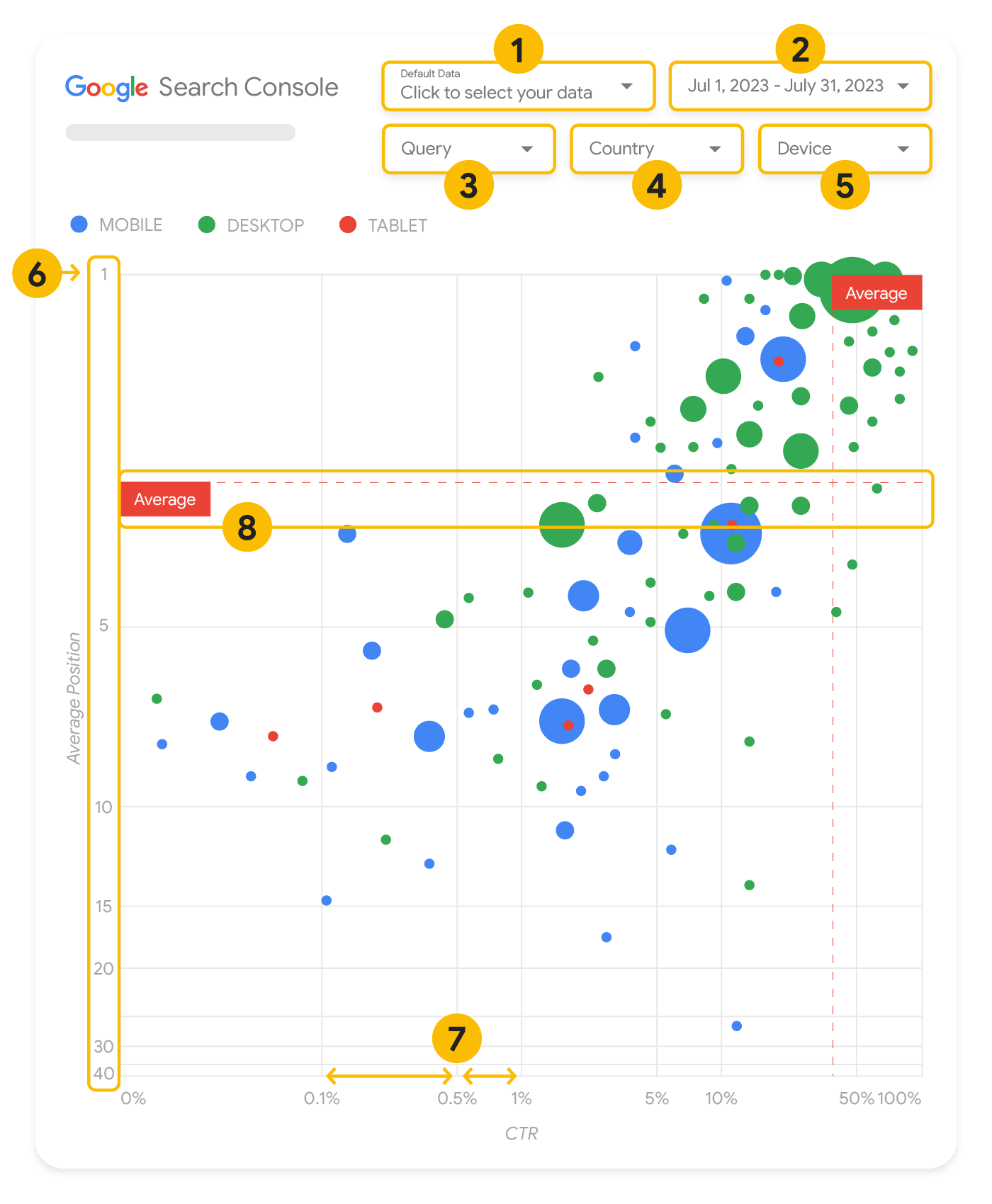
Bagian ini menjelaskan secara mendetail beberapa elemen diagram untuk memperjelas apa yang ditampilkan dalam diagram dan yang tidak.
Sumber data
Diagram balon yang ditampilkan di halaman ini menggunakan tabel Tayangan Situs yang tersedia melalui
sumber data Search Console.
Sumber data tersebut mencakup data performa Penelusuran
yang digabungkan berdasarkan situs dan kueri.
Filter dan kontrol data
Ada lima opsi penyesuaian dalam diagram untuk membantu Anda mengontrol data secara efektif:
Kontrol data:
Memilih properti Search Console yang ingin dianalisis.
Rentang tanggal: Memilih rentang tanggal yang ingin dilihat dalam laporan; secara default, Anda akan
melihat rentang tanggal 28 hari terakhir.
Kueri: Menyertakan atau mengecualikan kueri yang ingin dijadikan fokus. Anda dapat memfilter data
dengan cara yang sama seperti di Search Console.
Negara: Menyertakan atau mengecualikan negara.
Perangkat: Menyertakan atau mengecualikan kategori perangkat.
Sumbu
Sumbu pada diagram terdiri dari posisi rata-rata (sumbu y) dan CTR situs (sumbu x). Ada tiga transformasi
yang signifikan pada sumbu-sumbunya:
Pembalikan arah sumbu y: Karena sumbu y menunjukkan posisi rata-rata,
nilai 1 akan berada di atas jika sumbu ini dibalik.
Bagi sebagian besar diagram, posisi terbaik berada di sudut kanan atas, sehingga lebih intuitif untuk membalikkan
sumbu y saat menggunakannya untuk menampilkan posisi rata-rata.
Skala log: Menggunakan skala logaritmik
untuk kedua sumbu memungkinkan Anda lebih memahami kueri yang berada di ujung diagram
(posisi rata-rata, CTR yang sangat rendah, atau keduanya).
Garis referensi:
Garis referensi sangat berguna untuk menandai nilai yang berada di atas atau di bawah batas tertentu.
Dengan melihat rata-rata, median, atau persentil tertentu, Anda dapat memperhatikan deviasi dari
polanya.
Balon
Setiap balon dalam diagram mewakili satu kueri, dengan
properti gaya berikut:
Ukuran: Menggunakan ukuran balon untuk mewakili jumlah klik akan membantu Anda melihat sekilas kueri mana
yang mendorong banyak traffic—semakin besar balon, semakin banyak traffic yang
dihasilkan kueri.
Warna: Menggunakan warna balon untuk mewakili kategori perangkat akan membantu Anda memahami perbedaan
antara performa Penelusuran di perangkat seluler dan desktop. Anda dapat menggunakan dimensi apa pun sebagai warna, tetapi seiring
dengan bertambahnya jumlah nilai, maka semakin sulit untuk mengenali polanya.
Menganalisis data
Tujuan visualisasi ini adalah untuk membantu memunculkan peluang pengoptimalan kueri. Diagram
menunjukkan performa kueri, dengan sumbu y mewakili posisi rata-rata, sumbu x mewakili CTR,
ukuran balon mewakili jumlah total klik, dan warna balon mewakili
kategori perangkat.
Garis referensi Rata-Rata berwarna merah dan putus-putus menunjukkan rata-rata untuk setiap sumbu. Garis ini membagi
diagram menjadi kuadran, yang menunjukkan empat jenis performa kueri. Kuadran Anda mungkin terlihat
berbeda dari yang dibagikan di postingan ini; tergantung pada bagaimana kueri situs Anda
didistribusikan.
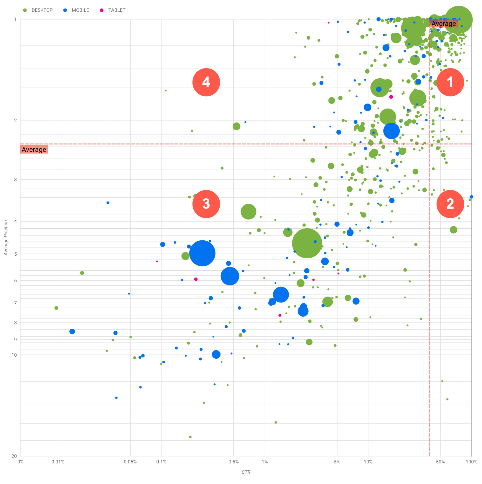
Diagram ini menampilkan empat grup kueri, yang dapat Anda analisis guna membantu memutuskan grup mana yang harus
menjadi fokus utama Anda saat mengoptimalkan performa Google Penelusuran.
Posisi teratas, CTR tinggi: Anda tidak perlu melakukan banyak hal; Anda sudah melakukannya
dengan baik.
Posisi rendah, CTR tinggi: Kueri tersebut tampak relevan bagi pengguna; kueri ini mendapatkan CTR
tinggi meskipun peringkatnya lebih rendah
daripada kueri rata-rata di situs Anda. Jika posisi rata-rata kueri naik, hal ini dapat berdampak
signifikan pada performa Anda—berfokuslah pada peningkatan SEO untuk kueri ini. Misalnya,
kueri terpopuler di kuadran 2 untuk situs berkebun bisa berupa "cara membangun gudang kayu".
Periksa apakah Anda sudah memiliki halaman tentang hal ini dan lanjutkan dengan dua cara:
Jika Anda tidak memiliki halaman, sebaiknya buat terlebih dahulu guna memusatkan semua info yang Anda
miliki di situs tentang subjek tersebut.
Jika Anda memiliki halaman, sebaiknya tambahkan konten agar dapat memenuhi kebutuhan pengguna dengan lebih baik.
Posisi rendah, CTR rendah: Saat memperhatikan kueri dengan CTR rendah (baik dengan posisi rendah maupun posisi teratas), sebaiknya perhatikan ukuran balon guna memahami kueri mana
yang memiliki CTR rendah tetapi masih mendorong traffic yang signifikan. Meskipun kueri di
kuadran ini mungkin tidak sepadan dengan upaya Anda, kueri tersebut dapat dibagi menjadi dua grup utama:
Kueri terkait: Jika kueri yang dimaksud penting bagi Anda, sebaiknya tampilkan
di Penelusuran. Prioritaskan kueri ini daripada kueri yang tidak muncul sama sekali di
hasil Penelusuran, karena kueri ini akan lebih mudah dioptimalkan.
Kueri yang tidak terkait: Jika situs Anda tidak mencakup konten yang terkait dengan kueri ini, mungkin ini adalah peluang yang tepat untuk
menyesuaikan konten Anda atau berfokus pada kueri yang akan menghasilkan traffic yang relevan.
Posisi teratas, CTR rendah: Kueri tersebut mungkin memiliki CTR rendah karena berbagai alasan. Periksa
balon terbesar untuk menemukan tanda-tanda berikut:
Anda mungkin telah melakukan pengoptimalan, atau secara "tidak sengaja" menentukan peringkat, untuk kueri yang tidak diminati
pengguna terkait situs Anda. Hal ini mungkin tidak menjadi masalah bagi Anda, dan Anda dapat mengabaikan
kueri tersebut. Jika tidak ingin orang lain menemukan Anda melalui kueri tersebut (misalnya, kueri berisi
kata-kata yang menyinggung), coba sesuaikan konten Anda dengan menghapus sebutan yang dapat dianggap sebagai
sinonim atau kueri terkait yang dapat mendorong traffic.
Orang lain mungkin telah menemukan informasi yang diperlukan, misalnya
jam buka, alamat, atau nomor telepon perusahaan Anda. Periksa kueri yang digunakan dan URL yang berisi
informasi tersebut. Jika salah satu sasaran situs Anda adalah untuk mendorong orang ke toko Anda, hal ini berjalan sebagaimana
mestinya; jika Anda yakin bahwa orang lain harus mengunjungi situs Anda untuk mendapatkan informasi tambahan, Anda dapat
mencoba mengoptimalkan judul dan deskripsi untuk memperjelasnya. Lihat bagian berikutnya untuk mengetahui detail lebih lanjut.
Kami belum menyebutkan kategori perangkat karena kategori tersebut dapat digunakan sebagai indikator tambahan
dari performa kueri. Misalnya, anggaplah beberapa kueri lebih relevan saat pengguna bernavigasi di
jalan, dan mencoba menemukan lokasi; dalam hal ini, kueri tersebut mungkin memiliki performa tinggi
di perangkat seluler, tetapi berperforma rendah di desktop.
Meningkatkan SEO untuk kueri tertentu
Setelah menemukan kueri yang sepadan dengan waktu dan usaha Anda, pastikan untuk mengoptimalkan atau membuat halaman
yang terkait dengan kueri tersebut.
Setelah menemukan kueri menggunakan visualisasi yang ditampilkan di halaman ini, Anda dapat
membuat filter kueri
untuk kueri tertentu menggunakan antarmuka pengguna Search Console, atau membuat
tabel pivot
menggunakan Looker Studio. Dengan kedua cara ini, Anda dapat memeriksa semua halaman yang menerima
traffic untuk kueri tertentu. Setelah mengetahui kueri yang ingin dioptimalkan dan URL yang terkait dengannya,
gunakan panduan memulai SEO
untuk mengoptimalkan konten Anda. Berikut beberapa tips yang bisa dilakukan:
Pastikan elemen judul,
tag meta deskripsi, dan atribut
alt Anda deskriptif, spesifik, dan akurat.
Gunakan elemen judul untuk menekankan teks penting dan membuat struktur hierarkis untuk
konten Anda, sehingga memudahkan pengguna dan mesin telusur menjelajahi dokumen Anda.
Pikirkan kata lain yang mungkin ditelusuri pengguna untuk menemukan bagian konten Anda,
misalnya, sinonim dan kueri terkait. Gunakan
Keyword Planner yang disediakan oleh Google Ads untuk membantu
Anda menemukan variasi kata kunci baru dan melihat perkiraan volume
penelusuran untuk setiap kata kunci. Anda juga dapat
menggunakan Google Trends untuk menemukan ide
dari topik serta kueri yang sedang populer yang terkait dengan situs Anda.
[[["Mudah dipahami","easyToUnderstand","thumb-up"],["Memecahkan masalah saya","solvedMyProblem","thumb-up"],["Lainnya","otherUp","thumb-up"]],[["Informasi yang saya butuhkan tidak ada","missingTheInformationINeed","thumb-down"],["Terlalu rumit/langkahnya terlalu banyak","tooComplicatedTooManySteps","thumb-down"],["Sudah usang","outOfDate","thumb-down"],["Masalah terjemahan","translationIssue","thumb-down"],["Masalah kode / contoh","samplesCodeIssue","thumb-down"],["Lainnya","otherDown","thumb-down"]],["Terakhir diperbarui pada 2025-08-04 UTC."],[[["\u003cp\u003eVisualize Search Console data with a bubble chart to reveal query optimization opportunities by analyzing click-through rate, average position, and clicks.\u003c/p\u003e\n"],["\u003cp\u003eIdentify high-potential queries by focusing on those with low positions but high click-through rates, indicating relevance and potential for increased traffic with improved ranking.\u003c/p\u003e\n"],["\u003cp\u003eInvestigate queries with low click-through rates and high positions to determine if they are unrelated to your site or require optimization for better user engagement.\u003c/p\u003e\n"],["\u003cp\u003eOptimize content for identified queries by refining titles, meta descriptions, headings, and incorporating relevant keywords to enhance search visibility and user experience.\u003c/p\u003e\n"]]],["A bubble chart visualizes query performance using Search Console data. It displays click-through rate (CTR) on the x-axis, average position on the y-axis, click volume as bubble size, and device category as bubble color. Customization options include data control, date range, query, country, and device filters. Analyzing the quadrants formed by average CTR and position helps identify optimization opportunities. Focus on queries with low position but high CTR, and address top-position, low-CTR queries by improving content or structured data.\n"],null,["# How to Create a Search Console Bubble Chart | Google Search Central\n\nImproving SEO with a Search Console bubble chart\n================================================\n\n\nAnalyzing Search performance data is always a challenge, but even more so when you have plenty of\nlong-tail queries, which are harder to visualize and understand. A\n[bubble chart](https://support.google.com/datastudio/answer/7207785)\ncan help you understand which queries are performing well for your site, and which could be improved.\n\n\nIf you'd like to test the techniques discussed here, you can\n[connect your data to Looker Studio](https://datastudio.google.com/reporting/1e5b5f6a-38d7-4547-a54b-69594681a09b/page/xFbeC/preview) and play with the chart settings. \n\n\nIf you haven't read [connecting Search Console to Looker Studio](/search/blog/2022/03/connecting-data-studio) and\n[monitoring Search traffic with Looker Studio](/search/blog/2022/03/monitoring-dashboard),\nconsider checking them out to understand more about what you can do with Search Console in Looker\nStudio.\n\nUnderstanding the chart\n-----------------------\n\n\nA bubble chart is a great visualization when you have multiple metrics and dimensions because it\nlets you to see relationships and patterns in your\ndata more effectively. In the example shown here, you can see\n[click-through rate](https://support.google.com/webmasters/answer/7576553#choosingmetrics)\n(CTR), average position, and clicks for the query and device dimensions in one view.\n\n\nThis section goes into detail on some of the chart elements to clarify what the chart shows, and what it doesn't.\n\n### Data source\n\n\nThe bubble chart shown in this page uses the Site Impression table available through the\n[Search Console data source](https://support.google.com/datastudio/answer/7314895),\nwhich includes [Search performance data](https://support.google.com/webmasters/answer/7576553)\naggregated by site and queries.\n\n### Filters and data controls\n\n\nThere are five customization options in the chart to help you control your data effectively:\n\n1. **[Data control](https://support.google.com/datastudio/answer/7415591)**: Choose the Search Console property you'd like to analyze.\n2. **Date range**: Choose the date range you'd like to see in the report; by default you'll see the last 28 days.\n3. **Query** : Include or exclude queries to focus on. You can [filter your data](/search/blog/2021/06/regex-negative-match) similar to how you do it in Search Console.\n4. **Country**: Include or exclude countries.\n5. **Device**: Include or exclude device categories.\n\n### Axes\n\n\nThe axes in the chart are average position (y-axis) and site CTR (x-axis). There are three\nsignificant transformations in the axes:\n\n6. **Reverse y-axis direction**: Since the y-axis shows average position, inverting it means that 1 is at the top. For most charts, the best position is in the top right corner, so it is more intuitive to invert the y-axis when using it to display average position.\n7. **Log scale** : Using a [logarithmic scale](https://en.wikipedia.org/wiki/Logarithmic_scale) for both axes lets you to have a better understanding of queries that are in the extremities of the chart (very low CTR, average position, or both).\n8. **[Reference lines](https://support.google.com/datastudio/answer/9921462)**: The reference line is very helpful to highlight values that are above or below a certain threshold. Looking at the average, median, or a certain percentile can call attention to deviations from the pattern.\n\n### Bubbles\n\n\nEach bubble in the chart represents a single query, with the following\n[style properties](https://support.google.com/datastudio/answer/7207785#style-properties):\n\n- **Size**: Using the number of clicks as the bubble size helps you see in a glance which queries are driving the bulk of the traffic---the larger the bubble the more traffic the query generates.\n- **Color**: Using the device category as the bubble color helps you understand the differences between mobile and desktop Search performance. You can use any dimension as the color, but as the number of values increases, the harder it is to recognize patterns.\n\nAnalyzing the data\n------------------\n\n\nThe goal of this visualization is to help surface query optimization opportunities. The chart\nshows query performance, where the y-axis represents average position, the x-axis represents CTR\nthe bubble size represents total number of clicks, and the bubble color represents\ndevice category.\n\n\nThe red Average dashed reference lines show the average for each of the axes, which split the chart\ninto quadrants, showing four types of query performance. Your quadrants are likely to look\ndifferent than the one shared in this post; they'll depend on how your site queries\nare distributed.\n\n\nThe chart shows four groups of queries, which you can analyze to help you decide where to invest\nyour time when optimizing your Google Search performance.\n\n1. **Top position, high CTR**: There's not much you need to do for those; you're doing a great job already.\n2. **Low position, high CTR** : Those queries seem relevant to users; the queries get a high CTR even when ranking lower than the average query on your website. If the query average position moves up, it could have a significant impact on your performance---focus on improving SEO for these queries. For example, a top query in quadrant 2 for a gardening website could be \"how to build a wooden shed.\" Check if you have a page about this already, and proceed in two ways:\n - If you don't have a page, consider creating one to centralize all the info you have in the website about the subject.\n - If you do have a page, consider adding content to better address that user need.\n3. **Low position, low CTR** : When looking at queries with low CTR (both with low and top position), it's especially interesting to look at the bubble sizes to understand which queries have a low CTR but are still driving significant traffic. While the queries in this quadrant might seem unworthy of your effort, they can be divided into two main groups:\n - **Related queries**: If the query in question is important to you, it's a good start to have it appearing in Search already. Prioritize these queries over queries that are not appearing in Search results at all, as they'll be easier to optimize.\n - **Unrelated queries**: If your site doesn't cover content related to this query, maybe it's a good opportunity to fine tune your content or focus on queries that will bring relevant traffic.\n4. **Top position, low CTR** : Those queries might have a low CTR for various reasons. Check the largest bubbles to find signs of the following:\n - Your competitors may have [structured data markup](/search/docs/appearance/search-result-features) and are showing up with rich results, which might attract users to click their results instead of yours. Consider optimizing for the most common [visual elements in Google Search](/search/docs/appearance/visual-elements-gallery).\n - You may have optimized, or be \"accidentally\" ranking, for a query that users are not interested in relation to your site. This might not be an issue for you, in which case you can ignore those queries. If you prefer people not to find you through those queries (for example, they contain offensive words), try to fine-tune your content to remove mentions that could be seen as synonyms or related queries to the one bringing traffic.\n - People may have already found the information they needed, for example your company's opening hours, address, or phone number. Check the queries that were used and the URLs that contained the information. If one of your website goals is to drive people to your stores, this is working as intended; if you believe that people should visit your website for extra information, you could try to optimize your titles and description to make that clear. See next section for more details.\n\n\nWe haven't mentioned the device categories because they can be used as additional signs of query\nperformance. For example, suppose some queries are more relevant when people are navigating in the\nstreet, trying to find a location; in that case, the query might have a high performance\non mobile devices, but a low performance on desktop.\n\nImproving SEO for specific queries\n----------------------------------\n\n\nOnce you find queries that are worth the time and effort, make sure to optimize or create pages\nrelated to those queries.\n\n\nAfter you find the queries using the visualization shown in this page, you can\n[create a query filter](https://support.google.com/webmasters/answer/7576553#filteringdata)\nfor specific queries using the Search Console user interface, or create a\n[pivot table](https://support.google.com/looker-studio/answer/7516660)\nusing Looker Studio; in both ways, you can check all the pages that are receiving\ntraffic for a specific query. After you know the queries you want to optimize and their related\nURLs, use the [SEO starter guide](/search/docs/fundamentals/seo-starter-guide)\nto optimize your content. Here are some tips:\n\n- Ensure that your [title](/search/docs/appearance/title-link#page-titles) elements, [description meta tags](/search/docs/appearance/snippet#meta-descriptions), and alt attributes are descriptive, specific, and accurate.\n- Use heading elements to emphasize important text and help create a hierarchical structure for your content, making it easier for users and search engines to navigate through your document.\n- Think about other words that a user might search for to find a piece of your content, for example, synonyms and related queries. You can use the [Keyword Planner](https://ads.google.com/home/tools/keyword-planner/) provided by Google Ads to help you discover new keyword variations and see the approximate search volume for each keyword. You can also [use Google Trends](/search/docs/monitor-debug/google-trends) to find ideas from rising topics and queries related to your website."]]