您可以通过 MediaSummary 和 MediaEffects 类查看媒体效应的可视化图表。每个类都有不同的图表来显示每个渠道的媒体指标。因此,您可以创建标准 HTML 输出中没有的自定义图表。例如,您可以绘制特定渠道、更改或删除可信区间、添加 Adstock 衰减,以及添加 Hill 饱和度曲线。
在 MediaSummary 类下,您可以绘制以下图表:
在 MediaEffects 类下,您可以绘制以下曲线:
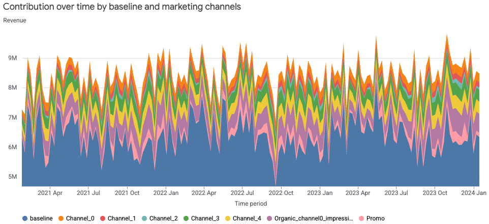
贡献面积图
贡献面积图以堆叠面积的形式显示各个营销渠道对总结果(收入或 KPI)的贡献随时间的变化。在特定时间点,每个彩色条带的高度表示相应渠道的贡献。某一时间点所有条带的总高度表示总结果。条带厚度随时间变化的情况表明渠道贡献的变化趋势。
运行以下命令可绘制渠道贡献面积图:
media_summary.plot_channel_contribution_area_chart()
输出示例:
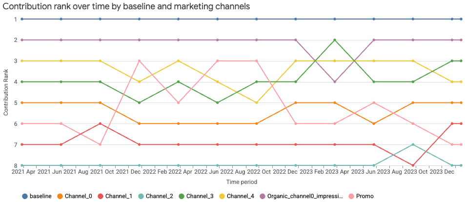
贡献排名变化图
贡献排名变化图根据增量结果显示各渠道(含基准)的贡献在一段时间内的相对排名变化。每条线代表一个渠道,其在给定时间点的垂直位置表示其排名。排名第 1 表示贡献最大。上升线表示排名提升,下降线表示排名下降,交叉线突出显示了各个渠道之间的相对表现变化。排名可每周显示一次或在每个季度末显示。
运行以下命令可绘制渠道贡献排名变化图:
media_summary.plot_channel_contribution_bump_chart()
输出示例:
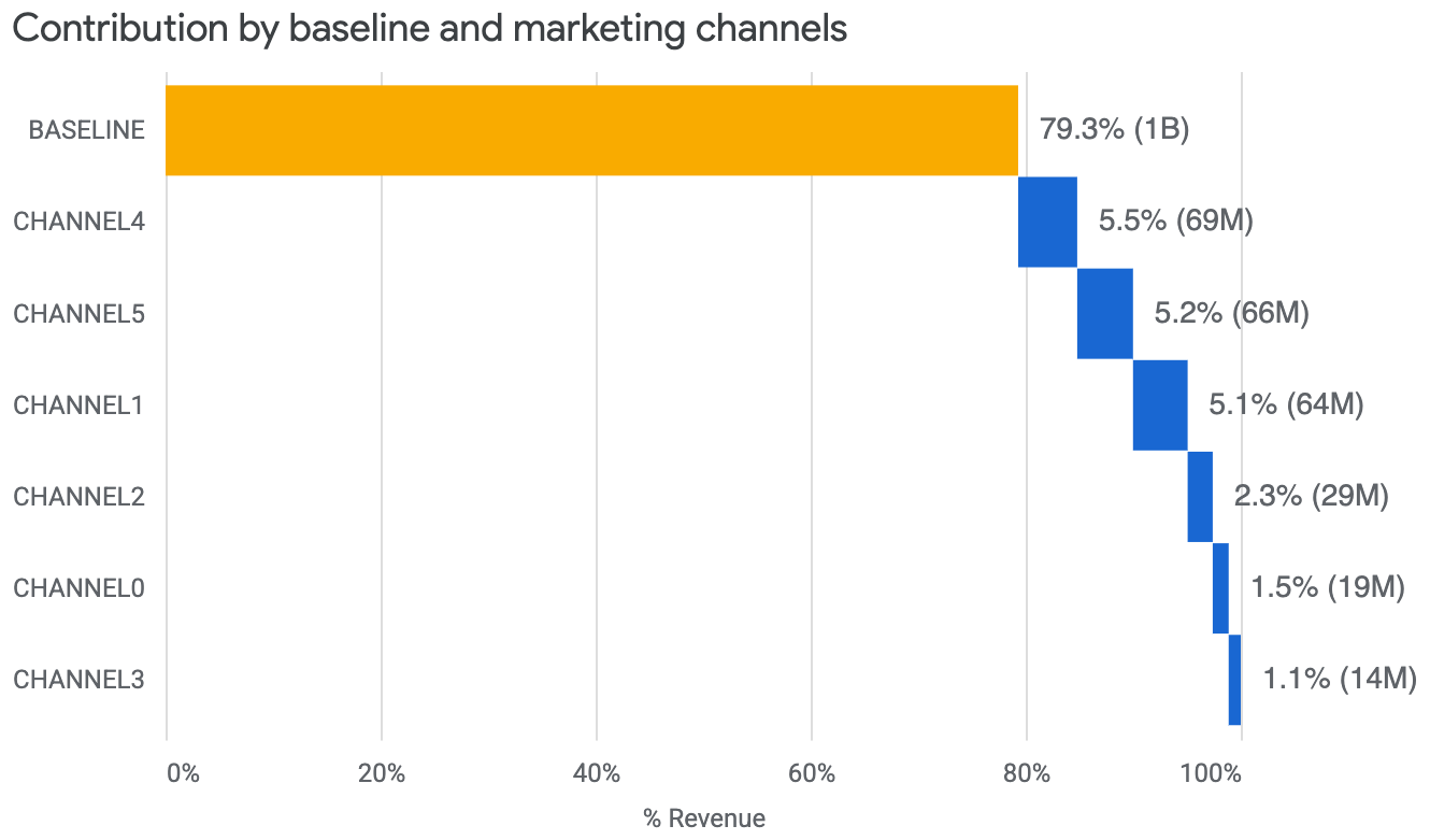
贡献瀑布图
贡献瀑布图向用户展示了每个渠道对总增量收入或 KPI 的贡献。基准显示的是没有任何媒体效应时的收入或 KPI。
运行以下命令可绘制贡献瀑布图:
media_summary.plot_contribution_waterfall_chart()
输出示例:
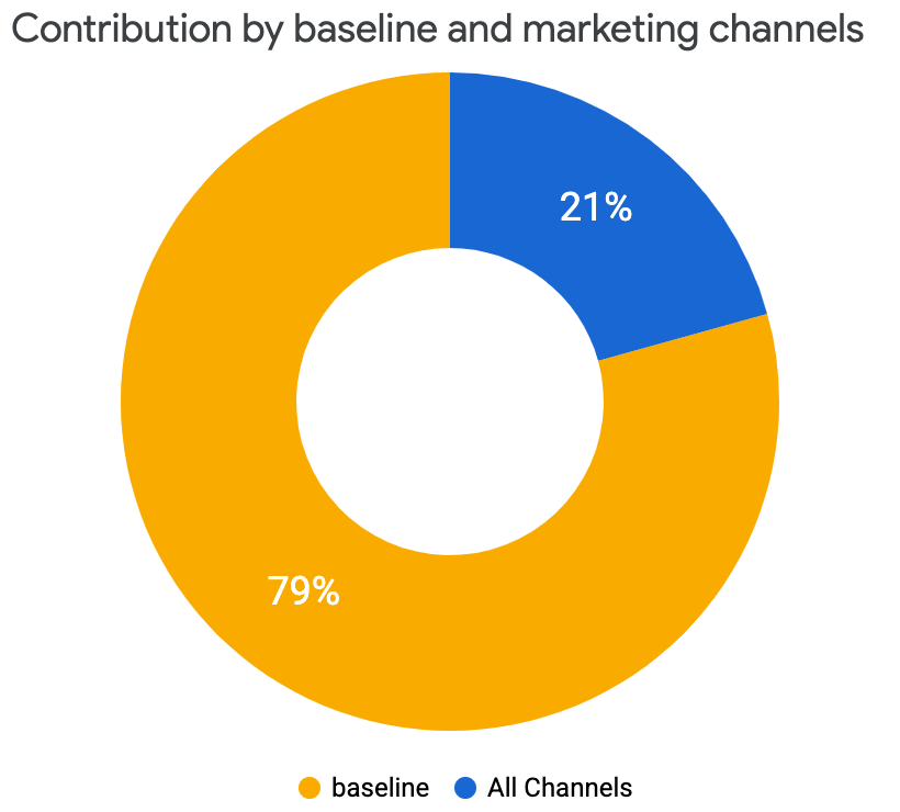
贡献饼图
您可以查看所有渠道带来的增量收入或 KPI 贡献的饼图,并将其与没有任何媒体效应时的基准进行比较。
运行以下命令可绘制贡献饼图:
media_summary.plot_contribution_pie_chart()
输出示例:
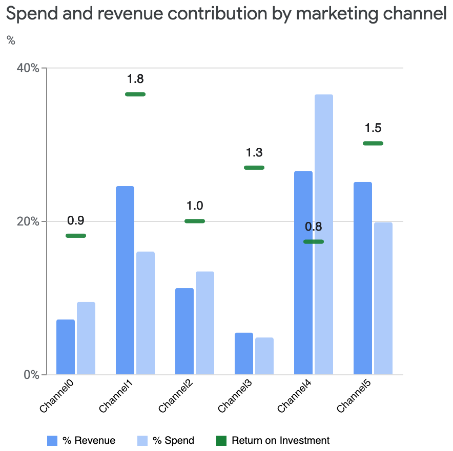
支出与贡献对比图
支出与贡献对比图比较了不同渠道间的支出与增量收入或 KPI 比例。这一可视化图表显示了各渠道所用的媒体支出百分比,以及各渠道对总增量收入或 KPI 的贡献百分比。100% 的收入(或 KPI)是媒体带来的总增量收入(或 KPI),不包括基准。最后,绿条突出显示了每个渠道的投资回报率 (ROI)。
运行以下命令可绘制支出与贡献对比图:
media_summary.plot_spend_vs_contribution()
输出示例:
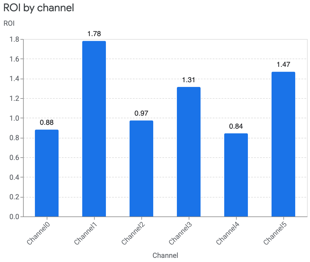
各渠道的投资回报率图
比较不同渠道的投资回报率 (ROI) 有助于了解每个渠道的支出对收入的影响。投资回报率是指单位支出带来的收入。此图显示了可信区间。
运行以下命令可绘制各渠道的投资回报率图:
media_summary.plot_roi_bar_chart()输出示例:
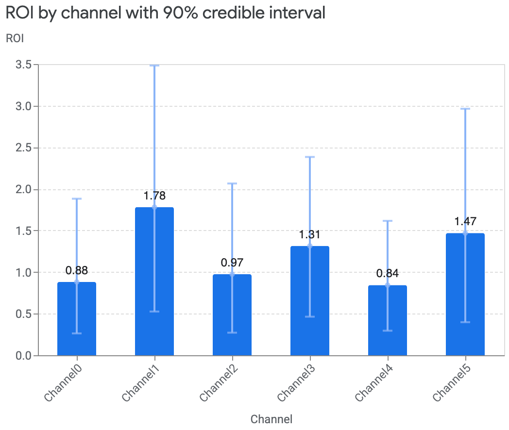
您还可以移除可信区间 (
ci),或将其更新为其他可信区间。以下示例展示了如何移除可信区间:
media_summary.plot_roi_bar_chart(include_ci=False)输出示例:
如果您的数据包含货币单位值未知的非收入型 KPI,您可以改为比较单位增量 KPI 的费用 (CPIK)。
运行以下命令可绘制各渠道的 CPIK 图:
media_summary.plot_cpik()
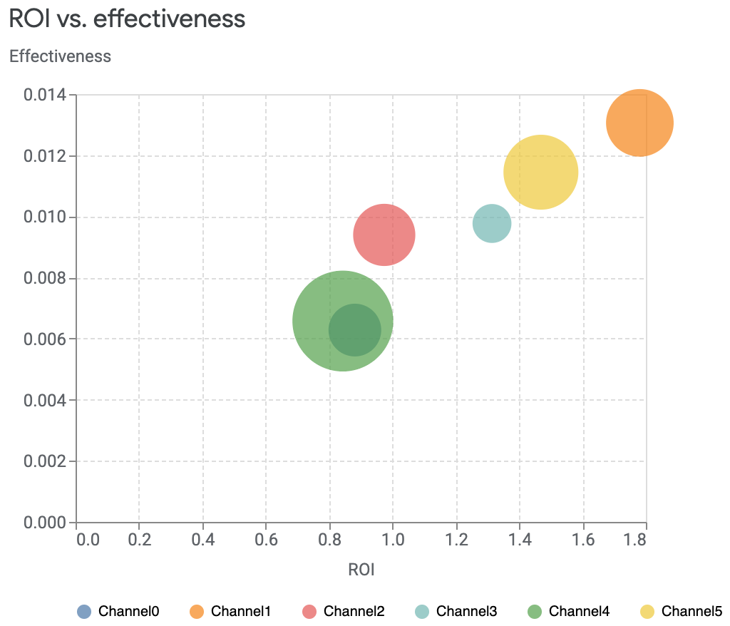
投资回报率与效果对比图
您可以绘制投资回报率 (ROI) 与效果对比图,比较每个渠道的投资回报率与效果。效果是根据每个媒体单位获得的增量收入来衡量的。在此图中,每个渠道的规模与支出水平相对应。圆圈越大,说明渠道支出越多。
运行以下命令可绘制投资回报率与效果对比图:
media_summary.plot_roi_vs_effectiveness()输出示例:
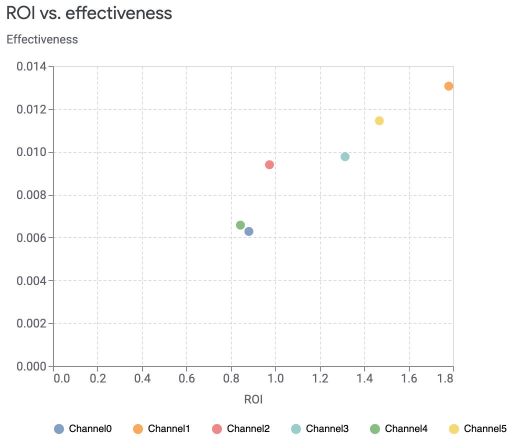
您还可以自定义要比较的渠道,也可以选择绘制没有大小差异的图表。
运行以下命令可停用大小差异:
media_summary.plot_roi_vs_effectiveness(disable_size=True)输出示例:
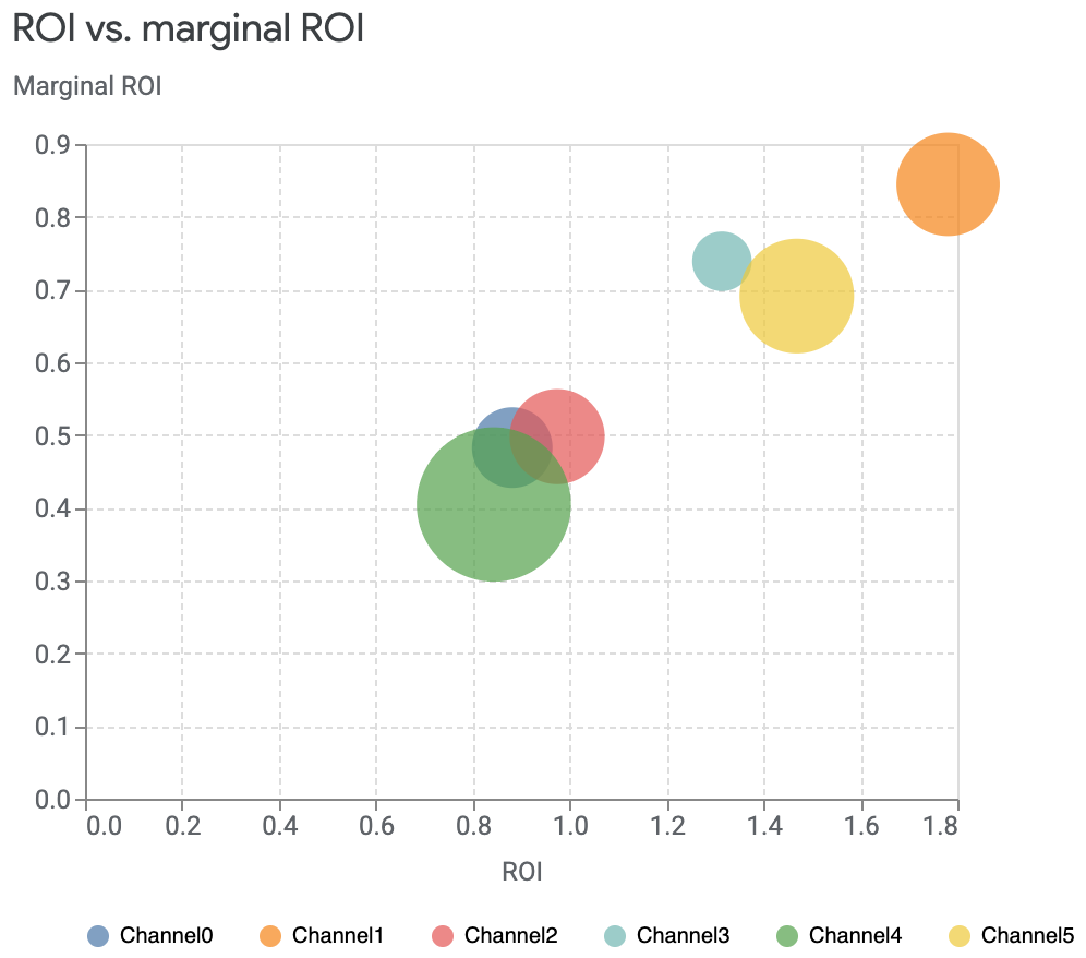
投资回报率与边际投资回报率对比图
您可以将投资回报率 (ROI) 与边际投资回报率 (mROI) 进行比较,其中边际投资回报率是指额外支出单位费用所带来的投资回报。圆圈的大小与相应渠道的支出金额相对应。支出越多,圆圈就越大。
运行以下命令可绘制投资回报率与边际投资回报率对比图:
media_summary.plot_roi_vs_mroi()输出示例:
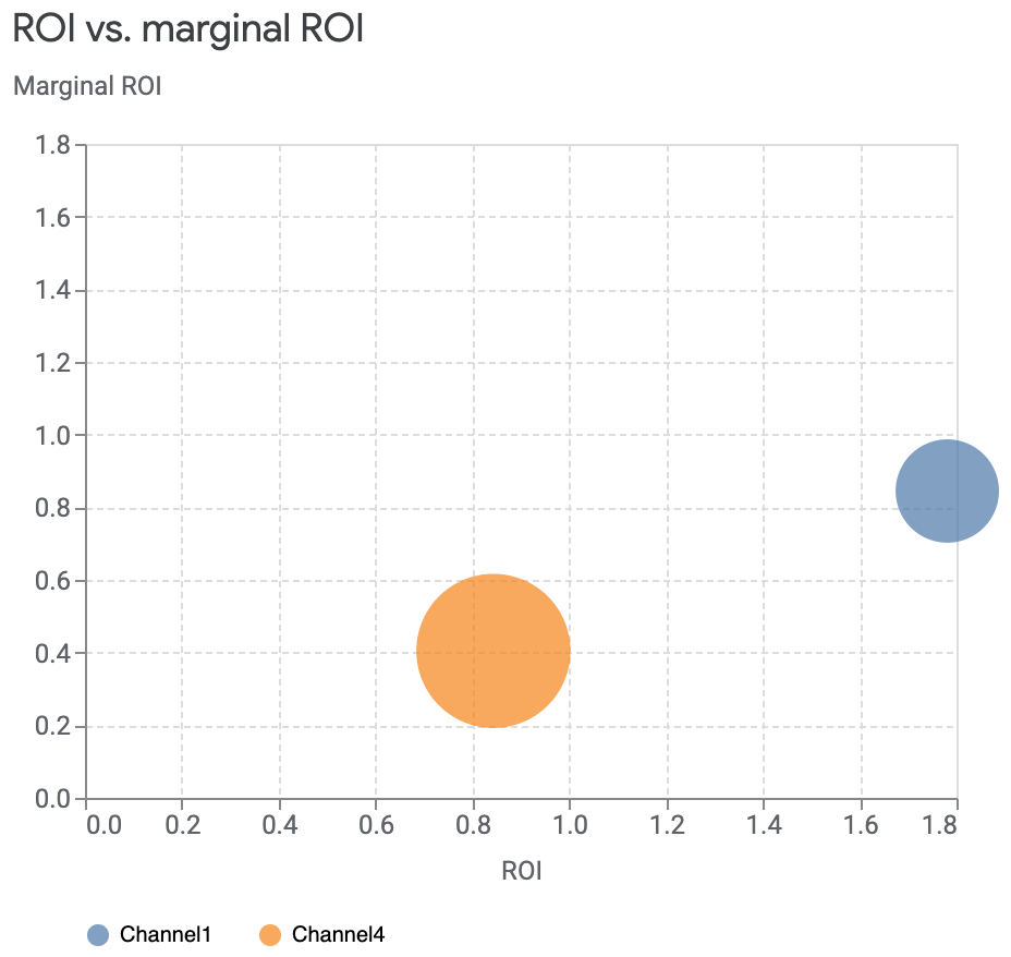
您可以选择要查看的具体渠道,并选择显示同等大小的投资回报率轴和边际投资回报率轴。您也可以停用大小差异。
以下命令示例选择了特定渠道,并将轴设置为同等大小:
media_summary.plot_roi_vs_mroi(
    selected_channels=["Channel1", "Channel4"],
    equal_axes=True
)
输出示例:
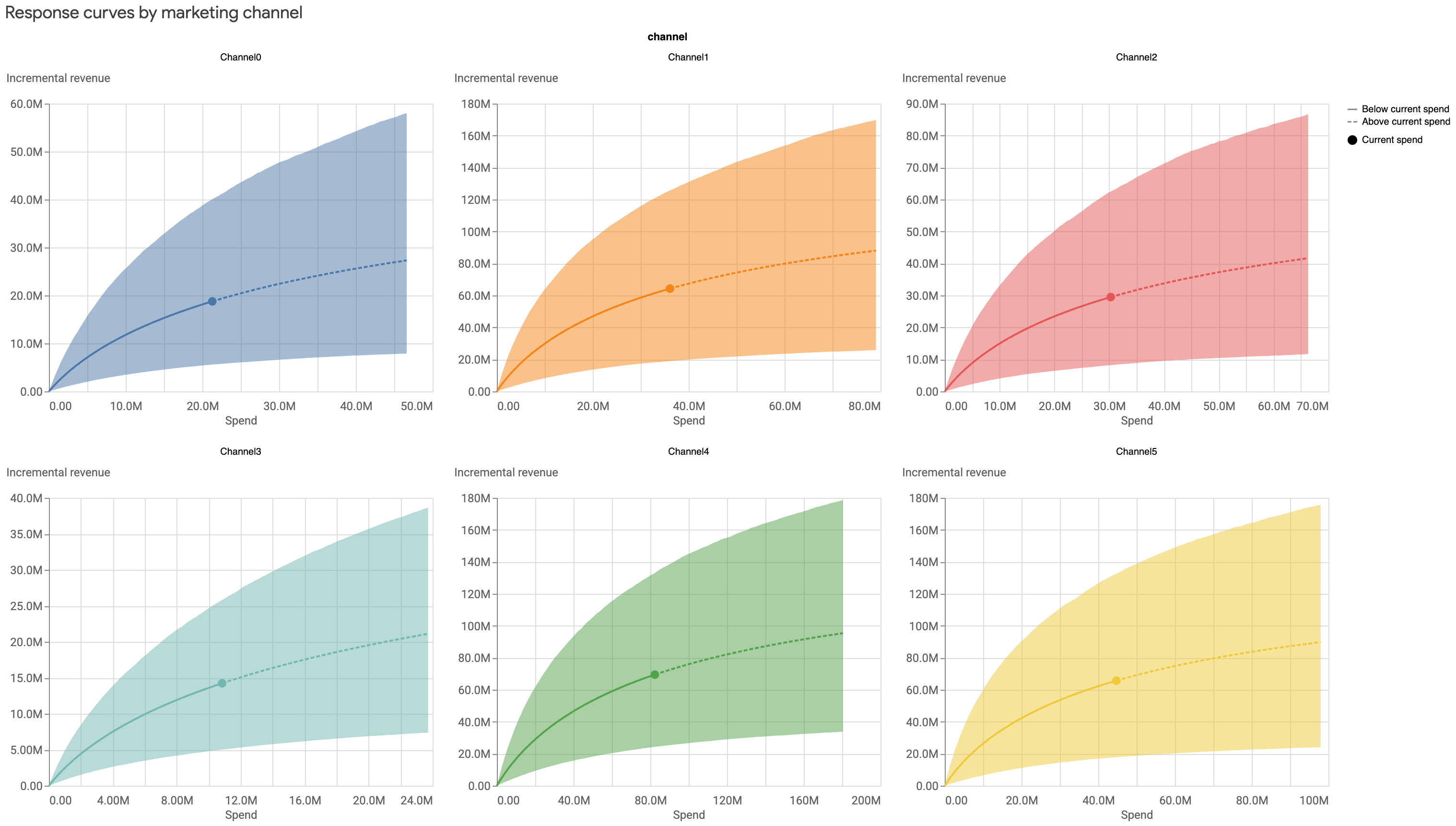
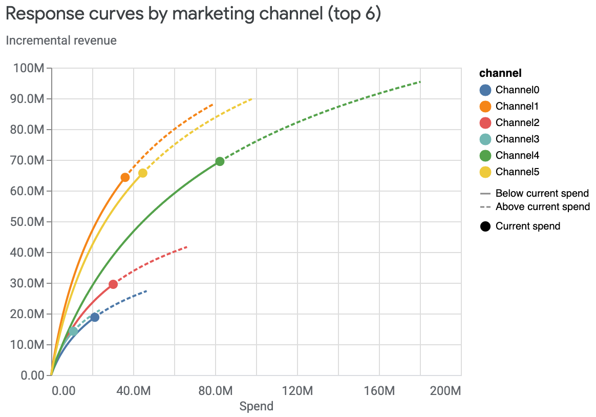
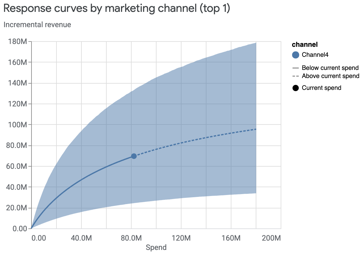
响应曲线
响应曲线显示了您当前的支出水平,以及每个渠道的支出回报从哪里开始递减。
您可以查看每个渠道的响应曲线,这些曲线可以显示在一张图表中,也可以单独绘制。图表中的阴影区域显示的是可信区间,而点则表示当前支出。
在独立图表中查看各条响应曲线:
media_effects = visualizer.MediaEffects(mmm) media_effects.plot_response_curves()输出示例:(点击图片可放大。)
在一张图表中查看多条曲线并隐藏可信区间:
media_effects = visualizer.MediaEffects(mmm)
media_effects.plot_response_curves(
    plot_separately=False,
    include_ci=False
)
输出示例:
仅查看支出排名靠前的渠道的响应曲线:
media_effects = visualizer.MediaEffects(mmm)
media_effects.plot_response_curves(
    plot_separately=False,
    num_channels_displayed=1
)
输出示例:
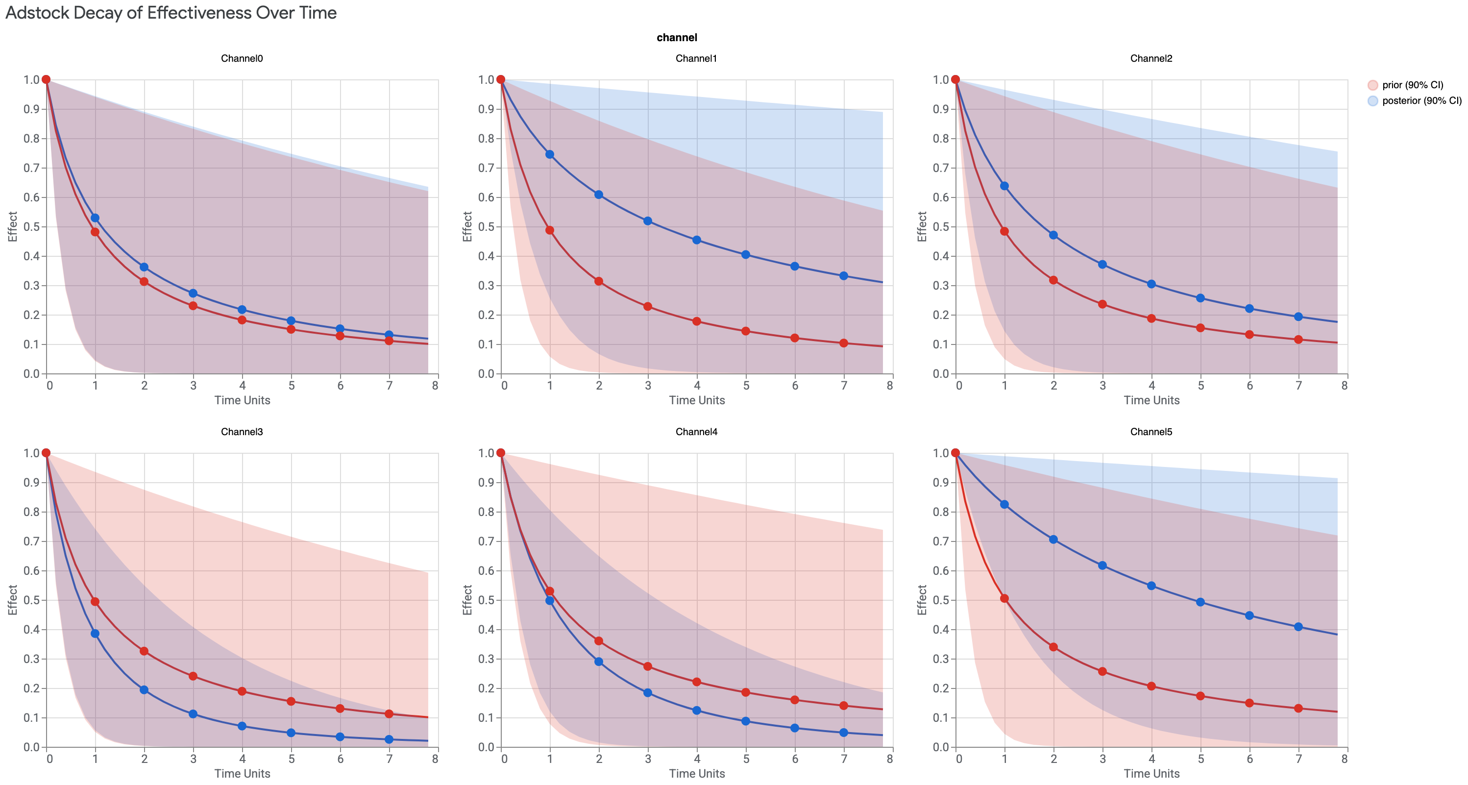
Adstock 衰减曲线
Adstock 衰减可视化图表显示了媒体效应的衰减率,Meridian 使用的单调衰减 Adstock 曲线会在第一天达到峰值。这种方法还考虑了广告在展示后对消费者的影响。
如果后验高于先验,那么在该媒体渠道投放广告的效应持续时间会比假设的更长。
显示的时间单位数只能为 max_lag 值,在以下输出示例中,该值设置为 8 个时间单位。时间单位通常设置为周,但也可以改用天。
运行以下命令可绘制 Adstock 衰减曲线:
media_effects.plot_adstock_decay()
输出示例:(点击图片可放大。)
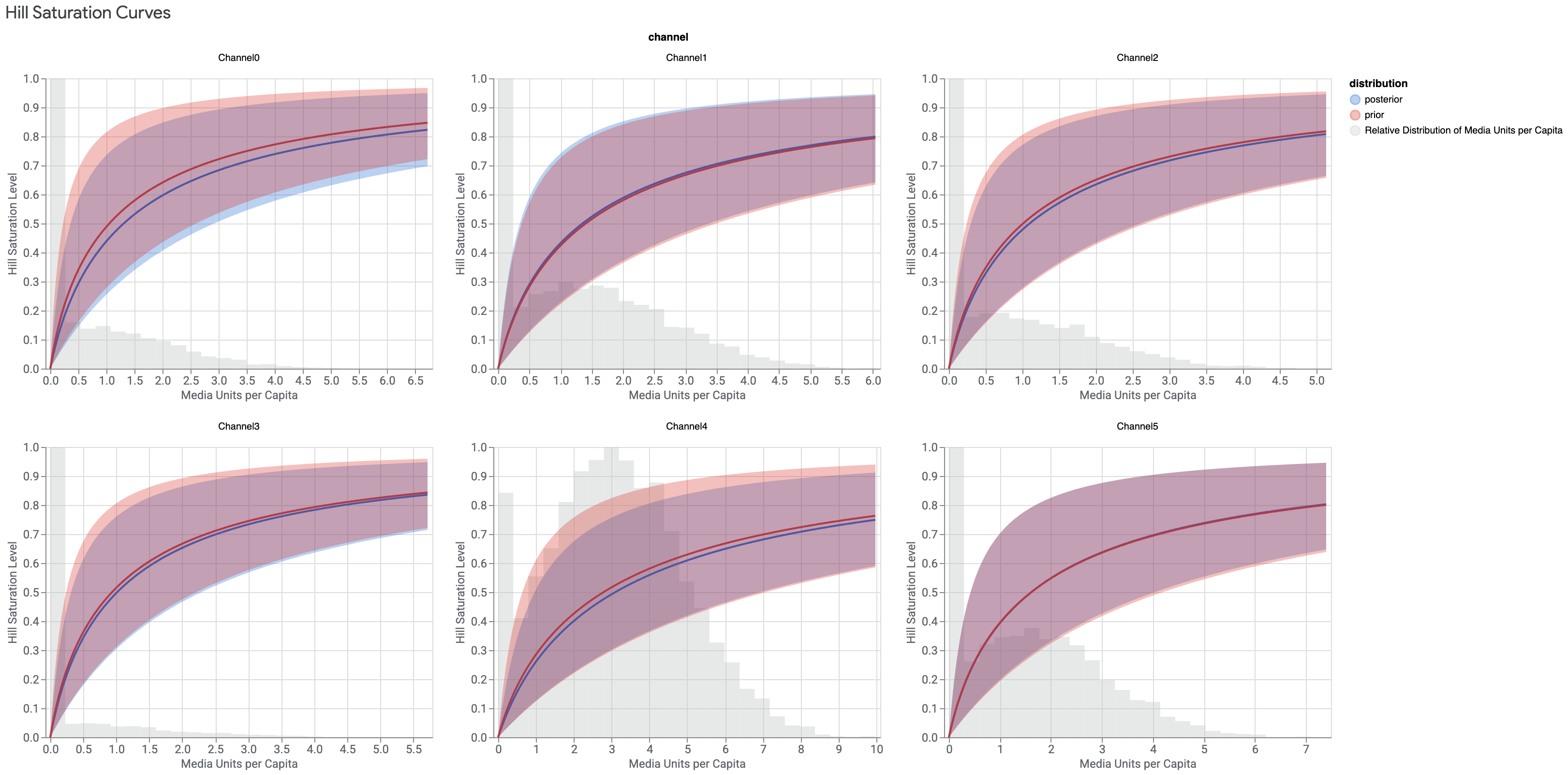
Hill 饱和度曲线
Hill 饱和度曲线显示了广告展示对消费者的回报递减情况。该模型使用 C 型曲线来表示效果降低或饱和情况。在下例中,Y 轴表示展示无限量广告的相对效果。X 轴表示人均展示次数,其中展示是指客户看到广告。这种组合显示了每个媒体渠道的饱和度。
此图表还显示了数据的直方图,即在数据的所有可用时间段和地理位置,广告的人均展示次数。
运行以下命令可绘制 Hill 饱和度曲线:
media_effects.plot_hill_curves()
输出示例:(点击图片可放大。)