
Advanced Place Details component
The Advanced version of the Place Details component offers the same features as Places Details Essentials. It also lets you configure the action buttons of the component and apply search and filtering options to the reviews and media that are displayed.
Built-in Jetpack Compose support
Places UI Kit provides Jetpack Compose @Composable functions for AdvancedPlaceDetailsCompact. These composables use hoisted state, built-in modifier support, and Compose-native slot DSLs.
The following code sample demonstrates how to use the composable function for a vertical layout.
Kotlin
import android.util.Log
import androidx.compose.foundation.layout.fillMaxWidth
import androidx.compose.foundation.layout.padding
import androidx.compose.material3.MaterialTheme
import androidx.compose.material3.Text
import androidx.compose.runtime.Composable
import androidx.compose.ui.Modifier
import androidx.compose.ui.graphics.painter.Painter
import androidx.compose.ui.unit.dp
import com.google.android.libraries.places.api.model.Place
import com.google.android.libraries.places.compose.AdvancedPlaceDetailsCompact
import com.google.android.libraries.places.compose.PlaceReference
import com.google.android.libraries.places.compose.action.CornerAction
import com.google.android.libraries.places.compose.action.MainAction
import com.google.android.libraries.places.compose.Orientation

@Composable
fun SampleAdvancedPlaceDetailsCompactCard(
    placeId: String,
    bookmarkIcon: Painter,
    onSavePlaceClicked: (Place) -> Unit
) {
    AdvancedPlaceDetailsCompact(
        // defines the place to be displayed
        reference = PlaceReference.PlaceId(placeId),
        // defines the orientation
        orientation = Orientation.VERTICAL,
        // defines custom styling
        modifier = Modifier
            .fillMaxWidth()
            .padding(16.dp),
        preferTruncation = true,
        enableLightbox = true,
        mainActions = { place ->
            listOf(
                MainAction.OpenDirections(),
                MainAction.OpenWebsite(),
                MainAction.Call()
            )
        },
        // action button configuration
        cornerActions = { place ->
            listOf(
                CornerAction.Custom(
                    icon = bookmarkIcon,
                    text = "Save Place",
                    onClick = { onSavePlaceClicked(place) }
                )
            )
        },
        onPlaceLoaded = { place ->
            Log.d("Places", "Successfully loaded place: ${place.id}")
        },
        onPlaceLoadFailed = { exception ->
            Log.e("Places", "Failed to load place", exception)
        }
    ) {
        // --- Slot: Injected directly above the place name ---
        basicSectionTop {
            Text(
                text = "Featured in 'Top 10 Coffee Shops in SF'",
                style = MaterialTheme.typography.labelSmall,
                color = MaterialTheme.colorScheme.secondary,
                modifier = Modifier.padding(top = 4.dp, bottom = 2.dp)
            )
        }

        // --- Slot: Injected directly below the action buttons ---
        basicSectionBottom {
            Text(
                text = "Notes: Great quiet atmosphere for meetings.",
                style = MaterialTheme.typography.bodySmall,
                color = MaterialTheme.colorScheme.onSurfaceVariant
            )
        }
    }
}
Advanced Place Details configuration
Use the AdvancedPlaceDetailsFragment or the AdvancedPlaceDetailsCompactFragment to access advanced features.
Configure action buttons
Use the PlaceActionProvider interface of the AdvancedPlaceDetailsFragment or the AdvancedPlaceDetailsCompactFragment to define and customize action buttons.
If you are using @composable functions, use mainActions and cornerActions lambdas to configure action buttons.
Visual attribution requirements
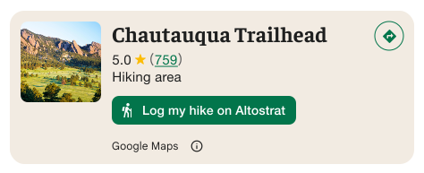
Important: You must make it clear to end-users when a custom action button will share user information with a third party other than Google. See visual attribution requirements.
The example at the right shows a custom image that makes it clear that user information will be sent to "Altostrat".
Apply search and filtering options
Use the SearchMediaOptions and SearchReviewsOptions classes of AdvancedPlaceDetailsFragment or AdvancedPlaceDetailsCompactFragment to enable search and filtering for media or reviews.
If you are using @composable functions, use com.google.android.libraries.places.compose.search.SearchMediaOptions to enable search and filtering for media or reviews.
Create custom content slots
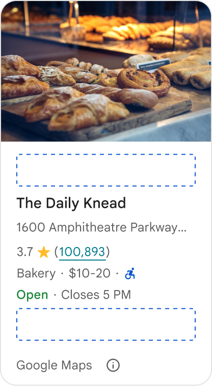
Custom content slots allow you to add your own content (such as AI-generated summaries, itinerary timestamps, or custom badges) directly into predefined layout zones.
Attribution requirements and content suggestions for content slots
When a custom content slot is mounted, the disclosure automatically updates to clarify which content is provided by Google and that some content is provided by 3rd parties.
Do
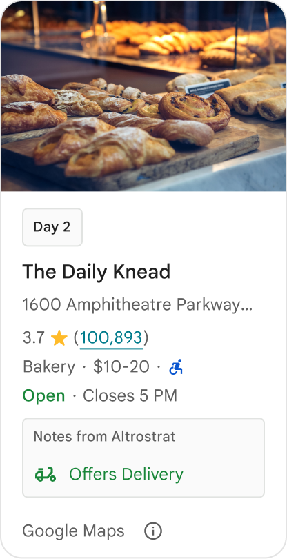
Maintain a clear visual hierarchy between Google Place details and custom content to prevent any ambiguity about the source of the information.
Do
Consider localized, high-value insights tailored to your users' immediate goals. Tailored content such as real-time booking windows or current availability helps users make faster, more informed decisions.
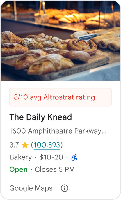
Don't
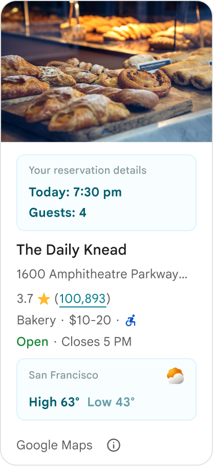
Don't duplicate existing Google Place details, such as ratings, reviews, or business hours, even if you have hidden the Google-provided content. Doing so can confuse users about the source of the content and whether it comes from Google or a third party.
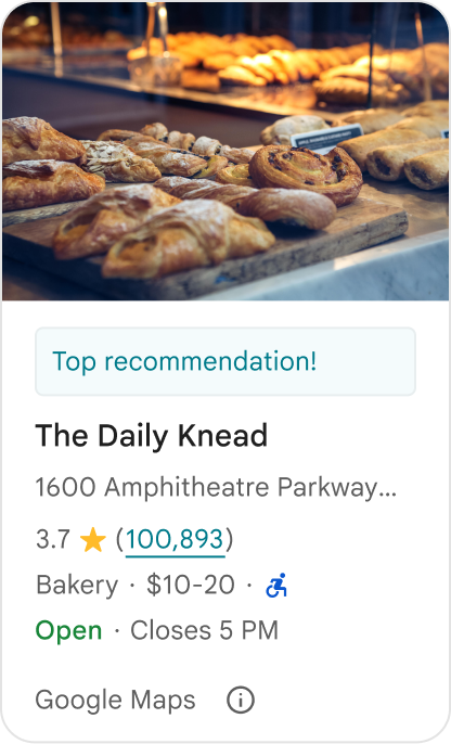
Don't
Don't display unattributed claims or badges (for example, "Top recommendation!") that could be mistaken for official Google endorsements. Custom content must explicitly attribute its source.
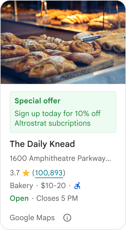
Don't
Don't include ads, marketing copy, promotional discounts, or subscription prompts within custom place containers.
To add custom content, use the AdvancedPlaceDetailsCompact composable. Use basicSectionTop or basicSectionBottom to specify the position of the content.
Advanced Place Details examples
Customize action buttons
Use the PlaceActionProvider interface to control which actions are available for each place.
Kotlin
class PlaceDetailsWidgetTestActivity : BaseActivity() {

// simplified example of starting the fragment
fun setupPPDFragment() {
   fullWidgetSelectedContent = AdvancedPlaceDetailsFragment.ALL_CONTENT.toMutableList()
   AdvancedPlaceDetailsFragment.newInstance(fullWidgetSelectedContent, Orientation.VERTICAL)
   supportFragmentManager
      .beginTransaction()
      .replace(R.id.fragment_container, fragment!!)
      .commitNow()
}

// you can set the callback elsewhere, but this is the ideal callback spot
override fun onAttachFragment(fragment: Fragment) {
    super.onAttachFragment(fragment)
    when (fragment) {
      is PlaceActionController -> setPlaceActionProvider(fragment)
    }
}

// have this callback return an empty list to hide all buttons
// if this callback isn't set, default buttons appear
 private fun setPlaceActionProvider(fragment: PlaceActionController) {
    fragment.setPlaceActionProvider(
        object : PlaceActionProvider {
        override fun getMainPlaceActions(place: Place): List<PlaceAction> = buildList {
            // predefined actions can be mixed in with custom ones
            add(PlaceAction.OPEN_IN_MAPS)

            // example of button with both text label and icon
            add(
              PlaceAction.builder()
                .setLabelTextResId(R.string.custom_action)
                .setIconResId(R.drawable.gs_custom_action_icon)
                .setContentDescriptionResId(R.string.custom_action_description)
                .setOnClickListener { /* todo perform action */ }
                .build()
            )

            // icon only button
            add(
              PlaceAction.builder()
                .setIconResId(R.drawable.custom_action_icon_2)
                .setContentDescriptionResId(R.string.custom_action_description_2)
                .setOnClickListener { /* todo perform action */}
                .build()
            )

            // text label only button
            add(
              PlaceAction.builder()
                .setLabelTextResId(R.string.custom_action_3)
                .setContentDescriptionResId(R.string.custom_action_description_2)
                .setOnClickListener {/* todo perform action */ }
                .build()
            )
          }

         /**
         You can also specify whether corner buttons should appear.
         For either callback, returning an empty list results in no buttons appearing
         */
         override fun getCornerPlaceActions(place: Place): List<PlaceAction> {
           return emptyList()
         }

        override fun addPlaceActionsChangedListener(
          listener: PlaceActionProvider.OnChangedListener
        ) {
          // in this example, just one listener and widget
          this@HostAppActivity.listener = listener
        }

        override fun removePlaceActionsChangedListener(
          listener: PlaceActionProvider.OnChangedListener
        ) {
          // if there are multiple listeners, remove only the provided listener
          this@HostAppActivity.listener = null
        }
      })
  }
}
Add custom and predefined actions
This sample adds a toggle button for a user to favorite or unfavorite a place.
Kotlin
private var listener: PlaceActionProvider.OnChangedListener? = null

private fun setPlaceActionProvider(fragment: PlaceActionController) {
    fragment.setPlaceActionProvider(
      object : PlaceActionProvider {
        private var placeFavorited = false

        override fun getMainPlaceActions(place: Place): List<PlaceAction> {
          val buttonList = mutableListOf<PlaceAction>()

          if (placeFavorited) {
            buttonList.add(
              PlaceAction.builder()
                .setLabelTextResId(R.string.place_details_button_config_favorite)
                .setIconResId(R.drawable.gs_web_vd_theme_24)
                .setOnClickListener {
                  placeFavorited = !placeFavorited
                  refreshButtonConfigs()
                }
                .build()
            )
          } else {
            buttonList.add(
              PlaceAction.builder()
                .setLabelTextResId(R.string.place_details_button_config_unfavorite)
                .setIconResId(R.drawable.gs_web_vd_theme_24)
                .setOnClickListener {
                  placeFavorited = !placeFavorited
                  refreshButtonConfigs()
                }
                .build()
            )
          }

          return buttonList
        }

        override fun addPlaceActionsChangedListener(
          listener: PlaceActionProvider.OnChangedListener
        ) {
          this@PlaceDetailsWidgetTestActivity.listener = listener
        }

        override fun removePlaceActionsChangedListener(
          listener: PlaceActionProvider.OnChangedListener
        ) {
          // if there are multiple listeners, remove only the provided listener
          this@PlaceDetailsWidgetTestActivity.listener = null
        }
      }
    )
  }

private fun refreshButtonConfigs() {
    listener?.onPlaceActionsChanged()
}
Use predefined standard buttons
Create action buttons that perform standard Google-defined actions.
Kotlin
  override fun getMainPlaceActions(place: Place): List<PlaceAction> {
    val buttonList = mutableListOf<PlaceAction>()
// these buttons will have different background and text color than user-created buttons.
    // Text and icon button
    buttonList.add(PlaceAction.OPEN_IN_MAPS)
    // Icon-only buttons not enabled for main action buttons
    // Use of kotlin extension to do the same.  see
    PlaceAction.OPEN_IN_MAPS {
       setIconResId(0)
     }

    return buttonList
  }
Filter reviews and media
This code sample shows only media and reviews that mention "spaghetti" and "tasty".
Kotlin
    import com.google.android.libraries.places.widget.AdvancedPlaceDetailsFragment
    import com.google.android.libraries.places.widget.model.SearchMediaOptions
    import com.google.android.libraries.places.widget.model.SearchReviewsOptions
    import com.google.android.libraries.places.widget.model.Orientation
    import com.google.android.libraries.places.R

     // 1. Create options using the Java builders (called from Kotlin)
    val mediaOptions = SearchMediaOptions.builder()
        .setQuery("spaghetti")
        .setRankPreference(SearchMediaOptions.RankPreference.MOST_RELEVANT)
        .build()

    val reviewOptions = SearchReviewsOptions.builder()
        .setQuery("tasty")
        .setRankPreference(SearchReviewsOptions.RankPreference.NEWEST)
        .build()

    // 2. Create the fragment
    val fragment = AdvancedPlaceDetailsFragment.newInstance(
        AdvancedPlaceDetailsFragment.STANDARD_CONTENT,
        Orientation.VERTICAL,
        R.style.PlacesMaterialTheme
    )

    // 3. Apply options to the fragment
    fragment.applySearchMediaOptions(mediaOptions)
    fragment.applySearchReviewsOptions(reviewOptions)
Create content slots
Kotlin
import androidx.compose.material3.MaterialTheme
import androidx.compose.material3.Text
import androidx.compose.runtime.Composable
import com.google.android.libraries.places.compose.AdvancedPlaceDetailsCompact
import com.google.android.libraries.places.compose.PlaceReference

@Composable
fun ItineraryPlaceCard(placeId: String) {
    AdvancedPlaceDetailsCompact(
        reference = PlaceReference.PlaceId(placeId)
    ) {
        // Slot: Injected directly above the place name
        basicSectionTop {
            Text(
                text = "Day 2 • 2:30 PM",
                style = MaterialTheme.typography.labelSmall,
                color = MaterialTheme.colorScheme.primary
            )
        }

        // Slot: Injected directly below the main action buttons
        basicSectionBottom {
            NotesCard(
                notes = "Great quiet atmosphere for morning meetings. Famous for house-roasted pour-overs."
            )
        }
    }
}