
장소 세부정보 구성요소
장소 UI 키트의 장소 세부정보 구성요소를 사용하면 앱에 장소 세부정보를 표시하는 개별 UI 구성요소를 추가할 수 있습니다. 이 구성요소는 맞춤설정할 수 있습니다.
장소 세부정보 구성요소는 독립적으로 사용하거나 다른 Google Maps Platform API 및 서비스와 함께 사용할 수 있습니다. 구성요소는 장소 ID, 리소스 이름 또는 위도/경도 좌표를 가져와 렌더링된 장소 세부정보 정보를 반환합니다.
장소 세부정보 구성요소는 완전히 테마를 지정할 수 있으므로 사용 사례 및 시각적 브랜드 가이드라인에 맞게 글꼴, 색상, 모서리 반지름을 맞춤설정할 수 있습니다. PlacesMaterialTheme을 확장하고 테마 속성에 재정의를 제공하는 테마를 만들어 장소 세부정보의 모양을 맞춤설정할 수 있습니다. 또한 장소에 관해 표시되는 정보 조각에 해당하는 콘텐츠 항목 목록을 지정하여 포함할 장소 세부정보 필드를 맞춤설정할 수 있습니다.
레이아웃 변형
장소 세부정보 구성요소는 두 가지 기본 레이아웃 변형을 지원합니다.
- 간단히 보기: 주요 정보를 미리 보는 레이아웃입니다.
- 전체: 사용 가능한 모든 장소 세부정보를 표시하는 포괄적인 레이아웃입니다.
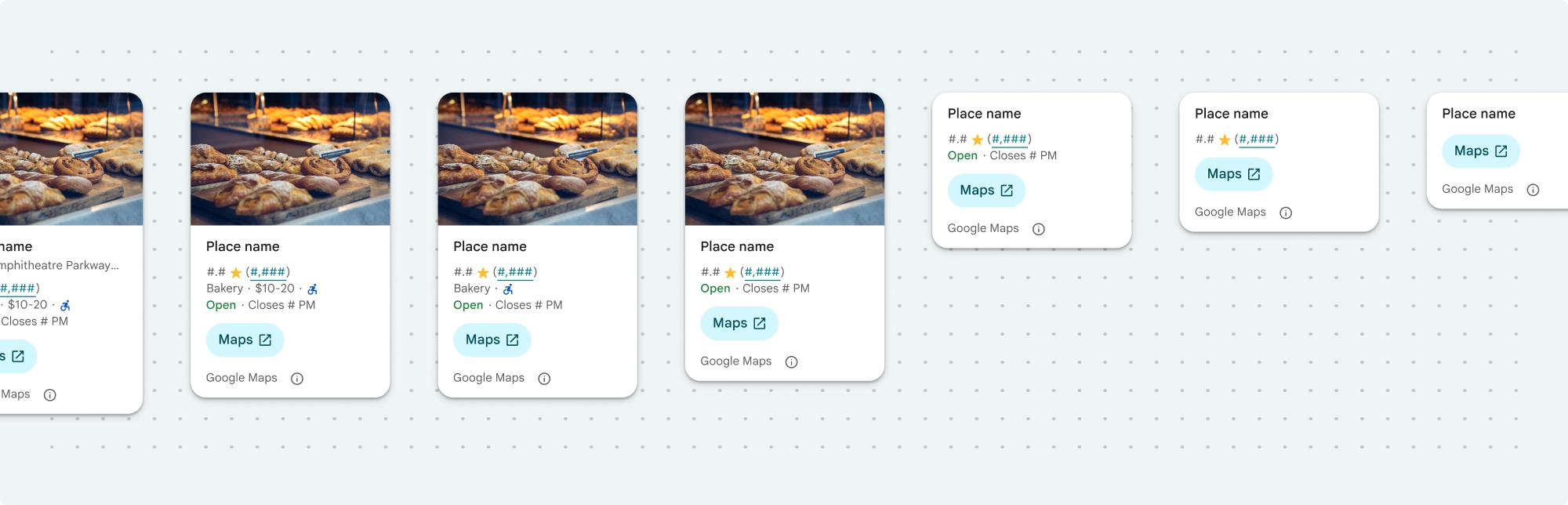
간단히 보기 레이아웃은 세로 또는 가로 방향으로 표시할 수 있습니다. 이렇게 하면 구성요소를 다양한 디자인 레이아웃과 화면 크기에 통합할 수 있습니다. 전체 레이아웃은 세로로만 표시할 수 있습니다.
장소 세부정보 구성요소를 사용하면 구성요소에 표시되는 콘텐츠를 세부적으로 제어할 수 있습니다. 사진, 리뷰, 연락처 정보와 같은 각 요소를 개별적으로 표시하거나 숨길 수 있으므로 구성요소 모양과 정보 밀도를 정확하게 맞춤설정할 수 있습니다.
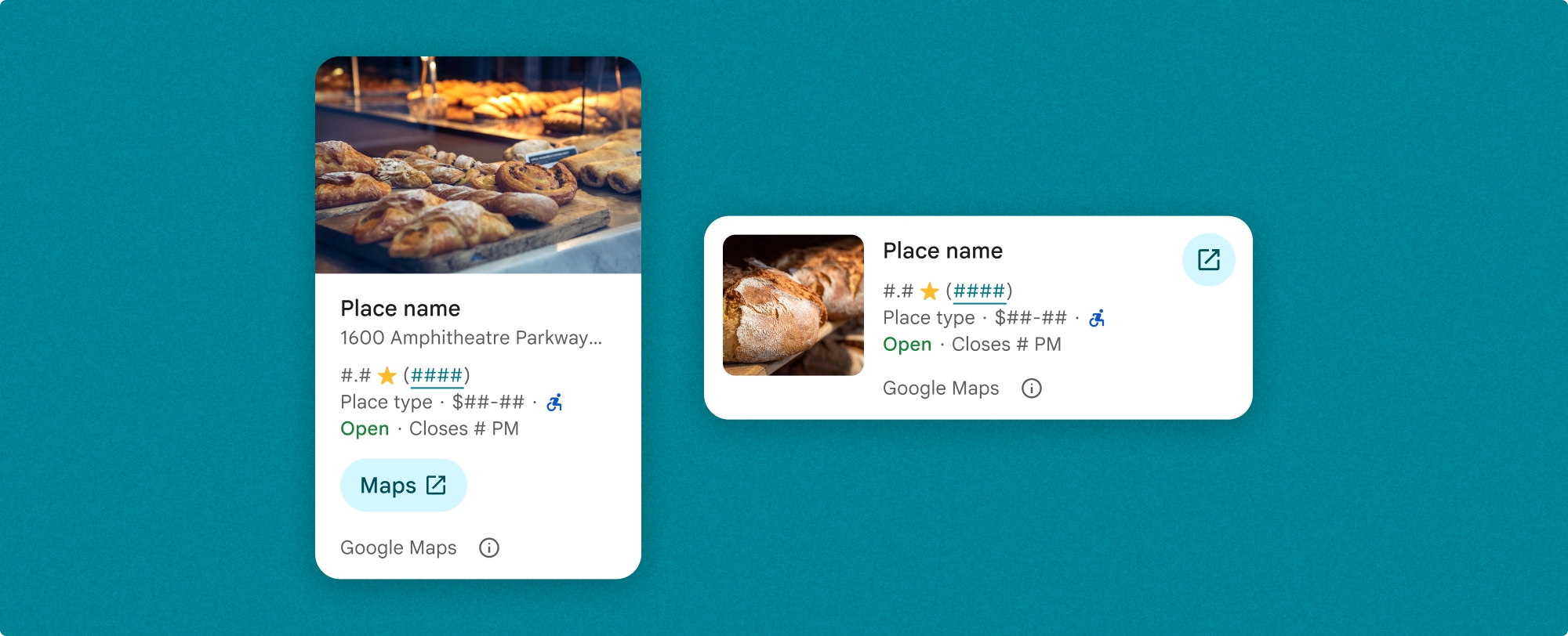
장소 세부정보 간단히 보기
장소 세부정보 간단히 보기 프래그먼트 (PlaceDetailsCompactFragment)는 최소한의 공간을 사용하여 선택한 장소의 세부정보를 렌더링합니다. 이는 지도에서 장소를 강조표시하는 정보 창, 채팅에서 위치를 공유하는 것과 같은 소셜 미디어 환경, 현재 위치를 선택하기 위한 추천 또는 Google 지도에서 장소를 참조하기 위한 미디어 기사 내에서 유용할 수 있습니다.
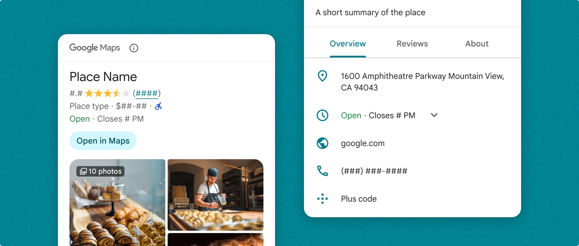
장소 세부정보 전체보기
장소 세부정보 전체보기 (PlaceDetailsFragment)는 장소 세부정보 정보를 표시할 수 있는 더 큰 화면을 제공하며 더 많은 유형의 정보를 표시할 수 있습니다.
콘텐츠 표시 옵션
PlaceDetailsCompactFragment.Content 또는 PlaceDetailsFragment.Content의 열거형을 사용하여 표시할 콘텐츠를 지정할 수 있습니다.
| 간단히 보기 | 전체보기 |
|---|---|
|
|
결제
장소 세부정보 UI 키트를 사용하면 .loadWithPlaceId(), .loadWithResourceName() 또는 loadWithCoordinates() 메서드가 호출될 때마다 요금이 청구됩니다. 동일한 장소를 여러 번 로드하면 각 요청에 대해 요금이 청구됩니다.
여러 번 청구되지 않도록 하려면 Android 수명 주기 메서드에 .loadWithPlaceId() 또는 .loadWithResourceName()을 직접 추가하지 마세요. 예를 들어 onResume() 메서드에서 .loadWithPlaceId() 또는 .loadWithResourceName()을 직접 호출하지 마세요.
앱에 장소 세부정보 추가
레이아웃에 프래그먼트를 추가하여 앱에 장소 세부정보를 추가할 수 있습니다. 프래그먼트를 인스턴스화할 때 필요에 맞게 장소 세부정보 정보의 디자인과 분위기를 맞춤설정하고 앱의 모양과 일치시킬 수 있습니다. 맞춤설정에 대해 자세히 알아보기.
Kotlin과 Java 모두에서 세 가지 메서드를 사용할 수 있습니다. 장소 ID로 프래그먼트를 로드하는 메서드 (loadWithPlaceId()), 리소스 이름으로 프래그먼트를 로드하는 메서드 (loadWithResourceName()), 위도/경도 좌표로 프래그먼트를 로드하는 메서드 (loadWithCoordinates())입니다. 메서드를 하나 또는 여러 개 선택할 수 있습니다.
간단히 보기의 기본 위치는 세로입니다. 가로 레이아웃을 사용하려면 Orientation.HORIZONTAL을 지정합니다. 명확성을 위해 Orientation.VERTICAL을 선택적으로 지정할 수도 있습니다. 전체보기는 세로로만 표시할 수 있습니다.
장소 세부정보 구성요소 예 섹션의 예시를 참고하세요.
시각적 모양 맞춤설정
맞춤 스타일 지정
장소 세부정보 구성요소의 색상, 서체, 간격, 테두리, 모서리를 맞춤설정할 수 있습니다.
장소 UI 키트는 Material Design을 대략적으로 기반으로 하는 시각적 맞춤설정에 대한 디자인 시스템 접근 방식을 제공합니다 (일부 Google 지도 관련 수정사항 포함). 색상 및 서체에 관한 Material Design의 참조를 확인하세요. 기본적으로 스타일은 Google 지도 시각적 디자인 언어를 준수합니다.
장소 UI 키트는 기본적으로 어두운 테마를 제공하므로 어두운 테마와 밝은 테마를 모두 맞춤설정해야 할 수 있습니다. 어두운 테마를 맞춤설정하려면 values-night/colors.xml에 색상 항목을 추가합니다.
스타일 지정에 관한 자세한 내용은 맞춤 스타일 지정 섹션을 참고하세요.
너비 및 높이 맞춤설정
간단히 보기
권장 너비:
- 세로 방향: 180dp~300dp
- 가로 방향: 180dp~500dp
너비가 160dp보다 작으면 올바르게 표시되지 않을 수 있습니다.
간단히 보기의 높이를 설정하지 않는 것이 좋습니다. 이렇게 하면 창의 콘텐츠가 높이를 설정하여 모든 정보를 표시할 수 있습니다.
전체보기
전체보기의 경우 권장 너비는 250dp~450dp입니다. 너비가 250dp보다 작으면 올바르게 표시되지 않을 수 있습니다.
구성요소의 높이를 설정할 수 있습니다. 세로 장소 세부정보 뷰는 할당된 공간 내에서 세로로 스크롤됩니다.
전체보기의 높이를 설정하는 것이 좋습니다. 이렇게 하면 창의 콘텐츠가 올바르게 스크롤될 수 있습니다.
장소 세부정보 구성요소 예
간단히 보기 또는 전체보기 만들기
Kotlin
        // We create a new instance of the fragment using its factory method.
        // We can specify which content to show, the orientation, and a custom theme.
        val fragment = PlaceDetailsCompactFragment.newInstance(
            PlaceDetailsCompactFragment.ALL_CONTENT, // Show all available content.
            orientation,
            R.style.CustomizedPlaceDetailsTheme,
        ).apply {
            // The PlaceLoadListener provides callbacks for when the place data is successfully
            // loaded or when an error occurs. This is where we update our UI state.
            setPlaceLoadListener(object : PlaceLoadListener {
                override fun onSuccess(place: Place) {
                    Log.d(TAG, "Place loaded: ${place.id}")
                    // Once the data is loaded, we hide the loading indicator and show the fragment.
                    binding.loadingIndicatorMain.visibility = View.GONE
                    binding.placeDetailsContainer.visibility = View.VISIBLE
                    binding.dismissButton.visibility = View.VISIBLE
                }

                override fun onFailure(e: Exception) {
                    Log.e(TAG, "Place failed to load", e)
                    // On failure, we hide the UI and notify the user.
                    dismissPlaceDetails()
                    Toast.makeText(this@MainActivity, "Failed to load place details.", Toast.LENGTH_SHORT).show()
                }
            })
        }

        // We add the fragment to our layout's container view.
        // `commitNow()` is used to ensure the fragment is immediately added and available,
        // which is important because we need to call a method on it right after.
        supportFragmentManager
            .beginTransaction()
            .replace(binding.placeDetailsContainer.id, fragment)
            .commitNow()

        // **This is the key step**: After adding the fragment, we call `loadWithPlaceId`
        // to trigger the data loading process for the selected place.
        // We use `post` to ensure this runs after the layout has been measured,
        // which can prevent potential timing issues.
        binding.root.post {
            fragment.loadWithPlaceId(placeId)
        }
    }
자바
PlaceDetailsCompactFragment fragment =
  PlaceDetailsCompactFragment.newInstance(
        Orientation.HORIZONTAL,
        Arrays.asList(Content.ADDRESS, Content.TYPE, Content.RATING, Content.ACCESSIBLE_ENTRANCE_ICON),
        R.style.CustomizedPlaceDetailsTheme);

fragment.setPlaceLoadListener(
  new PlaceLoadListener() {
        @Override public void onSuccess(Place place) { ... }

        @Override public void onFailure(Exception e) { ... }
});

getSupportFragmentManager()
      .beginTransaction()
      .add(R.id.fragment_container, fragment)
      .commitNow();

// Load the fragment with a Place ID.
fragment.loadWithPlaceId(placeId);

// Load the fragment with a resource name.
fragment.loadWithResourceName(resourceName);
이 전체 코드 샘플은 사용자 기기의 구성을 기반으로 간단히 보기의 방향을 프로그래매틱 방식으로 결정합니다.
Kotlin
package com.example.placedetailsuikit

import android.Manifest
import android.annotation.SuppressLint
import android.content.pm.PackageManager
import android.content.res.Configuration
import android.location.Location
import android.os.Bundle
import android.util.Log
import android.view.View
import android.widget.Toast
import androidx.activity.enableEdgeToEdge
import androidx.activity.result.ActivityResultLauncher
import androidx.activity.result.contract.ActivityResultContracts
import androidx.activity.viewModels
import androidx.appcompat.app.AppCompatActivity
import androidx.core.app.ActivityCompat
import androidx.lifecycle.ViewModel
import com.example.placedetailsuikit.databinding.ActivityMainBinding
import com.google.android.gms.location.FusedLocationProviderClient
import com.google.android.gms.location.LocationServices
import com.google.android.gms.maps.CameraUpdateFactory
import com.google.android.gms.maps.GoogleMap
import com.google.android.gms.maps.OnMapReadyCallback
import com.google.android.gms.maps.SupportMapFragment
import com.google.android.gms.maps.model.LatLng
import com.google.android.gms.maps.model.PointOfInterest
import com.google.android.libraries.places.api.Places
import com.google.android.libraries.places.api.model.Place
import com.google.android.libraries.places.widget.PlaceDetailsCompactFragment
import com.google.android.libraries.places.widget.PlaceLoadListener
import com.google.android.libraries.places.widget.model.Orientation

private const val TAG = "PlacesUiKit"

/**
 * A simple ViewModel to store UI state that needs to survive configuration changes.
 * In this case, it holds the ID of the selected place. Using a ViewModel is good practice
 * as it prevents data loss during events like screen rotation, ensuring a
 * seamless user experience.
 */
class MainViewModel : ViewModel() {
    var selectedPlaceId: String? = null
}

/**
 * This activity serves as a basic example of integrating the Place Details UI Kit.
 * It demonstrates the fundamental steps required:
 * 1. Setting up a Google Map.
 * 2. Requesting location permissions to center the map.
 * 3. Handling clicks on Points of Interest (POIs) to get a Place ID.
 * 4. Using the Place ID to load and display place details in a [PlaceDetailsCompactFragment].
 */
class MainActivity : AppCompatActivity(), OnMapReadyCallback, GoogleMap.OnPoiClickListener {
    // ViewBinding provides type-safe access to views defined in the XML layout,
    // eliminating the need for `findViewById` and preventing null pointer exceptions.
    private lateinit var binding: ActivityMainBinding
    private var googleMap: GoogleMap? = null

    // The FusedLocationProviderClient is the main entry point for interacting with the
    // fused location provider, which intelligently manages the underlying location technologies.
    private lateinit var fusedLocationClient: FusedLocationProviderClient

    // Using registerForActivityResult is the modern, recommended approach for handling
    // permission requests. It decouples the request from the handling logic, making the
    // code cleaner and easier to manage compared to the older `onRequestPermissionsResult` callback.
    private lateinit var requestPermissionLauncher: ActivityResultLauncher<Array<String>>

    // The `by viewModels()` delegate provides a lazy-initialized ViewModel scoped to this Activity.
    // This ensures that we get the same ViewModel instance across configuration changes.
    private val viewModel: MainViewModel by viewModels()

    override fun onCreate(savedInstanceState: Bundle?) {
        super.onCreate(savedInstanceState)

        // The ActivityResultLauncher is initialized here. The lambda defines the callback
        // that will be executed once the user responds to the permission dialog.
        requestPermissionLauncher =
            registerForActivityResult(ActivityResultContracts.RequestMultiplePermissions()) { permissions ->
                // We check if either fine or coarse location permission was granted.
                if (permissions[Manifest.permission.ACCESS_FINE_LOCATION] == true || permissions[Manifest.permission.ACCESS_COARSE_LOCATION] == true) {
                    Log.d(TAG, "Location permission granted by user.")
                    fetchLastLocation()
                } else {
                    // If permission is denied, we inform the user and default to a known location.
                    // This ensures the app remains functional even without location access.
                    Log.d(TAG, "Location permission denied by user.")
                    Toast.makeText(
                        this,
                        "Location permission denied. Showing default location.",
                        Toast.LENGTH_LONG
                    ).show()
                    moveToSydney()
                }
            }

        // enableEdgeToEdge() allows the app to draw behind the system bars for a more immersive experience.
        enableEdgeToEdge()
        binding = ActivityMainBinding.inflate(layoutInflater)
        setContentView(binding.root)

        binding.dismissButton.setOnClickListener {
            dismissPlaceDetails()
        }

        // --- Crucial: Initialize Places SDK ---
        // It's essential to initialize the Places SDK before making any other Places API calls.
        // This should ideally be done once, for example, in the Application's `onCreate`.
        val apiKey = BuildConfig.PLACES_API_KEY
        if (apiKey.isEmpty() || apiKey == "YOUR_API_KEY") {
            // A valid API key is required for the Places SDK to function.
            Log.e(TAG, "No api key")
            Toast.makeText(
                this,
                "Add your own API_KEY in local.properties",
                Toast.LENGTH_LONG
            ).show()
            finish()
            return
        }

        // `initializeWithNewPlacesApiEnabled` is used to opt-in to the new SDK version.
        Places.initializeWithNewPlacesApiEnabled(applicationContext, apiKey)

        fusedLocationClient = LocationServices.getFusedLocationProviderClient(this)
        // ------------------------------------

        // The SupportMapFragment is the container for the map. `getMapAsync` allows us to
        // work with the GoogleMap object via a callback once it's fully initialized.
        val mapFragment =
            supportFragmentManager.findFragmentById(R.id.map_fragment) as SupportMapFragment?
        mapFragment?.getMapAsync(this)

        // This block handles restoration after a configuration change (e.g., screen rotation).
        // If a place was selected before the rotation, its ID is stored in the ViewModel.
        // We use this ID to immediately show the details fragment again.
        if (viewModel.selectedPlaceId != null) {
            viewModel.selectedPlaceId?.let { placeId ->
                Log.d(TAG, "Restoring PlaceDetailsFragment for place ID: $placeId")
                showPlaceDetailsFragment(placeId)
            }
        }
    }

    /**
     * This callback is triggered when the GoogleMap object is ready to be used.
     * All map setup logic should be placed here.
     */
    override fun onMapReady(map: GoogleMap) {
        Log.d(TAG, "Map is ready")
        googleMap = map
        // Setting the OnPoiClickListener allows us to capture user taps on points of interest.
        googleMap?.setOnPoiClickListener(this)

        // After the map is ready, we determine the initial camera position based on location permissions.
        if (isLocationPermissionGranted()) {
            fetchLastLocation()
        } else {
            requestLocationPermissions()
        }
    }

    /**
     * A helper function to centralize the check for location permissions.
     */
    private fun isLocationPermissionGranted(): Boolean {
        return ActivityCompat.checkSelfPermission(
            this,
            Manifest.permission.ACCESS_FINE_LOCATION
        ) == PackageManager.PERMISSION_GRANTED ||
                ActivityCompat.checkSelfPermission(
                    this,
                    Manifest.permission.ACCESS_COARSE_LOCATION
                ) == PackageManager.PERMISSION_GRANTED
    }

    /**
     * This function triggers the permission request flow. The result is handled by the
     * ActivityResultLauncher defined in `onCreate`.
     */
    private fun requestLocationPermissions() {
        Log.d(TAG, "Requesting location permissions.")
        requestPermissionLauncher.launch(
            arrayOf(
                Manifest.permission.ACCESS_FINE_LOCATION,
                Manifest.permission.ACCESS_COARSE_LOCATION
            )
        )
    }

    /**
     * Fetches the device's last known location. This is a fast and battery-efficient way
     * to get a location fix. It should only be called after verifying permissions.
     */
    @SuppressLint("MissingPermission")
    private fun fetchLastLocation() {
        // Double-checking permissions here is a good practice, although the call sites are already guarded.
        if (isLocationPermissionGranted()) {
            fusedLocationClient.lastLocation
                .addOnSuccessListener { location: Location? ->
                    if (location != null) {
                        val userLocation = LatLng(location.latitude, location.longitude)
                        googleMap?.moveCamera(CameraUpdateFactory.newLatLngZoom(userLocation, 13f))
                        Log.d(TAG, "Moved to user's last known location.")
                    } else {
                        // `lastLocation` can be null if the location has never been recorded.
                        // In this case, we fall back to a default location.
                        Log.d(TAG, "Last known location is null. Falling back to Sydney.")
                        moveToSydney()
                    }
                }
                .addOnFailureListener {
                    // This listener handles errors in the location fetching process.
                    Log.e(TAG, "Failed to get location.", it)
                    moveToSydney()
                }
        }
    }

    /**
     * Moves the map camera to a default, hardcoded location (Sydney).
     * This serves as a reliable fallback.
     */
    private fun moveToSydney() {
        val sydney = LatLng(-33.8688, 151.2093)
        googleMap?.moveCamera(CameraUpdateFactory.newLatLngZoom(sydney, 13f))
        Log.d(TAG, "Moved to Sydney")
    }

    /**
     * This is the callback for the `OnPoiClickListener`. It's triggered when a user
     * taps a POI on the map.
     */
    override fun onPoiClick(poi: PointOfInterest) {
        val placeId = poi.placeId
        Log.d(TAG, "Place ID: $placeId")

        // We save the selected place ID to the ViewModel. This is critical for surviving
        // configuration changes. If the user rotates the screen now, the `onCreate`
        // method will be able to restore the place details view.
        viewModel.selectedPlaceId = placeId
        showPlaceDetailsFragment(placeId)
    }

    /**
     * This function is the core of the integration. It creates, configures, and displays
     * the [PlaceDetailsCompactFragment].
     * @param placeId The unique identifier for the place to be displayed.
     */
    private fun showPlaceDetailsFragment(placeId: String) {
        Log.d(TAG, "Showing PlaceDetailsFragment for place ID: $placeId")

        // We manage the visibility of UI elements to provide feedback to the user.
        // The wrapper is shown, and a loading indicator is displayed while the data is fetched.
        binding.placeDetailsWrapper.visibility = View.VISIBLE
        binding.dismissButton.visibility = View.GONE
        binding.placeDetailsContainer.visibility = View.GONE
        binding.loadingIndicatorMain.visibility = View.VISIBLE

        // The Place Details widget can be displayed vertically or horizontally.
        // We dynamically choose the orientation based on the device's current configuration.
        val orientation =
            if (resources.configuration.orientation == Configuration.ORIENTATION_LANDSCAPE) {
                Orientation.HORIZONTAL
            } else {
                Orientation.VERTICAL
            }


        // We create a new instance of the fragment using its factory method.
        // We can specify which content to show, the orientation, and a custom theme.
        val fragment = PlaceDetailsCompactFragment.newInstance(
            PlaceDetailsCompactFragment.ALL_CONTENT, // Show all available content.
            orientation,
            R.style.CustomizedPlaceDetailsTheme,
        ).apply {
            // The PlaceLoadListener provides callbacks for when the place data is successfully
            // loaded or when an error occurs. This is where we update our UI state.
            setPlaceLoadListener(object : PlaceLoadListener {
                override fun onSuccess(place: Place) {
                    Log.d(TAG, "Place loaded: ${place.id}")
                    // Once the data is loaded, we hide the loading indicator and show the fragment.
                    binding.loadingIndicatorMain.visibility = View.GONE
                    binding.placeDetailsContainer.visibility = View.VISIBLE
                    binding.dismissButton.visibility = View.VISIBLE
                }

                override fun onFailure(e: Exception) {
                    Log.e(TAG, "Place failed to load", e)
                    // On failure, we hide the UI and notify the user.
                    dismissPlaceDetails()
                    Toast.makeText(this@MainActivity, "Failed to load place details.", Toast.LENGTH_SHORT).show()
                }
            })
        }

        // We add the fragment to our layout's container view.
        // `commitNow()` is used to ensure the fragment is immediately added and available,
        // which is important because we need to call a method on it right after.
        supportFragmentManager
            .beginTransaction()
            .replace(binding.placeDetailsContainer.id, fragment)
            .commitNow()

        // **This is the key step**: After adding the fragment, we call `loadWithPlaceId`
        // to trigger the data loading process for the selected place.
        // We use `post` to ensure this runs after the layout has been measured,
        // which can prevent potential timing issues.
        binding.root.post {
            fragment.loadWithPlaceId(placeId)
        }
    }


    /**
     * Hides the place details view and clears the selected place ID from the ViewModel.
     */
    private fun dismissPlaceDetails() {
        binding.placeDetailsWrapper.visibility = View.GONE
        // Clearing the ID in the ViewModel is important so that if the user rotates the
        // screen after dismissing, the details view doesn't reappear.
        viewModel.selectedPlaceId = null
    }

    override fun onDestroy() {
        super.onDestroy()
        // It's a good practice to nullify references to objects that have a lifecycle
        // tied to the activity, like the GoogleMap object, to prevent potential memory leaks.
        googleMap = null
    }
}
테마 만들기
프래그먼트를 인스턴스화할 때 기본 스타일 속성을 재정의하는 테마를 지정할 수 있습니다. 재정의되지 않은 테마 속성은 기본 스타일을 사용합니다. 어두운 테마를 지원하려면 values-night/colors.xml에 색상 항목을 추가합니다.
장소 UI 키트는 기본적으로 어두운 테마를 제공하므로 어두운 테마와 밝은 테마를 모두 맞춤설정해야 할 수 있습니다. 어두운 테마를 맞춤설정하려면 values-night/colors.xml에 색상 항목을 추가합니다.
  <style name="CustomizedPlaceDetailsTheme" parent="PlacesMaterialTheme">
    <item name="placesColorPrimary">@color/app_primary_color</item>
    <item name="placesColorOnSurface">@color/app_color_on_surface</item>
    <item name="placesColorOnSurfaceVariant">@color/app_color_on_surface</item>

    <item name="placesTextAppearanceBodySmall">@style/app_text_appearence_small</item>

    <item name="placesCornerRadius">20dp</item>
  </style>
표준 콘텐츠 사용
이 샘플에서는 표준 콘텐츠를 사용합니다.
  val fragmentStandardContent = PlaceDetailsCompactFragment.newInstance(
    PlaceDetailsCompactFragment.STANDARD_CONTENT,
    orientation,
    R.style.CustomizedPlaceDetailsTheme
  )
특정 콘텐츠 맞춤설정
이 샘플에서는 간단히 보기에 주소, 장애인 이용 가능 입구, 미디어 Content 옵션만 선택하고 CustomizedPlaceDetailsTheme으로 렌더링합니다.
  val placeDetailsFragment = PlaceDetailsCompactFragment.newInstance(
    orientation,
    listOf(
        Content.ADDRESS,
        Content.ACCESSIBLE_ENTRANCE,
        Content.MEDIA
    ),
    R.style.CustomizedPlaceDetailsTheme
)
모든 콘텐츠 사용
이 샘플에서는 간단히 보기의 모든 Content 옵션을 사용합니다.
  val fragmentAllContent = PlaceDetailsCompactFragment.newInstance(
    orientation,
    PlaceDetailsCompactFragment.ALL_CONTENT,
    R.style.CustomizedPlaceDetailsTheme
  )