
Index
Action(message)Action.ActionParameter(message)Action.Interaction(enum)Action.LoadIndicator(enum)BorderStyle(message)BorderStyle.BorderType(enum)Button(message)Button.Type(enum)ButtonList(message)Card(message)Card.CardAction(message)Card.CardFixedFooter(message)Card.CardHeader(message)Card.DisplayStyle(enum)Card.DividerStyle(enum)Card.Section(message)Chip(message)ChipList(message)ChipList.Layout(enum)CollapseControl(message)Columns(message)Columns.Column(message)Columns.Column.HorizontalSizeStyle(enum)Columns.Column.VerticalAlignment(enum)Columns.Column.Widgets(message)DateTimePicker(message)DateTimePicker.DateTimePickerType(enum)DecoratedText(message)DecoratedText.SwitchControl(message)DecoratedText.SwitchControl.ControlType(enum)Divider(message)EndNavigation(message)EndNavigation.Action(enum)GetAutocompletionResponse(message)Grid(message)Grid.GridItem(message)Grid.GridItem.GridItemLayout(enum)Icon(message)Image(message)ImageComponent(message)ImageCropStyle(message)ImageCropStyle.ImageCropType(enum)Link(message)LinkPreview(message)MaterialIcon(message)Navigation(message)Notification(message)OnClick(message)OpenLink(message)OpenLink.OnClose(enum)OpenLink.OpenAs(enum)OverflowMenu(message)OverflowMenu.OverflowMenuItem(message)RenderActions(message)RenderActions.Action(message)SelectionInput(message)SelectionInput.PlatformDataSource(message)SelectionInput.PlatformDataSource.CommonDataSource(enum)SelectionInput.SelectionItem(message)SelectionInput.SelectionType(enum)SubmitFormResponse(message)Suggestions(message)Suggestions.SuggestionItem(message)TextInput(message)TextInput.Type(enum)TextParagraph(message)Validation(message)Validation.InputType(enum)Widget(message)Widget.HorizontalAlignment(enum)Widget.ImageType(enum)
Action
An action that describes the behavior when the form is submitted. For example, you can invoke an Apps Script script to handle the form. If the action is triggered, the form values are sent to the server.

 Available for Google Chat apps and Google Workspace Add-ons.
| Fields | |
|---|---|
function |
A custom function to invoke when the containing element is clicked or otherwise activated. For example usage, see Read form data. |
parameters[] |
List of action parameters. |
load |
Specifies the loading indicator that the action displays while making the call to the action. |
persist |
Indicates whether form values persist after the action. The default value is If If |
interaction |
Optional. Required when opening a dialog. What to do in response to an interaction with a user, such as a user clicking a button in a card message. If unspecified, the app responds by executing an By specifying an
|
required |
Optional. Fill this list with the names of widgets that this Action needs for a valid submission. If the widgets listed here don't have a value when this Action is invoked, the form submission is aborted.
|
all |
Optional. If this is true, then all widgets are considered required by this action.
|
ActionParameter
List of string parameters to supply when the action method is invoked. For example, consider three snooze buttons: snooze now, snooze one day, or snooze next week. You might use action method = snooze(), passing the snooze type and snooze time in the list of string parameters.
To learn more, see CommonEventObject.
Available for Google Chat apps and Google Workspace Add-ons.
| Fields | |
|---|---|
key |
The name of the parameter for the action script. |
value |
The value of the parameter. |
Interaction
Optional. Required when opening a dialog.
What to do in response to an interaction with a user, such as a user clicking a button in a card message.
If unspecified, the app responds by executing an action—like opening a link or running a function—as normal.
By specifying an interaction, the app can respond in special interactive ways. For example, by setting interaction to OPEN_DIALOG, the app can open a dialog.
When specified, a loading indicator isn't shown. If specified for an add-on, the entire card is stripped and nothing is shown in the client.
Available for Google Chat apps and unavailable for Google Workspace Add-ons.
| Enums | |
|---|---|
INTERACTION_UNSPECIFIED |
Default value. The action executes as normal. |
OPEN_DIALOG |
Opens a dialog, a windowed, card-based interface that Chat apps use to interact with users. Only supported by Chat apps in response to button-clicks on card messages. If specified for an add-on, the entire card is stripped and nothing is shown in the client.
|
LoadIndicator
Specifies the loading indicator that the action displays while making the call to the action.
Available for Google Chat apps and Google Workspace Add-ons.
| Enums | |
|---|---|
SPINNER |
Displays a spinner to indicate that content is loading. |
NONE |
Nothing is displayed. |
BorderStyle
The style options for the border of a card or widget, including the border type and color.
Available for Google Chat apps and Google Workspace Add-ons.
| Fields | |
|---|---|
type |
The border type. |
stroke |
The colors to use when the type is To set the stroke color, specify a value for the For example, the following sets the color to red at its maximum intensity: The |
corner |
The corner radius for the border. |
BorderType
Represents the border types applied to widgets.
Available for Google Chat apps and Google Workspace Add-ons.
| Enums | |
|---|---|
BORDER_TYPE_UNSPECIFIED |
Don't use. Unspecified. |
NO_BORDER |
Default value. No border. |
STROKE |
Outline. |
Button
A text, icon, or text and icon button that users can click. For an example in Google Chat apps, see Add a button.
To make an image a clickable button, specify an ImageImageComponentonClick action.
Available for Google Chat apps and Google Workspace Add-ons.
| Fields | |
|---|---|
text |
The text displayed inside the button. |
icon |
An icon displayed inside the button. If both |
color |
Optional. The color of the button. If set, the button To set the button color, specify a value for the For example, the following sets the color to red at its maximum intensity: The |
on |
Required. The action to perform when a user clicks the button, such as opening a hyperlink or running a custom function. |
disabled |
If |
alt |
The alternative text that's used for accessibility. Set descriptive text that lets users know what the button does. For example, if a button opens a hyperlink, you might write: "Opens a new browser tab and navigates to the Google Chat developer documentation at https://developers.google.com/workspace/chat". |
type |
Optional. The type of a button. If unset, button type defaults to
|
Type
Optional. The type of a button. If color field is set, the type is forced to FILLED.
Available for Google Chat apps and unavailable for Google Workspace Add-ons.
| Enums | |
|---|---|
TYPE_UNSPECIFIED |
Don't use. Unspecified. |
OUTLINED |
Outlined buttons are medium-emphasis buttons. They usually contain actions that are important, but aren’t the primary action in a Chat app or an add-on. |
FILLED |
A filled button has a container with a solid color. It has the most visual impact and is recommended for the important and primary action in a Chat app or an add-on. |
FILLED_TONAL |
A filled tonal button is an alternative middle ground between filled and outlined buttons. They’re useful in contexts where a lower-priority button requires slightly more emphasis than an outline button would give. |
BORDERLESS |
A button does not have an invisible container in its default state. It is often used for the lowest priority actions, especially when presenting multiple options. |
ButtonList
A list of buttons layed out horizontally. For an example in Google Chat apps, see Add a button.
Available for Google Chat apps and Google Workspace Add-ons.
| Fields | |
|---|---|
buttons[] |
An array of buttons. |
Card
A card interface displayed in a Google Chat message or Google Workspace Add-on.
Cards support a defined layout, interactive UI elements like buttons, and rich media like images. Use cards to present detailed information, gather information from users, and guide users to take a next step.
Design and preview cards with the Card Builder.
Open the Card BuilderTo learn how to build cards, see the following documentation:
- For Google Chat apps, see Design the components of a card or dialog.
- For Google Workspace Add-ons, see Card-based interfaces.
Example: Card message for a Google Chat app
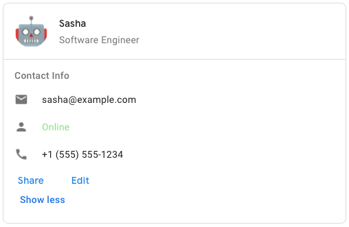
To create the sample card message in Google Chat, use the following JSON:
{
  "cardsV2": [
    {
      "cardId": "unique-card-id",
      "card": {
        "header": {
           "title": "Sasha",
           "subtitle": "Software Engineer",
           "imageUrl":
           "https://developers.google.com/workspace/chat/images/quickstart-app-avatar.png",
           "imageType": "CIRCLE",
           "imageAltText": "Avatar for Sasha"
         },
         "sections": [
           {
             "header": "Contact Info",
             "collapsible": true,
             "uncollapsibleWidgetsCount": 1,
             "widgets": [
               {
                 "decoratedText": {
                   "startIcon": {
                     "knownIcon": "EMAIL"
                   },
                   "text": "sasha@example.com"
                 }
               },
               {
                 "decoratedText": {
                   "startIcon": {
                     "knownIcon": "PERSON"
                   },
                   "text": "<font color=\"#80e27e\">Online</font>"
                 }
               },
               {
                 "decoratedText": {
                   "startIcon": {
                     "knownIcon": "PHONE"
                   },
                   "text": "+1 (555) 555-1234"
                 }
               },
               {
                 "buttonList": {
                   "buttons": [
                     {
                       "text": "Share",
                       "onClick": {
                        "openLink": {
                           "url": "https://example.com/share"
                         }
                       }
                     },
                     {
                       "text": "Edit",
                       "onClick": {
                         "action": {
                           "function": "goToView",
                           "parameters": [
                             {
                               "key": "viewType",
                               "value": "EDIT"
                             }
                           ]
                         }
                       }
                     }
                   ]
                 }
               }
             ]
           }
         ]
       }
    }
  ]
}
| Fields | |
|---|---|
header |
The header of the card. A header usually contains a leading image and a title. Headers always appear at the top of a card. |
sections[] |
Contains a collection of widgets. Each section has its own, optional header. Sections are visually separated by a line divider. For an example in Google Chat apps, see Define a section of a card. |
section |
The divider style between the header, sections and footer. |
card |
The card's actions. Actions are added to the card's toolbar menu.
For example, the following JSON constructs a card action menu with |
name |
Name of the card. Used as a card identifier in card navigation.
|
fixed |
The fixed footer shown at the bottom of this card. Setting
|
display |
In Google Workspace Add-ons, sets the display properties of the
|
peek |
When displaying contextual content, the peek card header acts as a placeholder so that the user can navigate forward between the homepage cards and the contextual cards.
|
CardAction
A card action is the action associated with the card. For example, an invoice card might include actions such as delete invoice, email invoice, or open the invoice in a browser.
Available for Google Workspace Add-ons and unavailable for Google Chat apps.
| Fields | |
|---|---|
action |
The label that displays as the action menu item. |
on |
The |
CardFixedFooter
A persistent (sticky) footer that that appears at the bottom of the card.
Setting fixedFooter without specifying a primaryButton or a secondaryButton causes an error.
For Chat apps, you can use fixed footers in dialogs, but not card messages. For an example in Google Chat apps, see Add a persistent footer.
Available for Google Chat apps and Google Workspace Add-ons.
CardHeader
Represents a card header. For an example in Google Chat apps, see Add a header.
Available for Google Chat apps and Google Workspace Add-ons.
| Fields | |
|---|---|
title |
Required. The title of the card header. The header has a fixed height: if both a title and subtitle are specified, each takes up one line. If only the title is specified, it takes up both lines. |
subtitle |
The subtitle of the card header. If specified, appears on its own line below the |
image |
The shape used to crop the image.
|
image |
The HTTPS URL of the image in the card header. |
image |
The alternative text of this image that's used for accessibility. |
DisplayStyle
In Google Workspace Add-ons, determines how a card is displayed.
Available for Google Workspace Add-ons and unavailable for Google Chat apps.
| Enums | |
|---|---|
DISPLAY_STYLE_UNSPECIFIED |
Don't use. Unspecified. |
PEEK |
The header of the card appears at the bottom of the sidebar, partially covering the current top card of the stack. Clicking the header pops the card into the card stack. If the card has no header, a generated header is used instead. |
REPLACE |
Default value. The card is shown by replacing the view of the top card in the card stack. |
DividerStyle
The divider style of a card. Currently only used for dividers betweens card sections.
Available for Google Chat apps and Google Workspace Add-ons.
| Enums | |
|---|---|
DIVIDER_STYLE_UNSPECIFIED |
Don't use. Unspecified. |
SOLID_DIVIDER |
Default option. Render a solid divider. |
NO_DIVIDER |
If set, no divider is rendered. This style completely removes the divider from the layout. The result is equivalent to not adding a divider at all. |
Section
A section contains a collection of widgets that are rendered vertically in the order that they're specified.
Available for Google Chat apps and Google Workspace Add-ons.
| Fields | |
|---|---|
header |
Text that appears at the top of a section. Supports simple HTML formatted text. For more information about formatting text, see Formatting text in Google Chat apps and Formatting text in Google Workspace Add-ons. |
widgets[] |
All the widgets in the section. Must contain at least one widget. |
collapsible |
Indicates whether this section is collapsible. Collapsible sections hide some or all widgets, but users can expand the section to reveal the hidden widgets by clicking Show more. Users can hide the widgets again by clicking Show less. To determine which widgets are hidden, specify |
uncollapsible |
The number of uncollapsible widgets which remain visible even when a section is collapsed. For example, when a section contains five widgets and the |
collapse |
Optional. Define the expand and collapse button of the section. This button will be shown only if the section is collapsible. If this field isn't set, the default button is used. |
Chip
A text, icon, or text and icon chip that users can click.
Available for Google Chat apps and unavailable for Google Workspace Add-ons.
| Fields | |
|---|---|
icon |
The icon image. If both |
label |
The text displayed inside the chip. |
on |
Optional. The action to perform when a user clicks the chip, such as opening a hyperlink or running a custom function. |
enabled |
Whether the chip is in an active state and responds to user actions. Defaults to |
disabled |
Whether the chip is in an inactive state and ignores user actions. Defaults to |
alt |
The alternative text that's used for accessibility. Set descriptive text that lets users know what the chip does. For example, if a chip opens a hyperlink, write: "Opens a new browser tab and navigates to the Google Chat developer documentation at https://developers.google.com/workspace/chat". |
ChipList
A list of chips layed out horizontally, which can either scroll horizontally or wrap to the next line.
Available for Google Chat apps and unavailable for Google Workspace Add-ons.
| Fields | |
|---|---|
layout |
Specified chip list layout. |
chips[] |
An array of chips. |
Layout
The chip list layout.
| Enums | |
|---|---|
LAYOUT_UNSPECIFIED |
Don't use. Unspecified. |
WRAPPED |
Default value. The chip list wraps to the next line if there isn't enough horizontal space. |
HORIZONTAL_SCROLLABLE |
The chips scroll horizontally if they don't fit in the available space. |
CollapseControl
Represent an expand and collapse control. Available for Google Chat apps and unavailable for Google Workspace Add-ons.
| Fields | |
|---|---|
horizontal |
The horizontal alignment of the expand and collapse button. |
expand |
Optional. Define a customizable button to expand the section. Both expandButton and collapseButton field must be set. Only one field set will not take into effect. If this field isn't set, the default button is used. |
collapse |
Optional. Define a customizable button to collapse the section. Both expandButton and collapseButton field must be set. Only one field set will not take into effect. If this field isn't set, the default button is used. |
Columns
The Columns widget displays up to 2 columns in a card or dialog. You can add widgets to each column; the widgets appear in the order that they are specified. For an example in Google Chat apps, see Display cards and dialogs in columns.
The height of each column is determined by the taller column. For example, if the first column is taller than the second column, both columns have the height of the first column. Because each column can contain a different number of widgets, you can't define rows or align widgets between the columns.
Columns are displayed side-by-side. You can customize the width of each column using the HorizontalSizeStyle field. If the user's screen width is too narrow, the second column wraps below the first:
- On web, the second column wraps if the screen width is less than or equal to 480 pixels.
- On iOS devices, the second column wraps if the screen width is less than or equal to 300 pt.
- On Android devices, the second column wraps if the screen width is less than or equal to 320 dp.
To include more than two columns, or to use rows, use the Grid
Available for Google Chat apps and Google Workspace Add-ons. The add-on UIs that support columns include:
- The dialog displayed when users open the add-on from an email draft.
- The dialog displayed when users open the add-on from the Add attachment menu in a Google Calendar event.
| Fields | |
|---|---|
column |
An array of columns. You can include up to 2 columns in a card or dialog. |
Column
A column.
| Fields | |
|---|---|
horizontal |
Specifies how a column fills the width of the card. |
horizontal |
Specifies whether widgets align to the left, right, or center of a column. |
vertical |
Specifies whether widgets align to the top, bottom, or center of a column. |
widgets[] |
An array of widgets included in a column. Widgets appear in the order that they are specified. |
HorizontalSizeStyle
Specifies how a column fills the width of the card. The width of each column depends on both the HorizontalSizeStyle and the width of the widgets within the column.
| Enums | |
|---|---|
HORIZONTAL_SIZE_STYLE_UNSPECIFIED |
Don't use. Unspecified. |
FILL_AVAILABLE_SPACE |
Default value. Column fills the available space, up to 70% of the card's width. If both columns are set to FILL_AVAILABLE_SPACE, each column fills 50% of the space. |
FILL_MINIMUM_SPACE |
Column fills the least amount of space possible and no more than 30% of the card's width. |
VerticalAlignment
Specifies whether widgets align to the top, bottom, or center of a column.
| Enums | |
|---|---|
VERTICAL_ALIGNMENT_UNSPECIFIED |
Don't use. Unspecified. |
CENTER |
Default value. Aligns widgets to the center of a column. |
TOP |
Aligns widgets to the top of a column. |
BOTTOM |
Aligns widgets to the bottom of a column. |
Widgets
The supported widgets that you can include in a column.
| Fields | |
|---|---|
Union field
|
|
text |
|
image |
|
decorated |
|
button |
|
text |
|
selection |
|
date |
|
chip |
|
DateTimePicker
Lets users input a date, a time, or both a date and a time. For an example in Google Chat apps, see Let a user pick a date and time.
Users can input text or use the picker to select dates and times. If users input an invalid date or time, the picker shows an error that prompts users to input the information correctly.
Available for Google Chat apps and Google Workspace Add-ons.
| Fields | |
|---|---|
name |
The name by which the For details about working with form inputs, see Receive form data. |
label |
The text that prompts users to input a date, a time, or a date and time. For example, if users are scheduling an appointment, use a label such as |
type |
Whether the widget supports inputting a date, a time, or the date and time. |
value |
The default value displayed in the widget, in milliseconds since Unix epoch time. Specify the value based on the type of picker (
|
timezone |
The number representing the time zone offset from UTC, in minutes. If set, the |
on |
Triggered when the user clicks Save or Clear from the |
validation |
Optional. Specify the validation required for this datetimer picker.
|
DateTimePickerType
The format for the date and time in the DateTimePicker widget. Determines whether users can input a date, a time, or both a date and time.
Available for Google Chat apps and Google Workspace Add-ons.
| Enums | |
|---|---|
DATE_AND_TIME |
Users input a date and time. |
DATE_ONLY |
Users input a date. |
TIME_ONLY |
Users input a time. |
DecoratedText
A widget that displays text with optional decorations such as a label above or below the text, an icon in front of the text, a selection widget, or a button after the text. For an example in Google Chat apps, see Display text with decorative text.
Available for Google Chat apps and Google Workspace Add-ons.
| Fields | |
|---|---|
icon |
Deprecated in favor of |
start |
The icon displayed in front of the text. |
top |
The text that appears above |
text |
Required. The primary text. Supports simple formatting. For more information about formatting text, see Formatting text in Google Chat apps and Formatting text in Google Workspace Add-ons. |
wrap |
The wrap text setting. If Only applies to |
bottom |
The text that appears below |
on |
This action is triggered when users click |
Union field control. A button, switch, checkbox, or image that appears to the right-hand side of text in the decoratedText widget. control can be only one of the following: |
|
button |
A button that a user can click to trigger an action. |
switch |
A switch widget that a user can click to change its state and trigger an action. |
end |
An icon displayed after the text. |
SwitchControl
Either a toggle-style switch or a checkbox inside a decoratedText widget.
Available for Google Chat apps and Google Workspace Add-ons.
Only supported in the decoratedText widget.
| Fields | |
|---|---|
name |
The name by which the switch widget is identified in a form input event. For details about working with form inputs, see Receive form data. |
value |
The value entered by a user, returned as part of a form input event. For details about working with form inputs, see Receive form data. |
selected |
When |
on |
The action to perform when the switch state is changed, such as what function to run. |
control |
How the switch appears in the user interface.
|
ControlType
How the switch appears in the user interface.
Available for Google Chat apps and Google Workspace Add-ons.
| Enums | |
|---|---|
SWITCH |
A toggle-style switch. |
CHECKBOX |
Deprecated in favor of CHECK_BOX. |
CHECK_BOX |
A checkbox. |
Divider
This type has no fields.
Displays a divider between widgets as a horizontal line. For an example in Google Chat apps, see Add a horizontal divider between widgets.
Available for Google Chat apps and Google Workspace Add-ons.
For example, the following JSON creates a divider:
"divider": {}
EndNavigation
Dialog flow action.
Available for Google Chat apps and unavailable for Google Workspace Add-ons.
| Fields | |
|---|---|
action |
The render action for the client to end a dialog flow.
|
Action
The render action types for the client to end a dialog flow.
Available for Google Chat apps and unavailable for Google Workspace Add-ons.
GetAutocompletionResponse
A response to getting autocomplete container, which includes elements necessary for showing auto complete items for text field.
Available for Google Workspace Add-ons and unavailable for Google Chat apps. For example:
{
  "autoComplete": {
    "items": [
      {
        "text": "C++"
      },
      {
        "text": "Java"
      },
      {
        "text": "JavaScript"
      },
      {
        "text": "Python"
      }
    ]
  }
}
| Fields | |
|---|---|
auto |
|
schema |
This is a no-op schema field that might be present in the markup for syntax checking. |
Grid
Displays a grid with a collection of items. Items can only include text or images. For responsive columns, or to include more than text or images, use Columns
A grid supports any number of columns and items. The number of rows is determined by items divided by columns. A grid with 10 items and 2 columns has 5 rows. A grid with 11 items and 2 columns has 6 rows.
Available for Google Chat apps and Google Workspace Add-ons.
For example, the following JSON creates a 2 column grid with a single item:
"grid": {
  "title": "A fine collection of items",
  "columnCount": 2,
  "borderStyle": {
    "type": "STROKE",
    "cornerRadius": 4
  },
  "items": [
    {
      "image": {
        "imageUri": "https://www.example.com/image.png",
        "cropStyle": {
          "type": "SQUARE"
        },
        "borderStyle": {
          "type": "STROKE"
        }
      },
      "title": "An item",
      "textAlignment": "CENTER"
    }
  ],
  "onClick": {
    "openLink": {
      "url": "https://www.example.com"
    }
  }
}
| Fields | |
|---|---|
title |
The text that displays in the grid header. |
items[] |
The items to display in the grid. |
border |
The border style to apply to each grid item. |
column |
The number of columns to display in the grid. A default value is used if this field isn't specified, and that default value is different depending on where the grid is shown (dialog versus companion). |
on |
This callback is reused by each individual grid item, but with the item's identifier and index in the items list added to the callback's parameters. |
GridItem
Represents an item in a grid layout. Items can contain text, an image, or both text and an image.
Available for Google Chat apps and Google Workspace Add-ons.
| Fields | |
|---|---|
id |
A user-specified identifier for this grid item. This identifier is returned in the parent grid's |
image |
The image that displays in the grid item. |
title |
The grid item's title. |
subtitle |
The grid item's subtitle. |
layout |
The layout to use for the grid item. |
GridItemLayout
Represents the various layout options available for a grid item.
Available for Google Chat apps and Google Workspace Add-ons.
| Enums | |
|---|---|
GRID_ITEM_LAYOUT_UNSPECIFIED |
Don't use. Unspecified. |
TEXT_BELOW |
The title and subtitle are shown below the grid item's image. |
TEXT_ABOVE |
The title and subtitle are shown above the grid item's image. |
Icon
An icon displayed in a widget on a card. For an example in Google Chat apps, see Add an icon.
Supports built-in and custom icons.
Available for Google Chat apps and Google Workspace Add-ons.
| Fields | |
|---|---|
alt |
Optional. A description of the icon used for accessibility. If unspecified, the default value If the icon is set in a |
image |
The crop style applied to the image. In some cases, applying a |
Union field icons. The icon displayed in the widget on the card. icons can be only one of the following: |
|
known |
Display one of the built-in icons provided by Google Workspace. For example, to display an airplane icon, specify For a full list of supported icons, see built-in icons. |
icon |
Display a custom icon hosted at an HTTPS URL. For example: Supported file types include |
material |
Display one of the Google Material Icons. For example, to display a checkbox icon, use
|
Image
An image that is specified by a URL and can have an onClick action. For an example, see Add an image.
Available for Google Chat apps and Google Workspace Add-ons.
| Fields | |
|---|---|
image |
The HTTPS URL that hosts the image. For example: |
on |
When a user clicks the image, the click triggers this action. |
alt |
The alternative text of this image that's used for accessibility. |
ImageComponent
Represents an image.
Available for Google Chat apps and Google Workspace Add-ons.
| Fields | |
|---|---|
image |
The image URL. |
alt |
The accessibility label for the image. |
crop |
The crop style to apply to the image. |
border |
The border style to apply to the image. |
ImageCropStyle
Represents the crop style applied to an image.
Available for Google Chat apps and Google Workspace Add-ons.
For example, here's how to apply a 16:9 aspect ratio:
cropStyle {
 "type": "RECTANGLE_CUSTOM",
 "aspectRatio": 16/9
}
| Fields | |
|---|---|
type |
The crop type. |
aspect |
The aspect ratio to use if the crop type is For example, here's how to apply a 16:9 aspect ratio: |
ImageCropType
Represents the crop style applied to an image.
Available for Google Chat apps and Google Workspace Add-ons.
| Enums | |
|---|---|
IMAGE_CROP_TYPE_UNSPECIFIED |
Don't use. Unspecified. |
SQUARE |
Default value. Applies a square crop. |
CIRCLE |
Applies a circular crop. |
RECTANGLE_CUSTOM |
Applies a rectangular crop with a custom aspect ratio. Set the custom aspect ratio with aspectRatio. |
RECTANGLE_4_3 |
Applies a rectangular crop with a 4:3 aspect ratio. |
Link
The link object for the third-party resource that's returned to the add-on. For more information, see Create third-party resources from the @ menu.
Available for Google Workspace Add-ons and unavailable for Google Chat apps.
| Fields | |
|---|---|
url |
URL of the link to return to the add-on. |
title |
Title of the link to return to the add-on. |
LinkPreview
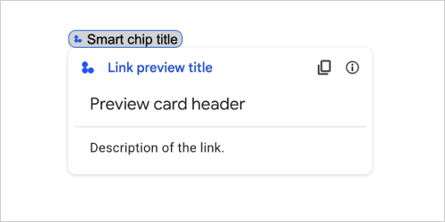
Card action that previews a third-party link by displaying a card and smart chip. To learn more, see Preview links with smart chips.
Available for Google Workspace Add-ons and unavailable for Google Chat apps.
For example, the following JSON returns a unique title for the link preview and its smart chip, and a preview card with a header and text description:
{
  "action": {
    "linkPreview": {
      "title": "Smart chip title",
      "linkPreviewTitle": "Link preview title",
      "previewCard": {
        "header": {
          "title": "Preview card header",
        },
        "sections": [
          {
            "widgets": [
              {
                "textParagraph": {
                  "text": "Description of the link."
                }
              }
            ]
          }
        ]
      }
    }
  }
}
The example returns the following link preview:
| Fields | |
|---|---|
preview |
A card that displays information about a link from a third-party service. |
title |
The title that displays in the smart chip for the link preview. If unset, the smart chip displays the header of the |
link |
The title that displays in the link preview. If unset, the link preview displays the header of the |
MaterialIcon
A Google Material Icon, which includes over 2500+ options.
For example, to display a checkbox icon with customized weight and grade, write the following:
{
  "name": "check_box",
  "fill": true,
  "weight": 300,
  "grade": -25
}
Available for Google Chat apps and unavailable for Google Workspace Add-ons.
| Fields | |
|---|---|
name |
The icon name defined in the Google Material Icon, for example, |
fill |
Whether the icon renders as filled. Default value is false. To preview different icon settings, go to Google Font Icons and adjust the settings under Customize. |
weight |
The stroke weight of the icon. Choose from {100, 200, 300, 400, 500, 600, 700}. If absent, default value is 400. If any other value is specified, the default value is used. To preview different icon settings, go to Google Font Icons and adjust the settings under Customize. |
grade |
Weight and grade affect a symbol’s thickness. Adjustments to grade are more granular than adjustments to weight and have a small impact on the size of the symbol. Choose from {-25, 0, 200}. If absent, default value is 0. If any other value is specified, the default value is used. To preview different icon settings, go to Google Font Icons and adjust the settings under Customize. |
Navigation
Card action that manipulates the card stack.
For example:
1) Add a new card to the stack (navigate forward). For Chat apps, only available for app home.
Available for Google Chat apps and Google Workspace Add-ons.
 navigations : {
    pushCard : CARD
  }
2) Update the card on top of the stack (in place update).
Available for Google Workspace Add-ons and unavailable for Google Chat apps.
  navigations : {
    popCard : true,
  }, {
    pushCard : CARD
  }
3) Go back one step without updating.
Available for Google Workspace Add-ons and unavailable for Google Chat apps.
  navigations : {
    popCard : true,
  }
4) Go back multiple steps and update that card.
Available for Google Workspace Add-ons and unavailable for Google Chat apps.
  navigations : {
    popCard : true,
  }, ... {
    pushCard : CARD
  }
5) Go back multiple steps to a defined CARD_NAME.
Available for Google Workspace Add-ons and unavailable for Google Chat apps.
  navigations : {
    popToCardName : CARD_NAME,
  }, {
    pushCard : CARD
  }
6) Go back to the root and update that card.
Available for Google Workspace Add-ons and unavailable for Google Chat apps.
  navigations : {
    popToRoot : true
  }, {
    pushCard : CARD
  }
7) Pop to the specified card and pop that one as well.
Available for Google Workspace Add-ons and unavailable for Google Chat apps.
  navigations : {
    popToCardName : CARD_NAME
  }, {
    popCard : true,
  }
8) Replace the top card with a new card. For Chat apps, only available for app home.
Available for Google Chat apps and Google Workspace Add-ons.
  navigations : {
    updateCard : CARD
  }
| Fields | |
|---|---|
Union field
|
|
pop |
Card stack pops all cards off except the root card. |
pop |
Card stack pops one card off. |
pop |
Card stack pops all cards above the specified card with given card name. |
push |
Card stack pushes a card onto the card stack. |
update |
Card stack updates the top card with a new card and preserves filled form fields values. For a non-equivalent field, the value is dropped. |
end |
Dialog flow end navigation action. For more information, see Build a homepage for a Google Chat app
|
Notification
Card action that displays a notification in the host app.
Available for Google Workspace Add-ons and unavailable for Google Chat apps.
| Fields | |
|---|---|
text |
Plain text to display for the notification, without HTML tags. |
OnClick
Represents how to respond when users click an interactive element on a card, such as a button.
Available for Google Chat apps and Google Workspace Add-ons.
| Fields | |
|---|---|
Union field
|
|
action |
If specified, an action is triggered by this |
open |
If specified, this |
open |
An add-on triggers this action when the action needs to open a link. This differs from the
|
card |
A new card is pushed to the card stack after clicking if specified.
|
overflow |
If specified, this |
OpenLink
Represents an onClick event that opens a hyperlink.
Available for Google Chat apps and Google Workspace Add-ons.
| Fields | |
|---|---|
url |
The URL to open. |
open |
How to open a link.
|
on |
Whether the client forgets about a link after opening it, or observes it until the window closes.
|
OnClose
What the client does when a link opened by an OnClick action is closed.
Implementation depends on client platform capabilities. For example, a web browser might open a link in a pop-up window with an OnClose handler.
If both OnOpen and OnClose handlers are set, and the client platform can't support both values, OnClose takes precedence.
Available for Google Workspace Add-ons and unavailable for Google Chat apps.
| Enums | |
|---|---|
NOTHING |
Default value. The card doesn't reload; nothing happens. |
RELOAD |
Reloads the card after the child window closes. If used in conjunction with |
OpenAs
When an OnClick action opens a link, then the client can either open it as a full-size window (if that's the frame used by the client), or an overlay (such as a pop-up). The implementation depends on the client platform capabilities, and the value selected might be ignored if the client doesn't support it. FULL_SIZE is supported by all clients.
Available for Google Workspace Add-ons and unavailable for Google Chat apps.
| Enums | |
|---|---|
FULL_SIZE |
The link opens as a full-size window (if that's the frame used by the client). |
OVERLAY |
The link opens as an overlay, such as a pop-up. |
OverflowMenu
A widget that presents a pop-up menu with one or more actions that users can invoke. For example, showing non-primary actions in a card. You can use this widget when actions don't fit in the available space. To use, specify this widget in the OnClick action of widgets that support it. For example, in a Button.
Available for Google Chat apps and unavailable for Google Workspace Add-ons.
| Fields | |
|---|---|
items[] |
Required. The list of menu options. |
OverflowMenuItem
An option that users can invoke in an overflow menu.
Available for Google Chat apps and unavailable for Google Workspace Add-ons.
| Fields | |
|---|---|
start |
The icon displayed in front of the text. |
text |
Required. The text that identifies or describes the item to users. |
on |
Required. The action invoked when a menu option is selected. This |
disabled |
Whether the menu option is disabled. Defaults to false. |
RenderActions
A set of render instructions that tells a card to perform an action, or tells the add-on host app or the Chat app to perform an app-specific action.
Available for Google Chat apps and Google Workspace Add-ons.
| Fields | |
|---|---|
action |
|
host |
Actions handled by individual host apps. |
schema |
This is a no-op schema field that might be present in the markup for syntax checking. |
Action
| Fields | |
|---|---|
navigations[] |
Push, pop, or update displayed cards. |
link |
Immediately open the target link in a new tab or a pop-up. |
notification |
Display a notification to the end user. |
link |
Display a link preview to the end user. |
links[] |
The link for a third-party resource that's created from within a Google Workspace application. Formatted as an array of objects with one item. For more information, see Create third-party resources from the @ menu. |
SelectionInput
A widget that creates one or more UI items that users can select. For example, a dropdown menu or checkboxes. You can use this widget to collect data that can be predicted or enumerated. For an example in Google Chat apps, see Add selectable UI elements.
Chat apps can process the value of items that users select or input. For details about working with form inputs, see Receive form data.
To collect undefined or abstract data from users, use the TextInput widget.
Available for Google Chat apps and Google Workspace Add-ons.
| Fields | |
|---|---|
name |
Required. The name that identifies the selection input in a form input event. For details about working with form inputs, see Receive form data. |
label |
The text that appears above the selection input field in the user interface. Specify text that helps the user enter the information your app needs. For example, if users are selecting the urgency of a work ticket from a drop-down menu, the label might be "Urgency" or "Select urgency". |
type |
The type of items that are displayed to users in a |
items[] |
An array of selectable items. For example, an array of radio buttons or checkboxes. Supports up to 100 items. |
on |
If specified, the form is submitted when the selection changes. If not specified, you must specify a separate button that submits the form. For details about working with form inputs, see Receive form data. |
multi |
For multiselect menus, the maximum number of items that a user can select. Minimum value is 1 item. If unspecified, defaults to 3 items. |
multi |
For multiselect menus, the number of text characters that a user inputs before the app queries autocomplete and displays suggested items in the menu. If unspecified, defaults to 0 characters for static data sources and 3 characters for external data sources. |
validation |
For dropdown menus, the validation for this selection input field.
|
Union field
|
|
external |
An external data source, such as a relational data base. |
platform |
A data source from Google Workspace. |
PlatformDataSource
For a SelectionInput
Available for Google Chat apps and unavailable for Google Workspace Add-ons.
| Fields | |
|---|---|
Union field data_source. The data source. data_source can be only one of the following: |
|
common |
A data source shared by all Google Workspace applications, such as users in a Google Workspace organization. |
host |
A data source that's unique to a Google Workspace host application, such spaces in Google Chat. This field supports the Google API Client Libraries but isn't available in the Cloud Client Libraries. To learn more, see Install the client libraries. |
CommonDataSource
A data source shared by all Google Workspace applications.
Available for Google Chat apps and unavailable for Google Workspace Add-ons.
| Enums | |
|---|---|
UNKNOWN |
Default value. Don't use. |
USER |
Google Workspace users. The user can only view and select users from their Google Workspace organization. |
SelectionItem
An item that users can select in a selection input, such as a checkbox or switch.
Available for Google Chat apps and Google Workspace Add-ons.
| Fields | |
|---|---|
text |
The text that identifies or describes the item to users. |
value |
The value associated with this item. The client should use this as a form input value. For details about working with form inputs, see Receive form data. |
selected |
Whether the item is selected by default. If the selection input only accepts one value (such as for radio buttons or a dropdown menu), only set this field for one item. |
start |
For multiselect menus, the URL for the icon displayed next to the item's |
bottom |
For multiselect menus, a text description or label that's displayed below the item's |
SelectionType
The format for the items that users can select. Different options support different types of interactions. For example, users can select multiple checkboxes, but can only select one item from a dropdown menu.
Each selection input supports one type of selection. Mixing checkboxes and switches, for example, isn't supported.
Available for Google Chat apps and Google Workspace Add-ons.
| Enums | |
|---|---|
CHECK_BOX |
A set of checkboxes. Users can select one or more checkboxes. |
RADIO_BUTTON |
A set of radio buttons. Users can select one radio button. |
SWITCH |
A set of switches. Users can turn on one or more switches. |
DROPDOWN |
A dropdown menu. Users can select one item from the menu. |
MULTI_SELECT |
A multiselect menu for static or dynamic data. From the menu bar, users select one or more items. Users can also input values to populate dynamic data. For example, users can start typing the name of a Google Chat space and the widget autosuggests the space. To populate items for a multiselect menu, you can use one of the following types of data sources:
For examples of how to implement multiselect menus, see Add a multiselect menu.
|
SubmitFormResponse
A response to a form submit other than getting an autocomplete container, which contains the actions the card should perform and/or the add-on host app should perform, and whether the card's state has changed.
Available for Google Workspace Add-ons and unavailable for Google Chat apps. For example:
{
  "renderActions": {
    "action": {
      "notification": {
        "text": "Email address is added: salam.heba@example.com"
      }
    },
    "hostAppAction": {
      "gmailAction": {
        "openCreatedDraftAction": {
          "draftId": "msg-a:r-79766936926021702",
          "threadServerPermId": "thread-f:15700999851086004"
        }
      }
    }
  }
}
| Fields | |
|---|---|
render |
A set of render instructions that tells the card to perform an action and/or tells the add-on host app to perform an app-specific action. |
state |
Whether the state of the cards has changed and data in existing cards is stale. |
schema |
This is a no-op schema field that may be present in the markup for syntax checking. |
Suggestions
Suggested values that users can enter. These values appear when users click inside the text input field. As users type, the suggested values dynamically filter to match what the users have typed.
For example, a text input field for programming language might suggest Java, JavaScript, Python, and C++. When users start typing Jav, the list of suggestions filters to show Java and JavaScript.
Suggested values help guide users to enter values that your app can make sense of. When referring to JavaScript, some users might enter javascript and others java script. Suggesting JavaScript can standardize how users interact with your app.
When specified, TextInput.type is always SINGLE_LINE, even if it's set to MULTIPLE_LINE.
Available for Google Chat apps and Google Workspace Add-ons.
| Fields | |
|---|---|
items[] |
A list of suggestions used for autocomplete recommendations in text input fields. |
SuggestionItem
One suggested value that users can enter in a text input field.
Available for Google Chat apps and Google Workspace Add-ons.
| Fields | |
|---|---|
Union field
|
|
text |
The value of a suggested input to a text input field. This is equivalent to what users enter themselves. |
TextInput
A field in which users can enter text. Supports suggestions and on-change actions. For an example in Google Chat apps, see Add a field in which a user can enter text.
Chat apps receive and can process the value of entered text during form input events. For details about working with form inputs, see Receive form data.
When you need to collect undefined or abstract data from users, use a text input. To collect defined or enumerated data from users, use the SelectionInput widget.
Available for Google Chat apps and Google Workspace Add-ons.
| Fields | |
|---|---|
name |
The name by which the text input is identified in a form input event. For details about working with form inputs, see Receive form data. |
label |
The text that appears above the text input field in the user interface. Specify text that helps the user enter the information your app needs. For example, if you are asking someone's name, but specifically need their surname, write Required if |
hint |
Text that appears below the text input field meant to assist users by prompting them to enter a certain value. This text is always visible. Required if |
value |
The value entered by a user, returned as part of a form input event. For details about working with form inputs, see Receive form data. |
type |
How a text input field appears in the user interface. For example, whether the field is single or multi-line. |
on |
What to do when a change occurs in the text input field. For example, a user adding to the field or deleting text. Examples of actions to take include running a custom function or opening a dialog in Google Chat. |
initial |
Suggested values that users can enter. These values appear when users click inside the text input field. As users type, the suggested values dynamically filter to match what the users have typed. For example, a text input field for programming language might suggest Java, JavaScript, Python, and C++. When users start typing Suggested values help guide users to enter values that your app can make sense of. When referring to JavaScript, some users might enter When specified,
|
auto |
Optional. Specify what action to take when the text input field provides suggestions to users who interact with it. If unspecified, the suggestions are set by If specified, the app takes the action specified here, such as running a custom function.
|
validation |
Specify the validation necessary for this text input field.
|
placeholder |
Text that appears in the text input field when the field is empty. Use this text to prompt users to enter a value. For example,
|
Type
How a text input field appears in the user interface. For example, whether it's a single line input field, or a multi-line input. If initialSuggestions is specified, type is always SINGLE_LINE, even if it's set to MULTIPLE_LINE.
Available for Google Chat apps and Google Workspace Add-ons.
| Enums | |
|---|---|
SINGLE_LINE |
The text input field has a fixed height of one line. |
MULTIPLE_LINE |
The text input field has a fixed height of multiple lines. |
TextParagraph
A paragraph of text that supports formatting. For an example in Google Chat apps, see Add a paragraph of formatted text. For more information about formatting text, see Formatting text in Google Chat apps and Formatting text in Google Workspace Add-ons.
Available for Google Chat apps and Google Workspace Add-ons.
| Fields | |
|---|---|
text |
The text that's shown in the widget. |
max |
The maximum number of lines of text that are displayed in the widget. If the text exceeds the specified maximum number of lines, the excess content is concealed behind a show more button. If the text is equal or shorter than the specified maximum number of lines, a show more button isn't displayed. The default value is 0, in which case all context is displayed. Negative values are ignored. |
Validation
Represents the necessary data for validating the widget it's attached to.
Available for Google Chat apps and Google Workspace Add-ons.
| Fields | |
|---|---|
character |
Specify the character limit for text input widgets. Note that this is only used for text input and is ignored for other widgets.
|
input |
Specify the type of the input widgets.
|
InputType
The type of the input widget.
| Enums | |
|---|---|
INPUT_TYPE_UNSPECIFIED |
Unspecified type. Do not use. |
TEXT |
Regular text that accepts all characters. |
INTEGER |
An integer value. |
FLOAT |
A float value. |
EMAIL |
An email address. |
EMOJI_PICKER |
A emoji selected from system-provided emoji picker. |
Widget
Each card is made up of widgets.
A widget is a composite object that can represent one of text, images, buttons, and other object types.
| Fields | |
|---|---|
horizontal |
Specifies whether widgets align to the left, right, or center of a column. |
Union field data. A widget can only have one of the following items. You can use multiple widget fields to display more items. data can be only one of the following: |
|
text |
Displays a text paragraph. Supports simple HTML formatted text. For more information about formatting text, see Formatting text in Google Chat apps and Formatting text in Google Workspace Add-ons. For example, the following JSON creates a bolded text: |
image |
Displays an image. For example, the following JSON creates an image with alternative text: |
decorated |
Displays a decorated text item. For example, the following JSON creates a decorated text widget showing email address: |
button |
A list of buttons. For example, the following JSON creates two buttons. The first is a blue text button and the second is an image button that opens a link: |
text |
Displays a text box that users can type into. For example, the following JSON creates a text input for an email address: As another example, the following JSON creates a text input for a programming language with static suggestions: |
selection |
Displays a selection control that lets users select items. Selection controls can be checkboxes, radio buttons, switches, or dropdown menus. For example, the following JSON creates a dropdown menu that lets users choose a size: |
date |
Displays a widget that lets users input a date, time, or date and time. For example, the following JSON creates a date time picker to schedule an appointment: |
divider |
Displays a horizontal line divider between widgets. For example, the following JSON creates a divider: |
grid |
Displays a grid with a collection of items. A grid supports any number of columns and items. The number of rows is determined by the upper bounds of the number items divided by the number of columns. A grid with 10 items and 2 columns has 5 rows. A grid with 11 items and 2 columns has 6 rows.
For example, the following JSON creates a 2 column grid with a single item: |
columns |
Displays up to 2 columns. To include more than 2 columns, or to use rows, use the For example, the following JSON creates 2 columns that each contain text paragraphs: |
chip |
A list of chips. For example, the following JSON creates two chips. The first is a text chip and the second is an icon chip that opens a link:
|
HorizontalAlignment
Specifies whether widgets align to the left, right, or center of a column.
Available for Google Chat apps and unavailable for Google Workspace Add-ons.
| Enums | |
|---|---|
HORIZONTAL_ALIGNMENT_UNSPECIFIED |
Don't use. Unspecified. |
START |
Default value. Aligns widgets to the start position of the column. For left-to-right layouts, aligns to the left. For right-to-left layouts, aligns to the right. |
CENTER |
Aligns widgets to the center of the column. |
END |
Aligns widgets to the end position of the column. For left-to-right layouts, aligns widgets to the right. For right-to-left layouts, aligns widgets to the left. |
ImageType
The shape used to crop the image.
Available for Google Chat apps and Google Workspace Add-ons.
| Enums | |
|---|---|
SQUARE |
Default value. Applies a square mask to the image. For example, a 4x3 image becomes 3x3. |
CIRCLE |
Applies a circular mask to the image. For example, a 4x3 image becomes a circle with a diameter of 3. |