
分析和商業智慧工具對於發掘 BigQuery 資料的洞察資訊至關重要。BigQuery 支援多種 Google 和第三方資料視覺化工具,可用於分析地點洞察資料的查詢結果,包括:
- BigQuery Studio 的「視覺化」分頁
- Colab 筆記本
- Looker Studio
- Google Earth Engine
- BigQuery Geo Viz
以下範例說明如何在下列項目中將結果視覺化:
- BigQuery Studio 的「視覺化」分頁,整合了地理資料檢視器。
- Colab 筆記本,這是一項代管的 Jupyter 筆記本服務。
- Looker Studio:這個平台可讓您建構及使用資料視覺化、資訊主頁和報表。
- BigQuery Geo Viz:BigQuery 中的地理空間資料視覺化工具,使用 Google Maps API。
範例顯示無障礙餐廳的視覺化資料,但任何地點洞察查詢和品牌資料查詢都可以視覺化。
如要進一步瞭解如何使用其他工具將資料視覺化,請參閱 BigQuery 說明文件。
查詢要顯示的資料
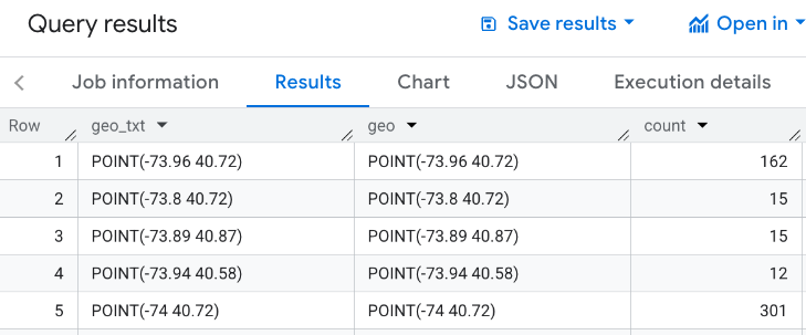
下列視覺化範例使用以下查詢,產生紐約市帝國大廈 3000 公尺內,設有輪椅無障礙入口的餐廳數量。這項查詢會傳回每個地理點的餐廳數量資料表,每個點的大小為 0.005 度。
由於您無法對 GEOGRAPHY 點執行 GROUP BY 作業,因此這項查詢會使用 BigQuery ST_ASTEXT 函式,將每個點轉換為點的 STRING
WKT 表示法,並將該值寫入 geo_txt 欄。然後使用 geo_txt 執行 GROUP BY。
SELECT
  geo_txt, -- STRING WKT geometry value.
  ST_GEOGFROMTEXT(geo_txt) AS geo, -- Convert STRING to GEOGRAPHY value.
  count
FROM (
  -- Create STRING WKT representation of each GEOGRAPHY point to
  -- GROUP BY the STRING value.
  SELECT WITH AGGREGATION_THRESHOLD
    ST_ASTEXT(ST_SNAPTOGRID(point, 0.005)) AS geo_txt,
    COUNT(*) AS count
  FROM
    `PROJECT_NAME.places_insights___us.places`
  WHERE
    'restaurant' IN UNNEST(types)
    AND wheelchair_accessible_entrance = true
    AND ST_DWITHIN(ST_GEOGPOINT(-73.9857, 40.7484), point, 3000)
  GROUP BY
    geo_txt
)
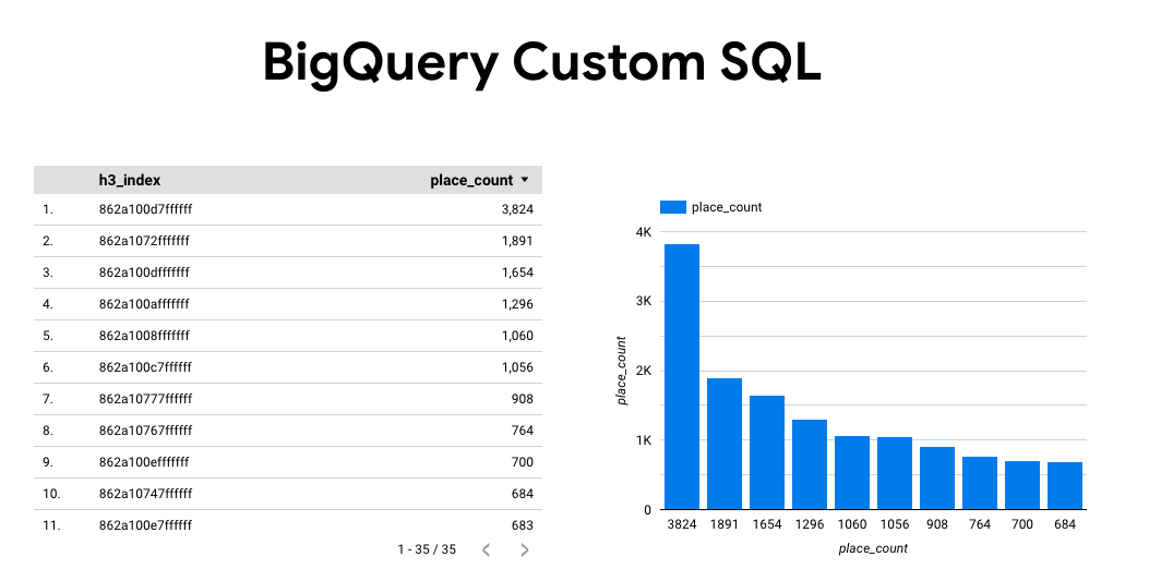
下圖顯示這項查詢的輸出範例,其中 count 包含每個點的餐廳數量:
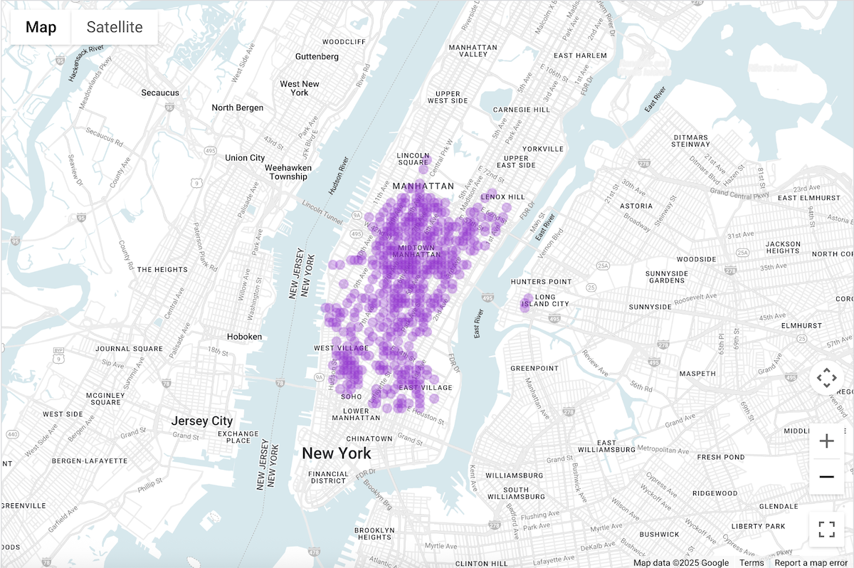
使用 BigQuery Studio 的「視覺化」分頁標籤,將資料視覺化
下圖顯示 BigQuery 中使用「Visualization」(視覺化) 分頁標籤顯示的資料。 圓圈顏色越深,表示該地點的餐廳越密集。
在 BigQuery Studio 中以圖表呈現資料
- 在「查詢資料以產生視覺化圖表」中執行上述查詢。
- 在 BigQuery 結果中,按一下「視覺化」分頁標籤。
- 地圖隨即開啟,並以圓圈代表查詢的點。
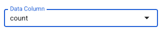
在「視覺化設定」下方,將「資料欄」設為「count」。
圓圈顏色越深,代表餐廳數量越多。
您也可以視需要更新其他設定,變更視覺化效果的外觀和風格。
如要進一步瞭解設定選項,請參閱 BigQuery 視覺化說明文件。
使用 Colab 筆記本將資料視覺化
與 BigQuery Studio 相比,Colab 筆記本的視覺化功能更具控制權和精緻度,而且您不必離開 Jupyter 筆記本環境。
我們提供三種格式的教學課程,說明如何在 Colab 中將地理空間分析資料視覺化:
- 請參閱 Colab 說明文件。
- 以 YouTube 影片形式分享。
- 在 GitHub 筆記本中,您可以複製並在 Colab for Workspaces 或 Colab Enterprise 中使用。
本教學課程著重於使用 pydeck、deck.gl 和
- 散布圖 (通常用於取樣)。
- GeoJSON (用於探索)。
- 等值線圖 (適用於強度)。
- 熱視圖 (適用於密度)。
運用 Looker Studio 以圖表呈現資料
下圖顯示以熱視圖形式呈現的 Looker Studio 資料。熱度圖會顯示密度,從低 (綠色) 到高 (紅色)。
將資料匯入 Looker Studio
如要將資料匯入 Looker Studio,請按照下列步驟操作:
在 BigQuery 結果中,依序點選「開啟方式」->「Looker Studio」。系統會自動將結果匯入 Looker Studio。
Looker Studio 會建立預設報表頁面,並以結果的標題、表格和長條圖初始化。
選取網頁上的所有內容並刪除。
按一下「插入」->「熱度圖」,即可在報表中加入熱度圖。
在「圖表類型 -> 設定」下方,將「資料」部分中的項目拖曳至設定欄位,如下所示:
熱視圖如上所示。您可以視需要選取「圖表類型」->「樣式」,進一步設定地圖外觀。
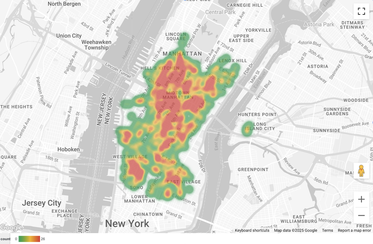
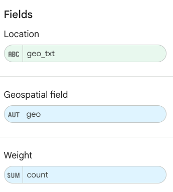
使用 BigQuery Geo Viz 呈現資料
下圖顯示 BigQuery Geo Viz 中以填滿地圖形式呈現的資料。填滿的地圖會依點格顯示餐廳密度,點越大代表密度越高。
將資料匯入 BigQuery Geo Viz
如要將資料匯入 BigQuery Geo Viz,請按照下列步驟操作:
在 BigQuery 結果中,按一下「在 GeoViz 中開啟」。
畫面會開啟「查詢」步驟。
選取「執行」按鈕來執行查詢。地圖會自動顯示地圖上的點。
選取「資料」即可查看資料。
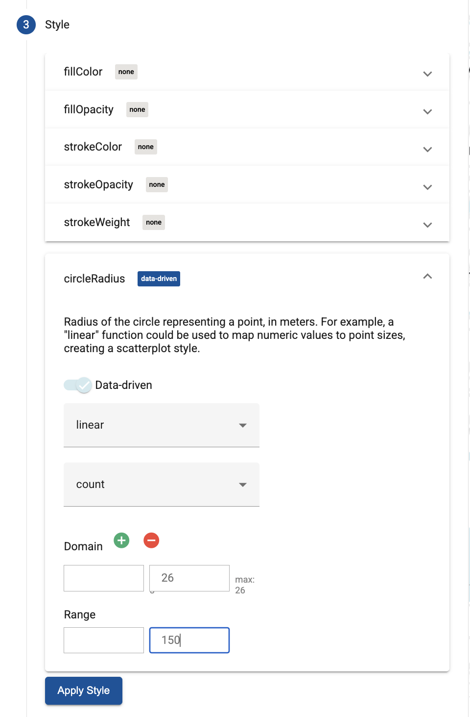
在「資料」部分,按一下「新增樣式」按鈕。
選取「circleRadius」,然後使用滑桿啟用「以資料為準」樣式。
依照下列欄位的值進行設定:
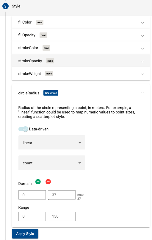
按一下「套用樣式」,將樣式套用至地圖。