
分析和商业智能 工具对于帮助您从 BigQuery 数据中发现洞见至关重要。BigQuery 支持多种 Google 和第三方 数据可视化 工具,您可以使用这些工具来分析对地点数据分析数据进行查询的结果,包括:
- BigQuery Studio 的“可视化图表”标签页
- Colab 笔记本
- Looker Studio
- Google Earth Engine
- BigQuery Geo Viz
以下示例介绍了如何在以下工具中直观呈现结果:
- BigQuery Studio 的“可视化图表”标签页,这是一个集成的地理位置数据查看器。
- Colab 笔记本,这是一项托管的 Jupyter 笔记本服务。
- Looker Studio,这是一个平台,让您可以构建和使用数据可视化、信息中心和报告。
- BigQuery Geo Viz,这是 BigQuery 中使用 Google Maps API 的地理空间数据可视化工具。
这些示例展示了轮椅无障碍餐厅的可视化图表,但您可以直观呈现任何 您的 地点数据分析查询 和 品牌数据查询。
如需详细了解如何使用其他工具直观呈现数据,请参阅 BigQuery 文档。
查询要直观呈现的数据
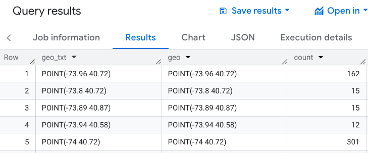
以下可视化图表示例使用以下查询来生成纽约市帝国大厦 3000 米范围内设有轮椅无障碍入口的餐厅数量。此查询会返回一个表格,其中包含每个地理位置 点 的餐厅数量,每个点的大小为 0.005 度。
由于您无法对 GROUP BY 点执行 GEOGRAPHY 操作,因此此
查询使用 BigQuery
ST_ASTEXT
函数将每个点转换为该
点的 STRING
WKT 表示形式,并将该值写入 geo_txt 列。然后,它使用 geo_txt 执行 GROUP BY。
SELECT
  geo_txt, -- STRING WKT geometry value.
  ST_GEOGFROMTEXT(geo_txt) AS geo, -- Convert STRING to GEOGRAPHY value.
  count
FROM (
  -- Create STRING WKT representation of each GEOGRAPHY point to
  -- GROUP BY the STRING value.
  SELECT WITH AGGREGATION_THRESHOLD
    ST_ASTEXT(ST_SNAPTOGRID(point, 0.005)) AS geo_txt,
    COUNT(*) AS count
  FROM
    `PROJECT_NAME.places_insights___us.places`
  WHERE
    'restaurant' IN UNNEST(types)
    AND wheelchair_accessible_entrance = true
    AND ST_DWITHIN(ST_GEOGPOINT(-73.9857, 40.7484), point, 3000)
  GROUP BY
    geo_txt
)
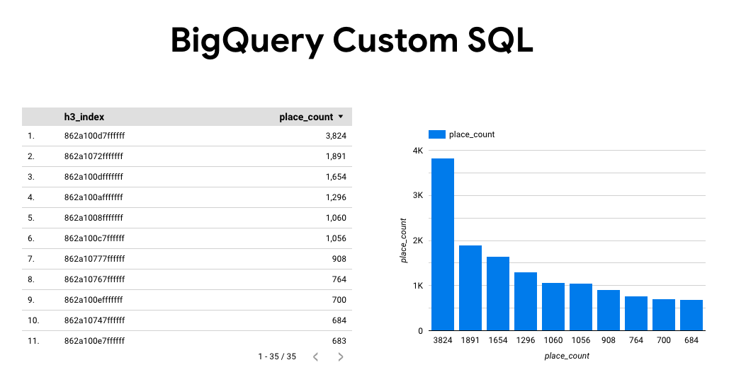
下图显示了此查询的示例输出,其中 count 包含每个点的餐厅数量:
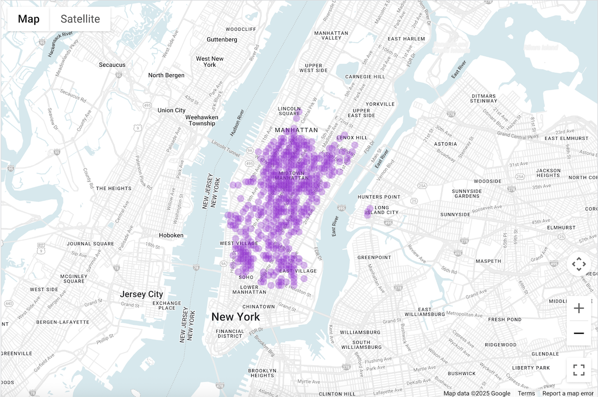
使用 BigQuery Studio 的“可视化图表”标签页直观呈现数据
下图显示了使用 可视化图表 标签页在 BigQuery 中显示的数据。 颜色较深的圆圈表示该位置的餐厅密度较高。
在 BigQuery Studio 中直观呈现数据
- 在查询要
直观呈现的数据中运行上述查询。
- 在 BigQuery 结果中,点击可视化图表 标签页。
- 系统会打开一张地图,其中包含代表所查询点的圆圈。
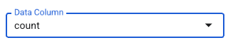
在可视化图表配置 下,将数据列 设置为 count。
颜色较深的圆圈表示餐厅数量较高的点。
您可以选择更新其他设置,以更改可视化图表的外观。
如需详细了解配置选项,请访问 BiqQuery 可视化图表 文档 。
使用 Colab 笔记本直观呈现数据
与 BigQuery Studio 相比,Colab 笔记本中的可视化图表可让您更好地控制和呈现数据,并让您留在 Jupyter 笔记本环境中。
您可以通过以下三种格式获取有关在 Colab 中直观呈现地理空间分析数据的教程:
本教程重点介绍使用 pydeck、deck.gl 和
- 散点图(通常用于抽样)。
- GeoJSON(用于发现)。
- 等值区域图(用于强度)。
- 热图(用于密度)。
使用 Looker Studio 直观呈现数据
下图显示了在 Looker Studio 中以热图形式显示的数据。热图显示了从低(绿色)到高(红色)的密度。
将数据导入 Looker Studio
如需将数据导入 Looker Studio,请执行以下操作:
在查询要直观呈现的数据中运行上述查询。
在 BigQuery 结果中,依次点击 打开方式 -> Looker Studio。您的结果会自动导入 Looker Studio。
Looker Studio 会创建一个默认报告页面,并使用结果的标题、表格和条形图对其进行初始化。
选择页面上的所有内容并将其删除。
依次点击插入 -> 热图,将热图添加到报告中。
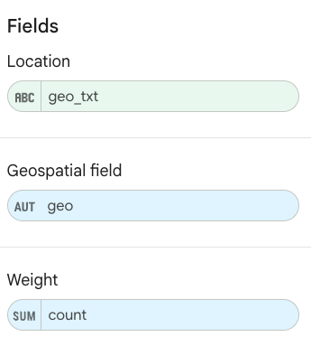
在图表类型 -> 设置 下,从数据 部分拖动项以 配置字段,如下所示:
热图如上所示。您可以选择图表类型 -> 样式 ,以进一步配置地图的外观。
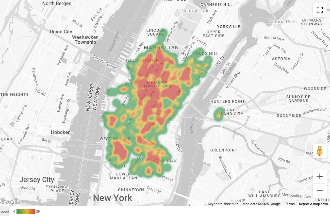
使用 BigQuery Geo Viz 直观呈现数据
下图显示了在 BigQuery Geo Viz 中以填充地图形式显示的数据。填充地图按点单元格显示了餐厅密度,其中点越大,对应的密度越高。
将数据导入 BigQuery Geo Viz
如需将数据导入 BigQuery Geo Viz,请执行以下操作:
在查询要直观呈现的数据中运行上述查询。
在 BigQuery 结果中,依次点击打开方式 -> GeoViz。
显示屏会打开,并进入查询 步骤。
选择运行 按钮以运行查询。地图会自动在地图上显示点。
选择数据 以查看数据。
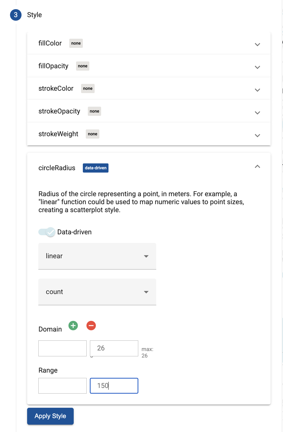
在数据 部分,点击添加样式 按钮。
选择 circleRadius ,然后使用滑块启用数据驱动型 样式。
设置其余字段,如下所示:
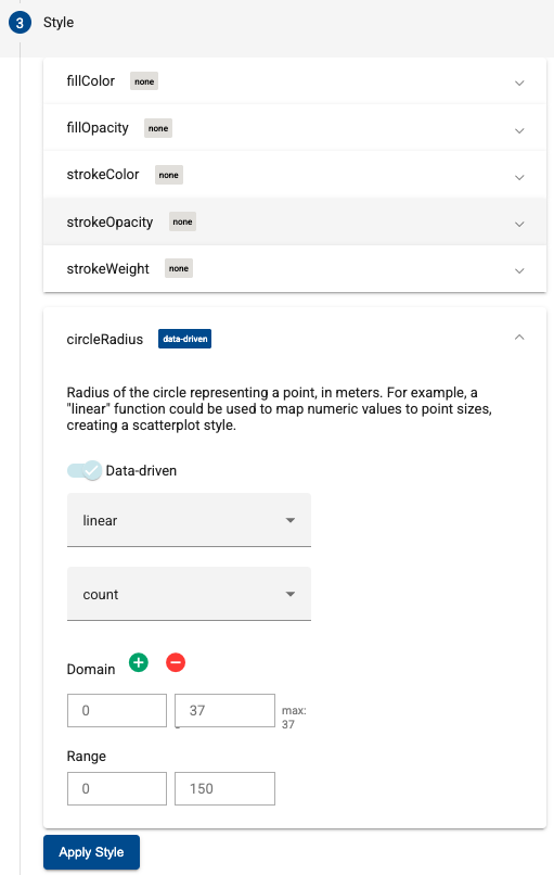
点击应用样式 以将样式应用于地图。