
맞춤 스타일 지정
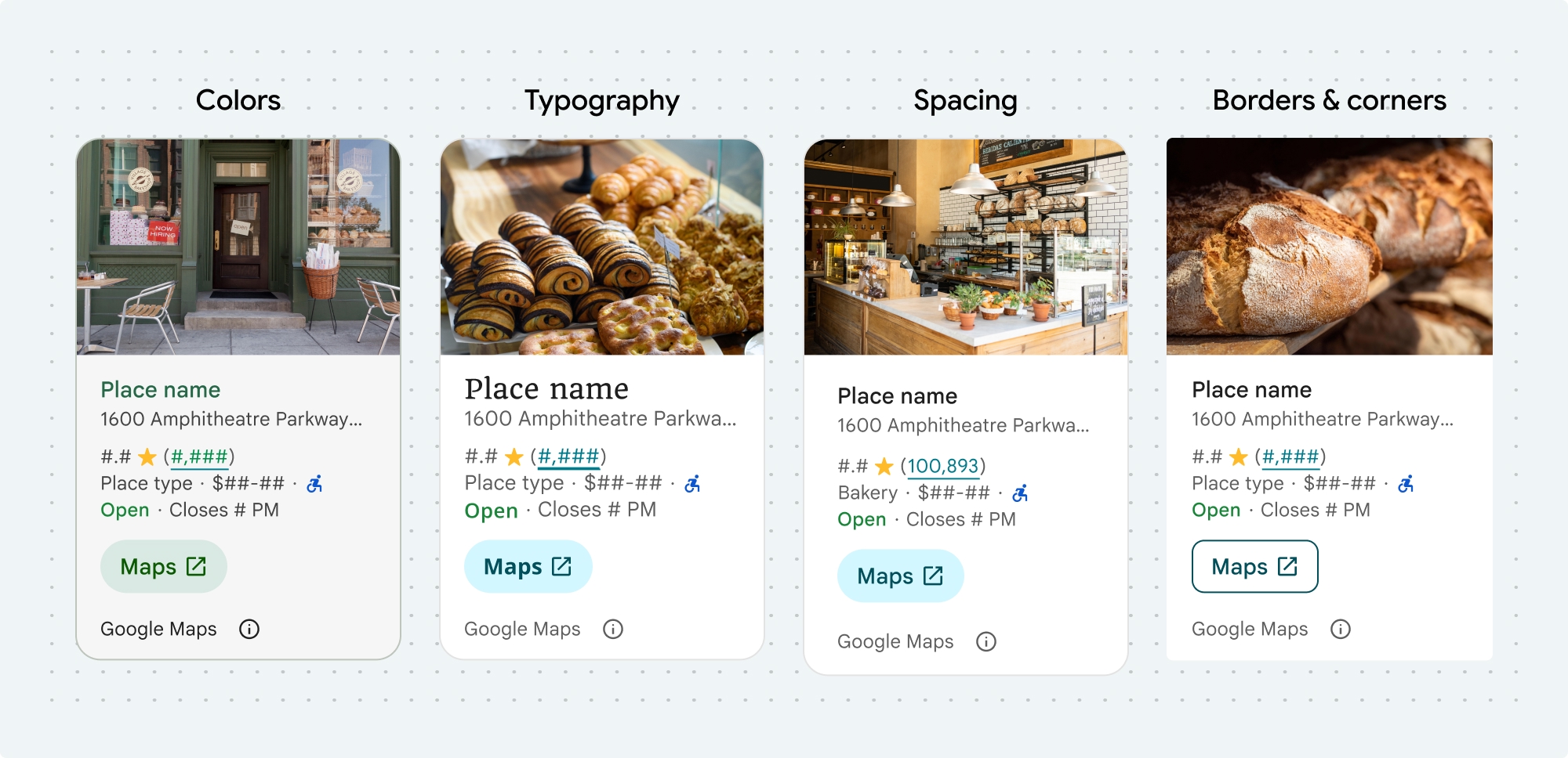
다음 장소 UI 키트 구성요소 및 비 UI 키트 기능의 색상, 서체, 간격, 테두리, 모서리를 맞춤설정할 수 있습니다.
장소 UI 키트는 Material Design을 대략적으로 기반으로 하는 시각적 맞춤설정에 디자인 시스템 접근 방식을 제공합니다 (일부 Google 지도 전용 수정사항 포함). 색상 및 서체에 관한 Material Design 참조를 확인하세요. 기본적으로 스타일은 Google 지도 시각적 디자인 언어를 따릅니다.
구성요소의 디자인은 placesMaterialColor, placesMaterialFont, placesMaterialShape, placesMaterialTheme 구조체로 맞춤설정됩니다.
다음 스타일을 맞춤설정할 수 있습니다.
| 테마 속성 | 사용 |
|---|---|
| 색상 | |
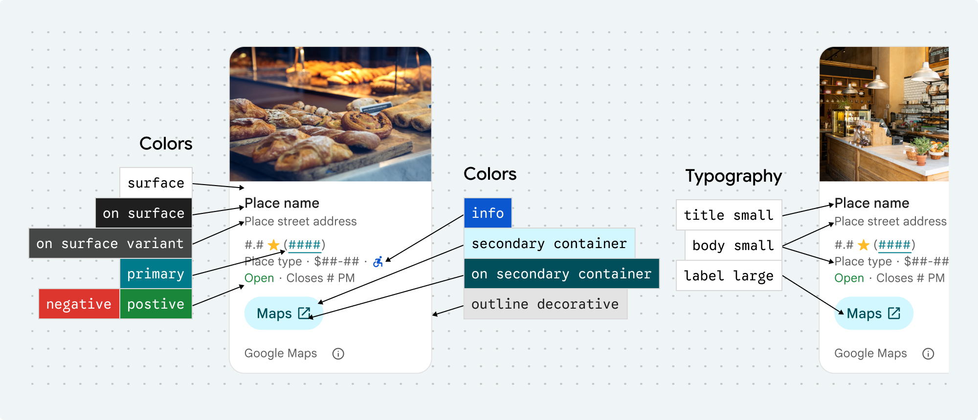
theme.color.surface |
컨테이너 및 대화상자 배경 |
theme.color.outlineDecorative |
컨테이너 테두리 |
theme.color.primary |
링크, 로드 표시기, 개요 아이콘 |
theme.color.onSurface |
제목, 대화상자 콘텐츠 |
theme.color.onSurfaceVariant |
장소 정보 |
theme.color.secondaryContainer |
버튼 배경 |
theme.color.onSecondaryContainer |
버튼 텍스트 및 아이콘 |
theme.color.neutralContainer |
날짜 배지, 로드 자리표시자 도형 검토 |
theme.color.onNeutralContainer |
검토 날짜, 로드 오류 |
theme.color.positiveContainer |
사용 가능한 EV 충전기 배지 |
theme.color.onPositiveContainer |
사용 가능한 EV 충전기 배지 콘텐츠 |
theme.color.positive |
'지금 영업 중' 라벨 배치 |
theme.color.negative |
'폐업' 라벨이 현재 라벨로 지정됨 |
theme.color.info |
장애인 이용 가능 입구 아이콘 |
theme.measurement.borderWidthButton |
지도에서 열기 및 확인 버튼 |
| 서체 | |
theme.font.bodySmall |
장소 정보 |
theme.font.bodyMedium |
장소 정보, 대화상자 콘텐츠 |
theme.font.labelMedium |
배지 콘텐츠 |
theme.font.labelLarge |
버튼 콘텐츠 |
theme.font.headlineMedium |
대화상자 제목 |
theme.font.displaySmall |
장소 이름 |
theme.font.titleSmall |
장소 이름 |
| 간격 | |
theme.measurement.spacingExtraSmall |
|
theme.measurement.spacingSmall |
|
theme.measurement.spacingMedium |
|
theme.measurement.spacinglarge |
|
theme.measurement.spacingExtraLarge |
|
theme.measurement.spacingTwoExtraLarge |
|
| 측정 | |
borderWidth |
컨테이너 |
theme.measurement.borderWidthButton |
|
| 도형 | |
theme.shape.cornerRadius |
컨테이너 |
theme.shape.cornerRadiusButton |
지도에서 열기 및 확인 버튼 (원형 아이콘 버튼 제외) |
theme.shape.cornerRadiusThumbnail |
썸네일 이미지 배치 |
theme.shape.cornerRadiusCollageOuter |
미디어 콜라주 |
theme.shape.cornerRadiusCard |
장소 카드, 사용자 리뷰 카드 |
theme.shape.cornerRadiusDialog |
Google 지도 공개 대화상자 |
| Google 지도 브랜드 저작자 표시 | |
attribution.lightModeColor |
밝은 테마 Google 지도 저작자 표시 및 공개 버튼 (흰색, 회색, 검은색의 열거형) |
attribution.darkModeColor |
어두운 테마 Google 지도 저작자 표시 및 공개 버튼 (흰색, 회색, 검은색의 열거형) |
기여 분석 색상
Google 지도 서비스 약관에 따라 Google 지도 저작자 표시에는 세 가지 브랜드 색상 중 하나를 사용해야 합니다. 맞춤설정 변경사항이 적용된 경우 이 출처가 표시되고 액세스할 수 있어야 합니다.
밝은 테마와 어두운 테마에 독립적으로 설정할 수 있는 3가지 브랜드 색상을 제공합니다.
- 밝은 테마: 흰색, 회색, 검은색의 열거형이 있는
attributionColorLight - 어두운 테마: 흰색, 회색, 검은색의 열거형이 있는
attributionColorDark
예
이 함수는 기본 스타일 속성을 재정의하는 테마를 만듭니다. 재정의되지 않은 테마 속성은 기본 스타일을 사용합니다.Swift
  // Same for compact and full
func makeTemplateTheme(colorScheme: ColorScheme) -> PlacesMaterialTheme {
  var theme = PlacesMaterialTheme()
  var color = PlacesMaterialColor()
  color.surface = (colorScheme == .dark ? .blue : .gray)
  color.buttonBorder = (colorScheme == .dark ? .pink : .orange)
  color.outlineDecorative = (colorScheme == .dark ? .white : .black)
  color.onSurface = (colorScheme == .dark ? .yellow : .red)
  color.onSurfaceVariant = (colorScheme == .dark ? .white : .blue)
  color.onSecondaryContainer = (colorScheme == .dark ? .white : .red)
  color.secondaryContainer = (colorScheme == .dark ? .green : .purple)
  color.positive = (colorScheme == .dark ? .yellow : .red)
  color.primary = (colorScheme == .dark ? .yellow : .purple)
  color.info = (colorScheme == .dark ? .yellow : .purple)
  var shape = PlacesMaterialShape()
  shape.cornerRadius = 10
  var font = PlacesMaterialFont()
  font.labelLarge = .system(size: UIFontMetrics.default.scaledValue(for: 18))
  font.headlineMedium = .system(size: UIFontMetrics.default.scaledValue(for: 15))
  font.bodyLarge = .system(size: UIFontMetrics.default.scaledValue(for: 15))
  font.bodyMedium = .system(size: UIFontMetrics.default.scaledValue(for: 12))
  font.bodySmall = .system(size: UIFontMetrics.default.scaledValue(for: 11))
  var attribution = PlacesMaterialAttribution()
  attribution.lightModeColor = .black
  attribution.darkModeColor = .white
  theme.measurement.borderWidthButton = 1
  theme.color = color
  theme.shape = shape
  theme.font = font
  theme.attribution = attribution
  return theme
}