
カスタム スタイル
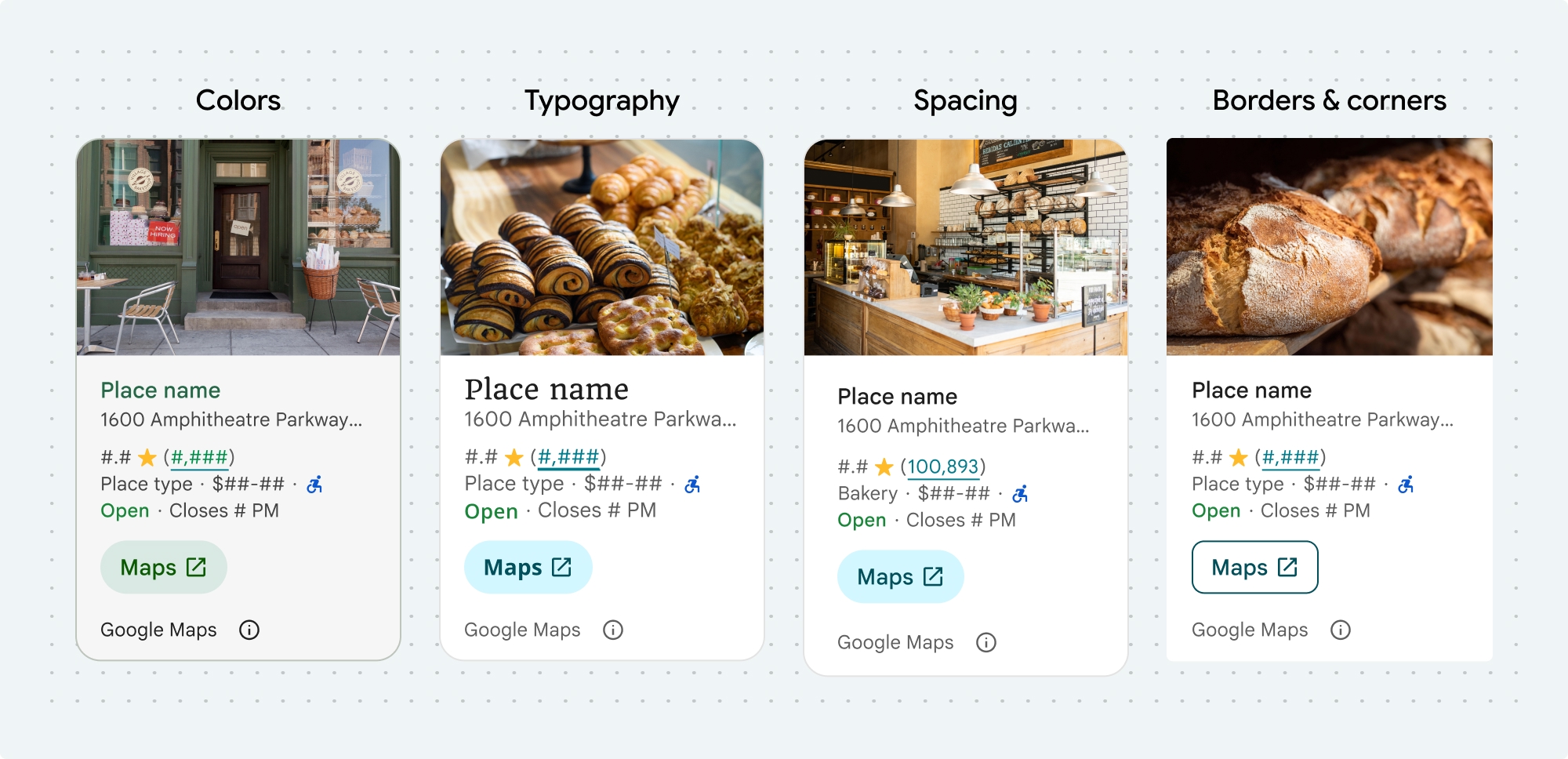
Places UI キットのコンポーネントと UI キット以外の機能の色、タイポグラフィ、スペーシング、境界線、角をカスタマイズできます。
- Place Details コンポーネント
- Place Search コンポーネント
- 基本的な Place Autocomplete コンポーネント
- UI Kit 以外の Place Autocomplete ウィジェット
Places UI キットは、マテリアル デザイン(Google マップ固有の変更がいくつか加えられています)にほぼ基づいた、ビジュアル カスタマイズに対するデザイン システム アプローチを提供します。マテリアル デザインの色とタイポグラフィのリファレンスをご覧ください。デフォルトでは、スタイルは Google マップのビジュアル デザイン言語に準拠しています。
コンポーネントのルック アンド フィールは、placesMaterialColor、placesMaterialFont、placesMaterialShape、placesMaterialTheme 構造体でカスタマイズされます。
次のスタイルをカスタマイズできます。
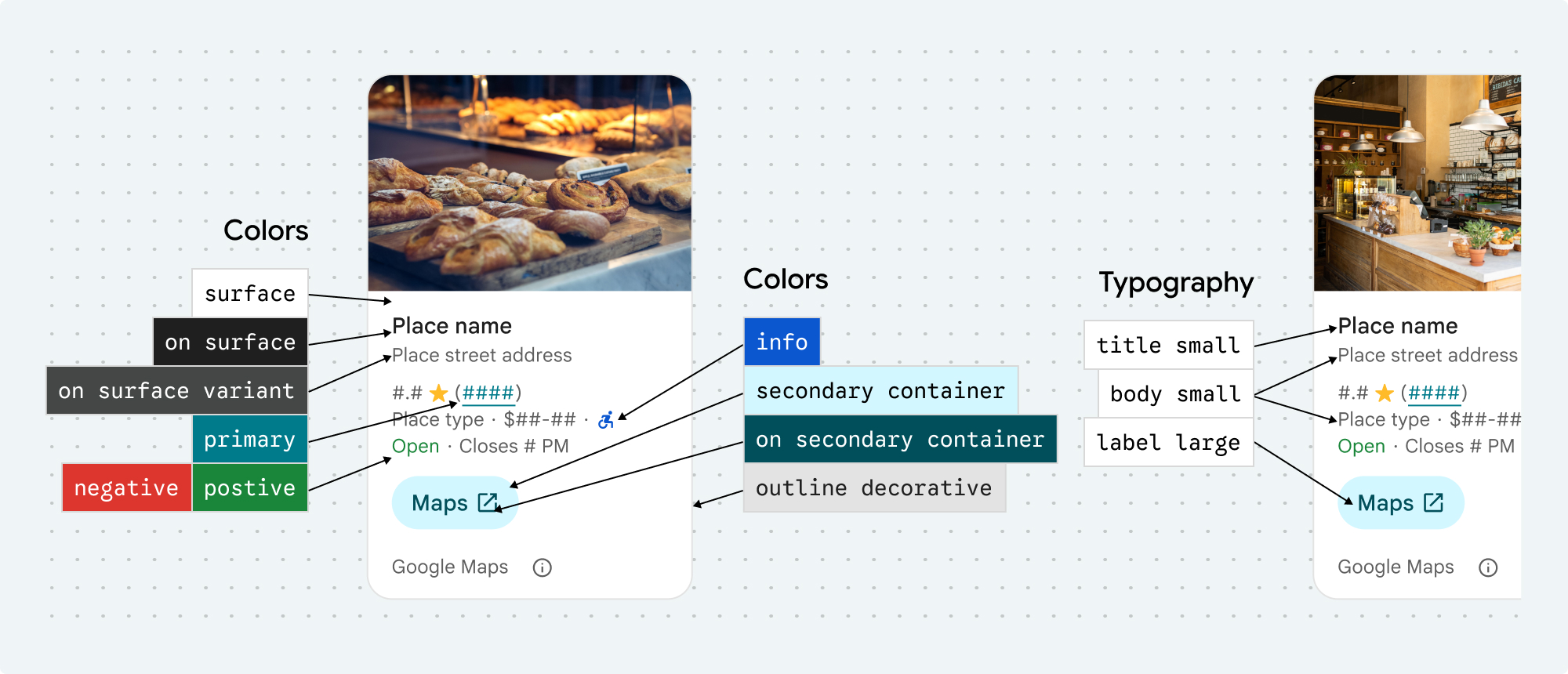
| テーマ属性 | 用途 |
|---|---|
| 色 | |
theme.color.surface |
コンテナとダイアログの背景 |
theme.color.outlineDecorative |
コンテナの境界線 |
theme.color.primary |
リンク、読み込みインジケーター、概要アイコン |
theme.color.onSurface |
見出し、ダイアログのコンテンツ |
theme.color.onSurfaceVariant |
お店/スポット情報 |
theme.color.secondaryContainer |
ボタンの背景 |
theme.color.onSecondaryContainer |
ボタンのテキストとアイコン |
theme.color.neutralContainer |
日付バッジ、読み込みプレースホルダの形状を確認 |
theme.color.onNeutralContainer |
レビューの日付、読み込みエラー |
theme.color.positiveContainer |
EV 充電器ありバッジ |
theme.color.onPositiveContainer |
利用可能な EV 充電器バッジのコンテンツ |
theme.color.positive |
「営業中」ラベルを配置 |
theme.color.negative |
閉店した場所のラベル |
theme.color.info |
入口がバリアフリーのアイコン |
theme.measurement.borderWidthButton |
[地図で開く] ボタンと [OK] ボタン |
| タイポグラフィ | |
theme.font.bodySmall |
お店/スポット情報 |
theme.font.bodyMedium |
場所の情報、ダイアログのコンテンツ |
theme.font.labelMedium |
バッジのコンテンツ |
theme.font.labelLarge |
ボタンのコンテンツ |
theme.font.headlineMedium |
ダイアログの見出し |
theme.font.displaySmall |
場所の名前 |
theme.font.titleSmall |
場所の名前 |
| スペーシング | |
theme.measurement.spacingExtraSmall |
|
theme.measurement.spacingSmall |
|
theme.measurement.spacingMedium |
|
theme.measurement.spacinglarge |
|
theme.measurement.spacingExtraLarge |
|
theme.measurement.spacingTwoExtraLarge |
|
| 測定 | |
borderWidth |
コンテナ |
theme.measurement.borderWidthButton |
|
| シェイプ | |
theme.shape.cornerRadius |
コンテナ |
theme.shape.cornerRadiusButton |
[マップで開く] ボタンと [OK] ボタン(丸いアイコンボタンを除く) |
theme.shape.cornerRadiusThumbnail |
サムネイル画像を配置する |
theme.shape.cornerRadiusCollageOuter |
メディア コラージュ |
theme.shape.cornerRadiusCard |
場所情報カード、ユーザー レビューカード |
theme.shape.cornerRadiusDialog |
Google マップの開示ダイアログ |
| Google マップのブランド アトリビューション | |
attribution.lightModeColor |
ライトモードの Google マップのアトリビューションと開示ボタン(白、グレー、黒の列挙型) |
attribution.darkModeColor |
ダークモードの Google マップのアトリビューションと開示ボタン(白、グレー、黒の列挙型) |
アトリビューションの色
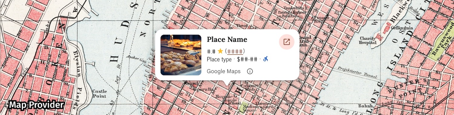
Google マップの利用規約では、Google マップの帰属表示に 3 つのブランドカラーのいずれかを使用することが義務付けられています。この帰属情報は、カスタマイズの変更が行われたときに表示され、アクセス可能である必要があります。
ライトモードとダークモードで個別に設定できる 3 つのブランドカラーから選択できます。
- ライトテーマ: 白、グレー、黒の列挙型を含む
attributionColorLight。 - ダークモード: 白、グレー、黒の列挙型を含む
attributionColorDark。
例
この関数は、デフォルトのスタイル属性をオーバーライドするテーマを作成します。オーバーライドされていないテーマ属性は、デフォルト スタイルを使用します。Swift
  // Same for compact and full
func makeTemplateTheme(colorScheme: ColorScheme) -> PlacesMaterialTheme {
  var theme = PlacesMaterialTheme()
  var color = PlacesMaterialColor()
  color.surface = (colorScheme == .dark ? .blue : .gray)
  color.buttonBorder = (colorScheme == .dark ? .pink : .orange)
  color.outlineDecorative = (colorScheme == .dark ? .white : .black)
  color.onSurface = (colorScheme == .dark ? .yellow : .red)
  color.onSurfaceVariant = (colorScheme == .dark ? .white : .blue)
  color.onSecondaryContainer = (colorScheme == .dark ? .white : .red)
  color.secondaryContainer = (colorScheme == .dark ? .green : .purple)
  color.positive = (colorScheme == .dark ? .yellow : .red)
  color.primary = (colorScheme == .dark ? .yellow : .purple)
  color.info = (colorScheme == .dark ? .yellow : .purple)
  var shape = PlacesMaterialShape()
  shape.cornerRadius = 10
  var font = PlacesMaterialFont()
  font.labelLarge = .system(size: UIFontMetrics.default.scaledValue(for: 18))
  font.headlineMedium = .system(size: UIFontMetrics.default.scaledValue(for: 15))
  font.bodyLarge = .system(size: UIFontMetrics.default.scaledValue(for: 15))
  font.bodyMedium = .system(size: UIFontMetrics.default.scaledValue(for: 12))
  font.bodySmall = .system(size: UIFontMetrics.default.scaledValue(for: 11))
  var attribution = PlacesMaterialAttribution()
  attribution.lightModeColor = .black
  attribution.darkModeColor = .white
  theme.measurement.borderWidthButton = 1
  theme.color = color
  theme.shape = shape
  theme.font = font
  theme.attribution = attribution
  return theme
}
各コンポーネントの完全な例
- Place Details コンポーネントのスタイル設定の例。
- Place Search コンポーネントのスタイリングの例。
- 基本的な Place Autocomplete コンポーネントのスタイリングの例。