
הרכיב Place Search
רכיב חיפוש המקומות בערכת ממשק המשתמש של Places מעבד את תוצאות החיפוש של מקום מסוים ברשימה.
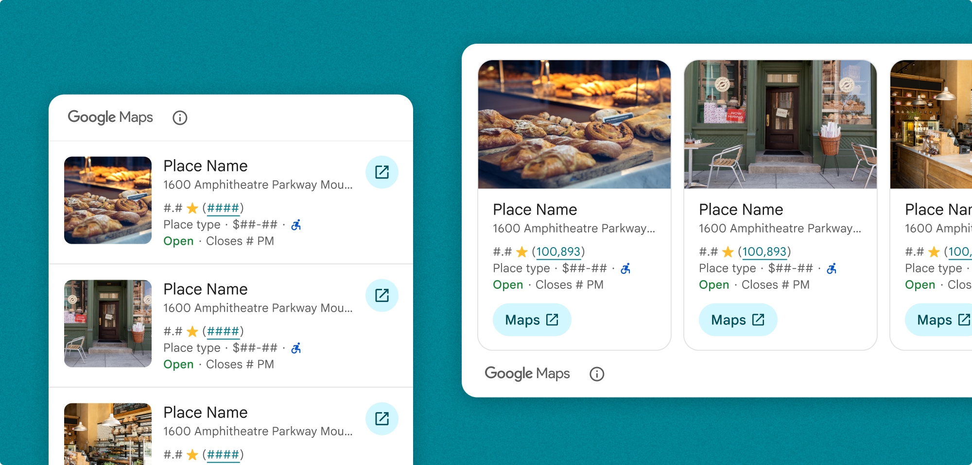
אפשר להתאים אישית את רשימת החיפוש של מקומות. אפשר לציין:
- התוכן שיוצג
- גודל המדיה בכיוון אנכי
- קטיעת הטקסט
- הכיוון
- החלפת עיצובים שמתאימים למותג ולשפת העיצוב של האפליקציה
- המיקום של השיוך
- האם אפשר לבחור מקום
אפשר גם להתאים אישית את הבקשה כדי לבצע SearchByTextRequest או SearchNearbyRequest.
חיוב
החיוב מתבצע בכל פעם שמשנים את ערך הקישור SearchByTextRequest() או PlaceSearchViewRequest().
הוספת חיפוש מקומות לאפליקציה
מוסיפים את הווידג'ט של חיפוש מקומות באמצעות הסמל PlaceSearchView class.
Swift
PlaceSearchView(
      orientation: .horizontal, // default is vertical
      request: $placeSearchViewRequest,
      configuration: configuration
)
כדי שהאפליקציה תטען תוצאה של חיפוש טקסט או חיפוש בקרבת מקום, צריך לעדכן את הערך של PlaceSearchViewRequest.
Swift
// use placeSearchViewRequest = .searchNearby(...) to  configure a searchNearby request

  @State private var let placeSearchViewRequest = .searchByText(
    SearchByTextRequest(
      textQuery: "Googleplex",
      placeProperties: [.all],
      locationBias: CircularCoordinateRegion(
        center: CLLocationCoordinate2D(latitude: 0, longitude: 0),
        radius: 0
      )
    )
  )
אפשר גם לקבל קריאות חוזרות (callback) כשהרכיב נטען, כשבוחרים מקום או כשיש שגיאה בטעינת הרכיב.
Swift
.onLoad { places in
  print("places: \(places)")
}
.onRequestError { error in
  print("error: \(error)")
}
.onPlaceSelected { place in
  print("place: \(place)")
}
התאמה אישית של רכיב החיפוש של מקומות
התאמה אישית של תוכן
אתם צריכים לציין איזה תוכן יוצג ברכיב.בדוגמה הזו מוגדר הרכיב להצגת הכתובת והדירוג של המקום.
Swift
private let configuration = PlaceSearchConfiguration(
    content: [.address(), .rating()]
)
אפשר גם להתאים אישית את ההיבטים הבאים של התוכן שמופיע ברכיב 'חיפוש מקומות':
-
content: התוכן שמוצג ברכיב. -
mediaSize: גודל התמונה בכיוון האנכי של הפריט. ברירת המחדל היא small. כפי שמצוין בתוכן. -
preferTruncation: האם לחתוך את הטקסט של כל תצוגת פרטי מקום. ברירת המחדל היא false. -
theme: העיצוב המותאם אישית שלכם שמוגדר על בסיס PlacesMaterialTheme. מידע נוסף על עיצובים -
attributionPosition: האם להציג את הקרדיט של מפות Google בחלק העליון או התחתון של הרכיב. ברירת המחדל היא .top. -
selectable: האם אפשר לבחור כל מקום ברשימה. אם אפשר לבחור אותו, הפונקציהonPlaceSelectedclosure תופעל אחרי שייבחר מקום. ברירת המחדל היא false.
מוסיפים את הגדרת ההתאמה האישית אל PlaceSearchConfiguration.
Swift
private let configuration = PlaceSearchConfiguration(
    content: [.address, .rating, .media(size: .large)],
    preferTruncation: true, // default is false
    theme: PlacesMaterialTheme(),
    attributionPosition: .bottom, // default is top
    selectable: true // default is false
)
התאמה אישית של הכיוון
כיוון ברירת המחדל הוא לאורך. אפשר לציין כיוון אופקי ב-PlaceSearchView.
Swift
PlaceSearchView(
      orientation: .horizontal, // default is vertical
      request: $placeSearchViewRequest,
      configuration: configuration
)
התאמה אישית של העיצוב
אתם יכולים לציין עיצוב שיבטל את כל מאפייני הסגנון שמוגדרים כברירת מחדל. ברירת המחדל היא PlacesMaterialTheme.
מידע נוסף על עיצוב ערכות נושא זמין בקטע עיצוב בהתאמה אישית.
ערכת ה-UI של Places מספקת עיצוב כהה כברירת מחדל, לכן יכול להיות שתצטרכו להתאים אישית גם את העיצוב הכהה וגם את העיצוב הבהיר. כדי להתאים אישית את העיצוב הכהה, מוסיפים ערכים ל-.dark ול-attribution.darkModeColor בעיצוב המותאם אישית.
דוגמאות
הוספת הרכיב Place Search
Swift
struct PlaceSearchDemoView: View {
  private let configuration = PlaceSearchConfiguration(
    content: [.address(), .rating(), .type(), .media(size: .large)],
    preferTruncation: true,  // default is false
    theme: PlacesMaterialTheme(),
    attributionPosition: .bottom,  // default is top
    selectable: true  // default is false
  )
  // can also do let placeSearchViewRequest = .searchNearby(...) to  configure a searchNearby request
  @State private var placeSearchViewRequest: PlaceSearchViewRequest = .searchByText(
    SearchByTextRequest(
      textQuery: "Googleplex",
      placeProperties: [.all],
      locationBias: CircularCoordinateRegion(
        center: CLLocationCoordinate2D(latitude: 0, longitude: 0),
        radius: 0
      )
    )
  )
  var body: some View {
    PlaceSearchView(
      orientation: .horizontal,  // default is vertical
      request: $placeSearchViewRequest,
      configuration: configuration
    )
    .onLoad { places in
      print("places: \(places)")
    }
    .onRequestError { error in
      print("error: \(error)")
    }
    .onPlaceSelected { place in
      print("place: \(place)")
    }
  }
}
התאמה אישית של העיצוב
ערכת ה-UI של Places מספקת עיצוב כהה כברירת מחדל, לכן יכול להיות שתצטרכו להתאים אישית גם את העיצוב הכהה וגם את העיצוב הבהיר. כדי להתאים אישית את העיצוב הכהה, מוסיפים ערכים ל.dark ולattribution.darkModeColor לעיצוב המותאם אישית.
Swift
@Environment(\.colorScheme) var colorScheme
var theme: PlacesMaterialTheme {
    if customTheme {
      var theme = PlacesMaterialTheme()
      var color = PlacesMaterialColor()
      color.surface = (colorScheme == .dark ? .blue : .gray)
      color.outlineDecorative = (colorScheme == .dark ? .white : .black)
      color.onSurface = (colorScheme == .dark ? .yellow : .red)
      color.onSurfaceVariant = (colorScheme == .dark ? .white : .blue)
      color.onSecondaryContainer = (colorScheme == .dark ? .white : .red)
      color.secondaryContainer = (colorScheme == .dark ? .green : .purple)
      color.positive = (colorScheme == .dark ? .yellow : .red)
      color.primary = (colorScheme == .dark ? .yellow : .purple)
      color.info = (colorScheme == .dark ? .yellow : .purple)
      var shape = PlacesMaterialShape()
      shape.cornerRadius = 10
      var font = PlacesMaterialFont()
      font.labelLarge = .system(size: UIFontMetrics.default.scaledValue(for: 18))
      font.headlineMedium = .system(size: UIFontMetrics.default.scaledValue(for: 15))
      font.bodyLarge = .system(size: UIFontMetrics.default.scaledValue(for: 15))
      font.bodyMedium = .system(size: UIFontMetrics.default.scaledValue(for: 12))
      font.bodySmall = .system(size: UIFontMetrics.default.scaledValue(for: 11))
      var attribution = PlacesMaterialAttribution()
      attribution.lightModeColor = .black
      attribution.darkModeColor = .white
      theme.color = color
      theme.shape = shape
      theme.font = font
      theme.attribution = attribution
    } else {
      return PlacesMaterialTheme()
    }
}