
Place Search component
The Place Search component of the Places UI Kit renders the results of a place search in a list.
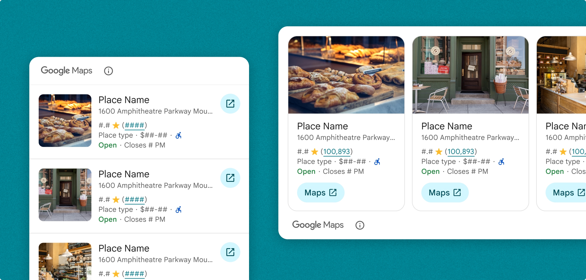
You can customize the Place Search list. You can specify:
- The content to display
- Media size in vertical orientation
- Text truncation
- The orientation
- Theme overrides that match your brand and app's design language
- The position of the attribution
- Whether a place is selectable
You can also customize the request to perform either a SearchByTextRequest or a SearchNearbyRequest.
Billing
You are billed each time the SearchByTextRequest() or PlaceSearchViewRequest() binding value is changed.
Add Place Search to your app
Add the Place Search widget using the PlaceSearchView class.
Swift
PlaceSearchView(
      orientation: .horizontal, // default is vertical
      request: $placeSearchViewRequest,
      configuration: configuration
)
When you want your app to load a text search or nearby search result, update your PlaceSearchViewRequest value.
Swift
// use placeSearchViewRequest = .searchNearby(...) to  configure a searchNearby request

  @State private var let placeSearchViewRequest = .searchByText(
    SearchByTextRequest(
      textQuery: "Googleplex",
      placeProperties: [.all],
      locationBias: CircularCoordinateRegion(
        center: CLLocationCoordinate2D(latitude: 0, longitude: 0),
        radius: 0
      )
    )
  )
You can also optionally receive callbacks when the component loads, a place is selected, or when there is an error loading the component.
Swift
.onLoad { places in
  print("places: \(places)")
}
.onRequestError { error in
  print("error: \(error)")
}
.onPlaceSelected { place in
  print("place: \(place)")
}
Customize the Place Search component
Customize content
You must specify which content your component will display.This example configures the component to display the address and rating of the Place.
Swift
private let configuration = PlaceSearchConfiguration(
    content: [.address(), .rating()]
)
You can also optionally customize the following aspects of the content that appears in your Place Search component:
content: The content shown in the component.mediaSize: The photo size in the vertical orientation of the fragment. The default is small. Specified in content.preferTruncation: Whether to truncate text of each Place Details view. The default is false.theme: Your custom theme that inherits from PlacesMaterialTheme. Learn more about theming.attributionPosition: Whether to show the Google Maps attribution at the top or bottom of the component. The default is .top.selectable: Whether each place in the list is selectable. If it is selectable,onPlaceSelectedclosure will be called after a place is selected. The default is false.
Add your customization configuration to PlaceSearchConfiguration.
Swift
private let configuration = PlaceSearchConfiguration(
    content: [.address, .rating, .media(size: .large)],
    preferTruncation: true, // default is false
    theme: PlacesMaterialTheme(),
    attributionPosition: .bottom, // default is top
    selectable: true // default is false
)
Customize orientation
The default orientation is vertical. You can specify a horizontal orientation in PlaceSearchView.
Swift
PlaceSearchView(
      orientation: .horizontal, // default is vertical
      request: $placeSearchViewRequest,
      configuration: configuration
)
Customize the theme
You can specify a theme that overrides any of the default style attributes. The default is PlacesMaterialTheme.
See the Custom styling section for more information on theming.
The Places UI Kit provides a dark theme by default, so you may need to customize both dark and light themes. To customize the dark theme, add values for .dark and attribution.darkModeColor to your custom theme.
Examples
Add the Place Search component
Swift
struct PlaceSearchDemoView: View {
  private let configuration = PlaceSearchConfiguration(
    content: [.address(), .rating(), .type(), .media(size: .large)],
    preferTruncation: true,  // default is false
    theme: PlacesMaterialTheme(),
    attributionPosition: .bottom,  // default is top
    selectable: true  // default is false
  )
  // can also do let placeSearchViewRequest = .searchNearby(...) to  configure a searchNearby request
  @State private var placeSearchViewRequest: PlaceSearchViewRequest = .searchByText(
    SearchByTextRequest(
      textQuery: "Googleplex",
      placeProperties: [.all],
      locationBias: CircularCoordinateRegion(
        center: CLLocationCoordinate2D(latitude: 0, longitude: 0),
        radius: 0
      )
    )
  )
  var body: some View {
    PlaceSearchView(
      orientation: .horizontal,  // default is vertical
      request: $placeSearchViewRequest,
      configuration: configuration
    )
    .onLoad { places in
      print("places: \(places)")
    }
    .onRequestError { error in
      print("error: \(error)")
    }
    .onPlaceSelected { place in
      print("place: \(place)")
    }
  }
}
Customize the theme
The Places UI Kit provides a dark theme by default, so you may need to customize both dark and light themes. To customize the dark theme, add values for .dark and attribution.darkModeColor to your custom theme.
Swift
@Environment(\.colorScheme) var colorScheme
var theme: PlacesMaterialTheme {
    if customTheme {
      var theme = PlacesMaterialTheme()
      var color = PlacesMaterialColor()
      color.surface = (colorScheme == .dark ? .blue : .gray)
      color.outlineDecorative = (colorScheme == .dark ? .white : .black)
      color.onSurface = (colorScheme == .dark ? .yellow : .red)
      color.onSurfaceVariant = (colorScheme == .dark ? .white : .blue)
      color.onSecondaryContainer = (colorScheme == .dark ? .white : .red)
      color.secondaryContainer = (colorScheme == .dark ? .green : .purple)
      color.positive = (colorScheme == .dark ? .yellow : .red)
      color.primary = (colorScheme == .dark ? .yellow : .purple)
      color.info = (colorScheme == .dark ? .yellow : .purple)
      var shape = PlacesMaterialShape()
      shape.cornerRadius = 10
      var font = PlacesMaterialFont()
      font.labelLarge = .system(size: UIFontMetrics.default.scaledValue(for: 18))
      font.headlineMedium = .system(size: UIFontMetrics.default.scaledValue(for: 15))
      font.bodyLarge = .system(size: UIFontMetrics.default.scaledValue(for: 15))
      font.bodyMedium = .system(size: UIFontMetrics.default.scaledValue(for: 12))
      font.bodySmall = .system(size: UIFontMetrics.default.scaledValue(for: 11))
      var attribution = PlacesMaterialAttribution()
      attribution.lightModeColor = .black
      attribution.darkModeColor = .white
      theme.color = color
      theme.shape = shape
      theme.font = font
      theme.attribution = attribution
    } else {
      return PlacesMaterialTheme()
    }
}