
Place Details component
The Place Details component of the Places UI Kit lets you add an individual UI component that displays place details in your app. This component is customizable.
The Place Details component can be used independently or in conjunction with other Google Maps Platform APIs and services. The component takes either a Place ID, resource name, or latitude/longitude coordinates and returns rendered Place Details information.
The Place Details component is fully themeable, allowing you to customize fonts, colors, and corner radii to match your use case and visual brand guidelines. You can customize the appearance of the place details by providing custom PlacesMaterialTheme values. You can also customize which place details fields are included by specifying a list of PlaceDetailsCompactView entries, each of which corresponds to a piece of information shown about the place.
Layout variants
The Place Details component supports two main layout variants:
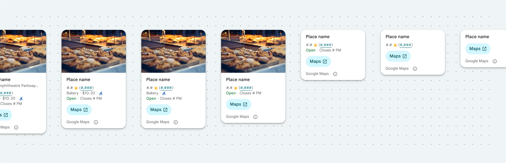
- Compact: A layout for previewing key information.
- Full: A comprehensive layout displaying all available place details.
The compact layout can be displayed in either vertical or horizontal orientation. This lets you integrate the component into various design layouts and screen sizes. The full layout can only be displayed vertically.
The Place Details component gives you granular control over the content displayed in the component. Each element (like photos, reviews, and contact information) can be individually shown or hidden, allowing for precise customization of the components appearance and information density.
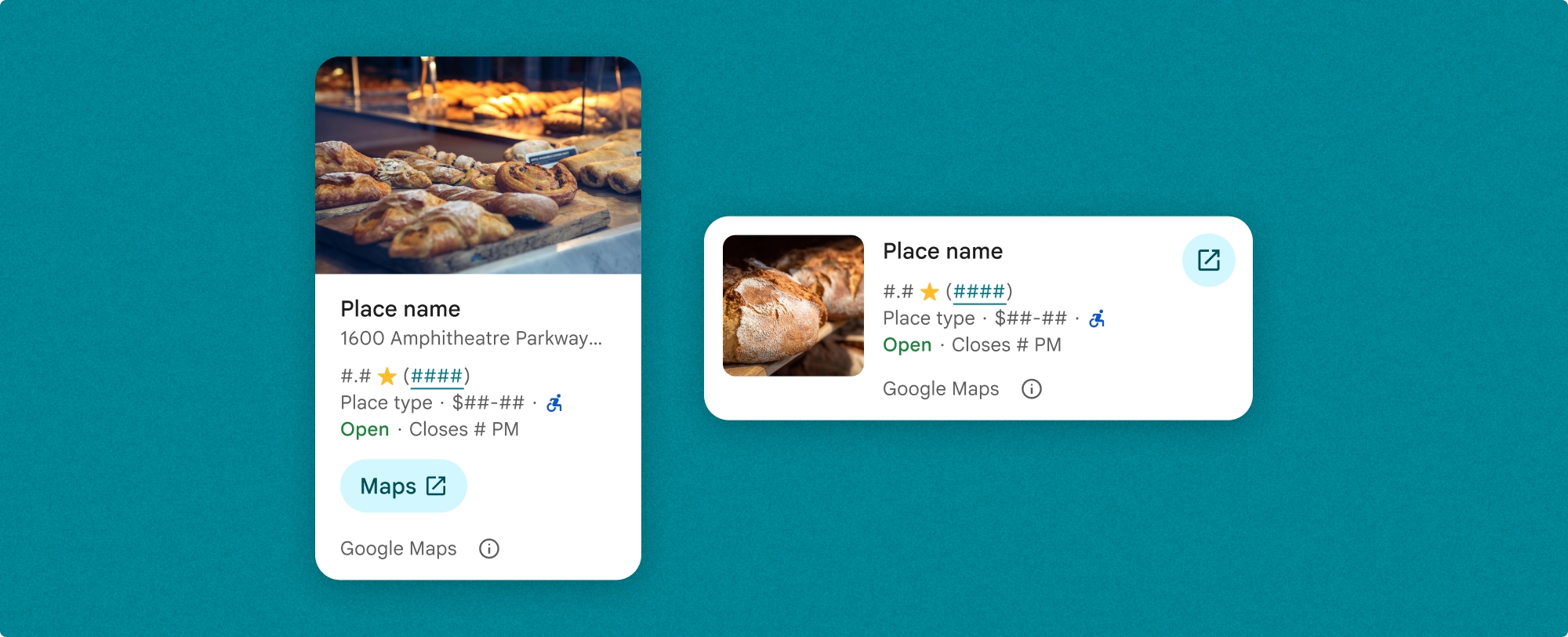
Place Details compact view
Place Details compact view (PlaceDetailsCompactView) renders details for a selected place using minimal space. This may be useful in an info window highlighting a place on a map, in a social media experience like sharing a location in a chat, as a suggestion for selecting your current location, or within a media article to reference the place on Google Maps.
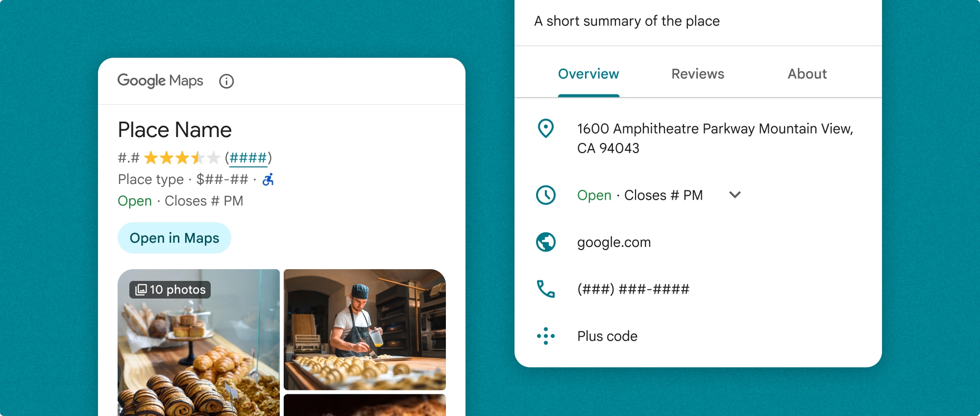
Place Details full view
Place details full view (PlaceDetailsView) offers a larger surface to display place detail information, and lets you display more types of information.
Content display options
You can specify which content to display using the enums in PlaceDetailsCompactContent or PlaceDetailsContent.
| Compact view | Full view |
|---|---|
|
|
Billing
When using the Place Details UI Kit, you are billed for each time the PlaceDetailsQuery method is called. If you load the same place multiple times, you are billed for each request.
Add place details to your app
The Place Details component is a Swift UI View. You can customize the look and feel of the place details information to suit your needs and match your app's appearance. Learn more about customization.
You can choose to load the Place Details component with a Place ID, a resource name, or latitude/longitude coordinates. You can choose any method, or multiple. Set the identifier in the PlaceDetailsQuery struct to .placeID, .resourceName, or .coordinate.
The default position for the compact view is vertical. If you would like a horizontal layout, specify orientation: .horizontal in PlaceDetailsCompactView. You can also optionally specify orientation: .vertical for clarity. The full view can only be displayed vertically.
See examples in the Place Details component examples section.
Customize the visual appearance
Custom styling
You can customize the colors, typography, spacing, borders, and corners of your Place Details component.
Places UI kit offers a design system approach to visual customization roughly based on Material Design (with some Google-Maps-specific modifications). See Material Design's reference for Color and Typography. By default, the style adheres to the Google Maps visual design language.
The Places UI Kit provides a dark theme by default, so you may need to customize both dark and light themes. To customize the dark theme, add values for .dark and attribution.darkModeColor to your custom theme.
See the Custom styling section for more information about styling.
Width and height customization
Compact views
Recommended widths:
- Vertical orientation: Between 180 pixels and 300 pixels.
- Horizontal orientation: Between 180 pixels and 500 pixels.
Best practice is to not set a height for compact views. This will allow the content in the window to set the height, allowing all the information to be displayed.
Widths smaller than 160 pixels may not display correctly.
Full views
For full views, the recommended width is between 250 pixels and 450 pixels. A width smaller than 250 pixels may not display correctly.
You can set the height of the component: the vertical Place Details view will scroll vertically within the allotted space.
Best practice is to set a height for full views. This will allow the content in the window to scroll properly.
Place Details component examples
Create a full view with vertical layout
Swift
  var selectedType: Set<PlaceDetailsCompactContent> = PlaceDetailsCompactView.standardContent

    @State var query: PlaceDetailsQuery = PlaceDetailsQuery(
      identifier: .placeID("ChIJT7FdmYiAhYAROFOvrIxRJDU"))

    var theme: PlacesMaterialTheme()
    var configuration: PlaceDetailsConfiguration {
      PlaceDetailsConfiguration(
        content: selectedType,
        theme: theme)
    }

    // Callback for the place details component.
    let placeDetailsCallback: (PlaceDetailsResult) -> Void = { result in
      if let place = result.place {
        print("Place: \(place.description)")
      } else {
        print("Error: \(String(describing: result.error))")
      }
    }
    PlaceDetailsCompactView(
      orientation: .vertical, query: $query,
      configuration: configuration,
      placeDetailsCallback: placeDetailsCallback
    )
Create a compact view with horizontal layout
Swift
  var selectedType: Set<PlaceDetailsCompactContent> = PlaceDetailsCompactView.standardContent

    @State var query: PlaceDetailsQuery = PlaceDetailsQuery(
      identifier: .placeID("ChIJT7FdmYiAhYAROFOvrIxRJDU"))

    var theme: PlacesMaterialTheme()
    var configuration: PlaceDetailsConfiguration {
      PlaceDetailsConfiguration(
        content: selectedType,
        theme: theme)
    }

    // Callback for the place details component.
    let placeDetailsCallback: (PlaceDetailsResult) -> Void = { result in
      if let place = result.place {
        print("Place: \(place.description)")
      } else {
        print("Error: \(String(describing: result.error))")
      }
    }
    PlaceDetailsCompactView(
      orientation: .horizontal, query: $query,
      configuration: configuration,
      placeDetailsCallback: placeDetailsCallback
    )
Create a full view with vertical layout
Swift
  @State var query: PlaceDetailsQuery = PlaceDetailsQuery(
    identifier: .placeID("ChIJT7FdmYiAhYAROFOvrIxRJDU"))
  var theme: PlacesMaterialTheme()
  var selectedType: Set<PlaceDetailsContent> = PlaceDetailsCompactView.standardContent

  var configuration: PlaceDetailsConfiguration {
    PlaceDetailsConfiguration(
      content: selectedType,
      theme: theme)
  }
  let placeDetailsCallback: (PlaceDetailsResult) -> Void = { result in
    placeIDPickerFocused = true
    if let place = result.place {
      print("Place: \(place.description)")
    } else {
      print("Error: \(String(describing: result.error))")
    }
  }
  GooglePlacesSwift.PlaceDetailsView(
    query: $query,
    configuration: configuration,
    placeDetailsCallback: placeDetailsCallback
  )
Customize style attributes
This sample shows how to customize the default style attributes of a full or compact view.
The Places UI Kit provides a dark theme by default, so you may need to customize both dark and light themes. To customize the dark theme, add values for .dark and attribution.darkModeColor to your custom theme.
Swift
  // Same for compact and full
func makeTemplateTheme(colorScheme: ColorScheme) -> PlacesMaterialTheme {
  var theme = PlacesMaterialTheme()
  var color = PlacesMaterialColor()
  color.surface = (colorScheme == .dark ? .blue : .gray)
  color.buttonBorder = (colorScheme == .dark ? .pink : .orange)
  color.outlineDecorative = (colorScheme == .dark ? .white : .black)
  color.onSurface = (colorScheme == .dark ? .yellow : .red)
  color.onSurfaceVariant = (colorScheme == .dark ? .white : .blue)
  color.onSecondaryContainer = (colorScheme == .dark ? .white : .red)
  color.secondaryContainer = (colorScheme == .dark ? .green : .purple)
  color.positive = (colorScheme == .dark ? .yellow : .red)
  color.primary = (colorScheme == .dark ? .yellow : .purple)
  color.info = (colorScheme == .dark ? .yellow : .purple)
  var shape = PlacesMaterialShape()
  shape.cornerRadius = 10
  var font = PlacesMaterialFont()
  font.labelLarge = .system(size: UIFontMetrics.default.scaledValue(for: 18))
  font.headlineMedium = .system(size: UIFontMetrics.default.scaledValue(for: 15))
  font.bodyLarge = .system(size: UIFontMetrics.default.scaledValue(for: 15))
  font.bodyMedium = .system(size: UIFontMetrics.default.scaledValue(for: 12))
  font.bodySmall = .system(size: UIFontMetrics.default.scaledValue(for: 11))
  var attribution = PlacesMaterialAttribution()
  attribution.lightModeColor = .black
  attribution.darkModeColor = .white
  theme.measurement.borderWidthButton = 1
  theme.color = color
  theme.shape = shape
  theme.font = font
  theme.attribution = attribution
  return theme
}
Display specific content
This sample creates a compact view that only displays media, address, rating, and type, using the theme created in the previous example.
Swift
  @State var query: PlaceDetailsQuery = PlaceDetailsQuery(
    identifier: .placeID("ChIJT7FdmYiAhYAROFOvrIxRJDU"))

  var body: some View {
    PlaceDetailsCompactView(
      orientation: .vertical, query: $query,
      contentType: [.media(), .address(), .rating(),
                    .type(), .price()], theme: theme,
      placeDetailsCallback: placeDetailsCallback, preferTruncation: false
    )
    .frame(width: 350)
  }