
맞춤 스타일 지정
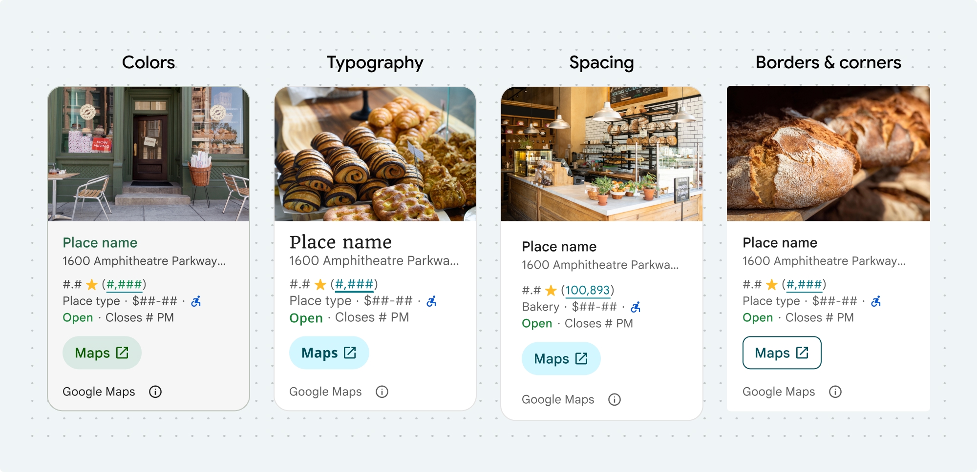
다음 장소 UI 키트 구성요소 및 비 UI 키트 기능의 색상, 서체, 간격, 테두리, 모서리를 맞춤설정할 수 있습니다.
장소 UI 키트는 Material Design을 대략적으로 기반으로 하는 시각적 맞춤설정에 디자인 시스템 접근 방식을 제공합니다 (일부 Google 지도 전용 수정사항 포함). 색상 및 서체에 관한 Material Design 참조를 확인하세요. 기본적으로 스타일은 Google 지도 시각적 디자인 언어를 따릅니다.

프래그먼트를 인스턴스화할 때 기본 스타일 속성을 재정의하는 테마를 지정할 수 있습니다. 재정의되지 않은 테마 속성은 기본 스타일을 사용합니다.
  <style name="CustomizedPlaceDetailsTheme" parent="PlacesMaterialTheme">
    <item name="placesColorPrimary">@color/app_primary_color</item>
    <item name="placesColorOnSurface">@color/app_color_on_surface</item>
    <item name="placesColorOnSurfaceVariant">@color/app_color_on_surface</item>

    <item name="placesTextAppearanceBodySmall">@style/app_text_appearence_small</item>

    <item name="placesCornerRadius">20dp</item>
  </style>
다음 스타일을 맞춤설정할 수 있습니다.
| 테마 속성 | 사용 |
|---|---|
| 색상 | |
placesColorSurface |
컨테이너 및 대화상자 배경 |
placesColorOutlineDecorative |
컨테이너 테두리 |
placesColorPrimary |
링크, 로드 표시기, 개요 아이콘 |
placesColorOnSurface |
제목, 대화상자 콘텐츠 |
placesColorOnSurfaceVariant |
장소 정보 |
placesColorSecondaryContainer |
버튼 배경 |
placesColorOnSecondaryContainer |
버튼 텍스트 및 아이콘 |
placesColorNeutralContainer |
날짜 배지, 로드 자리표시자 도형 검토 |
placesColorOnNeutralContainer |
검토 날짜, 로드 오류 |
placesColorPositiveContainer |
사용 가능한 EV 충전기 배지 |
placesColorOnPositiveContainer |
사용 가능한 EV 충전기 배지 콘텐츠 |
placesColorPositive |
'지금 영업 중' 라벨 배치 |
placesColorNegative |
'폐업' 라벨이 현재 라벨로 지정됨 |
placesColorInfo |
장애인 이용 가능 입구 아이콘 |
placesColorButtonBorder |
지도에서 열기 및 확인 버튼 |
| 서체 | |
placesTextAppearanceBodySmall |
장소 정보 |
placesTextAppearanceBodyMedium |
장소 정보, 대화상자 콘텐츠 |
placesTextAppearanceLabelMedium |
배지 콘텐츠 |
placesTextAppearanceLabelLarge |
버튼 콘텐츠 |
placesTextAppearanceHeadlineMedium |
대화상자 제목 |
placesTextAppearanceDisplaySmall |
장소 이름 |
placesTextAppearanceTitleSmall |
장소 이름 |
| 간격 | |
placesSpacingExtraSmall |
|
placesSpacingSmall |
|
placesSpacingMedium |
|
placesSpacingLarge |
|
placesSpacingExtraLarge |
|
placesSpacingTwoExtraLarge |
|
| 측정 | |
placesBorderWidth |
컨테이너 |
placesBorderWidthButton |
|
| 도형 | |
placesCornerRadius |
컨테이너 |
placesCornerRadiusButton |
지도에서 열기 및 확인 버튼 (원형 아이콘 버튼 제외) |
placesCornerRadiusThumbnail |
썸네일 이미지 배치 |
placesCornerRadiusCollageOuter |
미디어 콜라주 |
placesCornerRadiusCard |
장소 카드, 사용자 리뷰 카드 |
placesCornerRadiusDialog |
Google 지도 공개 대화상자 |
| Google 지도 브랜드 저작자 표시 | |
placesColorAttributionLightTheme |
밝은 테마 Google 지도 저작자 표시 및 공개 버튼 (흰색, 회색, 검은색의 열거형) |
placesColorAttributionDarkTheme |
어두운 테마 Google 지도 저작자 표시 및 공개 버튼 (흰색, 회색, 검은색의 열거형) |
기여 분석 색상
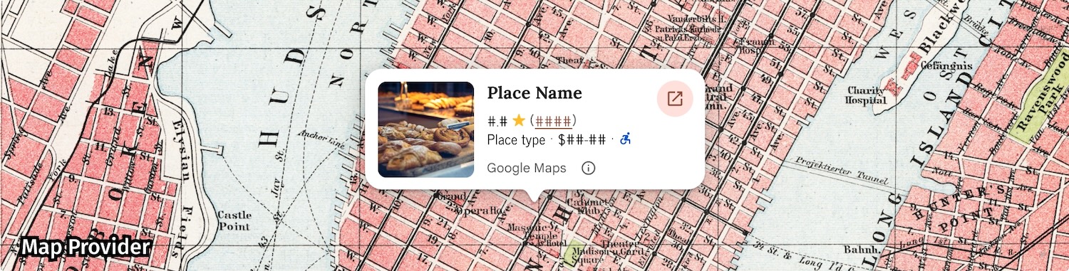
Google 지도 서비스 약관에 따라 Google 지도 저작자 표시에는 세 가지 브랜드 색상 중 하나를 사용해야 합니다. 맞춤설정 변경사항이 적용된 경우 이 출처가 표시되고 액세스할 수 있어야 합니다.
밝은 테마와 어두운 테마에 독립적으로 설정할 수 있는 3가지 브랜드 색상을 제공합니다.
- 밝은 테마: 흰색, 회색, 검은색의 열거형 값이 있는
placesColorAttributionLight - 어두운 테마: 흰색, 회색, 검은색의 열거형 값이 있는
placesColorAttributionDark
예시
이 코드 샘플은 기본 스타일 속성을 재정의하는 테마를 만드는 방법을 보여줍니다. 재정의되지 않은 테마 속성은 기본 스타일을 사용합니다.<style name="CustomizedPlaceDetailsTheme" parent="PlacesMaterialTheme"> <item name="placesColorPrimary">@color/app_primary_color</item> <item name="placesColorOnSurface">@color/app_color_on_surface</item> <item name="placesColorOnSurfaceVariant">@color/app_color_on_surface</item> <item name="placesTextAppearanceBodySmall">@style/app_text_appearence_small</item> <item name="placesCornerRadius">20dp</item> </style>