
Place Details コンポーネント
Places UI キットの Place Details コンポーネントを使用すると、アプリに場所の詳細を表示する個々の UI コンポーネントを追加できます。このコンポーネントはカスタマイズ可能です。
Place Details コンポーネントは、単独で使用することも、他の Google Maps Platform API やサービスと組み合わせて使用することもできます。このコンポーネントは、プレイス ID、リソース名、緯度と経度の座標のいずれかを受け取り、レンダリングされた Place Details 情報を返します。
Place Details コンポーネントは完全にテーマ設定可能で、フォント、色、角の丸みをカスタマイズして、ユースケースやビジュアル ブランド ガイドラインに合わせることができます。PlacesMaterialTheme を拡張し、テーマ属性のオーバーライドを提供するテーマを作成することで、スポットの詳細の外観をカスタマイズできます。場所に関する詳細情報のどのフィールドを含めるかをカスタマイズすることもできます。そのためには、Content エントリのリストを指定します。各エントリは、場所について表示される情報に対応しています。
レイアウト バリエーション
Place Details コンポーネントは、次の 2 つの主要なレイアウト バリエーションをサポートしています。
- コンパクト: 重要な情報をプレビューするためのレイアウト。
- フル: 利用可能なすべての場所の詳細を表示する包括的なレイアウト。
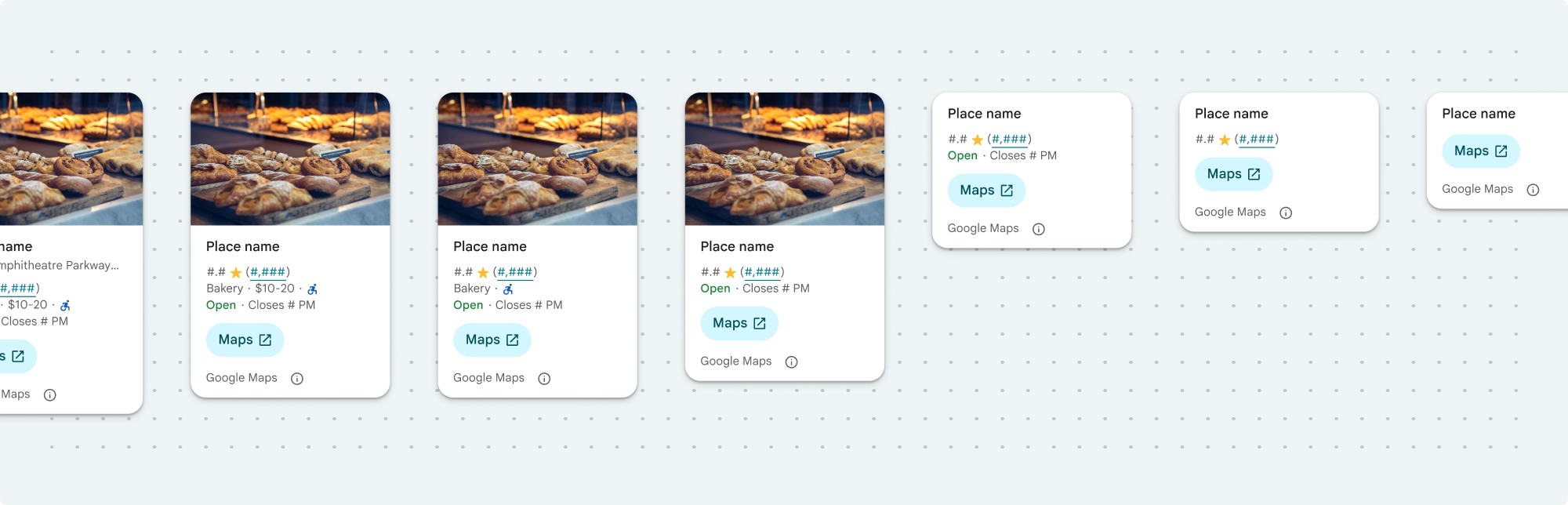
コンパクト レイアウトは縦向きと横向きのどちらでも表示できます。これにより、さまざまなデザイン レイアウトや画面サイズにコンポーネントを統合できます。フル レイアウトは縦向きでのみ表示できます。
プレイスの詳細コンポーネントを使用すると、コンポーネントに表示されるコンテンツをきめ細かく制御できます。各要素(写真、レビュー、連絡先情報など)を個別に表示または非表示にできるため、コンポーネントの外観と情報密度を正確にカスタマイズできます。
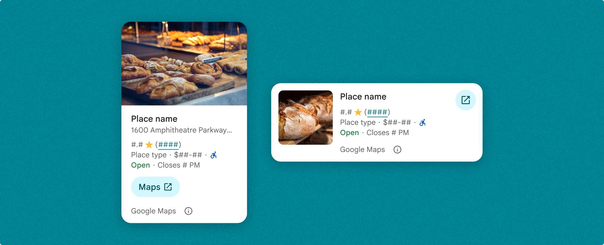
Place Details のコンパクト ビュー
場所の詳細のコンパクトなフラグメント(PlaceDetailsCompactFragment)は、選択した場所の詳細を最小限のスペースでレンダリングします。これは、地図上の場所をハイライト表示する情報ウィンドウ、チャットで位置情報を共有するなどのソーシャル メディア エクスペリエンス、現在地の選択の候補、Google マップ上の場所を参照するメディア記事などで役立ちます。
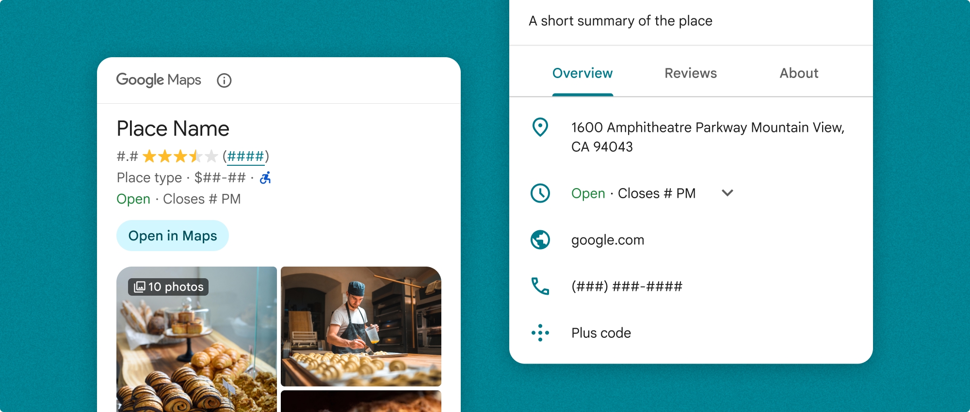
Place Details の全画面表示
場所の詳細の全画面表示(PlaceDetailsFragment)では、場所の詳細情報を表示するサーフェスが広くなり、より多くの種類の情報を表示できます。
コンテンツの表示オプション
PlaceDetailsCompactFragment.Content または PlaceDetailsFragment.Content の列挙型を使用して、表示するコンテンツを指定できます。
| コンパクト表示 | 全文表示 |
|---|---|
|
|
課金
Place Details UI キットを使用する場合、.loadWithPlaceId()、.loadWithResourceName()、loadWithCoordinates() の各メソッドが呼び出されるたびに課金されます。同じ場所を複数回読み込むと、リクエストごとに課金されます。
複数回請求されないように、Android ライフサイクル メソッドで .loadWithPlaceId() または .loadWithResourceName() を直接追加しないでください。たとえば、onResume() メソッドで .loadWithPlaceId() または .loadWithResourceName() を直接呼び出さないでください。
アプリに場所の詳細を追加する
レイアウトにフラグメントを追加することで、アプリに場所の詳細情報を追加できます。フラグメントをインスタンス化するときに、ニーズに合わせて、アプリの外観に合わせて、プレイスの詳細情報のデザインをカスタマイズできます。カスタマイズの詳細をご覧ください。
Kotlin と Java の両方で、3 つの方法を使用できます。1 つはプレイス ID(loadWithPlaceId())でフラグメントを読み込む方法、1 つはリソース名(loadWithResourceName())でフラグメントを読み込む方法、1 つは緯度/経度座標(loadWithCoordinates())でフラグメントを読み込む方法です。いずれかの方法を選択することも、複数の方法を選択することもできます。
コンパクト ビューのデフォルトの向きは縦向きです。横向きのレイアウトにする場合は、Orientation.HORIZONTAL を指定します。必要に応じて、わかりやすくするために Orientation.VERTICAL を指定することもできます。全画面表示は縦向きでのみ表示できます。
Place Details コンポーネントの例セクションの例をご覧ください。
外観をカスタマイズする
カスタム スタイル
Place Details コンポーネントの色、タイポグラフィ、間隔、枠線、角をカスタマイズできます。
Places UI キットは、マテリアル デザイン(Google マップ固有の変更を含む)にほぼ基づいた、視覚的カスタマイズのためのデザイン システム アプローチを提供します。色とタイポグラフィについては、マテリアル デザインの参照をご覧ください。デフォルトでは、スタイルは Google マップの視覚的デザイン言語に準拠しています。
Places UI キットでは、デフォルトでダークモードが提供されるため、ダークモードとライトモードの両方をカスタマイズする必要がある場合があります。ダークモードをカスタマイズするには、values-night/colors.xml に色のエントリを追加します。
スタイル設定の詳細については、カスタム スタイル設定のセクションをご覧ください。
幅と高さのカスタマイズ
コンパクト ビュー
推奨される幅:
- 縦向き: 180 dp ~ 300 dp。
- 横向き: 180 dp ~ 500 dp。
幅が 160dp 未満の場合、正しく表示されないことがあります。
コンパクト ビューの高さは設定しないことをおすすめします。これにより、ウィンドウ内のコンテンツで高さを設定できるようになり、すべての情報を表示できます。
完全再生数
フルビューの場合、推奨される幅は 250 dp ~ 450 dp です。幅が 250dp より小さいと、正しく表示されないことがあります。
コンポーネントの高さを設定できます。縦型の Place Details ビューは、割り当てられたスペース内で縦方向にスクロールします。
ベスト プラクティスは、全画面表示の高さを設定することです。これにより、ウィンドウ内のコンテンツが適切にスクロールされます。
Place Details コンポーネントの例
コンパクト ビューまたは全文表示を作成する
Kotlin
        // We create a new instance of the fragment using its factory method.
        // We can specify which content to show, the orientation, and a custom theme.
        val fragment = PlaceDetailsCompactFragment.newInstance(
            PlaceDetailsCompactFragment.ALL_CONTENT, // Show all available content.
            orientation,
            R.style.CustomizedPlaceDetailsTheme,
        ).apply {
            // The PlaceLoadListener provides callbacks for when the place data is successfully
            // loaded or when an error occurs. This is where we update our UI state.
            setPlaceLoadListener(object : PlaceLoadListener {
                override fun onSuccess(place: Place) {
                    Log.d(TAG, "Place loaded: ${place.id}")
                    // Once the data is loaded, we hide the loading indicator and show the fragment.
                    binding.loadingIndicatorMain.visibility = View.GONE
                    binding.placeDetailsContainer.visibility = View.VISIBLE
                    binding.dismissButton.visibility = View.VISIBLE
                }

                override fun onFailure(e: Exception) {
                    Log.e(TAG, "Place failed to load", e)
                    // On failure, we hide the UI and notify the user.
                    dismissPlaceDetails()
                    Toast.makeText(this@MainActivity, "Failed to load place details.", Toast.LENGTH_SHORT).show()
                }
            })
        }

        // We add the fragment to our layout's container view.
        // `commitNow()` is used to ensure the fragment is immediately added and available,
        // which is important because we need to call a method on it right after.
        supportFragmentManager
            .beginTransaction()
            .replace(binding.placeDetailsContainer.id, fragment)
            .commitNow()

        // **This is the key step**: After adding the fragment, we call `loadWithPlaceId`
        // to trigger the data loading process for the selected place.
        // We use `post` to ensure this runs after the layout has been measured,
        // which can prevent potential timing issues.
        binding.root.post {
            fragment.loadWithPlaceId(placeId)
        }
    }
Java
PlaceDetailsCompactFragment fragment =
  PlaceDetailsCompactFragment.newInstance(
        Orientation.HORIZONTAL,
        Arrays.asList(Content.ADDRESS, Content.TYPE, Content.RATING, Content.ACCESSIBLE_ENTRANCE_ICON),
        R.style.CustomizedPlaceDetailsTheme);

fragment.setPlaceLoadListener(
  new PlaceLoadListener() {
        @Override public void onSuccess(Place place) { ... }

        @Override public void onFailure(Exception e) { ... }
});

getSupportFragmentManager()
      .beginTransaction()
      .add(R.id.fragment_container, fragment)
      .commitNow();

// Load the fragment with a Place ID.
fragment.loadWithPlaceId(placeId);

// Load the fragment with a resource name.
fragment.loadWithResourceName(resourceName);
この完全なコードサンプルでは、ユーザーのデバイスの構成に基づいて、コンパクト ビューの画面の向きをプログラマティックに決定します。
Kotlin
package com.example.placedetailsuikit

import android.Manifest
import android.annotation.SuppressLint
import android.content.pm.PackageManager
import android.content.res.Configuration
import android.location.Location
import android.os.Bundle
import android.util.Log
import android.view.View
import android.widget.Toast
import androidx.activity.enableEdgeToEdge
import androidx.activity.result.ActivityResultLauncher
import androidx.activity.result.contract.ActivityResultContracts
import androidx.activity.viewModels
import androidx.appcompat.app.AppCompatActivity
import androidx.core.app.ActivityCompat
import androidx.lifecycle.ViewModel
import com.example.placedetailsuikit.databinding.ActivityMainBinding
import com.google.android.gms.location.FusedLocationProviderClient
import com.google.android.gms.location.LocationServices
import com.google.android.gms.maps.CameraUpdateFactory
import com.google.android.gms.maps.GoogleMap
import com.google.android.gms.maps.OnMapReadyCallback
import com.google.android.gms.maps.SupportMapFragment
import com.google.android.gms.maps.model.LatLng
import com.google.android.gms.maps.model.PointOfInterest
import com.google.android.libraries.places.api.Places
import com.google.android.libraries.places.api.model.Place
import com.google.android.libraries.places.widget.PlaceDetailsCompactFragment
import com.google.android.libraries.places.widget.PlaceLoadListener
import com.google.android.libraries.places.widget.model.Orientation

private const val TAG = "PlacesUiKit"

/**
 * A simple ViewModel to store UI state that needs to survive configuration changes.
 * In this case, it holds the ID of the selected place. Using a ViewModel is good practice
 * as it prevents data loss during events like screen rotation, ensuring a
 * seamless user experience.
 */
class MainViewModel : ViewModel() {
    var selectedPlaceId: String? = null
}

/**
 * This activity serves as a basic example of integrating the Place Details UI Kit.
 * It demonstrates the fundamental steps required:
 * 1. Setting up a Google Map.
 * 2. Requesting location permissions to center the map.
 * 3. Handling clicks on Points of Interest (POIs) to get a Place ID.
 * 4. Using the Place ID to load and display place details in a [PlaceDetailsCompactFragment].
 */
class MainActivity : AppCompatActivity(), OnMapReadyCallback, GoogleMap.OnPoiClickListener {
    // ViewBinding provides type-safe access to views defined in the XML layout,
    // eliminating the need for `findViewById` and preventing null pointer exceptions.
    private lateinit var binding: ActivityMainBinding
    private var googleMap: GoogleMap? = null

    // The FusedLocationProviderClient is the main entry point for interacting with the
    // fused location provider, which intelligently manages the underlying location technologies.
    private lateinit var fusedLocationClient: FusedLocationProviderClient

    // Using registerForActivityResult is the modern, recommended approach for handling
    // permission requests. It decouples the request from the handling logic, making the
    // code cleaner and easier to manage compared to the older `onRequestPermissionsResult` callback.
    private lateinit var requestPermissionLauncher: ActivityResultLauncher<Array<String>>

    // The `by viewModels()` delegate provides a lazy-initialized ViewModel scoped to this Activity.
    // This ensures that we get the same ViewModel instance across configuration changes.
    private val viewModel: MainViewModel by viewModels()

    override fun onCreate(savedInstanceState: Bundle?) {
        super.onCreate(savedInstanceState)

        // The ActivityResultLauncher is initialized here. The lambda defines the callback
        // that will be executed once the user responds to the permission dialog.
        requestPermissionLauncher =
            registerForActivityResult(ActivityResultContracts.RequestMultiplePermissions()) { permissions ->
                // We check if either fine or coarse location permission was granted.
                if (permissions[Manifest.permission.ACCESS_FINE_LOCATION] == true || permissions[Manifest.permission.ACCESS_COARSE_LOCATION] == true) {
                    Log.d(TAG, "Location permission granted by user.")
                    fetchLastLocation()
                } else {
                    // If permission is denied, we inform the user and default to a known location.
                    // This ensures the app remains functional even without location access.
                    Log.d(TAG, "Location permission denied by user.")
                    Toast.makeText(
                        this,
                        "Location permission denied. Showing default location.",
                        Toast.LENGTH_LONG
                    ).show()
                    moveToSydney()
                }
            }

        // enableEdgeToEdge() allows the app to draw behind the system bars for a more immersive experience.
        enableEdgeToEdge()
        binding = ActivityMainBinding.inflate(layoutInflater)
        setContentView(binding.root)

        binding.dismissButton.setOnClickListener {
            dismissPlaceDetails()
        }

        // --- Crucial: Initialize Places SDK ---
        // It's essential to initialize the Places SDK before making any other Places API calls.
        // This should ideally be done once, for example, in the Application's `onCreate`.
        val apiKey = BuildConfig.PLACES_API_KEY
        if (apiKey.isEmpty() || apiKey == "YOUR_API_KEY") {
            // A valid API key is required for the Places SDK to function.
            Log.e(TAG, "No api key")
            Toast.makeText(
                this,
                "Add your own API_KEY in local.properties",
                Toast.LENGTH_LONG
            ).show()
            finish()
            return
        }

        // `initializeWithNewPlacesApiEnabled` is used to opt-in to the new SDK version.
        Places.initializeWithNewPlacesApiEnabled(applicationContext, apiKey)

        fusedLocationClient = LocationServices.getFusedLocationProviderClient(this)
        // ------------------------------------

        // The SupportMapFragment is the container for the map. `getMapAsync` allows us to
        // work with the GoogleMap object via a callback once it's fully initialized.
        val mapFragment =
            supportFragmentManager.findFragmentById(R.id.map_fragment) as SupportMapFragment?
        mapFragment?.getMapAsync(this)

        // This block handles restoration after a configuration change (e.g., screen rotation).
        // If a place was selected before the rotation, its ID is stored in the ViewModel.
        // We use this ID to immediately show the details fragment again.
        if (viewModel.selectedPlaceId != null) {
            viewModel.selectedPlaceId?.let { placeId ->
                Log.d(TAG, "Restoring PlaceDetailsFragment for place ID: $placeId")
                showPlaceDetailsFragment(placeId)
            }
        }
    }

    /**
     * This callback is triggered when the GoogleMap object is ready to be used.
     * All map setup logic should be placed here.
     */
    override fun onMapReady(map: GoogleMap) {
        Log.d(TAG, "Map is ready")
        googleMap = map
        // Setting the OnPoiClickListener allows us to capture user taps on points of interest.
        googleMap?.setOnPoiClickListener(this)

        // After the map is ready, we determine the initial camera position based on location permissions.
        if (isLocationPermissionGranted()) {
            fetchLastLocation()
        } else {
            requestLocationPermissions()
        }
    }

    /**
     * A helper function to centralize the check for location permissions.
     */
    private fun isLocationPermissionGranted(): Boolean {
        return ActivityCompat.checkSelfPermission(
            this,
            Manifest.permission.ACCESS_FINE_LOCATION
        ) == PackageManager.PERMISSION_GRANTED ||
                ActivityCompat.checkSelfPermission(
                    this,
                    Manifest.permission.ACCESS_COARSE_LOCATION
                ) == PackageManager.PERMISSION_GRANTED
    }

    /**
     * This function triggers the permission request flow. The result is handled by the
     * ActivityResultLauncher defined in `onCreate`.
     */
    private fun requestLocationPermissions() {
        Log.d(TAG, "Requesting location permissions.")
        requestPermissionLauncher.launch(
            arrayOf(
                Manifest.permission.ACCESS_FINE_LOCATION,
                Manifest.permission.ACCESS_COARSE_LOCATION
            )
        )
    }

    /**
     * Fetches the device's last known location. This is a fast and battery-efficient way
     * to get a location fix. It should only be called after verifying permissions.
     */
    @SuppressLint("MissingPermission")
    private fun fetchLastLocation() {
        // Double-checking permissions here is a good practice, although the call sites are already guarded.
        if (isLocationPermissionGranted()) {
            fusedLocationClient.lastLocation
                .addOnSuccessListener { location: Location? ->
                    if (location != null) {
                        val userLocation = LatLng(location.latitude, location.longitude)
                        googleMap?.moveCamera(CameraUpdateFactory.newLatLngZoom(userLocation, 13f))
                        Log.d(TAG, "Moved to user's last known location.")
                    } else {
                        // `lastLocation` can be null if the location has never been recorded.
                        // In this case, we fall back to a default location.
                        Log.d(TAG, "Last known location is null. Falling back to Sydney.")
                        moveToSydney()
                    }
                }
                .addOnFailureListener {
                    // This listener handles errors in the location fetching process.
                    Log.e(TAG, "Failed to get location.", it)
                    moveToSydney()
                }
        }
    }

    /**
     * Moves the map camera to a default, hardcoded location (Sydney).
     * This serves as a reliable fallback.
     */
    private fun moveToSydney() {
        val sydney = LatLng(-33.8688, 151.2093)
        googleMap?.moveCamera(CameraUpdateFactory.newLatLngZoom(sydney, 13f))
        Log.d(TAG, "Moved to Sydney")
    }

    /**
     * This is the callback for the `OnPoiClickListener`. It's triggered when a user
     * taps a POI on the map.
     */
    override fun onPoiClick(poi: PointOfInterest) {
        val placeId = poi.placeId
        Log.d(TAG, "Place ID: $placeId")

        // We save the selected place ID to the ViewModel. This is critical for surviving
        // configuration changes. If the user rotates the screen now, the `onCreate`
        // method will be able to restore the place details view.
        viewModel.selectedPlaceId = placeId
        showPlaceDetailsFragment(placeId)
    }

    /**
     * This function is the core of the integration. It creates, configures, and displays
     * the [PlaceDetailsCompactFragment].
     * @param placeId The unique identifier for the place to be displayed.
     */
    private fun showPlaceDetailsFragment(placeId: String) {
        Log.d(TAG, "Showing PlaceDetailsFragment for place ID: $placeId")

        // We manage the visibility of UI elements to provide feedback to the user.
        // The wrapper is shown, and a loading indicator is displayed while the data is fetched.
        binding.placeDetailsWrapper.visibility = View.VISIBLE
        binding.dismissButton.visibility = View.GONE
        binding.placeDetailsContainer.visibility = View.GONE
        binding.loadingIndicatorMain.visibility = View.VISIBLE

        // The Place Details widget can be displayed vertically or horizontally.
        // We dynamically choose the orientation based on the device's current configuration.
        val orientation =
            if (resources.configuration.orientation == Configuration.ORIENTATION_LANDSCAPE) {
                Orientation.HORIZONTAL
            } else {
                Orientation.VERTICAL
            }


        // We create a new instance of the fragment using its factory method.
        // We can specify which content to show, the orientation, and a custom theme.
        val fragment = PlaceDetailsCompactFragment.newInstance(
            PlaceDetailsCompactFragment.ALL_CONTENT, // Show all available content.
            orientation,
            R.style.CustomizedPlaceDetailsTheme,
        ).apply {
            // The PlaceLoadListener provides callbacks for when the place data is successfully
            // loaded or when an error occurs. This is where we update our UI state.
            setPlaceLoadListener(object : PlaceLoadListener {
                override fun onSuccess(place: Place) {
                    Log.d(TAG, "Place loaded: ${place.id}")
                    // Once the data is loaded, we hide the loading indicator and show the fragment.
                    binding.loadingIndicatorMain.visibility = View.GONE
                    binding.placeDetailsContainer.visibility = View.VISIBLE
                    binding.dismissButton.visibility = View.VISIBLE
                }

                override fun onFailure(e: Exception) {
                    Log.e(TAG, "Place failed to load", e)
                    // On failure, we hide the UI and notify the user.
                    dismissPlaceDetails()
                    Toast.makeText(this@MainActivity, "Failed to load place details.", Toast.LENGTH_SHORT).show()
                }
            })
        }

        // We add the fragment to our layout's container view.
        // `commitNow()` is used to ensure the fragment is immediately added and available,
        // which is important because we need to call a method on it right after.
        supportFragmentManager
            .beginTransaction()
            .replace(binding.placeDetailsContainer.id, fragment)
            .commitNow()

        // **This is the key step**: After adding the fragment, we call `loadWithPlaceId`
        // to trigger the data loading process for the selected place.
        // We use `post` to ensure this runs after the layout has been measured,
        // which can prevent potential timing issues.
        binding.root.post {
            fragment.loadWithPlaceId(placeId)
        }
    }


    /**
     * Hides the place details view and clears the selected place ID from the ViewModel.
     */
    private fun dismissPlaceDetails() {
        binding.placeDetailsWrapper.visibility = View.GONE
        // Clearing the ID in the ViewModel is important so that if the user rotates the
        // screen after dismissing, the details view doesn't reappear.
        viewModel.selectedPlaceId = null
    }

    override fun onDestroy() {
        super.onDestroy()
        // It's a good practice to nullify references to objects that have a lifecycle
        // tied to the activity, like the GoogleMap object, to prevent potential memory leaks.
        googleMap = null
    }
}
テーマを作成する
フラグメントをインスタンス化するときに、デフォルトのスタイル属性をオーバーライドするテーマを指定できます。オーバーライドされていないテーマ属性は、デフォルト スタイルを使用します。ダークモードをサポートする場合は、values-night/colors.xml に色のエントリを追加できます。
Places UI キットでは、デフォルトでダークモードが提供されるため、ダークモードとライトモードの両方をカスタマイズする必要がある場合があります。ダークモードをカスタマイズするには、values-night/colors.xml に色のエントリを追加します。
  <style name="CustomizedPlaceDetailsTheme" parent="PlacesMaterialTheme">
    <item name="placesColorPrimary">@color/app_primary_color</item>
    <item name="placesColorOnSurface">@color/app_color_on_surface</item>
    <item name="placesColorOnSurfaceVariant">@color/app_color_on_surface</item>

    <item name="placesTextAppearanceBodySmall">@style/app_text_appearence_small</item>

    <item name="placesCornerRadius">20dp</item>
  </style>
標準コンテンツを使用する
このサンプルでは、標準コンテンツを使用します。
  val fragmentStandardContent = PlaceDetailsCompactFragment.newInstance(
    PlaceDetailsCompactFragment.STANDARD_CONTENT,
    orientation,
    R.style.CustomizedPlaceDetailsTheme
  )
特定のコンテンツをカスタマイズする
このサンプルでは、コンパクト ビューの住所、アクセス可能な入り口、メディアの Content オプションのみを選択し、CustomizedPlaceDetailsTheme でレンダリングします。
  val placeDetailsFragment = PlaceDetailsCompactFragment.newInstance(
    orientation,
    listOf(
        Content.ADDRESS,
        Content.ACCESSIBLE_ENTRANCE,
        Content.MEDIA
    ),
    R.style.CustomizedPlaceDetailsTheme
)
すべてのコンテンツを使用する
このサンプルでは、コンパクト ビューの Content オプションをすべて使用しています。
  val fragmentAllContent = PlaceDetailsCompactFragment.newInstance(
    orientation,
    PlaceDetailsCompactFragment.ALL_CONTENT,
    R.style.CustomizedPlaceDetailsTheme
  )