

Thành phần Place Details nâng cao
Phiên bản Nâng cao của thành phần Place Details cung cấp các tính năng tương tự như Place Details Essentials. Phiên bản này cũng cho phép bạn định cấu hình các nút hành động của thành phần và áp dụng các lựa chọn tìm kiếm và lọc cho các bài đánh giá và nội dung nghe nhìn được hiển thị.
Hỗ trợ tích hợp Jetpack Compose
Places UI Kit cung cấp các hàm @Composable Jetpack Compose cho AdvancedPlaceDetailsCompact. Các thành phần kết hợp này sử dụng trạng thái được nâng lên, hỗ trợ công cụ sửa đổi tích hợp và DSL khe cắm gốc của Compose.
Mã mẫu sau đây minh hoạ cách sử dụng hàm composable cho bố cục dọc.
Kotlin
import android.util.Log
import androidx.compose.foundation.layout.fillMaxWidth
import androidx.compose.foundation.layout.padding
import androidx.compose.material3.MaterialTheme
import androidx.compose.material3.Text
import androidx.compose.runtime.Composable
import androidx.compose.ui.Modifier
import androidx.compose.ui.graphics.painter.Painter
import androidx.compose.ui.unit.dp
import com.google.android.libraries.places.api.model.Place
import com.google.android.libraries.places.compose.AdvancedPlaceDetailsCompact
import com.google.android.libraries.places.compose.PlaceReference
import com.google.android.libraries.places.compose.action.CornerAction
import com.google.android.libraries.places.compose.action.MainAction
import com.google.android.libraries.places.compose.Orientation

@Composable
fun SampleAdvancedPlaceDetailsCompactCard(
    placeId: String,
    bookmarkIcon: Painter,
    onSavePlaceClicked: (Place) -> Unit
) {
    AdvancedPlaceDetailsCompact(
        // defines the place to be displayed
        reference = PlaceReference.PlaceId(placeId),
        // defines the orientation
        orientation = Orientation.VERTICAL,
        // defines custom styling
        modifier = Modifier
            .fillMaxWidth()
            .padding(16.dp),
        preferTruncation = true,
        enableLightbox = true,
        mainActions = { place ->
            listOf(
                MainAction.OpenDirections(),
                MainAction.OpenWebsite(),
                MainAction.Call()
            )
        },
        // action button configuration
        cornerActions = { place ->
            listOf(
                CornerAction.Custom(
                    icon = bookmarkIcon,
                    text = "Save Place",
                    onClick = { onSavePlaceClicked(place) }
                )
            )
        },
        onPlaceLoaded = { place ->
            Log.d("Places", "Successfully loaded place: ${place.id}")
        },
        onPlaceLoadFailed = { exception ->
            Log.e("Places", "Failed to load place", exception)
        }
    ) {
        // --- Slot: Injected directly above the place name ---
        basicSectionTop {
            Text(
                text = "Featured in 'Top 10 Coffee Shops in SF'",
                style = MaterialTheme.typography.labelSmall,
                color = MaterialTheme.colorScheme.secondary,
                modifier = Modifier.padding(top = 4.dp, bottom = 2.dp)
            )
        }

        // --- Slot: Injected directly below the action buttons ---
        basicSectionBottom {
            Text(
                text = "Notes: Great quiet atmosphere for meetings.",
                style = MaterialTheme.typography.bodySmall,
                color = MaterialTheme.colorScheme.onSurfaceVariant
            )
        }
    }
}
Cấu hình Place Details nâng cao
Sử dụng AdvancedPlaceDetailsFragment hoặc AdvancedPlaceDetailsCompactFragment để truy cập các tính năng nâng cao.
Định cấu hình các nút hành động
Sử dụng giao diện PlaceActionProvider của AdvancedPlaceDetailsFragment hoặc AdvancedPlaceDetailsCompactFragment để xác định và tuỳ chỉnh các nút hành động.
Nếu bạn đang sử dụng @composable hàm, hãy sử dụng mainActions và cornerActions lambda để định cấu hình các nút hành động.
Yêu cầu về thông tin ghi công hình ảnh

Quan trọng: Bạn phải cho người dùng cuối biết rõ khi nào một nút hành động tuỳ chỉnh sẽ chia sẻ thông tin người dùng với một bên thứ ba không phải là Google. Xem các yêu cầu về thông tin ghi công.
Ví dụ ở bên phải cho thấy một hình ảnh tuỳ chỉnh cho biết rõ rằng thông tin người dùng sẽ được gửi đến "Altostrat".
Áp dụng các lựa chọn tìm kiếm và lọc
Sử dụng các lớp SearchMediaOptions và SearchReviewsOptions của AdvancedPlaceDetailsFragment hoặc AdvancedPlaceDetailsCompactFragment để bật tính năng tìm kiếm và lọc cho nội dung nghe nhìn hoặc bài đánh giá.
Nếu bạn đang sử dụng @composable hàm, hãy sử dụng com.google.android.libraries.places.compose.search.SearchMediaOptions để bật tính năng tìm kiếm và lọc cho nội dung nghe nhìn hoặc bài đánh giá.
Tạo khe cắm nội dung tuỳ chỉnh

Khe cắm nội dung tuỳ chỉnh cho phép bạn thêm nội dung của riêng mình (chẳng hạn như bản tóm tắt do AI tạo, dấu thời gian của hành trình hoặc huy hiệu tuỳ chỉnh) trực tiếp vào các vùng bố cục được xác định trước.
Yêu cầu về thông tin ghi công và đề xuất nội dung cho khe nội dung
Khi một khe cắm nội dung tuỳ chỉnh được gắn, thông báo sẽ tự động cập nhật để làm rõ nội dung nào do Google cung cấp và nội dung nào do bên thứ ba cung cấp.
Việc nên làm
Duy trì hệ phân cấp hình ảnh rõ ràng giữa thông tin chi tiết về Địa điểm trên Google và nội dung tuỳ chỉnh để tránh gây nhầm lẫn về nguồn thông tin.
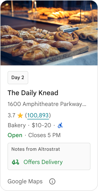
Việc nên làm
Cân nhắc thông tin chi tiết có giá trị cao và được bản địa hoá phù hợp với mục tiêu trước mắt của người dùng. Nội dung phù hợp, chẳng hạn như cửa sổ đặt phòng theo thời gian thực hoặc tình trạng còn phòng hiện tại, giúp người dùng đưa ra quyết định nhanh hơn và có nhiều thông tin hơn.
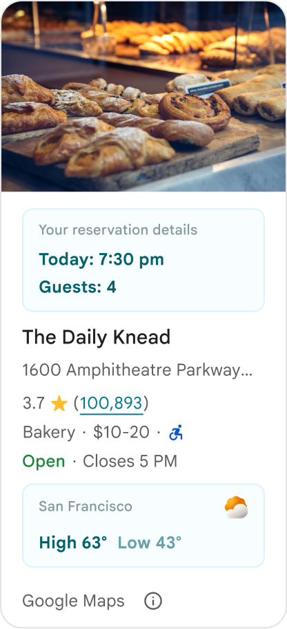
Việc không nên làm
Đừng sao chép Place Details hiện có trên Google, chẳng hạn như điểm xếp hạng, bài đánh giá hoặc giờ hoạt động, ngay cả khi bạn đã ẩn nội dung do Google cung cấp. Việc này có thể khiến người dùng nhầm lẫn về nguồn nội dung và không biết nội dung đó đến từ Google hay bên thứ ba.
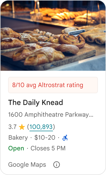
Việc không nên làm
Đừng hiển thị các tuyên bố hoặc huy hiệu không được phân bổ (ví dụ: "Đề xuất hàng đầu!") có thể bị nhầm lẫn với nội dung chính thức được Google xác nhận. Nội dung tuỳ chỉnh phải phân bổ rõ ràng nguồn của nội dung đó.

Việc không nên làm
Đừng thêm quảng cáo, nội dung tiếp thị, chiết khấu khuyến mãi hoặc lời nhắc đăng ký trong các vùng chứa địa điểm tuỳ chỉnh.

Để thêm nội dung tuỳ chỉnh, hãy sử dụng thành phần kết hợp AdvancedPlaceDetailsCompact. Sử dụng basicSectionTop hoặc basicSectionBottom để chỉ định vị trí của nội dung.
Ví dụ về Thông tin chi tiết nâng cao về địa điểm
Tuỳ chỉnh các nút hành động
Sử dụng giao diện PlaceActionProvider để kiểm soát những hành động có sẵn cho từng địa điểm.
Kotlin
class PlaceDetailsWidgetTestActivity : BaseActivity() {

// simplified example of starting the fragment
fun setupPPDFragment() {
   fullWidgetSelectedContent = AdvancedPlaceDetailsFragment.ALL_CONTENT.toMutableList()
   AdvancedPlaceDetailsFragment.newInstance(fullWidgetSelectedContent, Orientation.VERTICAL)
   supportFragmentManager
      .beginTransaction()
      .replace(R.id.fragment_container, fragment!!)
      .commitNow()
}

// you can set the callback elsewhere, but this is the ideal callback spot
override fun onAttachFragment(fragment: Fragment) {
    super.onAttachFragment(fragment)
    when (fragment) {
      is PlaceActionController -> setPlaceActionProvider(fragment)
    }
}

// have this callback return an empty list to hide all buttons
// if this callback isn't set, default buttons appear
 private fun setPlaceActionProvider(fragment: PlaceActionController) {
    fragment.setPlaceActionProvider(
        object : PlaceActionProvider {
        override fun getMainPlaceActions(place: Place): List<PlaceAction> = buildList {
            // predefined actions can be mixed in with custom ones
            add(PlaceAction.OPEN_IN_MAPS)

            // example of button with both text label and icon
            add(
              PlaceAction.builder()
                .setLabelTextResId(R.string.custom_action)
                .setIconResId(R.drawable.gs_custom_action_icon)
                .setContentDescriptionResId(R.string.custom_action_description)
                .setOnClickListener { /* todo perform action */ }
                .build()
            )

            // icon only button
            add(
              PlaceAction.builder()
                .setIconResId(R.drawable.custom_action_icon_2)
                .setContentDescriptionResId(R.string.custom_action_description_2)
                .setOnClickListener { /* todo perform action */}
                .build()
            )

            // text label only button
            add(
              PlaceAction.builder()
                .setLabelTextResId(R.string.custom_action_3)
                .setContentDescriptionResId(R.string.custom_action_description_2)
                .setOnClickListener {/* todo perform action */ }
                .build()
            )
          }

         /**
         You can also specify whether corner buttons should appear.
         For either callback, returning an empty list results in no buttons appearing
         */
         override fun getCornerPlaceActions(place: Place): List<PlaceAction> {
           return emptyList()
         }

        override fun addPlaceActionsChangedListener(
          listener: PlaceActionProvider.OnChangedListener
        ) {
          // in this example, just one listener and widget
          this@HostAppActivity.listener = listener
        }

        override fun removePlaceActionsChangedListener(
          listener: PlaceActionProvider.OnChangedListener
        ) {
          // if there are multiple listeners, remove only the provided listener
          this@HostAppActivity.listener = null
        }
      })
  }
}
Thêm các hành động tuỳ chỉnh và xác định trước
Mẫu này thêm một nút bật/tắt để người dùng yêu thích hoặc bỏ yêu thích một địa điểm.
Kotlin
private var listener: PlaceActionProvider.OnChangedListener? = null

private fun setPlaceActionProvider(fragment: PlaceActionController) {
    fragment.setPlaceActionProvider(
      object : PlaceActionProvider {
        private var placeFavorited = false

        override fun getMainPlaceActions(place: Place): List<PlaceAction> {
          val buttonList = mutableListOf<PlaceAction>()

          if (placeFavorited) {
            buttonList.add(
              PlaceAction.builder()
                .setLabelTextResId(R.string.place_details_button_config_favorite)
                .setIconResId(R.drawable.gs_web_vd_theme_24)
                .setOnClickListener {
                  placeFavorited = !placeFavorited
                  refreshButtonConfigs()
                }
                .build()
            )
          } else {
            buttonList.add(
              PlaceAction.builder()
                .setLabelTextResId(R.string.place_details_button_config_unfavorite)
                .setIconResId(R.drawable.gs_web_vd_theme_24)
                .setOnClickListener {
                  placeFavorited = !placeFavorited
                  refreshButtonConfigs()
                }
                .build()
            )
          }

          return buttonList
        }

        override fun addPlaceActionsChangedListener(
          listener: PlaceActionProvider.OnChangedListener
        ) {
          this@PlaceDetailsWidgetTestActivity.listener = listener
        }

        override fun removePlaceActionsChangedListener(
          listener: PlaceActionProvider.OnChangedListener
        ) {
          // if there are multiple listeners, remove only the provided listener
          this@PlaceDetailsWidgetTestActivity.listener = null
        }
      }
    )
  }

private fun refreshButtonConfigs() {
    listener?.onPlaceActionsChanged()
}
Sử dụng các nút tiêu chuẩn được xác định trước
Tạo các nút hành động thực hiện các hành động tiêu chuẩn do Google xác định.
Kotlin
  override fun getMainPlaceActions(place: Place): List<PlaceAction> {
    val buttonList = mutableListOf<PlaceAction>()
// these buttons will have different background and text color than user-created buttons.
    // Text and icon button
    buttonList.add(PlaceAction.OPEN_IN_MAPS)
    // Icon-only buttons not enabled for main action buttons
    // Use of kotlin extension to do the same.  see
    PlaceAction.OPEN_IN_MAPS {
       setIconResId(0)
     }

    return buttonList
  }
Lọc bài đánh giá và nội dung nghe nhìn
Mã mẫu này chỉ hiển thị nội dung nghe nhìn và bài đánh giá có đề cập đến "mì ý" và "ngon".
Kotlin
    import com.google.android.libraries.places.widget.AdvancedPlaceDetailsFragment
    import com.google.android.libraries.places.widget.model.SearchMediaOptions
    import com.google.android.libraries.places.widget.model.SearchReviewsOptions
    import com.google.android.libraries.places.widget.model.Orientation
    import com.google.android.libraries.places.R

     // 1. Create options using the Java builders (called from Kotlin)
    val mediaOptions = SearchMediaOptions.builder()
        .setQuery("spaghetti")
        .setRankPreference(SearchMediaOptions.RankPreference.MOST_RELEVANT)
        .build()

    val reviewOptions = SearchReviewsOptions.builder()
        .setQuery("tasty")
        .setRankPreference(SearchReviewsOptions.RankPreference.NEWEST)
        .build()

    // 2. Create the fragment
    val fragment = AdvancedPlaceDetailsFragment.newInstance(
        AdvancedPlaceDetailsFragment.STANDARD_CONTENT,
        Orientation.VERTICAL,
        R.style.PlacesMaterialTheme
    )

    // 3. Apply options to the fragment
    fragment.applySearchMediaOptions(mediaOptions)
    fragment.applySearchReviewsOptions(reviewOptions)
Tạo khe cắm nội dung
Kotlin
import androidx.compose.material3.MaterialTheme
import androidx.compose.material3.Text
import androidx.compose.runtime.Composable
import com.google.android.libraries.places.compose.AdvancedPlaceDetailsCompact
import com.google.android.libraries.places.compose.PlaceReference

@Composable
fun ItineraryPlaceCard(placeId: String) {
    AdvancedPlaceDetailsCompact(
        reference = PlaceReference.PlaceId(placeId)
    ) {
        // Slot: Injected directly above the place name
        basicSectionTop {
            Text(
                text = "Day 2 • 2:30 PM",
                style = MaterialTheme.typography.labelSmall,
                color = MaterialTheme.colorScheme.primary
            )
        }

        // Slot: Injected directly below the main action buttons
        basicSectionBottom {
            NotesCard(
                notes = "Great quiet atmosphere for morning meetings. Famous for house-roasted pour-overs."
            )
        }
    }
}