

Advanced Place Details コンポーネント
Place Details コンポーネントの Advanced バージョンは、Places Details Essentials と同じ機能を提供します。また、コンポーネントの操作ボタンを設定したり、表示されるレビューやメディアに検索オプションやフィルタ オプションを適用したりすることもできます。
Jetpack Compose の組み込みサポート
Places UI キットは、AdvancedPlaceDetailsCompact 用の Jetpack Compose @Composable 関数を提供します。これらのコンポーザブルは、ホイストされた状態、組み込みの修飾子のサポート、Compose ネイティブのスロット DSL を使用します。
次のコードサンプルは、垂直レイアウトにコンポーザブル関数を使用する方法を示しています。
Kotlin
import android.util.Log
import androidx.compose.foundation.layout.fillMaxWidth
import androidx.compose.foundation.layout.padding
import androidx.compose.material3.MaterialTheme
import androidx.compose.material3.Text
import androidx.compose.runtime.Composable
import androidx.compose.ui.Modifier
import androidx.compose.ui.graphics.painter.Painter
import androidx.compose.ui.unit.dp
import com.google.android.libraries.places.api.model.Place
import com.google.android.libraries.places.compose.AdvancedPlaceDetailsCompact
import com.google.android.libraries.places.compose.PlaceReference
import com.google.android.libraries.places.compose.action.CornerAction
import com.google.android.libraries.places.compose.action.MainAction
import com.google.android.libraries.places.compose.Orientation

@Composable
fun SampleAdvancedPlaceDetailsCompactCard(
    placeId: String,
    bookmarkIcon: Painter,
    onSavePlaceClicked: (Place) -> Unit
) {
    AdvancedPlaceDetailsCompact(
        // defines the place to be displayed
        reference = PlaceReference.PlaceId(placeId),
        // defines the orientation
        orientation = Orientation.VERTICAL,
        // defines custom styling
        modifier = Modifier
            .fillMaxWidth()
            .padding(16.dp),
        preferTruncation = true,
        enableLightbox = true,
        mainActions = { place ->
            listOf(
                MainAction.OpenDirections(),
                MainAction.OpenWebsite(),
                MainAction.Call()
            )
        },
        // action button configuration
        cornerActions = { place ->
            listOf(
                CornerAction.Custom(
                    icon = bookmarkIcon,
                    text = "Save Place",
                    onClick = { onSavePlaceClicked(place) }
                )
            )
        },
        onPlaceLoaded = { place ->
            Log.d("Places", "Successfully loaded place: ${place.id}")
        },
        onPlaceLoadFailed = { exception ->
            Log.e("Places", "Failed to load place", exception)
        }
    ) {
        // --- Slot: Injected directly above the place name ---
        basicSectionTop {
            Text(
                text = "Featured in 'Top 10 Coffee Shops in SF'",
                style = MaterialTheme.typography.labelSmall,
                color = MaterialTheme.colorScheme.secondary,
                modifier = Modifier.padding(top = 4.dp, bottom = 2.dp)
            )
        }

        // --- Slot: Injected directly below the action buttons ---
        basicSectionBottom {
            Text(
                text = "Notes: Great quiet atmosphere for meetings.",
                style = MaterialTheme.typography.bodySmall,
                color = MaterialTheme.colorScheme.onSurfaceVariant
            )
        }
    }
}
高度な Place Details の構成
AdvancedPlaceDetailsFragment または AdvancedPlaceDetailsCompactFragment を使用して、高度な機能にアクセスします。
アクション ボタンを設定する
AdvancedPlaceDetailsFragment または AdvancedPlaceDetailsCompactFragment の PlaceActionProvider インターフェースを使用して、アクション ボタンを定義してカスタマイズします。
@composable 関数を使用している場合は、mainActions ラムダと cornerActions ラムダを使用してアクション ボタンを構成します。
視覚的な表示ルールの要件
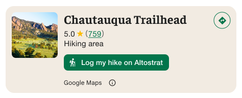
重要: カスタム操作ボタンが Google 以外の第三者とユーザー情報を共有する場合、エンドユーザーにそのことを明確に伝える必要があります。ビジュアル アトリビューションの要件をご覧ください。
右の例は、ユーザー情報が「Altostrat」に送信されることを明確にするカスタム画像を示しています。
検索とフィルタのオプションを適用する
AdvancedPlaceDetailsFragment または AdvancedPlaceDetailsCompactFragment の SearchMediaOptions クラスと SearchReviewsOptions クラスを使用して、メディアやレビューの検索とフィルタリングを有効にします。
@composable 関数を使用している場合は、com.google.android.libraries.places.compose.search.SearchMediaOptions を使用してメディアやレビューの検索とフィルタリングを有効にします。
カスタム コンテンツ スロットを作成する
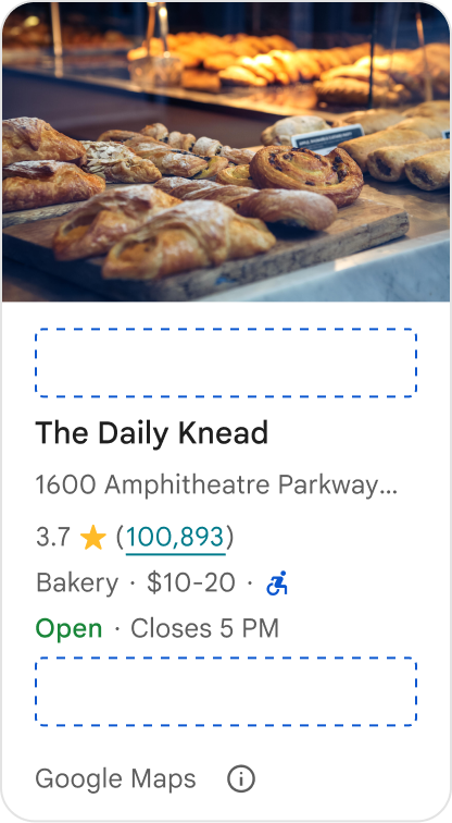
カスタム コンテンツ スロットを使用すると、独自のコンテンツ(AI 生成の要約、旅程のタイムスタンプ、カスタム バッジなど)を事前定義されたレイアウト ゾーンに直接追加できます。
コンテンツ スロットの帰属表示の要件とコンテンツの提案
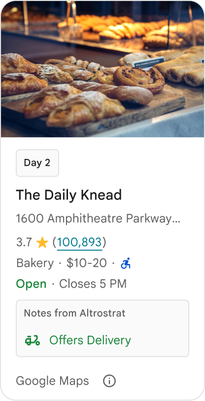
カスタム コンテンツ スロットがマウントされると、開示情報が自動的に更新され、どのコンテンツが Google によって提供され、どのコンテンツがサードパーティによって提供されるかが明確になります。
良い例
Google のプレイスの詳細とカスタム コンテンツの間に明確な視覚的階層を維持し、情報のソースに関する曖昧さを防ぎます。
良い例
ユーザーの直近の目標に合わせてローカライズされた、価値の高い分析情報を検討します。リアルタイムの予約ウィンドウや現在の空き状況などのカスタマイズされたコンテンツは、ユーザーがより迅速かつ十分な情報に基づいて判断を下すのに役立ちます。
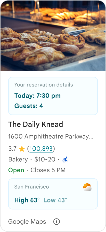
悪い例
Google 提供のコンテンツを非表示にした場合でも、評価、レビュー、営業時間など、既存の Google プレイスの詳細情報を複製しないでください。そうすると、コンテンツのソースや、Google から提供されたものか第三者から提供されたものかについて、ユーザーが混乱する可能性があります。
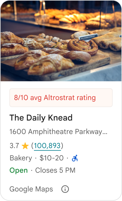
悪い例
Google の公式な推奨と誤解される可能性のある、帰属先のない主張やバッジ(「おすすめ!」など)を表示しないでください。カスタム コンテンツでは、出典を明示的に明記する必要があります。
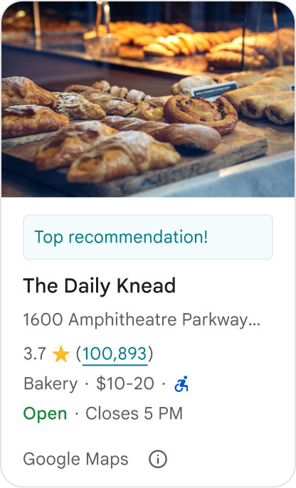
悪い例
カスタムのプレース コンテナ内に広告、マーケティング コピー、プロモーション割引、定期購入のプロンプトを含めないでください。
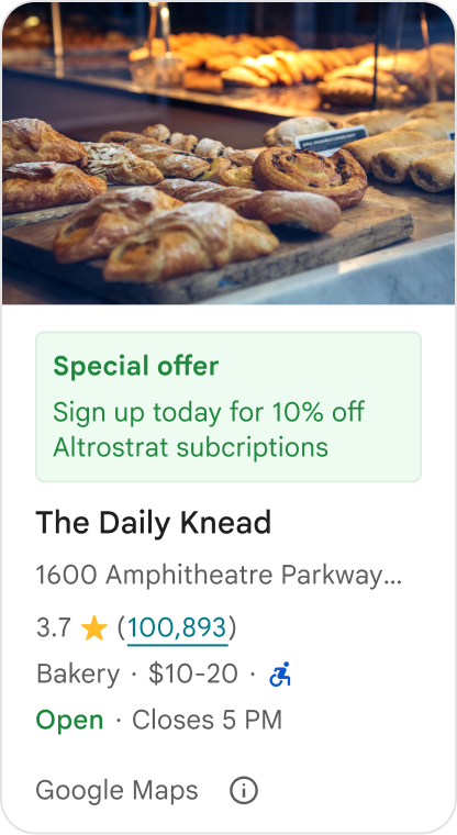
カスタム コンテンツを追加するには、AdvancedPlaceDetailsCompact コンポーザブルを使用します。basicSectionTop または basicSectionBottom を使用して、コンテンツの位置を指定します。
高度な Place Details の例
アクション ボタンをカスタマイズする
PlaceActionProvider インターフェースを使用して、各場所で利用できるアクションを制御します。
Kotlin
class PlaceDetailsWidgetTestActivity : BaseActivity() {

// simplified example of starting the fragment
fun setupPPDFragment() {
   fullWidgetSelectedContent = AdvancedPlaceDetailsFragment.ALL_CONTENT.toMutableList()
   AdvancedPlaceDetailsFragment.newInstance(fullWidgetSelectedContent, Orientation.VERTICAL)
   supportFragmentManager
      .beginTransaction()
      .replace(R.id.fragment_container, fragment!!)
      .commitNow()
}

// you can set the callback elsewhere, but this is the ideal callback spot
override fun onAttachFragment(fragment: Fragment) {
    super.onAttachFragment(fragment)
    when (fragment) {
      is PlaceActionController -> setPlaceActionProvider(fragment)
    }
}

// have this callback return an empty list to hide all buttons
// if this callback isn't set, default buttons appear
 private fun setPlaceActionProvider(fragment: PlaceActionController) {
    fragment.setPlaceActionProvider(
        object : PlaceActionProvider {
        override fun getMainPlaceActions(place: Place): List<PlaceAction> = buildList {
            // predefined actions can be mixed in with custom ones
            add(PlaceAction.OPEN_IN_MAPS)

            // example of button with both text label and icon
            add(
              PlaceAction.builder()
                .setLabelTextResId(R.string.custom_action)
                .setIconResId(R.drawable.gs_custom_action_icon)
                .setContentDescriptionResId(R.string.custom_action_description)
                .setOnClickListener { /* todo perform action */ }
                .build()
            )

            // icon only button
            add(
              PlaceAction.builder()
                .setIconResId(R.drawable.custom_action_icon_2)
                .setContentDescriptionResId(R.string.custom_action_description_2)
                .setOnClickListener { /* todo perform action */}
                .build()
            )

            // text label only button
            add(
              PlaceAction.builder()
                .setLabelTextResId(R.string.custom_action_3)
                .setContentDescriptionResId(R.string.custom_action_description_2)
                .setOnClickListener {/* todo perform action */ }
                .build()
            )
          }

         /**
         You can also specify whether corner buttons should appear.
         For either callback, returning an empty list results in no buttons appearing
         */
         override fun getCornerPlaceActions(place: Place): List<PlaceAction> {
           return emptyList()
         }

        override fun addPlaceActionsChangedListener(
          listener: PlaceActionProvider.OnChangedListener
        ) {
          // in this example, just one listener and widget
          this@HostAppActivity.listener = listener
        }

        override fun removePlaceActionsChangedListener(
          listener: PlaceActionProvider.OnChangedListener
        ) {
          // if there are multiple listeners, remove only the provided listener
          this@HostAppActivity.listener = null
        }
      })
  }
}
カスタム アクションと事前定義アクションを追加する
このサンプルでは、ユーザーが場所をお気に入りに追加またはお気に入りから削除するための切り替えボタンを追加します。
Kotlin
private var listener: PlaceActionProvider.OnChangedListener? = null

private fun setPlaceActionProvider(fragment: PlaceActionController) {
    fragment.setPlaceActionProvider(
      object : PlaceActionProvider {
        private var placeFavorited = false

        override fun getMainPlaceActions(place: Place): List<PlaceAction> {
          val buttonList = mutableListOf<PlaceAction>()

          if (placeFavorited) {
            buttonList.add(
              PlaceAction.builder()
                .setLabelTextResId(R.string.place_details_button_config_favorite)
                .setIconResId(R.drawable.gs_web_vd_theme_24)
                .setOnClickListener {
                  placeFavorited = !placeFavorited
                  refreshButtonConfigs()
                }
                .build()
            )
          } else {
            buttonList.add(
              PlaceAction.builder()
                .setLabelTextResId(R.string.place_details_button_config_unfavorite)
                .setIconResId(R.drawable.gs_web_vd_theme_24)
                .setOnClickListener {
                  placeFavorited = !placeFavorited
                  refreshButtonConfigs()
                }
                .build()
            )
          }

          return buttonList
        }

        override fun addPlaceActionsChangedListener(
          listener: PlaceActionProvider.OnChangedListener
        ) {
          this@PlaceDetailsWidgetTestActivity.listener = listener
        }

        override fun removePlaceActionsChangedListener(
          listener: PlaceActionProvider.OnChangedListener
        ) {
          // if there are multiple listeners, remove only the provided listener
          this@PlaceDetailsWidgetTestActivity.listener = null
        }
      }
    )
  }

private fun refreshButtonConfigs() {
    listener?.onPlaceActionsChanged()
}
事前定義された標準ボタンを使用する
標準の Google 定義アクションを実行するアクション ボタンを作成します。
Kotlin
  override fun getMainPlaceActions(place: Place): List<PlaceAction> {
    val buttonList = mutableListOf<PlaceAction>()
// these buttons will have different background and text color than user-created buttons.
    // Text and icon button
    buttonList.add(PlaceAction.OPEN_IN_MAPS)
    // Icon-only buttons not enabled for main action buttons
    // Use of kotlin extension to do the same.  see
    PlaceAction.OPEN_IN_MAPS {
       setIconResId(0)
     }

    return buttonList
  }
クチコミとメディアをフィルタする
このコードサンプルは、「スパゲッティ」と「おいしい」という単語を含むメディアとクチコミのみを表示します。
Kotlin
    import com.google.android.libraries.places.widget.AdvancedPlaceDetailsFragment
    import com.google.android.libraries.places.widget.model.SearchMediaOptions
    import com.google.android.libraries.places.widget.model.SearchReviewsOptions
    import com.google.android.libraries.places.widget.model.Orientation
    import com.google.android.libraries.places.R

     // 1. Create options using the Java builders (called from Kotlin)
    val mediaOptions = SearchMediaOptions.builder()
        .setQuery("spaghetti")
        .setRankPreference(SearchMediaOptions.RankPreference.MOST_RELEVANT)
        .build()

    val reviewOptions = SearchReviewsOptions.builder()
        .setQuery("tasty")
        .setRankPreference(SearchReviewsOptions.RankPreference.NEWEST)
        .build()

    // 2. Create the fragment
    val fragment = AdvancedPlaceDetailsFragment.newInstance(
        AdvancedPlaceDetailsFragment.STANDARD_CONTENT,
        Orientation.VERTICAL,
        R.style.PlacesMaterialTheme
    )

    // 3. Apply options to the fragment
    fragment.applySearchMediaOptions(mediaOptions)
    fragment.applySearchReviewsOptions(reviewOptions)
コンテンツ スロットを作成する
Kotlin
import androidx.compose.material3.MaterialTheme
import androidx.compose.material3.Text
import androidx.compose.runtime.Composable
import com.google.android.libraries.places.compose.AdvancedPlaceDetailsCompact
import com.google.android.libraries.places.compose.PlaceReference

@Composable
fun ItineraryPlaceCard(placeId: String) {
    AdvancedPlaceDetailsCompact(
        reference = PlaceReference.PlaceId(placeId)
    ) {
        // Slot: Injected directly above the place name
        basicSectionTop {
            Text(
                text = "Day 2 • 2:30 PM",
                style = MaterialTheme.typography.labelSmall,
                color = MaterialTheme.colorScheme.primary
            )
        }

        // Slot: Injected directly below the main action buttons
        basicSectionBottom {
            NotesCard(
                notes = "Great quiet atmosphere for morning meetings. Famous for house-roasted pour-overs."
            )
        }
    }
}