

進階 Place Details 元件
Place Details 元件的進階版提供與地點詳細資料基本版相同的功能。您也可以設定元件的動作按鈕,並對顯示的評論和媒體套用搜尋和篩選選項。
內建 Jetpack Compose 支援
Places UI Kit 提供 AdvancedPlaceDetailsCompact 適用的 Jetpack Compose @Composable 函式。這些可組合函式使用提升的狀態、內建修飾符支援和 Compose 原生 Slot DSL。
以下程式碼範例示範如何將可組合函式用於直向版面配置。
Kotlin
import android.util.Log
import androidx.compose.foundation.layout.fillMaxWidth
import androidx.compose.foundation.layout.padding
import androidx.compose.material3.MaterialTheme
import androidx.compose.material3.Text
import androidx.compose.runtime.Composable
import androidx.compose.ui.Modifier
import androidx.compose.ui.graphics.painter.Painter
import androidx.compose.ui.unit.dp
import com.google.android.libraries.places.api.model.Place
import com.google.android.libraries.places.compose.AdvancedPlaceDetailsCompact
import com.google.android.libraries.places.compose.PlaceReference
import com.google.android.libraries.places.compose.action.CornerAction
import com.google.android.libraries.places.compose.action.MainAction
import com.google.android.libraries.places.compose.Orientation

@Composable
fun SampleAdvancedPlaceDetailsCompactCard(
    placeId: String,
    bookmarkIcon: Painter,
    onSavePlaceClicked: (Place) -> Unit
) {
    AdvancedPlaceDetailsCompact(
        // defines the place to be displayed
        reference = PlaceReference.PlaceId(placeId),
        // defines the orientation
        orientation = Orientation.VERTICAL,
        // defines custom styling
        modifier = Modifier
            .fillMaxWidth()
            .padding(16.dp),
        preferTruncation = true,
        enableLightbox = true,
        mainActions = { place ->
            listOf(
                MainAction.OpenDirections(),
                MainAction.OpenWebsite(),
                MainAction.Call()
            )
        },
        // action button configuration
        cornerActions = { place ->
            listOf(
                CornerAction.Custom(
                    icon = bookmarkIcon,
                    text = "Save Place",
                    onClick = { onSavePlaceClicked(place) }
                )
            )
        },
        onPlaceLoaded = { place ->
            Log.d("Places", "Successfully loaded place: ${place.id}")
        },
        onPlaceLoadFailed = { exception ->
            Log.e("Places", "Failed to load place", exception)
        }
    ) {
        // --- Slot: Injected directly above the place name ---
        basicSectionTop {
            Text(
                text = "Featured in 'Top 10 Coffee Shops in SF'",
                style = MaterialTheme.typography.labelSmall,
                color = MaterialTheme.colorScheme.secondary,
                modifier = Modifier.padding(top = 4.dp, bottom = 2.dp)
            )
        }

        // --- Slot: Injected directly below the action buttons ---
        basicSectionBottom {
            Text(
                text = "Notes: Great quiet atmosphere for meetings.",
                style = MaterialTheme.typography.bodySmall,
                color = MaterialTheme.colorScheme.onSurfaceVariant
            )
        }
    }
}
進階地點詳細資料設定
使用 AdvancedPlaceDetailsFragment 或 AdvancedPlaceDetailsCompactFragment 存取進階功能。
設定動作按鈕
使用 AdvancedPlaceDetailsFragment 或 AdvancedPlaceDetailsCompactFragment 的 PlaceActionProvider 介面定義及自訂動作按鈕。
如果您使用 @composable 函式,請使用 mainActions 和 cornerActions lambda 設定動作按鈕。
視覺出處註明規定
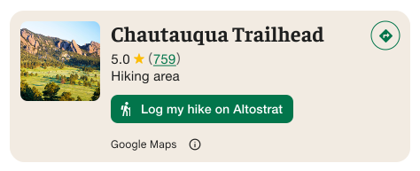
重要事項:如果自訂動作按鈕會將使用者資訊分享給 Google 以外的第三方,請務必清楚告知使用者。請參閱視覺化出處註明規定。
右側的範例顯示自訂圖片,清楚說明使用者資訊將傳送至「Altostrat」。
套用搜尋和篩選選項
使用 AdvancedPlaceDetailsFragment 或 AdvancedPlaceDetailsCompactFragment 的 SearchMediaOptions 和 SearchReviewsOptions 類別,啟用媒體或評論的搜尋和篩選功能。
如果您使用 @composable 函式,請使用 com.google.android.libraries.places.compose.search.SearchMediaOptions 啟用媒體或評論的搜尋和篩選功能。
建立自訂內容插槽
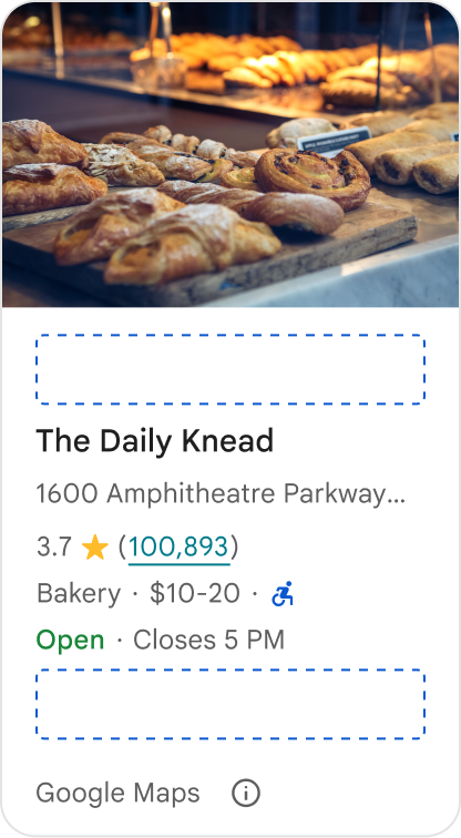
自訂內容插槽可讓您直接在預先定義的版面配置區域中,加入自己的內容 (例如 AI 生成摘要、行程時間戳記或自訂徽章)。
內容位置的出處註明規定和內容建議
掛接自訂內容位置時,揭露事項會自動更新,說明哪些內容由 Google 提供,哪些內容由第三方提供。
正確做法
在 Google 地點詳細資料和自訂內容之間維持清楚的視覺階層,避免資訊來源不明。
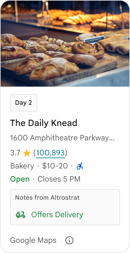
正確做法
請考慮提供符合使用者當下目標的在地化實用洞察資料。量身打造的內容 (例如即時預訂時間或目前供應情形) 有助於使用者更快做出更明智的決定。
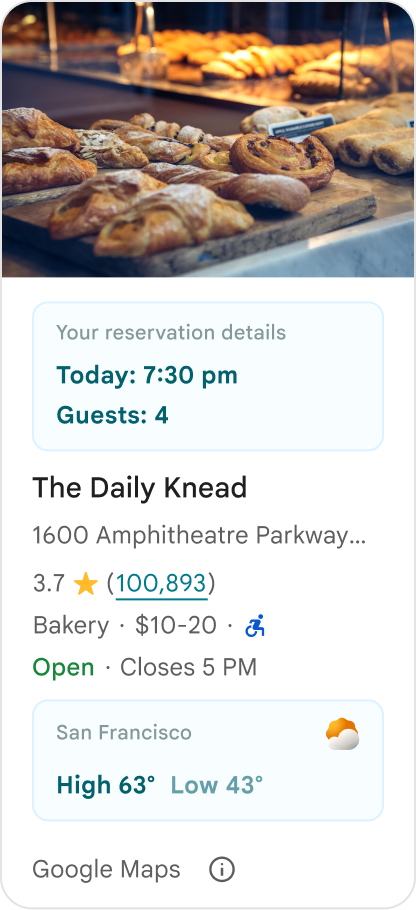
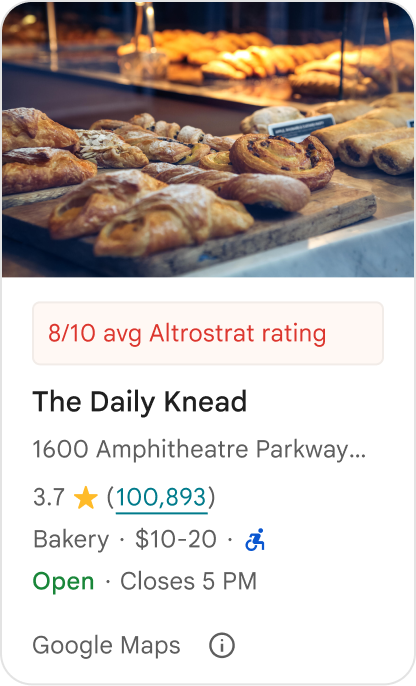
錯誤做法
即使隱藏了 Google 提供的內容,也不要重複現有的 Google 地點詳細資料,例如評分、評論或營業時間。這麼做可能會讓使用者混淆內容來源,不確定內容是來自 Google 還是第三方。
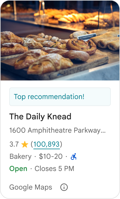
錯誤做法
請勿顯示未標示出處的聲明或徽章 (例如「最佳推薦!」),以免誤導消費者以為是 Google 官方認可。自訂內容必須明確標示來源。
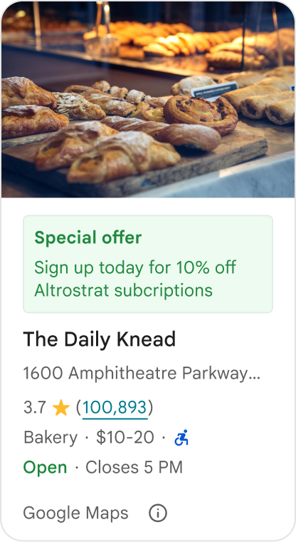
錯誤做法
請勿在自訂地點容器中加入廣告、行銷文案、促銷折扣或訂閱提示。
如要新增自訂內容,請使用 AdvancedPlaceDetailsCompact 可組合函式。使用 basicSectionTop 或 basicSectionBottom 指定內容位置。
進階地點詳細資料範例
自訂動作按鈕
使用 PlaceActionProvider 介面控制每個地點可用的動作。
Kotlin
class PlaceDetailsWidgetTestActivity : BaseActivity() {

// simplified example of starting the fragment
fun setupPPDFragment() {
   fullWidgetSelectedContent = AdvancedPlaceDetailsFragment.ALL_CONTENT.toMutableList()
   AdvancedPlaceDetailsFragment.newInstance(fullWidgetSelectedContent, Orientation.VERTICAL)
   supportFragmentManager
      .beginTransaction()
      .replace(R.id.fragment_container, fragment!!)
      .commitNow()
}

// you can set the callback elsewhere, but this is the ideal callback spot
override fun onAttachFragment(fragment: Fragment) {
    super.onAttachFragment(fragment)
    when (fragment) {
      is PlaceActionController -> setPlaceActionProvider(fragment)
    }
}

// have this callback return an empty list to hide all buttons
// if this callback isn't set, default buttons appear
 private fun setPlaceActionProvider(fragment: PlaceActionController) {
    fragment.setPlaceActionProvider(
        object : PlaceActionProvider {
        override fun getMainPlaceActions(place: Place): List<PlaceAction> = buildList {
            // predefined actions can be mixed in with custom ones
            add(PlaceAction.OPEN_IN_MAPS)

            // example of button with both text label and icon
            add(
              PlaceAction.builder()
                .setLabelTextResId(R.string.custom_action)
                .setIconResId(R.drawable.gs_custom_action_icon)
                .setContentDescriptionResId(R.string.custom_action_description)
                .setOnClickListener { /* todo perform action */ }
                .build()
            )

            // icon only button
            add(
              PlaceAction.builder()
                .setIconResId(R.drawable.custom_action_icon_2)
                .setContentDescriptionResId(R.string.custom_action_description_2)
                .setOnClickListener { /* todo perform action */}
                .build()
            )

            // text label only button
            add(
              PlaceAction.builder()
                .setLabelTextResId(R.string.custom_action_3)
                .setContentDescriptionResId(R.string.custom_action_description_2)
                .setOnClickListener {/* todo perform action */ }
                .build()
            )
          }

         /**
         You can also specify whether corner buttons should appear.
         For either callback, returning an empty list results in no buttons appearing
         */
         override fun getCornerPlaceActions(place: Place): List<PlaceAction> {
           return emptyList()
         }

        override fun addPlaceActionsChangedListener(
          listener: PlaceActionProvider.OnChangedListener
        ) {
          // in this example, just one listener and widget
          this@HostAppActivity.listener = listener
        }

        override fun removePlaceActionsChangedListener(
          listener: PlaceActionProvider.OnChangedListener
        ) {
          // if there are multiple listeners, remove only the provided listener
          this@HostAppActivity.listener = null
        }
      })
  }
}
新增自訂和預先定義的動作
這個範例會新增切換按鈕,供使用者將地點加入或移除我的最愛。
Kotlin
private var listener: PlaceActionProvider.OnChangedListener? = null

private fun setPlaceActionProvider(fragment: PlaceActionController) {
    fragment.setPlaceActionProvider(
      object : PlaceActionProvider {
        private var placeFavorited = false

        override fun getMainPlaceActions(place: Place): List<PlaceAction> {
          val buttonList = mutableListOf<PlaceAction>()

          if (placeFavorited) {
            buttonList.add(
              PlaceAction.builder()
                .setLabelTextResId(R.string.place_details_button_config_favorite)
                .setIconResId(R.drawable.gs_web_vd_theme_24)
                .setOnClickListener {
                  placeFavorited = !placeFavorited
                  refreshButtonConfigs()
                }
                .build()
            )
          } else {
            buttonList.add(
              PlaceAction.builder()
                .setLabelTextResId(R.string.place_details_button_config_unfavorite)
                .setIconResId(R.drawable.gs_web_vd_theme_24)
                .setOnClickListener {
                  placeFavorited = !placeFavorited
                  refreshButtonConfigs()
                }
                .build()
            )
          }

          return buttonList
        }

        override fun addPlaceActionsChangedListener(
          listener: PlaceActionProvider.OnChangedListener
        ) {
          this@PlaceDetailsWidgetTestActivity.listener = listener
        }

        override fun removePlaceActionsChangedListener(
          listener: PlaceActionProvider.OnChangedListener
        ) {
          // if there are multiple listeners, remove only the provided listener
          this@PlaceDetailsWidgetTestActivity.listener = null
        }
      }
    )
  }

private fun refreshButtonConfigs() {
    listener?.onPlaceActionsChanged()
}
使用預先定義的標準按鈕
建立執行 Google 定義標準動作的動作按鈕。
Kotlin
  override fun getMainPlaceActions(place: Place): List<PlaceAction> {
    val buttonList = mutableListOf<PlaceAction>()
// these buttons will have different background and text color than user-created buttons.
    // Text and icon button
    buttonList.add(PlaceAction.OPEN_IN_MAPS)
    // Icon-only buttons not enabled for main action buttons
    // Use of kotlin extension to do the same.  see
    PlaceAction.OPEN_IN_MAPS {
       setIconResId(0)
     }

    return buttonList
  }
篩選評論和媒體
這個程式碼範例只會顯示提及「義大利麵」和「美味」的媒體和評論。
Kotlin
    import com.google.android.libraries.places.widget.AdvancedPlaceDetailsFragment
    import com.google.android.libraries.places.widget.model.SearchMediaOptions
    import com.google.android.libraries.places.widget.model.SearchReviewsOptions
    import com.google.android.libraries.places.widget.model.Orientation
    import com.google.android.libraries.places.R

     // 1. Create options using the Java builders (called from Kotlin)
    val mediaOptions = SearchMediaOptions.builder()
        .setQuery("spaghetti")
        .setRankPreference(SearchMediaOptions.RankPreference.MOST_RELEVANT)
        .build()

    val reviewOptions = SearchReviewsOptions.builder()
        .setQuery("tasty")
        .setRankPreference(SearchReviewsOptions.RankPreference.NEWEST)
        .build()

    // 2. Create the fragment
    val fragment = AdvancedPlaceDetailsFragment.newInstance(
        AdvancedPlaceDetailsFragment.STANDARD_CONTENT,
        Orientation.VERTICAL,
        R.style.PlacesMaterialTheme
    )

    // 3. Apply options to the fragment
    fragment.applySearchMediaOptions(mediaOptions)
    fragment.applySearchReviewsOptions(reviewOptions)
建立內容位置
Kotlin
import androidx.compose.material3.MaterialTheme
import androidx.compose.material3.Text
import androidx.compose.runtime.Composable
import com.google.android.libraries.places.compose.AdvancedPlaceDetailsCompact
import com.google.android.libraries.places.compose.PlaceReference

@Composable
fun ItineraryPlaceCard(placeId: String) {
    AdvancedPlaceDetailsCompact(
        reference = PlaceReference.PlaceId(placeId)
    ) {
        // Slot: Injected directly above the place name
        basicSectionTop {
            Text(
                text = "Day 2 • 2:30 PM",
                style = MaterialTheme.typography.labelSmall,
                color = MaterialTheme.colorScheme.primary
            )
        }

        // Slot: Injected directly below the main action buttons
        basicSectionBottom {
            NotesCard(
                notes = "Great quiet atmosphere for morning meetings. Famous for house-roasted pour-overs."
            )
        }
    }
}