Page Summary
-
Smart displays support touch functionality for Web Receiver applications, offering a default UI with customizable player controls.
-
You can access UI controls using
cast.framework.ui.Controls.getInstance()and optimize for touch screens by settingtouchScreenOptimizedApptotrue. -
Default video and audio UI layouts are determined by
MetadataTypeandMediaStatus.supportedMediaCommands, which can be dynamically adjusted. -
Custom UI control button layouts can be created by clearing default assignments and assigning buttons to specific slots using
assignButton. -
The Secondary Image feature allows adding an informational image to the UI for audio and video applications.
Smart displays are devices with touch functionality to allow Web Receiver applications to support touch-enabled controls. The Web Receiver SDK provides a default UI experience with additional customization of the player controls.
This guide explains how to optimize your Web Receiver application when launched on smart displays and how to customize the player controls.
Accessing UI controls
The UI Controls object can be accessed with the following code:
const controls = cast.framework.ui.Controls.getInstance();
If you are not using a cast-media-player element, you need to set
touchScreenOptimizedApp property to true in UiConfig
under CastReceiverOptions.
context.start({
  uiConfig: {
    touchScreenOptimizedApp: true
  }
});
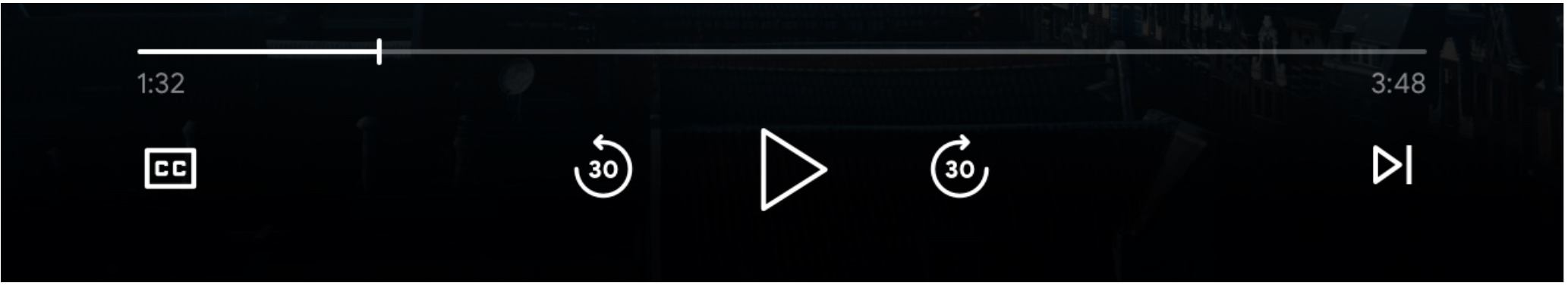
Default video UI
Default control buttons are assigned to each slot based on MetadataType and
MediaStatus.supportedMediaCommands.
MetadataType.Movie, MetadataType.Generic
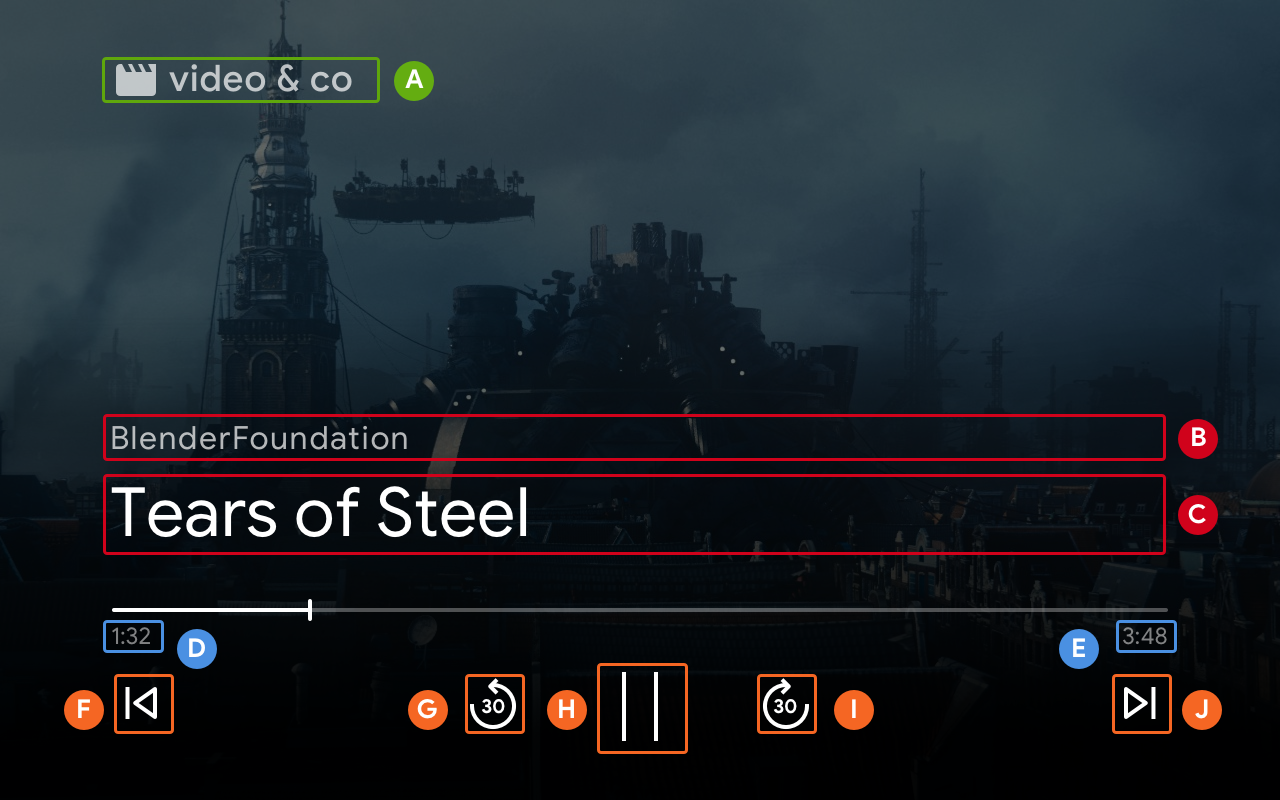
B. MovieMediaMetadata.subtitle or GenericMediaMetadata.subtitle.
C. MovieMediaMetadata.title or GenericMediaMetadata.title.
F. ControlsSlot.SLOT_SECONDARY_1
G. ControlsSlot.SLOT_PRIMARY_1
H. Play / Pause
I. ControlsSlot.SLOT_PRIMARY_2
J. ControlsSlot.SLOT_SECONDARY_2
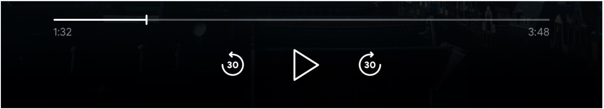
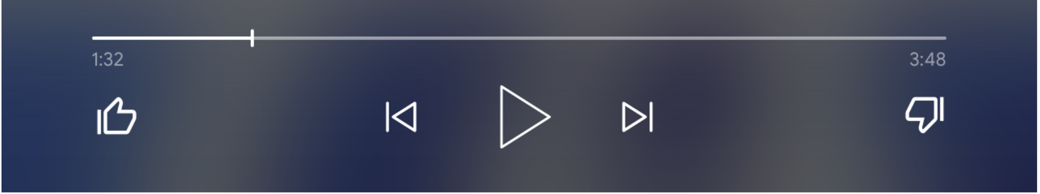
When the value of supportedMediaCommands equals to
ALL_BASIC_MEDIA,
default control layout will display as below:
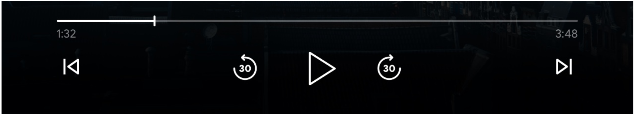
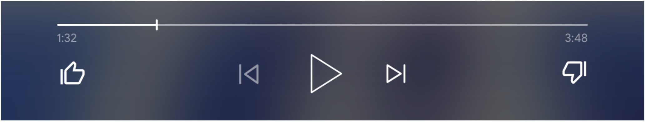
When the value of supportedMediaCommands equals to
ALL_BASIC_MEDIA |
QUEUE_PREV | QUEUE_NEXT
, default control layout will
display as below:
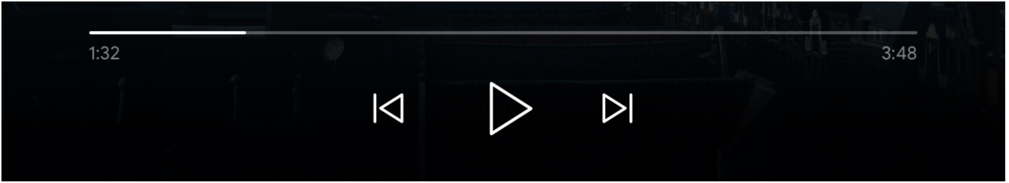
When the value of supportedMediaCommands equals to
PAUSE | QUEUE_PREV | QUEUE_NEXT, default control layout will display as below:
When text tracks are available, closed caption button would be always shown at
SLOT_SECONDARY_1.
To dynamically change the value of supportedMediaCommands after starting a
receiver context, you can call PlayerManager.setSupportedMediaCommands
to override the value. Also, you can add new command by using addSupportedMediaCommands
or remove existing command by using removeSupportedMediaCommands.
Default audio UI
MetadataType.MUSIC_TRACK
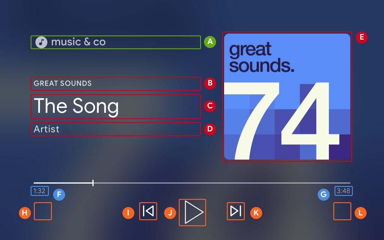
B. MusicTrackMediaMetadata.albumName
C. MusicTrackMediaMetadata.title
D. MusicTrackMediaMetadata.albumArtist, MusicTrackMediaMetadata.artist, or MusicTrackMediaMetadata.composer
E. MusicTrackMediaMetadata.images[0]
H. ControlsSlot.SLOT_SECONDARY_1
I. ControlsSlot.SLOT_PRIMARY_1
J. Play / Pause
K. ControlsSlot.SLOT_PRIMARY_2
L. ControlsSlot.SLOT_SECONDARY_2
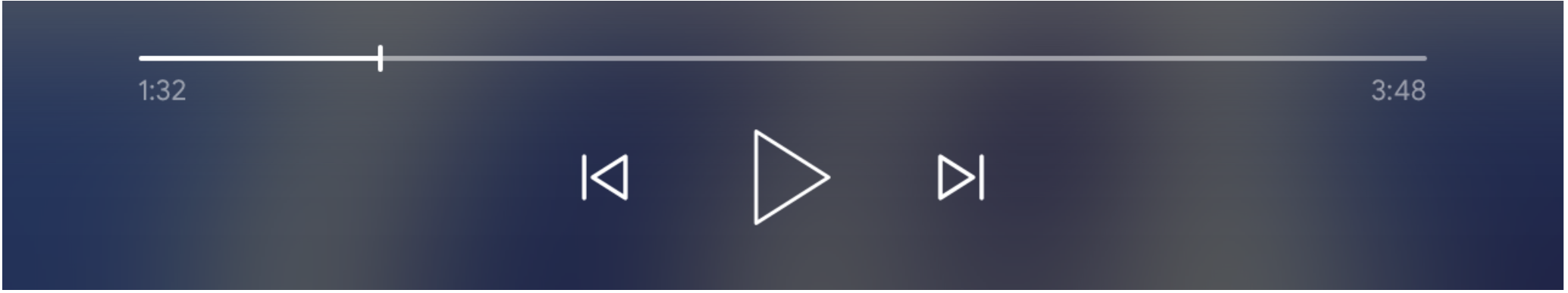
When the value of supportedMediaCommands equals to ALL_BASIC_MEDIA, default control layout will display as below:
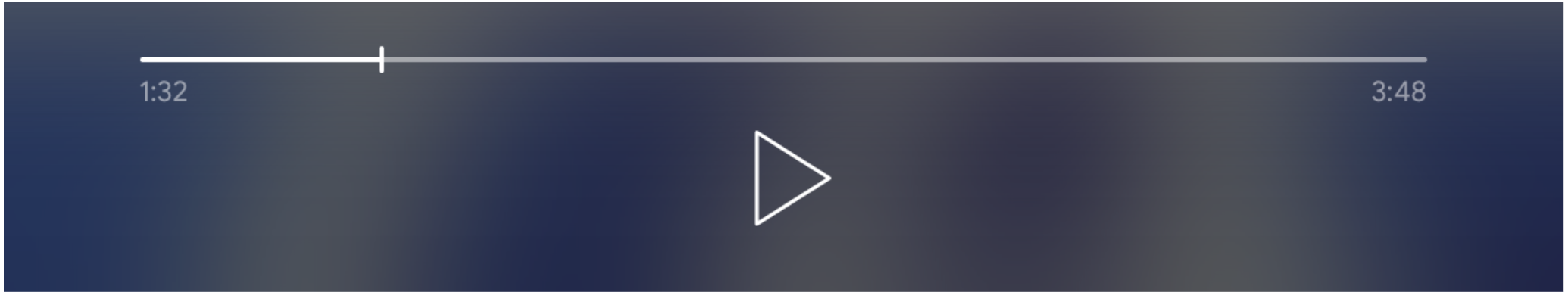
When the value of supportedMediaCommands equals to ALL_BASIC_MEDIA |
QUEUE_PREV | QUEUE_NEXT, default control layout will display as below:
To dynamically change the value of supportedMediaCommands after starting a
Web Receiver context, you can call PlayerManager.setSupportedMediaCommands
to override the value. Also, you can add new commands by using
addSupportedMediaCommands
or remove existing commands by using removeSupportedMediaCommands.
Customize UI control button layout
Using a custom layout if you want to change buttons in UI controls.
const controls = cast.framework.ui.Controls.getInstance();
controls.clearDefaultSlotAssignments();
Then, you can assign control buttons to 4 slots by calling assignButton.
controls.assignButton(
  cast.framework.ui.ControlsSlot.SLOT_SECONDARY_1,
  cast.framework.ui.ControlsButton.LIKE
)

controls.assignButton(
  cast.framework.ui.ControlsSlot.SLOT_SECONDARY_2,
  cast.framework.ui.ControlsButton.DISLIKE
)
And, the custom layout will display as below:
When the assigned button is not supported in MediaStatus.supportedMediaCommands,
the button is greyed out. For example, if the supportedMediaCommands equals
ALL_BASIC_MEDIA | QUEUE_NEXT | LIKE | DISLIKE, then the QUEUE_PREV
button is disabled.
To dynamically change the value of supportedMediaCommands after
starting a Web Receiver context, you can call PlayerManager.setSupportedMediaCommands
to override the value. Also, you can add new commands by using addSupportedMediaCommands
or remove existing commands by using removeSupportedMediaCommands.
Secondary Image
Secondary Image provides Cast developers the flexibility to add an informational image to the UI for audio and video applications, to display local channel logos or media format, for example. This new functionality is provided with very little overhead while maintaining a consistent UI across different Cast display platforms: Chromecast, smart displays, and Chromecast with Google TV.