Page Summary
-
Cast widgets can be customized in appearance and button types displayed.
-
The Apple UIAppearance Protocol in UIKit can be used to change the appearance of Cast framework widgets throughout your app.
-
Widgets can also be customized directly by accessing properties of their superclass, such as
tintColor. -
The buttons displayed on the expanded and mini media controller bars can be configured using the
GCKUIMediaButtonBarProtocol. -
Custom styles for font, color, and images can be applied to UI elements of default Cast widgets using the
GCKUIStylesingleton and its hierarchy of views and styles.
You can customize Cast widgets by setting the colors, styling the buttons, text, and thumbnail appearance, and by choosing the types of buttons to display.
Customize widget theme
The Cast framework widgets supports the Apple UIAppearance Protocol in UIKit to change the appearance of the widgets across your app, such as the position or border of a button. Use this protocol to style the Cast framework widgets to match an existing apps styling.
Cast button example
GCKUICastButton.appearance().tintColor = UIColor.gray
[GCKUICastButton appearance].tintColor = [UIColor grayColor];
Customize widget directly
Customize a widget directly using the properties of its superclass. For example,
it's common to customize the
GCKUICastButton
color using the
tintColor:
property.
Cast button example
castButton.tintColor = UIColor.gray
castButton.tintColor = [UIColor grayColor];
Choose controller buttons
Both the expanded controller class
(GCKUIExpandedMediaControlsViewController)
and the mini controller class
(GCKUIMiniMediaControlsViewController)
contain a button bar, and clients can configure which buttons are presented
on those bars. This is achieved by both classes conforming to
GCKUIMediaButtonBarProtocol.
The mini controller bar has 3 configurable slots for buttons:
SLOT  SLOT  SLOT
  1     2     3
The expanded controller bar has a permanent play/pause toggle button in the middle of the bar plus 4 configurable slots:
SLOT  SLOT  PLAY/PAUSE  SLOT  SLOT
  1     2     BUTTON      3     4
Your app can get a reference to the expanded controller with the
-[defaultExpandedMediaControlsViewController] property of
GCKCastContext
and can create a mini controller using
-[createMiniMediaControlsViewController].
Each slot can contain either a framework button, a custom button, or be empty. The list of framework control buttons are defined as:
| Button Type | Description |
|---|---|
GCKUIMediaButtonTypeNone |
Do not place a button in this slot |
GCKUIMediaButtonTypeCustom |
Custom button |
GCKUIMediaButtonTypePlayPauseToggle |
Toggles between playback and pause |
GCKUIMediaButtonTypeSkipPrevious |
Skips to the previous item in the queue |
GCKUIMediaButtonTypeSkipNext |
Skips to the next item in the queue |
GCKUIMediaButtonTypeRewind30Seconds |
Rewinds the playback by 30 seconds |
GCKUIMediaButtonTypeForward30Seconds |
Skips forward the playback by 30 seconds |
GCKUIMediaButtonTypeMuteToggle |
Mutes and unmutes the remote Web Receiver |
GCKUIMediaButtonTypeClosedCaptions |
Opens a dialog to select text and audio tracks |
Detailed descriptions of what each button does can be found in
GCKUIMediaButtonBarProtocol.h
Add a button as follows using methods on the
GCKUIMediaButtonBarProtocol:
To add a framework button to a bar requires only a call to
-[setButtonType:atIndex:].To add a custom button to a bar, your app must call
-[setButtonType:atIndex:]withbuttonTypeset toGCKUIMediaButtonTypeCustom, and then call-[setCustomButton:atIndex:]passing theUIButtonwith the same index.
Apply custom styles to your iOS app
The Cast iOS SDK enables you to style the font, color, and images of UI elements of the default widgets in your iOS sender, giving the views a look and feel that matches the rest of your app.
The following section shows you how to apply custom styles to any of the Cast widgets or group of widgets.
Applying a style to a UI element of a widget
This procedure uses the example of setting the body text color of your app's mini controller to red.
Look in the table of views and styles to find the view name of the widget or group of widgets that you want to style. Group names are marked with ▼.
Example:
miniControllerwidget viewFind the names of the attributes you want to change from the list of properties in the corresponding style class listed in this table.
Example:
bodyTextColoris a property of theGCKUIStyleAttributesMiniControllerclass.Write the code.
Example:
// Get the shared instance of GCKUIStyle
let castStyle = GCKUIStyle.sharedInstance()
// Set the property of the desired cast widget.
castStyle.castViews.mediaControl.miniController.bodyTextColor = UIColor.red
// Refresh all currently visible views with the assigned styles.
castStyle.apply()
// Get the shared instance of GCKUIStyle.
GCKUIStyle *castStyle = [GCKUIStyle sharedInstance];
// Set the property of the desired cast widget.
castStyle.castViews.mediaControl.miniController.bodyTextColor = [UIColor redColor];
// Refresh all currently visible views with the assigned styles.
[castStyle applyStyle];
Use this pattern for applying any style to any UI element of any widget.
Table of views and styles
This table shows the seven widget views and three groups (marked with ▼) that you can apply styles to.
| View name | Type | Style class |
|---|---|---|
▼ castViews |
Group | GCKUIStyleAttributesCastViews |
▼ deviceControl |
Group | GCKUIStyleAttributesDeviceControl |
deviceChooser |
Widget | GCKUIStyleAttributesDeviceChooser |
noDevicesAvailableController |
Widget | GCKUIStyleAttributesNoDevicesAvailableController |
▼ connectionController |
Group | GCKUIStyleAttributesConnectionController |
navigation |
Widget | GCKUIStyleAttributesConnectionNavigation |
toolbar |
Widget | GCKUIStyleAttributesConnectionToolbar |
▼ mediaControl |
Group | GCKUIStyleAttributesMediaControl |
miniController |
Widget | GCKUIStyleAttributesMiniController |
expandedController |
Widget | GCKUIStyleAttributesExpandedController |
trackSelector |
Widget | GCKUIStyleAttributesTrackSelector |
instructions |
Widget | GCKUIStyleAttributesInstructions |
Style hierarchy
The GCKUIStyle
singleton is the API entry point for all of the style settings. It has the property
castViews, which is the root of the style hierarchy,
as illustrated below; this diagram is a different way of looking at the same
views and groups shown in the previous table.
You can apply a style to an individual widget or to a group of widgets. The style hierarchy has three widget groups: castViews, deviceControl, and mediaControl. Each group's rectangle encloses its widgets. Applying a style to a group applies it to all widgets in that group.
For example, the castViews group lets you apply a style to all widgets and
the deviceControl group lets you apply a style to just its three device
control widgets. The instructions widget does not belong to any group.
| castViews | ||||||||||
| deviceControl | mediaControl | |||||||||
instructions 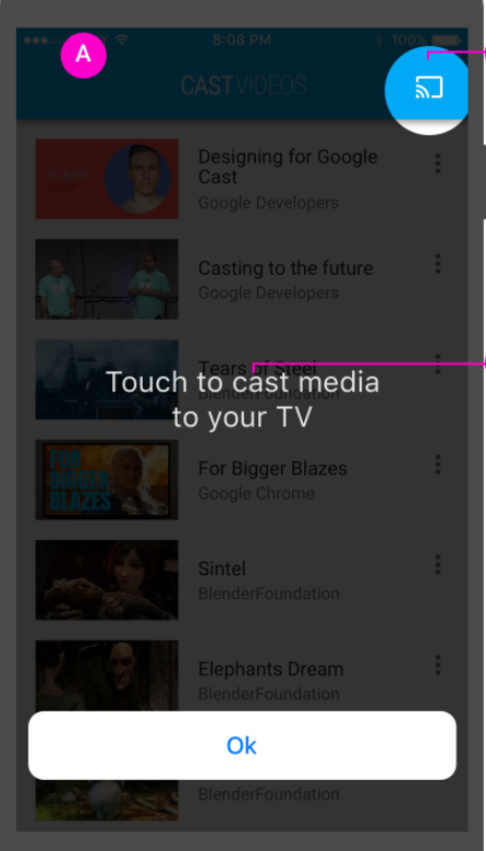 |
device Chooser 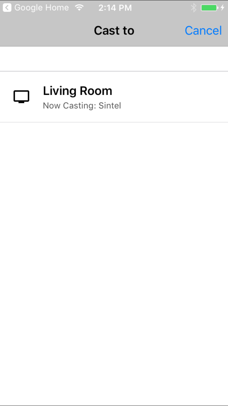 |
noDevicesAvailable screen 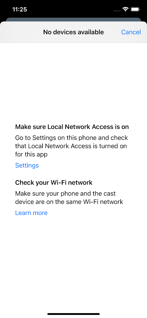
|
connection Controller  |
mini Controller 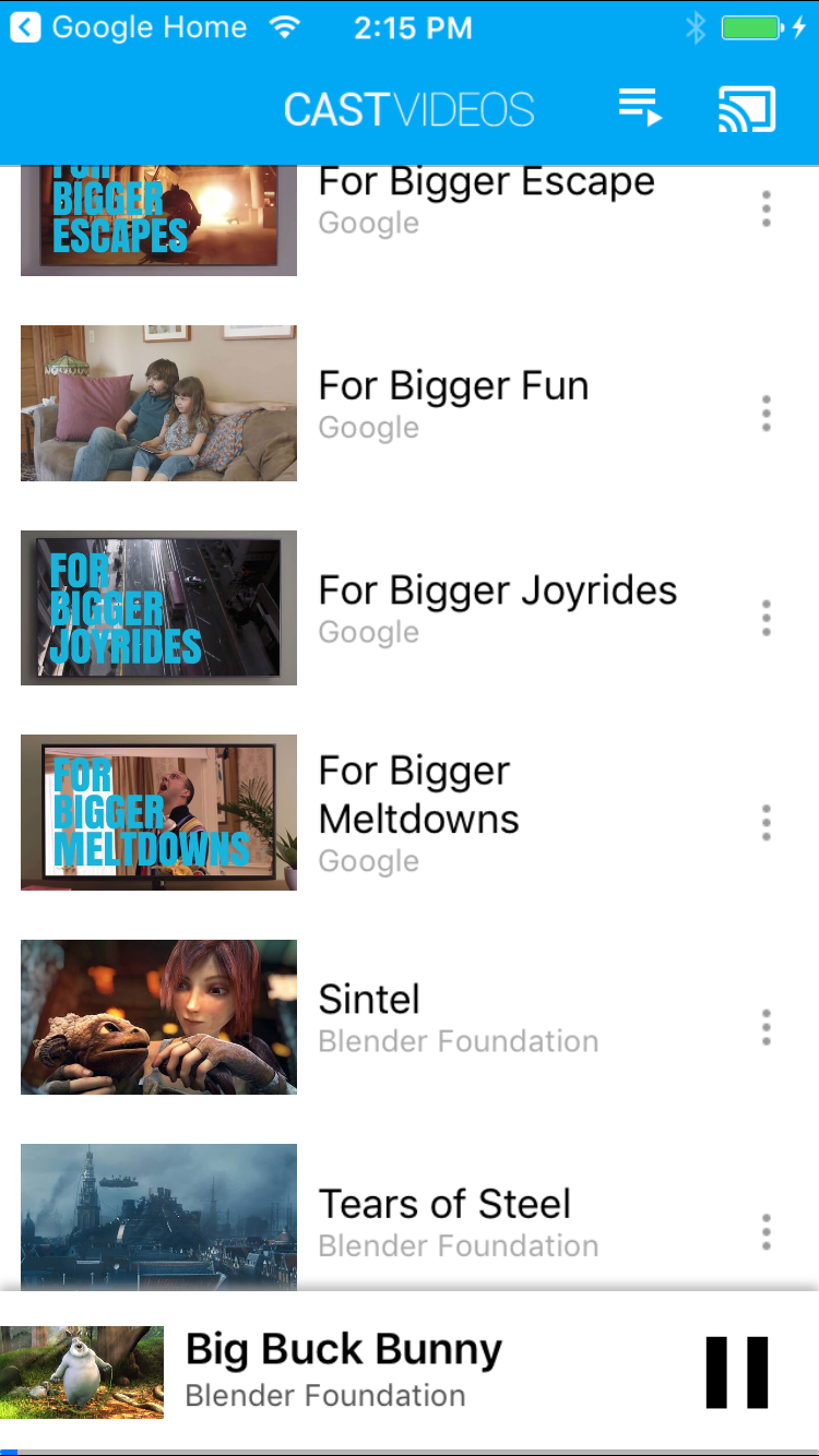 |
expanded Controller  |
track Selector  |
||||
navigation / toolbar 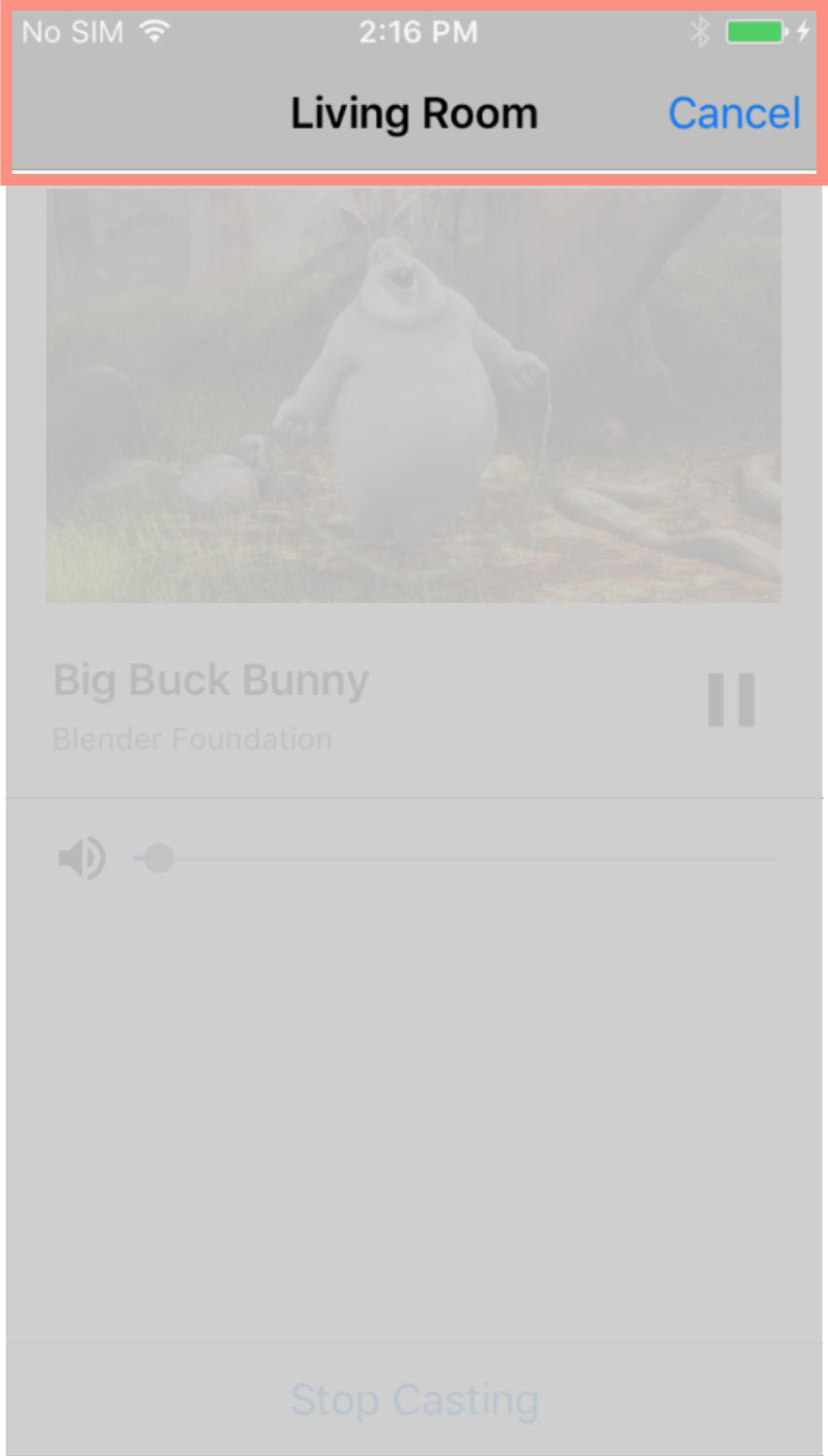
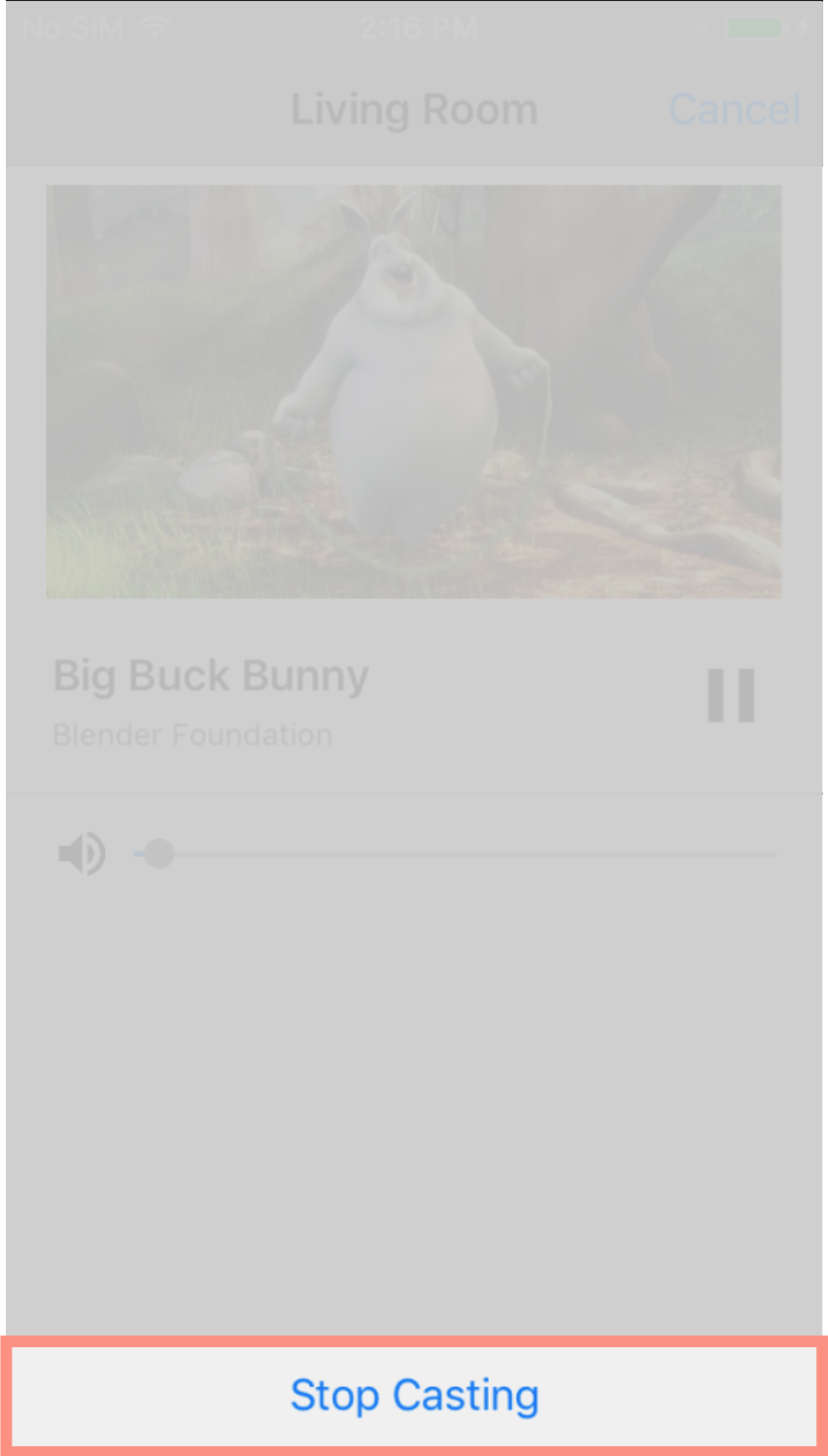 |
||||||||||
Footnote: Widget names in this diagram that are shown on two lines should be
written in code as one word, on one line, no spaces. For example,
device Chooser should be written deviceChooser. Roll over images to enlarge
them.