リッチ レスポンスでは、視覚要素を追加して、ユーザーとの アクション。プロンプトの一部として、次のリッチ レスポンス タイプを使用できます。
- ベーシック カード
- 画像カード
- テーブルカード
リッチ レスポンスを定義する場合は、RICH_RESPONSE で候補を使用します。
Google アシスタントがリッチ レスポンスのみを
対応しています。1 つの content オブジェクトにつき 1 つのリッチ レスポンスのみを使用できる
表示されます。
ベーシック カード
ベーシック カードは、重要(または概要)情報を簡潔に提示するように設計されています。 ユーザーに詳細情報を提供したり、必要に応じて(ウェブリンクを使用して)ユーザーが詳細を確認できるようにしたりできます。
基本カードはインタラクションが発生しないため、主に表示目的に使用します
すぐに利用できます。ボタンをウェブにリンクするには、サーフェスが
WEB_LINK 機能もあります。
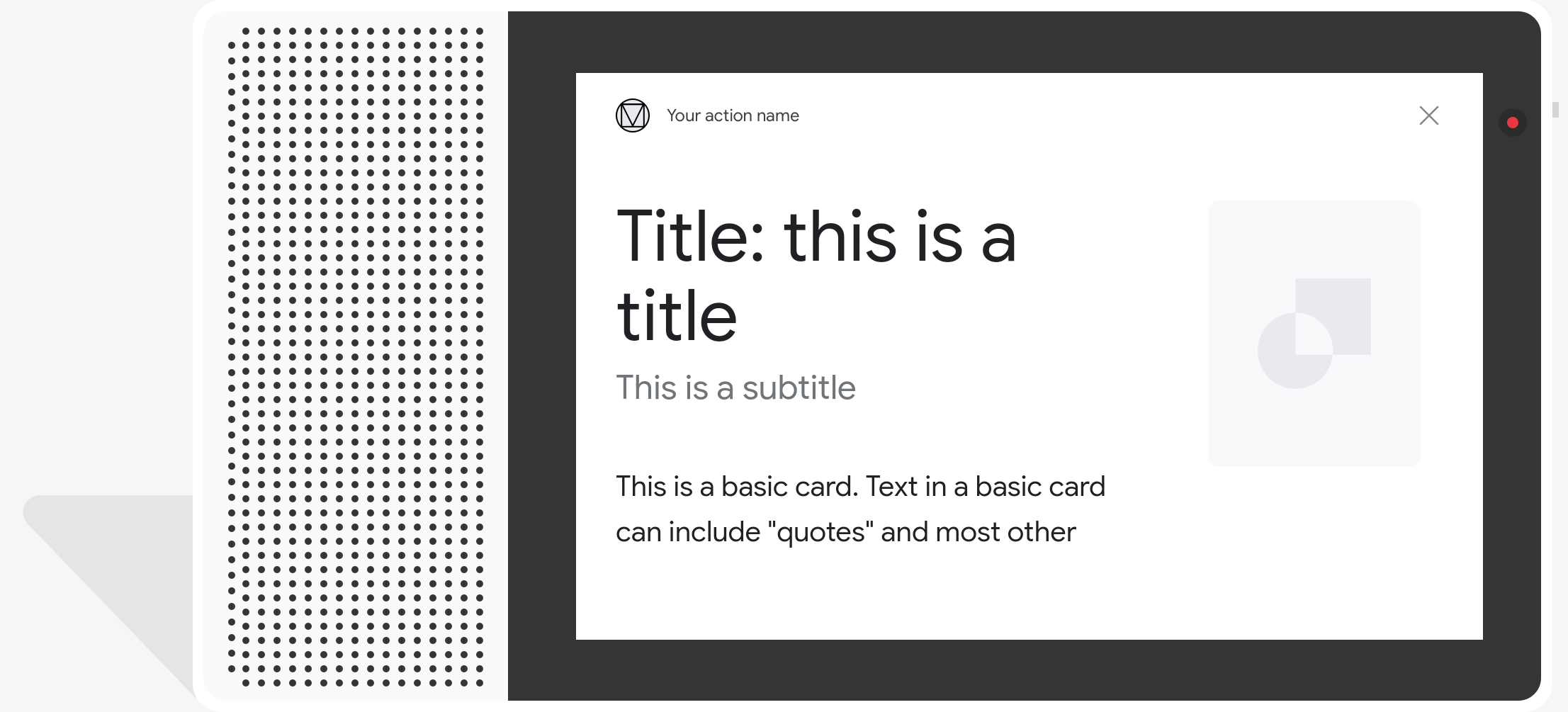
プロパティ
基本カード レスポンス タイプには次のプロパティがあります。
| プロパティ | タイプ | 要件 | 説明 |
|---|---|---|---|
title |
文字列 | 省略可 | 書式なしテキスト形式のカードのタイトル。タイトルのフォントとサイズが固定されており、 先頭行より後の文字は切り捨てられます。設定されていない場合、カードの高さは折りたたまれます title が指定されています。 |
subtitle |
文字列 | 省略可 | カードの書式なしテキストのサブタイトル。タイトルのフォントとサイズは固定されており 先頭行より後の文字は切り捨てられます。次の場合、カードの高さは折りたたまれます。 サブタイトルは指定されません。 |
text |
文字列 | 条件文 |
カードの書式なしテキスト コンテンツ。長すぎるテキストは
最後の単語の区切りは省略記号で示されます。このプロパティは、次の場合を除き必須
このプロパティには次の制限があります。
Markdown の限定されたサブセットがサポートされています。
|
image |
Image |
省略可 | カードに表示される画像。使用できる画像は、JPG、PNG、GIF(アニメーション付き)です。 アニメーションを使用しないなど)を設定します。 |
image_fill |
ImageFill |
省略可 | カードと画像コンテナの枠線が 画像のアスペクト比が画像コンテナのアスペクト比と一致しません できます。 |
button |
Link |
省略可 | タップ時にユーザーを URL にリンクするボタン。ボタンには、
ボタンのテキストを含む name プロパティと、
リンク URL を含む url プロパティ。ボタンテキストは
審査プロセスでチェックされる。 |
サンプルコード
YAML
candidates:
  - first_simple:
      variants:
        - speech: This is a card.
          text: This is a card.
    content:
      card:
        title: Card Title
        subtitle: Card Subtitle
        text: Card Content
        image:
          url: 'https://developers.google.com/assistant/assistant_96.png'
          alt: Google Assistant logo
JSON
{
  "candidates": [
    {
      "first_simple": {
        "variants": [
          {
            "speech": "This is a card.",
            "text": "This is a card."
          }
        ]
      },
      "content": {
        "card": {
          "title": "Card Title",
          "subtitle": "Card Subtitle",
          "text": "Card Content",
          "image": {
            "url": "https://developers.google.com/assistant/assistant_96.png",
            "alt": "Google Assistant logo"
          }
        }
      }
    }
  ]
}
Node.js
app.handle('Card', conv => {
  conv.add('This is a card.');
  conv.add(new Card({
    "title": "Card Title",
    "subtitle": "Card Subtitle",
    "text": "Card Content",
    "image": new Image({
      url: 'https://developers.google.com/assistant/assistant_96.png',
      alt: 'Google Assistant logo'
    })
  }));
});
JSON
{
  "responseJson": {
    "session": {
      "id": "session_id",
      "params": {}
    },
    "prompt": {
      "override": false,
      "content": {
        "card": {
          "title": "Card Title",
          "subtitle": "Card Subtitle",
          "text": "Card Content",
          "image": {
            "alt": "Google Assistant logo",
            "height": 0,
            "url": "https://developers.google.com/assistant/assistant_96.png",
            "width": 0
          }
        }
      },
      "firstSimple": {
        "speech": "This is a card.",
        "text": "This is a card."
      }
    }
  }
}
画像カード
画像カードは、基本的なカードに代わるシンプルなデザインで、 画像が含まれています。画像カードは、画像を共有するときに使用します。 テキストやインタラクティブなコンポーネントをサポートする必要はありません。
プロパティ
画像カードのレスポンス タイプには次のプロパティがあります。
| プロパティ | タイプ | 要件 | 説明 |
|---|---|---|---|
url |
文字列 | 必須 | 画像のソース URL。画像は、JPG、PNG、GIF(アニメーションおよび アニメーションを使用しない場合)。 |
alt |
文字列 | 必須 | ユーザー補助に使用される画像の説明テキスト。 |
height |
int32 | 省略可 | ピクセル単位の画像の高さです。 |
width |
int32 | 省略可 | ピクセル単位の画像の幅です。 |
サンプルコード
YAML
candidates:
  - first_simple:
      variants:
        - speech: This is an image prompt.
          text: This is an image prompt.
    content:
      image:
        alt: Google Assistant logo
        url: 'https://developers.google.com/assistant/assistant_96.png'
JSON
{
  "candidates": [
    {
      "first_simple": {
        "variants": [
          {
            "speech": "This is an image prompt.",
            "text": "This is an image prompt."
          }
        ]
      },
      "content": {
        "image": {
          "alt": "Google Assistant logo",
          "url": "https://developers.google.com/assistant/assistant_96.png"
        }
      }
    }
  ]
}
Node.js
app.handle('Image', conv => {
  conv.add("This is an image prompt!");
  conv.add(new Image({
      url: 'https://developers.google.com/assistant/assistant_96.png',
      alt: 'Google Assistant logo'
  }));
});
JSON
{
  "responseJson": {
    "session": {
      "id": "session_id",
      "params": {}
    },
    "prompt": {
      "override": false,
      "content": {
        "image": {
          "alt": "Google Assistant logo",
          "height": 0,
          "url": "https://developers.google.com/assistant/assistant_96.png",
          "width": 0
        }
      },
      "firstSimple": {
        "speech": "This is an image prompt.",
        "text": "This is an image prompt."
      }
    }
  }
}
テーブルカード
テーブルカードを使用すると、レスポンスで表形式のデータを表示できます(たとえば、 スポーツの順位、選挙結果、フライトなど)が表示されます。列を定義し、 アシスタントがテーブルカードに表示する行(それぞれ最大 3 行)です。「新規顧客の獲得」目標を 追加の列と行、それらの優先順位が表示されます。
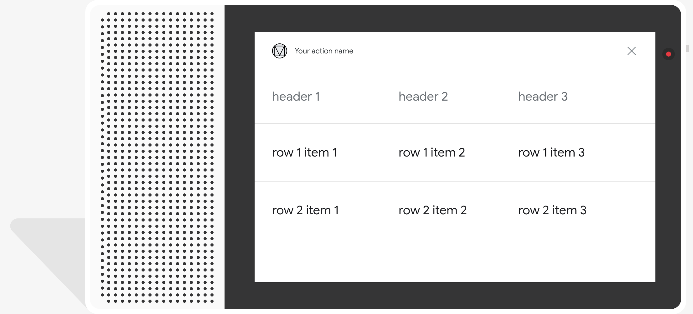
テーブルは静的データを表示するため、操作することはできません。インタラクティブな選択のため 視覚的選択型のレスポンスを使用してください。
プロパティ
テーブルカードのレスポンス タイプには次のプロパティがあります。
| プロパティ | タイプ | 要件 | 説明 |
|---|---|---|---|
title |
文字列 | 条件文 | 書式なしテキスト形式の表のタイトル。このプロパティは次の場合は必須です。
subtitle が設定されました。 |
subtitle |
文字列 | 省略可 | 表の書式なしテキストのサブタイトル。表カードの字幕は 影響を軽減できます。 |
columns |
TableColumn の配列 |
必須 | ヘッダーと列の配置。各 TableColumn オブジェクト
同じ列の別の列の見出しと配置を記述しています。
表します |
rows |
TableRow の配列 |
必須 |
テーブルの行データ。最初の 3 行は表示されることが保証されますが、 一部のサーフェスには表示されない場合があります。テストには、 シミュレータで特定のサーフェスについて表示される行を確認できます。 各 |
image |
Image |
省略可 | テーブルに関連付けられている画像。 |
button |
Link |
省略可 | タップ時にユーザーを URL にリンクするボタン。ボタンには、
name プロパティ(ボタンのテキスト、
リンク URL を含む url プロパティ。ボタンテキストは
審査プロセスでチェックされる。
|
サンプルコード
次のスニペットは、テーブルカードを実装する方法を示しています。
YAML
candidates:
  - first_simple:
      variants:
        - speech: This is a table.
          text: This is a table.
    content:
      table:
        title: Table Title
        subtitle: Table Subtitle
        columns:
          - header: Column A
          - header: Column B
          - header: Column C
        rows:
          - cells:
              - text: A1
              - text: B1
              - text: C1
          - cells:
              - text: A2
              - text: B2
              - text: C2
          - cells:
              - text: A3
              - text: B3
              - text: C3
        image:
          alt: Google Assistant logo
          url: 'https://developers.google.com/assistant/assistant_96.png'
JSON
{
  "candidates": [
    {
      "first_simple": {
        "variants": [
          {
            "speech": "This is a table.",
            "text": "This is a table."
          }
        ]
      },
      "content": {
        "table": {
          "title": "Table Title",
          "subtitle": "Table Subtitle",
          "columns": [
            {
              "header": "Column A"
            },
            {
              "header": "Column B"
            },
            {
              "header": "Column C"
            }
          ],
          "rows": [
            {
              "cells": [
                {
                  "text": "A1"
                },
                {
                  "text": "B1"
                },
                {
                  "text": "C1"
                }
              ]
            },
            {
              "cells": [
                {
                  "text": "A2"
                },
                {
                  "text": "B2"
                },
                {
                  "text": "C2"
                }
              ]
            },
            {
              "cells": [
                {
                  "text": "A3"
                },
                {
                  "text": "B3"
                },
                {
                  "text": "C3"
                }
              ]
            }
          ],
          "image": {
            "alt": "Google Assistant logo",
            "url": "https://developers.google.com/assistant/assistant_96.png"
          }
        }
      }
    }
  ]
}
Node.js
app.handle('Table', conv => {
  conv.add('This is a table.');
  conv.add(new Table({
    "title": "Table Title",
    "subtitle": "Table Subtitle",
    "image": new Image({
      url: 'https://developers.google.com/assistant/assistant_96.png',
      alt: 'Google Assistant logo'
    }),
    "columns": [{
      "header": "Column A"
    }, {
      "header": "Column B"
    }, {
      "header": "Column C"
    }],
    "rows": [{
      "cells": [{
        "text": "A1"
      }, {
        "text": "B1"
      }, {
        "text": "C1"
      }]
    }, {
      "cells": [{
        "text": "A2"
      }, {
        "text": "B2"
      }, {
        "text": "C2"
      }]
    }, {
      "cells": [{
        "text": "A3"
      }, {
        "text": "B3"
      }, {
        "text": "C3"
      }]
    }]
  }));
});
JSON
{
  "responseJson": {
    "session": {
      "id": "session_id",
      "params": {}
    },
    "prompt": {
      "override": false,
      "content": {
        "table": {
          "button": {},
          "columns": [
            {
              "header": "Column A"
            },
            {
              "header": "Column B"
            },
            {
              "header": "Column C"
            }
          ],
          "image": {
            "alt": "Google Assistant logo",
            "height": 0,
            "url": "https://developers.google.com/assistant/assistant_96.png",
            "width": 0
          },
          "rows": [
            {
              "cells": [
                {
                  "text": "A1"
                },
                {
                  "text": "B1"
                },
                {
                  "text": "C1"
                }
              ]
            },
            {
              "cells": [
                {
                  "text": "A2"
                },
                {
                  "text": "B2"
                },
                {
                  "text": "C2"
                }
              ]
            },
            {
              "cells": [
                {
                  "text": "A3"
                },
                {
                  "text": "B3"
                },
                {
                  "text": "C3"
                }
              ]
            }
          ],
          "subtitle": "Table Subtitle",
          "title": "Table Title"
        }
      },
      "firstSimple": {
        "speech": "This is a table.",
        "text": "This is a table."
      }
    }
  }
}
レスポンスのカスタマイズ
カスタムテーマを作成することで、リッチ レスポンスの外観を変更できます。 追加します。このカスタマイズは、一意のキーを定義するのに ユーザーがサーフェスでアクションを呼び出したときに、会話の外観を確認できます 画面と一緒です。
カスタムのレスポンス テーマを設定する手順は次のとおりです。
- Actions Console で、[Develop] >テーマのカスタマイズ。
- 次のいずれかまたはすべてを設定します。
<ph type="x-smartling-placeholder">
- </ph>
- 背景色: カードの背景として使用されます。一般的に 背景を明るい色にして、カードのコンテンツが見やすく 読み取ります
- メインカラー: カードのメインの色ヘッダーテキストとインターフェース あります。一般に、メインカラーとコントラストをはっきりさせるため、 変更できます。
- フォント ファミリー: タイトルなどに使用されるフォントの種類。 目立たせることができます。
- 画像隅のスタイル: カードの外観を変更できます。可能です。
- 背景画像: 背景の代わりに使用するカスタム画像 指定します。サーフェス デバイスがあるときのために 2 つの異なる画像を提供する 横表示と縦表示のどちらでも構いません背景画像を使用する場合、メインの 色は白に設定されています。
- [保存] をクリックします。