Page Summary
-
Rich responses add visual elements to enhance user interactions with your Action.
-
Three types of rich responses are available: Basic cards, Image cards, and Table cards.
-
Basic cards present concise information and can include a web link button.
-
Image cards are a simpler alternative to basic cards focused on displaying an image without additional text or interaction.
-
Table cards display tabular data with defined columns and rows.
Rich responses add visual elements to enhance user interactions with your Action. You can use the following rich response types as part of a prompt:
- Basic card
- Image card
- Table card
When defining a rich response, use a candidate with the RICH_RESPONSE
surface capability so that Google Assistant only returns the rich response on
supported devices. You can only use one rich response per content object in a
prompt.
Basic card
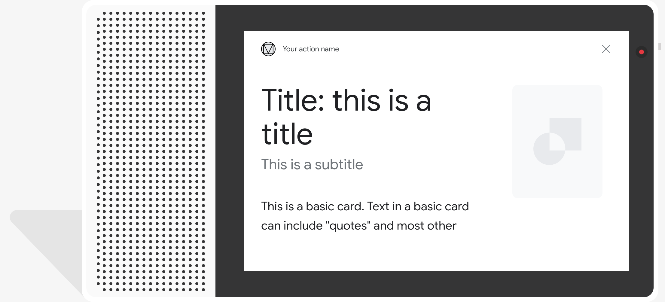
Basic cards are designed to be concise, to present key (or summary) information to users, and to allow users to learn more if you choose (using a web link).
Use basic cards mainly for display purposes, as they have no interaction
capabilities without a button. To link a button to the web, a surface must
also have the WEB_LINK capability.

Properties
The basic card response type has the following properties:
| Property | Type | Requirement | Description |
|---|---|---|---|
title |
string | Optional | Plain text title of the card. Titles are of a fixed font and size, and characters past the first line are truncated. Card height collapses if no title is specified. |
subtitle |
string | Optional | Plain text subtitle of the card. Titles are of a fixed font and size, and characters past the first line are truncated. Card height collapses if no subtitle is specified. |
text |
string | Conditional |
Plain text content of the card. Text that is too long is truncated at
the last word break with an ellipsis. This property is required unless
This property has the following restrictions:
A limited subset of Markdown is supported:
|
image |
Image |
Optional | Image displayed in the card. Images can be JPG, PNG, and GIF (animated and non-animated). |
image_fill |
ImageFill |
Optional | Border between the card and the image container to be used when the image's aspect ratio doesn't match the image container's aspect ratio. |
button |
Link |
Optional | Button that links the user to a URL when tapped. The button must have
a name property that contains the button text, and a
url property that contains the link URL. Button text may
not be misleading, and is checked during the review process. |
Sample code
YAML
candidates:
  - first_simple:
      variants:
        - speech: This is a card.
          text: This is a card.
    content:
      card:
        title: Card Title
        subtitle: Card Subtitle
        text: Card Content
        image:
          url: 'https://developers.google.com/assistant/assistant_96.png'
          alt: Google Assistant logo
JSON
{
  "candidates": [
    {
      "first_simple": {
        "variants": [
          {
            "speech": "This is a card.",
            "text": "This is a card."
          }
        ]
      },
      "content": {
        "card": {
          "title": "Card Title",
          "subtitle": "Card Subtitle",
          "text": "Card Content",
          "image": {
            "url": "https://developers.google.com/assistant/assistant_96.png",
            "alt": "Google Assistant logo"
          }
        }
      }
    }
  ]
}
Node.js
app.handle('Card', conv => {
  conv.add('This is a card.');
  conv.add(new Card({
    "title": "Card Title",
    "subtitle": "Card Subtitle",
    "text": "Card Content",
    "image": new Image({
      url: 'https://developers.google.com/assistant/assistant_96.png',
      alt: 'Google Assistant logo'
    })
  }));
});
JSON
{
  "responseJson": {
    "session": {
      "id": "session_id",
      "params": {}
    },
    "prompt": {
      "override": false,
      "content": {
        "card": {
          "title": "Card Title",
          "subtitle": "Card Subtitle",
          "text": "Card Content",
          "image": {
            "alt": "Google Assistant logo",
            "height": 0,
            "url": "https://developers.google.com/assistant/assistant_96.png",
            "width": 0
          }
        }
      },
      "firstSimple": {
        "speech": "This is a card.",
        "text": "This is a card."
      }
    }
  }
}
Image cards
Image cards are designed to be a simpler alternative to a basic card that also contains an image. Use an image card when you want to present an image, and have no need for supporting text or interactive components.
Properties
The image card response type has the following properties:
| Property | Type | Requirement | Description |
|---|---|---|---|
url |
string | Required | Source URL of the image. Images can be JPG, PNG, or GIF (animated and non-animated). |
alt |
string | Required | Text description of the image to be used for accessibility. |
height |
int32 | Optional | Height of the image in pixels. |
width |
int32 | Optional | Width of the image in pixels. |
Sample code
YAML
candidates:
  - first_simple:
      variants:
        - speech: This is an image prompt.
          text: This is an image prompt.
    content:
      image:
        alt: Google Assistant logo
        url: 'https://developers.google.com/assistant/assistant_96.png'
JSON
{
  "candidates": [
    {
      "first_simple": {
        "variants": [
          {
            "speech": "This is an image prompt.",
            "text": "This is an image prompt."
          }
        ]
      },
      "content": {
        "image": {
          "alt": "Google Assistant logo",
          "url": "https://developers.google.com/assistant/assistant_96.png"
        }
      }
    }
  ]
}
Node.js
app.handle('Image', conv => {
  conv.add("This is an image prompt!");
  conv.add(new Image({
      url: 'https://developers.google.com/assistant/assistant_96.png',
      alt: 'Google Assistant logo'
  }));
});
JSON
{
  "responseJson": {
    "session": {
      "id": "session_id",
      "params": {}
    },
    "prompt": {
      "override": false,
      "content": {
        "image": {
          "alt": "Google Assistant logo",
          "height": 0,
          "url": "https://developers.google.com/assistant/assistant_96.png",
          "width": 0
        }
      },
      "firstSimple": {
        "speech": "This is an image prompt.",
        "text": "This is an image prompt."
      }
    }
  }
}
Table cards
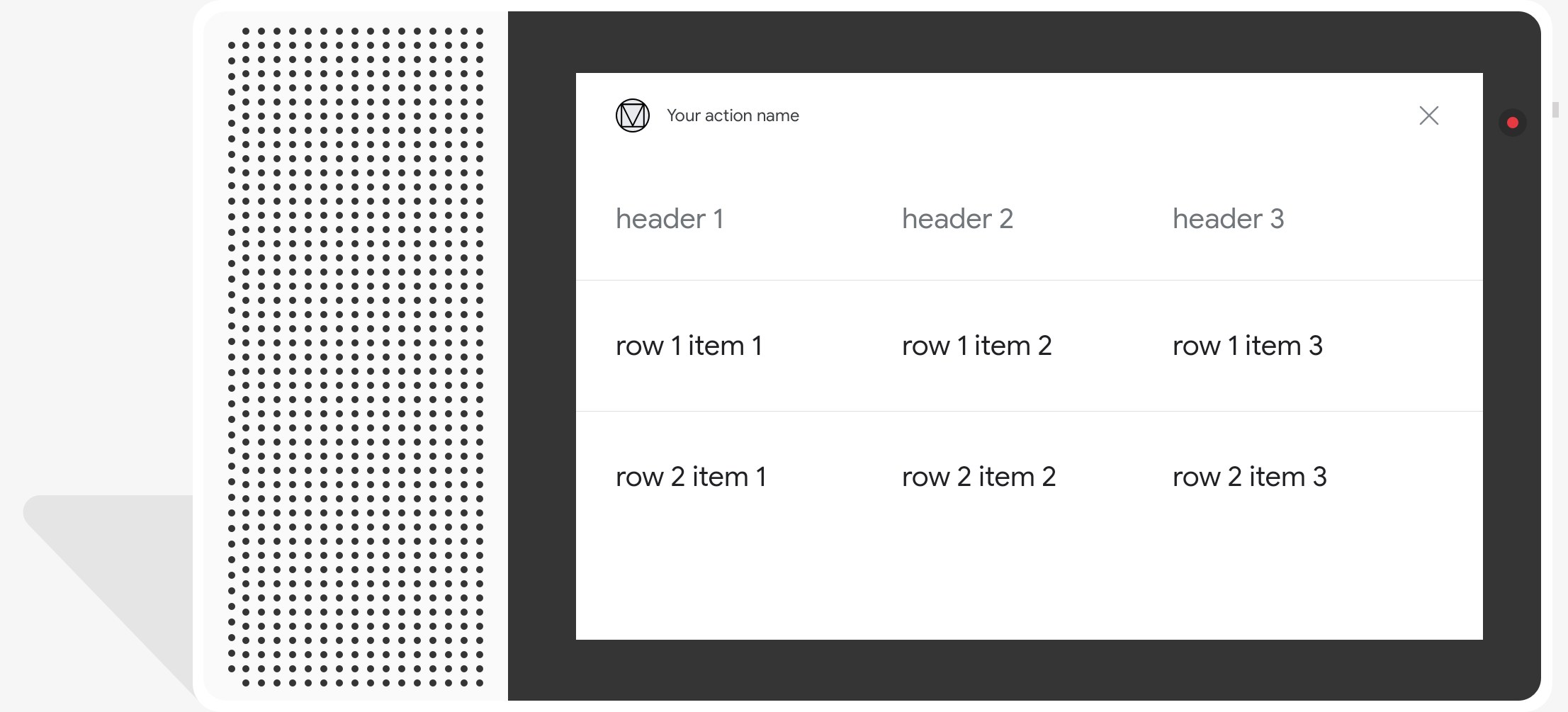
Table cards allow you to display tabular data in your response (for example, sports standings, election results, and flights). You can define columns and rows (up to 3 each) that Assistant shows in your table card. You can also define additional columns and rows, along with their prioritization.

Tables display static data and are not interactable. For interactive selection responses, use a visual selection response instead.
Properties
The table card response type has the following properties:
| Property | Type | Requirement | Description |
|---|---|---|---|
title |
string | Conditional | Plain text title of the table. This property is required if
subtitle is set. |
subtitle |
string | Optional | Plain text subtitle of the table. Subtitles in table cards are not affected by theme customization. |
columns |
array of TableColumn |
Required | Headers and alignment of columns. Each TableColumn object
describes the header and alignment of a different column in the same
table. |
rows |
array of TableRow |
Required |
Row data of the table. The first 3 rows are guaranteed to be shown, but others might not appear on certain surfaces. You can test with the simulator to see which rows are shown for a given surface. Each |
image |
Image |
Optional | Image associated with the table. |
button |
Link |
Optional | Button that links the user to a URL when tapped. The button must have a
name property that contains the button text, and a
url property that contains the link URL. Button text may not
be misleading, and is checked during the review process.
|
Sample code
The following snippets show how to implement a table card:
YAML
candidates:
  - first_simple:
      variants:
        - speech: This is a table.
          text: This is a table.
    content:
      table:
        title: Table Title
        subtitle: Table Subtitle
        columns:
          - header: Column A
          - header: Column B
          - header: Column C
        rows:
          - cells:
              - text: A1
              - text: B1
              - text: C1
          - cells:
              - text: A2
              - text: B2
              - text: C2
          - cells:
              - text: A3
              - text: B3
              - text: C3
        image:
          alt: Google Assistant logo
          url: 'https://developers.google.com/assistant/assistant_96.png'
JSON
{
  "candidates": [
    {
      "first_simple": {
        "variants": [
          {
            "speech": "This is a table.",
            "text": "This is a table."
          }
        ]
      },
      "content": {
        "table": {
          "title": "Table Title",
          "subtitle": "Table Subtitle",
          "columns": [
            {
              "header": "Column A"
            },
            {
              "header": "Column B"
            },
            {
              "header": "Column C"
            }
          ],
          "rows": [
            {
              "cells": [
                {
                  "text": "A1"
                },
                {
                  "text": "B1"
                },
                {
                  "text": "C1"
                }
              ]
            },
            {
              "cells": [
                {
                  "text": "A2"
                },
                {
                  "text": "B2"
                },
                {
                  "text": "C2"
                }
              ]
            },
            {
              "cells": [
                {
                  "text": "A3"
                },
                {
                  "text": "B3"
                },
                {
                  "text": "C3"
                }
              ]
            }
          ],
          "image": {
            "alt": "Google Assistant logo",
            "url": "https://developers.google.com/assistant/assistant_96.png"
          }
        }
      }
    }
  ]
}
Node.js
app.handle('Table', conv => {
  conv.add('This is a table.');
  conv.add(new Table({
    "title": "Table Title",
    "subtitle": "Table Subtitle",
    "image": new Image({
      url: 'https://developers.google.com/assistant/assistant_96.png',
      alt: 'Google Assistant logo'
    }),
    "columns": [{
      "header": "Column A"
    }, {
      "header": "Column B"
    }, {
      "header": "Column C"
    }],
    "rows": [{
      "cells": [{
        "text": "A1"
      }, {
        "text": "B1"
      }, {
        "text": "C1"
      }]
    }, {
      "cells": [{
        "text": "A2"
      }, {
        "text": "B2"
      }, {
        "text": "C2"
      }]
    }, {
      "cells": [{
        "text": "A3"
      }, {
        "text": "B3"
      }, {
        "text": "C3"
      }]
    }]
  }));
});
JSON
{
  "responseJson": {
    "session": {
      "id": "session_id",
      "params": {}
    },
    "prompt": {
      "override": false,
      "content": {
        "table": {
          "button": {},
          "columns": [
            {
              "header": "Column A"
            },
            {
              "header": "Column B"
            },
            {
              "header": "Column C"
            }
          ],
          "image": {
            "alt": "Google Assistant logo",
            "height": 0,
            "url": "https://developers.google.com/assistant/assistant_96.png",
            "width": 0
          },
          "rows": [
            {
              "cells": [
                {
                  "text": "A1"
                },
                {
                  "text": "B1"
                },
                {
                  "text": "C1"
                }
              ]
            },
            {
              "cells": [
                {
                  "text": "A2"
                },
                {
                  "text": "B2"
                },
                {
                  "text": "C2"
                }
              ]
            },
            {
              "cells": [
                {
                  "text": "A3"
                },
                {
                  "text": "B3"
                },
                {
                  "text": "C3"
                }
              ]
            }
          ],
          "subtitle": "Table Subtitle",
          "title": "Table Title"
        }
      },
      "firstSimple": {
        "speech": "This is a table.",
        "text": "This is a table."
      }
    }
  }
}
Customizing your responses
You can change the appearance of your rich responses by creating a custom theme for your Actions project. This customization can be useful for defining a unique look and feel to the conversation when users invoke your Actions on a surface with a screen.
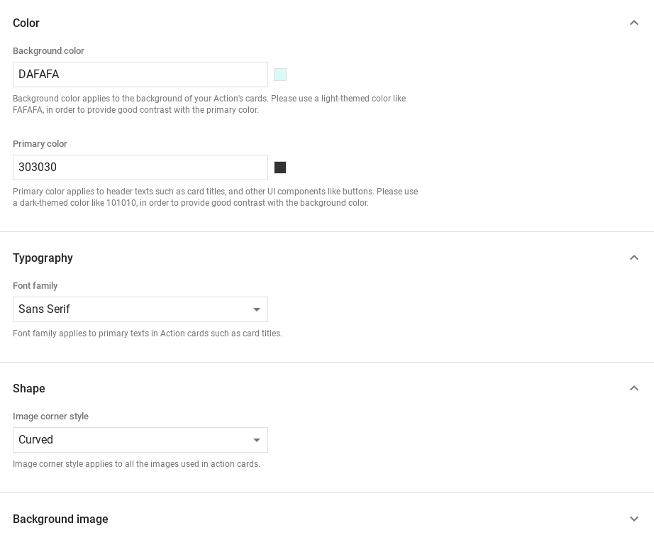
To set a custom response theme, do the following:
- In the Actions console, go to Develop > Theme customization.
- Set any or all of the following:
- Background color: Used as the background of your cards. In general, use a light color for the background to make the card's content easier to read.
- Primary color: Main color for your cards' header texts and interface elements. In general, use a darker primary color to better contrast with the background color.
- Font family: Describes the type of font used for titles and other prominent text elements.
- Image corner style: Alters the look of your cards' corners.
- Background image: Custom image to use in place of the background color. Provide two different images for when the surface device is in landscape or portrait mode. If you use a background image, the primary color is set to white.
- Click Save.

