
丰富的响应能够添加视觉元素,增强用户与您的 行动。您可以在提示中使用以下丰富的响应类型:
- 基本卡
- 图片卡片
- 表格卡片
定义丰富响应时,请使用带有 RICH_RESPONSE 的候选定位设置
使 Google 助理仅在
受支持的设备。在content
提示。
基本卡
基本卡片设计简洁,旨在呈现关键(或摘要)信息 并允许用户了解相关详情(使用网页链接)。
基本卡片主要用于显示目的,因为它们没有互动功能
功能。要将按钮关联至网页,必须有一个 surface
还具有 WEB_LINK 功能。

属性
基本卡片响应类型具有以下属性:
| 属性 | 类型 | 要求 | 说明 |
|---|---|---|---|
title |
字符串 | 可选 | 卡片的纯文本标题。标题具有固定的字体和大小,并且 首行之后的字符会被截断。如果没有,卡片高度会收起 已指定 title。 |
subtitle |
字符串 | 可选 | 卡片的纯文本副标题。标题具有固定的字体和大小, 首行之后的字符会被截断。在以下情况下,卡片高度会收起 未指定副标题。 |
text |
字符串 | 基于条件 |
卡片的纯文本内容。过长的文字将在 截断
以省略号表示最后一个字词的换行。此属性为必需属性,除非
此属性具有以下限制:
仅支持部分 Markdown:
|
image |
Image |
可选 | 卡片中显示的图片。图片可以是 JPG、PNG 和 GIF(动画 和非动画)。 |
image_fill |
ImageFill |
可选 | 卡片与图片容器之间的边界, 图片的宽高比与图片容器的宽高比不一致 宽高比。 |
button |
Link |
可选 | 点按此按钮可将用户链接到某个网址。该按钮必须包含
一个包含按钮文本的 name 属性,以及
包含链接网址的 url 资源。按钮文字可以
不具有误导性,并在审核流程中对其进行检查。 |
示例代码
YAML
candidates:
  - first_simple:
      variants:
        - speech: This is a card.
          text: This is a card.
    content:
      card:
        title: Card Title
        subtitle: Card Subtitle
        text: Card Content
        image:
          url: 'https://developers.google.com/assistant/assistant_96.png'
          alt: Google Assistant logo
JSON
{
  "candidates": [
    {
      "first_simple": {
        "variants": [
          {
            "speech": "This is a card.",
            "text": "This is a card."
          }
        ]
      },
      "content": {
        "card": {
          "title": "Card Title",
          "subtitle": "Card Subtitle",
          "text": "Card Content",
          "image": {
            "url": "https://developers.google.com/assistant/assistant_96.png",
            "alt": "Google Assistant logo"
          }
        }
      }
    }
  ]
}
Node.js
app.handle('Card', conv => {
  conv.add('This is a card.');
  conv.add(new Card({
    "title": "Card Title",
    "subtitle": "Card Subtitle",
    "text": "Card Content",
    "image": new Image({
      url: 'https://developers.google.com/assistant/assistant_96.png',
      alt: 'Google Assistant logo'
    })
  }));
});
JSON
{
  "responseJson": {
    "session": {
      "id": "session_id",
      "params": {}
    },
    "prompt": {
      "override": false,
      "content": {
        "card": {
          "title": "Card Title",
          "subtitle": "Card Subtitle",
          "text": "Card Content",
          "image": {
            "alt": "Google Assistant logo",
            "height": 0,
            "url": "https://developers.google.com/assistant/assistant_96.png",
            "width": 0
          }
        }
      },
      "firstSimple": {
        "speech": "This is a card.",
        "text": "This is a card."
      }
    }
  }
}
图片卡片
图片卡片与基本卡片相比,是一种更简单的替代选择, 包含图片。如果您想展示图片,可以使用图片卡片 而无需支持文本或互动组件。
属性
图片卡片响应类型具有以下属性:
| 属性 | 类型 | 要求 | 说明 |
|---|---|---|---|
url |
字符串 | 必填 | 图片的来源网址。图片可以是 JPG、PNG 或 GIF(动画 非动画)。 |
alt |
字符串 | 必填 | 图片的文字说明,用于提供无障碍功能。 |
height |
int32 | 可选 | 图片的高度(以像素为单位)。 |
width |
int32 | 可选 | 此图片的宽度,以像素为单位。 |
示例代码
YAML
candidates:
  - first_simple:
      variants:
        - speech: This is an image prompt.
          text: This is an image prompt.
    content:
      image:
        alt: Google Assistant logo
        url: 'https://developers.google.com/assistant/assistant_96.png'
JSON
{
  "candidates": [
    {
      "first_simple": {
        "variants": [
          {
            "speech": "This is an image prompt.",
            "text": "This is an image prompt."
          }
        ]
      },
      "content": {
        "image": {
          "alt": "Google Assistant logo",
          "url": "https://developers.google.com/assistant/assistant_96.png"
        }
      }
    }
  ]
}
Node.js
app.handle('Image', conv => {
  conv.add("This is an image prompt!");
  conv.add(new Image({
      url: 'https://developers.google.com/assistant/assistant_96.png',
      alt: 'Google Assistant logo'
  }));
});
JSON
{
  "responseJson": {
    "session": {
      "id": "session_id",
      "params": {}
    },
    "prompt": {
      "override": false,
      "content": {
        "image": {
          "alt": "Google Assistant logo",
          "height": 0,
          "url": "https://developers.google.com/assistant/assistant_96.png",
          "width": 0
        }
      },
      "firstSimple": {
        "speech": "This is an image prompt.",
        "text": "This is an image prompt."
      }
    }
  }
}
表格卡片
借助表格卡片,你可以在回答中显示表格数据(例如, 体育赛事排名、选举结果和航班信息)。您可以定义列和 行(每行最多 3 行),显示 Google 助理在表格卡片中显示的行。你还可以定义 附加列和行及其优先级。

表格显示静态数据,不可互动。用于交互选择 请改用视觉选择响应。
属性
表格卡片响应类型具有以下属性:
| 属性 | 类型 | 要求 | 说明 |
|---|---|---|---|
title |
字符串 | 基于条件 | 表格的纯文本标题。如果存在以下情况,则必须指定此属性:
已设置 subtitle。 |
subtitle |
字符串 | 可选 | 表格的纯文本副标题。表格卡片中的副标题 会受到主题自定义的影响 |
columns |
由 TableColumn 组成的数组 |
必填 | 标题和列的对齐方式。每个 TableColumn 对象
用于说明同一文件中不同列的标题和对齐方式。
表格。 |
rows |
由 TableRow 组成的数组 |
必填 |
表中的行数据。系统一定会显示前三行 而另一些则可能不会在某些平台上显示。您可以使用 模拟器来查看针对给定 surface 显示哪些行。 每个 |
image |
Image |
可选 | 与表关联的图片。 |
button |
Link |
可选 | 点按此按钮可将用户链接到某个网址。该按钮必须具有
name 属性,其中包含按钮文本和一个
包含链接网址的 url 资源。按钮文字不能
具有误导性,并在审核流程中接受核查。
|
示例代码
以下代码段展示了如何实现表格卡片:
YAML
candidates:
  - first_simple:
      variants:
        - speech: This is a table.
          text: This is a table.
    content:
      table:
        title: Table Title
        subtitle: Table Subtitle
        columns:
          - header: Column A
          - header: Column B
          - header: Column C
        rows:
          - cells:
              - text: A1
              - text: B1
              - text: C1
          - cells:
              - text: A2
              - text: B2
              - text: C2
          - cells:
              - text: A3
              - text: B3
              - text: C3
        image:
          alt: Google Assistant logo
          url: 'https://developers.google.com/assistant/assistant_96.png'
JSON
{
  "candidates": [
    {
      "first_simple": {
        "variants": [
          {
            "speech": "This is a table.",
            "text": "This is a table."
          }
        ]
      },
      "content": {
        "table": {
          "title": "Table Title",
          "subtitle": "Table Subtitle",
          "columns": [
            {
              "header": "Column A"
            },
            {
              "header": "Column B"
            },
            {
              "header": "Column C"
            }
          ],
          "rows": [
            {
              "cells": [
                {
                  "text": "A1"
                },
                {
                  "text": "B1"
                },
                {
                  "text": "C1"
                }
              ]
            },
            {
              "cells": [
                {
                  "text": "A2"
                },
                {
                  "text": "B2"
                },
                {
                  "text": "C2"
                }
              ]
            },
            {
              "cells": [
                {
                  "text": "A3"
                },
                {
                  "text": "B3"
                },
                {
                  "text": "C3"
                }
              ]
            }
          ],
          "image": {
            "alt": "Google Assistant logo",
            "url": "https://developers.google.com/assistant/assistant_96.png"
          }
        }
      }
    }
  ]
}
Node.js
app.handle('Table', conv => {
  conv.add('This is a table.');
  conv.add(new Table({
    "title": "Table Title",
    "subtitle": "Table Subtitle",
    "image": new Image({
      url: 'https://developers.google.com/assistant/assistant_96.png',
      alt: 'Google Assistant logo'
    }),
    "columns": [{
      "header": "Column A"
    }, {
      "header": "Column B"
    }, {
      "header": "Column C"
    }],
    "rows": [{
      "cells": [{
        "text": "A1"
      }, {
        "text": "B1"
      }, {
        "text": "C1"
      }]
    }, {
      "cells": [{
        "text": "A2"
      }, {
        "text": "B2"
      }, {
        "text": "C2"
      }]
    }, {
      "cells": [{
        "text": "A3"
      }, {
        "text": "B3"
      }, {
        "text": "C3"
      }]
    }]
  }));
});
JSON
{
  "responseJson": {
    "session": {
      "id": "session_id",
      "params": {}
    },
    "prompt": {
      "override": false,
      "content": {
        "table": {
          "button": {},
          "columns": [
            {
              "header": "Column A"
            },
            {
              "header": "Column B"
            },
            {
              "header": "Column C"
            }
          ],
          "image": {
            "alt": "Google Assistant logo",
            "height": 0,
            "url": "https://developers.google.com/assistant/assistant_96.png",
            "width": 0
          },
          "rows": [
            {
              "cells": [
                {
                  "text": "A1"
                },
                {
                  "text": "B1"
                },
                {
                  "text": "C1"
                }
              ]
            },
            {
              "cells": [
                {
                  "text": "A2"
                },
                {
                  "text": "B2"
                },
                {
                  "text": "C2"
                }
              ]
            },
            {
              "cells": [
                {
                  "text": "A3"
                },
                {
                  "text": "B3"
                },
                {
                  "text": "C3"
                }
              ]
            }
          ],
          "subtitle": "Table Subtitle",
          "title": "Table Title"
        }
      },
      "firstSimple": {
        "speech": "This is a table.",
        "text": "This is a table."
      }
    }
  }
}
自定义响应
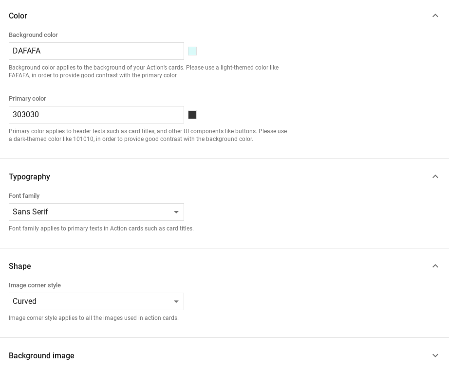
您可以通过创建自定义主题来更改丰富回复的外观 为 Actions 项目指定专用价格。这种自定义可用于定义一个 当用户在 Surface 上调用您的 Action 时,对话外观和风格 屏幕上有一个屏幕。
如需设置自定义响应主题,请执行以下操作:
- 在 Actions 控制台中,前往 Develop >(开发)>主题自定义。
- 设置以下任意或全部:
<ph type="x-smartling-placeholder">
- </ph>
- 背景颜色:用作卡片的背景。一般来说, 为背景使用浅色,使卡片内容更易于 阅读。
- 主要颜色:卡片的主颜色标题文本和界面 元素。一般而言,请使用较深的主色,以便与 背景颜色
- 字体系列:描述标题和其他内容所使用的字体类型 显眼的文字元素。
- 图片角样式:改变卡片的外观角。
- 背景图片:用于替代背景的自定义映像 color 决定。提供 2 张不同的图片,以便在 Surface 设备处于打开状态时显示 横向或纵向模式如果您使用背景图片, 设为白色。
- 点击保存。