
সূচক
-
Action(বার্তা) -
Action.ActionParameter(বার্তা) -
Action.Interaction(enum) -
Action.LoadIndicator(enum) -
BorderStyle(বার্তা) -
BorderStyle.BorderType(এনাম) -
Button(বার্তা) -
ButtonList(বার্তা) -
Card(বার্তা) -
Card.CardAction(বার্তা) -
Card.CardFixedFooter(বার্তা) -
Card.CardHeader(বার্তা) -
Card.DisplayStyle(এনাম) -
Card.DividerStyle(এনাম) -
Card.Section(বার্তা) -
Columns(বার্তা) -
Columns.Column(বার্তা) -
Columns.Column.HorizontalSizeStyle(এনাম) -
Columns.Column.VerticalAlignment(এনাম) -
Columns.Column.Widgets(বার্তা) -
DateTimePicker(বার্তা) -
DateTimePicker.DateTimePickerType(enum) -
DecoratedText(বার্তা) -
DecoratedText.SwitchControl(বার্তা) -
DecoratedText.SwitchControl.ControlType(enum) -
Divider(বার্তা) -
EndNavigation(বার্তা) -
EndNavigation.Action(enum) -
GetAutocompletionResponse(বার্তা) -
Grid(বার্তা) -
Grid.GridItem(বার্তা) -
Grid.GridItem.GridItemLayout(enum) -
Icon(বার্তা) -
Image(বার্তা) -
ImageComponent(বার্তা) -
ImageCropStyle(বার্তা) -
ImageCropStyle.ImageCropType(enum) -
Link(বার্তা) -
LinkPreview(বার্তা) -
MaterialIcon(বার্তা) -
Navigation(বার্তা) -
Notification(বার্তা) -
OnClick(বার্তা) -
OpenLink(বার্তা) -
OpenLink.OnClose(enum) -
OpenLink.OpenAs(enum) -
RenderActions(বার্তা) -
RenderActions.Action(বার্তা) -
SelectionInput(বার্তা) -
SelectionInput.PlatformDataSource(বার্তা) -
SelectionInput.PlatformDataSource.CommonDataSource(enum) -
SelectionInput.SelectionItem(বার্তা) -
SelectionInput.SelectionType(enum) -
SubmitFormResponse(বার্তা) -
Suggestions(বার্তা) -
Suggestions.SuggestionItem(বার্তা) -
TextInput(বার্তা) -
TextInput.Type(enum) -
TextParagraph(বার্তা) -
Widget(বার্তা) -
Widget.HorizontalAlignment(এনাম) -
Widget.ImageType(enum)
কর্ম
ফর্ম জমা দেওয়ার সময় আচরণের বর্ণনা দেয় এমন একটি ক্রিয়া। উদাহরণস্বরূপ, আপনি ফর্মটি পরিচালনা করতে একটি Apps স্ক্রিপ্ট স্ক্রিপ্ট আহ্বান করতে পারেন৷ যদি ক্রিয়াটি ট্রিগার করা হয়, ফর্মের মানগুলি সার্ভারে পাঠানো হয়।

 Google Chat অ্যাপ এবং Google Workspace অ্যাড-অনগুলির জন্য উপলব্ধ।
| ক্ষেত্র | |
|---|---|
function | একটি কাস্টম ফাংশন যখন ধারণ করা উপাদানটি ক্লিক করা হয় বা অন্যথায় সক্রিয় করা হয়। উদাহরণ ব্যবহারের জন্য, ফর্ম ডেটা পড়ুন দেখুন। |
parameters[] | কর্ম পরামিতি তালিকা. |
loadIndicator | অ্যাকশনে কল করার সময় অ্যাকশনটি যে লোডিং সূচকটি প্রদর্শন করে তা নির্দিষ্ট করে। |
persistValues | কর্মের পরে ফর্ম মানগুলি বজায় থাকে কিনা তা নির্দেশ করে৷ ডিফল্ট মান |
interaction | ঐচ্ছিক। একটি ডায়ালগ খোলার সময় প্রয়োজন। একজন ব্যবহারকারীর সাথে ইন্টারঅ্যাকশনের প্রতিক্রিয়ায় কী করবেন, যেমন একজন ব্যবহারকারী কার্ড বার্তায় একটি বোতামে ক্লিক করছেন। অনির্দিষ্ট থাকলে, অ্যাপটি একটি একটি
|
অ্যাকশন প্যারামিটার
যখন অ্যাকশন পদ্ধতি চালু করা হয় তখন সরবরাহ করার জন্য স্ট্রিং প্যারামিটারের তালিকা। উদাহরণস্বরূপ, তিনটি স্নুজ বোতাম বিবেচনা করুন: এখনই স্নুজ করুন, একদিন স্নুজ করুন বা পরের সপ্তাহে স্নুজ করুন৷ আপনি action method = snooze() , স্ট্রিং প্যারামিটারের তালিকায় স্নুজ টাইপ এবং স্নুজ সময় পাস করে।
আরও জানতে, CommonEventObject দেখুন।
Google Chat অ্যাপ এবং Google Workspace অ্যাড-অনগুলির জন্য উপলব্ধ।
| ক্ষেত্র | |
|---|---|
key | অ্যাকশন স্ক্রিপ্টের জন্য প্যারামিটারের নাম। |
value | প্যারামিটারের মান। |
মিথষ্ক্রিয়া
ঐচ্ছিক। একটি ডায়ালগ খোলার সময় প্রয়োজন।
একজন ব্যবহারকারীর সাথে ইন্টারঅ্যাকশনের প্রতিক্রিয়ায় কী করবেন, যেমন একজন ব্যবহারকারী কার্ড বার্তায় একটি বোতামে ক্লিক করছেন।
অনির্দিষ্ট থাকলে, অ্যাপটি একটি action সম্পাদন করে সাড়া দেয় - যেমন একটি লিঙ্ক খোলা বা একটি ফাংশন চালানো - স্বাভাবিক হিসাবে।
একটি interaction নির্দিষ্ট করে, অ্যাপটি বিশেষ ইন্টারেক্টিভ উপায়ে প্রতিক্রিয়া জানাতে পারে। উদাহরণস্বরূপ, OPEN_DIALOG এ interaction সেট করে, অ্যাপটি একটি ডায়ালগ খুলতে পারে।
নির্দিষ্ট করা হলে, একটি লোডিং সূচক দেখানো হয় না। একটি অ্যাড-অনের জন্য নির্দিষ্ট করা হলে, পুরো কার্ডটি ছিনতাই করা হয় এবং ক্লায়েন্টে কিছুই দেখানো হয় না।
Google Chat অ্যাপের জন্য উপলভ্য এবং Google Workspace অ্যাড-অনগুলির জন্য অনুপলব্ধ।
| Enums | |
|---|---|
INTERACTION_UNSPECIFIED | ডিফল্ট মান। action স্বাভাবিক হিসাবে সঞ্চালিত হয়। |
OPEN_DIALOG | একটি ডায়ালগ খোলে, একটি উইন্ডোযুক্ত, কার্ড-ভিত্তিক ইন্টারফেস যা চ্যাট অ্যাপ ব্যবহারকারীদের সাথে ইন্টারঅ্যাক্ট করতে ব্যবহার করে। কার্ড বার্তাগুলিতে বোতাম-ক্লিকগুলির প্রতিক্রিয়া হিসাবে শুধুমাত্র চ্যাট অ্যাপগুলি দ্বারা সমর্থিত৷ একটি অ্যাড-অনের জন্য নির্দিষ্ট করা হলে, পুরো কার্ডটি ছিনতাই করা হয় এবং ক্লায়েন্টে কিছুই দেখানো হয় না।
|
লোড ইন্ডিকেটর
অ্যাকশনে কল করার সময় অ্যাকশনটি যে লোডিং সূচকটি প্রদর্শন করে তা নির্দিষ্ট করে।
Google Chat অ্যাপ এবং Google Workspace অ্যাড-অনগুলির জন্য উপলব্ধ।
| Enums | |
|---|---|
SPINNER | কন্টেন্ট লোড হচ্ছে তা নির্দেশ করতে একটি স্পিনার দেখায়। |
NONE | কিছুই প্রদর্শিত হয় না. |
সীমানা শৈলী
একটি কার্ড বা উইজেটের সীমানার জন্য শৈলী বিকল্প, সীমানার ধরন এবং রঙ সহ।
Google Chat অ্যাপ এবং Google Workspace অ্যাড-অনগুলির জন্য উপলব্ধ।
| ক্ষেত্র | |
|---|---|
type | সীমান্তের ধরন। |
strokeColor | |
cornerRadius | সীমানার জন্য কোণার ব্যাসার্ধ। |
বর্ডার টাইপ
উইজেটগুলিতে প্রয়োগ করা সীমানা প্রকারগুলিকে প্রতিনিধিত্ব করে৷
Google Chat অ্যাপ এবং Google Workspace অ্যাড-অনগুলির জন্য উপলব্ধ।
| Enums | |
|---|---|
BORDER_TYPE_UNSPECIFIED | ব্যবহার করবেন না। অনির্দিষ্ট। |
NO_BORDER | ডিফল্ট মান। সীমানা নেই। |
STROKE | রূপরেখা। |
বোতাম
একটি পাঠ্য, আইকন, বা পাঠ্য এবং আইকন বোতাম যা ব্যবহারকারীরা ক্লিক করতে পারেন। Google Chat অ্যাপের উদাহরণের জন্য, একটি বোতাম যোগ করুন দেখুন।
একটি ছবিকে একটি ক্লিকযোগ্য বোতাম করতে, একটি ImageImageComponentonClick অ্যাকশন সেট করুন৷
Google Chat অ্যাপ এবং Google Workspace অ্যাড-অনগুলির জন্য উপলব্ধ।
| ক্ষেত্র | |
|---|---|
text | টেক্সট বোতাম ভিতরে প্রদর্শিত. |
icon | আইকন ইমেজ. যদি |
color | সেট করা থাকলে, বোতামটি একটি কঠিন পটভূমির রঙে পূর্ণ হয় এবং পটভূমির রঙের সাথে বৈসাদৃশ্য বজায় রাখতে ফন্টের রঙ পরিবর্তিত হয়। উদাহরণস্বরূপ, একটি নীল পটভূমি সেট করা সম্ভবত সাদা পাঠ্যের ফলাফল। সেট না থাকলে, ছবির পটভূমি সাদা এবং ফন্টের রঙ নীল। লাল, সবুজ এবং নীলের জন্য, প্রতিটি ক্ষেত্রের মান হল একটি ঐচ্ছিকভাবে উদাহরণস্বরূপ, নিম্নলিখিত রঙটি অর্ধেক স্বচ্ছ লালকে প্রতিনিধিত্ব করে: |
onClick | প্রয়োজন। যখন কোনো ব্যবহারকারী বোতামে ক্লিক করে, যেমন একটি হাইপারলিঙ্ক খোলা বা একটি কাস্টম ফাংশন চালানোর মতো ক্রিয়া সম্পাদন করা হয়। |
disabled | |
altText | বিকল্প পাঠ্য যা অ্যাক্সেসযোগ্যতার জন্য ব্যবহৃত হয়। বর্ণনামূলক পাঠ্য সেট করুন যা ব্যবহারকারীদের বোতামটি কী করে তা জানতে দেয়। উদাহরণস্বরূপ, যদি একটি বোতাম একটি হাইপারলিঙ্ক খোলে, আপনি লিখতে পারেন: "একটি নতুন ব্রাউজার ট্যাব খোলে এবং https://developers.google.com/workspace/chat-এ Google চ্যাট বিকাশকারী ডকুমেন্টেশনে নেভিগেট করুন" । |
বোতাম তালিকা
অনুভূমিকভাবে রাখা বোতামগুলির একটি তালিকা। Google Chat অ্যাপের উদাহরণের জন্য, একটি বোতাম যোগ করুন দেখুন।
Google Chat অ্যাপ এবং Google Workspace অ্যাড-অনগুলির জন্য উপলব্ধ।
| ক্ষেত্র | |
|---|---|
buttons[] | বোতাম একটি অ্যারে. |
কার্ড
Google Chat মেসেজে বা Google Workspace অ্যাড-অনে প্রদর্শিত কার্ড ইন্টারফেস।
কার্ডগুলি একটি সংজ্ঞায়িত লেআউট, বোতামগুলির মতো ইন্টারেক্টিভ UI উপাদান এবং ছবির মতো সমৃদ্ধ মিডিয়া সমর্থন করে৷ বিস্তারিত তথ্য উপস্থাপন করতে, ব্যবহারকারীদের কাছ থেকে তথ্য সংগ্রহ করতে এবং পরবর্তী পদক্ষেপ নিতে ব্যবহারকারীদের গাইড করতে কার্ড ব্যবহার করুন।
কার্ড নির্মাতার সাথে কার্ড ডিজাইন এবং পূর্বরূপ দেখুন।
কার্ড বিল্ডার খুলুনকিভাবে কার্ড তৈরি করতে হয় তা জানতে, নিম্নলিখিত ডকুমেন্টেশন দেখুন:
- Google চ্যাট অ্যাপের জন্য, একটি কার্ড বা ডায়ালগের উপাদান ডিজাইন দেখুন।
- Google Workspace অ্যাড-অনগুলির জন্য, কার্ড-ভিত্তিক ইন্টারফেসগুলি দেখুন।
উদাহরণ: একটি Google চ্যাট অ্যাপের জন্য কার্ড বার্তা
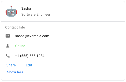
Google Chat-এ নমুনা কার্ড বার্তা তৈরি করতে, নিম্নলিখিত JSON ব্যবহার করুন:
{
  "cardsV2": [
    {
      "cardId": "unique-card-id",
      "card": {
        "header": {
           "title": "Sasha",
           "subtitle": "Software Engineer",
           "imageUrl":
           "https://developers.google.com/workspace/chat/images/quickstart-app-avatar.png",
           "imageType": "CIRCLE",
           "imageAltText": "Avatar for Sasha"
         },
         "sections": [
           {
             "header": "Contact Info",
             "collapsible": true,
             "uncollapsibleWidgetsCount": 1,
             "widgets": [
               {
                 "decoratedText": {
                   "startIcon": {
                     "knownIcon": "EMAIL"
                   },
                   "text": "sasha@example.com"
                 }
               },
               {
                 "decoratedText": {
                   "startIcon": {
                     "knownIcon": "PERSON"
                   },
                   "text": "<font color=\"#80e27e\">Online</font>"
                 }
               },
               {
                 "decoratedText": {
                   "startIcon": {
                     "knownIcon": "PHONE"
                   },
                   "text": "+1 (555) 555-1234"
                 }
               },
               {
                 "buttonList": {
                   "buttons": [
                     {
                       "text": "Share",
                       "onClick": {
                        "openLink": {
                           "url": "https://example.com/share"
                         }
                       }
                     },
                     {
                       "text": "Edit",
                       "onClick": {
                         "action": {
                           "function": "goToView",
                           "parameters": [
                             {
                               "key": "viewType",
                               "value": "EDIT"
                             }
                           ]
                         }
                       }
                     }
                   ]
                 }
               }
             ]
           }
         ]
       }
    }
  ]
}
| ক্ষেত্র | |
|---|---|
header | কার্ডের হেডার। একটি হেডারে সাধারণত একটি অগ্রণী চিত্র এবং একটি শিরোনাম থাকে। হেডার সবসময় একটি কার্ডের শীর্ষে প্রদর্শিত হয়। |
sections[] | উইজেটগুলির একটি সংগ্রহ রয়েছে। প্রতিটি বিভাগের নিজস্ব, ঐচ্ছিক শিরোনাম আছে। বিভাগগুলি দৃশ্যত একটি লাইন বিভাজক দ্বারা পৃথক করা হয়। Google Chat অ্যাপের উদাহরণের জন্য, কার্ডের একটি বিভাগ সংজ্ঞায়িত করুন দেখুন। |
sectionDividerStyle | বিভাগের মধ্যে বিভাজক শৈলী. |
cardActions[] | কার্ডের ক্রিয়াকলাপ। কার্ডের টুলবার মেনুতে অ্যাকশন যোগ করা হয়।
উদাহরণস্বরূপ, নিম্নলিখিত JSON |
name | কার্ডের নাম। কার্ড নেভিগেশন একটি কার্ড শনাক্তকারী হিসাবে ব্যবহৃত.
|
fixedFooter | এই কার্ডের নীচে দেখানো ফিক্সড ফুটার।
|
displayStyle | Google Workspace অ্যাড-অন-এ,
|
peekCardHeader | প্রাসঙ্গিক বিষয়বস্তু প্রদর্শন করার সময়, পিক কার্ড শিরোনাম একটি স্থানধারক হিসাবে কাজ করে যাতে ব্যবহারকারী হোমপেজ কার্ড এবং প্রাসঙ্গিক কার্ডগুলির মধ্যে এগিয়ে যেতে পারে৷
|
কার্ডঅ্যাকশন
একটি কার্ড অ্যাকশন হল কার্ডের সাথে যুক্ত ক্রিয়া। উদাহরণস্বরূপ, একটি চালান কার্ডে চালান মুছে ফেলা, ইমেল চালান বা ব্রাউজারে চালান খোলার মতো কাজ অন্তর্ভুক্ত থাকতে পারে।
Google Workspace অ্যাড-অনগুলির জন্য উপলব্ধ এবং Google Chat অ্যাপগুলির জন্য অনুপলব্ধ৷
| ক্ষেত্র | |
|---|---|
actionLabel | যে লেবেলটি অ্যাকশন মেনু আইটেম হিসাবে প্রদর্শিত হয়। |
onClick | এই অ্যাকশন আইটেমের জন্য |
কার্ডফিক্সডফুটার
একটি স্থায়ী (স্টিকি) ফুটার যা কার্ডের নীচে প্রদর্শিত হয়।
primaryButton বা secondaryButton উল্লেখ না করে fixedFooter সেট করা একটি ত্রুটি ঘটায়।
চ্যাট অ্যাপের জন্য, আপনি ডায়ালগে ফিক্সড ফুটার ব্যবহার করতে পারেন, কিন্তু কার্ড মেসেজ নয়। Google Chat অ্যাপের উদাহরণের জন্য, একটি স্থায়ী ফুটার যোগ করুন দেখুন।
Google Chat অ্যাপ এবং Google Workspace অ্যাড-অনগুলির জন্য উপলব্ধ।
কার্ডহেডার
একটি কার্ড হেডার প্রতিনিধিত্ব করে। Google চ্যাট অ্যাপের উদাহরণের জন্য, একটি শিরোনাম যোগ করুন দেখুন।
Google Chat অ্যাপ এবং Google Workspace অ্যাড-অনগুলির জন্য উপলব্ধ।
| ক্ষেত্র | |
|---|---|
title | প্রয়োজন। কার্ড হেডারের শিরোনাম। শিরোনামটির একটি নির্দিষ্ট উচ্চতা রয়েছে: যদি একটি শিরোনাম এবং উপশিরোনাম উভয়ই নির্দিষ্ট করা হয়, প্রতিটি একটি লাইন নেয়। শুধুমাত্র শিরোনাম নির্দিষ্ট করা হলে, এটি উভয় লাইন আপ করে। |
subtitle | কার্ড হেডারের সাবটাইটেল। নির্দিষ্ট করা হলে, |
imageType | ছবি ক্রপ করতে ব্যবহৃত আকৃতি।
|
imageUrl | কার্ড হেডারে ছবির HTTPS URL। |
imageAltText | এই চিত্রের বিকল্প পাঠ্য যা অ্যাক্সেসযোগ্যতার জন্য ব্যবহৃত হয়। |
ডিসপ্লে স্টাইল
Google Workspace অ্যাড-অন-এ, কার্ড কীভাবে দেখানো হবে তা নির্ধারণ করে।
Google Workspace অ্যাড-অনগুলির জন্য উপলব্ধ এবং Google Chat অ্যাপগুলির জন্য অনুপলব্ধ৷
| Enums | |
|---|---|
DISPLAY_STYLE_UNSPECIFIED | ব্যবহার করবেন না। অনির্দিষ্ট। |
PEEK | কার্ডের শিরোনামটি সাইডবারের নীচে প্রদর্শিত হয়, আংশিকভাবে স্ট্যাকের বর্তমান শীর্ষ কার্ডটিকে ঢেকে রাখে। হেডারে ক্লিক করলে কার্ডটি কার্ড স্ট্যাকের মধ্যে পপ হয়। যদি কার্ডের কোনো হেডার না থাকে, তাহলে একটি জেনারেটেড হেডার ব্যবহার করা হয়। |
REPLACE | ডিফল্ট মান। কার্ড স্ট্যাকের উপরের কার্ডের ভিউ প্রতিস্থাপন করে কার্ড দেখানো হয়। |
ডিভাইডার স্টাইল
একটি কার্ডের বিভাজক শৈলী। বর্তমানে শুধুমাত্র কার্ড বিভাগগুলির মধ্যে বিভাজকের জন্য ব্যবহৃত হয়।
Google Chat অ্যাপ এবং Google Workspace অ্যাড-অনগুলির জন্য উপলব্ধ।
| Enums | |
|---|---|
DIVIDER_STYLE_UNSPECIFIED | ব্যবহার করবেন না। অনির্দিষ্ট। |
SOLID_DIVIDER | ডিফল্ট বিকল্প। বিভাগগুলির মধ্যে একটি কঠিন বিভাজক রেন্ডার করুন। |
NO_DIVIDER | সেট করা হলে, বিভাগগুলির মধ্যে কোনও বিভাজক রেন্ডার করা হয় না। |
অধ্যায়
একটি বিভাগে উইজেটগুলির একটি সংগ্রহ রয়েছে যা উল্লম্বভাবে উল্লম্বভাবে রেন্ডার করা হয় যেগুলি নির্দিষ্ট করা হয়েছে৷
Google Chat অ্যাপ এবং Google Workspace অ্যাড-অনগুলির জন্য উপলব্ধ।
| ক্ষেত্র | |
|---|---|
header | একটি বিভাগের শীর্ষে প্রদর্শিত পাঠ্য। সহজ এইচটিএমএল ফরম্যাটেড টেক্সট সমর্থন করে। টেক্সট ফর্ম্যাট করার বিষয়ে আরও তথ্যের জন্য, Google Chat অ্যাপে টেক্সট ফর্ম্যাটিং এবং Google Workspace অ্যাড-অনগুলিতে টেক্সট ফর্ম্যাটিং দেখুন। |
widgets[] | বিভাগে সব উইজেট. কমপক্ষে একটি উইজেট থাকতে হবে। |
collapsible | এই বিভাগটি সংকোচনযোগ্য কিনা তা নির্দেশ করে৷ সংকোচনযোগ্য বিভাগগুলি কিছু বা সমস্ত উইজেট লুকিয়ে রাখে, তবে ব্যবহারকারীরা আরও দেখান ক্লিক করে লুকানো উইজেটগুলি প্রকাশ করতে বিভাগটি প্রসারিত করতে পারে। ব্যবহারকারীরা কম দেখান ক্লিক করে আবার উইজেটগুলি লুকিয়ে রাখতে পারেন৷ কোন উইজেটগুলি লুকানো আছে তা নির্ধারণ করতে, |
uncollapsibleWidgetsCount | অসংলগ্ন উইজেটের সংখ্যা যা একটি বিভাগ ভেঙে গেলেও দৃশ্যমান থাকে। উদাহরণস্বরূপ, যখন একটি বিভাগে পাঁচটি উইজেট থাকে এবং |
কলাম
Columns উইজেট একটি কার্ড বা ডায়ালগে 2টি পর্যন্ত কলাম প্রদর্শন করে। আপনি প্রতিটি কলামে উইজেট যোগ করতে পারেন; উইজেটগুলি নির্দিষ্ট ক্রমে প্রদর্শিত হয়। Google Chat অ্যাপের উদাহরণের জন্য, কলামে কার্ড এবং ডায়ালগ প্রদর্শন করুন।
প্রতিটি কলামের উচ্চতা লম্বা কলাম দ্বারা নির্ধারিত হয়। উদাহরণস্বরূপ, যদি প্রথম কলামটি দ্বিতীয় কলামের চেয়ে লম্বা হয়, তবে উভয় কলামের উচ্চতা প্রথম কলামের। যেহেতু প্রতিটি কলামে বিভিন্ন সংখ্যক উইজেট থাকতে পারে, আপনি সারি নির্ধারণ করতে পারবেন না বা কলামগুলির মধ্যে উইজেটগুলি সারিবদ্ধ করতে পারবেন না।
কলাম পাশাপাশি প্রদর্শিত হয়. আপনি HorizontalSizeStyle ক্ষেত্র ব্যবহার করে প্রতিটি কলামের প্রস্থ কাস্টমাইজ করতে পারেন। যদি ব্যবহারকারীর স্ক্রীনের প্রস্থ খুব সংকীর্ণ হয়, দ্বিতীয় কলামটি প্রথমটির নীচে মোড়ানো হয়:
- ওয়েবে, স্ক্রিনের প্রস্থ 480 পিক্সেলের কম বা সমান হলে দ্বিতীয় কলামটি মোড়ানো হয়।
- iOS ডিভাইসে, স্ক্রিনের প্রস্থ 300 pt এর কম বা সমান হলে দ্বিতীয় কলামটি মোড়ানো হয়।
- অ্যান্ড্রয়েড ডিভাইসে, স্ক্রিনের প্রস্থ 320 ডিপির কম বা সমান হলে দ্বিতীয় কলামটি মোড়ানো হয়।
2টির বেশি কলাম অন্তর্ভুক্ত করতে বা সারি ব্যবহার করতে, Grid
Google Chat অ্যাপ এবং Google Workspace অ্যাড-অনগুলির জন্য উপলব্ধ।
| ক্ষেত্র | |
|---|---|
columnItems[] | কলামের একটি অ্যারে। আপনি একটি কার্ড বা ডায়ালগে 2টি পর্যন্ত কলাম অন্তর্ভুক্ত করতে পারেন৷ |
কলাম
একটি কলাম।
Google Chat অ্যাপ এবং Google Workspace অ্যাড-অনগুলির জন্য উপলব্ধ।
| ক্ষেত্র | |
|---|---|
horizontalSizeStyle | একটি কলাম কিভাবে কার্ডের প্রস্থ পূরণ করে তা নির্দিষ্ট করে। |
horizontalAlignment | উইজেটগুলি একটি কলামের বাম, ডান বা কেন্দ্রে সারিবদ্ধ কিনা তা নির্দিষ্ট করে৷ |
verticalAlignment | উইজেটগুলি একটি কলামের উপরে, নীচে বা কেন্দ্রে সারিবদ্ধ কিনা তা নির্দিষ্ট করে৷ |
widgets[] | একটি কলামে অন্তর্ভুক্ত উইজেটগুলির একটি অ্যারে৷ উইজেটগুলি নির্দিষ্ট ক্রমে প্রদর্শিত হয়। |
অনুভূমিক আকার শৈলী
একটি কলাম কিভাবে কার্ডের প্রস্থ পূরণ করে তা নির্দিষ্ট করে। প্রতিটি কলামের প্রস্থ HorizontalSizeStyle এবং কলামের মধ্যে উইজেটগুলির প্রস্থ উভয়ের উপর নির্ভর করে।
Google Chat অ্যাপ এবং Google Workspace অ্যাড-অনগুলির জন্য উপলব্ধ।
| Enums | |
|---|---|
HORIZONTAL_SIZE_STYLE_UNSPECIFIED | ব্যবহার করবেন না। অনির্দিষ্ট। |
FILL_AVAILABLE_SPACE | ডিফল্ট মান। কার্ডের প্রস্থের 70% পর্যন্ত কলাম উপলব্ধ স্থান পূরণ করে। উভয় কলাম FILL_AVAILABLE_SPACE এ সেট করা থাকলে, প্রতিটি কলাম 50% স্থান পূরণ করে। |
FILL_MINIMUM_SPACE | কলাম সম্ভাব্য সর্বনিম্ন পরিমাণ স্থান পূরণ করে এবং কার্ডের প্রস্থের 30% এর বেশি নয়। |
উল্লম্ব প্রান্তিককরণ
উইজেটগুলি একটি কলামের উপরে, নীচে বা কেন্দ্রে সারিবদ্ধ কিনা তা নির্দিষ্ট করে৷
Google Chat অ্যাপ এবং Google Workspace অ্যাড-অনগুলির জন্য উপলব্ধ।
| Enums | |
|---|---|
VERTICAL_ALIGNMENT_UNSPECIFIED | ব্যবহার করবেন না। অনির্দিষ্ট। |
CENTER | ডিফল্ট মান। একটি কলামের কেন্দ্রে উইজেটগুলি সারিবদ্ধ করে। |
TOP | একটি কলামের শীর্ষে উইজেটগুলি সারিবদ্ধ করে। |
BOTTOM | একটি কলামের নীচে উইজেটগুলি সারিবদ্ধ করে৷ |
উইজেট
সমর্থিত উইজেট যা আপনি একটি কলামে অন্তর্ভুক্ত করতে পারেন।
Google Chat অ্যাপ এবং Google Workspace অ্যাড-অনগুলির জন্য উপলব্ধ।
| ক্ষেত্র | |
|---|---|
ইউনিয়ন ক্ষেত্রের | |
textParagraph | |
image | |
decoratedText | |
buttonList | |
textInput | |
selectionInput | |
dateTimePicker | |
ডেটটাইম পিকার
ব্যবহারকারীদের একটি তারিখ, একটি সময়, বা একটি তারিখ এবং একটি সময় উভয় ইনপুট করতে দেয়৷ Google Chat অ্যাপের উদাহরণের জন্য, ব্যবহারকারীকে একটি তারিখ এবং সময় বাছাই করতে দিন দেখুন।
ব্যবহারকারীরা পাঠ্য ইনপুট করতে পারেন বা তারিখ এবং সময় নির্বাচন করতে পিকার ব্যবহার করতে পারেন। যদি ব্যবহারকারীরা একটি অবৈধ তারিখ বা সময় ইনপুট করে, বাছাইকারী একটি ত্রুটি দেখায় যা ব্যবহারকারীদের সঠিকভাবে তথ্য ইনপুট করতে অনুরোধ করে।
Google Chat অ্যাপ এবং Google Workspace অ্যাড-অনগুলির জন্য উপলব্ধ।
| ক্ষেত্র | |
|---|---|
name | একটি ফর্ম ইনপুট ইভেন্টে ফর্ম ইনপুটগুলির সাথে কাজ করার বিষয়ে বিস্তারিত জানার জন্য, ফর্ম ডেটা গ্রহণ করুন দেখুন। |
label | পাঠ্য যা ব্যবহারকারীদের একটি তারিখ, একটি সময়, বা একটি তারিখ এবং সময় ইনপুট করতে অনুরোধ করে৷ উদাহরণস্বরূপ, যদি ব্যবহারকারীরা একটি অ্যাপয়েন্টমেন্টের সময় নির্ধারণ করে থাকেন, |
type | উইজেট একটি তারিখ, একটি সময়, বা তারিখ এবং সময় ইনপুট করা সমর্থন করে কিনা। |
valueMsEpoch | ইউনিক্স যুগের সময় থেকে মিলিসেকেন্ডে উইজেটে প্রদর্শিত ডিফল্ট মান। পিকারের প্রকারের উপর ভিত্তি করে মানটি নির্দিষ্ট করুন (
|
timezoneOffsetDate | UTC থেকে টাইম জোন অফসেট, মিনিটে প্রতিনিধিত্বকারী সংখ্যা। যদি সেট করা হয়, |
onChangeAction | ব্যবহারকারী যখন |
DateTimePickerType
DateTimePicker উইজেটে তারিখ এবং সময়ের বিন্যাস। ব্যবহারকারীরা একটি তারিখ, একটি সময়, বা একটি তারিখ এবং সময় উভয়ই ইনপুট করতে পারে কিনা তা নির্ধারণ করে৷
Google Chat অ্যাপ এবং Google Workspace অ্যাড-অনগুলির জন্য উপলব্ধ।
| Enums | |
|---|---|
DATE_AND_TIME | ব্যবহারকারীরা একটি তারিখ এবং সময় ইনপুট করে। |
DATE_ONLY | ব্যবহারকারীরা একটি তারিখ ইনপুট করে। |
TIME_ONLY | ব্যবহারকারীরা একটি সময় ইনপুট. |
সজ্জিত পাঠ্য
একটি উইজেট যা ঐচ্ছিক সজ্জা সহ পাঠ্য প্রদর্শন করে যেমন পাঠ্যের উপরে বা নীচে একটি লেবেল, পাঠ্যের সামনে একটি আইকন, একটি নির্বাচন উইজেট বা পাঠ্যের পরে একটি বোতাম। Google চ্যাট অ্যাপের উদাহরণের জন্য, শোভাকর পাঠ্য সহ প্রদর্শন পাঠ্য দেখুন।
Google Chat অ্যাপ এবং Google Workspace অ্যাড-অনগুলির জন্য উপলব্ধ।
| ক্ষেত্র | |
|---|---|
icon | |
startIcon | পাঠ্যের সামনে প্রদর্শিত আইকন। |
topLabel | টেক্সট উপরে প্রদর্শিত |
text | প্রয়োজন। প্রাথমিক পাঠ্য। সহজ বিন্যাস সমর্থন করে। টেক্সট ফর্ম্যাট করার বিষয়ে আরও তথ্যের জন্য, Google Chat অ্যাপে টেক্সট ফর্ম্যাটিং এবং Google Workspace অ্যাড-অনগুলিতে টেক্সট ফর্ম্যাটিং দেখুন। |
wrapText | মোড়ানো পাঠ্য সেটিং। শুধুমাত্র |
bottomLabel | যে টেক্সট |
onClick | ব্যবহারকারীরা |
ইউনিয়ন ক্ষেত্র control । একটি বোতাম, সুইচ, চেকবক্স বা চিত্র যা decoratedText উইজেটে পাঠ্যের ডানদিকে প্রদর্শিত হয়। control নিম্নলিখিতগুলির মধ্যে একটি হতে পারে: | |
button | একটি বোতাম যা একজন ব্যবহারকারী একটি অ্যাকশন ট্রিগার করতে ক্লিক করতে পারেন। |
switchControl | একটি সুইচ উইজেট যা একজন ব্যবহারকারী তার অবস্থা পরিবর্তন করতে এবং একটি ক্রিয়া ট্রিগার করতে ক্লিক করতে পারে৷ |
endIcon | পাঠ্যের পরে প্রদর্শিত একটি আইকন। অন্তর্নির্মিত এবং কাস্টম আইকন সমর্থন করে। |
সুইচ নিয়ন্ত্রণ
হয় একটি টগল-স্টাইল সুইচ বা একটি decoratedText উইজেটের ভিতরে একটি চেকবক্স৷
Google Chat অ্যাপ এবং Google Workspace অ্যাড-অনগুলির জন্য উপলব্ধ।
শুধুমাত্র decoratedText উইজেটে সমর্থিত।
| ক্ষেত্র | |
|---|---|
name | একটি ফর্ম ইনপুট ইভেন্টে সুইচ উইজেটটি চিহ্নিত করা হয় এমন নাম। ফর্ম ইনপুটগুলির সাথে কাজ করার বিষয়ে বিস্তারিত জানার জন্য, ফর্ম ডেটা গ্রহণ করুন দেখুন। |
value | একটি ব্যবহারকারীর দ্বারা প্রবেশ করা মান, একটি ফর্ম ইনপুট ইভেন্টের অংশ হিসাবে ফিরে আসে৷ ফর্ম ইনপুটগুলির সাথে কাজ করার বিষয়ে বিস্তারিত জানার জন্য, ফর্ম ডেটা গ্রহণ করুন দেখুন। |
selected | |
onChangeAction | যখন স্যুইচ অবস্থা পরিবর্তন করা হয়, যেমন কোন ফাংশন চালানো হবে। |
controlType | ইউজার ইন্টারফেসে কীভাবে সুইচ দেখা যায়।
|
কন্ট্রোল টাইপ
ইউজার ইন্টারফেসে কীভাবে সুইচ দেখা যায়।
Google Chat অ্যাপ এবং Google Workspace অ্যাড-অনগুলির জন্য উপলব্ধ।
| Enums | |
|---|---|
SWITCH | একটি টগল-স্টাইল সুইচ। |
CHECKBOX | CHECK_BOX এর পক্ষে অবজ্ঞা করা হয়েছে৷ |
CHECK_BOX | একটি চেকবক্স। |
বিভাজক
এই ধরনের কোন ক্ষেত্র আছে.
একটি অনুভূমিক রেখা হিসাবে উইজেটগুলির মধ্যে একটি বিভাজক প্রদর্শন করে৷ Google চ্যাট অ্যাপের উদাহরণের জন্য, উইজেটের মধ্যে একটি অনুভূমিক বিভাজক যোগ করুন দেখুন।
Google Chat অ্যাপ এবং Google Workspace অ্যাড-অনগুলির জন্য উপলব্ধ।
উদাহরণস্বরূপ, নিম্নলিখিত JSON একটি বিভাজক তৈরি করে:
"divider": {}
এন্ড নেভিগেশন
ডায়ালগ ফ্লো অ্যাকশন।
Google Chat অ্যাপের জন্য উপলভ্য এবং Google Workspace অ্যাড-অনগুলির জন্য অনুপলব্ধ।
| ক্ষেত্র | |
|---|---|
action | একটি ডায়ালগ প্রবাহ শেষ করার জন্য ক্লায়েন্টের জন্য রেন্ডার অ্যাকশন।
|
কর্ম
একটি ডায়ালগ প্রবাহ শেষ করতে ক্লায়েন্টের জন্য রেন্ডার অ্যাকশনের ধরন।
Google Chat অ্যাপের জন্য উপলভ্য এবং Google Workspace অ্যাড-অনগুলির জন্য অনুপলব্ধ।
GetAutocompletionResponse
স্বয়ংসম্পূর্ণ ধারক পাওয়ার একটি প্রতিক্রিয়া, যাতে পাঠ্য ক্ষেত্রের জন্য স্বয়ংক্রিয়ভাবে সম্পূর্ণ আইটেমগুলি দেখানোর জন্য প্রয়োজনীয় উপাদান অন্তর্ভুক্ত থাকে।
Google Workspace অ্যাড-অনগুলির জন্য উপলব্ধ এবং Google Chat অ্যাপগুলির জন্য অনুপলব্ধ৷ উদাহরণ স্বরূপ:
{
  "autoComplete": {
    "items": [
      {
        "text": "C++"
      },
      {
        "text": "Java"
      },
      {
        "text": "JavaScript"
      },
      {
        "text": "Python"
      }
    ]
  }
}
| ক্ষেত্র | |
|---|---|
autoComplete | |
schema | এটি একটি নো-অপ স্কিমা ক্ষেত্র যা সিনট্যাক্স পরীক্ষা করার জন্য মার্কআপে উপস্থিত থাকতে পারে। |
গ্রিড
আইটেম সংগ্রহের সাথে একটি গ্রিড প্রদর্শন করে। আইটেম শুধুমাত্র পাঠ্য বা ছবি অন্তর্ভুক্ত করতে পারে. প্রতিক্রিয়াশীল কলামের জন্য, বা পাঠ্য বা চিত্রের চেয়ে বেশি অন্তর্ভুক্ত করতে, Columns
একটি গ্রিড যেকোনো সংখ্যক কলাম এবং আইটেম সমর্থন করে। সারির সংখ্যা কলাম দ্বারা বিভক্ত আইটেম দ্বারা নির্ধারিত হয়। 10টি আইটেম এবং 2টি কলাম সহ একটি গ্রিডে 5টি সারি রয়েছে৷ 11টি আইটেম এবং 2টি কলাম সহ একটি গ্রিডে 6টি সারি রয়েছে।
Google Chat অ্যাপ এবং Google Workspace অ্যাড-অনগুলির জন্য উপলব্ধ।
উদাহরণস্বরূপ, নিম্নলিখিত JSON একটি একক আইটেম সহ একটি 2 কলাম গ্রিড তৈরি করে:
"grid": {
  "title": "A fine collection of items",
  "columnCount": 2,
  "borderStyle": {
    "type": "STROKE",
    "cornerRadius": 4
  },
  "items": [
    {
      "image": {
        "imageUri": "https://www.example.com/image.png",
        "cropStyle": {
          "type": "SQUARE"
        },
        "borderStyle": {
          "type": "STROKE"
        }
      },
      "title": "An item",
      "textAlignment": "CENTER"
    }
  ],
  "onClick": {
    "openLink": {
      "url": "https://www.example.com"
    }
  }
}
| ক্ষেত্র | |
|---|---|
title | গ্রিড হেডারে প্রদর্শিত পাঠ্য। |
items[] | গ্রিডে প্রদর্শিত আইটেম. |
borderStyle | প্রতিটি গ্রিড আইটেমে প্রয়োগ করার জন্য সীমানা শৈলী। |
columnCount | গ্রিডে প্রদর্শিত কলামের সংখ্যা। একটি ডিফল্ট মান ব্যবহার করা হয় যদি এই ক্ষেত্রটি নির্দিষ্ট করা না থাকে এবং সেই ডিফল্ট মানটি যেখানে গ্রিডটি দেখানো হয় তার উপর নির্ভর করে (সংলাপ বনাম সহচর)। |
onClick | এই কলব্যাকটি প্রতিটি পৃথক গ্রিড আইটেম দ্বারা পুনঃব্যবহার করা হয়, কিন্তু আইটেমের শনাক্তকারী এবং সূচী সহ আইটেম তালিকায় কলব্যাকের প্যারামিটারে যোগ করা হয়। |
গ্রিড আইটেম
একটি গ্রিড বিন্যাসে একটি আইটেম প্রতিনিধিত্ব করে। আইটেমগুলিতে পাঠ্য, একটি চিত্র বা পাঠ্য এবং একটি চিত্র উভয়ই থাকতে পারে।
Google Chat অ্যাপ এবং Google Workspace অ্যাড-অনগুলির জন্য উপলব্ধ।
| ক্ষেত্র | |
|---|---|
id | এই গ্রিড আইটেমের জন্য একটি ব্যবহারকারী-নির্দিষ্ট শনাক্তকারী। এই শনাক্তকারীটি মূল গ্রিডের |
image | যে চিত্রটি গ্রিড আইটেমে প্রদর্শিত হয়। |
title | গ্রিড আইটেমের শিরোনাম। |
subtitle | গ্রিড আইটেমের সাবটাইটেল। |
layout | গ্রিড আইটেমের জন্য ব্যবহার করার জন্য লেআউট। |
GridItemLayout
একটি গ্রিড আইটেমের জন্য উপলব্ধ বিভিন্ন লেআউট বিকল্পের প্রতিনিধিত্ব করে।
Google Chat অ্যাপ এবং Google Workspace অ্যাড-অনগুলির জন্য উপলব্ধ।
| Enums | |
|---|---|
GRID_ITEM_LAYOUT_UNSPECIFIED | ব্যবহার করবেন না। অনির্দিষ্ট। |
TEXT_BELOW | শিরোনাম এবং সাবটাইটেল গ্রিড আইটেমের ছবির নীচে দেখানো হয়েছে। |
TEXT_ABOVE | শিরোনাম এবং সাবটাইটেল গ্রিড আইটেমের ছবির উপরে দেখানো হয়েছে। |
আইকন
একটি কার্ডে একটি উইজেটে প্রদর্শিত একটি আইকন৷ Google Chat অ্যাপের উদাহরণের জন্য, একটি আইকন যোগ করুন দেখুন।
অন্তর্নির্মিত এবং কাস্টম আইকন সমর্থন করে।
Google Chat অ্যাপ এবং Google Workspace অ্যাড-অনগুলির জন্য উপলব্ধ।
| ক্ষেত্র | |
|---|---|
altText | ঐচ্ছিক। অ্যাক্সেসযোগ্যতার জন্য ব্যবহৃত আইকনের একটি বিবরণ। অনির্দিষ্ট হলে, ডিফল্ট মান আইকনটি একটি |
imageType | ছবিতে প্রয়োগ করা ক্রপ শৈলী। কিছু ক্ষেত্রে, একটি |
ইউনিয়ন ফিল্ড icons । কার্ডের উইজেটে প্রদর্শিত আইকন। icons নিম্নলিখিতগুলির মধ্যে একটি হতে পারে: | |
knownIcon | Google Workspace-এর দেওয়া বিল্ট-ইন আইকনগুলির মধ্যে একটি প্রদর্শন করুন। উদাহরণস্বরূপ, একটি বিমান আইকন প্রদর্শন করতে, সমর্থিত আইকনগুলির একটি সম্পূর্ণ তালিকার জন্য, অন্তর্নির্মিত আইকনগুলি দেখুন। |
iconUrl | একটি HTTPS URL এ হোস্ট করা একটি কাস্টম আইকন প্রদর্শন করুন৷ উদাহরণ স্বরূপ: সমর্থিত ফাইল প্রকারের মধ্যে রয়েছে |
materialIcon | গুগল ম্যাটেরিয়াল আইকনগুলির একটি প্রদর্শন করুন। উদাহরণস্বরূপ, একটি চেকবক্স আইকন প্রদর্শন করতে, ব্যবহার করুন |
ছবি
একটি URL দ্বারা নির্দিষ্ট করা একটি চিত্র এবং একটি onClick অ্যাকশন থাকতে পারে৷ একটি উদাহরণের জন্য, একটি ছবি যোগ করুন দেখুন।
Google Chat অ্যাপ এবং Google Workspace অ্যাড-অনগুলির জন্য উপলব্ধ।
| ক্ষেত্র | |
|---|---|
imageUrl | HTTPS URL যেটি ছবিটি হোস্ট করে। উদাহরণ স্বরূপ: |
onClick | যখন একজন ব্যবহারকারী ছবিটিতে ক্লিক করেন, তখন ক্লিকটি এই ক্রিয়াকে ট্রিগার করে। |
altText | এই চিত্রের বিকল্প পাঠ্য যা অ্যাক্সেসযোগ্যতার জন্য ব্যবহৃত হয়। |
ইমেজ কম্পোনেন্ট
একটি ইমেজ প্রতিনিধিত্ব করে.
Google Chat অ্যাপ এবং Google Workspace অ্যাড-অনগুলির জন্য উপলব্ধ।
| ক্ষেত্র | |
|---|---|
imageUri | ছবির URL। |
altText | ছবির জন্য অ্যাক্সেসিবিলিটি লেবেল। |
cropStyle | ছবিতে প্রয়োগ করার জন্য ক্রপ শৈলী। |
borderStyle | ছবিতে প্রয়োগ করার জন্য বর্ডার স্টাইল। |
ইমেজ ক্রপস্টাইল
একটি ছবিতে প্রয়োগ করা ক্রপ শৈলী প্রতিনিধিত্ব করে।
Google Chat অ্যাপ এবং Google Workspace অ্যাড-অনগুলির জন্য উপলব্ধ।
উদাহরণস্বরূপ, এখানে একটি 16:9 আকৃতির অনুপাত কীভাবে প্রয়োগ করবেন:
cropStyle {
 "type": "RECTANGLE_CUSTOM",
 "aspectRatio": 16/9
}
| ক্ষেত্র | |
|---|---|
type | ফসলের ধরন। |
aspectRatio | ক্রপ টাইপ উদাহরণস্বরূপ, এখানে একটি 16:9 আকৃতির অনুপাত কীভাবে প্রয়োগ করবেন: |
ImageCropType
একটি ছবিতে প্রয়োগ করা ক্রপ শৈলী প্রতিনিধিত্ব করে।
Google Chat অ্যাপ এবং Google Workspace অ্যাড-অনগুলির জন্য উপলব্ধ।
| Enums | |
|---|---|
IMAGE_CROP_TYPE_UNSPECIFIED | ব্যবহার করবেন না। অনির্দিষ্ট। |
SQUARE | ডিফল্ট মান। একটি বর্গাকার ফসল প্রয়োগ করে। |
CIRCLE | একটি বৃত্তাকার ফসল প্রয়োগ করে। |
RECTANGLE_CUSTOM | একটি কাস্টম আকৃতির অনুপাত সহ একটি আয়তক্ষেত্রাকার ফসল প্রয়োগ করে৷ aspectRatio এর সাথে কাস্টম আকৃতির অনুপাত সেট করুন। |
RECTANGLE_4_3 | একটি 4:3 আকৃতির অনুপাত সহ একটি আয়তক্ষেত্রাকার ফসল প্রয়োগ করে৷ |
লিঙ্ক
তৃতীয় পক্ষের সম্পদের জন্য লিঙ্ক বস্তু যা অ্যাড-অনে ফিরে এসেছে। আরও তথ্যের জন্য, @ মেনু থেকে তৃতীয় পক্ষের সংস্থান তৈরি করুন দেখুন।
Google Workspace অ্যাড-অনগুলির জন্য উপলব্ধ এবং Google Chat অ্যাপগুলির জন্য অনুপলব্ধ৷
| ক্ষেত্র | |
|---|---|
url | অ্যাড-অনে ফিরে যাওয়ার জন্য লিঙ্কের URL। |
title | লিঙ্কের শিরোনাম অ্যাড-অনে ফিরে যেতে। |
লিঙ্কপ্রিভিউ
কার্ড অ্যাকশন যা একটি কার্ড এবং স্মার্ট চিপ প্রদর্শন করে একটি তৃতীয় পক্ষের লিঙ্কের পূর্বরূপ দেখায়। আরও জানতে, স্মার্ট চিপগুলির সাথে প্রিভিউ লিঙ্কগুলি দেখুন৷
Google Workspace অ্যাড-অনগুলির জন্য উপলব্ধ এবং Google Chat অ্যাপগুলির জন্য অনুপলব্ধ৷
উদাহরণস্বরূপ, নিম্নলিখিত JSON লিঙ্কের পূর্বরূপ এবং এর স্মার্ট চিপের জন্য একটি অনন্য শিরোনাম এবং একটি শিরোনাম এবং পাঠ্য বিবরণ সহ একটি পূর্বরূপ কার্ড প্রদান করে:
{
  "action": {
    "linkPreview": {
      "title": "Smart chip title",
      "linkPreviewTitle": "Link preview title",
      "previewCard": {
        "header": {
          "title": "Preview card header",
        },
        "sections": [
          {
            "widgets": [
              {
                "textParagraph": {
                  "text": "Description of the link."
                }
              }
            ]
          }
        ]
      }
    }
  }
}
উদাহরণ নিম্নলিখিত লিঙ্ক পূর্বরূপ প্রদান করে:
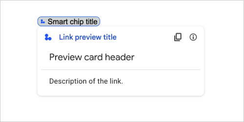
| ক্ষেত্র | |
|---|---|
previewCard | একটি কার্ড যা তৃতীয় পক্ষের পরিষেবা থেকে একটি লিঙ্ক সম্পর্কে তথ্য প্রদর্শন করে৷ |
title | লিঙ্কের পূর্বরূপের জন্য স্মার্ট চিপে প্রদর্শিত শিরোনাম। সেট না থাকলে, স্মার্ট চিপ |
linkPreviewTitle | লিঙ্ক প্রিভিউতে প্রদর্শিত শিরোনাম। যদি সেট করা না থাকে, লিঙ্ক প্রিভিউ |
ম্যাটেরিয়াল আইকন
একটি Google ম্যাটেরিয়াল আইকন , যাতে 2500টির বেশি বিকল্প রয়েছে৷
উদাহরণস্বরূপ, কাস্টমাইজড ওজন এবং গ্রেড সহ একটি চেকবক্স আইকন প্রদর্শন করতে, নিম্নলিখিতটি লিখুন:
{
  "name": "check_box",
  "fill": true,
  "weight": 300,
  "grade": -25
}
Google Chat অ্যাপের জন্য উপলভ্য এবং Google Workspace অ্যাড-অনগুলির জন্য অনুপলব্ধ।
| ক্ষেত্র | |
|---|---|
name | Google ম্যাটেরিয়াল আইকনে সংজ্ঞায়িত আইকনের নাম, উদাহরণস্বরূপ, |
fill | আইকনটি ভরাট হিসাবে রেন্ডার করা হয় কিনা। ডিফল্ট মান মিথ্যা। বিভিন্ন আইকন সেটিংসের পূর্বরূপ দেখতে, Google ফন্ট আইকনগুলিতে যান এবং কাস্টমাইজের অধীনে সেটিংস সামঞ্জস্য করুন। |
weight | আইকনের স্ট্রোকের ওজন। {100, 200, 300, 400, 500, 600, 700} থেকে বেছে নিন। অনুপস্থিত থাকলে, ডিফল্ট মান 400 হয়। অন্য কোনো মান নির্দিষ্ট করা থাকলে, ডিফল্ট মান ব্যবহার করা হয়। বিভিন্ন আইকন সেটিংসের পূর্বরূপ দেখতে, Google ফন্ট আইকনগুলিতে যান এবং কাস্টমাইজের অধীনে সেটিংস সামঞ্জস্য করুন। |
grade | ওজন এবং গ্রেড একটি প্রতীকের বেধকে প্রভাবিত করে। গ্রেডের সামঞ্জস্যগুলি ওজনের সামঞ্জস্যের চেয়ে বেশি দানাদার এবং প্রতীকের আকারের উপর একটি ছোট প্রভাব ফেলে। {-25, 0, 200} থেকে বেছে নিন। অনুপস্থিত থাকলে, ডিফল্ট মান 0। অন্য কোনো মান নির্দিষ্ট করা থাকলে, ডিফল্ট মান ব্যবহার করা হয়। বিভিন্ন আইকন সেটিংসের পূর্বরূপ দেখতে, Google ফন্ট আইকনগুলিতে যান এবং কাস্টমাইজের অধীনে সেটিংস সামঞ্জস্য করুন। |
নেভিগেশন
কার্ড অ্যাকশন যা কার্ড স্ট্যাককে ম্যানিপুলেট করে।
উদাহরণ স্বরূপ:
1) স্ট্যাকে একটি নতুন কার্ড যোগ করুন (এগিয়ে নেভিগেট করুন)। চ্যাট অ্যাপের জন্য, শুধুমাত্র অ্যাপ হোমের জন্য উপলব্ধ।
Google Chat অ্যাপ এবং Google Workspace অ্যাড-অনগুলির জন্য উপলব্ধ।
 navigations : {
    pushCard : CARD
  }
2) স্ট্যাকের উপরে কার্ডটি আপডেট করুন (স্থানীয় আপডেটে)।
Google Workspace অ্যাড-অনগুলির জন্য উপলব্ধ এবং Google Chat অ্যাপগুলির জন্য অনুপলব্ধ৷
  navigations : {
    popCard : true,
  }, {
    pushCard : CARD
  }
3) আপডেট না করে এক ধাপ পিছনে যান।
Google Workspace অ্যাড-অনগুলির জন্য উপলব্ধ এবং Google Chat অ্যাপগুলির জন্য অনুপলব্ধ৷
  navigations : {
    popCard : true,
  }
4) একাধিক ধাপে ফিরে যান এবং সেই কার্ডটি আপডেট করুন।
Google Workspace অ্যাড-অনগুলির জন্য উপলব্ধ এবং Google Chat অ্যাপগুলির জন্য অনুপলব্ধ৷
  navigations : {
    popCard : true,
  }, ... {
    pushCard : CARD
  }
5) একটি সংজ্ঞায়িত CARD_NAME এ একাধিক ধাপে ফিরে যান।
Google Workspace অ্যাড-অনগুলির জন্য উপলব্ধ এবং Google Chat অ্যাপগুলির জন্য অনুপলব্ধ৷
  navigations : {
    popToCardName : CARD_NAME,
  }, {
    pushCard : CARD
  }
6) রুটে ফিরে যান এবং সেই কার্ডটি আপডেট করুন।
Google Workspace অ্যাড-অনগুলির জন্য উপলব্ধ এবং Google Chat অ্যাপগুলির জন্য অনুপলব্ধ৷
  navigations : {
    popToRoot : true
  }, {
    pushCard : CARD
  }
7) নির্দিষ্ট কার্ডে পপ করুন এবং সেই সাথে একটি পপ করুন।
Google Workspace অ্যাড-অনগুলির জন্য উপলব্ধ এবং Google Chat অ্যাপগুলির জন্য অনুপলব্ধ৷
navigations : { popToCardName : CARD_NAME }, { popCard : true, }
8) উপরের কার্ডটি একটি নতুন কার্ড দিয়ে প্রতিস্থাপন করুন। চ্যাট অ্যাপের জন্য, শুধুমাত্র অ্যাপ হোমের জন্য উপলব্ধ।
Google Chat অ্যাপ এবং Google Workspace অ্যাড-অনগুলির জন্য উপলব্ধ।
  navigations : {
    updateCard : CARD
  }
| ক্ষেত্র | |
|---|---|
ইউনিয়ন ফিল্ড | |
popToRoot | কার্ড স্ট্যাক রুট কার্ড ব্যতীত সমস্ত কার্ড বন্ধ করে দেয়। |
pop | কার্ড স্ট্যাক একটি কার্ড বন্ধ পপ. |
popToCard | কার্ড স্ট্যাক প্রদত্ত কার্ডের নামের সাথে নির্দিষ্ট কার্ডের উপরে সমস্ত কার্ড পপ করে। |
pushCard | কার্ড স্ট্যাক কার্ড স্ট্যাকের উপর একটি কার্ড ঠেলে দেয়। |
updateCard | কার্ড স্ট্যাক একটি নতুন কার্ডের সাথে শীর্ষ কার্ড আপডেট করে এবং পূরণ করা ফর্ম ফিল্ডের মান সংরক্ষণ করে। একটি অ-সমতুল্য ক্ষেত্রের জন্য, মান বাদ দেওয়া হয়। |
endNavigation | ডায়ালগ প্রবাহ শেষ নেভিগেশন ক্রিয়া। আরও তথ্যের জন্য, অ্যাপ হোম কার্ড বার্তাগুলির জন্য একটি ডায়ালগের প্রতিক্রিয়া দেখুন৷
|
বিজ্ঞপ্তি
কার্ড অ্যাকশন যা হোস্ট অ্যাপে একটি বিজ্ঞপ্তি প্রদর্শন করে।
Google Workspace অ্যাড-অনগুলির জন্য উপলব্ধ এবং Google Chat অ্যাপগুলির জন্য অনুপলব্ধ৷
| ক্ষেত্র | |
|---|---|
text | HTML ট্যাগ ছাড়াই বিজ্ঞপ্তির জন্য প্রদর্শনের জন্য প্লেইন টেক্সট। |
অনক্লিক
ব্যবহারকারীরা একটি কার্ডে একটি ইন্টারেক্টিভ উপাদান, যেমন একটি বোতামে ক্লিক করলে কীভাবে প্রতিক্রিয়া জানাবেন তা প্রতিনিধিত্ব করে৷
Google Chat অ্যাপ এবং Google Workspace অ্যাড-অনগুলির জন্য উপলব্ধ।
| ক্ষেত্র | |
|---|---|
ইউনিয়ন ক্ষেত্রের | |
action | নির্দিষ্ট করা থাকলে, এই |
openLink | নির্দিষ্ট করা থাকলে, এই |
openDynamicLinkAction | একটি অ্যাড-অন এই ক্রিয়াটি ট্রিগার করে যখন অ্যাকশনটির একটি লিঙ্ক খোলার প্রয়োজন হয়। এটি উপরের
|
card | নির্দিষ্ট করা থাকলে ক্লিক করার পর একটি নতুন কার্ড কার্ড স্ট্যাকে পুশ করা হয়।
|
খোলা সংযুক্তি
একটি onClick ইভেন্টের প্রতিনিধিত্ব করে যা একটি হাইপারলিঙ্ক খোলে।
Google Chat অ্যাপ এবং Google Workspace অ্যাড-অনগুলির জন্য উপলব্ধ।
| ক্ষেত্র | |
|---|---|
url | খুলতে URL. |
openAs | কিভাবে একটি লিঙ্ক খুলবেন।
|
onClose | ক্লায়েন্ট এটি খোলার পরে একটি লিঙ্ক সম্পর্কে ভুলে যায় কিনা, বা উইন্ডোটি বন্ধ না হওয়া পর্যন্ত এটি পর্যবেক্ষণ করে।
|
অনক্লোজ
একটি OnClick অ্যাকশন দ্বারা খোলা একটি লিঙ্ক বন্ধ হলে ক্লায়েন্ট কী করে।
বাস্তবায়ন ক্লায়েন্ট প্ল্যাটফর্ম ক্ষমতার উপর নির্ভর করে। উদাহরণস্বরূপ, একটি ওয়েব ব্রাউজার একটি OnClose হ্যান্ডলারের সাথে একটি পপ-আপ উইন্ডোতে একটি লিঙ্ক খুলতে পারে।
যদি OnOpen এবং OnClose উভয় হ্যান্ডলার সেট করা থাকে এবং ক্লায়েন্ট প্ল্যাটফর্ম উভয় মানকে সমর্থন করতে না পারে, OnClose অগ্রাধিকার নেয়।
Google Workspace অ্যাড-অনগুলির জন্য উপলব্ধ এবং Google Chat অ্যাপগুলির জন্য অনুপলব্ধ৷
| Enums | |
|---|---|
NOTHING | ডিফল্ট মান। কার্ডটি পুনরায় লোড হয় না; কিছুই ঘটেনি। |
RELOAD | চাইল্ড উইন্ডো বন্ধ হওয়ার পরে কার্ডটি পুনরায় লোড করে। |
খুলবেন কোন ভাবে
যখন কোনও OnClick অ্যাকশন একটি লিঙ্ক খোলে, তখন ক্লায়েন্ট হয় এটি একটি পূর্ণ আকারের উইন্ডো হিসাবে খুলতে পারে (যদি এটি ক্লায়েন্ট দ্বারা ব্যবহৃত ফ্রেম), বা একটি ওভারলে (যেমন পপ-আপ)। বাস্তবায়ন ক্লায়েন্ট প্ল্যাটফর্মের ক্ষমতার উপর নির্ভর করে এবং ক্লায়েন্ট যদি এটি সমর্থন না করে তবে নির্বাচিত মানটি উপেক্ষা করা যেতে পারে। FULL_SIZE সমস্ত ক্লায়েন্ট দ্বারা সমর্থিত।
গুগল ওয়ার্কস্পেস অ্যাড-অনগুলির জন্য উপলব্ধ এবং গুগল চ্যাট অ্যাপ্লিকেশনগুলির জন্য অনুপলব্ধ।
| Enums | |
|---|---|
FULL_SIZE | লিঙ্কটি একটি পূর্ণ আকারের উইন্ডো হিসাবে খোলে (যদি এটি ক্লায়েন্ট দ্বারা ব্যবহৃত ফ্রেম হয়)। |
OVERLAY | লিঙ্কটি একটি ওভারলে হিসাবে খোলে, যেমন একটি পপ-আপ। |
রেন্ডারঅ্যাকশনস
রেন্ডার নির্দেশাবলীর একটি সেট যা কোনও কার্ডকে কোনও ক্রিয়া সম্পাদন করতে বলে, বা অ্যাড-অন হোস্ট অ্যাপ্লিকেশন বা চ্যাট অ্যাপ্লিকেশনটিকে অ্যাপ্লিকেশন-নির্দিষ্ট ক্রিয়া সম্পাদন করতে বলে।
গুগল চ্যাট অ্যাপ্লিকেশন এবং গুগল ওয়ার্কস্পেস অ্যাড-অনের জন্য উপলব্ধ।
| ক্ষেত্র | |
|---|---|
action | |
hostAppAction | পৃথক হোস্ট অ্যাপ্লিকেশন দ্বারা পরিচালিত ক্রিয়া। |
schema | এটি একটি নো-অপ-স্কিমা ক্ষেত্র যা সিনট্যাক্স চেকিংয়ের জন্য মার্কআপে উপস্থিত থাকতে পারে। |
কর্ম
| ক্ষেত্র | |
|---|---|
navigations[] | পুশ, পপ, বা প্রদর্শিত কার্ড আপডেট করুন। |
link | তাত্ক্ষণিকভাবে একটি নতুন ট্যাব বা একটি পপ-আপে লক্ষ্য লিঙ্কটি খুলুন। |
notification | শেষ ব্যবহারকারীকে একটি বিজ্ঞপ্তি প্রদর্শন করুন। |
linkPreview | শেষ ব্যবহারকারীর কাছে একটি লিঙ্ক পূর্বরূপ প্রদর্শন করুন। |
links[] | গুগল ওয়ার্কস্পেস অ্যাপ্লিকেশনটির মধ্যে থেকে তৈরি তৃতীয় পক্ষের সংস্থার লিঙ্ক। একটি আইটেম সহ অবজেক্টের অ্যারে হিসাবে ফর্ম্যাট করা। আরও তথ্যের জন্য, @ মেনু থেকে তৃতীয় পক্ষের সংস্থানগুলি তৈরি করুন দেখুন। |
নির্বাচন ইনপুট
একটি উইজেট যা এক বা একাধিক ইউআই আইটেম তৈরি করে যা ব্যবহারকারীরা নির্বাচন করতে পারেন। উদাহরণস্বরূপ, একটি ড্রপডাউন মেনু বা চেকবক্স। আপনি এই উইজেটটি এমন ডেটা সংগ্রহ করতে ব্যবহার করতে পারেন যা পূর্বাভাস বা গণনা করা যায়। গুগল চ্যাট অ্যাপ্লিকেশনগুলিতে উদাহরণের জন্য, নির্বাচনযোগ্য ইউআই উপাদানগুলি যুক্ত করুন দেখুন।
চ্যাট অ্যাপ্লিকেশনগুলি ব্যবহারকারীরা নির্বাচন বা ইনপুট নির্বাচন করে এমন আইটেমগুলির মান প্রক্রিয়া করতে পারে। ফর্ম ইনপুটগুলির সাথে কাজ করার বিষয়ে বিশদগুলির জন্য, ফর্ম ডেটা গ্রহণ করুন।
ব্যবহারকারীদের কাছ থেকে অপরিজ্ঞাত বা বিমূর্ত ডেটা সংগ্রহ করতে, TextInput উইজেটটি ব্যবহার করুন।
গুগল চ্যাট অ্যাপ্লিকেশন এবং গুগল ওয়ার্কস্পেস অ্যাড-অনের জন্য উপলব্ধ।
| ক্ষেত্র | |
|---|---|
name | নাম যা ফর্ম ইনপুট ইভেন্টে নির্বাচন ইনপুট সনাক্ত করে। ফর্ম ইনপুটগুলির সাথে কাজ করার বিষয়ে বিশদগুলির জন্য, ফর্ম ডেটা গ্রহণ করুন। |
label | ব্যবহারকারী ইন্টারফেসে নির্বাচন ইনপুট ক্ষেত্রের উপরে প্রদর্শিত পাঠ্য। এমন পাঠ্য নির্দিষ্ট করুন যা ব্যবহারকারীকে আপনার অ্যাপ্লিকেশনটির প্রয়োজনীয় তথ্য প্রবেশ করতে সহায়তা করে। উদাহরণস্বরূপ, যদি ব্যবহারকারীরা ড্রপ-ডাউন মেনু থেকে কোনও কাজের টিকিটের জরুরিতা নির্বাচন করে থাকেন তবে লেবেলটি "জরুরিতা" বা "জরুরী নির্বাচন করুন" হতে পারে। |
type | একটি |
items[] | নির্বাচনযোগ্য আইটেমগুলির একটি অ্যারে। উদাহরণস্বরূপ, রেডিও বোতাম বা চেকবক্সগুলির একটি অ্যারে। 100 টি পর্যন্ত আইটেম সমর্থন করে। |
onChangeAction | যদি নির্দিষ্ট করা হয় তবে নির্বাচনটি পরিবর্তিত হলে ফর্মটি জমা দেওয়া হয়। যদি নির্দিষ্ট না করা হয় তবে আপনাকে অবশ্যই একটি পৃথক বোতাম নির্দিষ্ট করতে হবে যা ফর্মটি জমা দেয়। ফর্ম ইনপুটগুলির সাথে কাজ করার বিষয়ে বিশদগুলির জন্য, ফর্ম ডেটা গ্রহণ করুন। |
multiSelectMaxSelectedItems | মাল্টিসেলেক্ট মেনুগুলির জন্য, কোনও ব্যবহারকারী নির্বাচন করতে পারে এমন সর্বোচ্চ সংখ্যক আইটেম। সর্বনিম্ন মান 1 আইটেম। যদি অনির্ধারিত হয় তবে 3 টি আইটেমে ডিফল্ট হয়। |
multiSelectMinQueryLength | মাল্টিসেলেক্ট মেনুগুলির জন্য, কোনও ব্যবহারকারী অ্যাপের আগে ইনপুটগুলি টেক্সট অক্ষরের সংখ্যা স্বতঃপ্রকাশ করে এবং মেনুতে প্রস্তাবিত আইটেমগুলি প্রদর্শন করে। যদি অনির্ধারিত হয় তবে স্থির ডেটা উত্সগুলির জন্য 0 টি অক্ষর এবং বাহ্যিক ডেটা উত্সগুলির জন্য 3 টি অক্ষর ডিফল্ট করে। |
ইউনিয়ন ফিল্ড
| |
externalDataSource | একটি বাহ্যিক ডেটা উত্স, যেমন একটি সম্পর্কিত ডেটা বেস। |
platformDataSource | গুগল ওয়ার্কস্পেসের একটি ডেটা উত্স। |
প্ল্যাটফর্মড্যাটাসোর্স
গুগল ওয়ার্কস্পেসের ডেটা উত্স, একটি মাল্টিসিলেক্ট মেনু ব্যবহার করে এমন একটি SelectionInput
গুগল চ্যাট অ্যাপ্লিকেশনগুলির জন্য উপলব্ধ এবং গুগল ওয়ার্কস্পেস অ্যাড-অনগুলির জন্য অনুপলব্ধ।
| ক্ষেত্র | |
|---|---|
ইউনিয়ন ফিল্ড data_source । ডেটা উত্স। data_source নিম্নলিখিতগুলির মধ্যে একটি হতে পারে: | |
commonDataSource | সমস্ত গুগল ওয়ার্কস্পেস অ্যাপ্লিকেশন দ্বারা ভাগ করা একটি ডেটা উত্স যেমন একটি গুগল ওয়ার্কস্পেস সংস্থার ব্যবহারকারী। |
hostAppDataSource | একটি ডেটা উত্স যা গুগল ওয়ার্কস্পেস হোস্ট অ্যাপ্লিকেশনটির জন্য অনন্য, গুগল চ্যাটে এই জাতীয় স্থান। |
কমনডেটা সোর্স
সমস্ত গুগল ওয়ার্কস্পেস অ্যাপ্লিকেশন দ্বারা ভাগ করা একটি ডেটা উত্স।
গুগল চ্যাট অ্যাপ্লিকেশনগুলির জন্য উপলব্ধ এবং গুগল ওয়ার্কস্পেস অ্যাড-অনগুলির জন্য অনুপলব্ধ।
| Enums | |
|---|---|
UNKNOWN | ডিফল্ট মান। ব্যবহার করবেন না। |
USER | গুগল ওয়ার্কস্পেস ব্যবহারকারীরা। ব্যবহারকারী কেবল তাদের গুগল ওয়ার্কস্পেস সংস্থা থেকে ব্যবহারকারীদের দেখতে এবং নির্বাচন করতে পারেন। |
নির্বাচন আইটেম
এমন একটি আইটেম যা ব্যবহারকারীরা কোনও নির্বাচন ইনপুট যেমন চেকবক্স বা স্যুইচ নির্বাচন করতে পারে।
গুগল চ্যাট অ্যাপ্লিকেশন এবং গুগল ওয়ার্কস্পেস অ্যাড-অনের জন্য উপলব্ধ।
| ক্ষেত্র | |
|---|---|
text | পাঠ্যটি যা ব্যবহারকারীদের কাছে আইটেমটি সনাক্ত করে বা বর্ণনা করে। |
value | এই আইটেমের সাথে সম্পর্কিত মান। ক্লায়েন্টকে এটি ফর্ম ইনপুট মান হিসাবে ব্যবহার করা উচিত। ফর্ম ইনপুটগুলির সাথে কাজ করার বিষয়ে বিশদগুলির জন্য, ফর্ম ডেটা গ্রহণ করুন। |
selected | আইটেমটি ডিফল্টরূপে নির্বাচন করা হয়েছে কিনা। যদি নির্বাচন ইনপুটটি কেবল একটি মান গ্রহণ করে (যেমন রেডিও বোতাম বা একটি ড্রপডাউন মেনু), কেবলমাত্র একটি আইটেমের জন্য এই ক্ষেত্রটি সেট করুন। |
startIconUri | মাল্টিসেলেক্ট মেনুগুলির জন্য, আইকনের জন্য ইউআরএল আইটেমটির |
bottomText | মাল্টিসেলেক্ট মেনুগুলির জন্য, একটি পাঠ্য বিবরণ বা লেবেল যা আইটেমের |
সিলেকশন টাইপ
ব্যবহারকারীরা যে আইটেমগুলি নির্বাচন করতে পারেন তার ফর্ম্যাট। বিভিন্ন বিকল্প বিভিন্ন ধরণের মিথস্ক্রিয়া সমর্থন করে। উদাহরণস্বরূপ, ব্যবহারকারীরা একাধিক চেকবক্স নির্বাচন করতে পারেন তবে কেবল একটি ড্রপডাউন মেনু থেকে একটি আইটেম নির্বাচন করতে পারেন।
প্রতিটি নির্বাচন ইনপুট এক ধরণের নির্বাচন সমর্থন করে। উদাহরণস্বরূপ, চেকবক্স এবং স্যুইচগুলি মিশ্রিত করা সমর্থিত নয়।
গুগল চ্যাট অ্যাপ্লিকেশন এবং গুগল ওয়ার্কস্পেস অ্যাড-অনের জন্য উপলব্ধ।
| Enums | |
|---|---|
CHECK_BOX | চেকবক্সের একটি সেট। ব্যবহারকারীরা এক বা একাধিক চেকবক্স নির্বাচন করতে পারেন। |
RADIO_BUTTON | রেডিও বোতামগুলির একটি সেট। ব্যবহারকারীরা একটি রেডিও বোতাম নির্বাচন করতে পারেন। |
SWITCH | সুইচগুলির একটি সেট। ব্যবহারকারীরা এক বা একাধিক সুইচ চালু করতে পারেন। |
DROPDOWN | একটি ড্রপডাউন মেনু। ব্যবহারকারীরা মেনু থেকে একটি আইটেম নির্বাচন করতে পারেন। |
MULTI_SELECT | স্ট্যাটিক বা গতিশীল ডেটার জন্য একটি মাল্টিসেলেক্ট মেনু। মেনু বার থেকে, ব্যবহারকারীরা এক বা একাধিক আইটেম নির্বাচন করেন। ব্যবহারকারীরা গতিশীল ডেটা পপুলেট করতে মানগুলি ইনপুট করতে পারেন। উদাহরণস্বরূপ, ব্যবহারকারীরা একটি গুগল চ্যাট স্পেসের নাম টাইপ করা শুরু করতে পারেন এবং উইজেটটি স্থানটি অটোস্যাজেস্ট করে। মাল্টিসেলেক্ট মেনুতে আইটেমগুলি পপুলেট করতে, আপনি নিম্নলিখিত ধরণের ডেটা উত্সগুলির একটি ব্যবহার করতে পারেন:
মাল্টিসেলেক্ট মেনুগুলি কীভাবে প্রয়োগ করতে হয় তার উদাহরণগুলির জন্য, একটি মাল্টিসেলেক্ট মেনু যুক্ত করুন দেখুন।
|
সাবমিট ফর্মারস্পোনস
একটি ফর্মের প্রতিক্রিয়া একটি অটো কমপ্লিট কনটেইনার পাওয়া ব্যতীত অন্য জমা দেয়, যাতে কার্ডটি সম্পাদন করা উচিত এবং/অথবা অ্যাড-অন হোস্ট অ্যাপটি সম্পাদন করা উচিত এবং কার্ডের অবস্থা পরিবর্তন হয়েছে কিনা তা ধারণ করে।
গুগল ওয়ার্কস্পেস অ্যাড-অনগুলির জন্য উপলব্ধ এবং গুগল চ্যাট অ্যাপ্লিকেশনগুলির জন্য অনুপলব্ধ। উদাহরণ স্বরূপ:
{
  "renderActions": {
    "action": {
      "notification": {
        "text": "Email address is added: salam.heba@example.com"
      }
    },
    "hostAppAction": {
      "gmailAction": {
        "openCreatedDraftAction": {
          "draftId": "msg-a:r-79766936926021702",
          "threadServerPermId": "thread-f:15700999851086004"
        }
      }
    }
  }
}
| ক্ষেত্র | |
|---|---|
renderActions | রেন্ডার নির্দেশাবলীর একটি সেট যা কার্ডটিকে কোনও ক্রিয়া সম্পাদন করতে বলে এবং/অথবা অ্যাড-অন হোস্ট অ্যাপটিকে অ্যাপ্লিকেশন-নির্দিষ্ট ক্রিয়া সম্পাদন করতে বলে। |
stateChanged | কার্ডগুলির অবস্থা পরিবর্তিত হয়েছে কিনা এবং বিদ্যমান কার্ডগুলিতে ডেটা বাসি। |
schema | এটি একটি নো-অপ-স্কিমা ক্ষেত্র যা সিনট্যাক্স চেকিংয়ের জন্য মার্কআপে উপস্থিত থাকতে পারে। |
পরামর্শ
প্রস্তাবিত মানগুলি যা ব্যবহারকারীরা প্রবেশ করতে পারেন। ব্যবহারকারীরা যখন পাঠ্য ইনপুট ক্ষেত্রের ভিতরে ক্লিক করেন তখন এই মানগুলি উপস্থিত হয়। ব্যবহারকারীরা টাইপ হিসাবে, ব্যবহারকারীরা টাইপ করেছেন তা মেলে দেওয়ার জন্য প্রস্তাবিত মানগুলি গতিশীলভাবে ফিল্টার করে।
উদাহরণস্বরূপ, প্রোগ্রামিং ভাষার জন্য একটি পাঠ্য ইনপুট ক্ষেত্র জাভা, জাভাস্ক্রিপ্ট, পাইথন এবং সি ++ এর পরামর্শ দিতে পারে। ব্যবহারকারীরা যখন Jav টাইপ করা শুরু করেন, তখন Java এবং JavaScript দেখানোর জন্য পরামর্শের ফিল্টারগুলির তালিকা।
প্রস্তাবিত মানগুলি ব্যবহারকারীদের এমন মানগুলি প্রবেশ করতে গাইড করতে সহায়তা করে যা আপনার অ্যাপ্লিকেশনটি বোঝাতে পারে। জাভাস্ক্রিপ্ট উল্লেখ করার সময়, কিছু ব্যবহারকারী javascript এবং অন্যদের java script প্রবেশ করতে পারে। JavaScript পরামর্শ দেওয়া ব্যবহারকারীরা কীভাবে আপনার অ্যাপ্লিকেশনটির সাথে ইন্টারঅ্যাক্ট করে তা মানিক করতে পারে।
যখন নির্দিষ্ট করা হয়, TextInput.type সর্বদা SINGLE_LINE থাকে, এমনকি এটি MULTIPLE_LINE সেট করা থাকলেও।
গুগল চ্যাট অ্যাপ্লিকেশন এবং গুগল ওয়ার্কস্পেস অ্যাড-অনের জন্য উপলব্ধ।
| ক্ষেত্র | |
|---|---|
items[] | পাঠ্য ইনপুট ক্ষেত্রগুলিতে স্বতঃপ্রকাশের জন্য ব্যবহৃত পরামর্শগুলির একটি তালিকা। |
পরামর্শ আইটেম
একটি প্রস্তাবিত মান যা ব্যবহারকারীরা একটি পাঠ্য ইনপুট ক্ষেত্রে প্রবেশ করতে পারেন।
গুগল চ্যাট অ্যাপ্লিকেশন এবং গুগল ওয়ার্কস্পেস অ্যাড-অনের জন্য উপলব্ধ।
| ক্ষেত্র | |
|---|---|
ইউনিয়ন ক্ষেত্রের | |
text | একটি পাঠ্য ইনপুট ক্ষেত্রে প্রস্তাবিত ইনপুটটির মান। এটি ব্যবহারকারীরা নিজেরাই প্রবেশের সমতুল্য। |
টেক্সটইনপুট
এমন একটি ক্ষেত্র যাতে ব্যবহারকারীরা পাঠ্য প্রবেশ করতে পারেন। পরামর্শ এবং অন-পরিবর্তন ক্রিয়া সমর্থন করে। গুগল চ্যাট অ্যাপ্লিকেশনগুলিতে উদাহরণের জন্য, এমন একটি ক্ষেত্র যুক্ত করুন যাতে কোনও ব্যবহারকারী পাঠ্য প্রবেশ করতে পারে ।
চ্যাট অ্যাপ্লিকেশনগুলি ফর্ম ইনপুট ইভেন্টগুলির সময় প্রবেশ করা পাঠ্যের মান গ্রহণ করে এবং প্রক্রিয়া করতে পারে। ফর্ম ইনপুটগুলির সাথে কাজ করার বিষয়ে বিশদগুলির জন্য, ফর্ম ডেটা গ্রহণ করুন।
যখন আপনাকে ব্যবহারকারীদের কাছ থেকে অপরিজ্ঞাত বা বিমূর্ত ডেটা সংগ্রহ করতে হবে, তখন একটি পাঠ্য ইনপুট ব্যবহার করুন। ব্যবহারকারীদের থেকে সংজ্ঞায়িত বা গণিত ডেটা সংগ্রহ করতে, SelectionInput উইজেটটি ব্যবহার করুন।
গুগল চ্যাট অ্যাপ্লিকেশন এবং গুগল ওয়ার্কস্পেস অ্যাড-অনের জন্য উপলব্ধ।
| ক্ষেত্র | |
|---|---|
name | নামটি যার মাধ্যমে পাঠ্য ইনপুটটি একটি ফর্ম ইনপুট ইভেন্টে চিহ্নিত করা হয়। ফর্ম ইনপুটগুলির সাথে কাজ করার বিষয়ে বিশদগুলির জন্য, ফর্ম ডেটা গ্রহণ করুন। |
label | ব্যবহারকারী ইন্টারফেসে পাঠ্য ইনপুট ক্ষেত্রের উপরে প্রদর্শিত পাঠ্য। এমন পাঠ্য নির্দিষ্ট করুন যা ব্যবহারকারীকে আপনার অ্যাপ্লিকেশনটির প্রয়োজনীয় তথ্য প্রবেশ করতে সহায়তা করে। উদাহরণস্বরূপ, আপনি যদি কারও নাম জিজ্ঞাসা করছেন তবে বিশেষত তাদের উপাধি প্রয়োজন, যদি |
hintText | পাঠ্য ইনপুট ক্ষেত্রের নীচে প্রদর্শিত পাঠ্য অর্থ ব্যবহারকারীদের একটি নির্দিষ্ট মান প্রবেশের জন্য অনুরোধ করে সহায়তা করা। এই পাঠ্যটি সর্বদা দৃশ্যমান। যদি |
value | কোনও ব্যবহারকারীর দ্বারা প্রবেশ করা মানটি ফর্ম ইনপুট ইভেন্টের অংশ হিসাবে ফিরে এসেছিল। ফর্ম ইনপুটগুলির সাথে কাজ করার বিষয়ে বিশদগুলির জন্য, ফর্ম ডেটা গ্রহণ করুন। |
type | ব্যবহারকারী ইন্টারফেসে কীভাবে একটি পাঠ্য ইনপুট ক্ষেত্র প্রদর্শিত হয়। উদাহরণস্বরূপ, ক্ষেত্রটি একক বা মাল্টি-লাইন কিনা। |
onChangeAction | পাঠ্য ইনপুট ক্ষেত্রে যখন কোনও পরিবর্তন ঘটে তখন কী করবেন। উদাহরণস্বরূপ, কোনও ব্যবহারকারী ক্ষেত্রটিতে যুক্ত করছেন বা পাঠ্য মুছে ফেলছেন। গ্রহণের জন্য ক্রিয়াকলাপগুলির উদাহরণগুলির মধ্যে একটি কাস্টম ফাংশন চালানো বা গুগল চ্যাটে একটি ডায়ালগ খোলার অন্তর্ভুক্ত। |
initialSuggestions | প্রস্তাবিত মানগুলি যা ব্যবহারকারীরা প্রবেশ করতে পারেন। ব্যবহারকারীরা যখন পাঠ্য ইনপুট ক্ষেত্রের ভিতরে ক্লিক করেন তখন এই মানগুলি উপস্থিত হয়। ব্যবহারকারীরা টাইপ হিসাবে, ব্যবহারকারীরা টাইপ করেছেন তা মেলে দেওয়ার জন্য প্রস্তাবিত মানগুলি গতিশীলভাবে ফিল্টার করে। উদাহরণস্বরূপ, প্রোগ্রামিং ভাষার জন্য একটি পাঠ্য ইনপুট ক্ষেত্র জাভা, জাভাস্ক্রিপ্ট, পাইথন এবং সি ++ এর পরামর্শ দিতে পারে। ব্যবহারকারীরা যখন প্রস্তাবিত মানগুলি ব্যবহারকারীদের এমন মানগুলি প্রবেশ করতে গাইড করতে সহায়তা করে যা আপনার অ্যাপ্লিকেশনটি বোঝাতে পারে। জাভাস্ক্রিপ্ট উল্লেখ করার সময়, কিছু ব্যবহারকারী যখন নির্দিষ্ট করা হয়,
|
autoCompleteAction | ঐচ্ছিক। পাঠ্য ইনপুট ক্ষেত্রটি যখন এটির সাথে যোগাযোগ করে তাদের পরামর্শ সরবরাহ করে তখন কী পদক্ষেপ নিতে হবে তা নির্দিষ্ট করুন। যদি অনির্ধারিত হয় তবে পরামর্শগুলি যদি নির্দিষ্ট করা হয় তবে অ্যাপ্লিকেশনটি এখানে নির্দিষ্ট ক্রিয়া গ্রহণ করে, যেমন একটি কাস্টম ফাংশন চালানো।
|
placeholderText | ক্ষেত্রটি খালি থাকলে পাঠ্য ইনপুট ক্ষেত্রে প্রদর্শিত পাঠ্য। একটি মান প্রবেশ করতে ব্যবহারকারীদের অনুরোধ করতে এই পাঠ্যটি ব্যবহার করুন। উদাহরণস্বরূপ,
|
টাইপ
ব্যবহারকারী ইন্টারফেসে কীভাবে একটি পাঠ্য ইনপুট ক্ষেত্র প্রদর্শিত হয়। উদাহরণস্বরূপ, এটি একটি একক লাইন ইনপুট ক্ষেত্র, বা একটি মাল্টি-লাইন ইনপুট কিনা। যদি initialSuggestions নির্দিষ্ট করা থাকে তবে এটি MULTIPLE_LINE সেট করা থাকলেও type সর্বদা SINGLE_LINE থাকে।
গুগল চ্যাট অ্যাপ্লিকেশন এবং গুগল ওয়ার্কস্পেস অ্যাড-অনের জন্য উপলব্ধ।
| Enums | |
|---|---|
SINGLE_LINE | পাঠ্য ইনপুট ক্ষেত্রের একটি লাইনের একটি নির্দিষ্ট উচ্চতা রয়েছে। |
MULTIPLE_LINE | পাঠ্য ইনপুট ক্ষেত্রের একাধিক লাইনের একটি নির্দিষ্ট উচ্চতা রয়েছে। |
পাঠ্য অনুচ্ছেদ
পাঠ্যের একটি অনুচ্ছেদ যা বিন্যাসকে সমর্থন করে। গুগল চ্যাট অ্যাপ্লিকেশনগুলির উদাহরণের জন্য, ফর্ম্যাট পাঠ্যের একটি অনুচ্ছেদ যুক্ত করুন । টেক্সট ফর্ম্যাট করার বিষয়ে আরও তথ্যের জন্য, গুগল চ্যাট অ্যাপ্লিকেশনগুলিতে ফর্ম্যাট করা পাঠ্য এবং গুগল ওয়ার্কস্পেস অ্যাড-অনগুলিতে পাঠ্য ফর্ম্যাট করা দেখুন।
গুগল চ্যাট অ্যাপ্লিকেশন এবং গুগল ওয়ার্কস্পেস অ্যাড-অনের জন্য উপলব্ধ।
| ক্ষেত্র | |
|---|---|
text | উইজেটে প্রদর্শিত পাঠ্য। |
উইজেট
প্রতিটি কার্ড উইজেটগুলি নিয়ে গঠিত।
একটি উইজেট একটি যৌগিক অবজেক্ট যা পাঠ্য, চিত্র, বোতাম এবং অন্যান্য অবজেক্টের ধরণের প্রতিনিধিত্ব করতে পারে।
| ক্ষেত্র | |
|---|---|
horizontalAlignment | উইজেটগুলি কোনও কলামের বাম, ডান বা কেন্দ্রের সাথে সারিবদ্ধ হয় কিনা তা নির্দিষ্ট করে। |
ইউনিয়ন ক্ষেত্রের data । একটি উইজেটে কেবল নিম্নলিখিত আইটেমগুলির মধ্যে একটি থাকতে পারে। আপনি আরও আইটেম প্রদর্শন করতে একাধিক উইজেট ক্ষেত্র ব্যবহার করতে পারেন। data নিম্নলিখিতগুলির মধ্যে একটি হতে পারে: | |
textParagraph | একটি পাঠ্য অনুচ্ছেদ প্রদর্শন করে। সাধারণ এইচটিএমএল ফর্ম্যাটযুক্ত পাঠ্য সমর্থন করে। টেক্সট ফর্ম্যাট করার বিষয়ে আরও তথ্যের জন্য, গুগল চ্যাট অ্যাপ্লিকেশনগুলিতে ফর্ম্যাট করা পাঠ্য এবং গুগল ওয়ার্কস্পেস অ্যাড-অনগুলিতে পাঠ্য ফর্ম্যাট করা দেখুন। উদাহরণস্বরূপ, নিম্নলিখিত জসন একটি সাহসী পাঠ্য তৈরি করে: |
image | একটি চিত্র প্রদর্শন। উদাহরণস্বরূপ, নিম্নলিখিত জেএসএন বিকল্প পাঠ্য সহ একটি চিত্র তৈরি করে: |
decoratedText | একটি সজ্জিত পাঠ্য আইটেম প্রদর্শন করে। উদাহরণস্বরূপ, নিম্নলিখিত জেএসএন একটি সজ্জিত পাঠ্য উইজেট তৈরি করে যা ইমেল ঠিকানা দেখায়: |
buttonList | বোতামগুলির একটি তালিকা। উদাহরণস্বরূপ, নিম্নলিখিত জেএসএন দুটি বোতাম তৈরি করে। প্রথমটি একটি নীল পাঠ্য বোতাম এবং দ্বিতীয়টি একটি চিত্র বোতাম যা একটি লিঙ্ক খোলে: |
textInput | ব্যবহারকারীরা টাইপ করতে পারে এমন একটি পাঠ্য বাক্স প্রদর্শন করে। উদাহরণস্বরূপ, নিম্নলিখিত জেএসএন একটি ইমেল ঠিকানার জন্য একটি পাঠ্য ইনপুট তৈরি করে: অন্য উদাহরণ হিসাবে, নিম্নলিখিত জেএসএন স্থির পরামর্শ সহ একটি প্রোগ্রামিং ভাষার জন্য একটি পাঠ্য ইনপুট তৈরি করে: |
selectionInput | একটি নির্বাচন নিয়ন্ত্রণ প্রদর্শন করে যা ব্যবহারকারীদের আইটেম নির্বাচন করতে দেয়। নির্বাচন নিয়ন্ত্রণগুলি চেকবক্স, রেডিও বোতাম, সুইচ বা ড্রপডাউন মেনু হতে পারে। উদাহরণস্বরূপ, নিম্নলিখিত জেএসএন একটি ড্রপডাউন মেনু তৈরি করে যা ব্যবহারকারীদের একটি আকার চয়ন করতে দেয়: |
dateTimePicker | একটি উইজেট প্রদর্শন করে যা ব্যবহারকারীদের একটি তারিখ, সময়, বা তারিখ এবং সময় ইনপুট দেয়। উদাহরণস্বরূপ, নিম্নলিখিত জেএসএন একটি অ্যাপয়েন্টমেন্টের সময়সূচী করার জন্য একটি তারিখ সময় বাছাইকারী তৈরি করে: |
divider | উইজেটগুলির মধ্যে একটি অনুভূমিক রেখা বিভাজক প্রদর্শন করে। উদাহরণস্বরূপ, নিম্নলিখিত জসন একটি বিভাজক তৈরি করে: |
grid | আইটেমগুলির সংগ্রহ সহ একটি গ্রিড প্রদর্শন করে। একটি গ্রিড যে কোনও সংখ্যক কলাম এবং আইটেম সমর্থন করে। সারিগুলির সংখ্যা কলামগুলির সংখ্যা দ্বারা বিভক্ত সংখ্যা আইটেমগুলির উপরের সীমানা দ্বারা নির্ধারিত হয়। 10 টি আইটেম এবং 2 কলাম সহ একটি গ্রিডে 5 টি সারি রয়েছে। 11 টি আইটেম এবং 2 কলাম সহ একটি গ্রিডে 6 টি সারি রয়েছে।
উদাহরণস্বরূপ, নিম্নলিখিত জেএসএন একটি একক আইটেম সহ একটি 2 কলাম গ্রিড তৈরি করে: |
columns | 2 টি কলাম পর্যন্ত প্রদর্শন করে। 2 টিরও বেশি কলাম অন্তর্ভুক্ত করতে, বা সারি ব্যবহার করতে উদাহরণস্বরূপ, নিম্নলিখিত জেএসএন 2 টি কলাম তৈরি করে যা প্রতিটিতে পাঠ্য অনুচ্ছেদ থাকে: |
অনুভূমিক সারিবদ্ধকরণ
উইজেটগুলি কোনও কলামের বাম, ডান বা কেন্দ্রের সাথে সারিবদ্ধ হয় কিনা তা নির্দিষ্ট করে।
গুগল চ্যাট অ্যাপ্লিকেশনগুলির জন্য উপলব্ধ এবং গুগল ওয়ার্কস্পেস অ্যাড-অনগুলির জন্য অনুপলব্ধ।
| Enums | |
|---|---|
HORIZONTAL_ALIGNMENT_UNSPECIFIED | ব্যবহার করবেন না। অনির্দিষ্ট। |
START | ডিফল্ট মান। কলামের শুরু অবস্থানে উইজেটগুলি সারিবদ্ধ করে। বাম থেকে ডান লেআউটগুলির জন্য, বাম দিকে সারিবদ্ধ হয়। ডান থেকে বাম লেআউটগুলির জন্য, ডানদিকে সারিবদ্ধ হয়। |
CENTER | কলামের কেন্দ্রে উইজেটগুলি সারিবদ্ধ করে। |
END | কলামের শেষ অবস্থানে উইজেটগুলি সারিবদ্ধ করে। বাম-থেকে-ডান লেআউটগুলির জন্য, উইজেটগুলি ডানদিকে সারিবদ্ধ করে। ডান থেকে বাম লেআউটগুলির জন্য, বামে উইজেটগুলি সারিবদ্ধ করে। |
ইমেজ টাইপ
চিত্রটি ক্রপ করতে ব্যবহৃত আকৃতি।
গুগল চ্যাট অ্যাপ্লিকেশন এবং গুগল ওয়ার্কস্পেস অ্যাড-অনের জন্য উপলব্ধ।
| Enums | |
|---|---|
SQUARE | ডিফল্ট মান। চিত্রটিতে একটি বর্গাকার মুখোশ প্রয়োগ করে। উদাহরণস্বরূপ, একটি 4x3 চিত্র 3x3 হয়ে যায়। |
CIRCLE | চিত্রটিতে একটি বৃত্তাকার মুখোশ প্রয়োগ করে। উদাহরণস্বরূপ, একটি 4x3 চিত্র 3 ব্যাস সহ একটি বৃত্তে পরিণত হয়। |