Page Summary
-
Sankey diagrams visualize flow from one set of values to another, using nodes for the things being connected and links for the connections.
-
They are best used to show many-to-many mappings or multiple paths through stages.
-
Sankey charts can be created with multiple levels and their layout is automatically handled.
-
Custom colors for nodes and links can be set using configuration options, with various coloring modes available.
-
The appearance of labels, nodes, and links can be customized through configuration options like font styles, padding, width, and border.
-
Sankey charts are loaded using the "sankey" package and require data formatted with 'From', 'To', and 'Weight' columns.
Overview
A sankey diagram is a visualization used to depict a flow from one set of values to another. The things being connected are called nodes and the connections are called links. Sankeys are best used when you want to show a many-to-many mapping between two domains (e.g., universities and majors) or multiple paths through a set of stages (for instance, Google Analytics uses sankeys to show how traffic flows from pages to other pages on your web site).
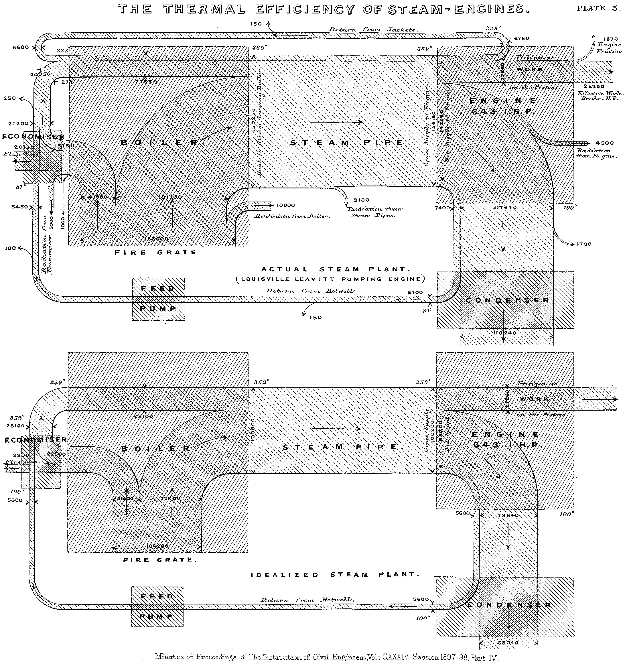
For the curious, they're named after Captain Sankey, who created a diagram of steam engine efficiency that used arrows having widths proportional to heat loss.
Note: The sankey chart may be undergoing substantial revisions in future Google Charts releases.
Sankey diagrams are rendered in the browser using SVG or VML, whichever is appropriate for the user's browser. Google's sankey layout code is derived from D3's sankey layout code.
Note: Google sankey charts are unavailable in Microsoft Internet Explorer 8 and earlier versions.
A Simple Example
Suppose you had two categories, A and B, that connect to three other categories, X, Y, and Z. Some of those connections are heavier than others. For instance, B has a thin connection to X and a much thicker connection to Y.
Try hovering over one of the links to highlight the connection.
To create a sankey chart, provide a set of rows, with each
containing information about one connection: from, to, and
weight. Then use the google.visualization.Sankey() method
to initialize the chart and then the draw() method to
render it:
<html>
  <head>
    <script type="text/javascript" src="https://www.gstatic.com/charts/loader.js"></script>
    <script type="text/javascript">
      google.charts.load('current', {'packages':['sankey']});
      google.charts.setOnLoadCallback(drawChart);

      function drawChart() {
        var data = new google.visualization.DataTable();
        data.addColumn('string', 'From');
        data.addColumn('string', 'To');
        data.addColumn('number', 'Weight');
        data.addRows([
          [ 'A', 'X', 5 ],
          [ 'A', 'Y', 7 ],
          [ 'A', 'Z', 6 ],
          [ 'B', 'X', 2 ],
          [ 'B', 'Y', 9 ],
          [ 'B', 'Z', 4 ]
        ]);

        // Sets chart options.
        var options = {
          width: 600,
        };

        // Instantiates and draws our chart, passing in some options.
        var chart = new google.visualization.Sankey(document.getElementById('sankey_basic'));
        chart.draw(data, options);
      }
    </script>
  </head>
  <body>
    <div id="sankey_basic" style="width: 900px; height: 300px;"></div>
  </body>
</html>
Note: Avoid cycles in your data: if A links to itself, or links to B which links to C which links to A, your chart will not render.
Multilevel Sankeys
You can create a Sankey chart with multiple levels of connections:
Sankey charts will add additional levels as needed, laying them out automatically. Here's the complete code for the above chart:
<html>
<body>
 <script type="text/javascript" src="https://www.gstatic.com/charts/loader.js"></script>

<div id="sankey_multiple" style="width: 900px; height: 300px;"></div>

<script type="text/javascript">
  google.charts.load("current", {packages:["sankey"]});
  google.charts.setOnLoadCallback(drawChart);
   function drawChart() {
    var data = new google.visualization.DataTable();
    data.addColumn('string', 'From');
    data.addColumn('string', 'To');
    data.addColumn('number', 'Weight');
    data.addRows([
       [ 'Brazil', 'Portugal', 5 ],
       [ 'Brazil', 'France', 1 ],
       [ 'Brazil', 'Spain', 1 ],
       [ 'Brazil', 'England', 1 ],
       [ 'Canada', 'Portugal', 1 ],
       [ 'Canada', 'France', 5 ],
       [ 'Canada', 'England', 1 ],
       [ 'Mexico', 'Portugal', 1 ],
       [ 'Mexico', 'France', 1 ],
       [ 'Mexico', 'Spain', 5 ],
       [ 'Mexico', 'England', 1 ],
       [ 'USA', 'Portugal', 1 ],
       [ 'USA', 'France', 1 ],
       [ 'USA', 'Spain', 1 ],
       [ 'USA', 'England', 5 ],
       [ 'Portugal', 'Angola', 2 ],
       [ 'Portugal', 'Senegal', 1 ],
       [ 'Portugal', 'Morocco', 1 ],
       [ 'Portugal', 'South Africa', 3 ],
       [ 'France', 'Angola', 1 ],
       [ 'France', 'Senegal', 3 ],
       [ 'France', 'Mali', 3 ],
       [ 'France', 'Morocco', 3 ],
       [ 'France', 'South Africa', 1 ],
       [ 'Spain', 'Senegal', 1 ],
       [ 'Spain', 'Morocco', 3 ],
       [ 'Spain', 'South Africa', 1 ],
       [ 'England', 'Angola', 1 ],
       [ 'England', 'Senegal', 1 ],
       [ 'England', 'Morocco', 2 ],
       [ 'England', 'South Africa', 7 ],
       [ 'South Africa', 'China', 5 ],
       [ 'South Africa', 'India', 1 ],
       [ 'South Africa', 'Japan', 3 ],
       [ 'Angola', 'China', 5 ],
       [ 'Angola', 'India', 1 ],
       [ 'Angola', 'Japan', 3 ],
       [ 'Senegal', 'China', 5 ],
       [ 'Senegal', 'India', 1 ],
       [ 'Senegal', 'Japan', 3 ],
       [ 'Mali', 'China', 5 ],
       [ 'Mali', 'India', 1 ],
       [ 'Mali', 'Japan', 3 ],
       [ 'Morocco', 'China', 5 ],
       [ 'Morocco', 'India', 1 ],
       [ 'Morocco', 'Japan', 3 ]
    ]);

    // Set chart options
    var options = {
      width: 600,
    };

    // Instantiate and draw our chart, passing in some options.
    var chart = new google.visualization.Sankey(document.getElementById('sankey_multiple'));
    chart.draw(data, options);
   }
</script>
</body>
</html>
Controlling Colors
Sankey charts have the ability to set custom colors for nodes and
links. Both nodes and links can be given custom color palettes using
their colors options (sankey.node.colors
and sankey.link.colors, respectively). They can also be
given different coloring modes using the colorMode
option.
If the colors aren't customized, they default to the standard Material palette.
    var colors = ['#a6cee3', '#b2df8a', '#fb9a99', '#fdbf6f',
                  '#cab2d6', '#ffff99', '#1f78b4', '#33a02c'];

    var options = {
      height: 400,
      sankey: {
        node: {
          colors: colors
        },
        link: {
          colorMode: 'gradient',
          colors: colors
        }
      }
    };
You can control the colors of the links, nodes, and labels with configuration options. Here, we select three with the same hue but different brightnesses:
Here's what those options look like:
    var options = {
      width: 600,
      sankey: {
        link: { color: { fill: '#d799ae' } },
        node: { colors: [ '#a61d4c' ],
                label: { color: '#871b47' } },
      }
    };
You can also control the transparency of the links with
the sankey.link.color.fillOpacity option:
    var options = {
      width: 600,
      sankey: {
        link: { color: { fill: '#d799ae', fillOpacity: 0.8 } },
        node: { colors: [ '#a61d4c' ],
                label: { color: '#871b47' } },
      }
    };
To create a border around the links, use
the sankey.link.color.stroke
and sankey.link.color.strokeWidth options:
The stroke color can be specified either in RGB format or by English name.
    var options = {
      width: 750,
      height: 400,
      sankey: {
        node: { colors: [ '#a61d4c' ] },
        link: { color: { stroke: 'black', strokeWidth: 1 } },
      }
    };
Customizing Labels
The text on sankey charts can be customized
using sankey.node.label.fontName and friends:
Here's the option stanza for the above chart:
    var options = {
      width: 600,
      sankey: {
        node: { label: { fontName: 'Times-Roman',
                         fontSize: 14,
                         color: '#871b47',
                         bold: true,
                         italic: true } } },
    };
You can adjust the position of the labels relative to the nodes
with the sankey.node.labelPadding option:
In the chart above, we've added 30 pixels of padding between the labels and the nodes.
    var options = {
      width: 600,
      sankey: { node: { labelPadding: 30 } },
    };
Adjusting Nodes
You can control the width of the nodes
with sankey.node.width:
Above, we set the node width to 2.
    var options = {
      width: 600,
      sankey: { node: { width: 2 } },
    };
You can adjust the distance between the nodes
with sankey.node.nodePadding:
In the above chart, we set sankey.node.nodePadding to 80.
    var options = {
      width: 900,
      sankey: { node: { nodePadding: 80 } },
    };
Loading
The google.charts.load package name is "sankey":
google.charts.load("current" {packages: ["sankey"]});
The visualization's class name is google.visualization.Sankey:
var visualization = new google.visualization.Sankey(container);
Data Format
Rows: Each row in the table represents a connection between two labels. The third column indicates the strength of that connection, and will be reflected in the width of the path between the labels.
Columns:
| Column 0 | Column 1 | Column 2 | ... | Column N (optional) | |
|---|---|---|---|---|---|
| Purpose: | Source | Destination | Value | ... | Optional roles |
| Data Type: | string | string | number | ... | |
| Role: | domain | domain | data | ... | |
| Optional column roles: | None |
None |
None |
... |
Configuration Options
| Name | |
|---|---|
| forceIFrame |
Draws the chart inside an inline frame. (Note that on IE8, this option is ignored; all IE8 charts are drawn in i-frames.) Type: boolean
Default: false
|
| height |
Height of the chart, in pixels. Type: number
Default: height of the containing element
|
| sankey.iterations |
With multilevel sankeys, it's sometimes nonobvious where nodes should be placed for optimal
readability. The D3 layout engine experiments with different node layouts, stopping when
Type: integer
Default: 32
|
| sankey.link |
Controls attributes of the connections between nodes. Currently all attributes pertain to color: sankey: {
link: {
color: {
fill: '#efd', // Color of the link.
fillOpacity: 0.8, // Transparency of the link.
stroke: 'black', // Color of the link border.
strokeWidth: 1 // Thickness of the link border (default 0).
},
colors: [
'#a6cee3', // Custom color palette for sankey links.
'#1f78b4', // Nodes will cycle through this palette
'#b2df8a', // giving the links for that node the color.
'#33a02c'
]
}
}
Type: object
Default: null
|
| sankey.link.colorMode |
Sets a coloring mode for the links between nodes. Possible values:
This option overrides sankey.link.color. Type: string
Default: 'none'
|
| sankey.node |
Controls attributes of the nodes (the vertical bars between links): sankey: {
node: {
label: {
fontName: 'Times-Roman',
fontSize: 12,
color: '#000',
bold: true,
italic: false
},
interactivity: true, // Allows you to select nodes.
labelPadding: 6, // Horizontal distance between the label and the node.
nodePadding: 10, // Vertical distance between nodes.
width: 5, // Thickness of the node.
colors: [
'#a6cee3', // Custom color palette for sankey nodes.
'#1f78b4', // Nodes will cycle through this palette
'#b2df8a', // giving each node its own color.
'#33a02c'
]
}
}
Type: object
Default: null
|
| sankey.node.colorMode |
Sets a coloring mode for the sankey nodes. Possible values:
Type: string
Default: 'unique'
|
| tooltip |
An object with members to configure various tooltip elements. To specify properties of this object, you can use object literal notation, as shown here: {textStyle: {color: '#FF0000'}, showColorCode: true}Type: object
Default: null
|
| tooltip.isHtml |
If set to true, use HTML-rendered (rather than SVG-rendered) tooltips. See Customizing Tooltip Content for more details. Note: customization of the HTML tooltip content via the tooltip column data role is not supported by the Bubble Chart visualization. Type: boolean
Default: false
|
| tooltip.textStyle |
An object that specifies the tooltip text style. The object has this format:
{ color: <string>,
  fontName: <string>,
  fontSize: <number>,
  bold: <boolean>,
  italic: <boolean> }
The Type: object
Default:
{color: 'black', fontName: <global-font-name>, fontSize: <global-font-size>}
|
| width |
Width of the chart, in pixels. Type: number
Default: width of the containing element
|
Methods
| Method | |
|---|---|
draw(data, options) |
Draws the chart. The chart accepts further method calls only after the
Return Type: none
|
getBoundingBox(id) |
Returns an object containing the left, top, width, and height of chart element
Values are relative to the container of the chart. Call this after the chart is drawn. Return Type: object
|
getSelection() |
Returns an array of the selected chart entities.
Selectable entities are bars, legend entries and categories.
For this chart, only one entity can be selected at any given moment.
Return Type: Array of selection elements
|
setSelection() |
Selects the specified chart entities. Cancels any previous selection.
Selectable entities are bars, legend entries and categories.
For this chart, only one entity can be selected at a time.
Return Type: none
|
clearChart() |
Clears the chart, and releases all of its allocated resources. Return Type: none
|
Events
| Name | |
|---|---|
error |
Fired when an error occurs when attempting to render the chart. Properties: id, message
|
onmouseover |
Fired when the user mouses over a visual entity. Passes back the row and column indices of the corresponding data table element. A bar correlates to a cell in the data table, a legend entry to a column (row index is null), and a category to a row (column index is null). Properties: row, column
|
onmouseout |
Fired when the user mouses away from a visual entity. Passes back the row and column indices of the corresponding data table element. A bar correlates to a cell in the data table, a legend entry to a column (row index is null), and a category to a row (column index is null). Properties: row, column
|
ready |
The chart is ready for external method calls. If you want to interact with the chart, and
call methods after you draw it, you should set up a listener for this event before you
call the Properties: none
|
select |
Fired when the user clicks a visual entity. To learn what has been selected, call
Properties: none
|
Data Policy
All code and data are processed and rendered in the browser. No data is sent to any server.