

Карта
Карточный интерфейс, отображаемый в сообщении Google Chat или в дополнении Google Workspace.
Карточки поддерживают заданную структуру, интерактивные элементы пользовательского интерфейса, такие как кнопки, и мультимедийный контент, например изображения. Используйте карточки для представления подробной информации, сбора информации от пользователей и направления пользователей к следующему шагу.
Создавайте и просматривайте карточки с помощью конструктора карточек.
Откройте конструктор карточек.To learn how to build cards, see the following documentation:
- Для приложений Google Chat см. раздел «Разработка компонентов карточки или диалогового окна» .
- Информацию о дополнениях для Google Workspace см. в разделе «Интерфейсы на основе карточек» .
Примечание: В каждую карточку можно добавить до 100 виджетов. Если количество виджетов в разделе превысит 100, весь этот раздел и все последующие разделы будут проигнорированы. Это ограничение применяется как к сообщениям и диалогам в карточках в приложениях Google Chat, так и к карточкам в надстройках Google Workspace.
Пример: Сообщение-открытка для приложения Google Chat
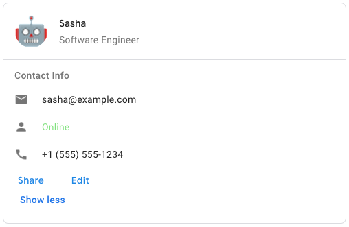
Для создания примера сообщения в Google Chat используйте следующий JSON:
{
  "cardsV2": [
    {
      "cardId": "unique-card-id",
      "card": {
        "header": {
           "title": "Sasha",
           "subtitle": "Software Engineer",
           "imageUrl":
           "https://developers.google.com/workspace/chat/images/quickstart-app-avatar.png",
           "imageType": "CIRCLE",
           "imageAltText": "Avatar for Sasha"
         },
         "sections": [
           {
             "header": "Contact Info",
             "collapsible": true,
             "uncollapsibleWidgetsCount": 1,
             "widgets": [
               {
                 "decoratedText": {
                   "startIcon": {
                     "knownIcon": "EMAIL"
                   },
                   "text": "sasha@example.com"
                 }
               },
               {
                 "decoratedText": {
                   "startIcon": {
                     "knownIcon": "PERSON"
                   },
                   "text": "<font color=\"#80e27e\">Online</font>"
                 }
               },
               {
                 "decoratedText": {
                   "startIcon": {
                     "knownIcon": "PHONE"
                   },
                   "text": "+1 (555) 555-1234"
                 }
               },
               {
                 "buttonList": {
                   "buttons": [
                     {
                       "text": "Share",
                       "onClick": {
                        "openLink": {
                           "url": "https://example.com/share"
                         }
                       }
                     },
                     {
                       "text": "Edit",
                       "onClick": {
                         "action": {
                           "function": "goToView",
                           "parameters": [
                             {
                               "key": "viewType",
                               "value": "EDIT"
                             }
                           ]
                         }
                       }
                     }
                   ]
                 }
               }
             ]
           }
         ]
       }
    }
  ]
}
| JSON-представление |
|---|
{ "header": { object ( |
| Поля | |
|---|---|
header | Заголовок карточки. Заголовок обычно содержит основное изображение и заголовок. Заголовки всегда располагаются в верхней части карточки. |
sections[] | Содержит набор виджетов. Каждый раздел имеет свой собственный, необязательный заголовок. Разделы визуально разделены разделительной линией. Пример использования в приложениях Google Chat см. в разделе «Определение раздела карточки» . |
sectionDividerStyle | Стиль разделителя между заголовком, разделами и нижним колонтитулом. |
cardActions[] | Действия карточки. Действия добавляются в меню панели инструментов карточки.
Например, следующий JSON-код формирует меню действий в виде карточки с опциями |
name | Name of the card. Used as a card identifier in card navigation.
|
fixedFooter | Фиксированный нижний колонтитул, показанный внизу этой карточки. Установка
|
displayStyle | In Google Workspace add-ons, sets the display properties of the
|
peekCardHeader | When displaying contextual content, the peek card header acts as a placeholder so that the user can navigate forward between the homepage cards and the contextual cards.
|
expressionData[] | Данные выражения для карты. Доступно для дополнений Google Workspace, расширяющих функциональность Google Workspace Studio. Недоступно для приложений Google Chat. |
CardHeader
Represents a card header. For an example in Google Chat apps, see Add a header .

 Available for Google Chat apps and Google Workspace add-ons.
| JSON-представление |
|---|
{
"title": string,
"subtitle": string,
"imageType": enum ( |
| Поля | |
|---|---|
title | Обязательно. Заголовок верхней части карточки. Высота заголовка фиксирована: если указаны и заголовок, и подзаголовок, каждый занимает одну строку. Если указан только заголовок, он занимает обе строки. |
subtitle | The subtitle of the card header. If specified, appears on its own line below the |
imageType | Форма, используемая для обрезки изображения.
|
imageUrl | HTTPS-адрес изображения в заголовке карточки. |
imageAltText | The alternative text of this image that's used for accessibility. |
Тип изображения
Форма, используемая для обрезки изображения.
Доступно для приложений Google Chat и дополнений Google Workspace.
| Перечисления | |
|---|---|
SQUARE | Default value. Applies a square mask to the image. For example, a 4x3 image becomes 3x3. |
CIRCLE | Applies a circular mask to the image. For example, a 4x3 image becomes a circle with a diameter of 3. |
Раздел
A section contains a collection of widgets that are rendered vertically in the order that they're specified.
Available for Google Chat apps and Google Workspace add-ons.
| JSON-представление |
|---|
{ "header": string, "widgets": [ { object ( |
| Поля | |
|---|---|
header | Текст, отображаемый в верхней части раздела. Поддерживается простой HTML-форматированный текст. Для получения дополнительной информации о форматировании текста см. разделы «Форматирование текста в приложениях Google Chat» и «Форматирование текста в надстройках Google Workspace». |
widgets[] | Все виджеты в разделе. Должен содержать как минимум один виджет. |
collapsible | Указывает, можно ли свернуть этот раздел. Collapsible sections hide some or all widgets, but users can expand the section to reveal the hidden widgets by clicking Show more . Users can hide the widgets again by clicking Show less . To determine which widgets are hidden, specify |
uncollapsibleWidgetsCount | The number of uncollapsible widgets which remain visible even when a section is collapsed. Например, если раздел содержит пять виджетов, а параметр |
id | A unique ID assigned to the section that's used to identify the section to be mutated. The ID has a character limit of 64 characters and should be in the format of Доступно для дополнений Google Workspace, расширяющих функциональность Google Workspace Studio. Недоступно для приложений Google Chat. |
collapseControl | Optional. Define the expand and collapse button of the section. This button will be shown only if the section is collapsible. If this field isn't set, the default button is used. |
Виджет
Каждая карточка состоит из виджетов.
A widget is a composite object that can represent one of text, images, buttons, and other object types.
| JSON-представление |
|---|
{ "horizontalAlignment": enum ( |
| Поля | |
|---|---|
horizontalAlignment | Specifies whether widgets align to the left, right, or center of a column. |
id | A unique ID assigned to the widget that's used to identify the widget to be mutated. The ID has a character limit of 64 characters and should be in the format of Доступно для дополнений Google Workspace, расширяющих функциональность Google Workspace Studio. Недоступно для приложений Google Chat. |
visibility | Specifies whether the widget is visible or hidden. The default value is Available for Google Workspace add-ons that extend Google Workspace Studio. Unavailable for Google Chat apps. |
eventActions[] | Specifies the event actions that can be performed on the widget. Available for Google Workspace add-ons that extend Google Workspace Studio. Unavailable for Google Chat apps. |
| Виджет может содержать только один из следующих элементов. Для отображения большего количества элементов можно использовать несколько полей виджета. Ниже приведен список взаимоисключающих полей. В ответе будет установлено не более одного из полей: | |
textParagraph | Отображает абзац текста. Поддерживает простой HTML-форматированный текст. Для получения дополнительной информации о форматировании текста см. разделы «Форматирование текста в приложениях Google Chat» и «Форматирование текста в надстройках Google Workspace». Например, следующий JSON-код создает текст, выделенный жирным шрифтом: |
image | Отображает изображение. Например, следующий JSON-код создает изображение с альтернативным текстом: |
decoratedText | Отображает текстовый элемент с декоративным оформлением. For example, the following JSON creates a decorated text widget showing email address: |
buttonList | Список кнопок. For example, the following JSON creates two buttons. The first is a blue text button and the second is an image button that opens a link: |
textInput | Отображает текстовое поле, в которое пользователи могут вводить текст. For example, the following JSON creates a text input for an email address: As another example, the following JSON creates a text input for a programming language with static suggestions: |
selectionInput | Отображает элемент управления выбором, позволяющий пользователям выбирать элементы. В качестве элементов управления выбором могут использоваться флажки, переключатели, переключатели или выпадающие меню. For example, the following JSON creates a dropdown menu that lets users choose a size: |
dateTimePicker | Отображает виджет, позволяющий пользователям вводить дату, время или дату и время. For example, the following JSON creates a date time picker to schedule an appointment: |
divider | Отображает горизонтальную разделительную линию между виджетами. Например, следующий JSON-код создает разделитель: |
grid | Отображает сетку с набором элементов. Таблица поддерживает любое количество столбцов и элементов. Количество строк определяется как верхнее значение отношения количества элементов к количеству столбцов. Таблица с 10 элементами и 2 столбцами имеет 5 строк. Таблица с 11 элементами и 2 столбцами имеет 6 строк.
Например, следующий JSON-код создает сетку из двух столбцов с одним элементом: |
columns | Отображает до 2 столбцов. Чтобы добавить более двух столбцов или использовать строки, воспользуйтесь виджетом Например, следующий JSON-код создает 2 столбца, каждый из которых содержит текстовые абзацы: |
carousel | Карусель содержит набор вложенных виджетов. Например, это JSON-представление карусели, содержащей два текстовых абзаца. |
chipList | Список чипсов. Например, следующий JSON-код создает два чипа. Первый — текстовый чип, а второй — чип-иконка, открывающий ссылку: |
| Конец взаимоисключающих областей. | |
Текстовый абзац
Абзац текста, поддерживающий форматирование. Пример использования в приложениях Google Chat см. в разделе «Добавление абзаца форматированного текста» . Дополнительную информацию о форматировании текста см. в разделах «Форматирование текста в приложениях Google Chat» и «Форматирование текста в надстройках Google Workspace» .
Доступно для приложений Google Chat и дополнений Google Workspace.
| JSON-представление |
|---|
{
"text": string,
"maxLines": integer,
"textSyntax": enum ( |
| Поля | |
|---|---|
text | Текст, отображаемый в виджете. |
maxLines | Максимальное количество строк текста, отображаемых в виджете. Если текст превышает указанное максимальное количество строк, лишнее содержимое скрывается за кнопкой «Показать больше» . Если текст равен или короче указанного максимального количества строк, кнопка «Показать больше» не отображается. The default value is 0, in which case all context is displayed. Negative values are ignored. |
textSyntax | Синтаксис текста. Если не задано, текст отображается как HTML.
|
Текстовый синтаксис
Синтаксис, используемый для форматирования текста.
Доступно для приложений Google Chat, но недоступно для дополнений Google Workspace.
| Перечисления | |
|---|---|
TEXT_SYNTAX_UNSPECIFIED | Если не указано иное, текст отображается в формате HTML. |
HTML | Текст отображается в формате HTML. Это значение по умолчанию. |
MARKDOWN | Текст отображается в формате Markdown. |
Изображение
Изображение, заданное по URL-адресу, может иметь действие onClick . Пример см. в разделе «Добавление изображения» .
Доступно для приложений Google Chat и дополнений Google Workspace.
| JSON-представление |
|---|
{
"imageUrl": string,
"onClick": {
object ( |
| Поля | |
|---|---|
imageUrl | HTTPS-адрес, на котором размещено изображение. Например: |
onClick | Когда пользователь щелкает по изображению, этот щелчок запускает данное действие. |
altText | Альтернативный текст этого изображения, используемый для обеспечения доступности. |
OnClick
Описывает, как реагировать, когда пользователи нажимают на интерактивный элемент на карточке, например, на кнопку.
Доступно для приложений Google Chat и дополнений Google Workspace.
| JSON-представление |
|---|
{ "action": { object ( |
| Поля | |
|---|---|
| Ниже приведён список взаимоисключающих полей. В ответе будет установлено не более одного из этих полей: | |
action | Если указано иное, действие запускается этим обработчиком |
openLink | Если указано, то |
openDynamicLinkAction | Дополнение запускает это действие, когда необходимо открыть ссылку. Это отличается от описанного выше метода
|
card | Если указано иное, после нажатия кнопки новая карточка добавляется в стопку карточек.
|
overflowMenu | Если указано, то |
| Конец взаимоисключающих областей. | |
Действие
Действие, описывающее поведение при отправке формы. Например, вы можете вызвать скрипт Apps Script для обработки формы. Если действие срабатывает, значения формы отправляются на сервер.
Available for Google Chat apps and Google Workspace add-ons.
| JSON-представление |
|---|
{ "function": string, "parameters": [ { object ( |
| Поля | |
|---|---|
function | Пользовательская функция, вызываемая при щелчке по содержащему элементу или при его иной активации. Пример использования см. в разделе «Чтение данных формы» . |
parameters[] | Список параметров действия. |
loadIndicator | Указывает индикатор загрузки, который отображается при вызове действия. |
persistValues | Указывает, сохраняются ли значения формы после выполнения действия. Значение по умолчанию — Если Если |
interaction | Необязательно. Обязательно при открытии диалогового окна . Что делать в ответ на взаимодействие с пользователем, например, когда пользователь нажимает кнопку в сообщении-карточке? Если параметр не указан, приложение реагирует, выполняя Указав параметр
|
requiredWidgets[] | Optional. Fill this list with the names of widgets that this Action needs for a valid submission. Если при вызове этого действия у перечисленных здесь виджетов отсутствует значение, отправка формы будет прервана.
|
allWidgetsAreRequired | Необязательно. Если это так, то все виджеты считаются обязательными для данного действия.
|
Параметр действия
Список строковых параметров, которые необходимо передать при вызове метода действия. Например, рассмотрим три кнопки отложенного будильника: отложить сейчас, отложить через день или отложить на следующей неделе. Вы можете использовать action method = snooze() , передав тип и время отложенного будильника в списке строковых параметров.
Для получения более подробной информации см. CommonEventObject .
Доступно для приложений Google Chat и дополнений Google Workspace.
| JSON-представление |
|---|
{ "key": string, "value": string } |
| Поля | |
|---|---|
key | Название параметра для скрипта действия. |
value | Значение параметра. |
LoadIndicator
Указывает индикатор загрузки, который отображается при вызове действия.
Доступно для приложений Google Chat и дополнений Google Workspace.
| Перечисления | |
|---|---|
SPINNER | Отображает индикатор загрузки контента. |
NONE | Ничего не отображается. |
Взаимодействие
Необязательно. Обязательно при открытии диалогового окна .
Что делать в ответ на взаимодействие с пользователем, например, когда пользователь нажимает кнопку в сообщении-карточке?
Если параметр не указан, приложение реагирует, выполняя action — например, открывая ссылку или запуская функцию — как обычно.
Указав тип interaction , приложение может реагировать особыми интерактивными способами. Например, установив interaction на OPEN_DIALOG , приложение может открыть диалоговое окно .
When specified, a loading indicator isn't shown. If specified for an add-on, the entire card is stripped and nothing is shown in the client.
Доступно для приложений Google Chat, но недоступно для дополнений Google Workspace.
| Перечисления | |
|---|---|
INTERACTION_UNSPECIFIED | Значение по умолчанию. action выполняется в обычном режиме. |
OPEN_DIALOG | Открывает диалоговое окно — оконный интерфейс на основе карточек, который приложения для чата используют для взаимодействия с пользователями. Поддерживается только в чат-приложениях в ответ на нажатия кнопок в сообщениях-карточках. Если указано для дополнения, вся карточка удаляется, и в клиенте ничего не отображается.
|
OpenLink
Представляет собой событие onClick , открывающее гиперссылку.
Доступно для приложений Google Chat и дополнений Google Workspace.
| JSON-представление |
|---|
{ "url": string, "openAs": enum ( |
| Поля | |
|---|---|
url | URL-адрес для открытия. HTTP-адреса преобразуются в HTTPS. |
openAs | Как открыть ссылку.
|
onClose | Забывает ли клиент о ссылке после её открытия или следит за ней до закрытия окна.
|
OpenAs
Когда действие OnClick открывает ссылку, клиент может открыть её либо как полноразмерное окно (если клиент использует такой фрейм), либо как наложение (например, всплывающее окно). Реализация зависит от возможностей платформы клиента, и выбранное значение может быть проигнорировано, если клиент его не поддерживает. FULL_SIZE поддерживается всеми клиентами.
Доступно для дополнений Google Workspace и недоступно для приложений Google Chat.
| Перечисления | |
|---|---|
FULL_SIZE | The link opens as a full-size window (if that's the frame used by the client). |
OVERLAY | Ссылка открывается в виде всплывающего окна или наложения. |
OnClose
What the client does when a link opened by an OnClick action is closed.
Реализация зависит от возможностей клиентской платформы. Например, веб-браузер может открывать ссылку во всплывающем окне с обработчиком события OnClose .
If both OnOpen and OnClose handlers are set, and the client platform can't support both values, OnClose takes precedence.
Доступно для дополнений Google Workspace и недоступно для приложений Google Chat.
| Перечисления | |
|---|---|
NOTHING | Default value. The card doesn't reload; nothing happens. |
RELOAD | Карта пополняется после закрытия дочернего окна. При использовании совместно с |
OverflowMenu
Виджет, отображающий всплывающее меню с одним или несколькими действиями, которые могут быть вызваны пользователями. Например, для отображения неосновных действий в карточке. Этот виджет можно использовать, когда действия не помещаются в доступное пространство. Для использования укажите этот виджет в действии OnClick виджетов, которые его поддерживают. Например, в Button .
Доступно для приложений Google Chat и дополнений Google Workspace.
| JSON-представление |
|---|
{
"items": [
{
object ( |
| Поля | |
|---|---|
items[] | Обязательно. Список пунктов меню. |
ПереполнениеМенюПункт
Опция, которую пользователи могут вызвать в дополнительном меню.
Available for Google Chat apps and Google Workspace add-ons.
| JSON-представление |
|---|
{ "startIcon": { object ( |
| Поля | |
|---|---|
startIcon | Значок, отображаемый перед текстом. |
text | Required. The text that identifies or describes the item to users. |
onClick | Required. The action invoked when a menu option is selected. This |
disabled | Whether the menu option is disabled. Defaults to false. |
Икона
An icon displayed in a widget on a card. For an example in Google Chat apps, see Add an icon .
Поддерживает встроенные и пользовательские значки.
Available for Google Chat apps and Google Workspace add-ons.
| JSON-представление |
|---|
{ "altText": string, "imageType": enum ( |
| Поля | |
|---|---|
altText | Optional. A description of the icon used for accessibility. If unspecified, the default value If the icon is set in a |
imageType | The crop style applied to the image. In some cases, applying a |
| The icon displayed in the widget on the card. The following is a list of mutually exclusive fields. At most one of the fields will be set in a response: | |
knownIcon | Display one of the built-in icons provided by Google Workspace. For example, to display an airplane icon, specify For a full list of supported icons, see built-in icons . |
iconUrl | Отобразить пользовательскую иконку, размещенную по адресу HTTPS. Например: Поддерживаются файлы следующих форматов: |
materialIcon | Отобразите один из значков Google Material Icons . Например, чтобы отобразить значок флажка , используйте
|
| Конец взаимоисключающих областей. | |
MaterialIcon
A Google Material Icon , which includes over 2500+ options.
For example, to display a checkbox icon with customized weight and grade, write the following:
{
"name": "check_box",
"fill": true,
"weight": 300,
"grade": -25
}
Доступно для приложений Google Chat, но недоступно для дополнений Google Workspace.
| JSON-представление |
|---|
{ "name": string, "fill": boolean, "weight": integer, "grade": integer } |
| Поля | |
|---|---|
name | Имя значка, определенное в Google Material Icon , например, |
fill | Whether the icon renders as filled. Default value is false. To preview different icon settings, go to Google Font Icons and adjust the settings under Customize . |
weight | The stroke weight of the icon. Choose from {100, 200, 300, 400, 500, 600, 700}. If absent, default value is 400. If any other value is specified, the default value is used. To preview different icon settings, go to Google Font Icons and adjust the settings under Customize . |
grade | Толщина и градиент влияют на размер символа. Корректировка градиента более точна, чем корректировка толщины, и оказывает незначительное влияние на размер символа. Выберите один из вариантов: {-25, 0, 200}. Если значение отсутствует, используется значение по умолчанию 0. Если указано другое значение, используется значение по умолчанию. To preview different icon settings, go to Google Font Icons and adjust the settings under Customize . |
Декорированный текст
Виджет, отображающий текст с дополнительными элементами оформления, такими как метка над или под текстом, значок перед текстом, виджет выделения или кнопка после текста. Пример использования в приложениях Google Chat см. в разделе «Отображение текста с декоративными элементами» .
Available for Google Chat apps and Google Workspace add-ons.
| JSON-представление |
|---|
{ "icon": { object ( |
| Поля | |
|---|---|
icon | Устарело, вместо него используется |
startIcon | Значок, отображаемый перед текстом. |
startIconVerticalAlignment | Optional. Vertical alignment of the start icon. If not set, the icon will be vertically centered.
|
topLabel | The text that appears above |
topLabelText |
|
text | Обязательно. Основной текст. Supports simple formatting. For more information about formatting text, see Formatting text in Google Chat apps and Formatting text in Google Workspace add-ons . |
contentText |
|
wrapText | Параметр переноса текста. Если Only applies to |
bottomLabel | Текст, отображаемый ниже |
bottomLabelText |
|
onClick | This action is triggered when users click |
Кнопка, переключатель, флажок или изображение, отображаемое справа от текста в виджете decoratedText . Ниже приведен список взаимоисключающих полей. В ответе будет установлено не более одного из полей: | |
button | A button that a user can click to trigger an action. |
switchControl | A switch widget that a user can click to change its state and trigger an action. |
endIcon | Значок, отображаемый после текста. Поддерживает встроенные и пользовательские значки. |
| Конец взаимоисключающих областей. | |
Вертикальное выравнивание
Представляет собой атрибут вертикального выравнивания.
| Перечисления | |
|---|---|
VERTICAL_ALIGNMENT_UNSPECIFIED | Тип не указан. Не использовать. |
TOP | Выравнивание по верхнему положению. |
MIDDLE | Выравнивание по центру. |
BOTTOM | Выравнивание по нижнему положению. |
Кнопка
A text, icon, or text and icon button that users can click. For an example in Google Chat apps, see Add a button .
To make an image a clickable button, specify an ImageImageComponentonClick action.
Available for Google Chat apps and Google Workspace add-ons.
| JSON-представление |
|---|
{ "text": string, "icon": { object ( |
| Поля | |
|---|---|
text | Текст, отображаемый внутри кнопки. |
icon | An icon displayed inside the button. If both |
color | Необязательный параметр. Цвет кнопки. Если задан, Чтобы задать цвет кнопки, укажите значения для полей Например, следующий код устанавливает цвет на красный с максимальной интенсивностью: The |
onClick | Required. The action to perform when a user clicks the button, such as opening a hyperlink or running a custom function. |
disabled | If |
altText | The alternative text that's used for accessibility. Добавьте описательный текст, который сообщит пользователям, что делает кнопка. Например, если кнопка открывает гиперссылку, вы можете написать: «Открывает новую вкладку браузера и переходит к документации для разработчиков Google Chat по адресу https://developers.google.com/workspace/chat» . |
type | Optional. The type of a button. If unset, button type defaults to |
Цвет
Представляет цвет в цветовом пространстве RGBA. Это представление разработано для упрощения преобразования в цветовые представления и обратно в различных языках программирования, а не для компактности. Например, поля этого представления можно легко передать конструктору java.awt.Color в Java; его также легко передать методу +colorWithRed:green:blue:alpha класса UIColor в iOS; и, приложив немного усилий, его можно легко отформатировать в строку CSS rgba() в JavaScript.
На этой справочной странице отсутствует информация об абсолютном цветовом пространстве, которое следует использовать для интерпретации значения RGB — например, sRGB, Adobe RGB, DCI-P3 и BT.2020. По умолчанию приложения должны использовать цветовое пространство sRGB.
Когда необходимо определить равенство цветов, в реализациях, если не указано иное, два цвета считаются равными, если значения красного, зеленого, синего и альфа-канала различаются не более чем на 1e-5 .
Пример (Java):
import com.google.type.Color;
// ...
public static java.awt.Color fromProto(Color protocolor) {
float alpha = protocolor.hasAlpha()
? protocolor.getAlpha().getValue()
: 1.0;
return new java.awt.Color(
protocolor.getRed(),
protocolor.getGreen(),
protocolor.getBlue(),
alpha);
}
public static Color toProto(java.awt.Color color) {
float red = (float) color.getRed();
float green = (float) color.getGreen();
float blue = (float) color.getBlue();
float denominator = 255.0;
Color.Builder resultBuilder =
Color
.newBuilder()
.setRed(red / denominator)
.setGreen(green / denominator)
.setBlue(blue / denominator);
int alpha = color.getAlpha();
if (alpha != 255) {
result.setAlpha(
FloatValue
.newBuilder()
.setValue(((float) alpha) / denominator)
.build());
}
return resultBuilder.build();
}
// ...
Пример (iOS / Objective-C):
// ...
static UIColor* fromProto(Color* protocolor) {
float red = [protocolor red];
float green = [protocolor green];
float blue = [protocolor blue];
FloatValue* alpha_wrapper = [protocolor alpha];
float alpha = 1.0;
if (alpha_wrapper != nil) {
alpha = [alpha_wrapper value];
}
return [UIColor colorWithRed:red green:green blue:blue alpha:alpha];
}
static Color* toProto(UIColor* color) {
CGFloat red, green, blue, alpha;
if (![color getRed:&red green:&green blue:&blue alpha:&alpha]) {
return nil;
}
Color* result = [[Color alloc] init];
[result setRed:red];
[result setGreen:green];
[result setBlue:blue];
if (alpha <= 0.9999) {
[result setAlpha:floatWrapperWithValue(alpha)];
}
[result autorelease];
return result;
}
// ...
Пример (JavaScript):
// ...
var protoToCssColor = function(rgb_color) {
var redFrac = rgb_color.red || 0.0;
var greenFrac = rgb_color.green || 0.0;
var blueFrac = rgb_color.blue || 0.0;
var red = Math.floor(redFrac * 255);
var green = Math.floor(greenFrac * 255);
var blue = Math.floor(blueFrac * 255);
if (!('alpha' in rgb_color)) {
return rgbToCssColor(red, green, blue);
}
var alphaFrac = rgb_color.alpha.value || 0.0;
var rgbParams = [red, green, blue].join(',');
return ['rgba(', rgbParams, ',', alphaFrac, ')'].join('');
};
var rgbToCssColor = function(red, green, blue) {
var rgbNumber = new Number((red << 16) | (green << 8) | blue);
var hexString = rgbNumber.toString(16);
var missingZeros = 6 - hexString.length;
var resultBuilder = ['#'];
for (var i = 0; i < missingZeros; i++) {
resultBuilder.push('0');
}
resultBuilder.push(hexString);
return resultBuilder.join('');
};
// ...
| JSON-представление |
|---|
{ "red": number, "green": number, "blue": number, "alpha": number } |
| Поля | |
|---|---|
red | Количество красного цвета в заданном диапазоне значений находится в интервале [0, 1]. |
green | Количество зеленого цвета в заданном диапазоне значений находится в интервале [0, 1]. |
blue | Количество синего цвета в заданном цвете выражается значением в интервале [0, 1]. |
alpha | Доля этого цвета, которая должна быть применена к пикселю. То есть, окончательный цвет пикселя определяется уравнением: Это означает, что значение 1,0 соответствует сплошному цвету, а значение 0,0 — полностью прозрачному цвету. Используется оберточное сообщение, а не простое скалярное значение с плавающей запятой, что позволяет различать значение по умолчанию и значение, которое не задано. Если этот параметр опущен, объект цвета отображается как сплошной цвет (как если бы значению альфа-канала было явно присвоено значение 1,0). |
Тип
Optional. The type of a button. If color field is set, the type is forced to FILLED .
Доступно для приложений Google Chat, но недоступно для дополнений Google Workspace.
| Перечисления | |
|---|---|
TYPE_UNSPECIFIED | Не использовать. Не указано. |
OUTLINED | Outlined buttons are medium-emphasis buttons. They usually contain actions that are important, but aren't the primary action in a Chat app or an add-on. |
FILLED | A filled button has a container with a solid color. It has the most visual impact and is recommended for the important and primary action in a Chat app or an add-on. |
FILLED_TONAL | Заполненная тональная кнопка представляет собой промежуточный вариант между заполненными и обведенными кнопками. Она полезна в ситуациях, когда кнопка с более низким приоритетом требует немного большего акцента, чем кнопка с обведенной рамкой. |
BORDERLESS | В своем стандартном состоянии кнопка не имеет невидимого контейнера. Она часто используется для действий с самым низким приоритетом, особенно при отображении нескольких вариантов. |
SwitchControl
Either a toggle-style switch or a checkbox inside a decoratedText widget.
Available for Google Chat apps and Google Workspace add-ons.
Поддерживается только в виджете decoratedText .
| JSON-представление |
|---|
{ "name": string, "value": string, "selected": boolean, "onChangeAction": { object ( |
| Поля | |
|---|---|
name | The name by which the switch widget is identified in a form input event. For details about working with form inputs, see Receive form data . |
value | The value entered by a user, returned as part of a form input event. For details about working with form inputs, see Receive form data . |
selected | Если |
onChangeAction | The action to perform when the switch state is changed, such as what function to run. |
controlType | Как переключатель отображается в пользовательском интерфейсе.
|
ControlType
Как переключатель отображается в пользовательском интерфейсе.
Available for Google Chat apps and Google Workspace add-ons.
| Перечисления | |
|---|---|
SWITCH | Переключатель тумблерного типа. |
CHECKBOX | Устарело, вместо него используется CHECK_BOX . |
CHECK_BOX | Флажок. |
ButtonList
Список кнопок, расположенных горизонтально. Пример использования в приложениях Google Chat см. в разделе «Добавить кнопку» .
Доступно для приложений Google Chat и дополнений Google Workspace.
| JSON-представление |
|---|
{
"buttons": [
{
object ( |
| Поля | |
|---|---|
buttons[] | Набор кнопок. |
Текстовое поле
Поле, в которое пользователи могут вводить текст. Поддерживает подсказки и действия при изменении. Поддерживает проверку данных при отправке формы. Если для Action.all_widgets_are_required установлено значение true или этот виджет указан в Action.required_widgets , отправка формы блокируется, если не введено значение. Пример использования в приложениях Google Chat см. в разделе «Добавление поля, в которое пользователь может вводить текст» .
Chat apps receive and can process the value of entered text during form input events. For details about working with form inputs, see Receive form data .
When you need to collect undefined or abstract data from users, use a text input. To collect defined or enumerated data from users, use the SelectionInput widget.
Доступно для приложений Google Chat и дополнений Google Workspace.
| JSON-представление |
|---|
{ "name": string, "label": string, "hintText": string, "value": string, "type": enum ( |
| Поля | |
|---|---|
name | Имя, по которому текстовое поле идентифицируется в событии ввода формы. Подробную информацию о работе с полями ввода формы см. в разделе «Получение данных формы» . |
label | The text that appears above the text input field in the user interface. Укажите текст, который поможет пользователю ввести необходимую вашему приложению информацию. Например, если вы спрашиваете имя, но вам нужна именно фамилия, напишите Обязательно, если |
hintText | Текст, отображаемый под полем ввода текста, призван помочь пользователям, предлагая им ввести определенное значение. Этот текст всегда виден. Обязательно, если |
value | Значение, введенное пользователем, возвращается в рамках события ввода данных в форму. Подробную информацию о работе с полями ввода формы см. в разделе «Получение данных формы» . |
type | Как текстовое поле ввода отображается в пользовательском интерфейсе. Например, является ли поле однострочным или многострочным. |
onChangeAction | Что делать, если в текстовом поле произошли изменения? Например, пользователь добавил текст в поле или удалил его. В качестве примеров действий можно привести запуск пользовательской функции или открытие диалога в Google Chat. |
initialSuggestions | Предлагаемые значения, которые могут ввести пользователи. Эти значения появляются при щелчке мышью внутри текстового поля ввода. По мере ввода пользователем предлагаемые значения динамически фильтруются, чтобы соответствовать введенному тексту. Например, текстовое поле ввода для языка программирования может предлагать Java, JavaScript, Python и C++. Когда пользователь начинает вводить Предлагаемые значения помогают пользователям вводить данные, которые ваше приложение сможет распознать. Применительно к JavaScript, одни пользователи могут ввести Если указано значение,
|
autoCompleteAction | Необязательно. Укажите, какое действие следует предпринять, когда текстовое поле ввода предлагает варианты действий пользователям, взаимодействующим с ним. Если параметр не указан, предложения формируются параметром Если указано иное, приложение выполнит указанное здесь действие, например, запустит пользовательскую функцию.
|
validation | Укажите необходимые параметры проверки формата ввода для этого текстового поля.
|
placeholderText | Текст, который отображается в поле ввода текста, когда поле пустое. Используйте этот текст, чтобы предложить пользователям ввести значение. Например: «
|
| Ниже приведён список взаимоисключающих полей. В ответе будет установлено не более одного из этих полей: | |
hostAppDataSource | Уникальный для каждого приложения Google Workspace источник данных, например, электронные письма Gmail, события Google Calendar или сообщения Google Chat. Доступно для дополнений Google Workspace, расширяющих функциональность Google Workspace Studio. Недоступно для приложений Google Chat. |
| Конец взаимоисключающих областей. | |
Тип
Как текстовое поле ввода отображается в пользовательском интерфейсе. Например, является ли оно однострочным или многострочным полем ввода. Если указан параметр initialSuggestions , type всегда будет SINGLE_LINE , даже если он установлен на MULTIPLE_LINE .
Доступно для приложений Google Chat и дополнений Google Workspace.
| Перечисления | |
|---|---|
SINGLE_LINE | Поле ввода текста имеет фиксированную высоту в одну строку. |
MULTIPLE_LINE | Поле ввода текста имеет фиксированную высоту и состоит из нескольких строк. |
RenderActions
Набор инструкций рендеринга, который указывает карточке выполнить действие, или указывает приложению-хосту дополнения или приложению чата выполнить действие, специфичное для данного приложения.
Доступно для приложений Google Chat и дополнений Google Workspace.
| Поля | |
|---|---|
action | |
Действие
| Поля | |
|---|---|
navigations[] | Выполняет операцию добавления, извлечения или обновления карты. |
Навигация
Добавить новую карточку в стопку (перейти вперед). Для приложений чата: доступно только на главной странице приложения .
Доступно для приложений Google Chat и дополнений Google Workspace.
navigations: {
pushCard: CARD
}
Замените верхнюю карточку новой. Доступно только на главной странице приложения для чат-приложений .
Доступно для приложений Google Chat и дополнений Google Workspace.
navigations: {
updateCard: CARD
}
Предложения
Предлагаемые значения, которые могут ввести пользователи. Эти значения появляются при щелчке мышью внутри текстового поля ввода. По мере ввода пользователем предлагаемые значения динамически фильтруются, чтобы соответствовать введенному тексту.
Например, текстовое поле ввода для языка программирования может предлагать Java, JavaScript, Python и C++. Когда пользователь начинает вводить Jav , список подсказок фильтруется, отображая Java и JavaScript .
Предлагаемые значения помогают пользователям вводить данные, которые ваше приложение сможет распознать. Применительно к JavaScript, одни пользователи могут ввести javascript , а другие java script . Предложение значений JavaScript может стандартизировать взаимодействие пользователей с вашим приложением.
Если указано значение, TextInput.type всегда будет SINGLE_LINE , даже если оно установлено на MULTIPLE_LINE .
Доступно для приложений Google Chat и дополнений Google Workspace.
| JSON-представление |
|---|
{
"items": [
{
object ( |
| Поля | |
|---|---|
items[] | Список подсказок, используемых для автозаполнения в текстовых полях ввода. |
Предложение
Одно из предлагаемых значений, которое пользователи могут ввести в текстовое поле ввода.
Доступно для приложений Google Chat и дополнений Google Workspace.
| JSON-представление |
|---|
{ "text": string } |
| Поля | |
|---|---|
| The following is a list of mutually exclusive fields. At most one of the fields will be set in a response: | |
text | The value of a suggested input to a text input field. This is equivalent to what users enter themselves. |
| End of mutually exclusive fields. | |
Проверка
Represents the necessary data for validating the widget it's attached to.
Available for Google Chat apps and Google Workspace add-ons.
| JSON-представление |
|---|
{
"characterLimit": integer,
"inputType": enum ( |
| Поля | |
|---|---|
characterLimit | Specify the character limit for text input widgets. Note that this is only used for text input and is ignored for other widgets.
|
inputType | Specify the type of the input widgets.
|
InputType
The type of the input widget.
| Перечисления | |
|---|---|
INPUT_TYPE_UNSPECIFIED | Unspecified type. Do not use. |
TEXT | Regular text that accepts all characters. |
INTEGER | An integer value. |
FLOAT | A float value. |
EMAIL | An email address. |
EMOJI_PICKER | A emoji selected from system-provided emoji picker. |
HostAppDataSourceMarkup
Источник данных из приложения Google Workspace. Источник данных заполняет доступные элементы для виджета.
| JSON-представление |
|---|
{ "chatDataSource": { object ( |
| Поля | |
|---|---|
| The Google Workspace application that populates available items for a widget. The following is a list of mutually exclusive fields. At most one of the fields will be set in a response: | |
chatDataSource | Источник данных из Google Chat. |
workflowDataSource | Источник данных из Google Workflow. |
| End of mutually exclusive fields. | |
ChatClientDataSourceMarkup
Для виджета SelectionInput
Доступно для приложений Google Chat, но недоступно для дополнений Google Workspace.
| JSON-представление |
|---|
{
"spaceDataSource": {
object ( |
| Поля | |
|---|---|
| The Google Chat data source. The following is a list of mutually exclusive fields. At most one of the fields will be set in a response: | |
spaceDataSource | Чат-пространства Google, участником которых является пользователь. |
| End of mutually exclusive fields. | |
SpaceDataSource
Источник данных, который отображает пространства Google Chat в качестве элементов выбора для меню с множественным выбором. Отображает данные только из тех пространств, в которых состоит пользователь.
Доступно для приложений Google Chat, но недоступно для дополнений Google Workspace.
| JSON-представление |
|---|
{ "defaultToCurrentSpace": boolean } |
| Поля | |
|---|---|
defaultToCurrentSpace | Если установлено значение |
WorkflowDataSourceMarkup
* Поддерживается только в Google Workspace Workflow, но не в приложениях Google Chat или надстройках Google Workspace.
В виджете TextInputSelectionInputDateTimePicker
| JSON-представление |
|---|
{
"includeVariables": boolean,
"type": enum ( |
| Поля | |
|---|---|
includeVariables | Следует ли включать переменные из предыдущего шага в источник данных. |
type | Тип источника данных. |
Тип
Перечисление, представляющее тип источника данных рабочего процесса.
| Перечисления | |
|---|---|
UNKNOWN | Значение по умолчанию. Не использовать. |
USER | Пользователи Google Workspace. Пользователь может просматривать и выбирать только пользователей из своей организации Google Workspace. |
SPACE | Чат-пространства Google, участником которых является пользователь. |
USER_WITH_FREE_FORM | Пользователи могут просматривать и выбирать существующих участников из своей организации Google Workspace или вручную вводить адрес электронной почты или действительный домен. |
SelectionInput
A widget that creates one or more UI items that users can select. Supports form submission validation for dropdown and multiselect menus only. When Action.all_widgets_are_required is set to true or this widget is specified in Action.required_widgets , the submission action is blocked unless a value is selected. For example, a dropdown menu or checkboxes. You can use this widget to collect data that can be predicted or enumerated. For an example in Google Chat apps, see Add selectable UI elements .
Chat apps can process the value of items that users select or input. For details about working with form inputs, see Receive form data .
To collect undefined or abstract data from users, use the TextInput widget.
Available for Google Chat apps and Google Workspace add-ons.
| JSON-представление |
|---|
{ "name": string, "label": string, "type": enum ( |
| Поля | |
|---|---|
name | Required. The name that identifies the selection input in a form input event. For details about working with form inputs, see Receive form data . |
label | The text that appears above the selection input field in the user interface. Specify text that helps the user enter the information your app needs. For example, if users are selecting the urgency of a work ticket from a drop-down menu, the label might be "Urgency" or "Select urgency". |
type | The type of items that are displayed to users in a |
items[] | An array of selectable items. For example, an array of radio buttons or checkboxes. Supports up to 100 items. |
onChangeAction | If specified, the form is submitted when the selection changes. If not specified, you must specify a separate button that submits the form. For details about working with form inputs, see Receive form data . |
multiSelectMinQueryLength | For multiselect menus, the number of text characters that a user inputs before the menu returns suggested selection items. If unset, the multiselect menu uses the following default values:
|
dataSourceConfigs[] | Optional. The data source configs for the selection control. This field provides more fine-grained control over the data source. If specified, the Available for Google Workspace add-ons that extend Google Workspace Studio. Available for the |
multiSelectMaxSelectedItems | For multiselect menus, the maximum number of items that a user can select. Minimum value is 1 item. If unspecified, defaults to 3 items. |
hintText | Optional. Text that appears below the selection input field meant to assist users by prompting them to enter a certain value. This text is always visible. Available for Google Workspace add-ons that extend Google Workspace Studio. Unavailable for Google Chat apps. |
For a multiselect menu, a data source that dynamically populates selection items.
| |
externalDataSource | An external data source, such as a relational database. |
platformDataSource | A data source from Google Workspace. |
| End of mutually exclusive fields. | |
Тип выбора
The format for the items that users can select. Different options support different types of interactions. For example, users can select multiple checkboxes, but can only select one item from a dropdown menu.
Each selection input supports one type of selection. Mixing checkboxes and switches, for example, isn't supported.
Available for Google Chat apps and Google Workspace add-ons.
| Перечисления | |
|---|---|
CHECK_BOX | A set of checkboxes. Users can select one or more checkboxes. |
RADIO_BUTTON | A set of radio buttons. Users can select one radio button. |
SWITCH | A set of switches. Users can turn on one or more switches. |
DROPDOWN | A dropdown menu. Users can select one item from the menu. For Google Chat apps, you can populate items using a dynamic data source and autosuggest items as users type in the menu. For example, users can start typing the name of a Google Chat space and the widget autosuggests the space. To dynamically populate items for a dropdown menu, use one of the following types of data sources:
For examples of how to implement dropdown menus for Chat apps, see Add a dropdown menu and Dynamically populate drop-down menus .
|
MULTI_SELECT | A menu with a text box. Users can type and select one or more items. For Google Workspace add-ons, you must populate items using a static array of For Google Chat apps, you can also populate items using a dynamic data source and autosuggest items as users type in the menu. For example, users can start typing the name of a Google Chat space and the widget autosuggests the space. To dynamically populate items for a multiselect menu, use one of the following types of data sources:
For examples of how to implement multiselect menus for Chat apps, see Add a multiselect menu .
|
SelectionItem
An item that users can select in a selection input, such as a checkbox or switch. Supports up to 100 items.
Available for Google Chat apps and Google Workspace add-ons.
| JSON-представление |
|---|
{ "text": string, "value": string, "selected": boolean, "bottomText": string, "startIconUri": string } |
| Поля | |
|---|---|
text | The text that identifies or describes the item to users. |
value | The value associated with this item. The client should use this as a form input value. For details about working with form inputs, see Receive form data . |
selected | Whether the item is selected by default. If the selection input only accepts one value (such as for radio buttons or a dropdown menu), only set this field for one item. |
bottomText | For multiselect menus, a text description or label that's displayed below the item's |
For multiselect menus, the URL for the icon displayed next to the item's text field. Supports PNG and JPEG files. Must be an HTTPS URL. For example, https://developers.google.com/workspace/chat/images/quickstart-app-avatar.png . The following is a list of mutually exclusive fields. At most one of the fields will be set in a response: | |
startIconUri | |
| End of mutually exclusive fields. | |
PlatformDataSource
For a SelectionInput
Доступно для приложений Google Chat, но недоступно для дополнений Google Workspace.
| JSON-представление |
|---|
{ "commonDataSource": enum ( |
| Поля | |
|---|---|
| The data source. The following is a list of mutually exclusive fields. At most one of the fields will be set in a response: | |
commonDataSource | A data source shared by all Google Workspace applications, such as users in a Google Workspace organization. |
hostAppDataSource | A data source that's unique to a Google Workspace host application, such spaces in Google Chat. This field supports the Google API Client Libraries but isn't available in the Cloud Client Libraries. To learn more, see Install the client libraries . |
| End of mutually exclusive fields. | |
CommonDataSource
A data source shared by all Google Workspace applications .
Доступно для приложений Google Chat, но недоступно для дополнений Google Workspace.
| Перечисления | |
|---|---|
UNKNOWN | Значение по умолчанию. Не использовать. |
USER | Пользователи Google Workspace. Пользователь может просматривать и выбирать только пользователей из своей организации Google Workspace. |
DataSourceConfig
A configuration object that helps configure the data sources for a widget.
Available for Google Chat apps and Google Workspace add-ons that extend Google Workspace Studio.
| JSON-представление |
|---|
{ "remoteDataSource": { object ( |
| Поля | |
|---|---|
| The data source. The following is a list of mutually exclusive fields. At most one of the fields will be set in a response: | |
remoteDataSource | The data is from a remote data provider. |
platformDataSource | The data is from a Google Workspace application. |
| End of mutually exclusive fields. | |
minCharactersTrigger | The minimum number of characters the user must enter before this data provider is triggered (ie, before it starts returning results). |
DateTimePicker
Lets users input a date, a time, or both a date and a time. Supports form submission validation. When Action.all_widgets_are_required is set to true or this widget is specified in Action.required_widgets , the submission action is blocked unless a value is selected. For an example in Google Chat apps, see Let a user pick a date and time .
Users can input text or use the picker to select dates and times. If users input an invalid date or time, the picker shows an error that prompts users to input the information correctly.
Available for Google Chat apps and Google Workspace add-ons.
| JSON-представление |
|---|
{ "name": string, "label": string, "type": enum ( |
| Поля | |
|---|---|
name | The name by which the For details about working with form inputs, see Receive form data . |
label | The text that prompts users to input a date, a time, or a date and time. For example, if users are scheduling an appointment, use a label such as |
type | Whether the widget supports inputting a date, a time, or the date and time. |
valueMsEpoch | The default value displayed in the widget, in milliseconds since Unix epoch time . Specify the value based on the type of picker (
|
timezoneOffsetDate | The number representing the time zone offset from UTC, in minutes. If set, the |
onChangeAction | Triggered when the user clicks Save or Clear from the |
| The data source specified to represent a date and time. The following is a list of mutually exclusive fields. At most one of the fields will be set in a response: | |
hostAppDataSource | A data source that's unique to a Google Workspace host application, such as Gmail emails, Google Calendar events, or Google Chat messages. Available for Google Workspace add-ons that extend Google Workspace Studio. Unavailable for Google Chat apps. |
| End of mutually exclusive fields. | |
DateTimePickerType
The format for the date and time in the DateTimePicker widget. Determines whether users can input a date, a time, or both a date and time.
Available for Google Chat apps and Google Workspace add-ons.
| Перечисления | |
|---|---|
DATE_AND_TIME | Users input a date and time. |
DATE_ONLY | Users input a date. |
TIME_ONLY | Users input a time. |
Разделитель
Этот тип не содержит полей.
Displays a divider between widgets as a horizontal line. For an example in Google Chat apps, see Add a horizontal divider between widgets .
Available for Google Chat apps and Google Workspace add-ons.
For example, the following JSON creates a divider:
"divider": {}
Сетка
Displays a grid with a collection of items. Items can only include text or images. For responsive columns, or to include more than text or images, use Columns
A grid supports any number of columns and items. The number of rows is determined by items divided by columns. A grid with 10 items and 2 columns has 5 rows. A grid with 11 items and 2 columns has 6 rows.
Available for Google Chat apps and Google Workspace add-ons.
For example, the following JSON creates a 2 column grid with a single item:
"grid": {
  "title": "A fine collection of items",
  "columnCount": 2,
  "borderStyle": {
    "type": "STROKE",
    "cornerRadius": 4
  },
  "items": [
    {
      "image": {
        "imageUri": "https://www.example.com/image.png",
        "cropStyle": {
          "type": "SQUARE"
        },
        "borderStyle": {
          "type": "STROKE"
        }
      },
      "title": "An item",
      "textAlignment": "CENTER"
    }
  ],
  "onClick": {
    "openLink": {
      "url": "https://www.example.com"
    }
  }
}
| JSON-представление |
|---|
{ "title": string, "items": [ { object ( |
| Поля | |
|---|---|
title | The text that displays in the grid header. |
items[] | The items to display in the grid. |
borderStyle | The border style to apply to each grid item. |
columnCount | The number of columns to display in the grid. A default value is used if this field isn't specified, and that default value is different depending on where the grid is shown (dialog versus companion). |
onClick | This callback is reused by each individual grid item, but with the item's identifier and index in the items list added to the callback's parameters. |
GridItem
Represents an item in a grid layout. Items can contain text, an image, or both text and an image.
Available for Google Chat apps and Google Workspace add-ons.
| JSON-представление |
|---|
{ "id": string, "image": { object ( |
| Поля | |
|---|---|
id | A user-specified identifier for this grid item. This identifier is returned in the parent grid's |
image | The image that displays in the grid item. |
title | The grid item's title. |
subtitle | The grid item's subtitle. |
layout | The layout to use for the grid item. |
ImageComponent
Represents an image.
Available for Google Chat apps and Google Workspace add-ons.
| JSON-представление |
|---|
{ "imageUri": string, "altText": string, "cropStyle": { object ( |
| Поля | |
|---|---|
imageUri | The image URL. |
altText | The accessibility label for the image. |
cropStyle | The crop style to apply to the image. |
borderStyle | The border style to apply to the image. |
ImageCropStyle
Represents the crop style applied to an image.
Available for Google Chat apps and Google Workspace add-ons.
For example, here's how to apply a 16:9 aspect ratio:
cropStyle {
 "type": "RECTANGLE_CUSTOM",
 "aspectRatio": 16/9
}
| JSON-представление |
|---|
{
"type": enum ( |
| Поля | |
|---|---|
type | The crop type. |
aspectRatio | The aspect ratio to use if the crop type is For example, here's how to apply a 16:9 aspect ratio: |
ImageCropType
Represents the crop style applied to an image.
Available for Google Chat apps and Google Workspace add-ons.
| Перечисления | |
|---|---|
IMAGE_CROP_TYPE_UNSPECIFIED | Don't use. Unspecified. |
SQUARE | Default value. Applies a square crop. |
CIRCLE | Applies a circular crop. |
RECTANGLE_CUSTOM | Applies a rectangular crop with a custom aspect ratio. Set the custom aspect ratio with aspectRatio . |
RECTANGLE_4_3 | Applies a rectangular crop with a 4:3 aspect ratio. |
BorderStyle
The style options for the border of a card or widget, including the border type and color.
Available for Google Chat apps and Google Workspace add-ons.
| JSON-представление |
|---|
{ "type": enum ( |
| Поля | |
|---|---|
type | The border type. |
strokeColor | The colors to use when the type is To set the stroke color, specify a value for the For example, the following sets the color to red at its maximum intensity: The |
cornerRadius | The corner radius for the border. |
BorderType
Represents the border types applied to widgets.
Available for Google Chat apps and Google Workspace add-ons.
| Перечисления | |
|---|---|
BORDER_TYPE_UNSPECIFIED | Don't use. Unspecified. |
NO_BORDER | Нет границ. |
STROKE | Default value. Outline. |
GridItemLayout
Represents the various layout options available for a grid item.
Available for Google Chat apps and Google Workspace add-ons.
| Перечисления | |
|---|---|
GRID_ITEM_LAYOUT_UNSPECIFIED | Don't use. Unspecified. |
TEXT_BELOW | The title and subtitle are shown below the grid item's image. |
TEXT_ABOVE | The title and subtitle are shown above the grid item's image. |
Колонки
The Columns widget displays up to 2 columns in a card or dialog. You can add widgets to each column; the widgets appear in the order that they are specified. For an example in Google Chat apps, see Display cards and dialogs in columns .
The height of each column is determined by the taller column. For example, if the first column is taller than the second column, both columns have the height of the first column. Because each column can contain a different number of widgets, you can't define rows or align widgets between the columns.
Columns are displayed side-by-side. You can customize the width of each column using the HorizontalSizeStyle field. If the user's screen width is too narrow, the second column wraps below the first:
- On web, the second column wraps if the screen width is less than or equal to 480 pixels.
- On iOS devices, the second column wraps if the screen width is less than or equal to 300 pt.
- On Android devices, the second column wraps if the screen width is less than or equal to 320 dp.
To include more than two columns, or to use rows, use the Grid
Available for Google Chat apps and Google Workspace add-ons. The add-on UIs that support columns include:
- The dialog displayed when users open the add-on from an email draft.
- The dialog displayed when users open the add-on from the Add attachment menu in a Google Calendar event.
| JSON-представление |
|---|
{
"columnItems": [
{
object ( |
| Поля | |
|---|---|
columnItems[] | An array of columns. You can include up to 2 columns in a card or dialog. |
Столбец
A column.
| JSON-представление |
|---|
{ "horizontalSizeStyle": enum ( |
| Поля | |
|---|---|
horizontalSizeStyle | Specifies how a column fills the width of the card. |
horizontalAlignment | Specifies whether widgets align to the left, right, or center of a column. |
verticalAlignment | Specifies whether widgets align to the top, bottom, or center of a column. |
widgets[] | An array of widgets included in a column. Widgets appear in the order that they are specified. |
HorizontalSizeStyle
Specifies how a column fills the width of the card. The width of each column depends on both the HorizontalSizeStyle and the width of the widgets within the column.
| Перечисления | |
|---|---|
HORIZONTAL_SIZE_STYLE_UNSPECIFIED | Don't use. Unspecified. |
FILL_AVAILABLE_SPACE | Default value. Column fills the available space, up to 70% of the card's width. If both columns are set to FILL_AVAILABLE_SPACE , each column fills 50% of the space. |
FILL_MINIMUM_SPACE | Column fills the least amount of space possible and no more than 30% of the card's width. |
Горизонтальное выравнивание
Specifies whether widgets align to the left, right, or center of a column.
Доступно для приложений Google Chat, но недоступно для дополнений Google Workspace.
| Перечисления | |
|---|---|
HORIZONTAL_ALIGNMENT_UNSPECIFIED | Don't use. Unspecified. |
START | Default value. Aligns widgets to the start position of the column. For left-to-right layouts, aligns to the left. For right-to-left layouts, aligns to the right. |
CENTER | Aligns widgets to the center of the column. |
END | Aligns widgets to the end position of the column. For left-to-right layouts, aligns widgets to the right. For right-to-left layouts, aligns widgets to the left. |
Вертикальное выравнивание
Specifies whether widgets align to the top, bottom, or center of a column.
| Перечисления | |
|---|---|
VERTICAL_ALIGNMENT_UNSPECIFIED | Don't use. Unspecified. |
CENTER | Default value. Aligns widgets to the center of a column. |
TOP | Aligns widgets to the top of a column. |
BOTTOM | Aligns widgets to the bottom of a column. |
Виджеты
The supported widgets that you can include in a column.
| JSON-представление |
|---|
{ "textParagraph": { object ( |
| Поля | |
|---|---|
| The following is a list of mutually exclusive fields. At most one of the fields will be set in a response: | |
textParagraph | |
image | |
decoratedText | |
buttonList | |
textInput | |
selectionInput | |
dateTimePicker | |
chipList | |
| End of mutually exclusive fields. | |
ChipList
A list of chips layed out horizontally, which can either scroll horizontally or wrap to the next line.
Available for Google Chat apps and Google Workspace add-ons.
| JSON-представление |
|---|
{ "layout": enum ( |
| Поля | |
|---|---|
layout | Specified chip list layout. |
chips[] | An array of chips. |
Макет
The chip list layout.
| Перечисления | |
|---|---|
LAYOUT_UNSPECIFIED | Don't use. Unspecified. |
WRAPPED | Default value. The chip list wraps to the next line if there isn't enough horizontal space. |
HORIZONTAL_SCROLLABLE | The chips scroll horizontally if they don't fit in the available space. |
Чип
A text, icon, or text and icon chip that users can click.
Available for Google Chat apps and Google Workspace add-ons.
| JSON-представление |
|---|
{ "icon": { object ( |
| Поля | |
|---|---|
icon | The icon image. If both |
label | The text displayed inside the chip. |
onClick | Optional. The action to perform when a user clicks the chip, such as opening a hyperlink or running a custom function. |
enabled | Whether the chip is in an active state and responds to user actions. Defaults to |
disabled | Whether the chip is in an inactive state and ignores user actions. Defaults to |
altText | The alternative text that's used for accessibility. Set descriptive text that lets users know what the chip does. For example, if a chip opens a hyperlink, write: "Opens a new browser tab and navigates to the Google Chat developer documentation at https://developers.google.com/workspace/chat" . |
Карусель
A carousel, also known as a slider, rotates and displays a list of widgets in a slideshow format, with buttons navigating to the previous or next widget.
For example, this is a JSON representation of a carousel that contains three text paragraph widgets.
{
  "carouselCards": [
    {
      "widgets": [
        {
          "textParagraph": {
            "text": "First text paragraph in carousel",
          }
        }
      ]
    },
    {
      "widgets": [
        {
          "textParagraph": {
            "text": "Second text paragraph in carousel",
          }
        }
      ]
    },
    {
      "widgets": [
        {
          "textParagraph": {
            "text": "Third text paragraph in carousel",
          }
        }
      ]
    }
  ]
}
Доступно для приложений Google Chat, но недоступно для дополнений Google Workspace.
| JSON-представление |
|---|
{
"carouselCards": [
{
object ( |
| Поля | |
|---|---|
carouselCards[] | A list of cards included in the carousel. |
CarouselCard
A card that can be displayed as a carousel item. Доступно для приложений Google Chat, но недоступно для дополнений Google Workspace.
| JSON-представление |
|---|
{ "widgets": [ { object ( |
| Поля | |
|---|---|
widgets[] | A list of widgets displayed in the carousel card. The widgets are displayed in the order that they are specified. |
footerWidgets[] | A list of widgets displayed at the bottom of the carousel card. The widgets are displayed in the order that they are specified. |
NestedWidget
A list of widgets that can be displayed in a containing layout, such as a CarouselCard . Доступно для приложений Google Chat, но недоступно для дополнений Google Workspace.
| JSON-представление |
|---|
{ "textParagraph": { object ( |
| Поля | |
|---|---|
| The following is a list of mutually exclusive fields. At most one of the fields will be set in a response: | |
textParagraph | A text paragraph widget. |
buttonList | A button list widget. |
image | An image widget. |
| End of mutually exclusive fields. | |
Видимость
Specifies whether an UI element is visible or hidden.
Available for Google Workspace add-ons that extend Google Workspace Studio. Unavailable for Google Chat apps.
| Перечисления | |
|---|---|
VISIBILITY_UNSPECIFIED | Unspecified visibility. Do not use. |
VISIBLE | The UI element is visible. |
HIDDEN | The UI element is hidden. |
EventAction
Represents an actionthat can be performed on an ui element.
Available for Google Workspace add-ons that extend Google Workspace Studio. Unavailable for Google Chat apps.
| JSON-представление |
|---|
{ "actionRuleId": string, "postEventTriggers": [ { object ( |
| Поля | |
|---|---|
actionRuleId | The unique identifier of the ActionRule. |
postEventTriggers[] | The list of triggers that will be triggered after the EventAction is executed. |
| The action to perform. The following is a list of mutually exclusive fields. At most one of the fields will be set in a response: | |
commonWidgetAction | Common widget action. |
| End of mutually exclusive fields. | |
Курок
Represents a trigger.
Available for Google Workspace add-ons that extend Google Workspace Studio. Unavailable for Google Chat apps.
| JSON-представление |
|---|
{ "actionRuleId": string } |
| Поля | |
|---|---|
actionRuleId | The unique identifier of the ActionRule. |
CommonWidgetAction
Represents an action that is not specific to a widget.
Available for Google Workspace add-ons that extend Google Workspace Studio. Unavailable for Google Chat apps.
| JSON-представление |
|---|
{
"updateVisibilityAction": {
object ( |
| Поля | |
|---|---|
| The action to perform. The following is a list of mutually exclusive fields. At most one of the fields will be set in a response: | |
updateVisibilityAction | The action to update the visibility of a widget. |
| End of mutually exclusive fields. | |
UpdateVisibilityAction
Represents an action that updates the visibility of a widget.
Available for Google Workspace add-ons that extend Google Workspace Studio. Unavailable for Google Chat apps.
| JSON-представление |
|---|
{
"visibility": enum ( |
| Поля | |
|---|---|
visibility | The new visibility. |
CollapseControl
Represent an expand and collapse control.
Available for Google Chat apps and Google Workspace add-ons.
| JSON-представление |
|---|
{ "horizontalAlignment": enum ( |
| Поля | |
|---|---|
horizontalAlignment | The horizontal alignment of the expand and collapse button. |
expandButton | Optional. Define a customizable button to expand the section. Both expandButton and collapseButton field must be set. Only one field set will not take into effect. If this field isn't set, the default button is used. |
collapseButton | Optional. Define a customizable button to collapse the section. Both expandButton and collapseButton field must be set. Only one field set will not take into effect. If this field isn't set, the default button is used. |
DividerStyle
The divider style of a card. Currently only used for dividers betweens card sections.
Available for Google Chat apps and Google Workspace add-ons.
| Перечисления | |
|---|---|
DIVIDER_STYLE_UNSPECIFIED | Don't use. Unspecified. |
SOLID_DIVIDER | Default option. Render a solid divider. |
NO_DIVIDER | If set, no divider is rendered. This style completely removes the divider from the layout. The result is equivalent to not adding a divider at all. |
CardAction
A card action is the action associated with the card. For example, an invoice card might include actions such as delete invoice, email invoice, or open the invoice in a browser.
Available for Google Workspace add-ons and unavailable for Google Chat apps.
| JSON-представление |
|---|
{
"actionLabel": string,
"onClick": {
object ( |
| Поля | |
|---|---|
actionLabel | The label that displays as the action menu item. |
onClick | The |
CardFixedFooter
A persistent (sticky) footer that that appears at the bottom of the card.
Setting fixedFooter without specifying a primaryButton or a secondaryButton causes an error.
For Chat apps, you can use fixed footers in dialogs , but not card messages . For an example in Google Chat apps, see Add a persistent footer .
Available for Google Chat apps and Google Workspace add-ons.
DisplayStyle
In Google Workspace add-ons, determines how a card is displayed.
Available for Google Workspace add-ons and unavailable for Google Chat apps.
| Перечисления | |
|---|---|
DISPLAY_STYLE_UNSPECIFIED | Don't use. Unspecified. |
PEEK | The header of the card appears at the bottom of the sidebar, partially covering the current top card of the stack. Clicking the header pops the card into the card stack. If the card has no header, a generated header is used instead. |
REPLACE | Default value. The card is shown by replacing the view of the top card in the card stack. |
ExpressionData
Represents the data that is used to evaluate an expression.
Available for Google Workspace add-ons that extend Google Workspace Studio. Unavailable for Google Chat apps.
| JSON-представление |
|---|
{ "id": string, "expression": string, "conditions": [ { object ( |
| Поля | |
|---|---|
id | The unique identifier of the ExpressionData. |
expression | The uncompiled expression. |
conditions[] | The list of conditions that are determined by the expression evaluation result. |
eventActions[] | The list of actions that the ExpressionData can be used. |
Состояние
Represents a condition that can be used to trigger an action.
Available for Google Workspace add-ons that extend Google Workspace Studio. Unavailable for Google Chat apps.
| JSON-представление |
|---|
{
"actionRuleId": string,
"expressionDataCondition": {
object ( |
| Поля | |
|---|---|
actionRuleId | The unique identifier of the ActionRule. |
| The condition. The following is a list of mutually exclusive fields. At most one of the fields will be set in a response: | |
expressionDataCondition | The condition that is determined by the expression data. |
| End of mutually exclusive fields. | |
ExpressionDataCondition
Represents a condition that is evaluated using CEL.
Available for Google Workspace add-ons that extend Google Workspace Studio. Unavailable for Google Chat apps.
| JSON-представление |
|---|
{
"conditionType": enum ( |
| Поля | |
|---|---|
conditionType | The type of the condition. |
ConditionType
The type of the condition.
| Перечисления | |
|---|---|
CONDITION_TYPE_UNSPECIFIED | Unspecified condition type. |
EXPRESSION_EVALUATION_SUCCESS | The expression evaluation was successful. |
EXPRESSION_EVALUATION_FAILURE | The expression evaluation was unsuccessful. |