Page Summary
-
Rich cards combine media, text, and suggestions to provide a clear overview of a topic with actionable options.
-
A rich card can include optional media (image, GIF, video, PDF), title text, description text, and suggested replies and actions, with at least one of the first three required.
-
Rich cards can have either a vertical or horizontal layout, and multiple vertical rich cards can be combined into a carousel.
-
Device capabilities and factors like screen size affect rich card support and rendering, so testing on target devices is recommended.
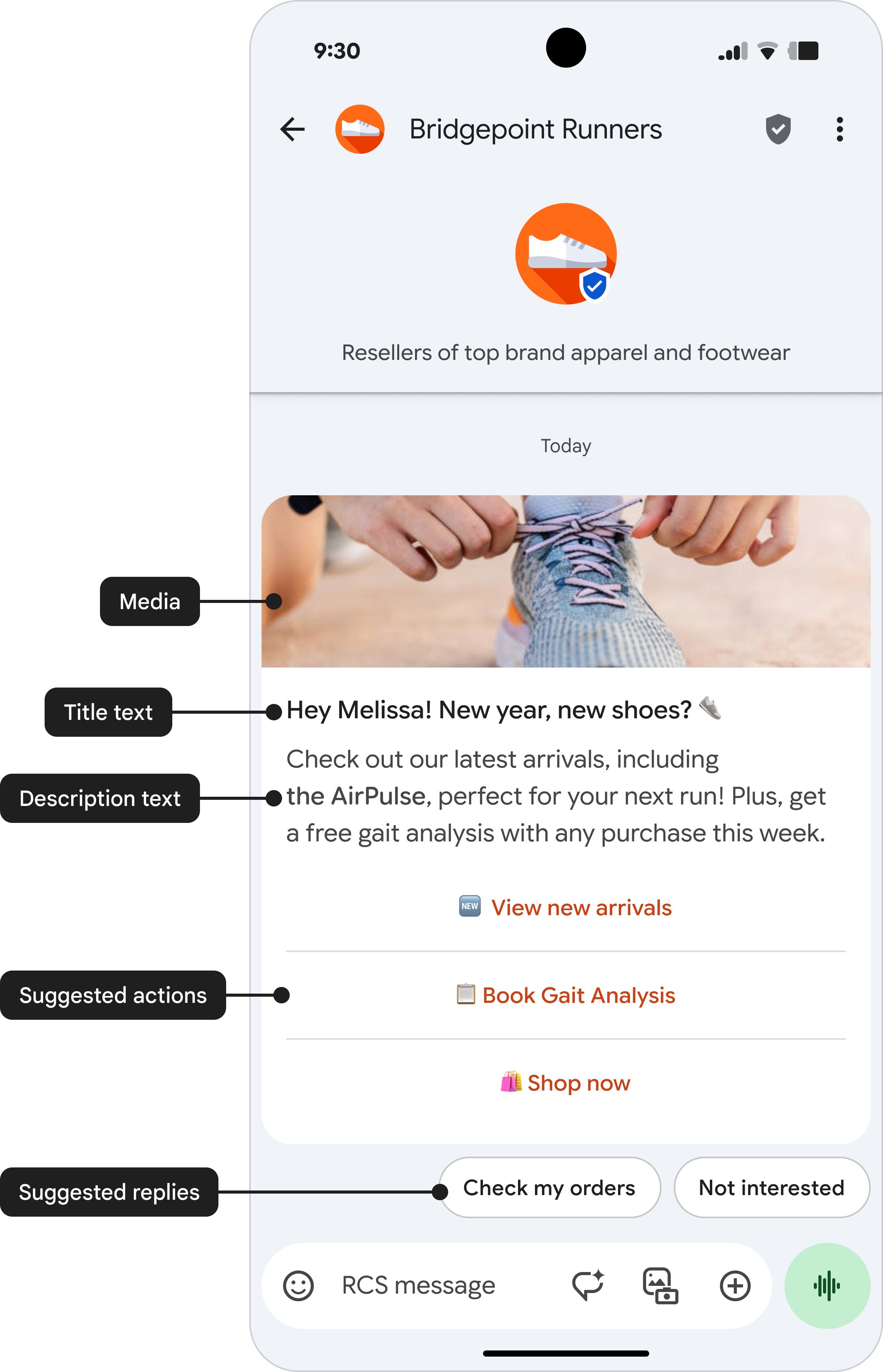
Rich cards combine media, text, and suggestions in one message. They focus on a single topic and offer clear actions to users.
A rich card can contain the following:
- Media (image/GIF, video, or PDF file)
- Title text
- Description text
- Suggested replies and actions.
Each of these fields is optional, but at least one of the fields 1–3 must be included in the rich card.
Rich card components
Media
Rich cards can include various media, such as images, GIFs, videos, and PDF files. Rich cards support a variety of media formats.
Supported image types:
- JPEG/JPG
- GIF
- PNG
Supported video types:
- H.263
- M4V
- MP4
- MPEG
- MPEG-4
- WebM
Supported file types (only available in India on the Google Messages client):
You can choose between three media heights for a rich card:
| Media type | Media height |
|---|---|
| Short media | 112 DP |
| Medium media | 168 DP |
| Tall media | 264 DP |
DP stands for density-independent pixels, which are units designed to provide a consistent physical size for UI elements across screens with different pixel densities.
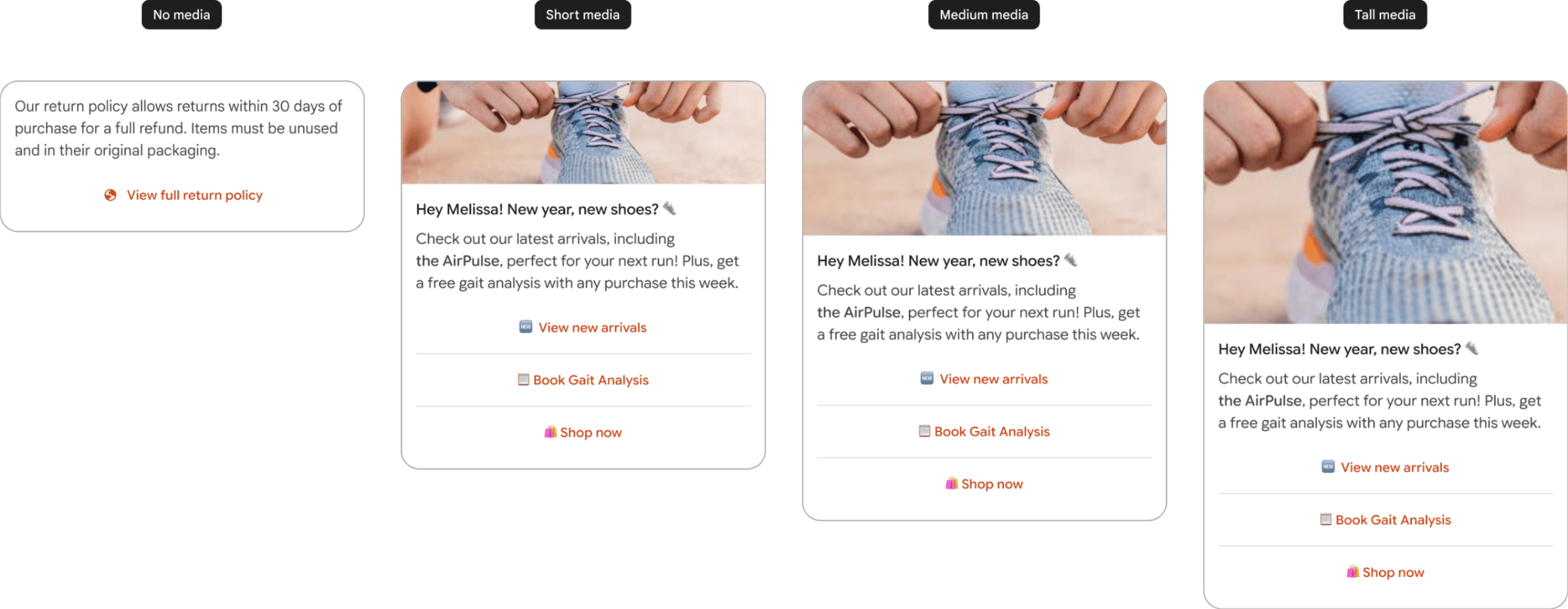
If the media's dimensions don't match the selected height, the system automatically zooms and centrally crops the media. This cropping may result in an undesirable preview. To display the exact image you want, specify a thumbnail. Clicking the preview or thumbnail opens a full-screen view of the media file.
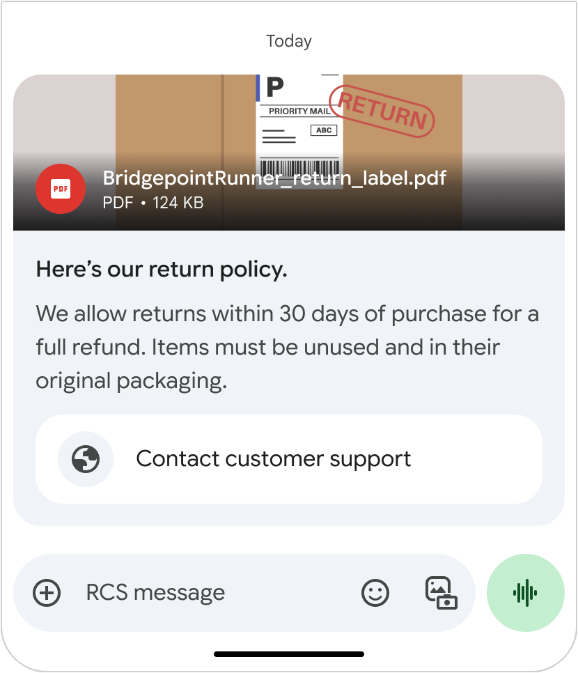
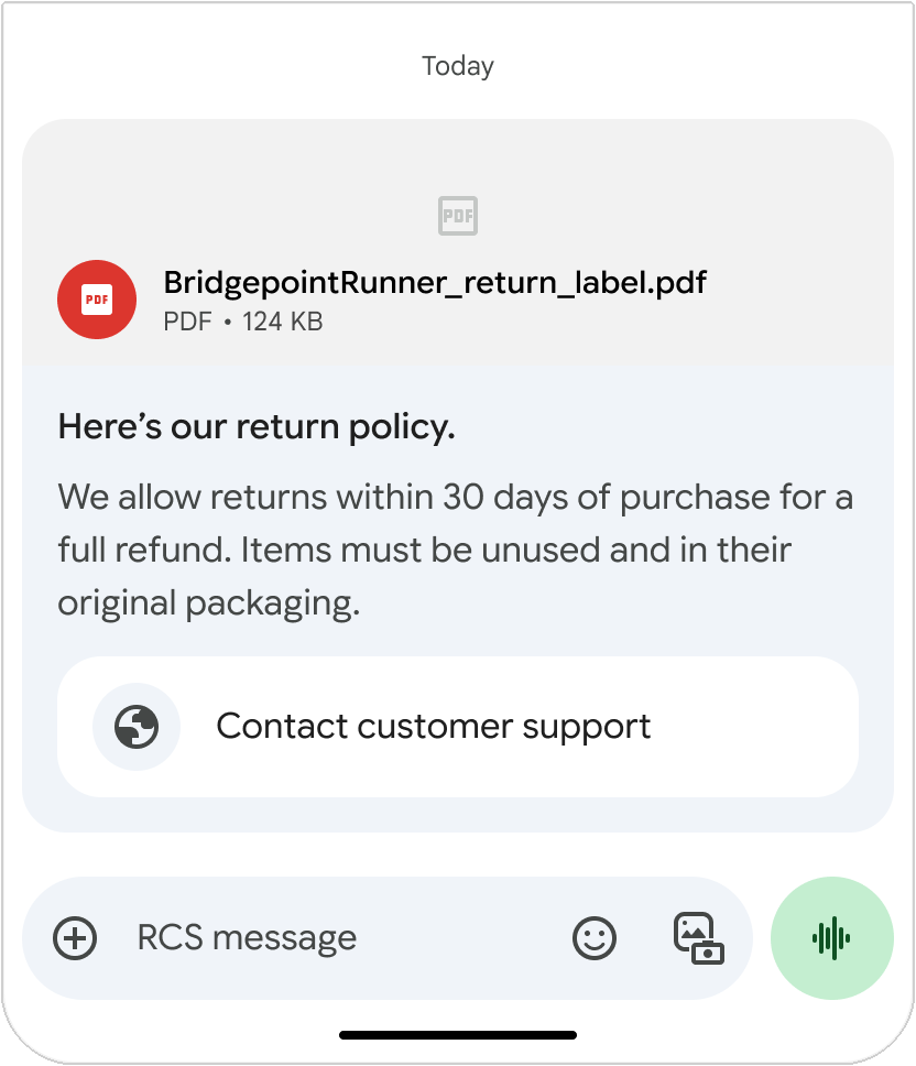
PDF files display a preview image based on the first page of the PDF file, even if a thumbnail is provided. Clicking the preview image opens the file in a PDF viewer. When a preview is not available (for example, when the file is password-protected), the PDF file displays the thumbnail image, or a default icon if a thumbnail isn't specified.
Upload media by either specifying a URL or directly uploading a file. You can find more information on the Send messages page.
Thumbnail
The maximum file size of a thumbnail is 100 kB. For optimal user experience, we recommend it to be 50 kB or less. If you don't provide a thumbnail, a default icon is shown instead. The thumbnail remains visible during file download, even if the download fails, and also serves as the preview for downloaded videos. Tapping the thumbnail or default icon opens a full-screen view of the media file.

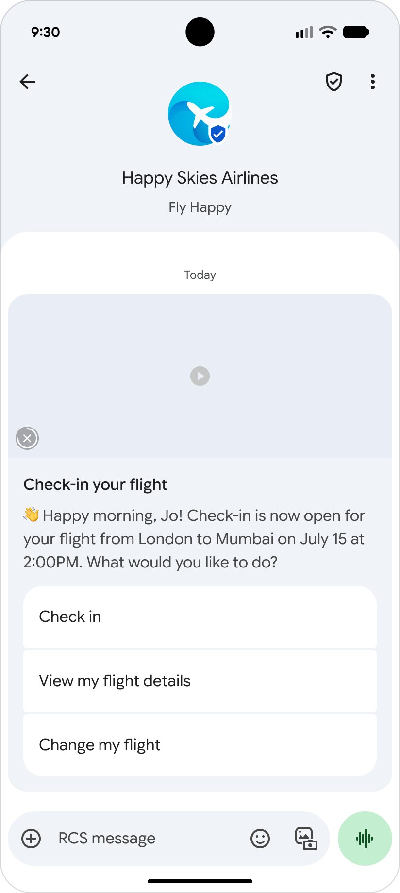
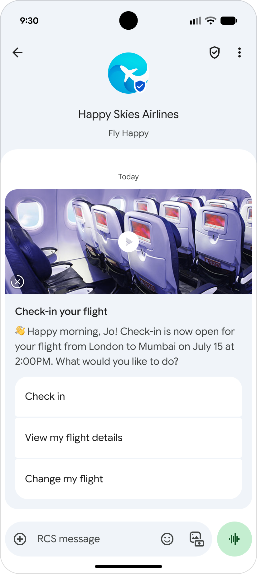
Title text
The title of your rich card is like a headline that captures the user's attention and gives them a clear idea of what your message is about. Make sure it's concise and informative. It can be up to 200 characters long.
Description
The rich card description includes essential supporting information. This is where you elaborate on the title, highlight key benefits, and drive conversions with a clear call to action. The description can be up to 2000 characters long.
Suggested replies and actions
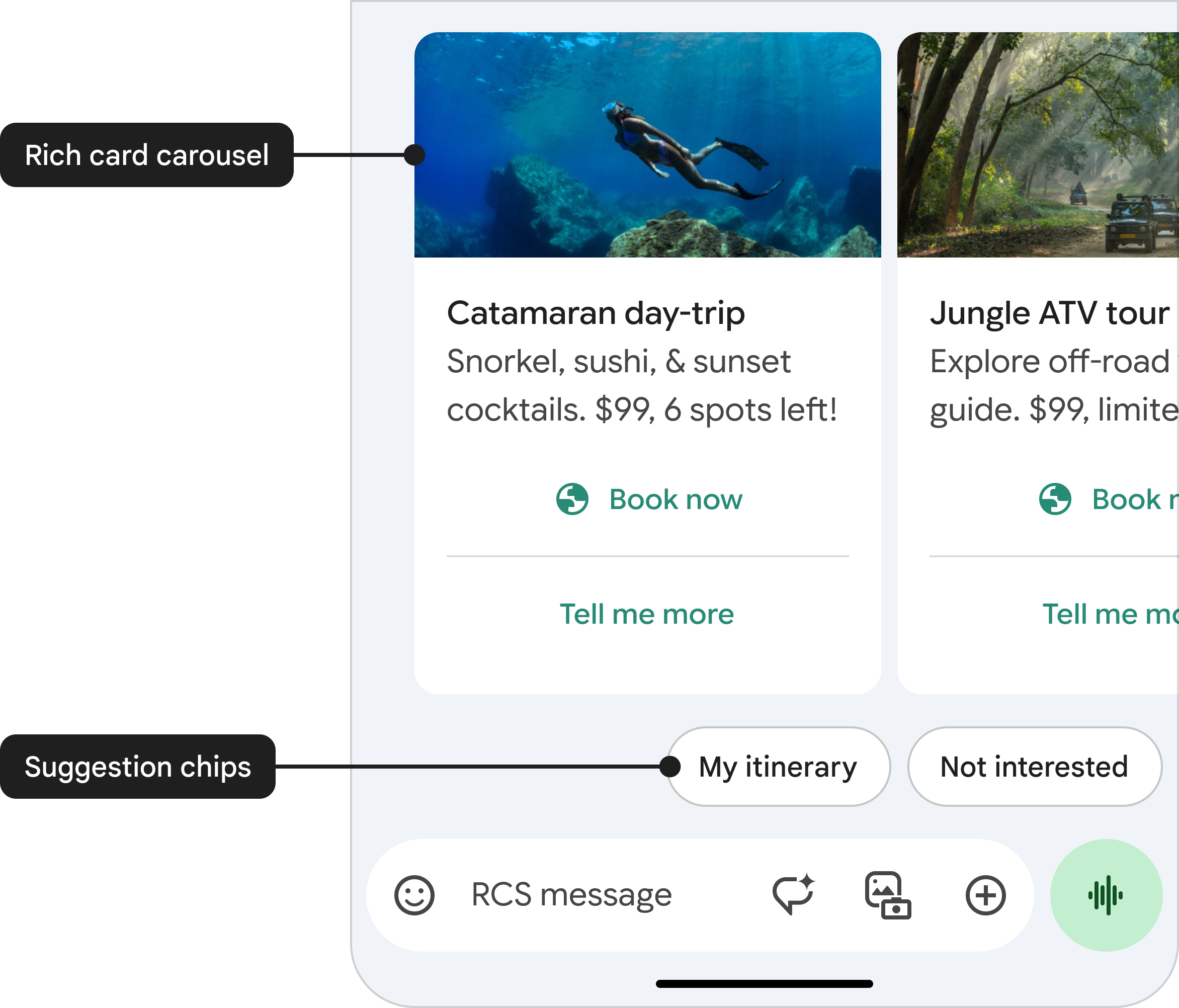
Each rich card can contain up to four suggested replies and suggested actions. In addition, you can add up to 11 suggestions below your card in a chip list, much like you would add suggestions to a text message. Suggested replies and actions within a chip list are a way of advancing the conversation. They shouldn't repeat the options listed within the rich card, and they are not selection tools for the items presented in a carousel.
You can find detailed information about suggestions in this article.
Suggested replies
Suggested replies help users interact with your agent in ways that it can easily respond to. Unless the interaction requires a freeform response, use suggested replies. They're easier to process than freeform text and they allow your agent to steer conversations down an optimal path.
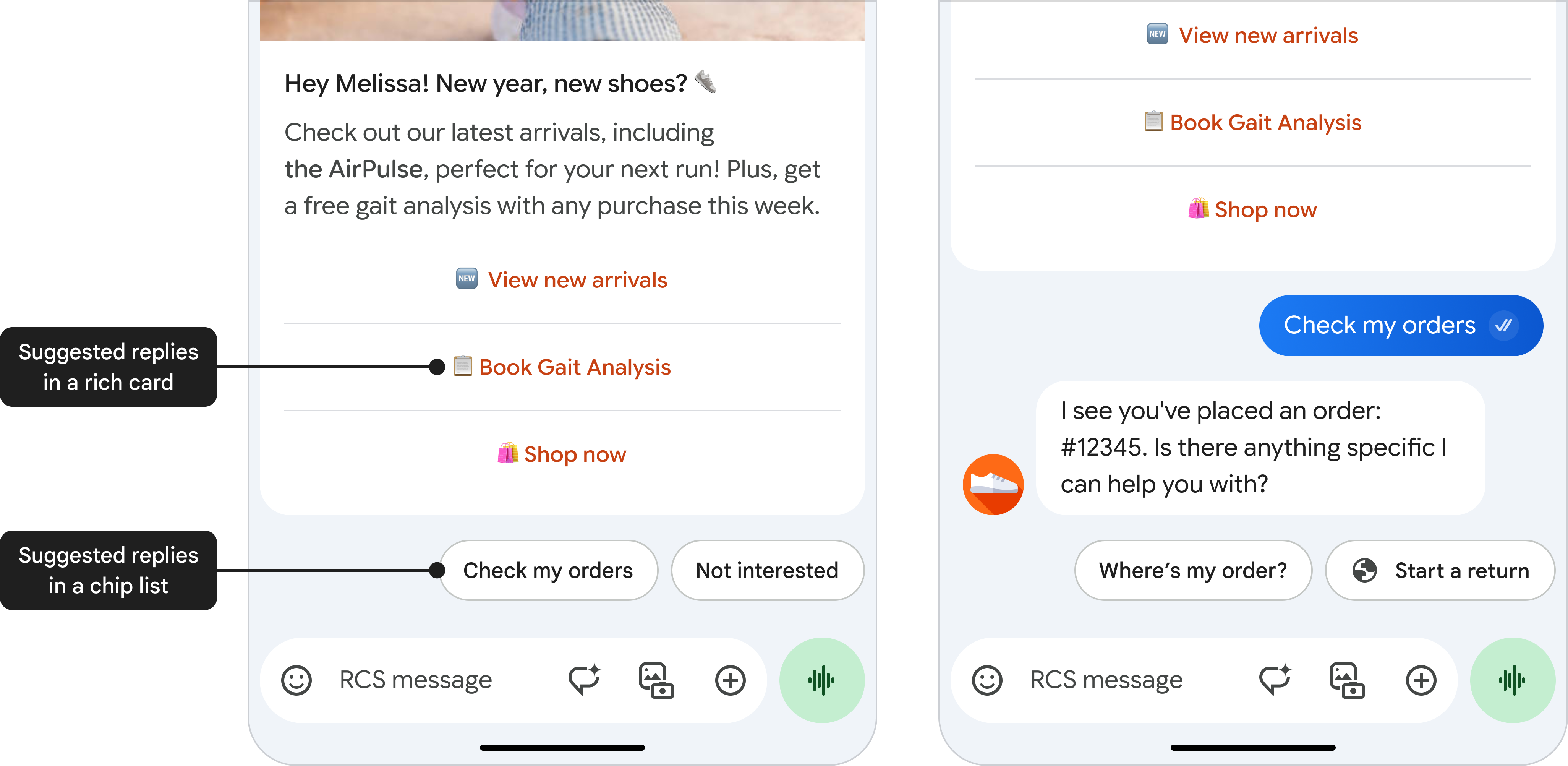
Suggested replies can be up to 25 characters long.
Suggested actions
Suggested actions allow an agent to hook into native device actions and they provide a tightly integrated experience for the user. When relevant, suggested actions can make it easy to call customer support or find a location on the map.
But don't overwhelm users with options. Only provide actions that are related to the most recent message, and only provide as many actions as necessary. Limit the number of suggested actions and suggested replies to what is useful to the user in a given context.
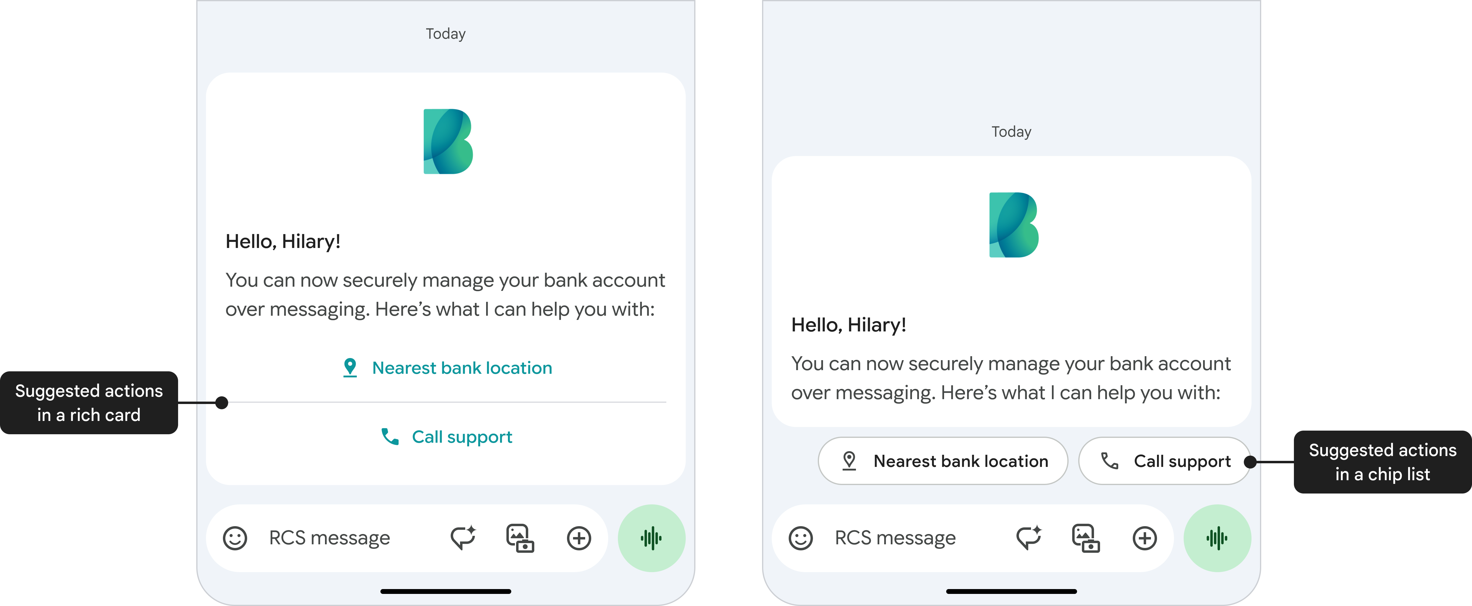
Suggested actions can be up to 25 characters long.
Rich card layout
Rich cards can have either a vertical or horizontal layout.
Vertical rich cards

Vertical rich cards display horizontal media at the top of the card. The minimum height of a vertical rich card is 112 DP.
Media used in a vertical rich card can have the following height:
- Short: 112 DP
- Medium: 168 DP
- Tall: 264 DP
Media used in a vertical rich card can have an aspect ratio of:
- 2:1
- 16:9
- 7:3
Horizontal rich cards
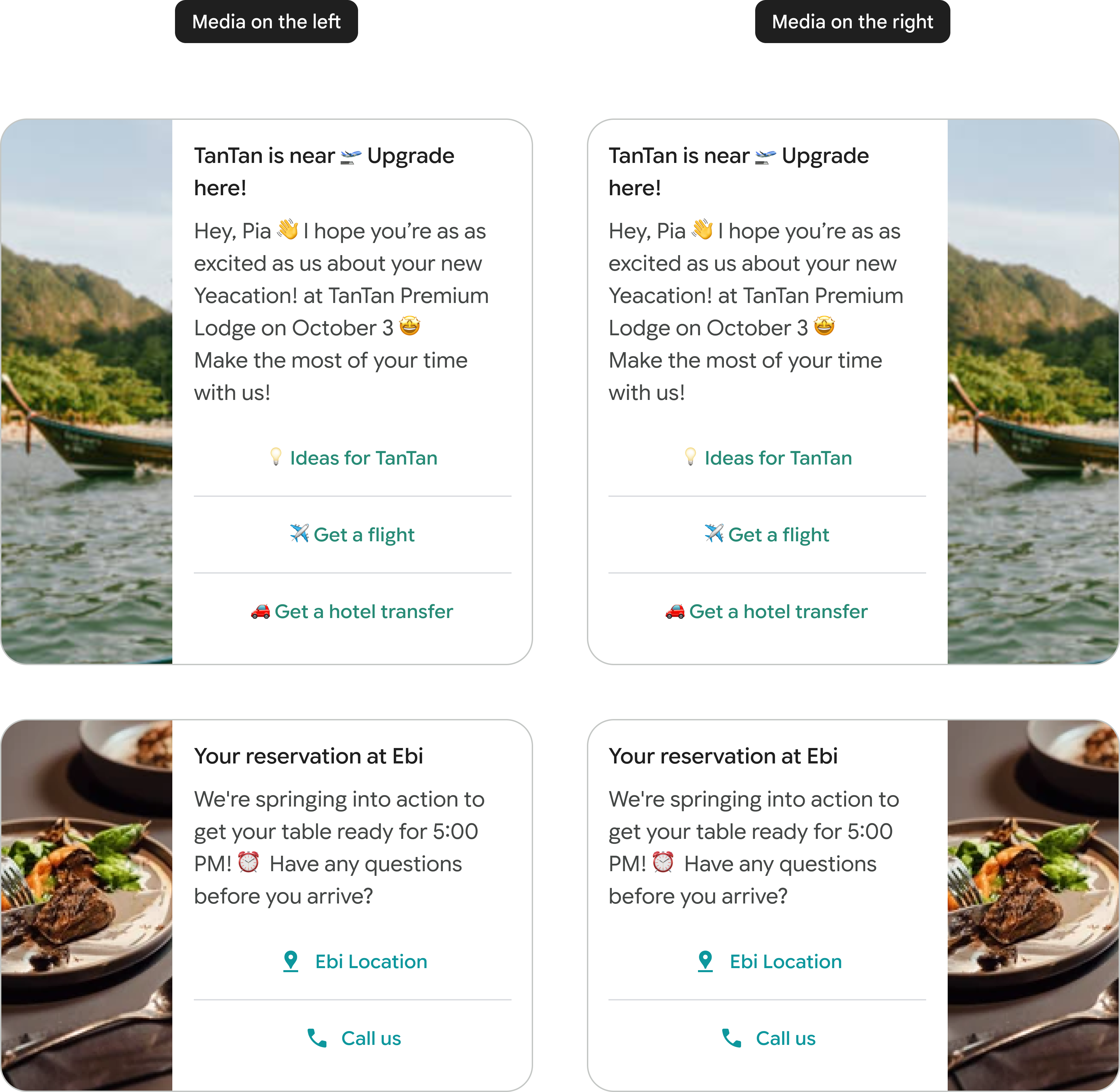
Horizontal rich cards display media on the left or right side of the card.
A horizontal rich card doesn't have a fixed media ratio, but a fixed width of 128 DP. The height scales to the height of the text elements in the card.
Rich card carousels
You can send a standalone rich card or a carousel of rich cards.
Rich card carousels are ideal for showcasing multiple items, such as data plans or devices, allowing users to browse and compare different options within a single message. A carousel is ideal when you want to present a variety of choices or enable exploration of related content.
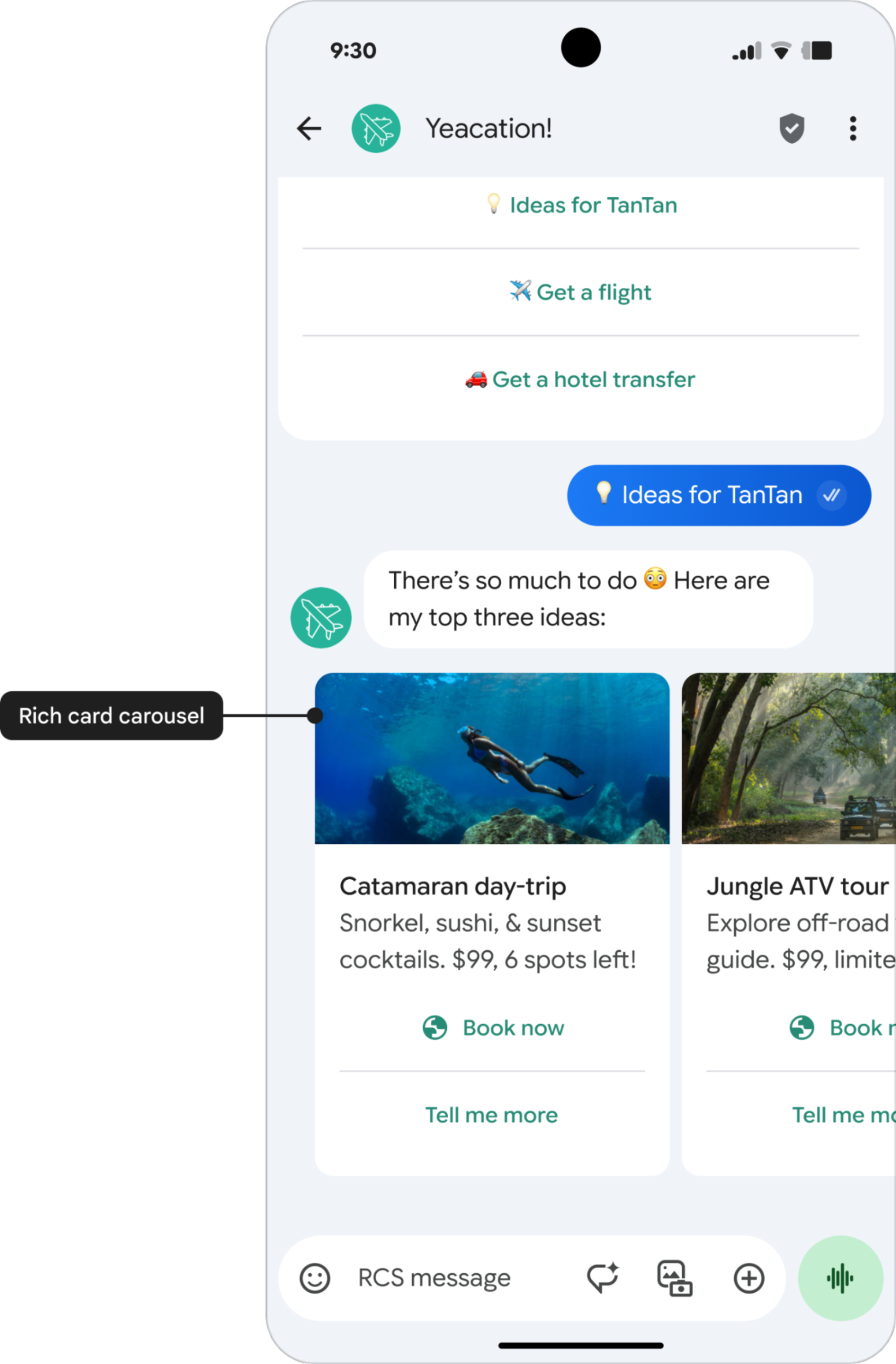
The first item in a carousel should be the optimal choice, and the reason why should be clear to the user. You can have up to ten cards in a rich card carousel. Rich card carousels can contain only vertical rich cards.
Similar to a standalone rich card message, you can include suggestion chips below a carousel to move the conversation forward. Suggestion chips shouldn't repeat the options listed within the carousel, and they are not selection tools for the items presented in the carousel.
Carousel specifications
| Specification | Details |
|---|---|
| Title | Maximum 200 characters |
| Description | Maximum 2000 characters |
| Height | • Small carousels: maximum height of 542 DP • Medium carousels: maximum height of 592 DP All cards within a carousel will be scaled to match the height of the tallest card. For details on how content is adjusted to fit this height, see Content sizing and truncation. |
| Width | Choose one of the following options: • Small: 180 DP (fixed width) • Medium: 296 DP (fixed width) |
Content sizing and truncation
If the contents of a rich card carousel aren't large enough to fill the minimum height, extra whitespace will be added at the bottom. If the contents exceed the maximum height, they will be truncated in the following order:
- Description, reduced to a single line.
- Title, reduced to a single line.
- Suggestions, removed entirely.
- Description, removed entirely.
- Title, removed entirely.
To solve this truncation issue, so users can always see the full content, RCS for Business provides an expandable, full-screen view for cards in a carousel. For more details on this feature, see Full-screen view for carousels.
Full-screen view for carousels
To prevent text or suggestions from getting lost in truncation, RCS for Business provides a full-screen view for rich card carousels. This lets designers use the full text limits, knowing users can expand the card to see the complete message.
Key details for developers
- No action required: This feature is enabled automatically for all rich card carousels.
- Scope: Applies only to rich card carousels. Standalone rich cards are not affected.
- Limits: All existing character and suggestion limits for titles (200), descriptions (2000), and suggestions (4) remain the same.
Open and close full-screen view
To open: When content on a card is truncated, a More button appears at the end of the visible text. A user can tap anywhere on the card's text area or on the More button to open the full-screen view.
To close: Users can exit the full-screen view in the following ways:
- Tap the X button in the top-left corner.
- Use the system back button or back gesture navigation.
- Tap a suggestion that continues the conversation.
Navigation in full-screen view
The full-screen view allows for both vertical scrolling within a card and horizontal swiping between cards.
- Vertical scrolling: If a card's text is still longer than the full-screen view, the text and media area becomes vertically scrollable. The suggestions remain "floating" and always visible at the bottom of the screen.
- Horizontal swiping: In full-screen view, users can swipe horizontally to move to the next or previous card in the carousel.
Vertical scrolling
Horizontal swiping
Specifications for full-screen view
When a card is expanded, it uses a standardized full-screen layout.
| Specification | Details |
|---|---|
| Media height | 264 DP The media height in full-screen view always uses the Tall media setting. |
| Media width | screenwidth - 32 DP Media expands to fill the screen width with 16 DP margins on each side. The same central cropping rules apply. |
How suggestions work in full-screen view
When a user taps a suggestion in full-screen view, the resulting behavior depends on the suggestion type:
| Suggestion type | Behavior |
|---|---|
| Open URL action | The URL opens in the default browser or a webview overlay. When the user navigates back to Google Messages, the full-screen view is restored. |
| Dial, View Location, and Create a Calendar Event actions | The corresponding app opens. Upon returning to Google Messages, the full-screen view is restored. |
| Share Location action | The full-screen view closes, and Google Maps opens. After the user sends their location, they automatically return to the standard chat view. |
| Suggested reply | The full-screen view closes, and the reply is sent in the standard chat view, continuing the conversation. |
Limits
Rich card titles are limited to 200 characters, whereas descriptions can be up to 2000 characters. Keep in mind that special characters, such as emoji or a multi-byte character set, count as 2–4 characters or more.
Media in a rich card or a rich card carousel can have the following height:
- Short: 112 DP
- Medium: 168 DP
- Tall: 264 DP
For all elements (media, titles, descriptions, and buttons) to display correctly in your rich card or carousel, they must adhere to the specified character and size limits.
The maximum size of a rich card payload is 250 KB.