Page Summary
-
These guidelines provide instructions for implementing the Google Wallet API to enable users to save passes to Google Pay within apps or websites.
-
The "Save to Google Pay" button must adhere to specific brand guidelines, including size, style, and clear space requirements, and should be used consistently.
-
Strategic button placement is crucial, with recommendations for optimal placement near loyalty information, purchase confirmations, and offer displays to maximize saved objects.
-
When referring to Google Pay in text, ensure to capitalize "G" and "P", avoid abbreviations and translations, and maintain consistency with your overall UI style.
These guidelines are meant to help you implement the Google Wallet API within your apps or websites.
Save to Google Pay button
The Save to Google Pay button must call one of the Google Pay API for Passes flows. These flows surface a screen where users can save boarding passes, event or transit tickets, loyalty cards, gift cards, and offers to their Android device. This button can be used in merchant apps, websites, emails, or SMS.
Assets
The Save to Google Pay buttons are available as EPS and SVG files.
Download assets - EPS Download assets - SVG
All Save to Google Pay buttons displayed on your site, app, or email communications must adhere to our brand guidelines, which are described on this page. They include, but aren't limited to, the following:
- Size relative to other similar buttons or elements of the page
- Contrast with the background color of the surrounding area
- Clear space
The Save to Google Pay buttons are available in the following languages: Arabic, Croatian, Czech, Danish, Dutch, English, Finnish, French, German, Indonesian, Italian, Japanese, Korean, Norwegian (Bokmal), Polish, Portuguese, Russian, Simplified Chinese, Slovak, Spanish, Swedish, Thai, Traditional Chinese, and Ukranian.
Size
Adjust the height and width of the Save to Google Pay button to fit your layout. If there are other buttons on the page, the Save to Google Pay button needs to be equal in size to or larger than these buttons. Do not make the Save to Google Pay button smaller than other buttons.
Style
The Save to Google Pay buttons are available in three variations: black, white, and white with a black outline. Buttons with localized versions of the text are provided. Do not create buttons with your own localized text.
 |
 |
 |
| Black | White | White with outline |
| Use the black button on white or light backgrounds to provide contrast. Do not use the black button on dark backgrounds. Instead, use the white button. | Use the white button on dark or colorful backgrounds. Do not use the white button on white or light backgrounds. Instead, use the black button or the white button with an outline. | Use the white button with an outline as an alternative to the black button on white or light backgrounds. Do not use this button on dark or colorful backgrounds; use the standard white button instead. |
Clear space
Always maintain the minimum clear space of 8 dp on all sides of the Save to Google Pay button. Ensure that the clear space is never broken with graphics or text.

Minimum height
All Save to Google Pay buttons need to have a minimum height of 36 dp.

Dos and don’ts
| Dos | Don'ts |
|---|---|
| Do: Use only the Save to Google Pay buttons provided by Google. | Don't: Don't create your own Save to Google Pay buttons or alter the font, color, button radius, or padding within the button in any way. |
| Do: Use the same style of button throughout your site. Button color may adapt if the color of the background changes. | Don't: Don't make the Save to Google Pay buttons smaller than other buttons. |
| Do: Ensure that the size of the Save to Google Pay buttons remains equal to or larger than other buttons. | Don't: Don't use a button color that's similar to the background. For example, don't use the white button on a white background. |
| Do: Ensure that you choose a button color that contrasts with your background. | Don't: Don’t free scale the button. |
| Do: Keep the button ratio the same when resizing the Save to Google Pay buttons. |
Best practices for button placement
To maximize the number of saved objects, display the Save to Google Pay buttons prominently within your app, website, or email. You need to adhere to the following best practices in order to receive brand approval from Google.
Loyalty cards
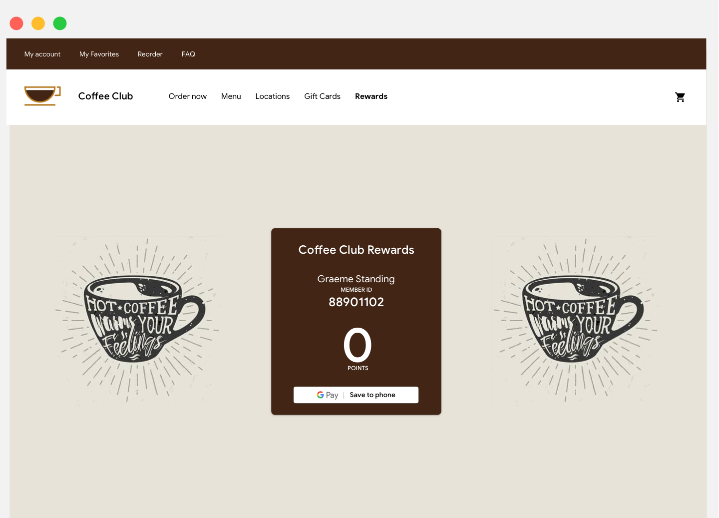
We recommend that you place the Save to Google Pay button near user experiences in your app, site, or email communication where you display current customer loyalty information. It’s also useful to display the button on confirmation screens that surface right after users sign up for your loyalty program in your app or website.

Gift cards
We recommend that you place the Save to Google Pay button on the confirmation screen that surfaces after a user purchases a gift card in your app or website. It’s also a good idea to display the button in any email communication delivered to the gift card recipient.
Offers
We recommend that you place the Save to Google Pay button near screens or pages in your app or website where users access offers. For better results, it’s highly recommended that you include the button in any email communication about the offer.
Event and transit tickets
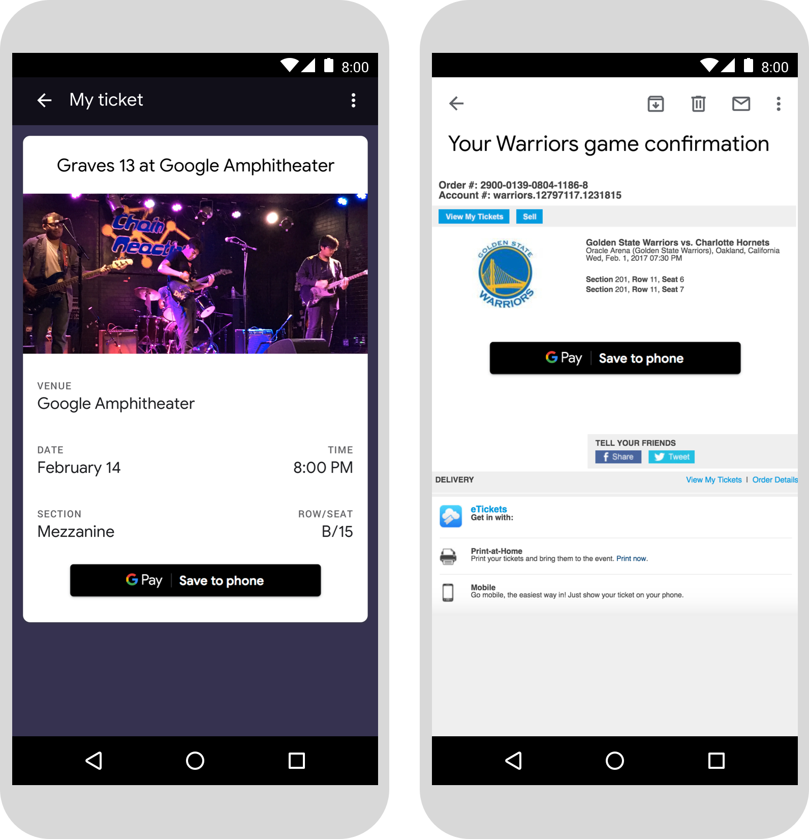
Display the Save to Google Pay button at the end of your purchase flow or on confirmation app screens, web pages, or emails. We recommend that you place the Save to Google Pay button where users access their tickets in your app or website.

Boarding passes
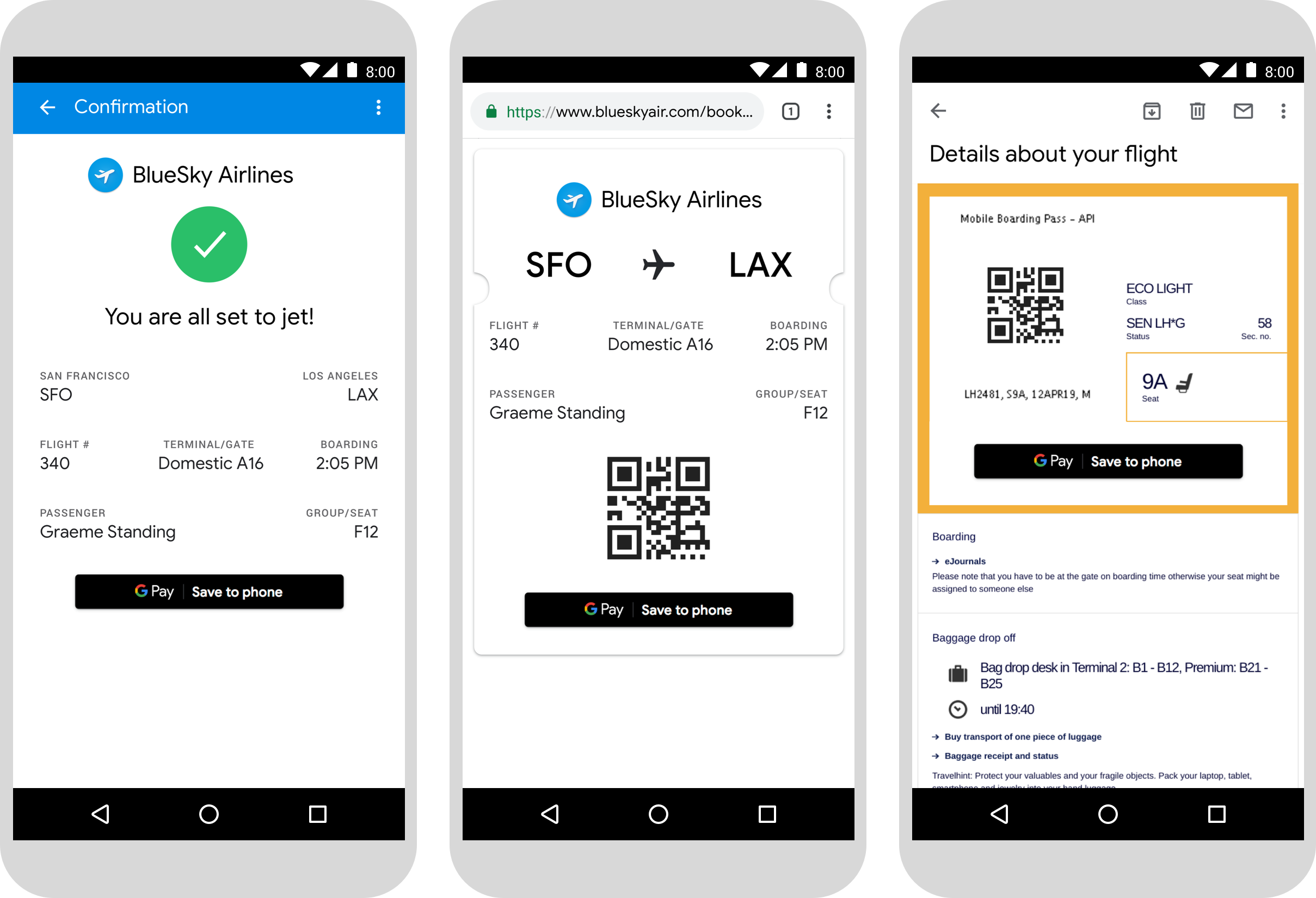
Display the Save to Google Pay button at the end of your purchase flow or on confirmation app screens, web pages, or emails. You can also display the button where passengers check in to their flights or view their boarding passes on your website or app, or include it in relevant emails.

Use of the Google Pay product name in text
You can use text to indicate to the user that their boarding pass, event or transit ticket, loyalty card, gift card, or offer has been saved to their device.
Capitalize the letters "G" and "P"
Always use an uppercase "G" and an uppercase "P" followed by lowercase letters to refer to Google Pay. Don't capitalize the full name "GOOGLE PAY" unless it's to match the typographic style in your UI.
Don't abbreviate Google Pay
Always write out the words "Google" and "Pay."
Match the style in your UI
Set "Google Pay" in the same font and typographic style as the rest of the text in your UI. Do not mimic Google's typographic style.
Don't translate Google Pay
Always write "Google Pay" in English. Do not translate it to another language.
