
AMP makes it easier to build reliable, responsive, performant web pages. AMP lets you create common site interactions without writing JavaScript. The amp.dev website includes predesigned, quick-start templates.
What you'll build
In this codelab, you'll build a fully-responsive, interactive, beautiful AMP page that incorporates many of AMP's features and extended components:
|
|
|
What you'll need
- A modern web browser
- Node.js and a text editor or access to CodePen or a similar online playground
- Basic knowledge of HTML, CSS, JavaScript, and Google Chrome Developer Tools
Tooling for serving content
We'll use Node.js to run a local HTTP server to serve our AMP page. Check the Node.js website to learn how to install it.
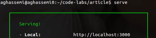
Our tool of choice to serve content locally will be serve, a Node.js-based static content server. To install it, run the following command:
npm install -g serve
Download a template from amp.dev
AMP Templates is a repository of quick-start AMP templates and components to help you to create modern, responsive AMP pages quickly.
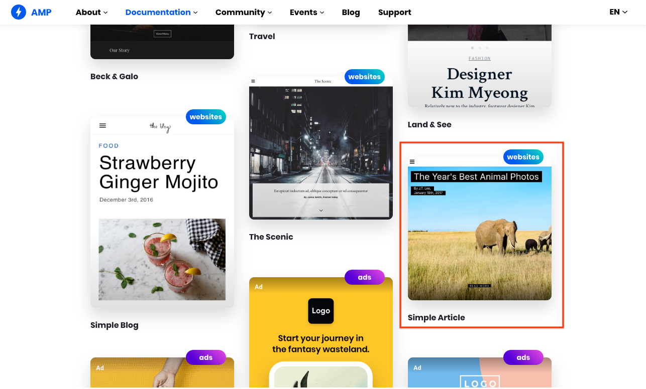
Visit AMP Templates and download the code for the "Simple Article" for "The Year's Best Animal Photos" template.
Running the template code
Extract the contents of the ZIP file.
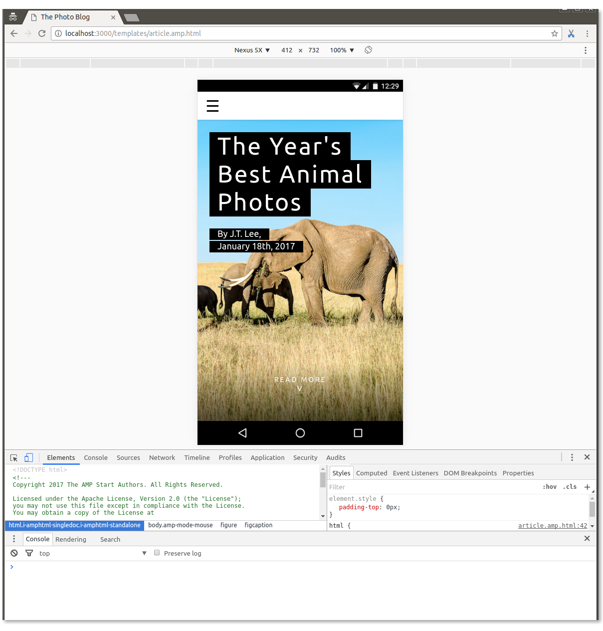
Run the command serve inside the article folder to serve the files locally.
Visit http://localhost:5000/templates/article.amp.html in your browser. (The port might be 3000 or a different number depending on the version of serve. Check the console for the exact address.)
While we are at it, let's open the Chrome DevTools and toggle the Device mode as well.
Trim the template code
At this point, we've scaffolded a mostly functioning AMP page, but the purpose of this codelab is for you to learn and practice, so...
Delete everything inside the <body></body>.
Now we are left with an empty page containing only some boilerplate code:
Throughout this codelab, you'll add many components to this empty page, partially recreating the template with even more functionality.
An AMP page is an HTML page with extra tags and with some restrictions for reliable performance.
Though most tags in an AMP page are regular HTML tags, some HTML tags are replaced with AMP-specific tags. These custom elements, called AMP HTML components, make common patterns easy to implement in a performant way.
The simplest AMP HTML file looks like this (sometimes referred to as AMP boilerplate):
<!doctype html>
<html ⚡>
 <head>
   <meta charset="utf-8">
   <link rel="canonical" href="hello-world.html">
   <meta name="viewport" content="width=device-width,minimum-scale=1,initial-scale=1">
   <style amp-boilerplate>body{-webkit-animation:-amp-start 8s steps(1,end) 0s 1 normal both;-moz-animation:-amp-start 8s steps(1,end) 0s 1 normal both;-ms-animation:-amp-start 8s steps(1,end) 0s 1 normal both;animation:-amp-start 8s steps(1,end) 0s 1 normal both}@-webkit-keyframes -amp-start{from{visibility:hidden}to{visibility:visible}}@-moz-keyframes -amp-start{from{visibility:hidden}to{visibility:visible}}@-ms-keyframes -amp-start{from{visibility:hidden}to{visibility:visible}}@-o-keyframes -amp-start{from{visibility:hidden}to{visibility:visible}}@keyframes -amp-start{from{visibility:hidden}to{visibility:visible}}</style><noscript><style amp-boilerplate>body{-webkit-animation:none;-moz-animation:none;-ms-animation:none;animation:none}</style></noscript>
   <script async src="https://cdn.ampproject.org/v0.js"></script>
 </head>
 <body>Hello World!</body>
</html>
Take a look at the code of the empty page that you created during setup, which includes this boilerplate and has a few additions—importantly, a <style amp-custom> tag that includes lots of minified CSS.
AMP is not opinionated about design and does not enforce a particular set of styles. Most AMP components have very basic styling. It is left to the page authors to provide their custom CSS. That's where <style amp-custom> comes into play.
AMP Templates, however, provides its own opinionated CSS styles that are beautifully designed, cross-browser, and responsive to help you to build elegant AMP pages quickly. The template code you have downloaded includes these opinionated CSS styles in <style amp-custom>.
We'll start by adding back some of the components that we removed from the template, to create a shell for our page, including a navigation menu, page header image, and title.
We'll get help from the AMP Start UI components page, but we won't dig deep into their implementation details. Later steps in the codelab will provide plenty of opportunities to do so.
Add responsive navigation
Head to https://ampstart.com/components#navigation and copy and paste the HTML code provided for RESPONSIVE MENUBAR into the body of your page.
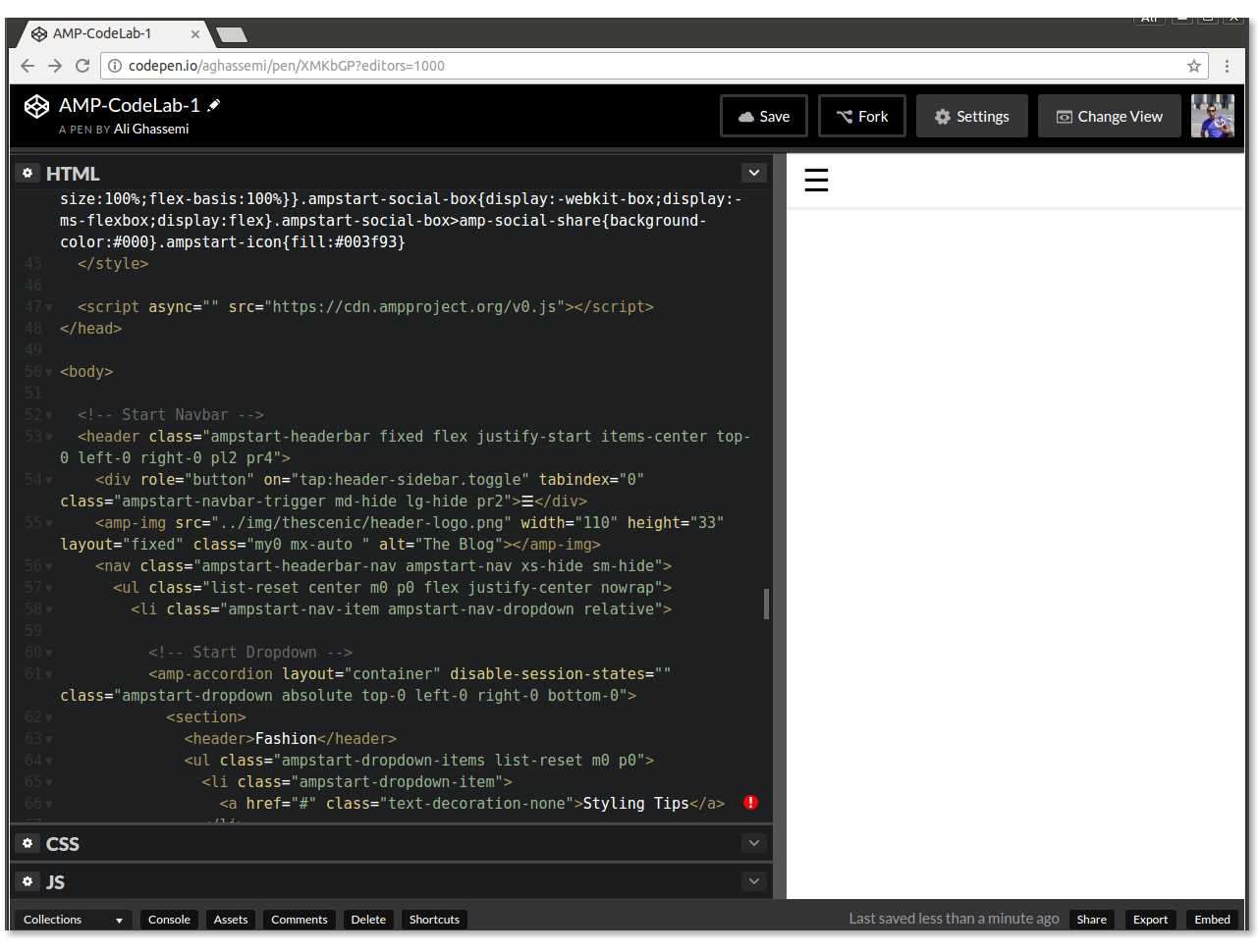
The code provided by AMP Start includes the necessary HTML and CSS class structure to implement a responsive navigation bar for your page.
Try it out: Resize your window to see how it responds to different screen sizes.
|
|
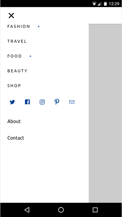
This code uses CSS media queries and the amp-sidebar and amp-accordion AMP components.
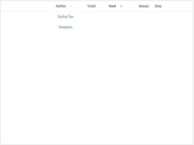
Add hero image and title
AMP Start provides ready-to-use snippets for beautiful, responsive hero images and titles, as well.
Head to https://ampstart.com/components#media and copy and paste the HTML code provided for Fullpage Hero into your code, right after the <!-- End Navbar --> comment in body.
Let's update the image and the title now.
As you may have noticed, there are two different amp-img tags in the code snippet. One is used for smaller widths and should point to a lower-resolution image, and the other one is for larger displays. They are toggled automatically based on the media attribute, which AMP supports on all AMP elements.
Update the src, width, and height to different images and the title to "Most Beautiful Hikes in the Pacific Northwest" by replacing the existing <figure>...</figure> with:
<figure class="ampstart-image-fullpage-hero m0 relative mb4">
    <amp-img width="600" height="900" layout="responsive" src="https://unsplash.it/600/900?image=1003" media="(max-width: 415px)"></amp-img>
    <amp-img height="1800" layout="fixed-height" src="https://unsplash.it/1200/1800?image=1003" media="(min-width: 416px)"></amp-img>
    <figcaption class="absolute top-0 right-0 bottom-0 left-0">
      <header class="p3">
        <h1 class="ampstart-fullpage-hero-heading mb3">
        <span class="ampstart-fullpage-hero-heading-text">
          Most Beautiful Hikes in the Pacific Northwest
        </span>
      </h1>
        <span class="ampstart-image-credit h4">
        By <a href="#" role="author" class="text-decoration-none">D.F. Roy</a>,<br> January 14, 2017
      </span>
      </header>
      <footer class="absolute left-0 right-0 bottom-0">
        <a class="ampstart-readmore py3 caps line-height-2 text-decoration-none center block h5" href="#content">Read more</a>
      </footer>
    </figcaption>
</figure>
Let's take a look at the page now:

Summary
- You created a shell for your page, including responsive navigation and a hero image and title.
- You learned more about AMP Templates and used the AMP Start UI components to quickly put together a page shell.
The completed code for this section can be found here: http://codepen.io/aghassemi/pen/RpRdzV
In this section we'll add responsive images, videos, embeds, and some text to our page.
Let's add a main element that will host the content of the page. We'll add it to the end of body:
<main id="content">

</main>
Add headings and paragraphs
Add the following inside main:
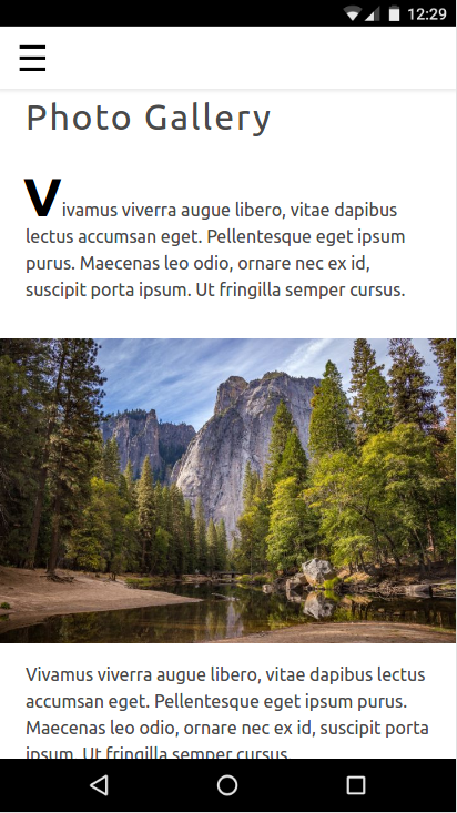
<h2 class="px3 pt2 mb2">Photo Gallery</h2>
<p class="ampstart-dropcap mb4 px3">Vivamus viverra augue libero, vitae dapibus lectus accumsan eget. Pellentesque eget ipsum purus. Maecenas leo odio, ornare nec ex id, suscipit porta ipsum. Ut fringilla semper cursus.</p>
Since AMP is just HTML, there is nothing special about this code except for those CSS class names. What are px3, mb2, and ampstart-dropcap? Where are they coming from?
These classes are not part of AMP HTML. The AMP Start templates use Basscss to provide a low-level CSS toolkit and add classes specific to AMP Start.
In this snippet, px3 and mb2 are defined by Basscss and translate to padding-left-right and margin-bottom respectively. ampstart-dropcap is provided by AMP Start and makes the first letter of a paragraph larger.
You can find documentation for these pre-defined CSS classes on http://basscss.com/ and https://ampstart.com/components.
Let's see how the page looks now:
Add an image
Making responsive pages is easy in AMP. In many cases, making an AMP component responsive is as simple as adding a layout="responsive" attribute. Similar to the HTML img tag, amp-img also supports srcset to specify different images for varying viewport widths and pixel densities.
Add an amp-img to main:
<amp-img
  layout="responsive" width="1080" height="720"
  srcset="https://unsplash.it/1080/720?image=1043 1080w, https://unsplash.it/720/480?image=1043 720w"
  alt="Photo of mountains and trees landscape">
</amp-img>
With this code, we are creating a responsive image by specifying layout="responsive" and providing width and height.
Why do I have to specify width and height when using responsive layout?
Two reasons:
- AMP uses width and height to calculate the aspect ratio and maintain the correct height as width changes to fit its parent container.
- AMP enforces static sizing for all elements to ensure a good user experience (no jumps in the page), and to determine each element's size and position to lay out the page before resources are downloaded.
Let's take a look at the page now:
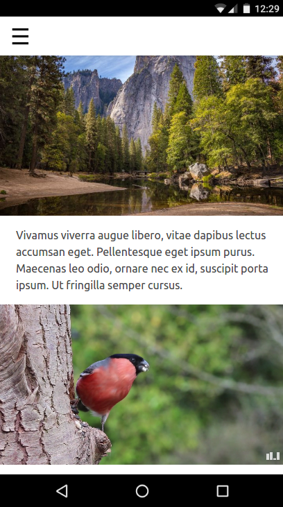
Add an autoplaying video
AMP supports many video players, such as YouTube and Vimeo. AMP has its own version of the HTML5 video element under the amp-video extended component. Some of these video players, including amp-video and amp-youtube support muted autoplay on mobile as well.
Similar to amp-img, amp-video can become responsive with the addition of layout="responsive"
Let's add an autoplaying video to our page.
Add another paragraph and the following amp-video element to main:
<p class="my2 px3">Vivamus viverra augue libero, vitae dapibus lectus accumsan eget. Pellentesque eget ipsum purus. Maecenas leo odio, ornare nec ex id, suscipit porta ipsum. Ut fringilla semper cursus.</p>

<amp-video
  layout="responsive" width="1280" height="720"
  autoplay controls loop
  src="https://storage.googleapis.com/ampconf-76504.appspot.com/Bullfinch%20-%202797.mp4">
</amp-video>Let's take a look:
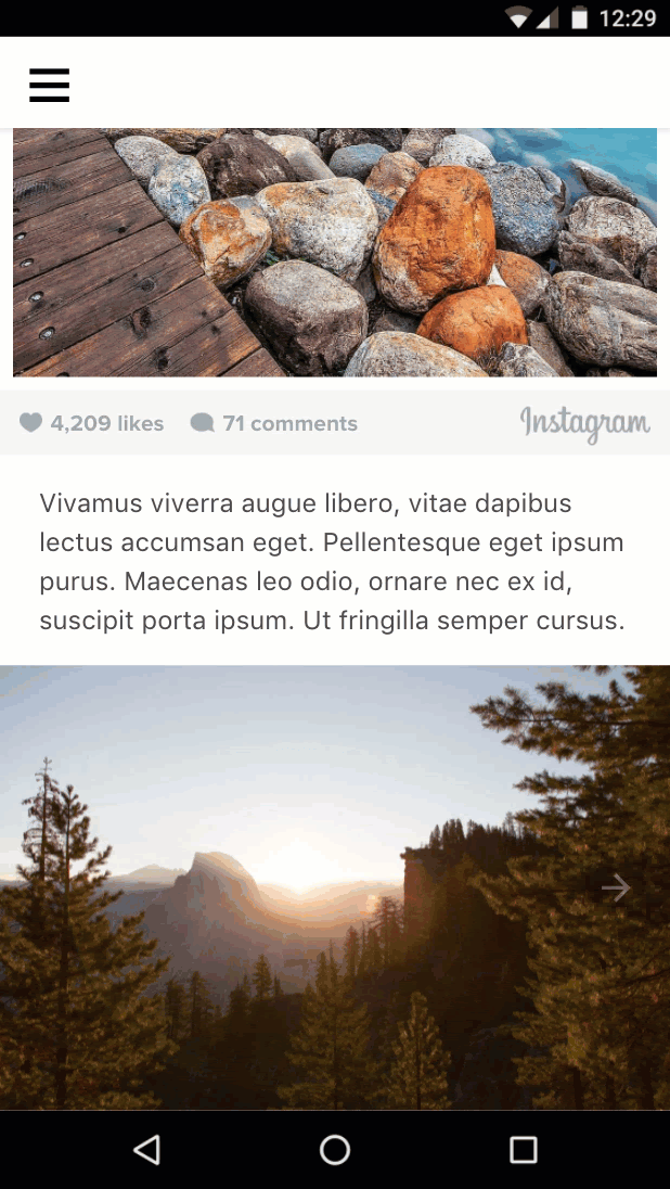
Add an embed
AMP has extended components for many third-party embeds such as Twitter and Instagram. For embeds that lack an AMP component, there is always amp-iframe.
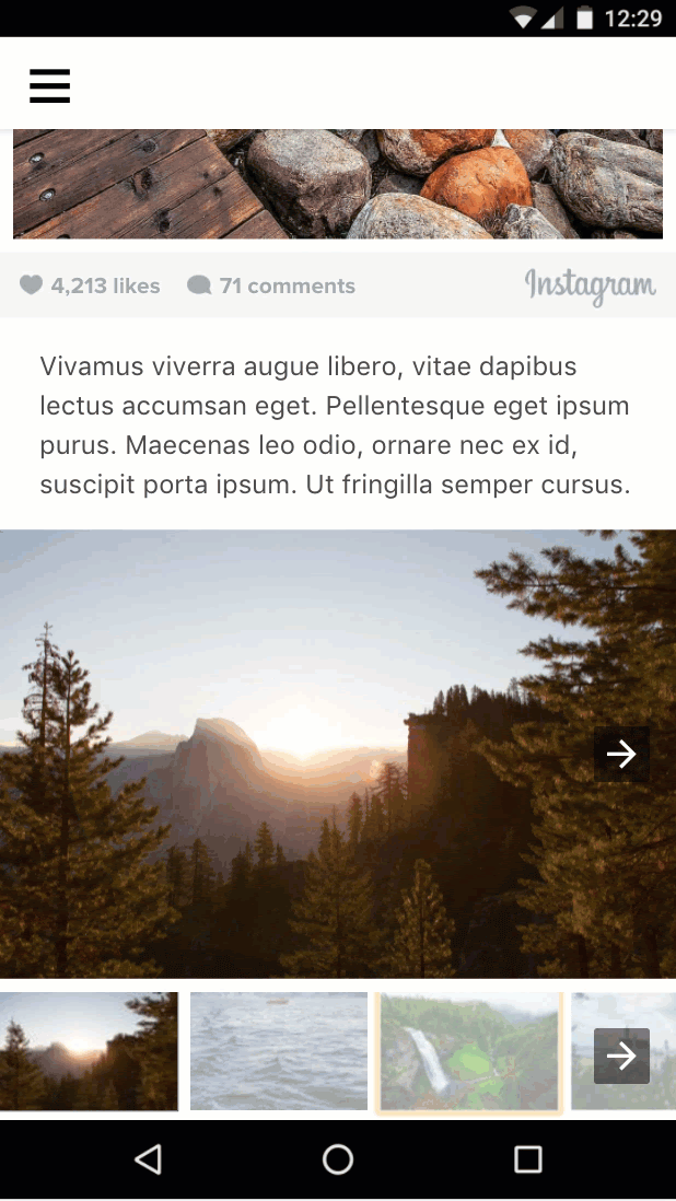
Let's add an Instagram embed to our page.
Unlike amp-img and amp-video, amp-instagram is not a built-in component. The import script tag for it must be included explicitly in the head of the AMP page before the component can be used.
The AMP Start boilerplate that we are using includes several import script tags. Look for them at the beginning of the head tag and ensure that the following import script line is included:
<script custom-element="amp-instagram" src="https://cdn.ampproject.org/v0/amp-instagram-0.1.js" async></script>Add another paragraph and the following amp-instagram element to main:
<p class="my2 px3">Vivamus viverra augue libero, vitae dapibus lectus accumsan eget. Pellentesque eget ipsum purus. Maecenas leo odio, ornare nec ex id, suscipit porta ipsum. Ut fringilla semper cursus.</p>

<amp-instagram
   layout="responsive" width="566" height="708"
   data-shortcode="BJ_sPxzAGyg">
</amp-instagram>
Let's take a look:

That's probably enough content for now.
Summary
- You learned about responsive components in AMP.
- You added different types of media and text content.
The completed code for this section can be found here: http://codepen.io/aghassemi/pen/OpXGoa
So far we have only created static content for our page. In this section, we'll create an interactive photo gallery using components such as a carousel, a lightbox, and AMP actions.
Although AMP does not support custom JavaScript, it still exposes several building blocks to receive and handle user actions.
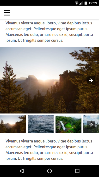
Add a photo carousel
Having every image for our photo-focused AMP page visible on the page will not create a great user experience. Fortunately, we can use amp-carousel to create horizontally swipeable slides of photos.
First, let's make sure the script tag for amp-carousel is included in head:
<script custom-element="amp-carousel" src="https://cdn.ampproject.org/v0/amp-carousel-0.1.js" async></script>Now let's add a responsive amp-carousel of type slides with several images to main:
<p class="my2 px3">Vivamus viverra augue libero, vitae dapibus lectus accumsan eget. Pellentesque eget ipsum purus. Maecenas leo odio, ornare nec ex id, suscipit porta ipsum. Ut fringilla semper cursus.</p>

<amp-carousel
  layout="responsive" width="1080" height="720"
  type="slides">

    <amp-img src="https://unsplash.it/1080/720?image=1037" layout="fill"></amp-img>
    <amp-img src="https://unsplash.it/1080/720?image=1038" layout="fill"></amp-img>
    <amp-img src="https://unsplash.it/1080/720?image=1039" layout="fill"></amp-img>
    <amp-img src="https://unsplash.it/1080/720?image=1040" layout="fill"></amp-img>
    <amp-img src="https://unsplash.it/1080/720?image=1041" layout="fill"></amp-img>
    <amp-img src="https://unsplash.it/1080/720?image=1042" layout="fill"></amp-img>
    <amp-img src="https://unsplash.it/1080/720?image=1043" layout="fill"></amp-img>
    <amp-img src="https://unsplash.it/1080/720?image=1044" layout="fill"></amp-img>
</amp-carousel>
type="slides" ensures that only one image is visible at a time, and it allows users to swipe through them.
For the images inside the carousel, we use layout="fill", since a slide carousel always fills its size with the child element, so there is no need to specify a different layout that requires width and height.
Let's try it out and see how it looks:
Add a thumbnails carousel
Now let's add a horizontally scrollable container for the thumbnails for these images. We'll use <amp-carousel> again, but without type="slides" and with a fixed-height layout.
Add the following after the previous amp-carousel element.
<amp-carousel layout="fixed-height" height="78" class="mt1">

    <amp-img src="https://unsplash.it/108/72?image=1037" layout="fixed" width="108" height="72"></amp-img>
    <amp-img src="https://unsplash.it/108/72?image=1038" layout="fixed" width="108" height="72"></amp-img>
    <amp-img src="https://unsplash.it/108/72?image=1039" layout="fixed" width="108" height="72"></amp-img>
    <amp-img src="https://unsplash.it/108/72?image=1040" layout="fixed" width="108" height="72"></amp-img>
    <amp-img src="https://unsplash.it/108/72?image=1041" layout="fixed" width="108" height="72"></amp-img>
    <amp-img src="https://unsplash.it/108/72?image=1042" layout="fixed" width="108" height="72"></amp-img>
    <amp-img src="https://unsplash.it/108/72?image=1043" layout="fixed" width="108" height="72"></amp-img>
    <amp-img src="https://unsplash.it/108/72?image=1044" layout="fixed" width="108" height="72"></amp-img>

</amp-carousel>
Note that for the thumbnail images we simply used layout="fixed" and low-resolution versions of the same photos.
Let's take a look:
Change the image when user taps a thumbnail
To do this, we need to tie events such as tap to actions such as changing the slide.
event: We can use the on attribute to install event handlers on an element and the tap event is supported on all elements.
action: amp-carousel exposes a goToSlide(index=INTEGER) action that we can call from the tap event handler of each thumbnail image.
Now that we know about the event and the action, let's tie them together.
First we need to give the slides carousel an id so we can reference it from the tap event handler on the thumbnails.
Modify your existing code to add an id attribute to the slides carousel (first one):
<amp-carousel
  id="imageSlides"
  type="slides"

  ....
Now let's install the event handler (on="tap:imageSlides.goToSlide(index=<slideNumber>)")" on each thumbnail image:
<amp-img on="tap:imageSlides.goToSlide(index=0)" role="button" tabindex="1" layout="fixed" ...
<amp-img on="tap:imageSlides.goToSlide(index=1)" role="button" tabindex="1" layout="fixed" ...
<amp-img on="tap:imageSlides.goToSlide(index=2)" role="button" tabindex="1" layout="fixed" ...
...
Note that we must also give it a tabindex and set the ARIA role for accessibility.
That's it. Now tapping each thumbnail image shows the corresponding image inside the slide carousel.

Highlight the thumbnail when the user taps it
Can we do this? There don't seem to be any actions to change CSS classes for an element to call from the tap event handlers. So how can we highlight the selected thumbnail?
<amp-selector> to the rescue!
amp-selector is different from components we have used so far. It is not a presentation component, since it does not affect the layout of the page; rather, it is a building block that allows the AMP page to know what option the user has selected.
What amp-selector does is fairly simple yet powerful:
amp-selectorcan contain any arbitrary HTML elements or AMP components.- Any descendant element of
amp-selectorcan become an option if it has anoption=<value>attribute. - When a user taps an element that is an option,
amp-selectorjust adds aselectedattribute to that element (and removes it from other option elements in single-selection mode). - You can style the selected element in your custom CSS by targeting the
selectedattribute with a CSS attribute selector.
Let's see how this helps us accomplish the task at hand.
Add the script tag for amp-selector to head:
<script custom-element="amp-selector" src="https://cdn.ampproject.org/v0/amp-selector-0.1.js" async></script>- Wrap the thumbnail carousel in an
amp-selector - Make every thumbnail an option by adding an
option=<value>attribute. - Make the first thumbnail selected by default by adding the
selectedattribute.
<amp-selector>

  <amp-carousel layout="fixed-height" height="78" class="mt1">

    <amp-img option=0 selected on="tap:imageSlides.goToSlide(index=0)" ...

    <amp-img option=1 on="tap:imageSlides.goToSlide(index=1)" ...

    ...

  </amp-carousel>

</amp-selector>
Now we need to add styling to highlight the selected thumbnail.
Add the following custom CSS in <style amp-custom> after the minified CSS boilerplate from AMP Start:
<style amp-custom>
...

/* low opacity for non-selected thumbnails */
amp-selector amp-img[option] {
  opacity: 0.4;
}

/* normal opacity for the selected thumbnail */
amp-selector amp-img[option][selected] {
  opacity: 1;
}

</style>
Let's take a look:

Looks good, but did you notice a bug?
If user swipes the slide carousel, the selected thumbnail does not update to reflect that. How can we bind the current slide in the carousel with the selected thumbnail?
In the next section, we'll learn how.
Summary
- You learned about different types of carousels and how to use them.
- You used AMP actions and events to change the visible slide in the image carousel when the user taps a thumbnail image.
- You learned about
amp-selectorand how it can be used as a building block to implement interesting use-cases.
The completed code for this section can be found here: http://codepen.io/aghassemi/pen/gmMJMy
In this section, we'll use amp-bind to improve the interactivity of the image gallery from the previous section.
What is amp-bind?
The core AMP component amp-bind lets you create custom interactivity with data binding and expressions.
amp-bind has three key parts:
- State
- Binding
- Mutation
State is an application state variable, containing anything from a single value to a complex data structure. All components can read and write to this shared variable.
Binding is an expression that ties the state to an HTML attribute or the content of an element.
Mutation is the action of changing the value of the state as result of some user action or event.
The power of amp-bind starts when a mutation happens: All components that have a binding to that state will be notified and will update themselves automatically to reflect the new state.
Let's see it in action!
Use amp-bind to re-implement the image gallery
Previously, we used AMP actions (for example, goToSlide()) to tie the full-image slide carousel with a tap event on the thumbnail images and used amp-selector to highlight the selected thumbnail.
Let's see how we can completely re-implement this code using the amp-bind approach to data binding.
But before we start coding, let's design our approach:
1. What is our state?
Fairly simple in our case, the only value we care about is what the current slide number is. So, selectedSlide is our state.
2. What are our bindings?
What needs to change when selectedSlide changes?
- The visible
slideof the full-image carousel:
<amp-carousel [slide]="selectedSlide" ...- The
selecteditem inamp-selectorneeds to change, too. This will fix the bug we ran into in the previous section.
<amp-selector [selected]="selectedSlide" ...3. What are our mutations?
When does selectedSlide need to change?
- When the user changes to a new slide in the full-image carousel by swiping:
<amp-carousel on="slideChange:AMP.setState({selectedSlide:event.index})" ...- When the user selects a thumbnail:
<amp-selector on="select:AMP.setState({selectedSlide:event.targetOption})" ...Let's use AMP.setState to trigger a mutation, which means that we no longer need all of the on="tap:imageSlides.goToSlide(index=n)" code we had on thumbnail anymore!
Let's put it all together:
Add the script tag for amp-bind to head:
<script custom-element="amp-bind" src="https://cdn.ampproject.org/v0/amp-bind-0.1.js" async></script>Replace the existing gallery code with the new approach:
<amp-carousel [slide]="selectedSlide" on="slideChange:AMP.setState({selectedSlide:event.index})" type="slides" id="imageSlides" layout="responsive" width="1080" height="720">

  <amp-img src="https://unsplash.it/1080/720?image=1037" layout="fill"></amp-img>
  <amp-img src="https://unsplash.it/1080/720?image=1038" layout="fill"></amp-img>
  <amp-img src="https://unsplash.it/1080/720?image=1039" layout="fill"></amp-img>
  <amp-img src="https://unsplash.it/1080/720?image=1040" layout="fill"></amp-img>
  <amp-img src="https://unsplash.it/1080/720?image=1041" layout="fill"></amp-img>
  <amp-img src="https://unsplash.it/1080/720?image=1042" layout="fill"></amp-img>
  <amp-img src="https://unsplash.it/1080/720?image=1043" layout="fill"></amp-img>
  <amp-img src="https://unsplash.it/1080/720?image=1044" layout="fill"></amp-img>

</amp-carousel>


<amp-selector [selected]="selectedSlide" on="select:AMP.setState({selectedSlide:event.targetOption})">

  <amp-carousel layout="fixed-height" height="78" class="mt1">

    <amp-img option=0 selected src="https://unsplash.it/108/72?image=1037" layout="fixed" width="108" height="72"></amp-img>
    <amp-img option=1 src="https://unsplash.it/108/72?image=1038" layout="fixed" width="108" height="72"></amp-img>
    <amp-img option=2 src="https://unsplash.it/108/72?image=1039" layout="fixed" width="108" height="72"></amp-img>
    <amp-img option=3 src="https://unsplash.it/108/72?image=1040" layout="fixed" width="108" height="72"></amp-img>
    <amp-img option=4 src="https://unsplash.it/108/72?image=1041" layout="fixed" width="108" height="72"></amp-img>
    <amp-img option=5 src="https://unsplash.it/108/72?image=1042" layout="fixed" width="108" height="72"></amp-img>
    <amp-img option=6 src="https://unsplash.it/108/72?image=1043" layout="fixed" width="108" height="72"></amp-img>
    <amp-img option=7 src="https://unsplash.it/108/72?image=1044" layout="fixed" width="108" height="72"></amp-img>

  </amp-carousel>

</amp-selector>
Let's test it out. Tap a thumbnail, and image slides will change. Swipe the image slides, and the highlighted thumbnail will change.
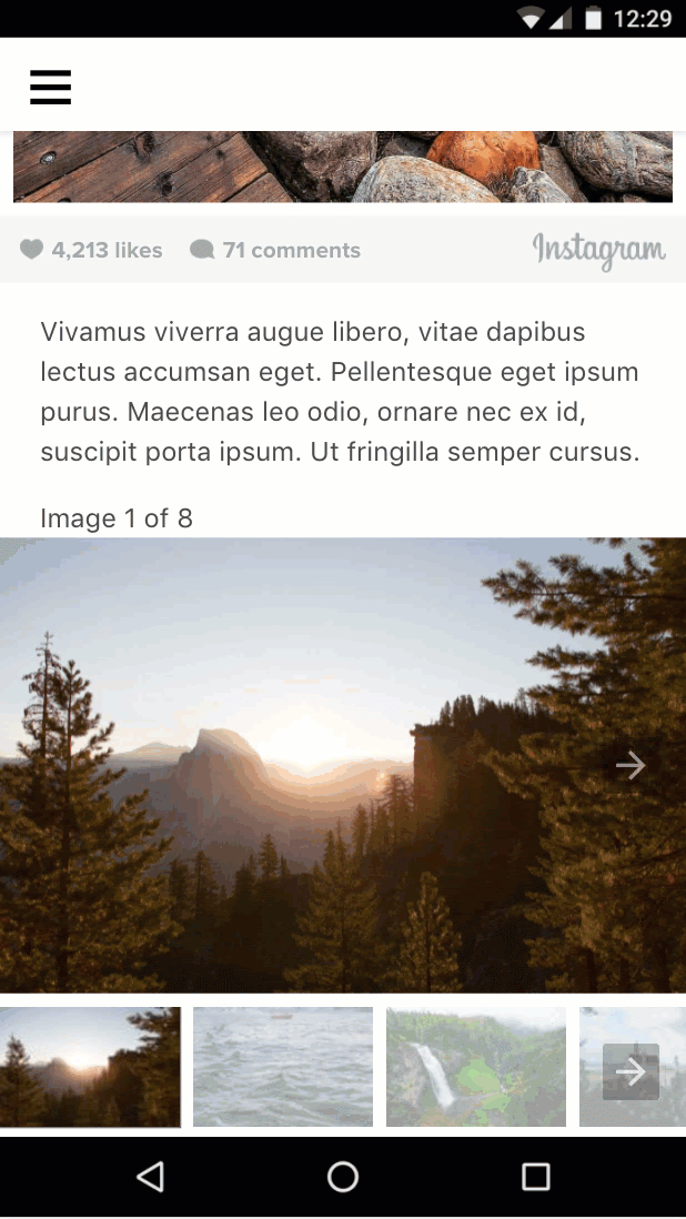
Add text to the gallery
We have already done the heavy work to define and mutate a state for our current slide. Now we can easily provide additional bindings to update other pieces of information based on the current slides number.
Let's add "Image x/of y" text to our gallery:
Add the following code above the slides carousel element:
<div class="px3">Image <span [text]="1*selectedSlide + 1">1</span> of 8</div>This time, we're binding to the inner text of an element using [text]= instead of binding to an HTML attribute.
Let's try it out:
Summary
- You learned about
amp-bind. - You used
amp-bindto implement an improved version of the image gallery.
The completed code for this section can be found here: http://codepen.io/aghassemi/pen/MpeMdL
In this section we'll use two new features to add animation to our page.
Add a parallax effect to the title
amp-fx-collection is an extension that provides a collection of preset visual effects such as parallax that can be easily enabled on any element with attributes.
With the parallax effect, as the user scrolls the page, the element scrolls faster or slower depending on the value assigned to the attribute.
The parallax effect can be enabled by adding the amp-fx="parallax" data-parallax-factor="<a decimal factor>" attribute to any HTML or AMP element.
- A factor value greater than 1 makes the element scroll faster when the user scrolls down the page.
- A factor value less than 1 makes the element scroll slower when the user scrolls down the page.
Let's add parallax with a factor of 1.5 to our page title and see how it looks!
Add the script tag for amp-fx-collection to head:
<script custom-element="amp-fx-collection" src="https://cdn.ampproject.org/v0/amp-fx-collection-0.1.js" async></script>Now, find the existing header title element in the code and add the amp-fx="parallax" and data-parallax-factor="1.5" attribute to it:
<header amp-fx="parallax" data-parallax-factor="1.5" class="p3">
  <h1 class="ampstart-fullpage-hero-heading mb3">
    <span class="ampstart-fullpage-hero-heading-text">
      Most Beautiful Hikes in the Pacific Northwest
    </span>
  </h1>
  <span class="ampstart-image-credit h4">
    By <a href="#" role="author" class="text-decoration-none">D.F. Roy</a>,<br> January 14, 2017
  </span>
</header>
Let's take a look at the result:

The title is now scrolling faster than the rest of the page. Cool!
Add animation to the page
amp-animation is a feature that brings the Web Animations API to AMP pages.
In this section, we'll use amp-animation to create a subtle zoom-in effect for the cover image.
Add the script tag for amp-animation to the head:
<script custom-element="amp-animation" src="https://cdn.ampproject.org/v0/amp-animation-0.1.js" async></script>Now we need to define our animation and the target element it applies to.
Animations are defined as JSON inside a top-level amp-animation tag.
Insert the following code directly below the opening body tag in your page.
<amp-animation trigger="visibility" layout="nodisplay">
    <script type="application/json">
      {
        "target": "heroimage",
        "duration": 30000,
        "delay": 0,
        "fill": "forwards",
        "easing": "ease-out",
        "keyframes": {"transform":  "scale(1.3)"}
      }
      </script>
</amp-animation>
This code defines an animation that runs for 30 seconds without delay and scales the image to be 30% larger.
We define a forward fill to allow the image to stay zoomed in after the animation ends. target is the HTML id of the element that the animation applies to.
Let's add an id to the hero image element in our page so amp-animation can act on it.
- Locate the existing hero image (the high-resolution one with
layout="fixed-height") in your code and addid="heroimage"to theamp-imgtag. - For the sake of simplicity, also delete
media="(min-width: 416px)"and also remove the other low-resolutionamp-imgso we don't have to deal with multiple animations and media queries in amp-animation for now.
<figure class="ampstart-image-fullpage-hero m0 relative mb4">

    <amp-img id="heroimage" height="1800" layout="fixed-height" src="https://unsplash.it/1200/1800?image=1003"></amp-img>

    <figcaption class="absolute top-0 right-0 bottom-0 left-0">

...
As you may have noticed, scaling the image will make it overflow its parent, so we need to fix that by hiding the overflow.
Add the following CSS rule to the end of the existing <style amp-custom>:
.ampstart-image-fullpage-hero {
  overflow: hidden;
}
Let's try it out and see how it looks:

Subtle!
But I could have done that with CSS anyway. What's the point of amp-animation?
That's true in this case, but amp-animation enables extra functionality that can't be done with CSS alone. For example, animation can be triggered based on visibility (and pause based on visibility as well) or it can be triggered with an AMP action. amp-animation is also based on the Web Animations API, which itself has more features than CSS animations, especially around composability.
Summary
- You learned about creating parallax effects with
amp-fx-collection. - You learned about
amp-animation.
The completed code for this section can be found here: http://codepen.io/aghassemi/pen/OpXKzo
You've just finished creating a beautiful, interactive AMP page.
Let's celebrate by taking another look at what you have accomplished today.
Here is a link to the finished page: http://s.codepen.io/aghassemi/debug/OpXKzo
... and the final code: http://codepen.io/aghassemi/pen/OpXKzo

The collection of CodePen entries for this codelab can be found here: https://codepen.io/collection/XzKmNB/
Oh, before we go...
We forgot to check how our page looks on other form factors, like a tablet in landscape mode.
Let's see:

Excellent!
Have a beautiful day.
What's next
This codelab only scratches the surface of what's possible in AMP. There are many resources and codelabs available to help you to create amazing AMP pages:
- https://amp.dev
- https://ampstart.com/components
- AMP foundations codelab
- AMP advanced concepts codelab
If you have questions or run into issues, please find us on the AMP Slack channel or create discussions, bug reports, or feature requests on GitHub.