Os banners adaptativos são anúncios responsivos de última geração e maximizam a performance ao otimizar o tamanho do anúncio para cada dispositivo. A vantagem em relação aos banners inteligentes, que só usam alturas fixas, é que neles você pode especificar a largura do anúncio e, com isso, determinar o tamanho ideal.
Para escolher o melhor tamanho de anúncio, os banners adaptativos usam proporções fixas em vez de uma altura predefinida. Com isso, os anúncios ocupam uma parte mais consistente da tela em vários dispositivos e podem melhorar a performance.
Os banners adaptativos sempre retornam um tamanho constante para um determinado dispositivo e largura. Depois de testar o layout em um determinado dispositivo, você sabe que o tamanho do anúncio não vai mudar. No entanto, o tamanho do criativo de banner pode mudar em diferentes dispositivos. Por isso, recomendamos que seu layout acomode variações na altura do anúncio. Em casos raros, o tamanho total não é preenchido, e um criativo de tamanho padrão será centralizado nesse espaço.
Quando usar banners adaptativos
Os banners adaptativos foram projetados para substituir o tamanho padrão do setor de 320 x 50 e o formato de banner inteligente.
Esses tamanhos costumam ser usados como banners fixos, que geralmente ficam na parte de cima ou de baixo da tela. Nesses banners fixos, a proporção ao usar banners adaptativos será semelhante à de um anúncio padrão de 320 x 50, como mostrado nestas capturas de tela:
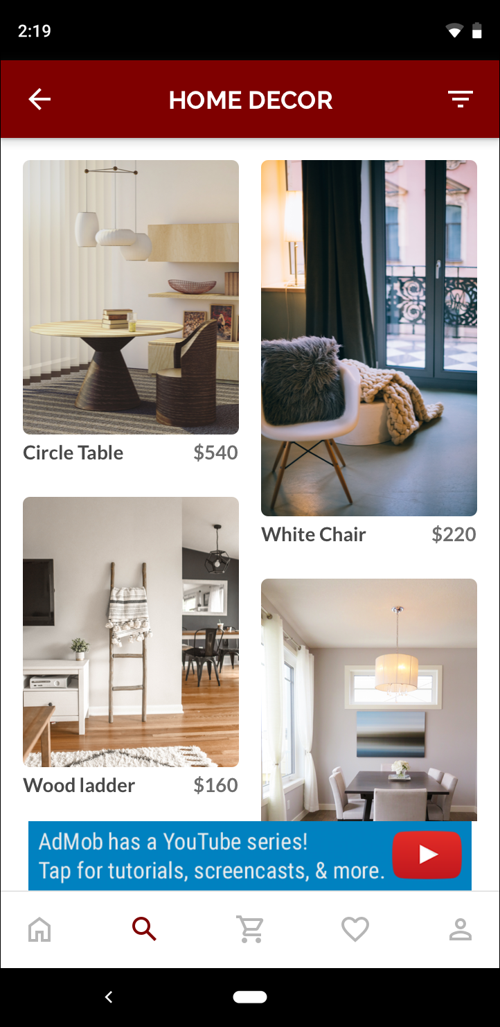 Banner de 320 x 50 |
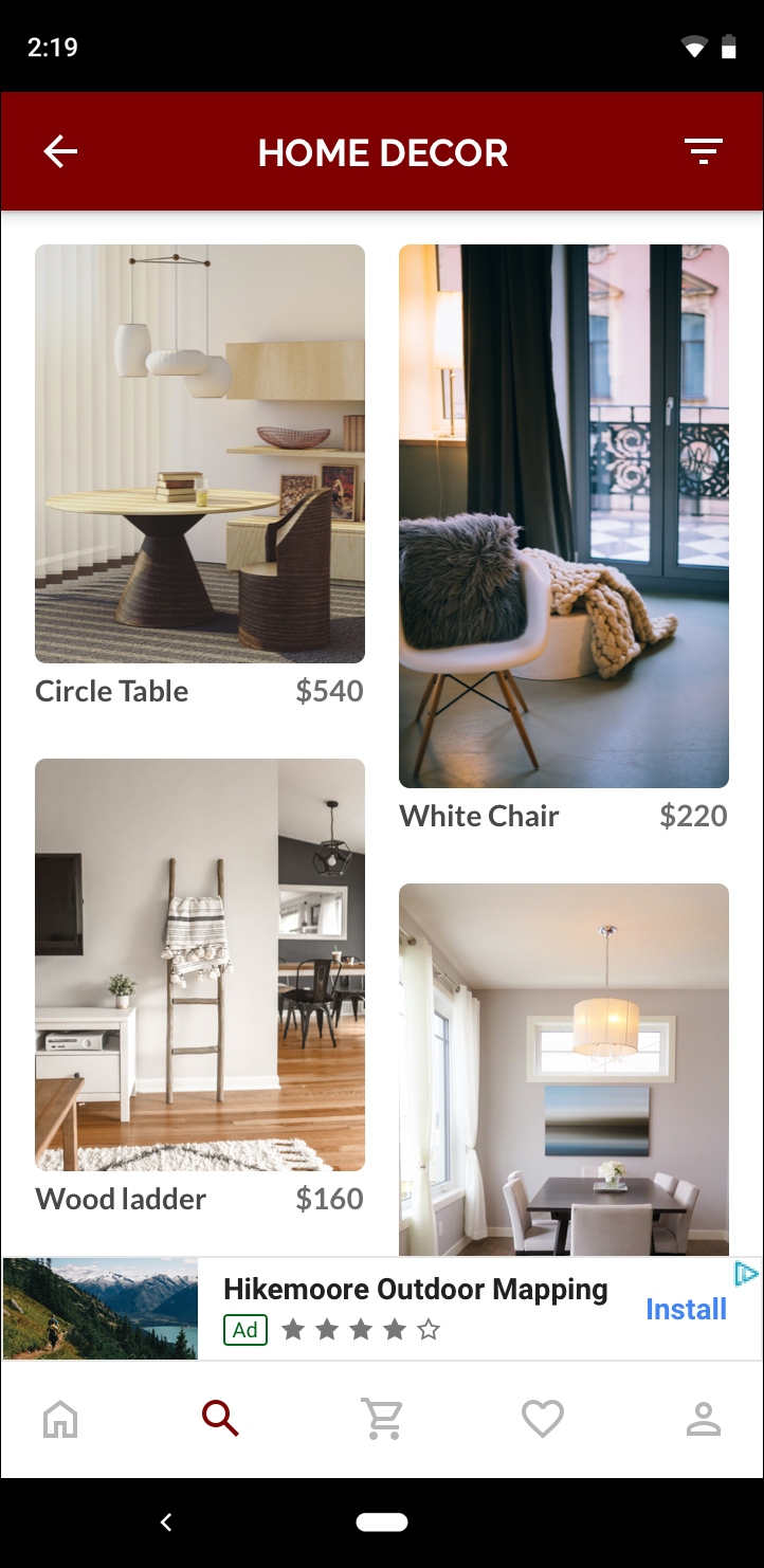 Banner inteligente |
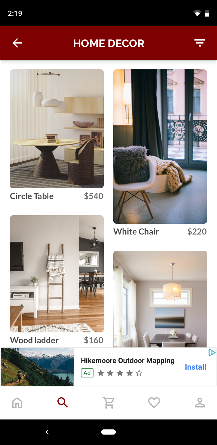 Banner adaptativo |
Um banner adaptativo aproveita melhor o tamanho da tela disponível. Além disso, em comparação com um banner inteligente, um banner adaptativo é uma opção melhor porque:
Ele usa uma largura fornecida em vez da largura em tela cheia, permitindo que você considere as áreas seguras.
Ele seleciona uma altura ideal para o dispositivo específico, em vez de uma altura constante em dispositivos de tamanhos diferentes. Isso reduz os efeitos da fragmentação de dispositivos.
Observações sobre implementação
Ao implementar banners adaptáveis no seu app, lembre-se do seguinte:
Você precisa saber a largura da visualização em que o anúncio será colocado, e isso deve considerar a largura do dispositivo e as áreas seguras aplicáveis.
O segundo plano da visualização de anúncio precisa ser opaco para obedecer às políticas da AdMob quando tamanhos menores de anúncios são veiculados e não preenchem todo o espaço.
Use a versão mais recente do SDK dos anúncios para dispositivos móveis do Google para C++. No caso de mediação, use a versão mais recente de cada adaptador.
Os tamanhos de banner adaptativo são projetados para funcionar melhor quando ocupam toda a largura disponível. Na maioria dos casos, é a largura total da tela do dispositivo em uso. É importante considerar as áreas seguras relevantes.
O SDK dos anúncios para dispositivos móveis do Google para C++ retorna uma altura de anúncio otimizada para a largura especificada em um
firebase::gma::AdSize.Há três métodos para saber o tamanho de um anúncio de banner adaptativo: um para paisagem, um para retrato e um para a orientação atual no momento da execução.
O tamanho retornado para uma determinada largura em um dispositivo específico será sempre o mesmo. Portanto, depois de testar seu layout em um dispositivo, saiba que o tamanho do anúncio não vai mudar.
A altura do banner fixo nunca é maior que 15% da altura do dispositivo e nunca é menor que 50 pontos.
Início rápido
Siga as etapas abaixo para implementar um banner adaptativo fixo simples.
Receba o tamanho de um anúncio de banner adaptativo. O tamanho definido será usado para solicitar seu banner adaptativo. Para saber o tamanho do anúncio adaptativo, faça o seguinte:
Descubra qual é a largura do dispositivo em uso ou defina uma, se não quiser usar a largura total da tela.
Use os métodos estáticos apropriados na classe
AdSize, comoGetCurrentOrientationAnchoredAdaptiveBannerAdSize(uint32_t width), para receber um objetoAdSizeadaptável para a orientação escolhida.Invoque
Initialize()noAdViewcom oAdSizeadaptável que você criou.Confira um exemplo completo abaixo.
Crie um objeto
AdRequeste carregue o banner usando o métodoloadAd()na visualização de anúncio preparada, assim como faria com uma solicitação de banner normal.
Código de amostra
Confira um exemplo de AdView que carrega um banner adaptativo:
// Determine view width in pixels based on your app's current width on the
// device's screen. This process will vary depending on which windowing toolkit
// you're using.

firebase::gma::AdSize adaptive_ad_size =
      AdSize::GetCurrentOrientationAnchoredAdaptiveBannerAdSize(view_width);

// my_ad_parent is a reference to an iOS UIView or an Android Activity.
// This is the parent UIView or Activity of the banner view.
firebase::gma::AdParent ad_parent =
  static_cast<firebase::gma::AdParent>(my_ad_parent);
firebase::Future<void> result =
  ad_view->Initialize(ad_parent, kBannerAdUnit, adaptive_ad_size);
A função GetCurrentOrientationAnchoredAdaptiveBannerAdSize(uint32_t width) é usada para pegar o tamanho de um banner em uma posição ancorada para a orientação atual da interface. Para pré-carregar um banner fixo em uma determinada orientação, use a função relevante de GetPortraitAnchoredAdaptiveBannerAdSize(uint32_t width) e GetLandscapeAnchoredAdaptiveBannerAdSize(uint32_t width).