Banery adaptacyjne to następna generacja reklam elastycznych, która maksymalizuje skuteczność, ponieważ optymalizuje rozmiar reklamy pod kątem każdego urządzenia. To ulepszona wersja banerów inteligentnych, które obsługiwały jedynie ustalone wysokości. Banery adaptacyjne pozwalają natomiast określić szerokość reklamy i wykorzystują te dane do wyznaczenia optymalnego rozmiaru reklamy.
Aby dobrać najlepszy rozmiar reklamy, banery adaptacyjne używają stałych proporcji zamiast stałych wysokości. Sprawia to, że banery reklamowe zajmują bardziej spójną część ekranu na różnych urządzeniach i umożliwiają poprawę skuteczności.
Pamiętaj, że banery adaptacyjne zawsze zwracają stały rozmiar dla danego urządzenia i danej szerokości. Po przetestowaniu układu na danym urządzeniu możesz mieć pewność, że rozmiar reklamy się nie zmieni. Rozmiar kreacji banerowej może się jednak różnić w zależności od urządzenia. Dlatego zalecamy, aby układ był dostosowany do różnych wysokości reklam. W rzadkich przypadkach pełny rozmiar adaptacyjny może nie zostać wypełniony, a w tym miejscu zostanie wyśrodkowany kreacja o standardowym rozmiarze.
Kiedy używać banerów adaptacyjnych
Banery adaptacyjne zostały zaprojektowane jako niewymagający edytowania kodu zamiennik zgodnych ze standardem branżowym banerów w rozmiarze 320x50 oraz banerów inteligentnych, które bezpośrednio zastępują.
Te rozmiary banerów są często używane jako banery zakotwiczone, które zwykle są zablokowane u góry lub u dołu ekranu. W przypadku takich zakotwiczonych banerów proporcje obrazu podczas korzystania z banerów adaptacyjnych będą podobne do proporcji standardowej reklamy 320x50, co widać na tych zrzutach ekranu:
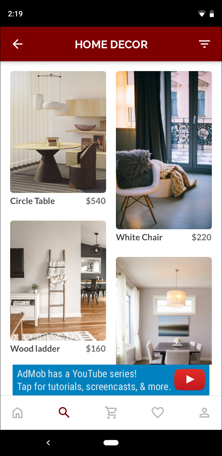 Baner o wymiarach 320 x 50 |
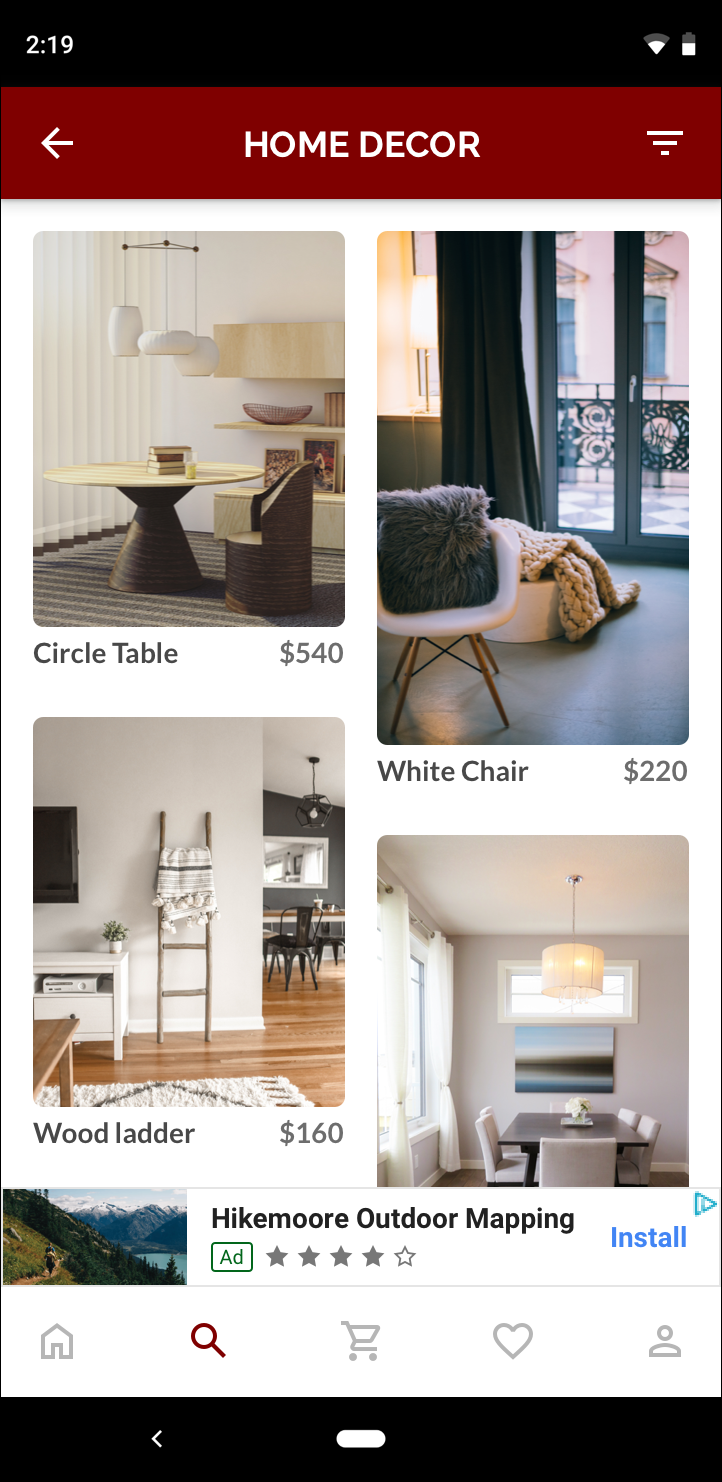 Baner inteligentny |
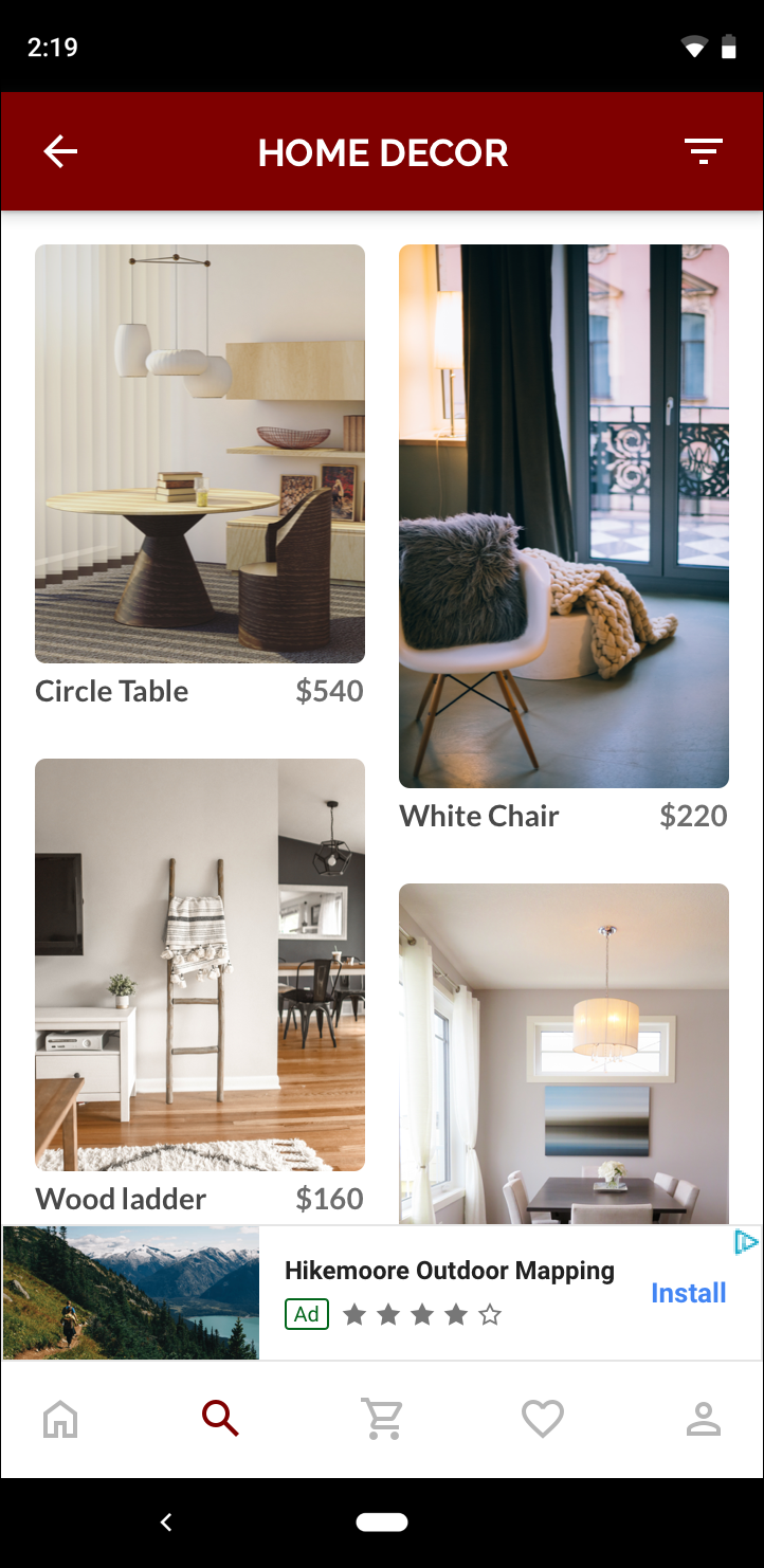 Baner adaptacyjny |
Baner adaptacyjny lepiej wykorzystuje dostępny rozmiar ekranu. W porównaniu z banerem inteligentnym baner adaptacyjny jest lepszym wyborem, ponieważ:
Korzysta z podanej szerokości zamiast szerokości pełnego ekranu, co pozwala uwzględniać bezpieczne obszary.
Wybiera optymalną wysokość dla konkretnego urządzenia, zamiast stosować stałą wysokość na urządzeniach o różnych rozmiarach, co ogranicza skutki fragmentacji urządzeń.
Uwagi dotyczące wdrażania
Wdrażając w aplikacji banery adaptacyjne, pamiętaj o tych kwestiach:
Musisz znać szerokość widoku, w którym będzie wyświetlana reklama. Powinna ona uwzględniać szerokość urządzenia i wszystkie odpowiednie bezpieczne obszary.
Zadbaj o to, aby tło widoku reklamy było nieprzezroczyste, aby zachować zgodność z zasadami AdMob w przypadku wyświetlania mniejszych reklam, które nie wypełniają boksu reklamowego.
Upewnij się, że używasz najnowszej wersji pakietu SDK do reklam mobilnych Google w C++. W przypadku zapośredniczenia używaj najnowszej wersji każdego adaptera zapośredniczenia.
Rozmiary banerów adaptacyjnych są zaprojektowane tak, aby działać najlepiej, gdy wykorzystują całą dostępną szerokość. W większości przypadków będzie to pełna szerokość ekranu używanego urządzenia. Pamiętaj o obowiązujących bezpiecznych obszarach.
Pakiet SDK do reklam mobilnych Google w C++ zwraca zoptymalizowaną wysokość reklamy dla podanej szerokości w
firebase::gma::AdSize.Istnieją 3 metody uzyskiwania rozmiaru reklamy w przypadku banerów adaptacyjnych: jedna dla orientacji poziomej, jedna dla pionowej i jedna dla bieżącej orientacji w momencie wykonania.
Rozmiar zwracany dla danej szerokości na danym urządzeniu będzie zawsze taki sam, więc po przetestowaniu układu na danym urządzeniu możesz mieć pewność, że rozmiar reklamy się nie zmieni.
Wysokość zakotwiczonego banera nigdy nie przekracza 15% wysokości urządzenia i nigdy nie jest mniejsza niż 50 punktów.
Szybki start
Aby wdrożyć prosty zakotwiczony baner adaptacyjny, wykonaj czynności opisane poniżej.
Uzyskaj rozmiar adaptacyjnego banera reklamowego. Uzyskany rozmiar będzie wykorzystywany w żądaniach banera adaptacyjnego. Aby uzyskać rozmiar reklamy adaptacyjnej, musisz:
Pobierz szerokość używanego urządzenia lub ustaw własną szerokość, jeśli nie chcesz używać pełnej szerokości ekranu.
Użyj odpowiednich metod statycznych w klasie
AdSize, np.GetCurrentOrientationAnchoredAdaptiveBannerAdSize(uint32_t width), aby uzyskać adaptacyjny obiektAdSizedla wybranej orientacji.Wywołaj
Initialize()naAdViewza pomocą utworzonego przez siebie adaptacyjnegoAdSize.Pełny przykład znajdziesz poniżej.
Utwórz obiekt
AdRequesti wczytaj baner za pomocą metodyloadAd()w przygotowanym wyświetleniu reklamy, tak jak w przypadku zwykłego żądania banera.
Przykładowy kod
Oto przykład tagu AdView, który wczyta baner adaptacyjny:
// Determine view width in pixels based on your app's current width on the
// device's screen. This process will vary depending on which windowing toolkit
// you're using.

firebase::gma::AdSize adaptive_ad_size =
      AdSize::GetCurrentOrientationAnchoredAdaptiveBannerAdSize(view_width);

// my_ad_parent is a reference to an iOS UIView or an Android Activity.
// This is the parent UIView or Activity of the banner view.
firebase::gma::AdParent ad_parent =
  static_cast<firebase::gma::AdParent>(my_ad_parent);
firebase::Future<void> result =
  ad_view->Initialize(ad_parent, kBannerAdUnit, adaptive_ad_size);
W tym przypadku funkcja GetCurrentOrientationAnchoredAdaptiveBannerAdSize(uint32_t width) służy do uzyskiwania rozmiaru banera w zakotwiczonej pozycji dla bieżącej orientacji interfejsu. Aby wstępnie wczytać zakotwiczony baner w danym położeniu, użyj odpowiedniej funkcji z GetPortraitAnchoredAdaptiveBannerAdSize(uint32_t width) i GetLandscapeAnchoredAdaptiveBannerAdSize(uint32_t width).