Adaptive Banner sind die nächste Generation responsiver Anzeigen. Sie maximieren die Leistung, indem die Anzeigengröße für jedes Gerät optimiert wird. Anders als bei Smart-Bannern, die eine feste Höhe haben, können Sie bei adaptiven Bannern die Anzeigenbreite festlegen. Auf dieser Grundlage wird dann die optimale Anzeigengröße ermittelt.
Dazu werden bei adaptiven Bannern feste Seitenverhältnisse anstatt fester Höhen verwendet. Die präsentierten Banneranzeigen nehmen also unabhängig von Bildschirmgröße und Gerät immer einen vergleichbaren Teil des Bildschirms ein. Daraus ergeben sich Möglichkeiten zur Leistungsoptimierung.
Adaptive Banner haben für ein bestimmtes Gerät und eine bestimmte Breite immer eine feste Größe. Nachdem Sie Ihr Layout auf einem bestimmten Gerät getestet haben, können Sie sicher sein, dass sich die Anzeigengröße nicht ändert. Die Größe des Banner-Creatives kann sich jedoch auf verschiedenen Geräten ändern. Daher sollten Sie darauf achten, dass Ihr Layout Abweichungen in der Anzeigenhöhe zulässt. In seltenen Fällen wird die volle adaptive Größe möglicherweise nicht ausgefüllt und stattdessen wird ein Creative in Standardgröße in diesem Bereich zentriert.
Wann Sie adaptive Banner verwenden sollten
Adaptive Banner sollen die Anzeigengröße 320 × 50 sowie das Smart-Banner-Format ersetzen.
Diese Bannergrößen werden üblicherweise als verankerte Banner verwendet, meist oben oder unten auf dem Bildschirm. Bei solchen verankerten Bannern ist das Seitenverhältnis bei Verwendung adaptiver Banner ähnlich wie bei einer Standardanzeige mit 320 × 50 Pixeln. Das können Sie in diesen Screenshots sehen:
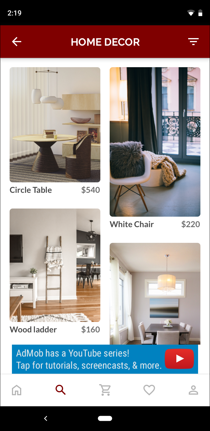 Banner mit 320 × 50 Pixeln |
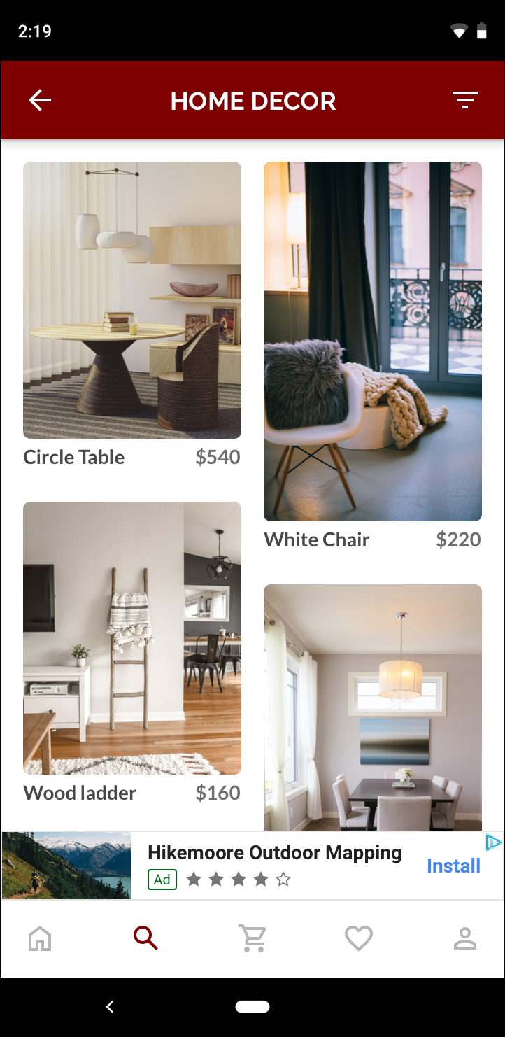 Smart-Banner |
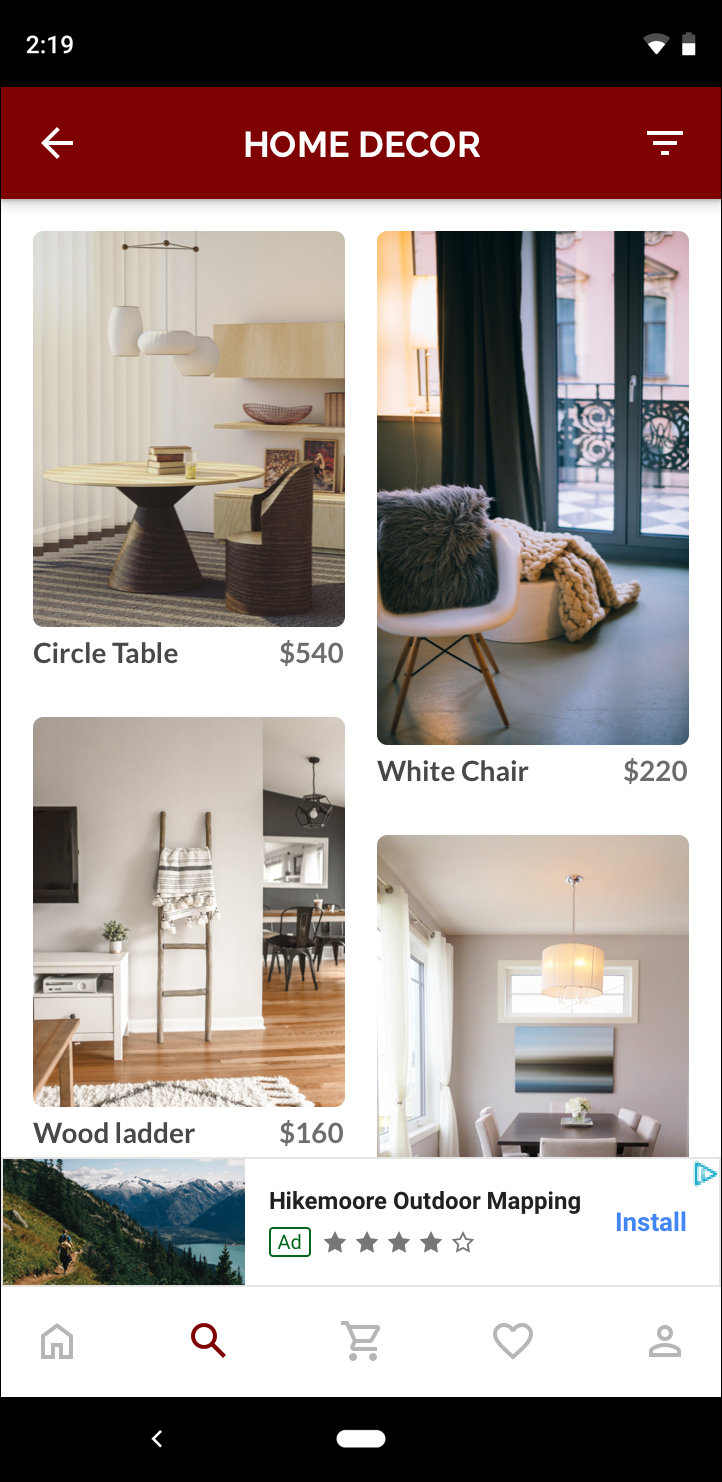 Adaptives Banner |
Ein adaptives Banner nutzt die verfügbare Bildschirmgröße besser. Außerdem ist ein adaptives Banner im Vergleich zu einem Smart-Banner die bessere Wahl, weil:
Es verwendet eine angegebene Breite und nicht die volle Bildschirmbreite, wodurch Sie sichere Bereiche berücksichtigen können.
Es wählt eine optimale Höhe für das jeweilige Gerät aus, anstatt eine konstante Höhe für Geräte unterschiedlicher Größe zu verwenden. So werden die Auswirkungen der Gerätefragmentierung verringert.
Implementierungshinweise
Beachten Sie bei der Implementierung adaptiver Banner in Ihrer App Folgendes:
Sie müssen die Breite der Ansicht kennen, in der die Anzeige platziert wird. Dabei sollten die Gerätebreite und alle relevanten sicheren Bereiche berücksichtigt werden.
Der Hintergrund Ihrer Anzeigenansicht muss undurchsichtig sein, damit die AdMob-Richtlinien eingehalten werden, wenn kleinere Anzeigengrößen ausgeliefert werden, die den Anzeigenbereich nicht ausfüllen.
Verwenden Sie die aktuelle Version des Google Mobile Ads C++ SDK. Verwenden Sie für die Vermittlung die aktuelle Version jedes Vermittlungsadapters.
Adaptive Bannergrößen funktionieren am besten, wenn die gesamte verfügbare Breite genutzt wird. In den meisten Fällen ist das die volle Breite des Bildschirms des verwendeten Geräts. Berücksichtigen Sie dabei die relevanten sicheren Bereiche.
Das Google Mobile Ads C++ SDK gibt eine optimierte Anzeigenhöhe für die angegebene Breite in einem
firebase::gma::AdSize-Objekt zurück.Es gibt drei Methoden, um eine Anzeigengröße für adaptive Banner zu erhalten: eine für das Querformat, eine für das Hochformat und eine für die aktuelle Ausrichtung zum Zeitpunkt der Ausführung.
Die für eine bestimmte Breite auf einem bestimmten Gerät zurückgegebene Größe ist immer gleich. Nachdem Sie Ihr Layout auf einem bestimmten Gerät getestet haben, können Sie also sicher sein, dass sich die Anzeigengröße nicht ändert.
Die Höhe verankerter Banner ist nie größer als 15% der Gerätehöhe und nie kleiner als 50 Punkte.
Schnelleinstieg
So richten Sie ein einfaches adaptives Ankerbanner ein:
Rufen Sie die Anzeigengröße für das adaptive Banner ab. Die Größe, die Sie erhalten, wird verwendet, um Ihr adaptives Banner anzufordern. So rufen Sie die adaptive Anzeigengröße ab:
Rufen Sie die Breite des verwendeten Geräts ab oder legen Sie eine eigene Breite fest, wenn Sie nicht die volle Bildschirmbreite verwenden möchten.
Verwenden Sie die entsprechenden statischen Methoden in der
AdSizeKlasse, z. B.GetCurrentOrientationAnchoredAdaptiveBannerAdSize(uint32_t width)um ein adaptivesAdSize-Objekt für die ausgewählte Ausrichtung zu erhalten.Rufen Sie
Initialize()fürAdViewmit der erstellten adaptivenAdSizeauf.Ein ausführliches Beispiel finden Sie unten.
Erstellen Sie ein
AdRequestObjekt und laden Sie Ihr Banner mit derloadAd()Methode in der vorbereiteten Anzeigenansicht, so wie bei einer herkömmlichen Banner Anfrage.
Beispielcode
Hier ist ein Beispiel für eine AdView, in die ein adaptives Banner geladen wird:
// Determine view width in pixels based on your app's current width on the
// device's screen. This process will vary depending on which windowing toolkit
// you're using.

firebase::gma::AdSize adaptive_ad_size =
      AdSize::GetCurrentOrientationAnchoredAdaptiveBannerAdSize(view_width);

// my_ad_parent is a reference to an iOS UIView or an Android Activity.
// This is the parent UIView or Activity of the banner view.
firebase::gma::AdParent ad_parent =
  static_cast<firebase::gma::AdParent>(my_ad_parent);
firebase::Future<void> result =
  ad_view->Initialize(ad_parent, kBannerAdUnit, adaptive_ad_size);
Hier wird die Funktion GetCurrentOrientationAnchoredAdaptiveBannerAdSize(uint32_t width) verwendet, um die Größe für ein Banner in einer verankerten Position für die aktuelle Ausrichtung der Benutzeroberfläche zu erhalten. Wenn Sie ein verankertes Banner in einer bestimmten Ausrichtung vorab laden möchten, verwenden Sie die entsprechende Funktion aus GetPortraitAnchoredAdaptiveBannerAdSize(uint32_t width) und GetLandscapeAnchoredAdaptiveBannerAdSize(uint32_t width).