Biểu ngữ thích ứng là thế hệ tiếp theo của quảng cáo thích ứng, giúp bạn tăng tối đa hiệu suất bằng cách tối ưu hoá kích thước của quảng cáo cho từng thiết bị. Nhờ cải thiện dựa trên biểu ngữ thông minh, vốn chỉ hỗ trợ chiều cao cố định, biểu ngữ thích ứng cho phép bạn chỉ định chiều rộng của quảng cáo và sử dụng chiều rộng này để xác định kích thước quảng cáo tối ưu.
Để chọn kích thước quảng cáo thích hợp nhất, biểu ngữ thích ứng sử dụng tỷ lệ khung hình cố định thay vì chiều cao cố định. Nhờ đó, quảng cáo biểu ngữ chiếm một phần nhất quán hơn trên màn hình các thiết bị và mang lại cơ hội cải thiện hiệu quả hoạt động.
Khi sử dụng biểu ngữ thích ứng, xin lưu ý rằng biểu ngữ này sẽ luôn hiển thị ở một kích thước không đổi cho một thiết bị và chiều rộng nhất định. Sau khi kiểm thử bố cục trên một thiết bị nhất định, bạn có thể chắc chắn rằng kích thước quảng cáo sẽ không thay đổi. Tuy nhiên, kích thước của quảng cáo biểu ngữ có thể thay đổi trên các thiết bị khác nhau. Do đó, bạn nên đảm bảo rằng bố cục của mình có thể điều chỉnh theo các biến thể về chiều cao quảng cáo. Trong một số ít trường hợp, kích thước thích ứng đầy đủ có thể không hiển thị được và một quảng cáo kích thước tiêu chuẩn sẽ được đặt ở giữa trong vùng này.
Những trường hợp nên sử dụng biểu ngữ thích ứng
Biểu ngữ thích ứng được thiết kế để thay thế cho kích thước biểu ngữ 320x50 tiêu chuẩn của ngành, cũng như định dạng biểu ngữ thông minh mà các đơn vị quảng cáo này thay thế.
Các kích thước biểu ngữ này thường được dùng làm biểu ngữ cố định (loại biểu ngữ thường xuất hiện ở phía trên cùng hoặc dưới cùng của màn hình). Đối với các biểu ngữ cố định như vậy, tỷ lệ khung hình khi sử dụng biểu ngữ thích ứng sẽ tương tự như tỷ lệ khung hình của quảng cáo chuẩn 320x50. Hãy xem các ảnh chụp màn hình dưới đây:
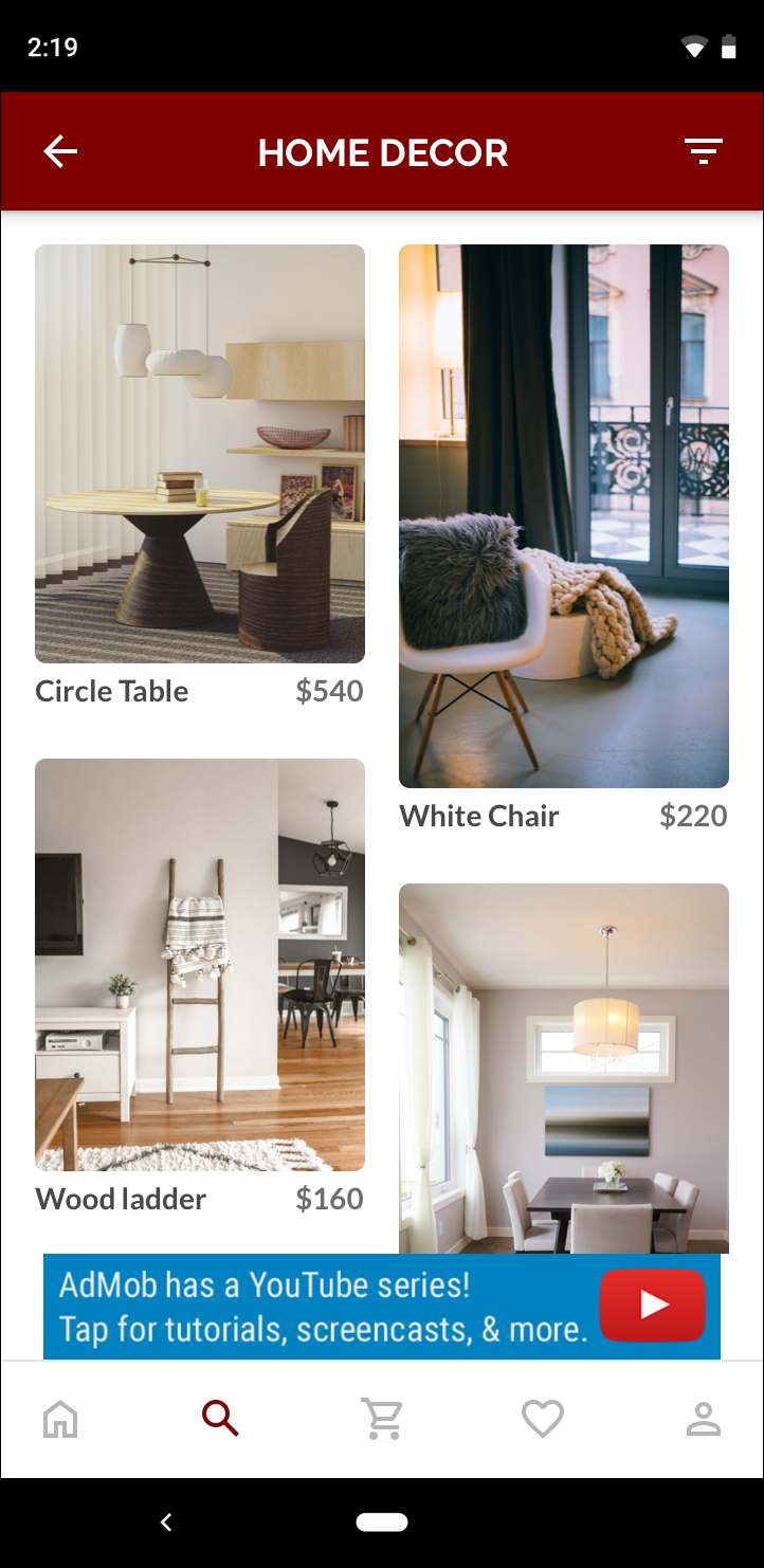 Biểu ngữ 320x50 |
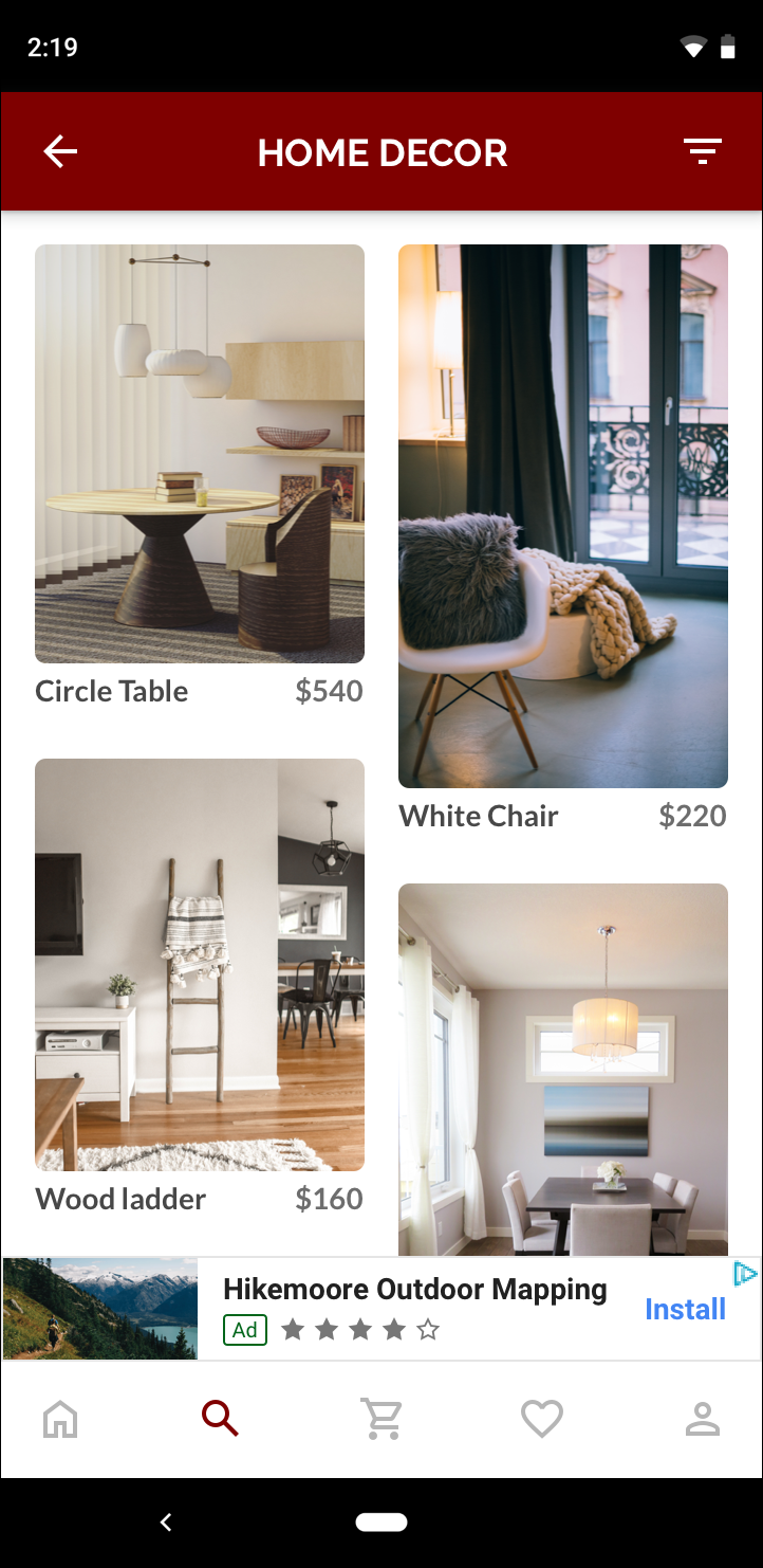 Biểu ngữ thông minh |
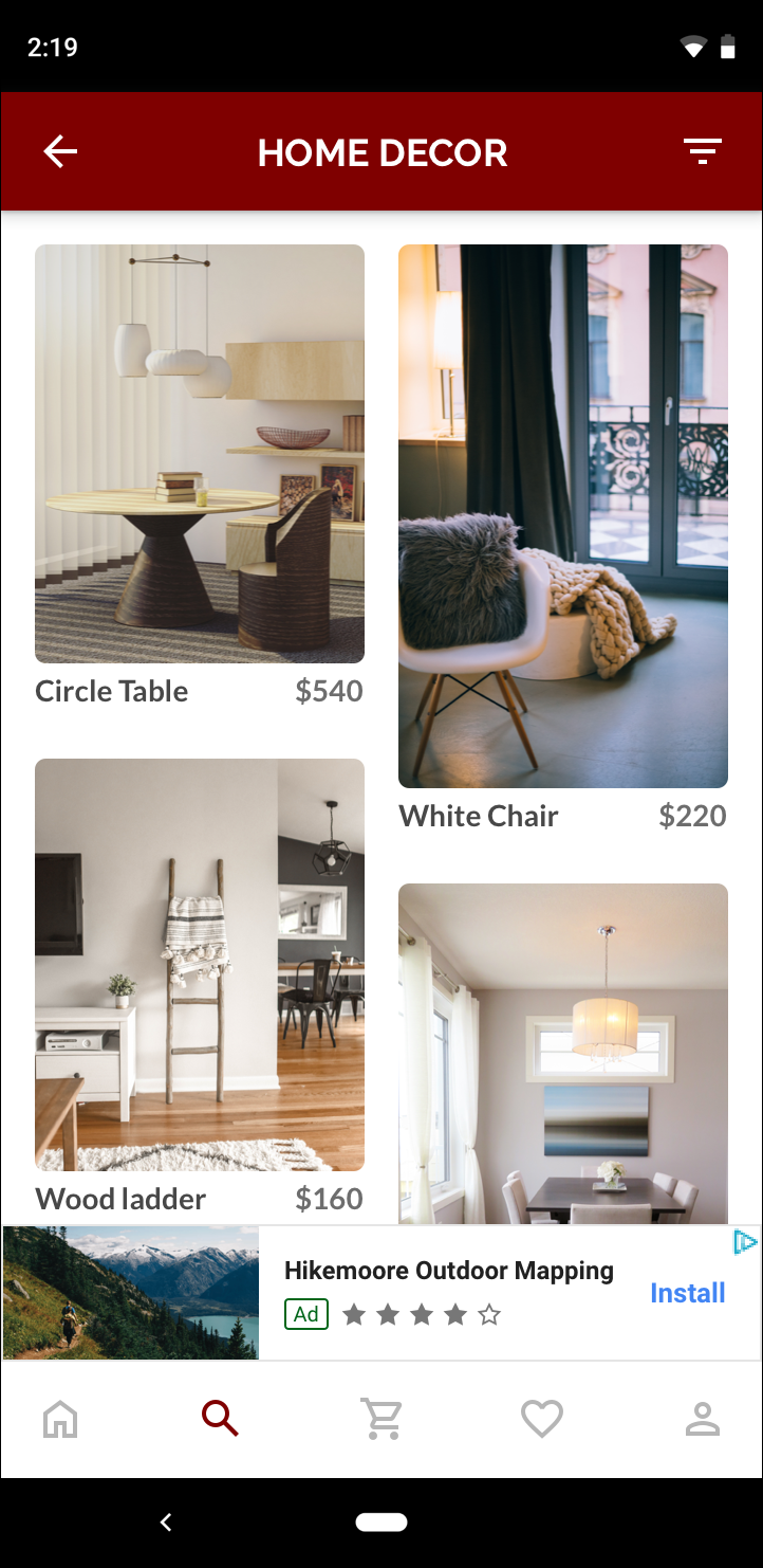 Biểu ngữ thích ứng |
Biểu ngữ thích ứng tận dụng tốt hơn kích thước màn hình có sẵn. Ngoài ra, so với biểu ngữ thông minh, biểu ngữ thích ứng là lựa chọn tốt hơn vì:
Biểu ngữ thích ứng có thể hiển thị với chiều rộng đã chỉ định thay vì chiều rộng toàn màn hình, để bù cho vùng an toàn.
Biểu ngữ thích ứng lựa chọn chiều cao tối ưu cho từng thiết bị, thay vì sử dụng chiều cao cố định trên các thiết bị có kích thước khác nhau. Việc này giúp giảm thiểu tác động của sự phân mảnh thiết bị.
Lưu ý khi triển khai
Khi triển khai biểu ngữ thích ứng trong ứng dụng của bạn, hãy lưu ý các điểm sau:
Bạn phải biết chiều rộng của chế độ xem hiển thị quảng cáo, và phải cân nhắc chiều rộng của thiết bị, cũng như mọi vùng an toàn (nếu có).
Đảm bảo rằng nền của chế độ xem quảng cáo được làm mờ để tuân thủ các chính sách của AdMob khi kích thước quảng cáo nhỏ hơn phân phát (kích thước này không lấp đầy vùng quảng cáo).
Đảm bảo bạn đang sử dụng phiên bản mới nhất của SDK quảng cáo trên thiết bị di động của Google bằng C++. Để sử dụng tính năng dàn xếp, hãy sử dụng phiên bản mới nhất của mỗi bộ chuyển đổi dàn xếp.
Kích thước của biểu ngữ thích ứng hoạt động hiệu quả nhất khi sử dụng toàn bộ chiều rộng có sẵn. Trong hầu hết các trường hợp, đây sẽ là toàn bộ chiều rộng màn hình của thiết bị đang sử dụng. Hãy nhớ cân nhắc vùng an toàn (nếu có).
SDK quảng cáo trên thiết bị di động của Google bằng C++ sẽ trả về chiều cao quảng cáo tối ưu cho chiều rộng nhất định trong
firebase::gma::AdSize.Có ba phương pháp để đặt kích thước quảng cáo biểu ngữ thích ứng, trong đó một phương pháp dành cho biểu ngữ ngang, một phương pháp dành cho biểu ngữ dọc và một phương pháp dành cho hướng cụ thể tại thời điểm thực thi.
Kích thước được trả về cho một chiều rộng nhất định trên một thiết bị nhất định sẽ luôn giống nhau. Do đó, sau khi kiểm thử bố cục trên một thiết bị nhất định, bạn có thể chắc chắn rằng kích thước quảng cáo sẽ không thay đổi.
Chiều cao của biểu ngữ cố định không được lớn hơn 15% chiều cao của thiết bị và không được nhỏ hơn 50 điểm.
Bắt đầu nhanh
Làm theo các bước bên dưới để triển khai một biểu ngữ thích ứng cố định đơn giản.
Đặt kích thước quảng cáo biểu ngữ thích ứng. Kích thước bạn đặt sẽ được dùng để yêu cầu biểu ngữ thích ứng. Để đặt kích thước quảng cáo thích ứng, hãy đảm bảo rằng bạn:
Đặt chiều rộng của thiết bị đang sử dụng hoặc đặt chiều rộng riêng nếu bạn không muốn sử dụng toàn bộ chiều rộng của màn hình.
Sử dụng các phương thức tĩnh thích hợp trên lớp
AdSize, chẳng hạn nhưGetCurrentOrientationAnchoredAdaptiveBannerAdSize(uint32_t width)để đặt đối tượngAdSizethích ứng cho hướng đã chọn.Gọi
Initialize()trênAdViewbằngAdSizethích ứng mà bạn đã tạo.Dưới đây là một ví dụ đầy đủ.
Tạo đối tượng
AdRequestvà tải biểu ngữ của bạn bằng cách sử dụng phương thứcloadAd()trên lượt xem quảng cáo đã chuẩn bị, giống như cách bạn thực hiện với yêu cầu biểu ngữ thông thường.
Mã mẫu
Dưới đây là ví dụ về AdView sẽ tải một biểu ngữ thích ứng:
// Determine view width in pixels based on your app's current width on the
// device's screen. This process will vary depending on which windowing toolkit
// you're using.

firebase::gma::AdSize adaptive_ad_size =
      AdSize::GetCurrentOrientationAnchoredAdaptiveBannerAdSize(view_width);

// my_ad_parent is a reference to an iOS UIView or an Android Activity.
// This is the parent UIView or Activity of the banner view.
firebase::gma::AdParent ad_parent =
  static_cast<firebase::gma::AdParent>(my_ad_parent);
firebase::Future<void> result =
  ad_view->Initialize(ad_parent, kBannerAdUnit, adaptive_ad_size);
Ở đây, hàm GetCurrentOrientationAnchoredAdaptiveBannerAdSize(uint32_t width) được dùng để lấy kích thước của biểu ngữ ở một vị trí cố định cho hướng giao diện hiện tại. Để tải trước một biểu ngữ cố định theo một hướng nhất định, hãy sử dụng hàm phù hợp từ GetPortraitAnchoredAdaptiveBannerAdSize(uint32_t width) và GetLandscapeAnchoredAdaptiveBannerAdSize(uint32_t width).