Page Summary
-
Following these guidelines on displaying the Sign in with Google button is required for app verification.
-
The recommended way to display the button is using Google Identity Services SDKs, but you can also render an HTML button, download assets, or create a custom button.
-
Pre-approved brand icons are available for download in various styles, themes, and shapes.
-
If creating a custom button, adhere to specific guidelines regarding size, text, color, font, padding, and the Google logo.
-
The Sign in with Google button should be displayed at least as prominently as other third-party sign-in options.
This document provides guidelines on how to display a Sign in with Google button on your website or app. Your website or app must follow these guidelines to complete the app verification process.
Our Google Identity Services SDKs render a Sign in with Google button that always adheres to the most recent Google branding guidelines. They are the recommended way to display the Sign in with Google button on your website or app. For cases where you are not able to use the Google-rendered button option, you can render an HTML button element, download our pre-approved branding assets or optionally create a custom Sign in with Google button.
Render HTML Button Element
We provide an HTML configurator that allows you to customize the appearance of the Sign in with Google button. You can then download an HTML and CSS snippet that will render the button on your website.Generate HTML Button Element
Download Pre-Approved Brand Icons
As an alternative to using a custom image button, you can download our pre-approved Sign in with Google buttons provided in PNG and SVG formats for all platforms.The provided images buttons are available in standard and icon modes and include the below style options:
- Theme : Light, Neutral, Dark
- Shape : Rectangular, Pill
| Theme | Buttons | Description |
|---|---|---|
| Light |

|
Standard large light themed rectangular Sign in with Google button |
| Dark |

|
Standard dark themed pill shaped Sign in with Google button |
Supported Button Modes
| Light |
|
|
| Dark |
|
|
| Neutral |
|
|
Create a custom Sign in with Google Button
Using our Google Identity Services SDKs or any of the other options covered in previous sections is strongly recommended as it enables Google users to more easily identify the Google brand. The more easily users can identify an action button, the more likely they are to interact with it.
If you, however, need to adapt the button to match your app design, adhere to the following guidelines.
Size
You can scale the button as needed for different devices and screen sizes, but you must preserve the aspect ratio so that the Google logo is not stretched.
Text
To encourage users to click the button, we recommend the call-to-action text "Sign in with Google", "Sign up with Google", or "Continue with Google". Localization of this text to match the language of your app or website is permitted and encouraged to provide a better user experience. It should be clear to the user that they are signing into your app or signing up for your app with their Google credentials, not signing up or registering for a Google Account on your app.
Color
The default state of the buttons are shown below. The button must always include the standard color for the Google "G".
| Theme | Example | |
|---|---|---|
| Light |

|
Fill: #FFFFFF Stroke: #747775 | 1px | inside Font: #1F1F1F | Roboto Medium | 14/20 |
| Dark |

|
Fill: #131314 Stroke: #8E918F | 1px | inside Font: #E3E3E3 | Roboto Medium | 14/20 |
| Neutral |

|
Fill: #F2F2F2 Stroke: No stroke Font: #1F1F1F | Roboto Medium | 14/20 |
Font
The button font is Roboto Medium, a TrueType font. To install, first download the Roboto font and unzip the download bundle. On Mac, just double-click Roboto-Medium.ttf, then click "Install Font". On Windows, drag the file to "My Computer" > "Windows" > "Fonts" folder.
Padding
| Android |

|
| iOS |

|
| Web (mobile + desktop) |

|
| Reference |

|
Google logo in the "Sign in with Google" button
Regardless of the text, you can't change the size or color of the Google "G" logo. It must be the standard color version and appear on a white background. If you need to create your own custom size Google logo, start with any of the logo sizes included in the download bundle.

Incorrect button design
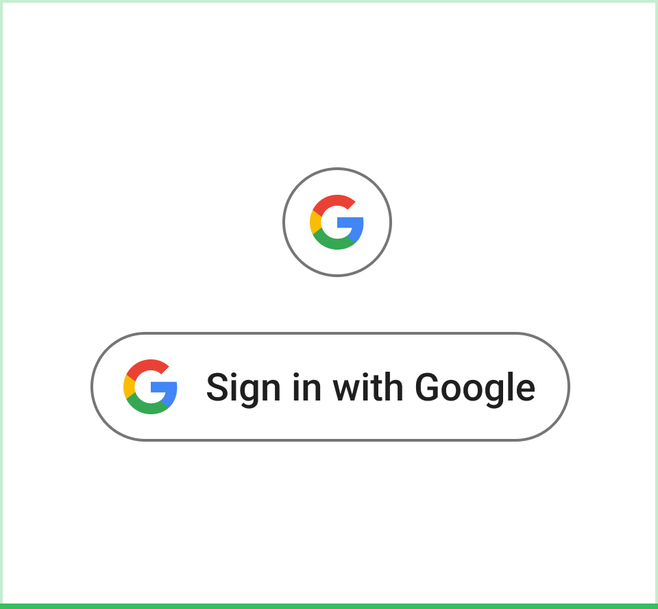 Do Use the Google Material 3 design guidelines for button boundary and color scheme. |
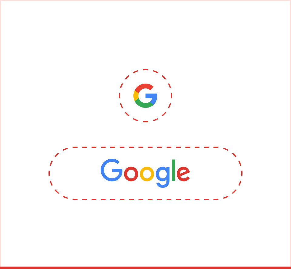 Don't Use the Google icon or logo by itself without the button boundary and without text to indicate the user action. |
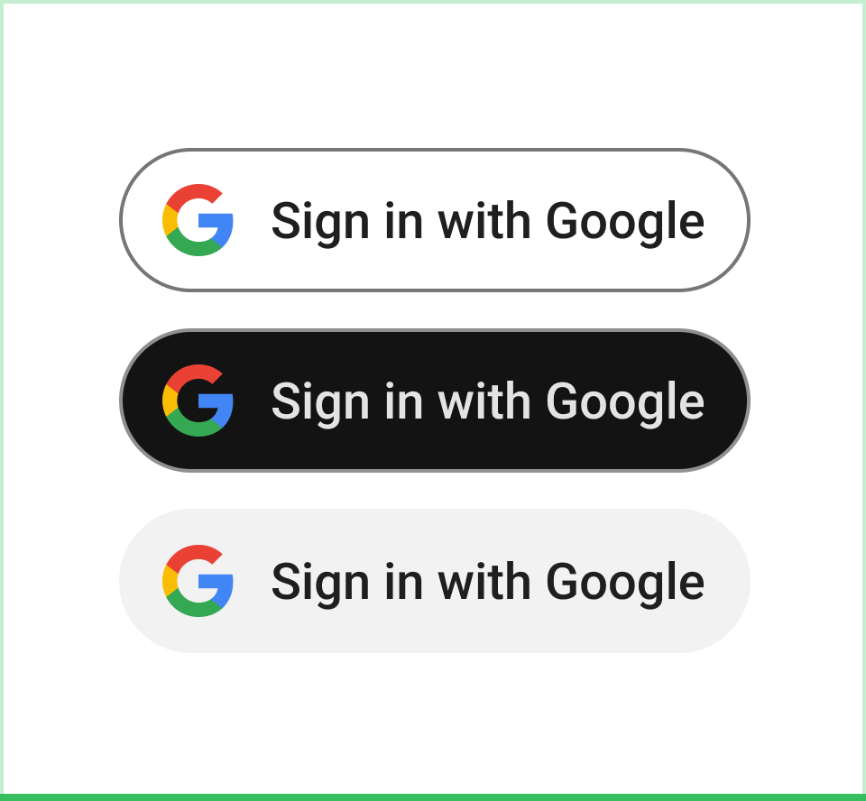 Do Use the Google brand color for Google icon for dark, light, and neutral modes. |
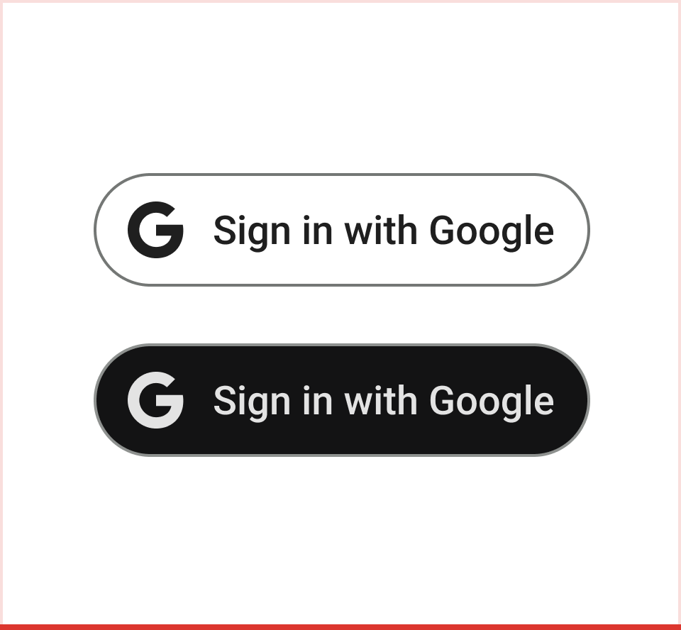 Don't Use monochrome versions of the Google "G" for the button. |
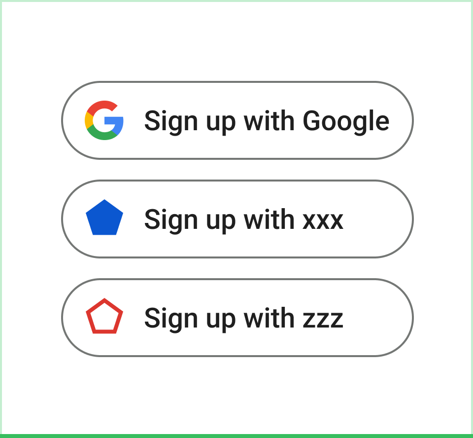 Do Choose the button in the right color mode for accessibility and equal prominence. |
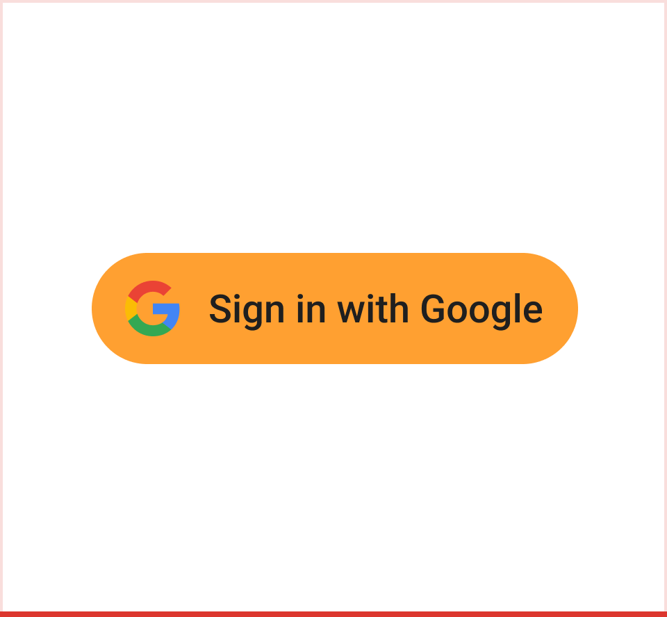 Don't Put the standard color Google "G" icon on a colored background other than light, dark, or neutral. |
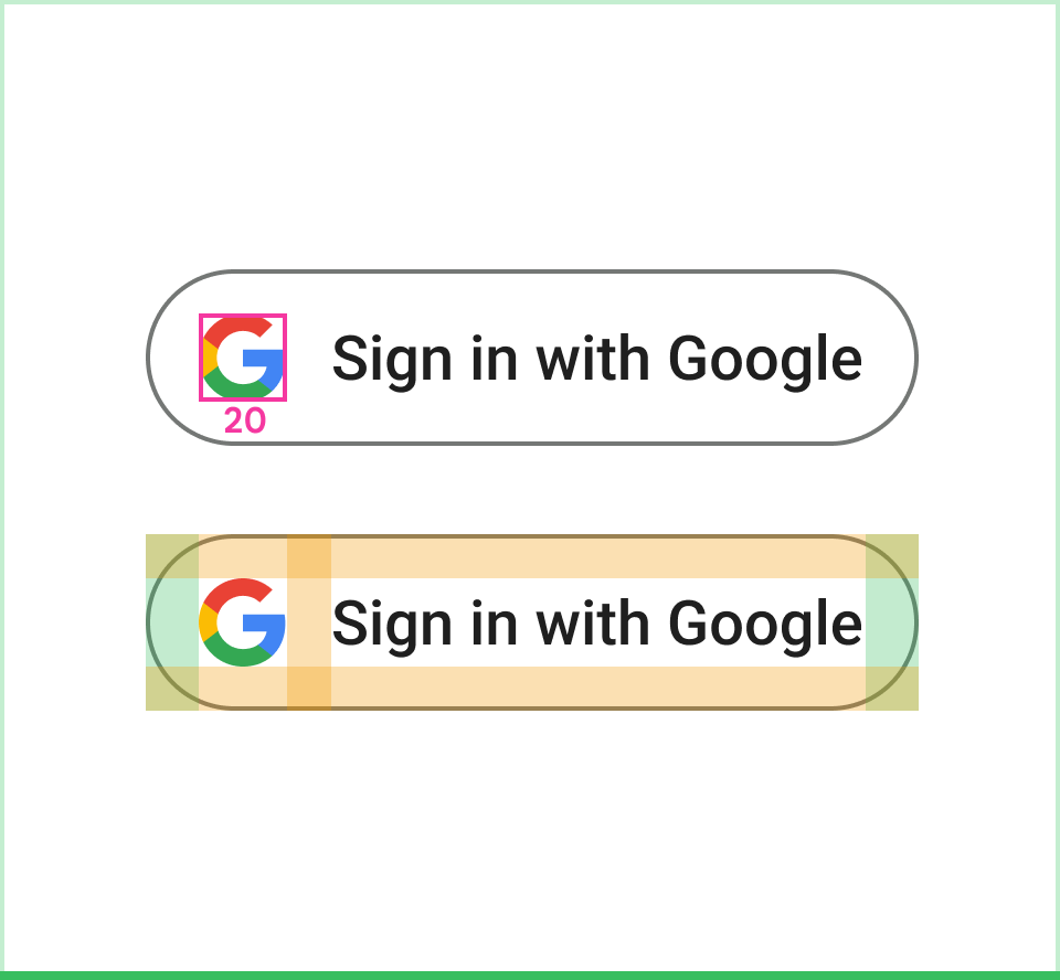 Do Stick with the Google "G" with fixed padding and size. |
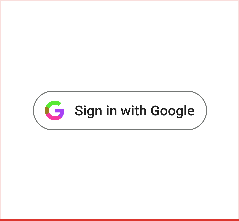 Don't Create your own icon for the button. |
 Do Use the Google "G" by itself for action button if needed. |
 Don't Use the term "Google" by itself in the button to represent the action of Sign in with Google. |
Sign in with Google Branding Best Practices
Sign in with Google and other third party sign-in options
The Sign in with Google button should be displayed at least as prominently as other third party sign-in options. For example, buttons should be approximately the same size and have similar visual weight.
Other Guidelines
If you request additional scopes, do so with incremental authorization (Android, iOS, web), only prompting the user for authorization as they begin to interact with a feature that requires API access.
If you request YouTube scopes, use a YouTube button.
If you use Google Play games services, also see the Google Play games services branding guidelines.
Use of Google brands in ways not expressly covered by this document is not allowed without prior written consent from Google (see the Guidelines for Third Party Use of Google Brand Features for more information).


