
Use a visual selection response if you want the user to select one among several options in order to continue with your Action. You can use the following visual selection response types as part of a prompt:
- List
- Collection
- Collection browse
When defining a visual selection response, use a candidate with the
RICH_RESPONSE surface capability so that Google Assistant only returns the
response on supported devices. You can only use one rich response per content
object in a prompt.
Adding a visual selection response
Visual selection responses use slot filling in a scene both to present options that a user can select and to handle a selected item. When users select an item, Assistant passes the selected item value to your webhook as an argument. Then, in the argument value, you receive the key for the selected item.
Before you can use a visual selection response, you must define a type that represents the response a user later selects. In your webhook, you override that type with content that you want to display for selection.
To add a visual selection response to a scene in Actions Builder, follow these steps:
- In the scene, add a slot to the Slot filling section.
- Select a previously defined type for your visual selection response and give it a name. Your webhook uses this slot name to reference the type later.
- Check the Call your webhook box and provide the name of the event handler in your webhook that you want to use for the visual selection response.
- Check the Send prompts box.
- In the prompt, provide the appropriate JSON or YAML content based on the visual selection response you want to return.
- In your webhook, follow the steps in Handling selected items.
See the list, collection, and collection browse sections below for the available prompt properties and examples of overriding types.
Handling selected items
Visual selection responses require you to handle a user's selection in your webhook code. When the user selects something from a visual selection response, Google Assistant fills the slot with that value.
In the following example, the webhook code receives and stores the selected option in a variable:
Node.js
app.handle('Option', conv => {
  // Note: 'prompt_option' is the name of the slot.
  const selectedOption = conv.session.params.prompt_option;
  conv.add(`You selected ${selectedOption}.`);
});
JSON
{
  "responseJson": {
    "session": {
      "id": "session_id",
      "params": {
        "prompt_option": "ITEM_1"
      }
    },
    "prompt": {
      "override": false,
      "firstSimple": {
        "speech": "You selected ITEM_1.",
        "text": "You selected ITEM_1."
      }
    }
  }
}
List
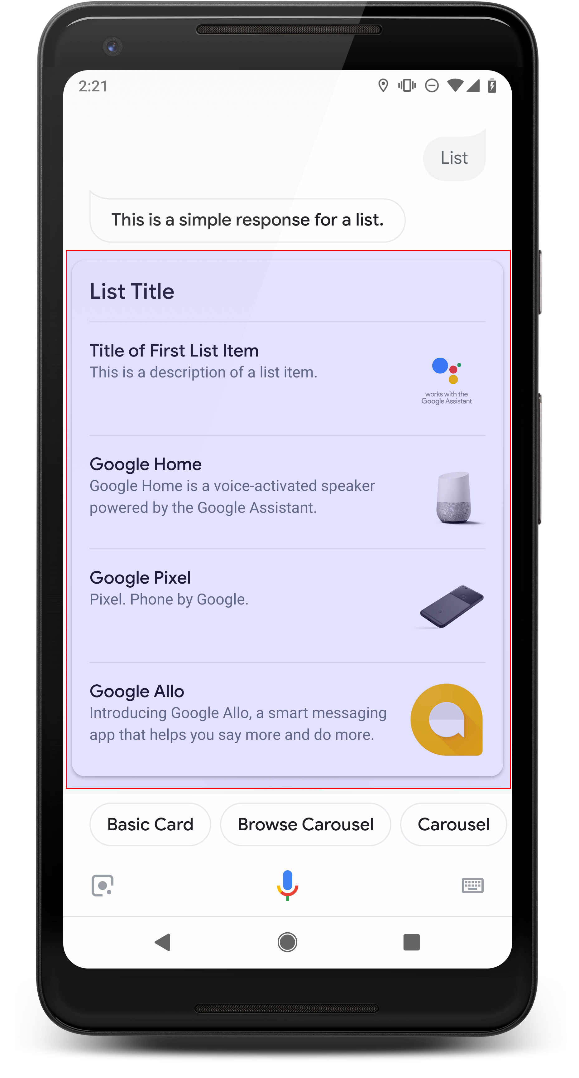
A list presents users with a vertical list of multiple items and allows them to select one by touch or voice input. When a user selects an item from the list, Assistant generates a user query (chat bubble) containing the title of the list item.
Lists are good for when it's important to disambiguate options, or when the user needs to choose between options that need to be scanned in their entirety. For example, which "Peter" do you need to speak to, Peter Jons or Peter Hans?
Lists must contain a minimum of 2 and a maximum of 30 list items. The number of elements initially displayed depends on the user's device, and common starting number is 10 items.
Creating a list
When creating a list, your prompt only contains keys for each item that a user
can select. In your webhook, you define the items that correspond to those keys
based on the Entry type.
List items defined as Entry objects have the following display
characteristics:
- Title
- Fixed font and font size
- Max length: 1 line (truncated with ellipses…)
- Required to be unique (to support voice selection)
- Description (optional)
- Fixed font and font size
- Max length: 2 lines (truncated with ellipses…)
- Image (optional)
- Size: 48x48 px
Visual selection responses require you to override a type by its slot name using
a runtime type in the TYPE_REPLACE mode. In your webhook
event handler, reference the type to override by its slot name (defined in
Adding selection responses) in the name property.
After a type is overwritten, the resultant type represents the list of items your user can choose from that Assistant displays.
Properties
The list response type has the following properties:
| Property | Type | Requirement | Description |
|---|---|---|---|
items |
array of ListItem |
Required | Represents an item in the list that users can select. Each
ListItem contains a key that maps to a referenced type for
the list item. |
title |
string | Optional | Plain text title of the list, restricted to a single line. If no title is specified, the card height collapses. |
subtitle |
string | Optional | Plain text subtitle of the list. |
Sample code
The following samples define the prompt content in the webhook code or in the JSON webhookResponse. However, you may instead define the prompt content in Actions Builder (as YAML or JSON) as well.
Node.js
const ASSISTANT_LOGO_IMAGE = new Image({
  url: 'https://developers.google.com/assistant/assistant_96.png',
  alt: 'Google Assistant logo'
});

app.handle('List', conv => {
  conv.add('This is a list.');

  // Override type based on slot 'prompt_option'
  conv.session.typeOverrides = [{
    name: 'prompt_option',
    mode: 'TYPE_REPLACE',
    synonym: {
      entries: [
        {
          name: 'ITEM_1',
          synonyms: ['Item 1', 'First item'],
          display: {
             title: 'Item #1',
             description: 'Description of Item #1',
             image: ASSISTANT_LOGO_IMAGE,
                }
        },
        {
          name: 'ITEM_2',
          synonyms: ['Item 2', 'Second item'],
          display: {
             title: 'Item #2',
             description: 'Description of Item #2',
             image: ASSISTANT_LOGO_IMAGE,
                }
        },
        {
          name: 'ITEM_3',
          synonyms: ['Item 3', 'Third item'],
          display: {
             title: 'Item #3',
             description: 'Description of Item #3',
             image: ASSISTANT_LOGO_IMAGE,
                }
        },
        {
          name: 'ITEM_4',
          synonyms: ['Item 4', 'Fourth item'],
          display: {
             title: 'Item #4',
             description: 'Description of Item #4',
             image: ASSISTANT_LOGO_IMAGE,
                }
        },
        ]
    }
  }];

  // Define prompt content using keys
  conv.add(new List({
    title: 'List title',
    subtitle: 'List subtitle',
    items: [
      {
        key: 'ITEM_1'
      },
      {
        key: 'ITEM_2'
      },
      {
        key: 'ITEM_3'
      },
      {
        key: 'ITEM_4'
      }
    ],
  }));
});
JSON
{
 "responseJson": {
   "session": {
     "id": "session_id",
     "params": {},
     "typeOverrides": [
       {
         "name": "prompt_option",
         "synonym": {
           "entries": [
             {
               "name": "ITEM_1",
               "synonyms": [
                 "Item 1",
                 "First item"
               ],
               "display": {
                 "title": "Item #1",
                 "description": "Description of Item #1",
                 "image": {
                   "alt": "Google Assistant logo",
                   "height": 0,
                   "url": "https://developers.google.com/assistant/assistant_96.png",
                   "width": 0
                 }
               }
             },
             {
               "name": "ITEM_2",
               "synonyms": [
                 "Item 2",
                 "Second item"
               ],
               "display": {
                 "title": "Item #2",
                 "description": "Description of Item #2",
                 "image": {
                   "alt": "Google Assistant logo",
                   "height": 0,
                   "url": "https://developers.google.com/assistant/assistant_96.png",
                   "width": 0
                 }
               }
             },
             {
               "name": "ITEM_3",
               "synonyms": [
                 "Item 3",
                 "Third item"
               ],
               "display": {
                 "title": "Item #3",
                 "description": "Description of Item #3",
                 "image": {
                   "alt": "Google Assistant logo",
                   "height": 0,
                   "url": "https://developers.google.com/assistant/assistant_96.png",
                   "width": 0
                 }
               }
             },
             {
               "name": "ITEM_4",
               "synonyms": [
                 "Item 4",
                 "Fourth item"
               ],
               "display": {
                 "title": "Item #4",
                 "description": "Description of Item #4",
                 "image": {
                   "alt": "Google Assistant logo",
                   "height": 0,
                   "url": "https://developers.google.com/assistant/assistant_96.png",
                   "width": 0
                 }
               }
             }
           ]
         },
         "typeOverrideMode": "TYPE_REPLACE"
       }
     ]
   },
   "prompt": {
     "override": false,
     "content": {
       "list": {
         "items": [
           {
             "key": "ITEM_1"
           },
           {
             "key": "ITEM_2"
           },
           {
             "key": "ITEM_3"
           },
           {
             "key": "ITEM_4"
           }
         ],
         "subtitle": "List subtitle",
         "title": "List title"
       }
     },
     "firstSimple": {
       "speech": "This is a list.",
       "text": "This is a list."
     }
   }
 }
}
Collection
A collection scrolls horizontally and allows users to select one item by touch or voice input. Compared to lists, collections have large tiles and allow for richer content. The tiles that make up a collection are similar to the basic card with image. When users select an item from a collection, Assistant generates a user query (chat bubble) containing the title of the item.
Collections are good when various options are presented to the user, but a direct comparison is not required among them (versus lists). In general, prefer lists to collections because lists are easier to visually scan and to interact with by voice.
Collections must contain a minimum of 2 and a maximum of 10 tiles. On display-capable devices, users can swipe left or right to scroll through cards in a collection before selecting an item.
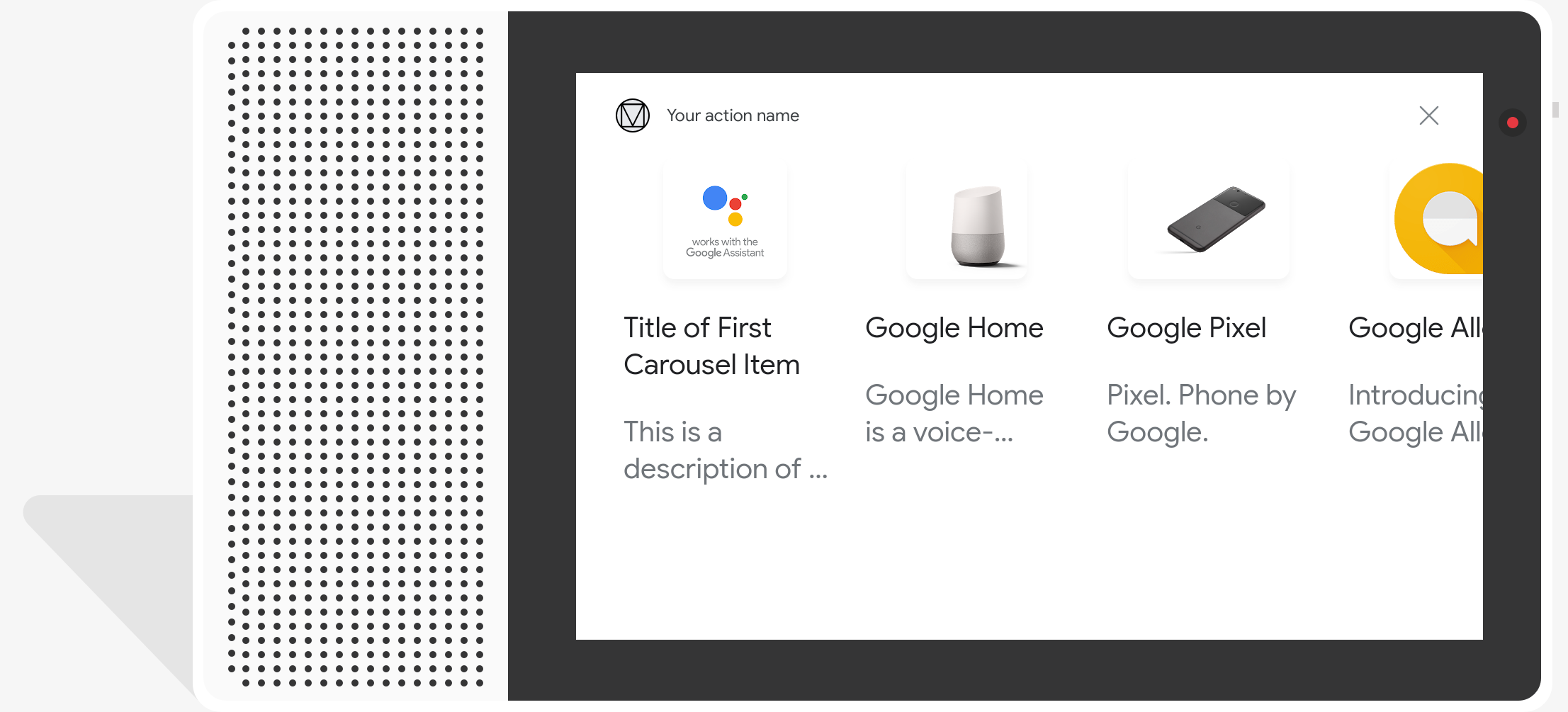
Creating a collection
When creating a collection, your prompt only contains keys for each item that a
user can select. In your webhook, you define the items that correspond to those
keys based on the Entry type.
Collection items defined as Entry objects have the following display
characteristics:
- Image (optional)
- Image is forced to be 128 dp tall x 232 dp wide
- If the image aspect ratio doesn't match the image bounding box, then the image is centered with bars on either side
- If an image link is broken then a placeholder image is used instead
- Title (required)
- Plain text, Markdown is not supported. Same formatting options as the basic card rich response
- Card height collapses if no title is specified.
- Required to be unique (to support voice selection)
- Description (optional)
- Plain text, Markdown is not supported. Same formatting options as the basic card rich response
Visual selection responses require you to override a type by its slot name using
a runtime type in the TYPE_REPLACE mode. In your webhook
event handler, reference the type to override by its slot name (defined in
Adding selection responses) in the name property.
After a type is overwritten, the resultant type represents the collection of items your user can choose from that Assistant displays.
Properties
The collection response type has the following properties:
| Property | Type | Requirement | Description |
|---|---|---|---|
items |
array of CollectionItem |
Required | Represents an item in the collection that users can select. Each
CollectionItem contains a key that maps to a referenced type
for the collection item. |
title |
string | Optional | Plain text title of the collection. Titles must be unique in a collection to support voice selection. |
subtitle |
string | Optional | Plain text subtitle of the collection. |
image_fill |
ImageFill |
Optional | Border between the card and the image container to be used when the image's aspect ratio doesn't match the image container's aspect ratio. |
Sample code
The following samples define the prompt content in the webhook code or in the JSON webhook response. However, you may instead define the prompt content in Actions Builder (as YAML or JSON) as well.
Node.js
const ASSISTANT_LOGO_IMAGE = new Image({
  url: 'https://developers.google.com/assistant/assistant_96.png',
  alt: 'Google Assistant logo'
});

app.handle('Collection', conv => {
  conv.add("This is a collection.");

  // Override type based on slot 'prompt_option'
  conv.session.typeOverrides = [{
    name: 'prompt_option',
    mode: 'TYPE_REPLACE',
    synonym: {
      entries: [
        {
          name: 'ITEM_1',
          synonyms: ['Item 1', 'First item'],
          display: {
             title: 'Item #1',
             description: 'Description of Item #1',
             image: ASSISTANT_LOGO_IMAGE,
                }
        },
        {
          name: 'ITEM_2',
          synonyms: ['Item 2', 'Second item'],
          display: {
             title: 'Item #2',
             description: 'Description of Item #2',
             image: ASSISTANT_LOGO_IMAGE,
                }
        },
        {
          name: 'ITEM_3',
          synonyms: ['Item 3', 'Third item'],
          display: {
             title: 'Item #3',
             description: 'Description of Item #3',
             image: ASSISTANT_LOGO_IMAGE,
                }
        },
        {
          name: 'ITEM_4',
          synonyms: ['Item 4', 'Fourth item'],
          display: {
             title: 'Item #4',
             description: 'Description of Item #4',
             image: ASSISTANT_LOGO_IMAGE,
                }
        },
        ]
    }
  }];

  // Define prompt content using keys
  conv.add(new Collection({
    title: 'Collection Title',
    subtitle: 'Collection subtitle',
    items: [
      {
        key: 'ITEM_1'
      },
      {
        key: 'ITEM_2'
      },
      {
        key: 'ITEM_3'
      },
      {
        key: 'ITEM_4'
      }
    ],
  }));
});
JSON
{
  "responseJson": {
    "session": {
      "id": "ABwppHHz--uQEEy3CCOANyB0J58oF2Yw5JEX0oXwit3uxDlRwzbEIK3Bcz7hXteE6hWovrLX9Ahpqu8t-jYnQRFGpAUqSuYjZ70",
      "params": {},
      "typeOverrides": [
        {
          "name": "prompt_option",
          "synonym": {
            "entries": [
              {
                "name": "ITEM_1",
                "synonyms": [
                  "Item 1",
                  "First item"
                ],
                "display": {
                  "title": "Item #1",
                  "description": "Description of Item #1",
                  "image": {
                    "alt": "Google Assistant logo",
                    "height": 0,
                    "url": "https://developers.google.com/assistant/assistant_96.png",
                    "width": 0
                  }
                }
              },
              {
                "name": "ITEM_2",
                "synonyms": [
                  "Item 2",
                  "Second item"
                ],
                "display": {
                  "title": "Item #2",
                  "description": "Description of Item #2",
                  "image": {
                    "alt": "Google Assistant logo",
                    "height": 0,
                    "url": "https://developers.google.com/assistant/assistant_96.png",
                    "width": 0
                  }
                }
              },
              {
                "name": "ITEM_3",
                "synonyms": [
                  "Item 3",
                  "Third item"
                ],
                "display": {
                  "title": "Item #3",
                  "description": "Description of Item #3",
                  "image": {
                    "alt": "Google Assistant logo",
                    "height": 0,
                    "url": "https://developers.google.com/assistant/assistant_96.png",
                    "width": 0
                  }
                }
              },
              {
                "name": "ITEM_4",
                "synonyms": [
                  "Item 4",
                  "Fourth item"
                ],
                "display": {
                  "title": "Item #4",
                  "description": "Description of Item #4",
                  "image": {
                    "alt": "Google Assistant logo",
                    "height": 0,
                    "url": "https://developers.google.com/assistant/assistant_96.png",
                    "width": 0
                  }
                }
              }
            ]
          },
          "typeOverrideMode": "TYPE_REPLACE"
        }
      ]
    },
    "prompt": {
      "override": false,
      "content": {
        "collection": {
          "imageFill": "UNSPECIFIED",
          "items": [
            {
              "key": "ITEM_1"
            },
            {
              "key": "ITEM_2"
            },
            {
              "key": "ITEM_3"
            },
            {
              "key": "ITEM_4"
            }
          ],
          "subtitle": "Collection subtitle",
          "title": "Collection Title"
        }
      },
      "firstSimple": {
        "speech": "This is a collection.",
        "text": "This is a collection."
      }
    }
  }
}
Collection browse
Similar to a collection, collection browse is a rich response that allows users to scroll through option cards. Collection browse is designed specifically for web content and opens the selected tile in a web browser (or an AMP browser if all tiles are AMP-enabled).
Collection browse responses contain a minimum of 2 and a maximum of 10 tiles. On display-capable devices, users can swipe up or down to scroll through cards before selecting an item.
Creating a collection browse
When creating a collection browse, consider how users will interact with this
prompt. Each collection browse item opens its defined URL, so provide helpful
details to the user.
Collection browse items have the following display characteristics:
- Image (optional)
- Image is forced to 128 dp tall x 232 dp wide.
- If the image aspect ratio doesn't match the image bounding box, the image is
centered with bars on either the sides or top and bottom. The color of the
bars is determined by the collection browse
ImageFillproperty. - If an image link is broken, a placeholder image is used in its place.
- Title (required)
- Plain text, Markdown is not supported. The same formatting as the basic card rich response is used.
- Card height collapses if no title is defined.
- Description (optional)
- Plain text, Markdown is not supported. The same formatting as the basic card rich response is used.
- Footer (optional)
- Plain text; Markdown is not supported.
Properties
The collection browse response type has the following properties:
| Property | Type | Requirement | Description |
|---|---|---|---|
item |
object | Required | Represents an item in the collection that users can select. |
image_fill |
ImageFill |
Optional | Border between the card and the image container to be used when the image's aspect ratio doesn't match the image container's aspect ratio. |
Collection browse item has the following properties:
| Property | Type | Requirement | Description |
|---|---|---|---|
title |
string | Required | Plain text title of the collection item. |
description |
string | Optional | Description of the collection item. |
footer |
string | Optional | Footer text for the collection item, displayed below the description. |
image |
Image |
Optional | Image displayed for the collection item. |
openUriAction |
OpenUrl |
Required | URI to open when the collection item is selected. |
Sample code
The following samples define the prompt content in the webhook code or in the JSON webhook response. However, you may instead define the prompt content in Actions Builder (as YAML or JSON) as well.
YAML
candidates:
  - first_simple:
      variants:
        - speech: This is a collection browse.
    content:
      collection_browse:
        items:
          - title: Item #1
            description: Description of Item #1
            footer: Footer of Item #1
            image:
              url: 'https://developers.google.com/assistant/assistant_96.png'
            open_uri_action:
              url: 'https://www.example.com'
          - title: Item #2
            description: Description of Item #2
            footer: Footer of Item #2
            image:
              url:  'https://developers.google.com/assistant/assistant_96.png'
            open_uri_action:
              url: 'https://www.example.com'
        image_fill: WHITE
JSON
{
 "candidates": [
   {
     "firstSimple": {
       "speech": "This is a collection browse.",
       "text": "This is a collection browse."
     },
     "content": {
       "collectionBrowse": {
         "items": [
           {
             "title": "Item #1",
             "description": "Description of Item #1",
             "footer": "Footer of Item #1",
             "image": {
               "url": "https://developers.google.com/assistant/assistant_96.png"
             },
             "openUriAction": {
               "url": "https://www.example.com"
             }
           },
           {
             "title": "Item #2",
             "description": "Description of Item #2",
             "footer": "Footer of Item #2",
             "image": {
               "url": "https://developers.google.com/assistant/assistant_96.png"
             },
             "openUriAction": {
               "url": "https://www.example.com"
             }
           }
         ],
         "imageFill": "WHITE"
       }
     }
   }
 ]
}
Node.js
// Collection Browse
app.handle('collectionBrowse', (conv) => {
  conv.add('This is a collection browse.');
  conv.add(new CollectionBrowse({
    'imageFill': 'WHITE',
    'items':
      [
        {
          'title': 'Item #1',
          'description': 'Description of Item #1',
          'footer': 'Footer of Item #1',
          'image': {
            'url': 'https://developers.google.com/assistant/assistant_96.png'
          },
          'openUriAction': {
            'url': 'https://www.example.com'
          }
        },
        {
          'title': 'Item #2',
          'description': 'Description of Item #2',
          'footer': 'Footer of Item #2',
          'image': {
            'url': 'https://developers.google.com/assistant/assistant_96.png'
          },
          'openUriAction': {
            'url': 'https://www.example.com'
          }
        }
      ]
  }));
});
JSON
{
  "responseJson": {
    "session": {
      "id": "session_id",
      "params": {},
      "languageCode": ""
    },
    "prompt": {
      "override": false,
      "content": {
        "collectionBrowse": {
          "imageFill": "WHITE",
          "items": [
            {
              "title": "Item #1",
              "description": "Description of Item #1",
              "footer": "Footer of Item #1",
              "image": {
                "url": "https://developers.google.com/assistant/assistant_96.png"
              },
              "openUriAction": {
                "url": "https://www.example.com"
              }
            },
            {
              "title": "Item #2",
              "description": "Description of Item #2",
              "footer": "Footer of Item #2",
              "image": {
                "url": "https://developers.google.com/assistant/assistant_96.png"
              },
              "openUriAction": {
                "url": "https://www.example.com"
              }
            }
          ]
        }
      },
      "firstSimple": {
        "speech": "This is a collection browse.",
        "text": "This is a collection browse."
      }
    }
  }
}